What is Belleek Parian China?
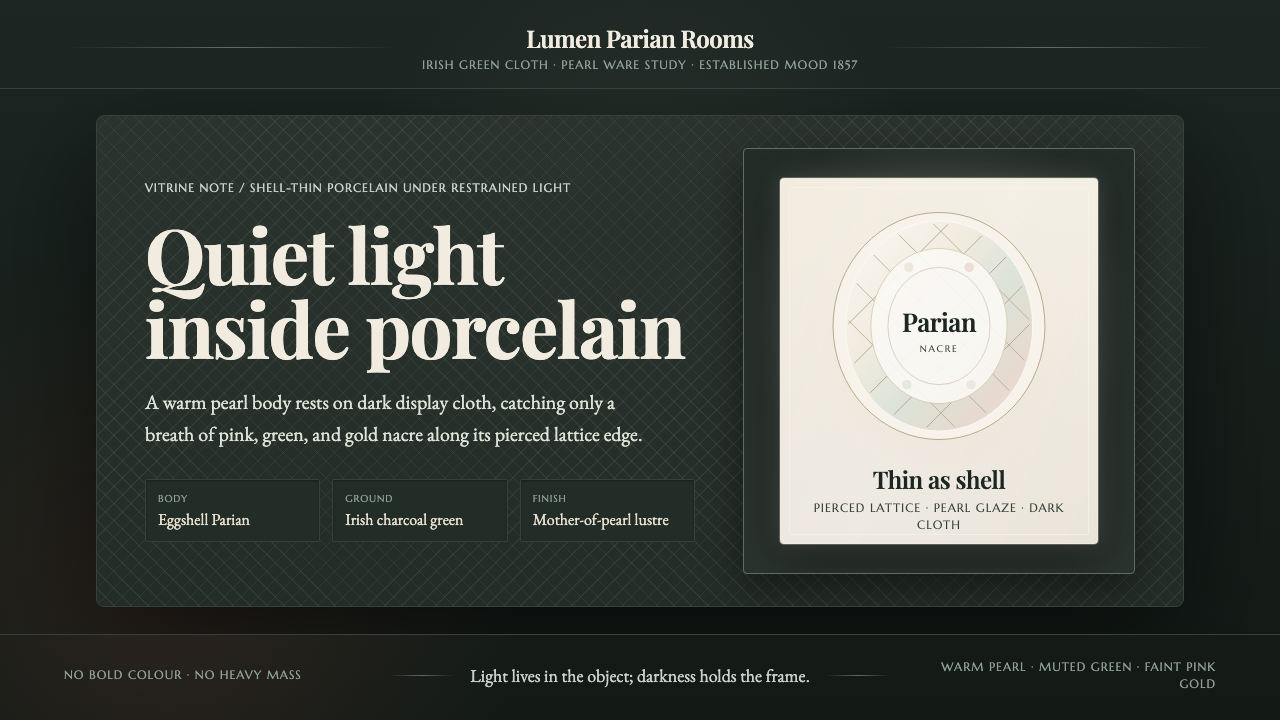
Belleek makes porcelain glow by subtraction — pearl-white translucency, woven openwork, and a whisper of nacre set against the depth of Irish green.
Belleek Parian China in brief
Belleek Parian China is the visual language of Irish porcelain from County Fermanagh, prized since 1857 for eggshell-thin Parian china, woven-basket openwork, and a frit-based Brianchon glaze. Its defining impression is not opulence but delicacy: a warm pearl-white body that seems to gather light, pierced surfaces that allow darkness through, and a restrained nacre sheen that shifts quietly across the object.
The system treats porcelain as a luminous object rather than a decorated surface. Forms should feel impossibly thin, almost shell-like, with translucency doing the work that solid color or heavy modeling might do elsewhere. The supporting field is dark Irish green or near-black, recalling the cloth used to present Belleek in a vitrine. Against that darkness, the porcelain appears to float between material presence and light.
Its Victorian character is refined rather than theatrical. Serif typography, delicate lattice, warm white surfaces, and subdued iridescence establish an atmosphere of heritage and close looking. Pink, green, and gold appear as traces within the glaze, never as loud blocks of color. Every decision is governed by restraint: no chunky mass, no forceful contrast for its own sake, and no ornament that overwhelms the fragile object.

Where does Belleek Parian China come from?
Belleek was founded in 1857 in Belleek, County Fermanagh, Ireland, during the Victorian period and before 1900. The heritage line remains in production, which gives the style an unusual relationship to time: it is historical in origin but not sealed inside a museum case. Its visual identity can therefore be approached as a living heritage language rather than as a reconstructed period fantasy.
The approved heritage record places Belleek within several overlapping traditions: Victorian Parian ware, Irish decorative porcelain, and iridescent-glaze lustreware. These categories explain why the style balances structural fragility with decorative intricacy. Parian china supplies the pale, thin body; Irish decorative porcelain supplies the sense of crafted detail; lustreware supplies the restrained surface change that appears only when the object catches light.
Belleek is especially associated with three material signatures. The first is eggshell-thin Parian china, whose translucency makes the body read as light-bearing rather than merely white. The second is woven-basket openwork, a pierced lattice that introduces shadow, rhythm, and visual air. The third is the frit-based Brianchon glaze, which casts a faint mother-of-pearl nacre of pink, green, and gold across the warm pearl-white surface.
The heritage record identifies David McBirney, Robert Williams Armstrong, and William Bromley as key figures. The supplied material does not assign separate biographies or production roles to them, so they should be presented as names within Belleek’s documented lineage rather than attached to invented anecdotes. Their inclusion matters because it keeps the style connected to a real regional tradition: the result is not an abstract palette, but a continuing Irish porcelain heritage with a specific place, material vocabulary, and historical era.
What defines the Belleek Parian China look?
Pearl-White Body
The base is a warm pearl white, never a stark clinical white. It carries the visual softness of porcelain while leaving enough tonal presence for the form to remain legible against dark cloth. White is not used as empty background alone; it is the principal material voice of the system, quiet but unmistakably luminous.
Nacreous Restraint
The Brianchon glaze introduces a faint mother-of-pearl cast of pink, green, and gold. These colors should behave like a surface discovery, not a painted pattern. Iridescence is most convincing when it stays subordinate to the pearl-white body and emerges through changing emphasis rather than loud saturation.
Dark Cloth Ground
Dark Irish green or near-black provides the grounding field. It is not a competing color story but a stage for translucency. The darkness gives the porcelain visual depth, allowing its thin body and pale surface to read as an illuminated object under vitrine light.
Pierced Lattice
Woven-basket openwork supplies the style’s most distinctive rhythm. The lattice is delicate, repetitive, and visibly porous, creating a conversation between porcelain and shadow. It should remain fine enough to suggest hand-crafted fragility, never becoming a heavy ornamental border or a dense graphic block.
Victorian Serif
Typography uses refined Victorian serifs to connect the contemporary composition with Belleek’s historical identity. Letterforms should feel composed and cultivated, with enough contrast to remain clear on the dark ground. Type is a quiet frame around the object, not a second spectacle competing with it.
Thinness and Light
The central formal idea is shell-thin translucency. Surfaces should feel light-catching, airy, and almost weightless, while shadows remain deep enough to reveal the object’s edge. The system gains its authority from this tension: the porcelain is precious because it appears physically delicate, yet visually precise.

Who shaped Belleek Parian China?
David McBirney is named in the approved Belleek heritage record as a key figure associated with this style. The available material gives no separate biography or attribution, so his presence should be understood as part of the continuing Belleek lineage rather than represented through invented personal detail.
Robert Williams Armstrong appears in the supplied heritage record among Belleek’s key figures. His inclusion anchors the style in the named history of Belleek rather than in a generalized Victorian mood. The visual language remains collective: Parian thinness, openwork, pearl white, and nacreous glaze.
William Bromley is identified by the approved material as another key figure in the Belleek heritage line. No individual visual signature is supplied for him. For educational use, the responsible emphasis is therefore on the shared material tradition and on the fact that the heritage line remains in production.
How do you use Belleek Parian China today?
For presentation slides, let the cover behave like a vitrine: a dark Irish-green or near-black field, a pearl-white title in refined Victorian serif, and a quiet suggestion of pierced lattice or nacre near the edge. Content slides should keep the same museum-like calm, using open space to separate sections and allowing pale type to sit clearly against the dark ground. Data slides should make charts and labels feel like arranged porcelain fragments: precise, light, and subordinate to the reading task, with pink, green, or gold appearing only as restrained accents.
For web dashboards and pricing pages, the style can make dense information feel curated rather than industrial. Use a dark grounding surface, warm pearl-white text, delicate borders, and cards that feel like display cases rather than heavy containers. Iridescent accents can distinguish states or tiers, but they should remain quiet and material-led. Navigation benefits from typographic clarity; the atmosphere should come from contrast between dark cloth and luminous content, not from ornamental interface chrome.
For editorial and marketing work, Belleek Parian China suits heritage stories, object catalogues, craft features, and campaigns built around close observation. Give the main text a calm reading measure and let captions, provenance notes, or pull quotes sit like small labels beside an exhibited piece. Marketing compositions can alternate dark fields with pearl-white object areas, using lattice as a fine structural motif and nacre as a barely visible atmospheric note.
For product presentation, keep the object as the primary event. A single delicate form can carry more meaning than a crowded arrangement, especially when its silhouette, translucency, or openwork is given room to register. Backgrounds should feel like cloth or shadow, while light surfaces should feel tactile and near, as though viewed through a vitrine. This approach preserves the style’s relationship to collection, display, and careful looking.
The common mistake is to make Belleek feel heavy, glossy, or theatrically antique. Large decorative frames, loud jewel tones, thick borders, exaggerated metallic effects, and aggressive gradients all contradict the source material. Another error is to treat the pink, green, and gold nacre as a fixed rainbow palette. The glaze should remain a faint surface whisper, while the pearl-white body, dark ground, thinness, and pierced detail carry the identity.

Belleek Parian China — FAQ
Is Belleek Parian China a material style or a historical design style?
It is both, but the material is the foundation. The style comes from the interaction of Belleek’s eggshell-thin Parian china, woven-basket openwork, and frit-based Brianchon glaze with a dark display setting. Removing the material logic and keeping only pearl white or Victorian serif type would produce a mood, not a convincing Belleek-derived system.
Why is the background dark if the porcelain itself is pale?
The dark Irish-green or near-black ground recalls the cloth used to present Belleek under vitrine light. More importantly, darkness gives the pearl-white body and its translucency somewhere to register. It creates a visual stage for the object, making the pale surface feel luminous without requiring loud color or artificial shine.
How should the pink, green, and gold nacre be used?
Treat them as a faint glaze effect rather than as a dominant palette. They should appear to move across pearl white, with their visibility varying gently according to the surface or light. Used as accents, they can suggest the Brianchon glaze; used everywhere at equal strength, they lose the delicacy that defines it.
Does the Victorian reference mean the design should be heavily ornate?
No. The approved visual language is refined and restrained. Its Victorian reference is carried by serif typography, crafted detail, and heritage atmosphere, while the openwork remains thin and airy. Ornament should clarify the impression of porcelain craftsmanship, not cover the entire composition or turn the dark setting into theatrical period decoration.
What makes a digital interface feel like Belleek rather than simply dark and elegant?
The defining cues are material and relational: warm pearl-white content against dark cloth, delicate rather than massive containers, fine lattice rhythm, serif heritage typography, and nacre used as a quiet shift rather than a bright effect. A generic dark interface may borrow the mood, but it will miss the essential tension between fragility, translucency, and display.
Related design styles
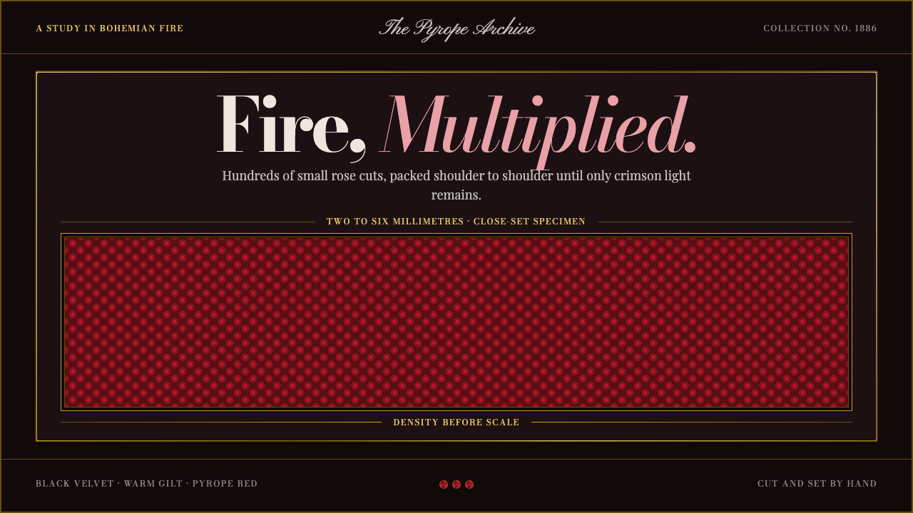 Bohemian GarnetFire thrives in density. Tiny pyrope facets pack tight against black velvet a…
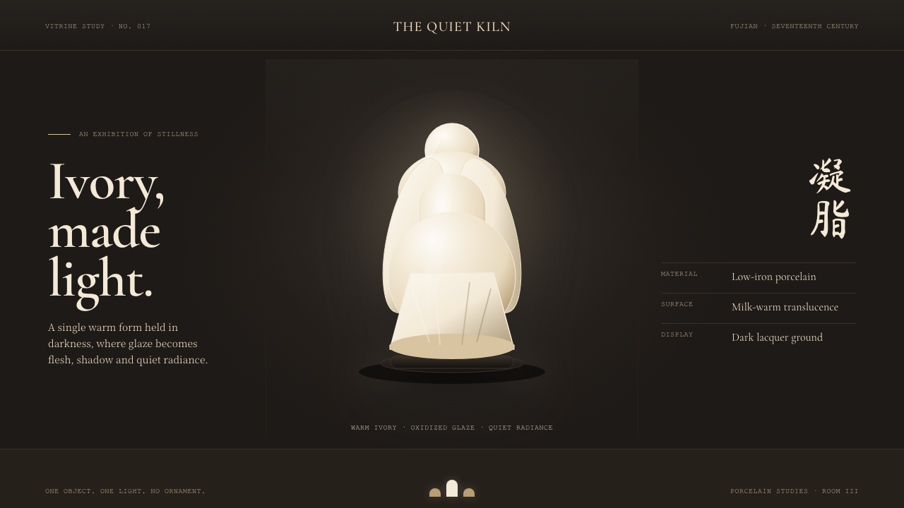 Dehua Blanc de ChineIvory becomes light. Warm porcelain glows as one quiet form against a near-bl…
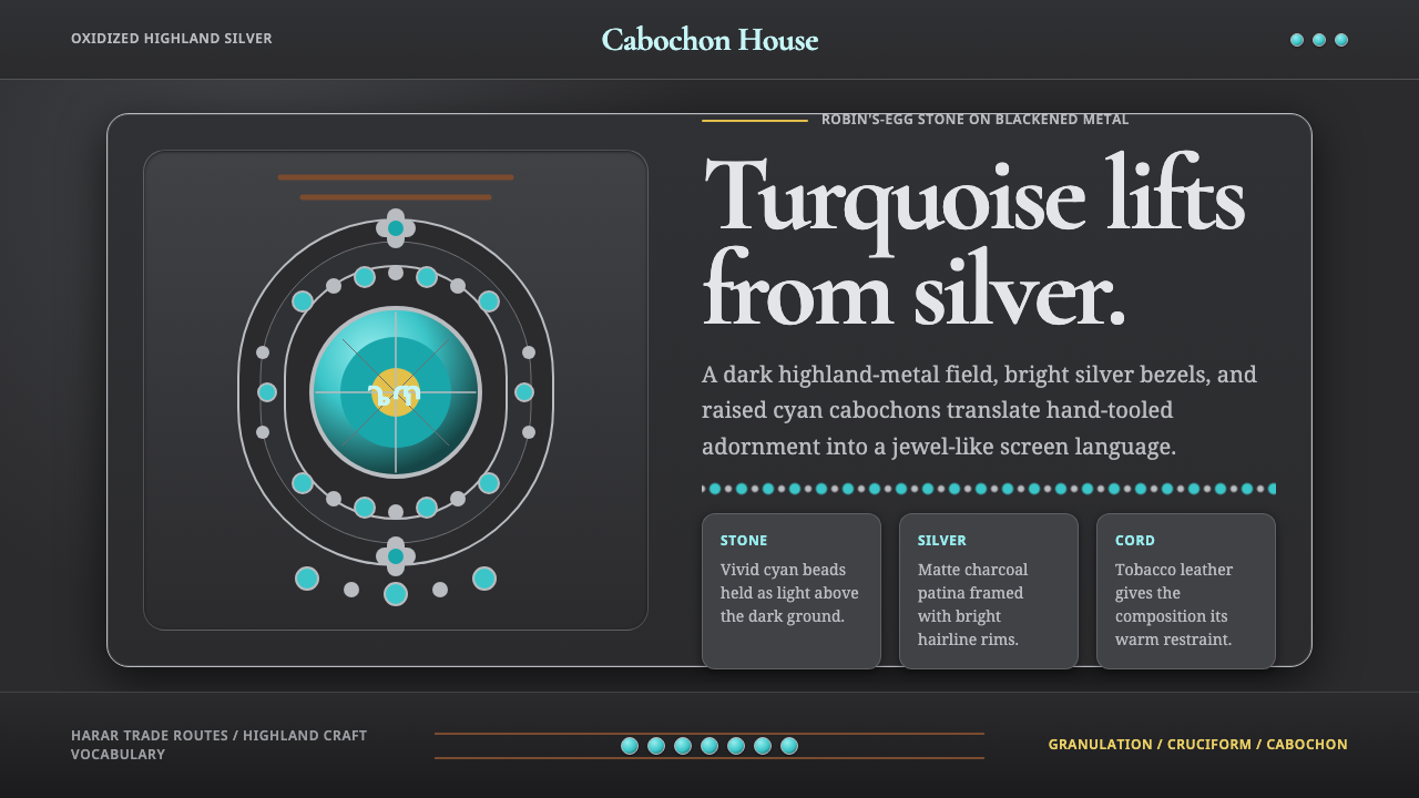 Ethiopian Turquoise SilverDark metal makes stone glow. Cyan cabochons and silver bead rows frame a matt…
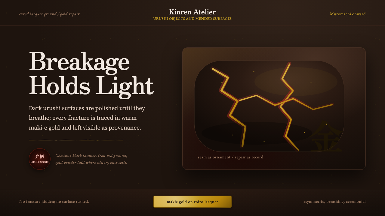 Kintsugi & Urushi LacquerBreakage becomes ceremony. Urushi black-brown carries gold seams and asymmetr…
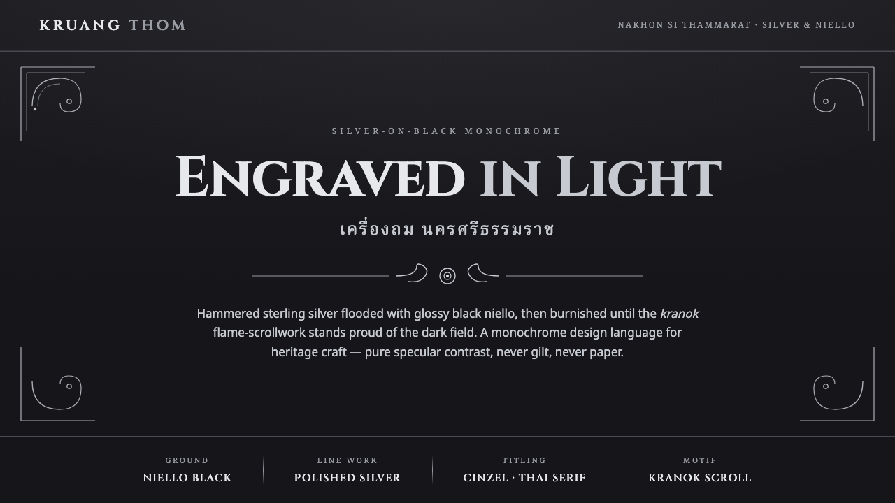 Thai Nielloware ThomSilver-on-black, never gilt. Polished kranok scrollwork glints proud of a glo…
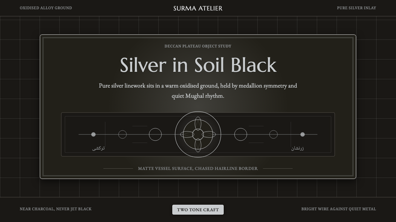 Bidar Bidriware VesselsSoil-black luxury. Crisp silver medallions and hairline borders cut the warm…