What is Bohemian Garnet?
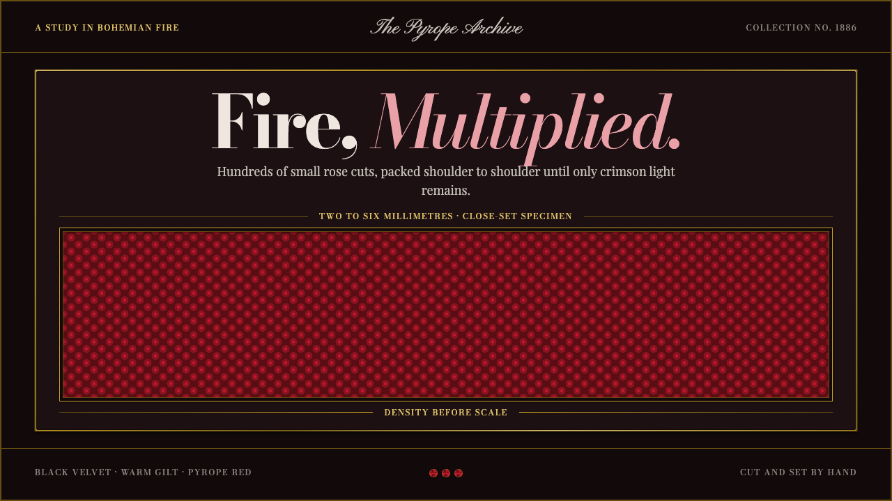
Bohemian garnet jewellery proves that fire does not need size — only density, a dark ground and a great deal of patience.
Bohemian Garnet in brief
Bohemian garnet is the Czech tradition of setting very small, deep-red pyrope garnets — chromium-bearing stones from the České středohoří uplands of Bohemia — shoulder to shoulder in modest metal mounts. The stones are cut deliberately small, only a few millimetres across, in the old rose cut, and then packed so tightly that the metal beneath disappears. A single brooch or necklace may carry hundreds of them. The impression is not of one bright gem but of a surface that glows because it is made of countless tiny sparks.
The tradition inverts the usual logic of luxury. Instead of a large, flawless centre stone supported by discreet metalwork, Bohemian garnet puts all the value in the stones and none in the setting. Mounts are low-grade gold, silver-gilt or tombak, the humble copper-and-zinc alloy, and they are designed to stay out of the way. Ornament is symmetric about a vertical axis: stars, crescents, drops and matched sets built around a central line, as formal as a coat of arms.
Visually the style belongs to the jeweller's showcase. Everything is staged on the black velvet that lines a jewellery case, because pyrope fire only reads against a dark ground. Curio's interpretation takes that literally. The page is dark, matte and quiet; reds appear as dense clusters of fine points rather than broad fills; antique gilt appears as hairline frames and small labels. Density comes before scale, and the darkness is not a mood but a working requirement.
Where does Bohemian Garnet come from?
The garnet itself sets the terms. Pyrope is a magnesium-aluminium garnet, and the chromium-bearing variety found in the České středohoří has a deep, saturated red that moves toward wine and blood rather than orange. Stones of this kind tend to be small, and Bohemian cutters made a virtue of that limit. They chose the rose cut — a flat back beneath a low dome of triangular facets, older than the brilliant cut and well suited to thin, small stones — and then set the results so close together that the surface becomes a continuous field of tiny reflections. What looks like extravagance is in fact an economy of means.
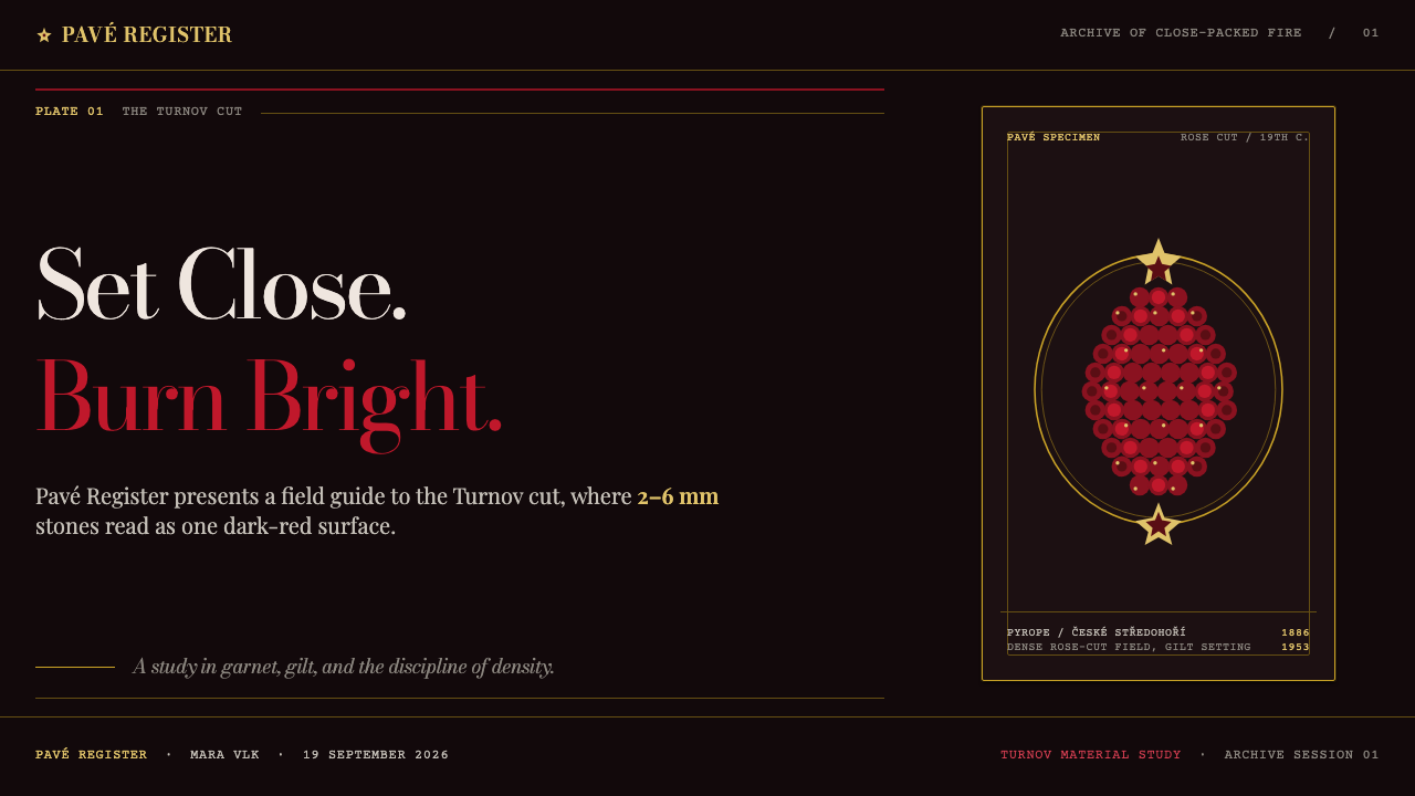
The cutting trade has a geography of its own. Garnet work was centred in Prague before it settled at Turnov, where the craft has been kept continuous ever since. The Turnov Museum opened in 1886, a sign that the town already understood its stone-cutting as a heritage worth documenting, and the Granát cooperative was founded there in 1953, carrying the workshop tradition into the modern era. Few decorative crafts can point to this kind of unbroken line: cutters, setters, museum and cooperative form a single community of skills that has survived changes of empire, regime and fashion.
The golden age came in the nineteenth century, at the height of the Austro-Hungarian period, when garnet jewellery became both a commercial staple and a cultural emblem. The classic repertoire was already settled: star and crescent brooches, matched sets of necklace, earrings and bracelet, and ornaments worn in mourning. The taste for dark, sober, red-black jewellery overlapped with Victorian mourning custom, which valued pieces that looked solemn yet rich. At the same time, the Czech national revival was asking applied arts to speak for a people, and the Bohemian stone served very well as a local jewel that could hold its own beside imported gems.
The result is a design language defined by restraint in the mount and abundance in the stone. Pieces were photographed and worn against black velvet, and that habit is as much a part of the style as the garnets themselves. Dark ground, dense red, quiet gold, vertical symmetry: these four decisions fit together, and each one makes the others work. Remove the dark ground and the fire dies; remove the density and the red looks thin; replace the quiet gold with bright showy metal and the stones lose their authority.
What defines the Bohemian Garnet look?
Color
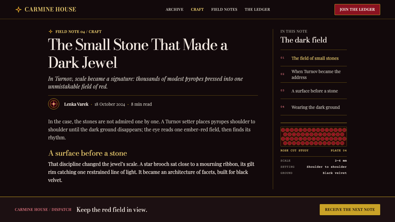
The palette is narrow and deliberate. A near-black velvet ground carries garnet reds that run from deep wine to blood red to almost black cherry, with tiny flashes of lighter red where a facet catches light. Warm antique gold supplies the only second colour. There are no bright secondary hues and no cool accents: the whole composition is a conversation between darkness, red and old metal.
Density Before Scale
Impact comes from how many small points are packed together, not from how big any one of them is. Elements sit shoulder to shoulder with almost no gutters, forming a continuous granular field. Hierarchy is built by the size of the cluster and its position on the page rather than by enlarging a single object. When something becomes large, it should be a cluster, never a flat block of colour.
Vertical Symmetry
Ornament is arranged symmetrically around a vertical axis, in the manner of star brooches, crescents and pendant drops. Compositions are centred, formal and balanced, with a clear spine running through the middle of the page. This is the opposite of casual asymmetry. It gives the style a ceremonial calm and makes even a dense layout feel orderly rather than busy.
Black Velvet Ground
The ground is matte, soft and light-absorbing, like the lining of a jeweller's case. It is not glossy black and not a flat digital black with hard edges; it should feel as if it swallows stray light so that only the points of red answer. Subtle tonal variation across the surface is welcome. Light themes defeat the premise, because pyrope fire simply does not read on pale grounds.
Worn Gilt Mounts
Metal is always subordinate. It appears as thin frames, borders, rules and small labels in a soft, slightly worn gilt rather than a polished mirror gold. The reference is low-grade gold, silver-gilt and tombak, materials chosen because they are modest. Metallic elements should look aged and calm, as if handled for generations, never freshly plated or reflective.
Rose-Cut Facets
The rose cut gives a low dome of small triangular facets, and the style echoes it in miniature faceted shapes, subtle triangular highlights and points that look like they have a flat back and a gently raised face. Sparkle is delivered as pinpoint highlights in lighter red, not as soft gradients or glows. The effect is crisp and granular, closer to a scattering of embers than to a wash of colour.
Case-Lid Typography
Lettering behaves like the engraved label on the lid of a jewellery case: small, spaced, refined and set in the same antique gold as the mounts. Headlines are modest in scale and rely on position and contrast rather than size. Text is brief, because the garnets are the content and words are only captions. A restrained serif character with generous letterspacing suits the tone.
Who shaped Bohemian Garnet?
The anonymous cutters and setters of Turnov are the real authors of the tradition. Their skill lay in cutting stones that were small and many, and then seating them so closely that the mount vanished. Generations of this repetitive, precise labour produced the craft's signature density. For design purposes they stand for the principle that quality can come from many small acts done well rather than a single large gesture.
The museum at Turnov opened in 1886 and treated the town's stone-cutting as something worth preserving and displaying. It marks the moment when a working trade also became a cultural heritage. Collections like this fixed the visual canon of the style: the star and crescent brooches, the matched sets, the funerary pieces shown against dark velvet. It is a reminder that the dark display case is part of how garnet has always been seen.
The Granát cooperative, founded in Turnov in 1953, carried the workshop tradition forward into the modern period and kept cutting and setting alive as a living industry rather than a museum piece. Its existence is why Bohemian garnet is a continuous tradition rather than a revival. For a design system, that continuity matters: the style is not nostalgic costume but a craft idiom still practised today.
How do you use Bohemian Garnet today?
Bohemian garnet is ideal when the subject deserves ceremony: jewellery and luxury goods, heritage brands, memorial and anniversary pages, awards, invitations, fine-craft marketplaces and anything that wants to feel precious without feeling loud. It depends on a dark ground, so treat it as a dark-mode system from the start rather than a light theme with the colours inverted.
For presentation slides, a cover can be nearly empty: a matte black field, a single centred ornament built from tiny red points in the shape of a star or crescent, and a title set in small antique-gold lettering beneath it. Content slides should stay symmetrical and sparing, with one centred idea per slide and a thin gilt frame. Data slides work when marks are rendered as small, closely spaced dots or beads, so that a chart reads like a necklace laid out on velvet.
For web interfaces, treat cards as velvet-lined cases and keep everything centred on a vertical spine. Pricing tiers can be symmetrical, brooch-like panels, with the recommended tier distinguished by a denser cluster of red points rather than a bigger box. Reserve garnet red for active states, selected items and key figures, and let gilt hairlines draw dividers and focus rings. Dashboards should stay low-contrast and calm, with red used as an accent that appears rarely and means something when it does.
For editorial and marketing work, the style shines in catalogues, product stories and long-form heritage features. Place objects or photographs on dark grounds with ample margin, add captions in small gilt lettering, and let section breaks be a narrow ornamental line with a small red cluster at its centre. Copy should be economical. The garnets do the persuading, so words should only name, date and describe.
The most common mistake is reaching for scale. A large flat block of garnet red looks like a warning banner, not a gemstone; it loses all the fire that comes from tiny faceted points. The second mistake is shiny gold gradients, which turn quiet gilt into showy bling and make the stones look cheap. The third is breaking symmetry for the sake of dynamism. If a layout needs to feel casual or playful, this is the wrong system.
Bohemian Garnet — FAQ
What makes Bohemian garnet different from other garnet jewellery?
It is defined by three things together: the stone, the cut and the setting. The stone is chromium-bearing pyrope from the České středohoří, with a deep red. The cut is small and rose-cut, only a few millimetres across. The setting packs many stones tightly into a low-key mount of low-grade gold, silver-gilt or tombak. Other garnet jewellery may use larger faceted stones with prominent settings; Bohemian garnet makes density and surface the whole point.
Why does this style need a dark background?
Because garnet fire only reads against darkness. The red of pyrope is a deep, saturated colour, and small facets show up as pinpoint highlights only when the surrounding field is dark enough to make them stand out. Jewellers have always displayed the stones on black velvet for exactly this reason. In a design system the same logic applies: on a pale ground, the red points look weak and the whole composition loses its glow.
What does 'density before scale' mean in practice?
It means you build emphasis by packing many small elements together, not by enlarging one. A feature area becomes a tight cluster of fine red points; a key number sits within a closely beaded frame; a hero image sits in a narrow gilt border with little empty space around the ornament. When something has to be bigger, grow the cluster, keep each point small and let the eye feel accumulation rather than size.
Why are the metal mounts so modest?
Because the tradition is built on the idea that the stone does all the work. Low-grade gold, silver-gilt and tombak are inexpensive and unobtrusive, which keeps attention on the garnets and keeps the pieces affordable. In design terms, it means metallic or ornamental elements must support the red points, not compete with them. Gilt lines should be thin and soft, borders should be narrow, and nothing should look more expensive than the content it frames.
Can this style be used outside jewellery?
Yes, when the subject benefits from formality and preciousness. It suits heritage and craft brands, memorial pages, premium packaging, awards and invitations, and editorial features about objects or history. It is less suited to playful consumer apps, children's products, or data-heavy tools that need bright, high-contrast signalling. The test is whether your content can bear solemnity: if it can, the dark, dense, symmetrical language will feel natural rather than imposed.
Related design styles
 Bulgarian Revival WoodcarvingDark devotion in relief. Walnut panels, Cardo serifs, and gilt rosettes catch…
 Circassian Adyghe Gold BraidCourtly gold on dark wool. Raised braid edges coil over indigo-black panels.
 Georgian Minankari CloisonnéJewel-deep and wire-fenced. Lapis enamel, gold seams, emerald cells, glossy s…
 Kosovar Prizren Filigree SilverAir becomes ornament. Burgundy velvet and stone grey frame Cinzel type with c…
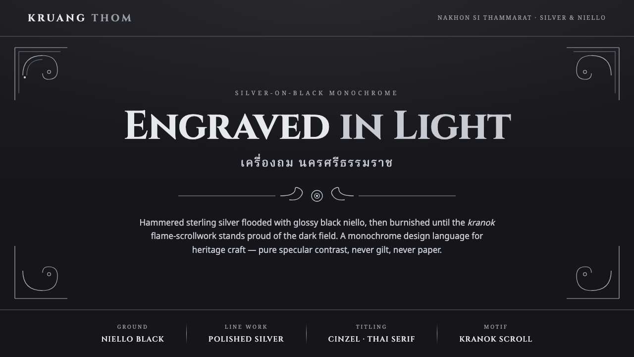 Thai Nielloware ThomSilver-on-black, never gilt. Polished kranok scrollwork glints proud of a glo…
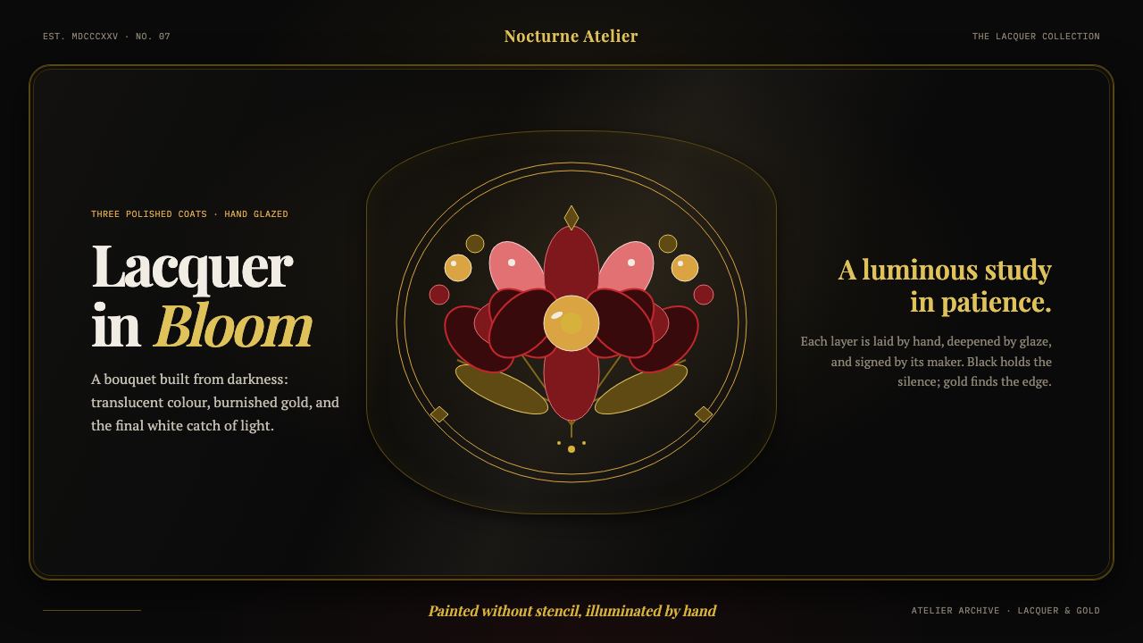 Zhostovo Lacquer Tray BouquetThe darker the ground, the brighter it blooms. Glazed petals, white catch-lig…