What is Thai Nielloware Thom?
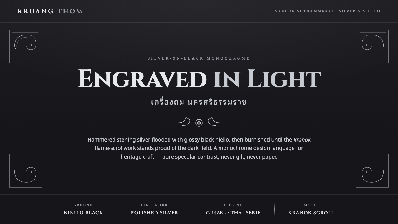
Thai Nielloware Thom turns metalwork into a nocturne: polished silver scrolls rise from a glossy black field, with no color needed beyond light and shadow.
Thai Nielloware Thom in brief
Thai Nielloware Thom refers to kruang thom, the niello craft associated with Nakhon Si Thammarat in southern Thailand. Its vessels begin as hammered sterling silver, then receive a dark niello inlay made from sulphur, copper, silver, and lead. The result is not simply a decorated silver object: bright metal and black alloy are constructed as equal visual forces.
Its defining image is the kranok flame-scrollwork. Polished silver lines and motifs stand proud against a deep, shiny black ground, making ornament read as engraving, relief, and reflected light at once. The contrast is severe but not empty. The black field gives the silver its force, while the silver gives the black surface structure, movement, and ceremonial presence.
As a digital style, Thai Nielloware Thom translates this material relationship rather than imitating a vessel literally. It uses a glossy black niello-like ground, silver line work, engraved scroll borders, and inscriptional serif typography. The system is deliberately monochrome: silver on black, never gilt, never paper-white, and never dependent on decorative color for richness.
Where does Thai Nielloware Thom come from?
Kruang thom belongs to the royal-patronised craft history of Nakhon Si Thammarat, a southern Thai center identified with niello work before 1900 and with a living tradition today. Its regional identity matters: the style is not a generic black-and-silver luxury treatment, but a visual language rooted in a particular southern Thai metalworking practice.
The craft joins hammered sterling silver with a black niello alloy of sulphur, copper, silver, and lead. That sequence establishes the aesthetic hierarchy. Silver supplies the vessel, its engraved drawing, and its polished highlights; niello supplies the dark field that receives and intensifies those marks. The visible beauty depends on their contact, not on either material used alone.
Thai Nielloware Thom also sits within Thai niello inlay craft and the wider field of Southeast Asian engraved metalwork. Its approved visual vocabulary is therefore specific but adaptable: kranok scrollwork, reflective black grounds, fine silver contours, and borders that feel cut into metal. A screen application should preserve this disciplined relationship between inscription, ornament, and dark reflective space.
What defines the Thai Nielloware Thom look?
Silver on Black
The palette is a material contrast, not a color scheme. Bright polished silver carries text, lines, and focal ornament; glossy black holds the field behind it. Gold and warm paper tones break the identity because they replace the craft’s essential tension with a different kind of luxury.
Kranok Scrollwork
Kranok flame-scrollwork provides movement without illustration. It should curl, frame, and direct attention like engraved metalwork, never spread as casual botanical decoration. The strongest use is concentrated at borders, corners, section thresholds, or around a central inscription.
Engraved Line
Line work should feel cut, polished, and deliberate. Fine silver contours can define panels, ornaments, dividers, or symbolic marks, but they should retain the precision of engraving. Soft, hazy, or casually sketched strokes weaken the impression of worked metal.
Gloss and Relief
The black ground should imply the shine and depth of niello, while silver details appear raised through reflected brightness rather than theatrical lighting. Depth is restrained: the eye should read a polished surface and proud metalwork, not a soft digital scene with atmospheric haze.
Inscriptional Serif
Typography should feel inscribed, formal, and ceremonial. A serif voice gives titles and labels the gravity of an object made to endure, while clear supporting text keeps the composition readable. Type should occupy the page as an engraving does: measured, intentional, and never casually decorative.
Bordered Ceremony
Borders are not filler. Engraved scroll frames create a threshold between the black field and its content, making a card, cover, or panel feel like an object with an edge and a face. They should support hierarchy and pause, not crowd every available surface.
Who shaped Thai Nielloware Thom?
The named makers behind this tradition are the master niello silversmiths of Nakhon Si Thammarat. Their craft establishes the defining relationship of hammered sterling silver, black niello alloy, and polished kranok ornament. Any digital interpretation should acknowledge that its visual confidence comes from this material practice rather than from a generic luxury motif.
Thai niello inlay craft is the central making tradition represented here. It supplies both the black reflective field and the logic of silver ornament standing against it. For designers, it is a reminder that contrast is not an optional styling layer; it is the structure through which the style becomes recognizable.
Southeast Asian engraved metalwork is the broader craft context named for the style. It helps explain why line, border, reflective surface, and ornament must operate as one system. The goal is not to make a flat black interface more ornate, but to make it feel governed by the discipline of worked metal.
How do you use Thai Nielloware Thom today?
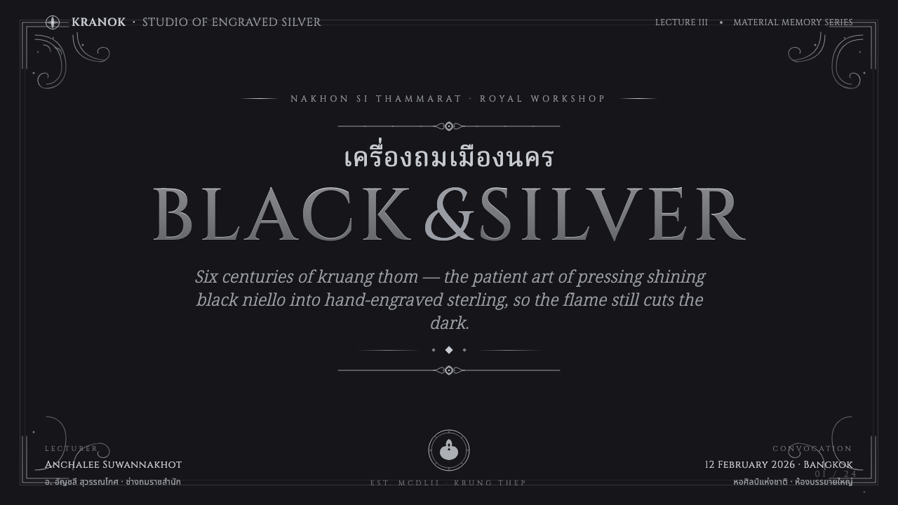
For presentation covers, use the black ground as a formal field and let a silver title act as the principal inscription. A restrained kranok border can frame the page or gather around one edge, while a single silver ornamental focal point gives the cover ceremonial weight. Avoid replacing the dark field with white space or adding gold accents for presumed prestige.
For content and data slides, treat silver rules and engraved panels as organizational devices. Section labels can feel like inscriptions, while charts and diagrams should remain clear enough to read before they are admired. Data marks should use the same silver-on-black logic as the rest of the slide, with ornament held at the margins so it does not compete with comparison or explanation.
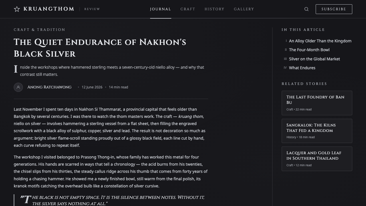
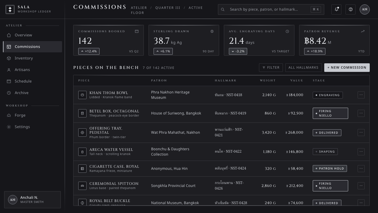
For web interfaces, the style suits dashboards, premium account areas, archives, and pricing contexts where authority and composure matter. Use black surfaces to establish depth, silver typography for hierarchy, and bordered panels to create object-like zones. Interaction should remain legible and direct; the craft reference should enrich navigation and status, not make controls feel ceremonial for their own sake.
For editorial and marketing pages, use the style to make long-form content feel collected and inscribed. A dark masthead, silver serif headline, and selectively framed quotations can establish the system before the article opens into quieter reading areas. Product storytelling works best when it explains material contrast, craft lineage, or refined detail rather than using ornamental density as a substitute for substance.
The common mistake is turning Thai Nielloware Thom into black-and-gold ornament. Gold is explicitly outside this system, and broad decorative excess also obscures the identity. Keep the silver bright, the black glossy and deep, the scrollwork purposeful, and the typography formal. If the composition would work equally well with any metallic accent, it has lost the specific logic of nielloware.
Thai Nielloware Thom — FAQ
Is Thai Nielloware Thom a black-and-gold style?
No. Its identity is silver on black, never gilt. The point is the contrast between polished silver and glossy dark niello, not the familiar luxury shorthand of metallic gold against a dark ground. Gold changes both the temperature and the material logic of the style.
Why is the black background so important?
The black field corresponds to the shiny niello inlay of kruang thom. It is the surface that makes silver line work appear proud, polished, and precious. Without that dark reflective ground, the scrollwork becomes ordinary silver ornament rather than the defining contrast of nielloware.
Can kranok scrollwork be used everywhere in an interface?
It should be used with discipline. Kranok is strongest when it frames, directs, or marks a transition: around a title, along a border, at a corner, or beside a significant callout. Repeating it indiscriminately turns engraved ornament into visual noise.
Does the style require literal photographs of nielloware?
No. The digital system can communicate through black gloss, silver contours, engraved borders, and inscriptional type alone. Literal imagery may be useful when explaining the craft, but the style should still read through its structural relationship of dark field and polished silver detail.
Where does this style work best?
It works best where a product or publication benefits from formality, craft association, and focused contrast: premium information spaces, archival content, ceremonial invitations, carefully framed editorial work, and dark interface areas that need hierarchy without a broad color palette.
Related design styles
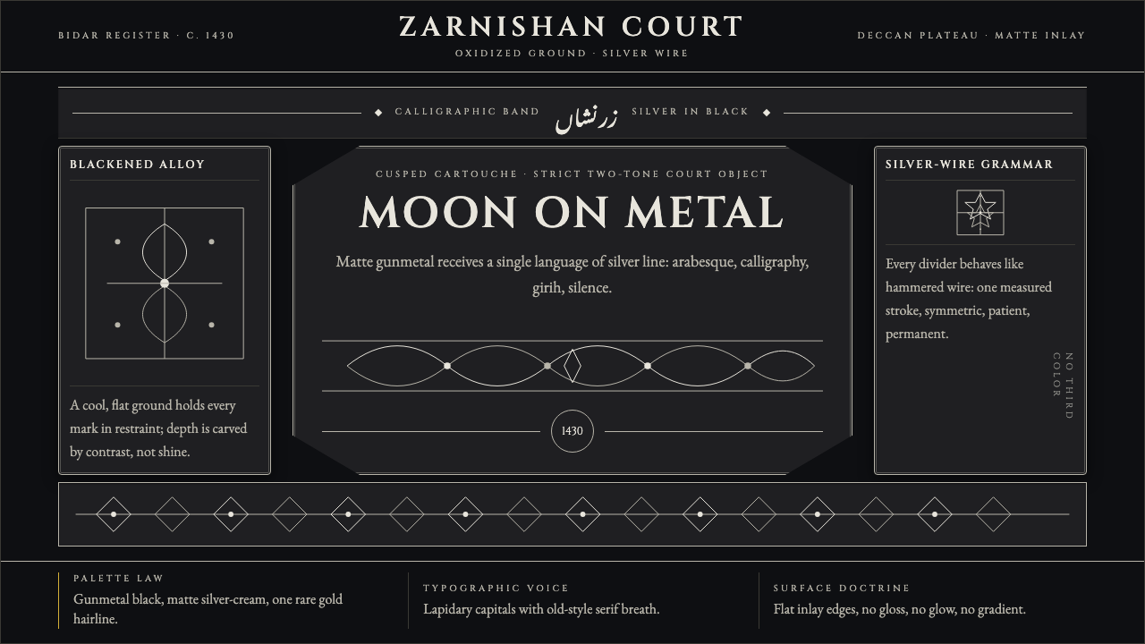 Bidri Deccan MetalworkCourtly darkness, tooled by silver. Cinzel caps and hairline arabesques cut g…
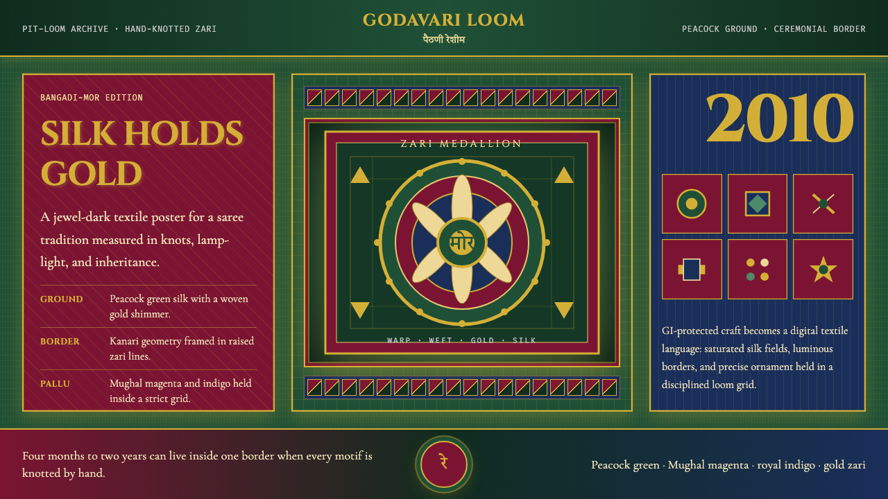 Maharashtra Paithani Peacock SareeSilk carries ceremony. Peacock green, Mughal magenta, and gold grids shimmer…
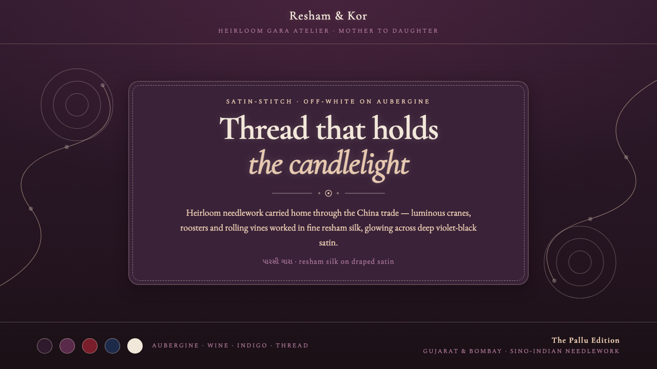 Parsi Gara EmbroideryHeirloom needlework, made digital. Off-white silk vines glow over deep auberg…
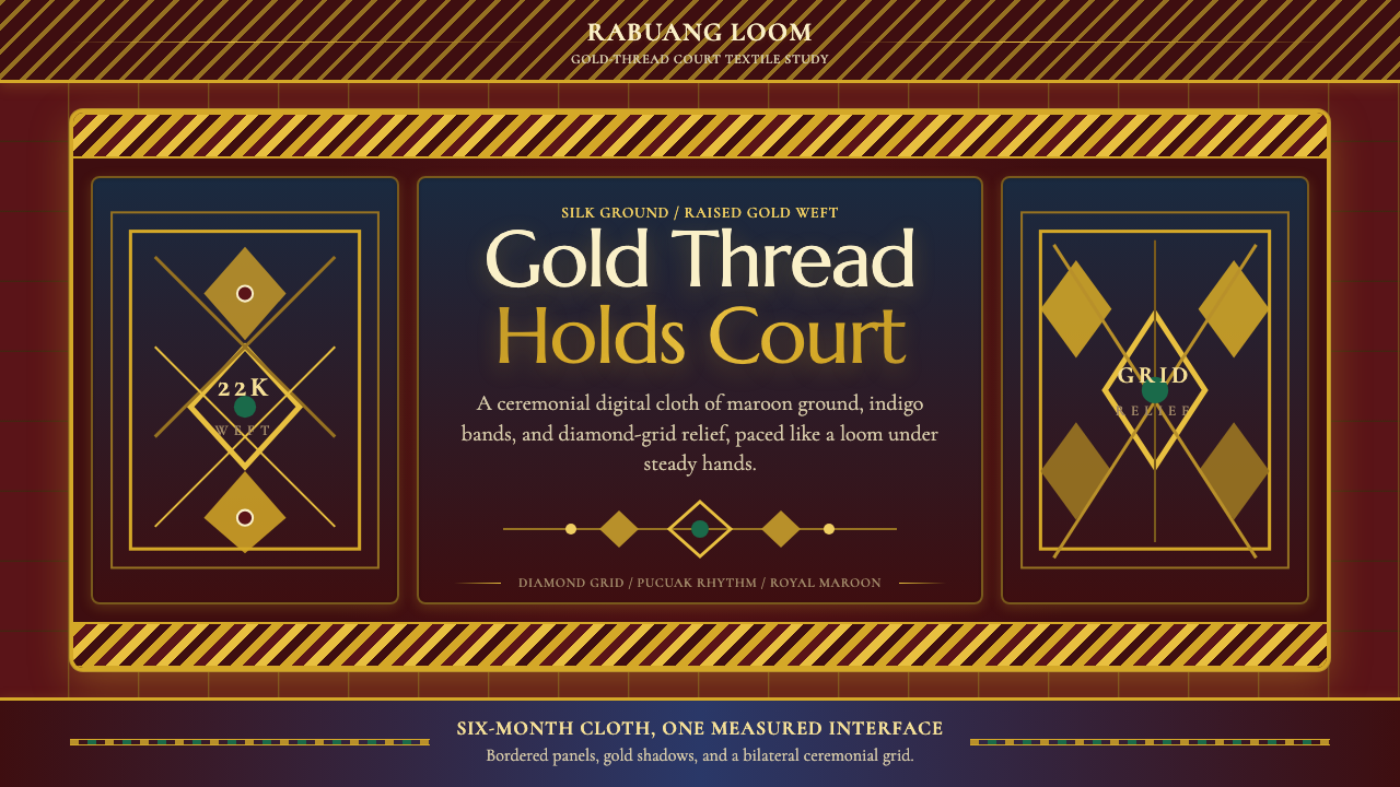 Sumatran Songket (Pandai Sikek)Courtly weight glows. Maroon silk, Cormorant small caps, and gold diamond gri…
 Bruneian Jong SaratNo resting ground. Royal yellow and thread-built gold pack every stepped repe…
 Bulgarian Revival WoodcarvingDark devotion in relief. Walnut panels, Cardo serifs, and gilt rosettes catch…