What is Georgian Minankari Cloisonné?
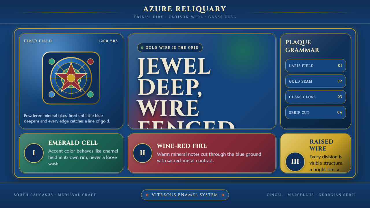
Georgian Minankari turns design into a jewel box: deep lapis enamel, bright gold wire, mineral color, and the solemn authority of carved stone.
Georgian Minankari Cloisonné in brief
Minankari is Georgia’s cloisonné-enamel tradition, a craft in which fine gold wires are bent into enclosed cells on a silver or gold base. Each cell is filled with powdered mineral glass, then fired until the material fuses into a glossy plaque with jewel-like depth. The result is neither painted ornament nor printed pattern: it is a surface built through containment, heat, and layered material.
Its visual signature is immediately legible. A deep lapis-blue ground carries fields of azure, emerald, and wine-red enamel, each separated by bright, unbroken gold seams. The gold is not an outline added after the fact; it is the fence that gives every color its territory. In digital form, this becomes a dark, reflective system where borders, cells, and saturated mineral color do the organizing work.
The style carries a ceremonial feeling without requiring literal religious imagery. Gloss replaces matte flatness, serif type becomes lapidary and ritual, and every composition feels assembled as a precious object rather than laid out as a neutral interface. Its richness comes from disciplined enclosure: color is intense because it is held, and ornament feels authoritative because it follows structure.

Where does Georgian Minankari Cloisonné come from?
The word Minankari names Georgia’s cloisonné-enamel inheritance: a vocabulary of gold wire, mineral glass, precious-metal grounds, and fired color. The process begins with a metal base, continues through the bending and placement of fine wires, and reaches its visual climax in the kiln, where powdered glass fuses into a smooth, glossy surface. The craft therefore joins drawing, metalwork, and material transformation in one object.
The tradition is medieval and Byzantine-derived, with its major flowering placed between the eighth and twelfth centuries. Its historical identity is connected to sacred goldsmithing, especially the kind of work associated with medieval icon covers. In this context, the gold seam is both practical and visual: it divides the enamel into cells while giving the finished surface a precious, ordered radiance.
Georgia’s South Caucasus setting is central to the style’s cultural geography. The source material names Tbilisi, Gelati, and Khakhuli as important places in its story, linking present-day jewelry workshops with medieval centers of ecclesiastical and metalworking production. The Khakhuli Triptych workshops are specifically remembered through the work of medieval goldsmiths, whose legacy gives the tradition a strong sense of continuity.
Minankari did not remain a closed medieval vocabulary. It continues into the present, particularly through rings, earrings, and other jewelry made in Tbilisi workshops. That continuity matters for design translation: the style is not a museum reconstruction but a living language. Its digital expression can therefore honor historical gravity while allowing contemporary interfaces, editorial pages, and presentation systems to behave like newly made enamel objects.
What defines the Georgian Minankari Cloisonné look?
Enamel Ground
The ground is deep, dark, and jewel-like, led by lapis blue rather than black or neutral gray. It should feel dense enough to hold color and reflective enough to suggest fused glass. The darkness establishes the atmosphere, while the saturated cells appear embedded within it rather than floating above it. The overall impression is precious, nocturnal, and materially substantial.
Cloison Structure
Gold wire is the load-bearing graphic element. It bends around every enamel field, creating cells that are visibly contained and carefully separated. Borders should remain bright, continuous, and intentional, with enough presence to read as metal rather than a generic interface stroke. The system gains its identity from this fencing: remove the enclosure and the palette becomes decorative instead of structural.
Mineral Palette
Color should recall stones and fired glass: lapis and azure blue, emerald green, and wine red. These hues are rich rather than sugary, with darkness and saturation working together. A composition may be led by the lapis ground and one dominant cell color, while the remaining hues act as deliberate accents. The palette is opulent, but its force comes from containment and contrast.
Glassy Reflection
Minankari-derived surfaces should suggest light caught inside material. Use restrained highlights, polished edges, and subtle variation that makes enamel feel fused and reflective. The finish must remain controlled: excessive glow makes the work look synthetic, while a completely matte treatment erases the craft reference. Reflection is not decoration added on top; it is evidence of the surface’s imagined material.
Lapidary Serif
Typography should carry the authority of an inscription or a finely cut hallmark. Serif forms provide the ritual, historical, and lapidary character, while contrast in scale and placement establishes hierarchy. Headings can feel engraved into the plaque; supporting text should remain composed and legible. Avoid playful lettering or overly delicate display faces that compete with the gold-wire structure.
Fenced Composition
Composition should feel assembled from plaques, cells, and precious borders. Panels may be nested, interrupted, or arranged as a reliquary-like field, but each grouping needs a clear enclosure or visual anchor. Space is not empty neutrality; it is the dark ground that lets the cells breathe. Strong alignment, deliberate framing, and controlled asymmetry keep the richness from becoming visual noise.

Who shaped Georgian Minankari Cloisonné?
This collective name represents the living practitioners who carry the craft from its medieval inheritance into present-day Georgia. Their essential contribution is the continuity of the process itself: gold wires define cells, mineral glass fills them, and firing creates the glossy, jewel-deep surface. In a design system, they stand for material discipline rather than a single signature style.
These medieval goldsmiths are linked to one of the named centers in the tradition’s history. Their place in the system is tied to Byzantine-derived sacred goldsmithing and the world of medieval icon covers. They embody the fusion of precious metal, enclosed color, and devotional gravity that gives Georgian Minankari its ceremonial authority.
The present-day makers of Tbilisi demonstrate that Minankari remains an active practice rather than a purely historical reference. Their work in rings, earrings, and related jewelry keeps the language close to the body and to contemporary use. They provide the bridge between inherited enamel structure and a modern visual system designed for screens.
How do you use Georgian Minankari Cloisonné today?
For presentation slides, use the cover as a single ceremonial plaque: a deep lapis field, a strong serif title, and one carefully framed cluster of enamel color held by gold-like borders. Content slides should behave like related panels from the same object, with clear enclosure and restrained reflection. Data slides can turn charts into cells and seams, using azure, emerald, or wine red to distinguish categories while keeping the dark ground in command.
For web interfaces, the style suits dashboards, pricing pages, and premium product tools that need authority without looking clinical. Treat navigation and cards as connected enamel compartments. Gold borders can clarify selected states, tabs, or active pricing tiers; mineral colors can distinguish status or category. Keep the interface legible by reserving the strongest gloss and color contrast for meaningful actions, summaries, and moments of decision.
For editorial and marketing work, Georgian Minankari supports a sense of heritage, rarity, and crafted value. Articles can use a dark reading field with framed pull quotes, jewel-toned section markers, and serif headlines that feel engraved rather than merely enlarged. Marketing pages can present products as precious plaques, pairing close-cropped imagery with gold-seamed captions and restrained blocks of mineral color. The result should feel curated and tactile, not antique for its own sake.
The system is especially effective when the content itself concerns craft, jewelry, cultural heritage, luxury goods, ceremonial events, or carefully made digital products. Its visual logic gives ordinary information a sense of custody: each fact appears housed, bordered, and worth preserving. The same logic can support a refined portfolio, a museum-like catalog, or a pricing experience where tiers need to feel distinct and valuable.
The common mistake is to treat the style as a dark theme with gold decoration. Random gold lines, excessive gradients, equally loud jewel colors, and ornamental serif type will produce theatrical clutter rather than Minankari. Every border should enclose something, every color should have a role, and every reflective finish should reinforce the imagined material. The design becomes convincing when richness is governed by structure.

Georgian Minankari Cloisonné — FAQ
What is Georgian Minankari?
Minankari is Georgia’s cloisonné-enamel tradition. Fine gold wires are bent into cells on a silver or gold base, powdered mineral glass is placed inside the cells, and firing fuses the material into a glossy, jewel-deep surface. Its most recognizable expression uses a deep lapis or azure ground divided by bright gold seams.
Why does the design system use such a dark ground?
The dark lapis ground is drawn directly from the source material and gives the enamel cells somewhere to reside. It allows azure, emerald, wine red, and gold to appear dense and luminous without turning the composition into a flat color collage. In digital work, the darkness also preserves the nocturnal, precious atmosphere associated with the finished enamel plaque.
Is the gold border merely decorative?
No. In cloisonné, the wire physically creates the cells that hold the enamel, so the border is both structure and ornament. A digital translation should preserve that dual role. Gold-like lines need to separate, frame, or organize content; if they are scattered without enclosing anything, they lose the logic of Minankari and become generic luxury styling.
How should typography be handled in a Minankari-inspired interface?
Use serif typography with a carved, lapidary, and ceremonial character. Headlines can feel like inscriptions on a precious plaque, while supporting text should remain calm and highly legible. Hierarchy should come from deliberate contrast in scale, placement, and enclosure rather than from many competing typefaces. The type must support the gold-wire structure, not imitate it with excessive ornament.
What is the biggest mistake when applying this style?
The biggest mistake is confusing material richness with visual excess. A convincing result does not require every surface to shine, every cell to use a different jewel color, or every edge to become gold. The system works through controlled enclosure, a dominant lapis atmosphere, selective color, and reflective surfaces used with restraint. Structure must remain visible beneath the luxury.
Related design styles
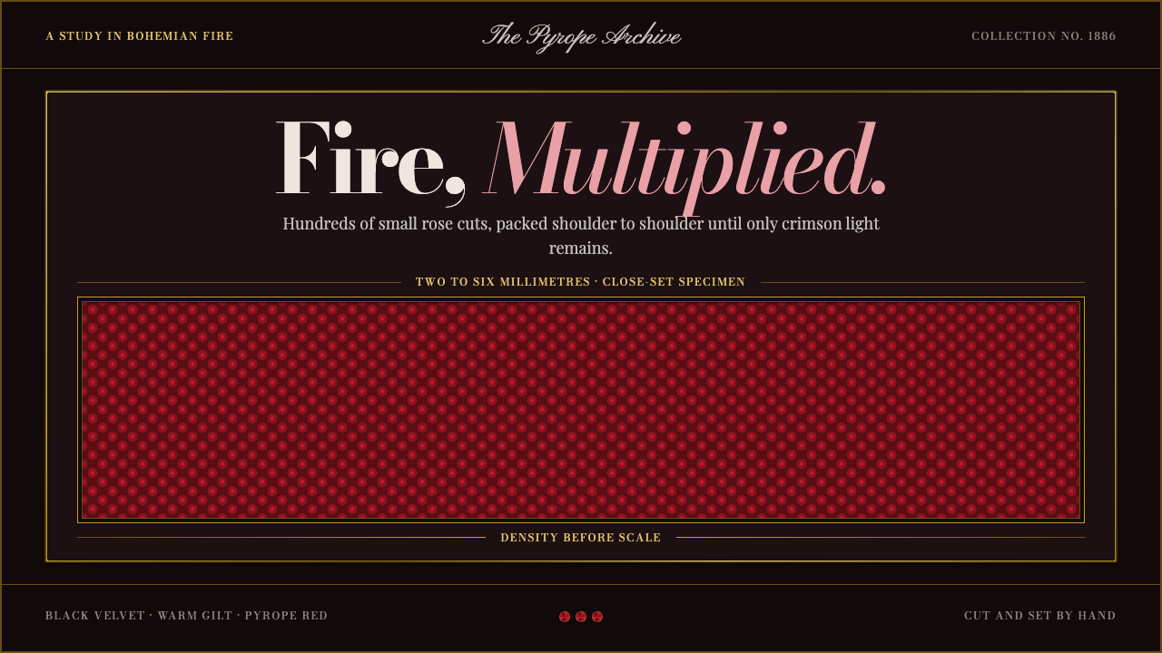 Bohemian GarnetFire thrives in density. Tiny pyrope facets pack tight against black velvet a…
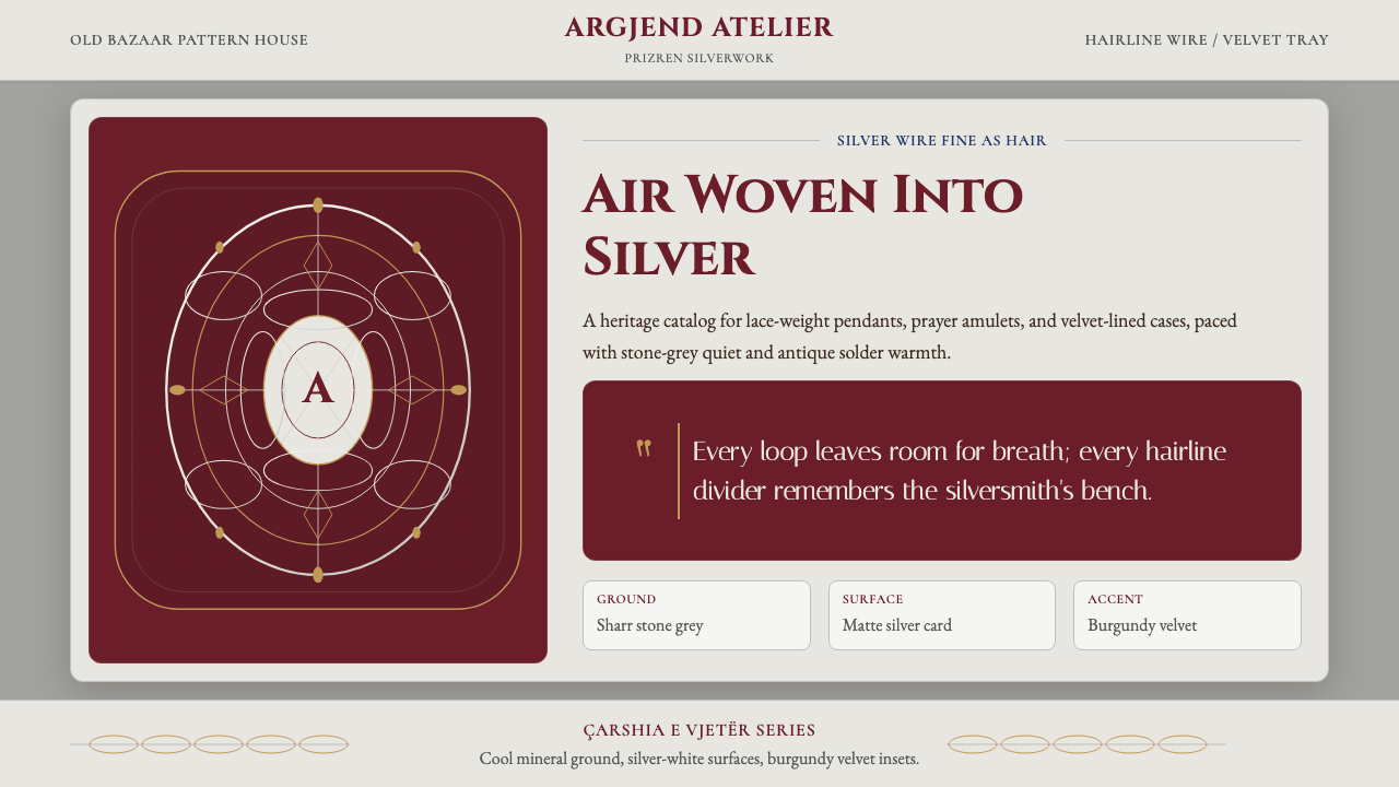 Kosovar Prizren Filigree SilverAir becomes ornament. Burgundy velvet and stone grey frame Cinzel type with c…
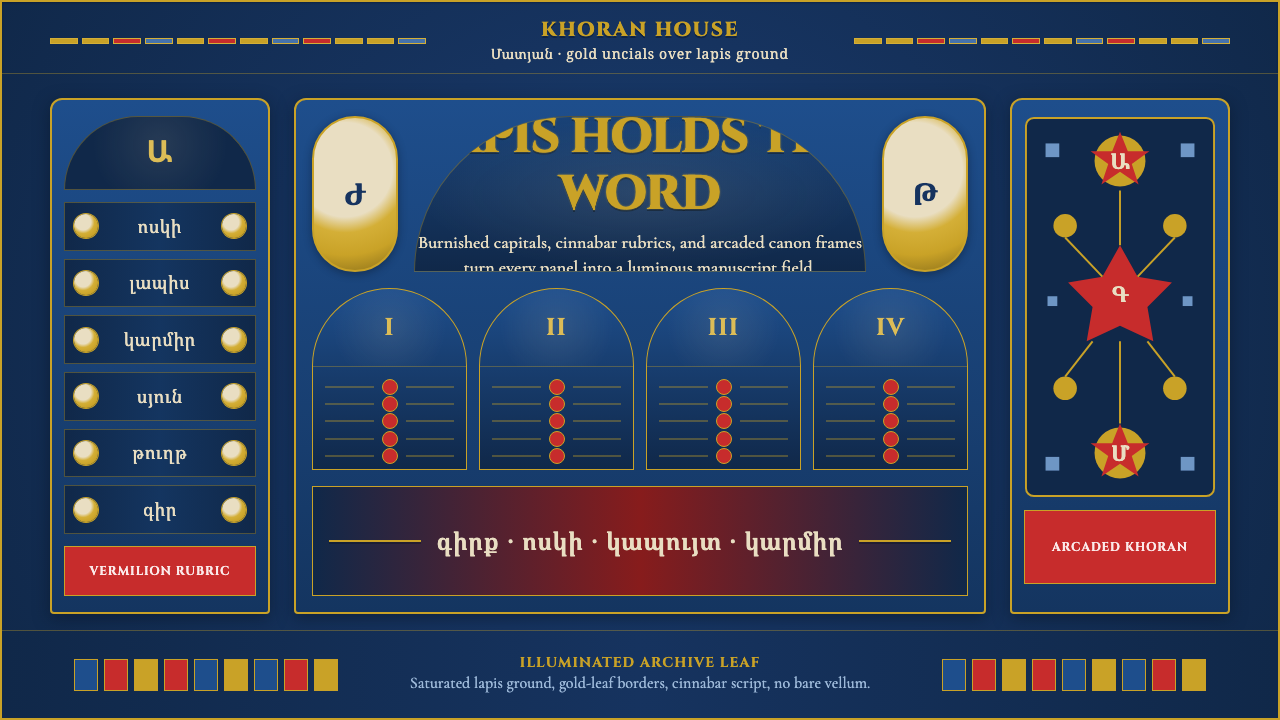 Armenian Manuscript FolkloreJewel-dense devotion. Lapis ground, gold uncials, and vermilion arcades fill…
 Belarusian Slutsk SashCourtly silk, vitrined. Taupe ground, crimson panels, Cinzel type, antique go…
 Bulgarian Revival WoodcarvingDark devotion in relief. Walnut panels, Cardo serifs, and gilt rosettes catch…
 Circassian Adyghe Gold BraidCourtly gold on dark wool. Raised braid edges coil over indigo-black panels.