What is Ethiopian Turquoise Silver?
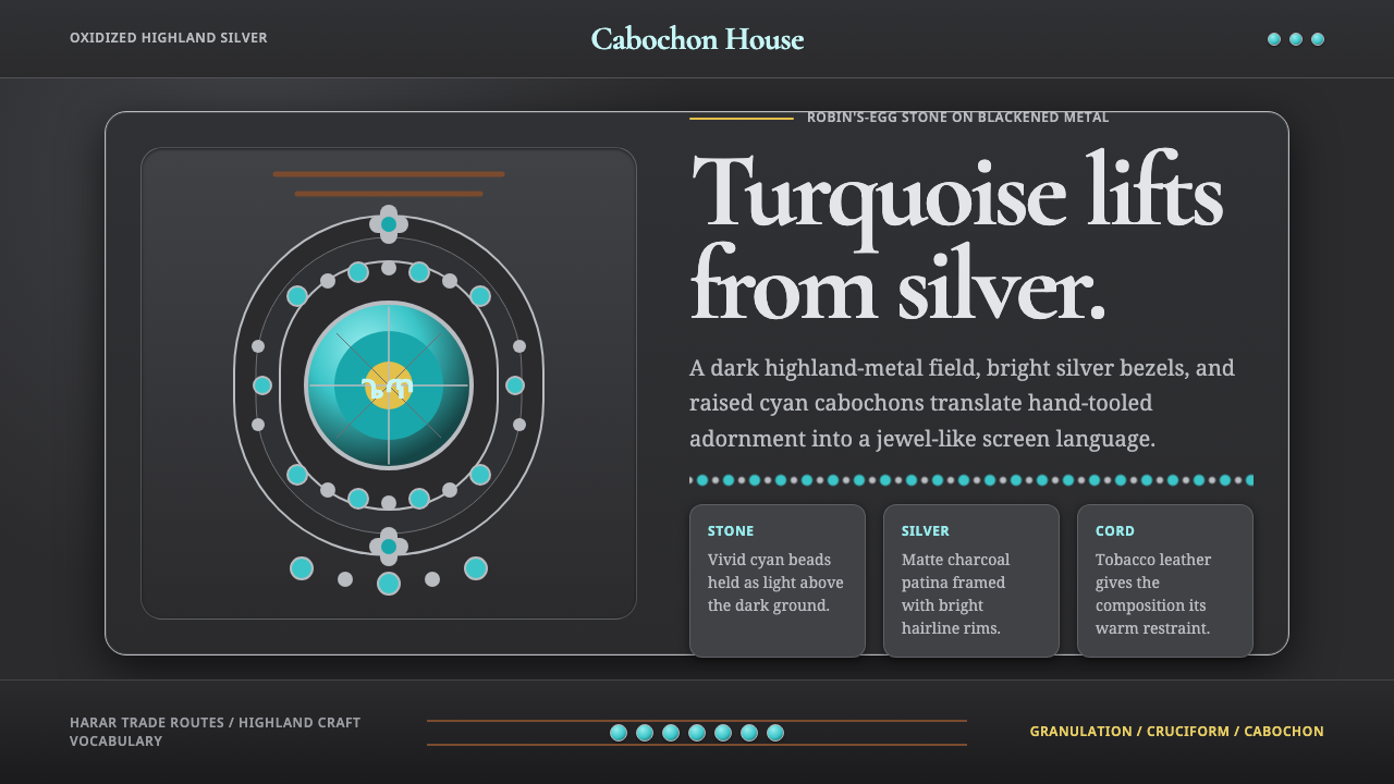
Ethiopian Turquoise Silver turns contrast into radiance — luminous cyan stones rise from blackened silver like cool light emerging through worked metal.
Ethiopian Turquoise Silver in brief
Ethiopian Turquoise Silver is a dark decorative style distilled from highland Ethiopian and Harari adornment. Its defining relationship is between vivid robin’s-egg turquoise and oxidized or blackened silver, often joined by tobacco-toned leather cord. Bright cabochons, bead rows, silver borders, granulated details, crosses, and crescent pendants form a dense but orderly vocabulary rooted in the jewellery traditions of the Horn of Africa.
The style depends less on any isolated motif than on the optical tension between material states. Turquoise appears smooth, cool, and luminous; silver ranges from bright polished edges to shadowed, patinated fields; leather contributes warmth and dryness. Dark metal does not merely serve as a background. It surrounds and intensifies the stone, making cyan seem almost self-illuminated while preserving the weight and gravity of the object.
When translated to screens, the system retains that material hierarchy. The interface begins with a matte oxidized-silver ground, never a cream field, then introduces turquoise as an inset jewel rather than a broad wash. Bright silver lines define boundaries and reading paths, while granular marks and cruciform or crescent forms provide cultural character. The result should feel assembled, edged, and set by hand without becoming a literal imitation of jewellery.
Where does Ethiopian Turquoise Silver come from?
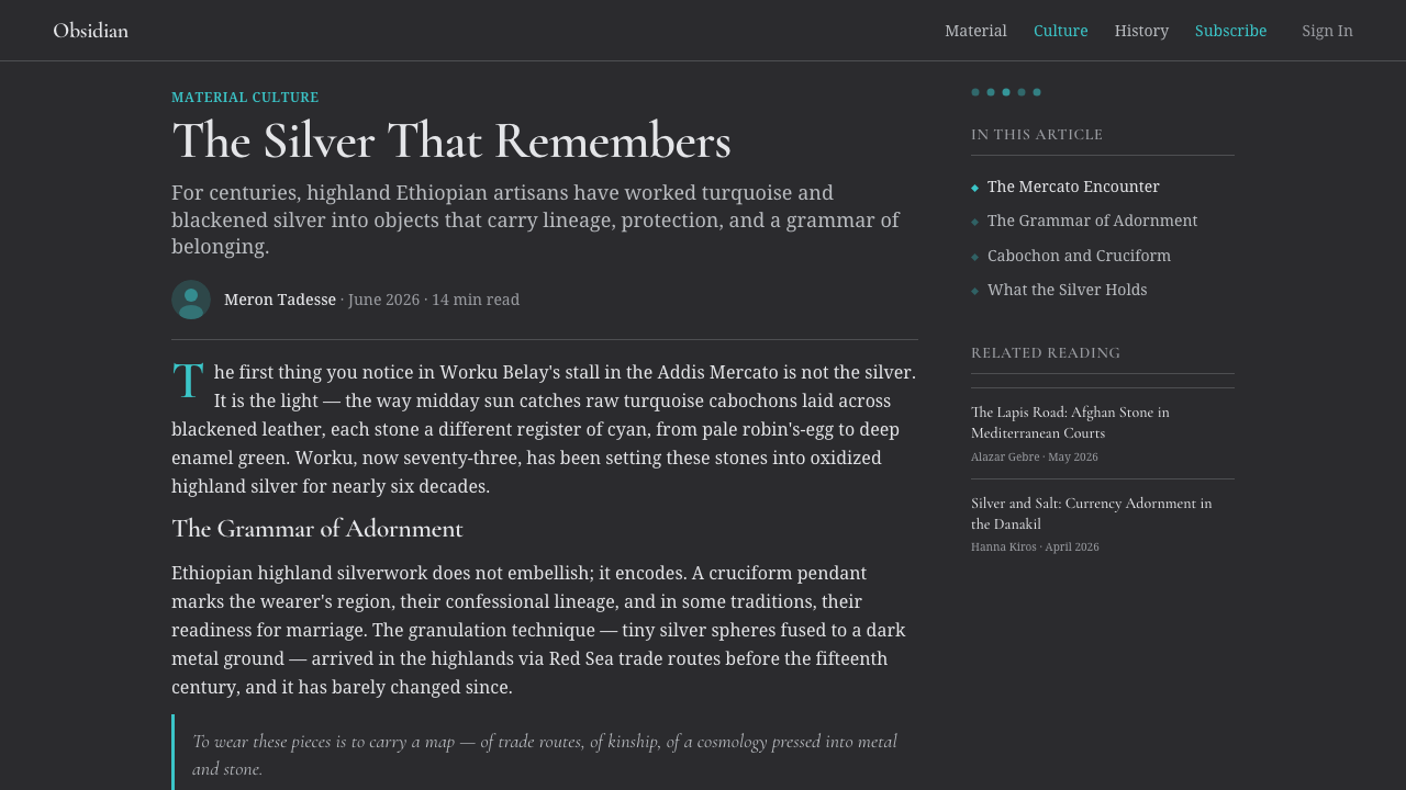
The source tradition predates 1900 and belongs to the Ethiopian highlands and the walled city of Harar in the Horn of Africa. It is not presented as a single school founded at a documented moment, but as a long-running practice of ethnic adornment shaped through jewellery, beadwork, enamel, leather cord, and worked silver. Its history is therefore carried by materials, recurring forms, and communities of makers rather than by a manifesto or named designer.
Highland Ethiopian and Harari adornment establishes the style’s central contrast by placing raw-looking robin’s-egg turquoise beadwork and enamel against oxidized, blackened silver. Patination deepens the metal toward gunmetal, while leather introduces tobacco warmth. Against these restrained surfaces, turquoise becomes unusually brilliant. The aesthetic grows from this physical arrangement: darkness gathers around the stone, polished silver catches narrow highlights, and repeated beads turn brightness into rhythm.
The ornamental vocabulary is associated with Harari and Amhara silversmiths and Tigray beadworkers. Their roles describe complementary craft knowledge within the approved source: metalworkers shape the silver setting, border, granulation, and pendant forms, while beadworkers organize turquoise into repeated sequences. Crosses and crescent pendants add recognizable silhouettes, and granular surfaces prevent the dark metal from reading as empty or industrial.
As a contemporary design system, Ethiopian Turquoise Silver does not claim to reproduce a particular historical object. It abstracts durable relationships from the source tradition: bright stone against dark patina, polished edging against matte fields, ordered bead rows against substantial metal, and cool turquoise against warm leather. Preserving those relationships is more faithful than scattering isolated ethnic motifs across an otherwise unrelated composition.
What defines the Ethiopian Turquoise Silver look?
Dark Metal Ground
The ground is always dark, recalling oxidized or blackened highland silver rather than painted black or neutral cream. It should feel matte, dense, and slightly varied, with enough depth to suggest patina without becoming a photographic metal texture. This darkness gives the system its gravity and creates the optical condition in which turquoise can glow.
Turquoise Cabochons
Turquoise is the luminous center of the palette. It appears as cabochons, beads, enamel-like insets, or compact accents with rounded visual weight. The hue should feel raw and mineral rather than synthetic or aquatic. Large uninterrupted turquoise fields weaken the jewellery logic; concentrated stones and repeated insets preserve the sense of something precious held within metal.
Silver Edges
Bright silver is used as an edge, separator, clasp, or narrow structural highlight. It does not replace the dark ground. Its purpose is to reveal boundaries, catch attention at joints, and make inset forms legible. Alternating polished lines with blackened fields creates the impression of an object whose raised areas have been handled and brightened over time.
Bead-Row Rhythm
Repeated beads create cadence and framing. A row may border a title, mark a section transition, or organize a sequence of states, but each bead should remain visibly discrete. Slight organic variation is welcome; perfect mechanical repetition can make the system feel electronic rather than crafted. The row works best as an enclosing or directional device, not as all-over decoration.
Granulation
Granulated details give the metal surface a tactile register between smooth stone and broad matte fields. Small raised marks may cluster around borders, crosses, or pendant-like anchors. They should reinforce construction and hierarchy rather than become visual noise. Used sparingly, granulation makes a digital panel feel worked, pressed, and assembled.
Cross and Crescent Forms
Crosses and crescent pendants supply the system’s most distinctive silhouettes. In interfaces, they can inform dividers, markers, badges, or terminal shapes without being scattered as generic decoration. Their geometry should remain substantial and metal-like, with clear outlines and stable balance. Context and restraint are essential because these forms carry cultural specificity.
Leather Warmth
Tobacco-toned leather serves as a quiet counterweight to cold silver and cyan stone. It is most effective in cords, tabs, secondary bands, or supporting surfaces rather than dominant panels. Its warmth softens the severity of the metal without turning the composition rustic. The leather note should remain dry, dark, and functional.
Who shaped Ethiopian Turquoise Silver?
Harari silversmiths represent the metalworking tradition associated with the walled city of Harar. Within this style, their importance lies in the handling of darkened silver, bright borders, granulated surfaces, and pendant forms. They are understood collectively rather than as a single named author, reflecting an adornment tradition transmitted through craft practice.
Amhara silversmiths belong to the broader highland context from which the oxidized-silver vocabulary is drawn. Their place in the source material emphasizes substantial metal, blackened patina, and worked ornament as the structural setting for bright stone and enamel. The silver is not a neutral support: its darkness, borders, and surface treatment actively determine how the turquoise is perceived.
Tigray beadworkers represent the bead-based side of the tradition. Their contribution is reflected in the ordering of turquoise into rows, frames, and repeated accents whose rhythm differs from a single central gemstone. This bead logic is especially transferable to information design, where repetition can organize sections, steps, categories, or status while retaining a crafted visual identity.
How do you use Ethiopian Turquoise Silver today?
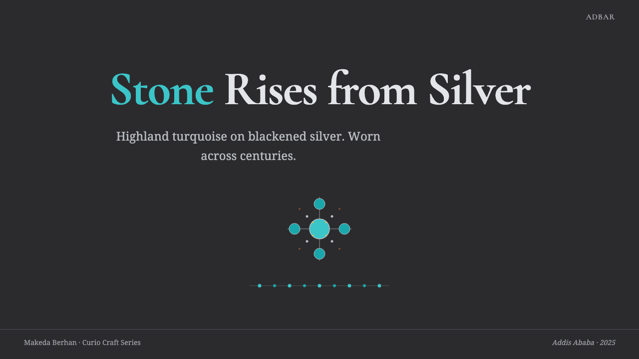
For presentation covers, begin with a broad blackened-silver field and one concentrated turquoise focal element. A bright silver border or bead row can frame the title without enclosing every edge. Content slides should preserve generous dark breathing room, use silver-toned text for the main reading layer, and reserve turquoise for headings, key terms, or selected evidence. The mood should be ceremonial and substantial, not glittering.
Data slides benefit from the style’s contrast and repetition. Turquoise can identify the principal series or decisive result, while muted silver distinguishes supporting information. Bead-like markers work naturally in timelines, progressions, and categorical comparisons; granulated dividers can separate sections. Avoid turning every data point into a jewel, because equal brilliance destroys hierarchy and makes the visual field feel ornamental rather than analytical.
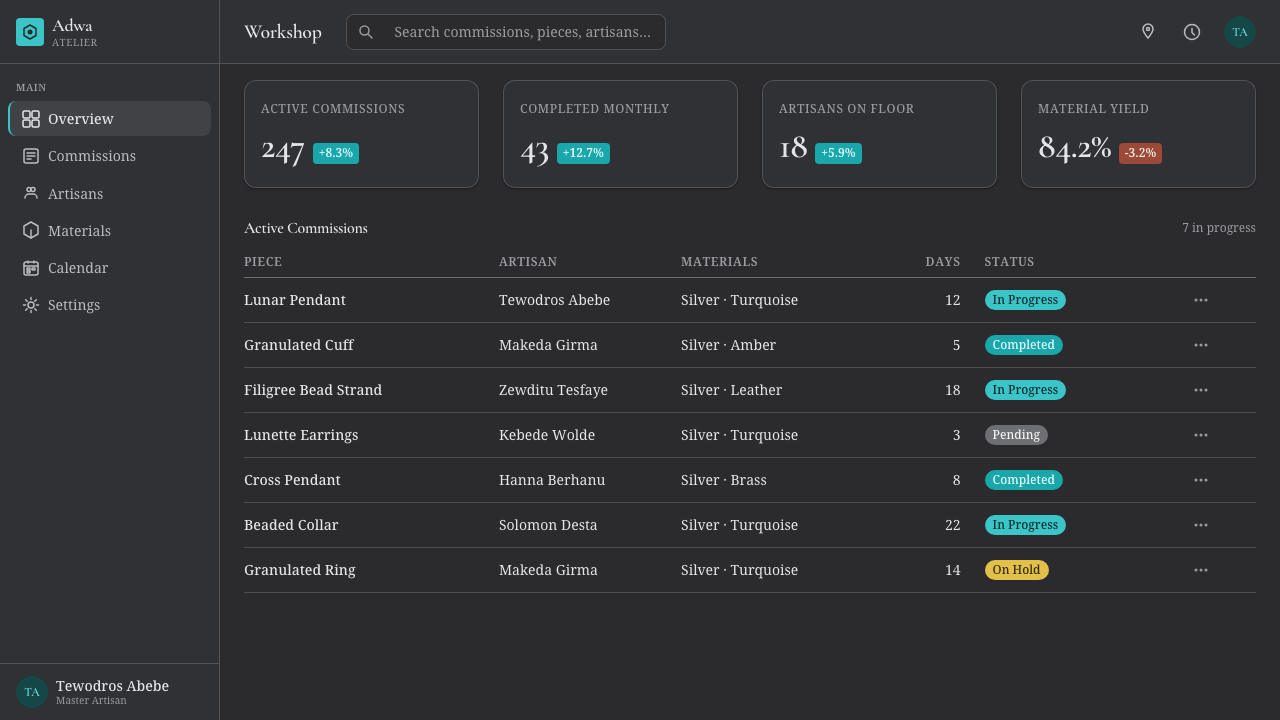
For web dashboards and pricing interfaces, treat panels as inset metal plates. Dark matte surfaces establish the primary workspace, bright borders define active regions, and turquoise cabochons or enamel-like tabs indicate selected states, alerts, or recommended choices. Pricing tiers can be differentiated through border treatment and concentrated turquoise accents rather than large changes of background. Controls should appear set into the surface, with clear boundaries and restrained depth.
Editorial and marketing layouts can use pendant-like anchors, silver rules, and bead rows to organize long-form stories or product narratives. A feature opening may pair a large turquoise inset with a compact title block, while subsequent sections alternate quieter metal fields with small crafted markers. The style is especially persuasive when the subject involves craft, material culture, adornment, or objects with provenance, because its visual language already communicates handling and assembly.
The most common mistake is reducing the style to cyan on black. Without patinated silver, polished edging, bead rhythm, granulation, and the quiet warmth of leather, the result becomes generic futuristic neon. Another error is covering the interface with crosses, crescents, and simulated jewellery textures. Authenticity comes from structural relationships and disciplined placement, not from maximizing the number of recognizable motifs.
Ethiopian Turquoise Silver — FAQ
Is Ethiopian Turquoise Silver simply a dark turquoise color scheme?
No. Color supplies the immediate contrast, but the style is defined by material roles and construction. Turquoise behaves like an inset stone, dark silver acts as a patinated support, bright silver reveals borders, leather introduces warmth, and repeated beads establish rhythm. If those roles disappear, cyan and black alone cannot preserve the identity.
Why must the background remain dark?
The dark oxidized-silver ground is the condition that makes the stone appear luminous. A cream or white background removes the central material contrast and changes the style into a lighter decorative system. Darkness also gives bright silver borders a distinct function: they catch and direct light instead of dissolving into the page.
How can the style be used without copying a historical ornament?
Translate relationships rather than reproducing an object. Use a dark patinated field, concentrated turquoise insets, bright structural edges, repeated bead rhythms, and limited granulated detail. Crosses and crescents should appear only where their form supports meaning or hierarchy. This approach acknowledges the source vocabulary while allowing the composition to serve a contemporary function.
Does the style require realistic metal and stone textures?
No. Material character can be expressed through contrast, edge treatment, shape, and hierarchy. A matte dark field beside a polished-looking line already suggests oxidized silver; a compact rounded turquoise form can read as a cabochon without photographic veining. Excessive realism often makes interfaces noisy and turns functional elements into theatrical props.
Where does Ethiopian Turquoise Silver work best, and where does it struggle?
It works best where darkness, craft, rarity, and strong hierarchy support the subject: cultural editorial work, premium product stories, distinctive dashboards, exhibition material, and presentations about objects or making. It struggles when a product needs airy neutrality, playful softness, or dense uninterrupted reading. Its powerful stone-and-metal contrast can dominate content unless accents are carefully rationed.
Related design styles
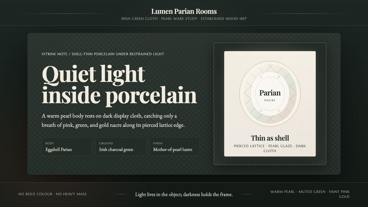 Belleek Parian ChinaPorcelain glows in restraint. Pearl white, nacre tints, and lattice sit on da…
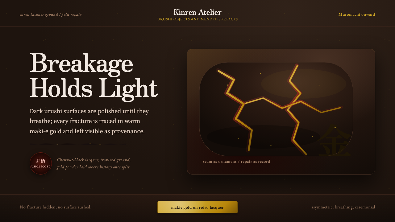 Kintsugi & Urushi LacquerBreakage becomes ceremony. Urushi black-brown carries gold seams and asymmetr…
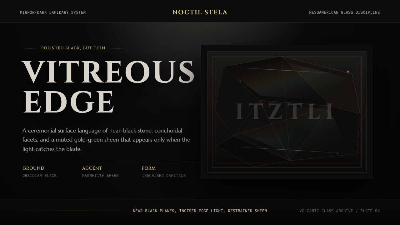 Obsidian Volcanic GlassMirror-dark gravitas. Cinzel capitals, obsidian facets, and muted gold-green…
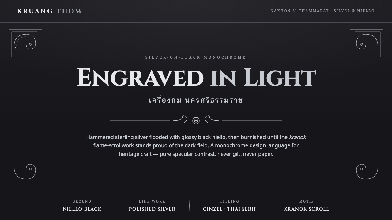 Thai Nielloware ThomSilver-on-black, never gilt. Polished kranok scrollwork glints proud of a glo…
 Bamileke Elephant MaskRoyal density. Indigo bead fields lock white triangle rows into ceremonial po…
 Bidar Bidriware VesselsSoil-black luxury. Crisp silver medallions and hairline borders cut the warm…