What is Kintsugi & Urushi Lacquer?
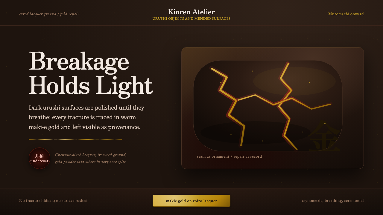
Kintsugi turns breakage into ceremony — a design language built on lacquered dark grounds, hand-traced gold seams, and the conviction that a repaired thing is more beautiful than one that was never broken.
Kintsugi & Urushi Lacquer in brief
Kintsugi ("golden joinery") is the Japanese craft of repairing broken ceramics with lacquer dusted or mixed with gold, so that the fracture is not disguised but drawn in light. Where Western restoration tries to make damage invisible, kintsugi does the opposite: the crack becomes the most deliberate line in the piece, the one part of the object a viewer's eye is guided toward rather than away from. As a design system, kintsugi translates that logic into a full visual language — a dark lacquer ground, veined with gold seams, held together by breathing asymmetric space.
The foundation beneath the gold is urushi, the sap of the lacquer tree, applied in dozens of thin coats and polished to a glossy, chestnut-black depth. This is not paint; urushi cures through humidity into a hard, glass-like film that has been used to coat bowls, boxes, and armor in Japan for millennia. A kintsugi system borrows that surface quality directly: near-black or deep brown-black grounds with real depth and sheen, never flat or matte, as though the interface itself had been lacquered rather than printed.
Visually, the style reads as controlled contrast. Vast dark fields carry almost no ornament, and then a single thin gold line interrupts them — never straight for its own sake, but following the logic of a repaired crack: irregular, confident, and drawn with the assumption that asymmetry is more honest than symmetry. Text and interface elements sit in that same tension, generously spaced, so that gold accents read as rare and precious rather than as recurring decoration.
Where does Kintsugi & Urushi Lacquer come from?
Kintsugi's origin story is often told as legend: a Japanese shogun of the Muromachi period (14th–16th century), possibly Ashikaga Yoshimasa, sent a favorite tea bowl to China for repair after it cracked, and was dismayed when it came back joined with ugly metal staples. Dissatisfied, Japanese craftsmen developed a repair method using lacquer and gold that turned the crack into an ornament rather than a disfigurement. Whether or not the anecdote is literally true, it captures the real shift: by the Muromachi era, tea ceremony culture (chanoyu) had begun to prize imperfect, humble, asymmetric vessels over the flawless symmetry once imported from China and Korea, and kintsugi gave that aesthetic a physical technique.
The craft depends entirely on urushi lacquer, documented in Japan since the Jomon period, many thousands of years before kintsugi itself existed. Lacquer artisans developed maki-e — a related sprinkled-gold decorative technique used on boxes, writing implements, and furniture — centuries before anyone applied gold to a repaired crack. Kintsugi essentially borrowed maki-e's material vocabulary and redirected it toward mending rather than pure ornament, which is why the two crafts share techniques and, often, practitioners.
The aesthetic philosophy underneath kintsugi is wabi-sabi — the appreciation of transience, imperfection, and the beauty that accumulates through age and use. Wabi-sabi shaped tea ceremony, garden design, and poetry throughout the Muromachi and subsequent Edo period (1603–1868), privileging an irregular, weathered object over a pristine, symmetrical one. Kintsugi is arguably wabi-sabi's most literal material expression: it treats damage as the moment a vessel's individual history becomes visible, and therefore as the moment it becomes more valuable, not less.
Kintsugi has never stopped being practiced — it survives today as a living craft taught in workshops across Japan and increasingly abroad, alongside contemporary artists who use gold-seamed repair as a metaphor in painting, sculpture, and product design. Its philosophy has also traveled well outside ceramics: in the West, "kintsugi" is now commonly invoked in therapy, business writing, and self-help contexts as a metaphor for resilience.
What defines the Kintsugi & Urushi Lacquer look?
Lacquer Ground
The base surface reads as deeply lacquered rather than flatly colored — near-black or dark chestnut-brown, with a glossy depth that suggests many thin translucent layers stacked over one another rather than a single opaque fill. Surfaces should feel like they could reflect light unevenly, the way real polished lacquer does, rather than presenting a uniform matte plane. This is the quality that separates an authentic kintsugi treatment from a generic 'dark mode' — the darkness has warmth and depth, not just low brightness.
Gold Seams
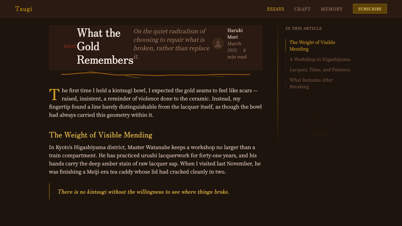
The signature move of the system: thin, irregular gold or warm-metallic lines that trace across dark surfaces the way a repaired crack traces across a bowl. These lines are never straight grid rules — they wander, branch, and taper the way an actual fracture does, and they should appear sparingly, marking a boundary, a divider, or a moment of emphasis rather than outlining every element. A gold line used everywhere stops reading as a repair and starts reading as a border; restraint is what keeps the metaphor alive.
Asymmetric Composition
Layouts favor uneven, off-center arrangements over mirrored symmetry, echoing the unpredictable path a crack takes through a ceramic surface. A composition might weight visual mass heavily toward one side and let the other breathe in near-emptiness, or place a single gold accent well off any center axis. This is not randomness — it is balance achieved through tension and counterweight, the same principle that governs a well-mended bowl, where the repair line is never centered but always exactly where the object actually broke.
Negative Space
Generous emptiness is not a gap to be filled but the material that lets the gold seams read as significant. A kintsugi-derived layout resists the instinct to populate every dark field with content; instead it treats the void the way a lacquer artisan treats the unbroken portion of a bowl — necessary ground against which the repaired line can be seen at all. Crowding the composition is the fastest way to destroy the effect, because it removes the silence the gold line depends on.
Depth and Sheen
Elevation and hierarchy are suggested through subtle sheen and soft, warm glow rather than crisp offset shadows. An element that needs to feel raised can be given a faint warm halo or a slightly richer surface gloss, evoking polished lacquer catching ambient light — depth as something the surface itself holds, not something cast by a light source outside the object.
Honest Imperfection
The underlying principle, borrowed directly from wabi-sabi, is that irregularity is not a flaw to correct but a record worth keeping. This shows up as slightly uneven line weights on the gold seams, corners that are not machine-perfect, and a general resistance to the crisp uniformity of purely digital-native systems. The system should feel touched by hand somewhere, because the entire premise of kintsugi is that the trace of an event is what gives an object its value.

Who shaped Kintsugi & Urushi Lacquer?
The Muromachi-era shogun credited in the popular origin legend with prompting kintsugi's invention, after a favorite tea bowl returned from Chinese repair joined with unsightly metal staples. Whether or not the story is precise history, Yoshimasa's court was genuinely central to codifying the tea ceremony aesthetics — restraint, asymmetry, appreciation of the handmade — that kintsugi both depends on and expresses.
A polymath artist, calligrapher, and lacquerware designer of the late 16th and early 17th centuries, Koetsu is among the most celebrated names associated with Japanese lacquer and gold-decoration craft broadly. His inkstone boxes, often combining maki-e gold techniques with bold, asymmetric composition, exemplify the sensibility — dark ground, gold accent, confident irregularity — that kintsugi shares with its sibling crafts.
A painter and lacquer designer of the Rinpa school (late 17th–early 18th century), Korin is best known for boldly stylized, asymmetric compositions rendered in gold leaf and lacquer, most famously on screens and writing boxes. His work shows how the same visual grammar — dark or gold grounds, irregular flowing forms, generous negative space — moved fluidly between painting and lacquer craft in the Japanese tradition.
A lacquer artist historically associated with maki-e gold-sprinkling technique refinement, representing the technical lineage that kintsugi draws its material vocabulary from. Craftsmen in this tradition developed the methods of applying and burnishing gold and silver powder into wet lacquer that kintsugi repair still uses today, underscoring that the craft is an application of a much older decorative discipline.
How do you use Kintsugi & Urushi Lacquer today?
Kintsugi's visual grammar transfers well wherever a brand wants to signal depth, craft, and quiet luxury rather than speed or disposability — but it depends on discipline, because the language rests on scarcity. Every gold line has to feel earned; the moment gold accents multiply past a handful per view, the metaphor of a rare, hand-repaired seam collapses into ordinary gold-foil decoration.
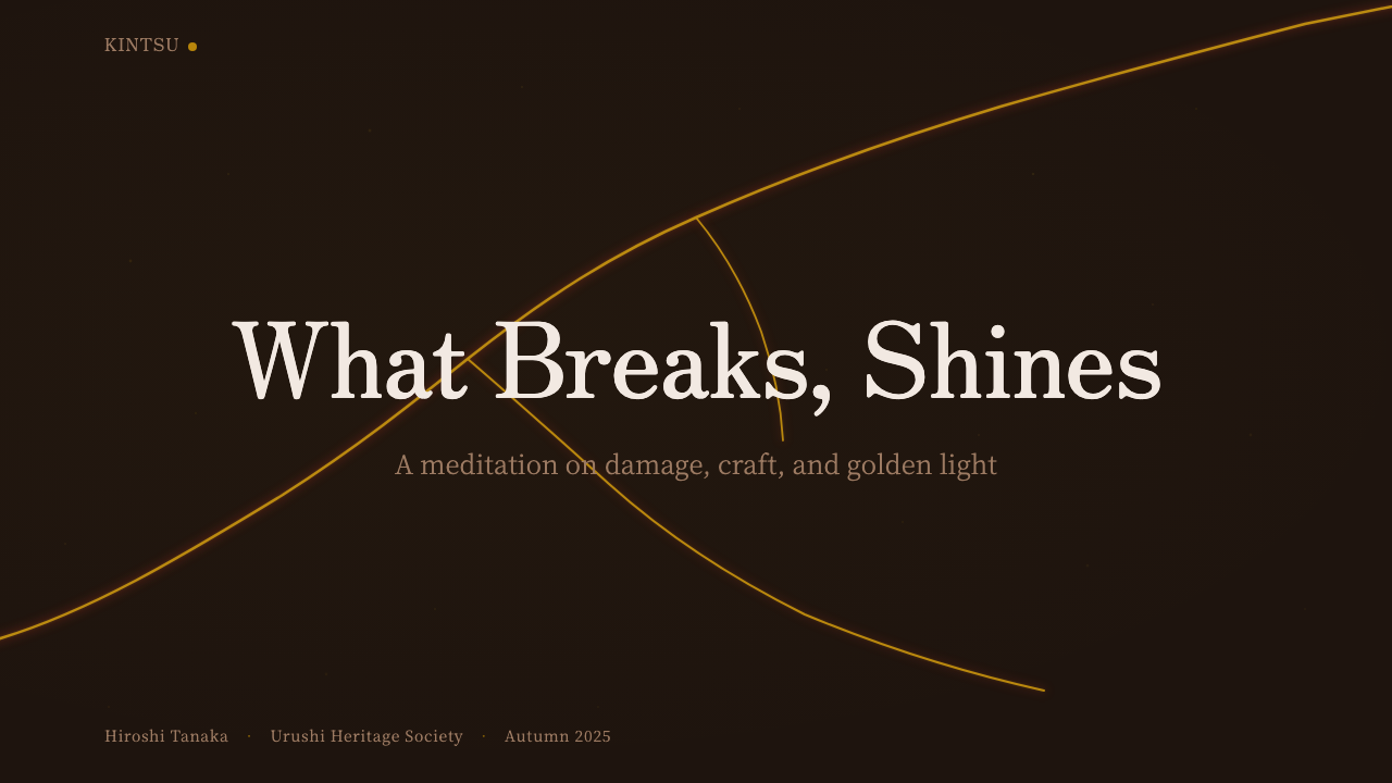
On presentation slide covers, a kintsugi treatment reads best as a single, near-black or deep-brown field crossed by one confident, irregular gold line running off-center — title type sitting in the quiet field it creates rather than on top of the line itself. Content and data slides should keep the same restraint: one lacquer-dark background, generous margins, gold reserved for a single chart accent or section divider rather than applied to every bullet. A deck that gilds every heading loses the sense of ceremony the style depends on.
For web interfaces — dashboards and pricing pages in particular — the dark lacquer ground doubles as a premium signal and a genuine focal-contrast tool: a highlighted plan tier can sit in warm gold against the dark field and immediately read as the most important thing on screen, precisely because gold appears nowhere else. Card components benefit from soft warm-glow elevation rather than hard shadows; borders, where used, should feel like drawn seams rather than ruled lines.
In editorial and marketing contexts, kintsugi's asymmetric, breathing layouts suit long-form storytelling and premium campaigns particularly well — a pull-quote or product shot can be treated as the page's 'repaired seam,' placed deliberately off-center and given the gold accent, while the rest of the composition stays dark and quiet around it. This suits narratives about resilience, craft, or renewal especially well, where the wabi-sabi philosophy reinforces the message rather than merely decorating it.
The most common mistake is treating kintsugi as simply 'black background plus gold trim' applied uniformly to every icon and border, which produces a generic luxury template rather than an authentic system. The second is over-symmetry: centering every gold accent defeats the premise, since real seams are never centered, only ever where the object broke. Designers should also resist perfectly straight, ruled gold lines — a seam that reads as a technical border undermines the whole metaphor.
Kintsugi & Urushi Lacquer — FAQ
Is kintsugi the same style as Japandi or general 'Japanese minimalism'?
No, and the difference matters. Japandi and generic Japanese-minimalist styles typically favor light, neutral, low-contrast palettes and an almost total absence of ornament. Kintsugi is darker, richer, and depends on a single deliberate ornamental gesture — the gold seam — that those minimalist styles would consider excessive. Kintsugi's negative space serves a different purpose too: it isn't emptiness for its own sake, it exists specifically to make a rare gold accent legible. Confusing the two produces either a flat dark theme with no focal gold moment, or a light minimalist theme with gold trim that has no metaphorical grounding.
Does a kintsugi-inspired design have to be dark? Can it work on a light background?
The historic material reality is dark: urushi lacquer cures to a near-black or deep brown-black, and that is the ground kintsugi repairs are actually laid on. A light-background variant is possible in principle, but it loses the most distinctive part of the effect — gold reads as rare and precious specifically because it interrupts a deep, glossy darkness. On a pale ground, the same gold line reads as ordinary trim rather than a luminous scar. If a lighter palette is required for accessibility or brand reasons, it's worth introducing at least one genuinely dark, lacquered section elsewhere in the composition so the gold has somewhere to feel earned.
Why does the style insist the gold lines look irregular rather than clean and straight?
Because a straight, ruled gold line reads as a border — a structural device borrowed from ordinary UI design — while an irregular, tapering line reads as a trace of an event, which is the entire point of kintsugi. A real repaired crack follows the exact, unrepeatable path the ceramic happened to break along; no two are alike, and their unevenness is proof they are genuine rather than applied as decoration after the fact. A perfectly straight gold rule undermines that credibility immediately, no matter how warm its color, because it signals 'ornament' rather than 'repair.'
What kinds of products or brands does kintsugi suit, and where does it struggle?
It suits brands built around craft, longevity, premium positioning, or narratives of resilience and renewal — luxury goods, wellness products, sustainability-focused brands, artisanal or heritage-craft businesses, and storytelling around recovery or transformation. It struggles in contexts that need to feel fast, disposable, or youth-oriented, since the style's entire premise is patience — many thin layers of lacquer, a slow ceremony of repair — which reads as sluggish for a snappy consumer app. It can also clash with high information density, since it needs generous negative space to keep gold accents meaningful.
How is kintsugi different from maki-e, since both use gold on lacquer?
Maki-e is the older and broader decorative craft — sprinkling gold or silver powder onto wet lacquer to create pictures, patterns, or pure ornament on boxes, furniture, and writing implements, with no requirement that anything was ever broken. Kintsugi borrows maki-e's exact materials and application technique but restricts them to a single purpose: tracing an actual repair. In design terms, this means maki-e-derived work can be freely decorative and pattern-based, while an authentic kintsugi system should always imply that the gold marks something that was mended — a seam, a boundary, a transition — rather than a repeating motif.
Related design styles
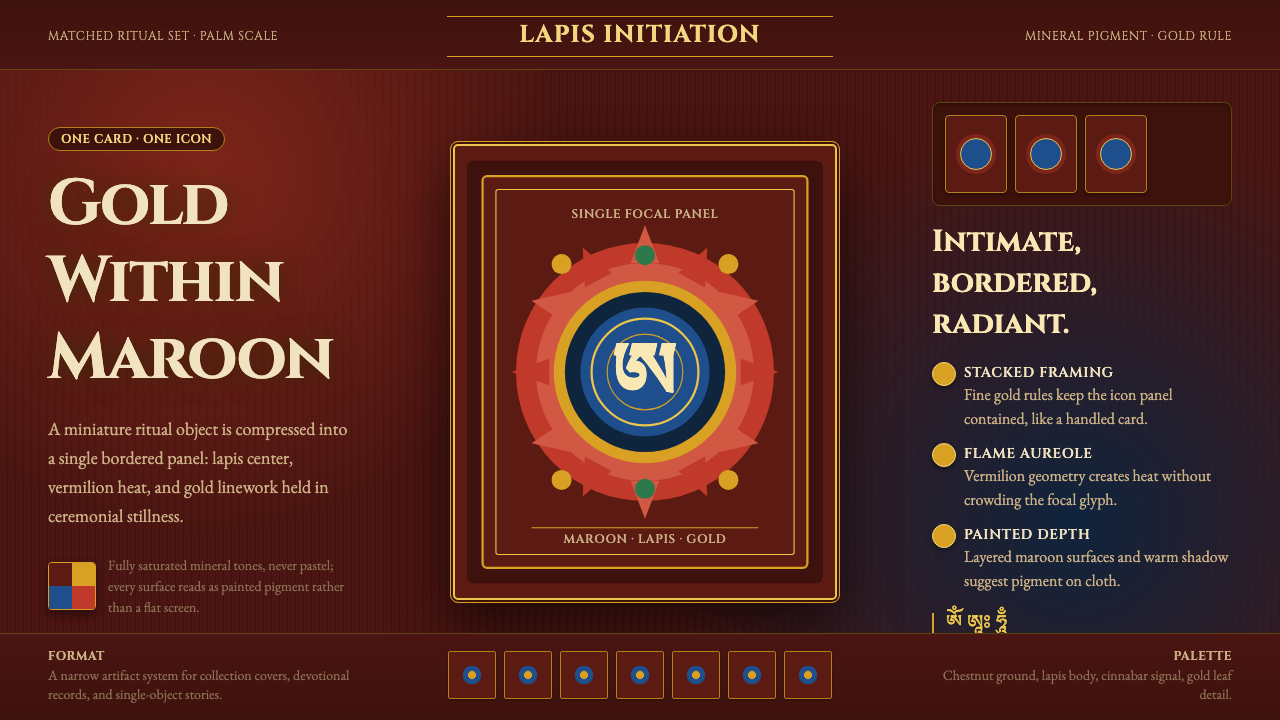 Tibetan Tsakli Initiation CardsPalm-sized radiance. Gold rules, lapis centers, and vermilion flame on maroon…
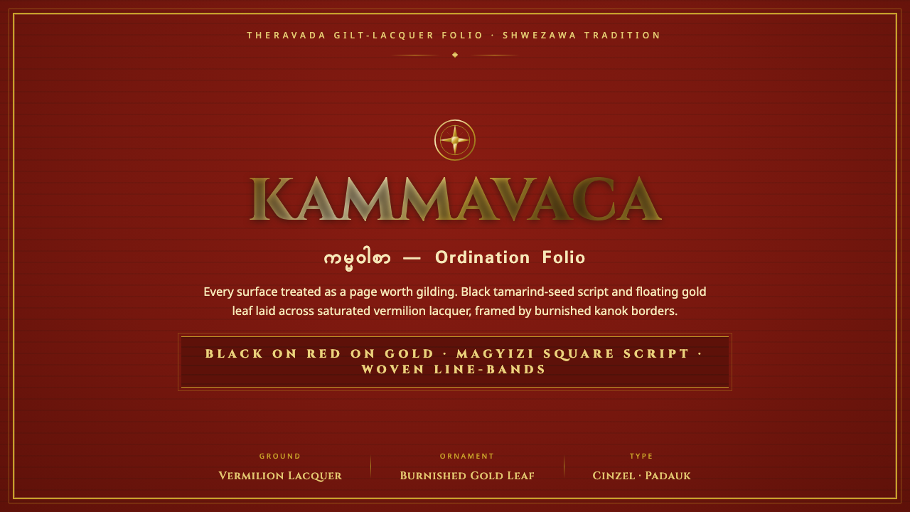 Kammavaca ManuscriptEvery surface worth gilding. Black tamarind-seed script and floating gold lea…
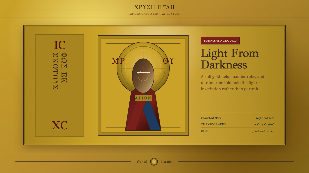 Mount Athos IconStillness becomes light. GFS Greek inscriptions frame madder, ultramarine, an…
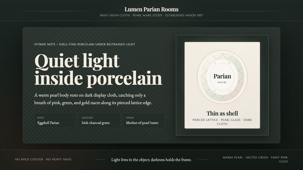 Belleek Parian ChinaPorcelain glows in restraint. Pearl white, nacre tints, and lattice sit on da…
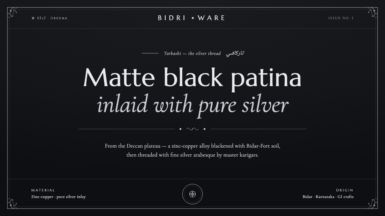 Bidriware Black MetalMonochrome luxury, hammered by hand. Matte-black Deccan patina threaded with…
 Ethiopian Turquoise SilverDark metal makes stone glow. Cyan cabochons and silver bead rows frame a matt…