What is Mount Athos Icon?
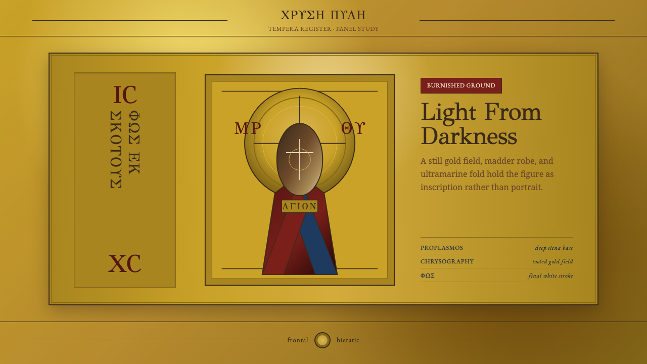
Mount Athos icon painting turns a picture into a window onto another world — gold instead of sky, frontal stillness instead of motion, and a face built layer by layer out of darkness toward light.
Mount Athos Icon in brief
The Mount Athos icon is a devotional painting tradition practiced in the monasteries of the Holy Mountain in northern Greece, a self-governing peninsula that has sheltered Orthodox monastic life continuously since the Byzantine era. An icon is not meant to represent a person the way a portrait does; it is meant to be a threshold, a surface through which the viewer meets the saint rather than merely looks at an image of one. Everything in the visual language follows from that purpose: figures face forward, eyes are enlarged and fixed on the viewer, and the setting behind them is not a landscape but a flat field of burnished gold that stands for uncreated, timeless light rather than any particular place or time of day.
As a design system, the style is built on hieratic frontality, somber sacred color, and a disciplined method of building form out of tonal layers rather than blended shading. Faces and hands are long, thin, and ascetic — bodies flattened and elongated rather than anatomically naturalistic — because the goal is spiritual presence, not physical likeness. Greek inscriptions accompany every figure, but function as identification and consecration rather than decorative lettering.
What makes the system transferable to interface and editorial design is its total rejection of naturalistic depth. There is no vanishing-point perspective, no cast shadow, no atmospheric haze. Depth is instead built through layered value — a dark base pushed toward a bright highlight in fixed, legible steps. That gives designers a rare thing: a genuinely flat, luminous visual language that still reads as rich and hand-made rather than merely minimal.
Where does Mount Athos Icon come from?
Mount Athos icon painting belongs to the broader Byzantine and post-Byzantine iconographic tradition, a visual language that crystallized in the Eastern Roman Empire over the first millennium and kept developing on the Holy Mountain long after Constantinople fell in 1453. Athos is a peninsula in northern Greece governed as an autonomous monastic republic since Byzantine times, home to twenty ruling monasteries whose workshops preserved icon painting as a living craft rather than a fossilized style. Because the Mountain was never fully absorbed into Ottoman or later secular administration, its ateliers functioned as a continuous transmission line for a technique disrupted elsewhere by war, iconoclasm, and changing patronage.
The single most consequential figure in the tradition is Theophanes the Cretan, a painter active roughly between 1535 and 1546 whose frescoes and panel icons at Athonite monasteries — including the Great Lavra and Stavronikita — set the template generations of monk-painters would study and repeat. Theophanes worked within the Cretan school, a lineage of icon painters from Venetian-ruled Crete who fused inherited Byzantine formulas with a new rigor of drawing and a more saturated, jewel-like palette, prized for combining monumental gravity with an almost graphic precision of line.
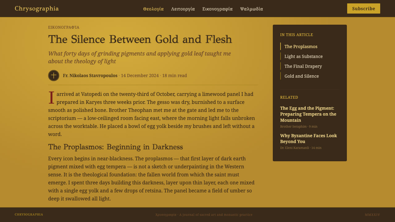
The technical method behind the style is egg tempera on a gesso-prepared wood panel, built up through a strict sequence: a dark undercoat called the proplasmos establishes the shadow structure of a face or hand, and successive thin layers of increasingly lightened pigment are added in fixed steps, culminating in a final sharp white highlight, traditionally on the brow, nose, and cheekbones. This is not blending in the Western painterly sense — each tonal step remains visible as a distinct layer, giving Byzantine faces their sculptural, almost geological quality. Gold leaf, burnished to a mirror sheen, replaces any illusionistic sky or interior — a technique called chrysography when it also draws fine linear highlights directly onto drapery.
This method survives on Athos not as an art-historical revival but as an unbroken monastic craft: novices apprentice under senior painter-monks, copying established compositions rather than inventing new ones, because the icon's authority rests on continuity with tradition rather than individual originality. That transmission model — a closed, rule-governed craft practiced inside a religious community for over a thousand years — is itself part of what gives the visual language its unusual stillness and weight.
What defines the Mount Athos Icon look?
Color
The palette is somber and restrained rather than bright or playful: deep madder reds, dense ultramarine blues, and warm ochre or clay tones dominate, set against the constant presence of burnished gold. Colors are chosen for their sacred and symbolic associations rather than for visual excitement — a garment's hue can mark a figure's role or status — and hues are kept saturated but never garish. Nothing is pastel and nothing is neon; the effect is jewel-like density rather than cheerful brightness.
Gold Ground
Instead of a rendered sky, room, or landscape, the space behind every figure is a flat, burnished sheet of gold. This is the system's most identifiable signature: it collapses background into pure light rather than place, so compositions read as luminous and weightless even though every other element is dense and heavily worked. In an interface or layout, this translates to a warm metallic or near-gold field used deliberately as negative space rather than as mere ornament.
Frontal Hieratic Pose
Figures face the viewer directly, upright and symmetrical, with almost no implied movement. This is not a technical limitation but a deliberate choice: the frontal pose addresses the viewer as a presence to be met rather than a scene to be observed. Applied to design, this principle favors centered, symmetrical, direct compositions over dynamic diagonal ones — a layout that confronts rather than narrates.
Layered Tonal Modeling
Faces and hands are built from a dark base color pushed toward light through a fixed sequence of thin, distinct layers, ending in a sharp final highlight rather than a soft blend. Each tonal step stays visible rather than melting into the next, producing a faceted, almost sculptural surface. This is the opposite of smooth photographic shading — it is closer to a stepped gradient where every step is a deliberate, countable decision.
Elongated Ascetic Figures
Bodies and faces are stretched thin and long, deliberately departing from naturalistic proportion. Cheeks are hollow, fingers are slender, robes hang in stylized rather than physically accurate folds. The elongation signals spiritual asceticism — the figure has transcended ordinary physical bulk — and gives every composition a vertical, upward-reaching quality even when the figure is static.
Inscription as Identity
Greek letterforms accompany nearly every figure, but they function as a name and a seal of consecration rather than as decorative typography. The lettering is typically restrained, upright, and secondary in visual weight to the figure itself. Translated into design language, this favors small, quiet, purposeful labeling — text that identifies and confirms rather than text that competes for attention.
Flatness Over Perspective
There is no vanishing point, no receding architecture, no atmospheric depth. Any architectural or landscape element that does appear is compressed and symbolic rather than spatially coherent — a building might be small enough to fit in a hand, signaling 'a place' rather than depicting one accurately. This deliberate flatness is what allows the style to feel iconic and graphic rather than illustrative, and it is the quality that makes it adaptable to screens, where true perspective is rarely needed and often distracting.
Who shaped Mount Athos Icon?
Active roughly from 1535 to 1546, Theophanes was the most influential painter of the Cretan school to work on Mount Athos, producing frescoes and panel icons at monasteries including the Great Lavra and Stavronikita that became study models for generations of monk-painters. His work combines monumental, weighty figures with a refined, almost graphic precision of line and a jewel-toned palette, fusing inherited Byzantine formulas with the more disciplined draftsmanship of the Cretan tradition. Later Athonite painting is, in large part, a continuing dialogue with the standard he set.
Beyond any single named master, the tradition's true continuity rests with generations of anonymous monk-painters working inside Athos's twenty monasteries. Novices learn by copying established compositions under the direction of senior painters, a closed apprenticeship model that values fidelity to inherited prototype over individual invention. This collective, largely unsigned authorship is itself part of the style's logic — the icon's authority comes from unbroken tradition, not from a named artist's personal vision.
A near-legendary painter traditionally credited with the frescoes of the Protaton church in Karyes, the administrative center of Athos, dated to around 1290. Panselinos is often described in Athonite tradition as a founding genius of the later Macedonian school of Byzantine painting, prized for a warmth within the icon idiom that later painters, including Theophanes, studied closely. Much of his biography is legend rather than record, but the Protaton frescoes remain a reference point for the tradition's own sense of its highest achievement.
Founded in 963, the Great Lavra is the oldest and senior-ranking of Athos's twenty monasteries, and its workshops preserved some of the tradition's most important surviving fresco cycles, including major work attributed to Theophanes the Cretan. As an institution rather than an individual, the Lavra represents the structural backbone of the tradition: a monastery wealthy and stable enough to commission major cycles, maintain a scriptorium and painting workshop, and safeguard finished works for centuries.
How do you use Mount Athos Icon today?
The Mount Athos system transfers into contemporary design work best when it is treated as a logic of stillness and layered light rather than as a literal religious motif. Applying it correctly means borrowing its structural habits — frontal symmetry, a luminous flat ground, disciplined tonal steps, restrained sacred color — rather than pasting gold borders and halos onto an otherwise ordinary layout.
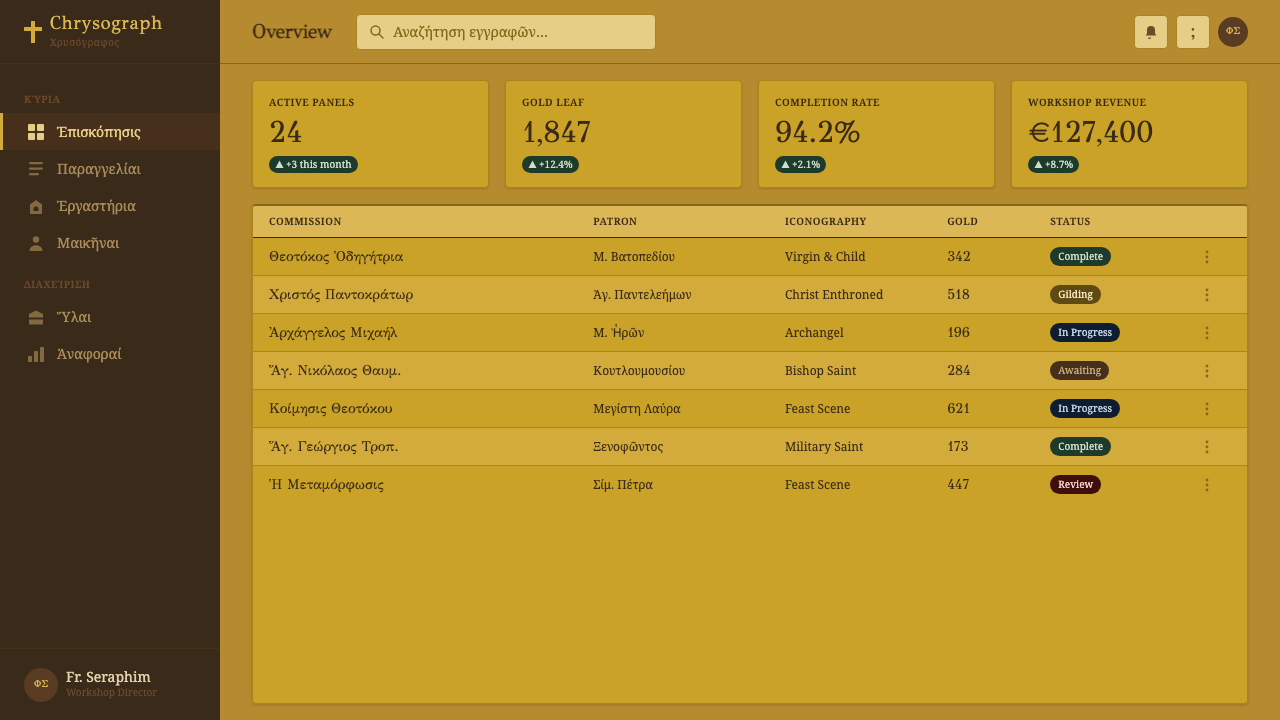
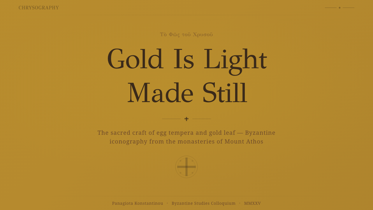
For presentation slide covers, the style produces an unusually commanding effect: a centered, symmetrical composition against a warm gold-toned field reads as authoritative and calm rather than corporate. Content slides should borrow the layered tonal-step principle rather than gradients — headers set in a dense, saturated accent color against the gold-adjacent ground, body content organized with generous quiet space rather than dense grids. Data visuals work best rendered as flat, faceted blocks of value rather than smooth chart gradients, echoing the stepped modeling of an icon's face.
For web interfaces such as dashboards and pricing pages, the frontal, hieratic quality translates into centered hero moments, direct headline copy, and a restrained, symbolic use of accent color to mark tiers or states rather than a full rainbow of status colors. A warm near-gold surface used sparingly behind a single key panel — a pricing highlight, a featured plan — can carry the same weight the gold ground carries behind a saintly figure: this is the important thing, look here.
For editorial and marketing work, the system rewards a slow, dignified pace: long-form articles benefit from a narrow, upright measure and deep madder or ultramarine accents used only for emphasis. Marketing pages built in this idiom feel more like an icon than an advertisement — composed, unhurried, confident the viewer will meet it rather than scroll past it.
The most common mistake is to treat the style as a costume — adding a gold rectangle and a serif-ish inscription to an otherwise conventional layout and calling it Athonite. The system only works when frontal symmetry, layered tonal construction, and a genuinely restrained sacred palette are all present together; any one element in isolation reads as generic 'gold luxury' branding rather than the specific, disciplined stillness this tradition is built on.
Mount Athos Icon — FAQ
Is Mount Athos icon style the same as 'Byzantine style' in general?
They overlap but are not identical. Byzantine style is the broad visual tradition of the Eastern Roman Empire, spanning architecture, mosaic, manuscript illumination, and panel painting across many centuries and regions. Mount Athos icon painting is a specific, living continuation of the panel-icon branch of that tradition, preserved inside a closed monastic community after the empire itself had fallen. It is narrower and more rule-governed than the broader Byzantine umbrella, passed down through direct workshop apprenticeship rather than reconstructed from scattered surviving artifacts.
Can this style work in a dark-mode interface?
Yes, and in some ways it suits dark surfaces naturally, since the historic icon itself is a dark, saturated composition punctuated by a luminous gold field rather than an all-bright image. A dark-mode application should keep the deep madder and ultramarine tones as the dominant surface colors and reserve the warm gold-adjacent tone for a small number of focal elements — a highlighted card, a key metric, a call to action — rather than spreading it evenly. The danger is using too much gold at once, which reads as generic opulence rather than the specific, contained radiance the tradition depends on.
Why does the style avoid perspective and cast shadows so completely?
Because the icon is not trying to depict a physical scene the viewer could stand inside — it is trying to present a spiritual presence that exists outside ordinary space and time. Perspective and cast shadow are tools for describing where a light source sits and how far away an object is; both concepts belong to the physical, changeable world. By replacing spatial depth with a flat gold ground and replacing lighting with layered value steps, the tradition builds a visual language whose depth is entirely symbolic — closer to how a coat of arms or an emblem organizes meaning than to how a photograph organizes a room.
How should color hierarchy be handled when applying this style to a product?
Lead with the somber base tones — deep red, deep blue, warm clay — as the primary surface and text colors, and treat the gold-adjacent tone as a rare, deliberate accent reserved for the single most important element on a screen, the way the historic icon reserves gold for the ground behind the sacred figure rather than for every object in the composition. Avoid introducing a wide range of bright secondary colors for status or category tags; the tradition's power comes from a narrow, disciplined palette, and adding a rainbow of interface colors on top of it collapses the effect immediately.
Does this style suit every kind of product, or are there places it struggles?
It suits products and content that benefit from gravity, trust, and a slower pace — editorial long-form, premium or heritage-positioned brands, contemplative or wellness contexts, and any interface where a single moment of focus matters more than rapid scanning. It struggles in fast-moving, high-density, or playful contexts — real-time dashboards full of shifting numbers, casual consumer apps — because the style's logic is built around stillness, and forcing motion or density into it undermines the very quality that makes it distinctive.
Related design styles
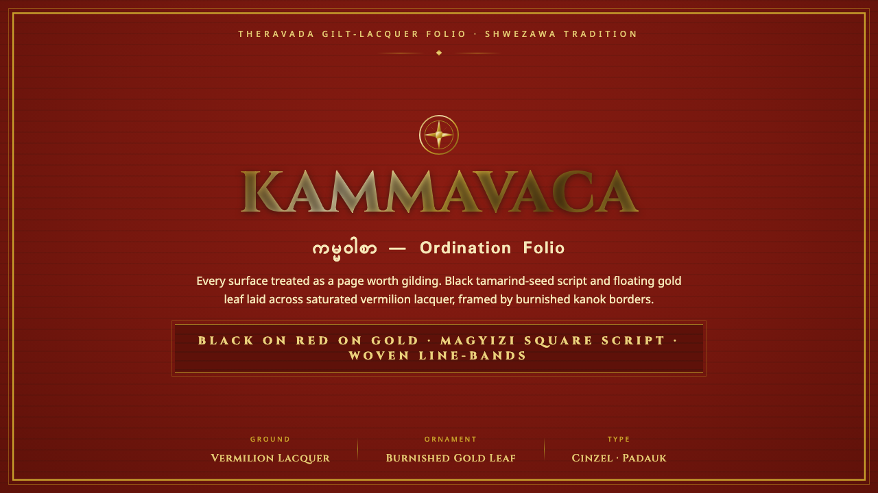 Kammavaca ManuscriptEvery surface worth gilding. Black tamarind-seed script and floating gold lea…
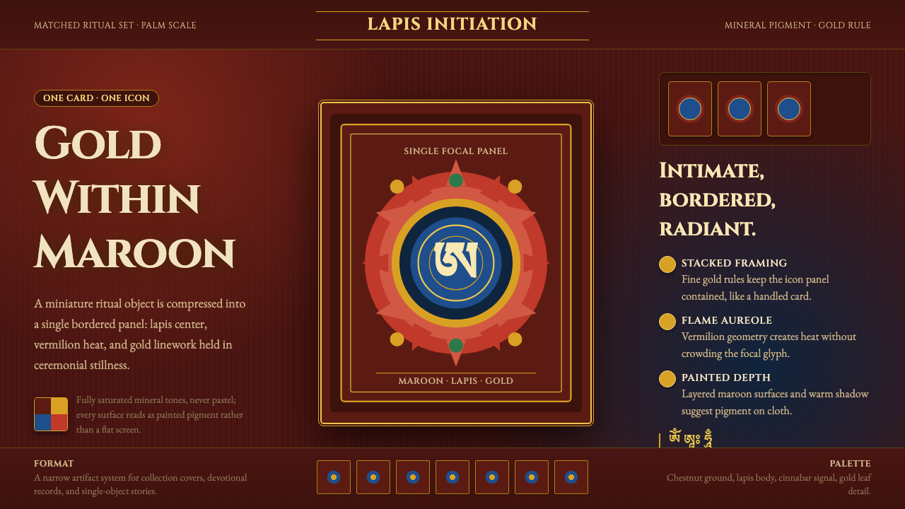 Tibetan Tsakli Initiation CardsPalm-sized radiance. Gold rules, lapis centers, and vermilion flame on maroon…
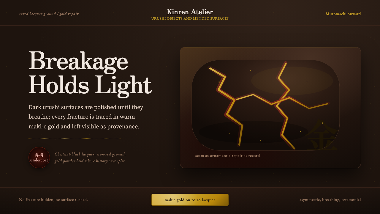 Kintsugi & Urushi LacquerBreakage becomes ceremony. Urushi black-brown carries gold seams and asymmetr…
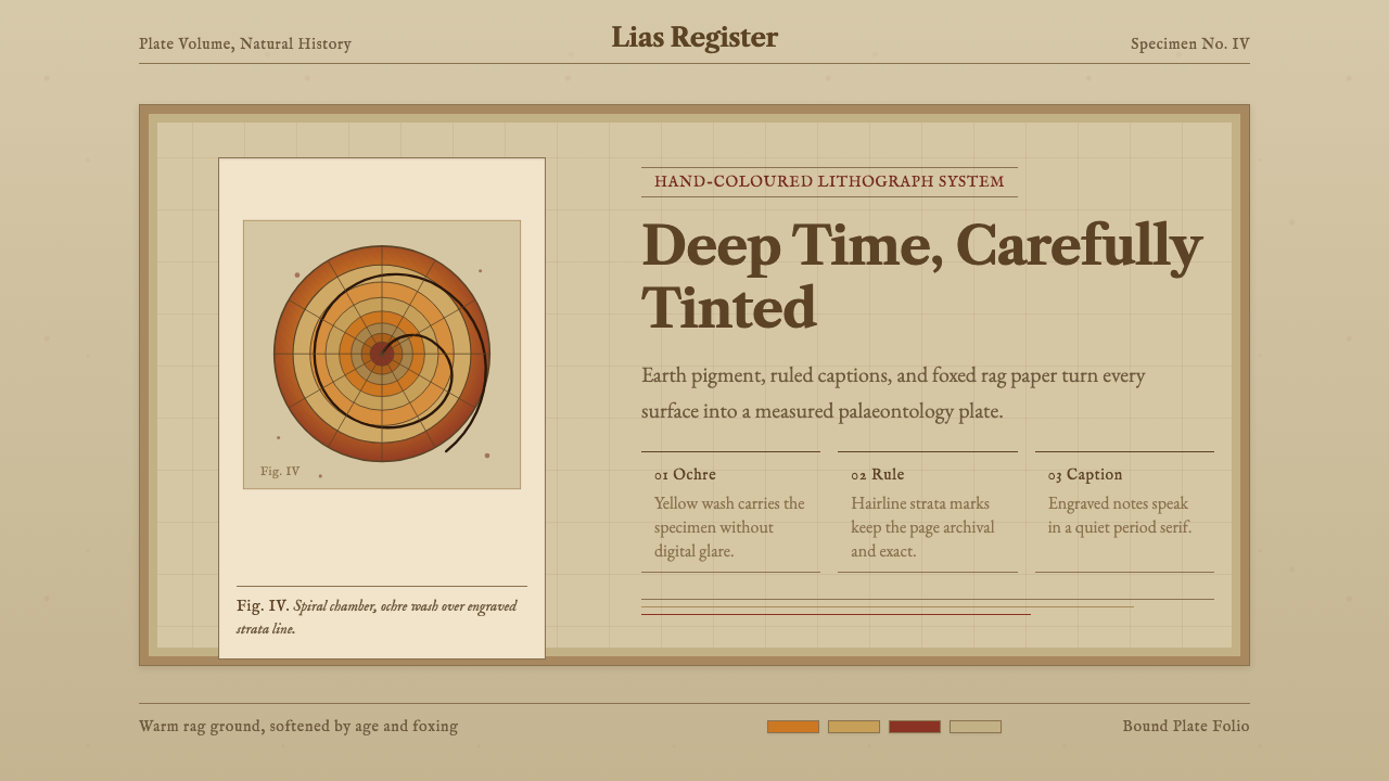 Ammonite Fossil PlateDeep time feels hand-tinted. Ochre spiral, foxed paper, and engraved captions…
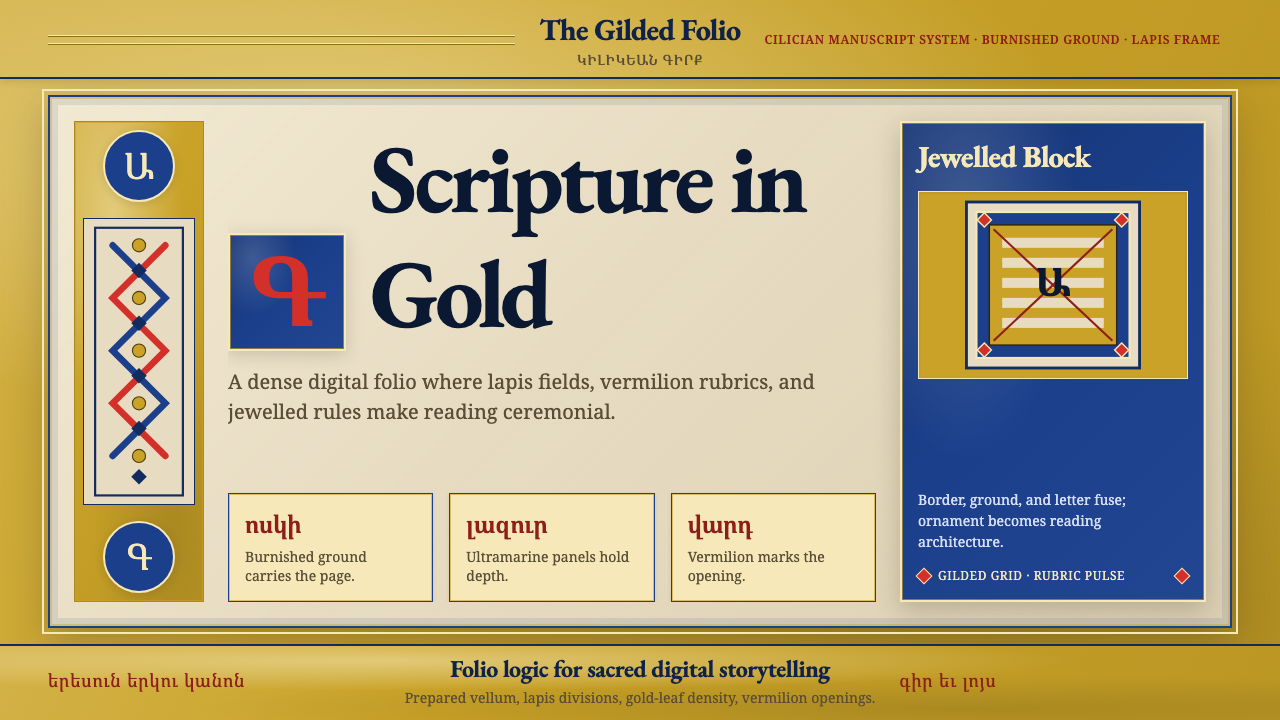 Armenian Illuminated ManuscriptGilded maximalism. Burnished gold, lapis frames, and vermilion initials build…
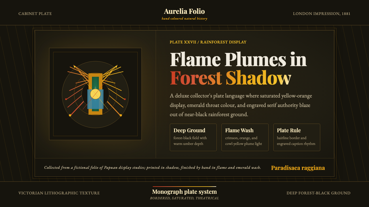 Bird of Paradise MonographTheatrical plate-book darkness. Flame plumes blaze from a bordered forest-bla…