What is Thai Nielloware?
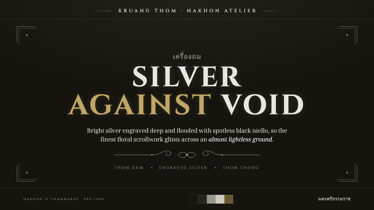
Thai Nielloware turns darkness into a field of precision: a spotless black ground, a bright engraved silver line, and gold held back for moments that must feel singular.
Thai Nielloware in brief
Thai nielloware, known as kruang thom and associated with workshops in Nakhon Si Thammarat in southern Thailand, is a metalcraft built on contrast at its most exacting. Bright silver is deeply engraved with formal floral scrollwork, then filled with a dense black niello alloy. The result is not simply a dark object with decoration applied to it. The black field and the silver line are interdependent: one gives the other its authority. Fine pattern seems to emerge from near-lightlessness, sharp enough to be read as drawing and precious enough to be read as metal.
The prized black finish is thom dam: solid, even, and spotless. Its role is disciplined restraint. It suppresses visual noise so that every engraved silver contour can carry meaning, whether it traces a floral curl, frames a border, or articulates a central emblematic area. Silver is the active mark, but it is not a flat white substitute. It should feel bright, cool, slightly aged at the edge, and physically cut into the dark ground rather than floating above it.
A digital Thai Nielloware system translates this relationship rather than imitating a physical vessel literally. It uses a near-black ground with a restrained cool cast, formal engraved capitals, silver-toned outlines, and scrolling ornament that behaves like an intentional line system. Thom thong, the gilded niello tradition, supplies a second accent language: gold is rare, ceremonial, and never a general-purpose highlight. The aesthetic succeeds when darkness feels immaculate, silver feels worked by hand, and every decorative gesture appears to have earned its place.
Where does Thai Nielloware come from?
Thai nielloware belongs to a pre-1900 tradition of Thai metalcraft associated with Nakhon Si Thammarat, in southern Thailand. The form is commonly named kruang thom, a term that places the craft’s identity in the black-filled engraved surface itself. Its visual language is inseparable from technique: engraving establishes a path for the line, silver supplies the visible brightness, and the dark niello alloy gives the pattern its profound ground. The object’s beauty comes from controlled opposition rather than from abundance.
The craft developed within a setting of royal and court patronage. That context helps explain its emphasis on finish, precision, and scarcity. A flawless dark field is not treated as an empty background; it is evidence of care. Dense scrollwork does not operate as casual decoration; it signals labor, hierarchy, and ceremonial value. Even when pattern becomes intricate, the dark ground remains dominant enough to preserve calm and authority.
Within the tradition, thom dam identifies black niello and thom thong identifies gilded niello. Together they describe a useful hierarchy of visual materials. Thom dam establishes the central black-and-silver language: dark mass first, bright engraved detail second. Thom thong introduces gold as a more exceptional note, connected to the elevated status of gilded court work. This distinction is crucial when adapting the style: silver can organize and articulate, while gold should mark the rarest focal point, reward, seal, or transition.
For contemporary design, the historical lesson is not to turn every surface into ornamental metalwork. It is to preserve the craft’s economy of attention. Nakhon nielloware workshops and royal patrons sustained a language in which workmanship was visible through restraint: a smooth field, a deliberate incision, and a limited hierarchy of precious materials. A faithful digital interpretation should retain that same logic, allowing the black ground to carry atmosphere and allowing bright detail to arrive with the force of a deliberate engraving.
What defines the Thai Nielloware look?
Spotless Black Ground
The ground should feel nearly lightless, smooth, dense, and faintly cool rather than merely dark gray. Its purpose is to absorb clutter and create a disciplined field for silver detail. Texture, if present, should be so restrained that it suggests the depth of a finished alloy rather than paper grain, stone, smoke, or a generic dark-mode surface. A damaged, noisy, or mottled black field breaks the thom dam ideal immediately.
Engraved Silver Line
Silver is the principal active mark. It should read as a precise incision with a bright face and a subtly tarnished edge, never as luminous neon or chrome decoration. Lines can frame, divide, curl, or describe floral forms, but their thickness and density should remain controlled. The strongest compositions treat the line as both ornament and structure: it tells the eye where to travel while preserving the measured gravity of metalwork.
Formal Scrollwork
Floral scrollwork is not a freehand botanical illustration. It should be symmetrical only where a formal frame demands it, otherwise paced through deliberate curls, leaves, stems, and returning contours. The pattern is best concentrated at borders, medallion-like focal areas, or transitions between information groups. Leaving large areas unornamented is essential; the scrollwork becomes precious because it rises from silence.
Engraved Capitals
Typography should feel formal, monumental, and inscribed. Capitals are particularly effective for titles, labels, navigation, and ceremonial calls to action because they echo the deliberate character of engraved metal. Lettering should not become ornate calligraphy or soft luxury branding. The desired impression is stately clarity: words appear cut, aligned, and held within the same disciplined system as the silver ornament.
Rare Gilded Accent
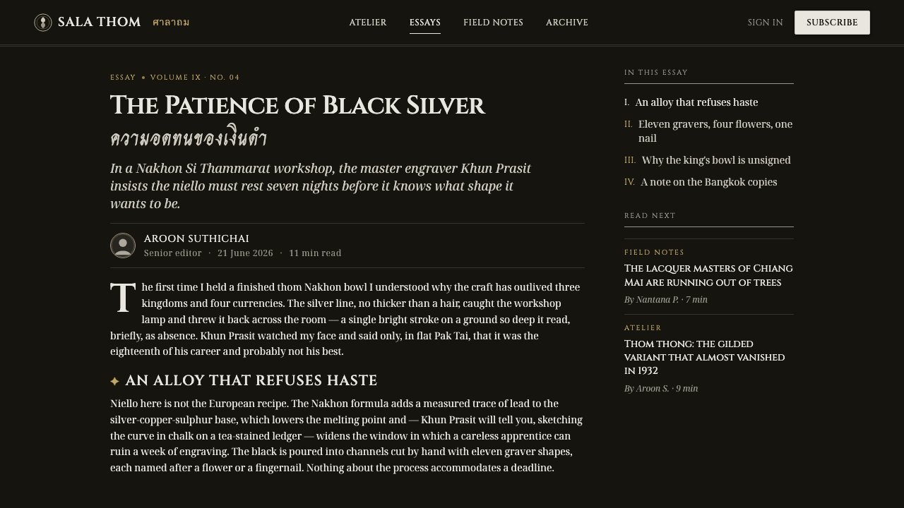
Gold belongs to thom thong and must retain the status of an exception. It can identify a single selected state, a premium distinction, a seal, a pivotal number, or the central point of a composition. It should not share every interface role with silver, and it should never become a broad metallic wash. Gold is most convincing when its scarcity makes the surrounding silver appear even more purposeful.
Ceremonial Restraint
The style is luxurious without being exuberant. Its richness comes from dark space, precision, and the implied labor of engraving, not from multiplying effects. Soft haze, colorful glow, casual stickers, playful illustration, and decorative abundance weaken the system. Every bright intervention should feel consequential, as though the surface had to be cut or gilded to receive it.
Who shaped Thai Nielloware?
The workshops associated with Nakhon Si Thammarat are the central makers named in this tradition. Their significance lies in preserving kruang thom as a disciplined relationship between deeply engraved bright silver and a dense black niello filling. For contemporary designers, they anchor the style in craft practice rather than in a generic luxury mood.
Thai royal and court patrons provided the ceremonial context associated with the craft. Their presence clarifies why immaculate finish, formal ornament, and rare gilding matter so much to the visual language. The style does not communicate casual decoration; it communicates an object made to be examined, valued, and presented with care.
Thom dam and thom thong are the defining material traditions within the source language. Thom dam establishes the black niello ground that makes silver engraving legible; thom thong provides the gilded variant used for the highest-value accent. Together they supply a complete hierarchy for digital application: black creates authority, silver carries information, and gold reserves distinction.
How do you use Thai Nielloware today?
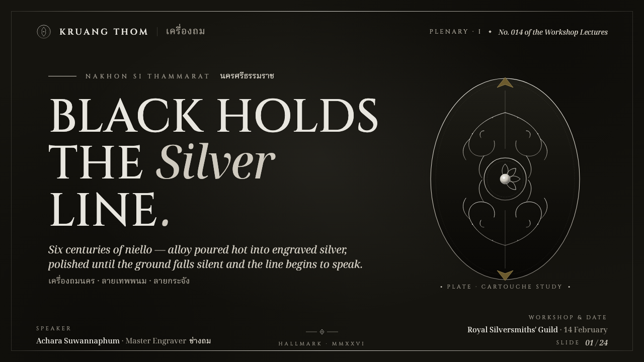
For presentation covers, Thai Nielloware works best when the composition begins with a broad near-black field and a single silver ornamental route. Place a formal uppercase title within a carefully bounded area, then let a border fragment, medallion, or scrolling line occupy one edge or corner. A rare gold note may identify an edition, honor, or central emblem, but the cover should remain predominantly black and silver. The goal is ceremony and anticipation, not visual density.
Content and data slides should use silver engraving as a hierarchy tool. A quiet silver rule can separate sections; a small scroll motif can mark a chapter opening; formal labels can anchor categories. Charts should remain legible before they become decorative, with dark space doing much of the organizing work. Use silver to establish the main data structure and reserve gold for a single exceptional result or highlighted category. Avoid turning every bar, marker, and divider metallic, which makes the information feel ornamental rather than clear.
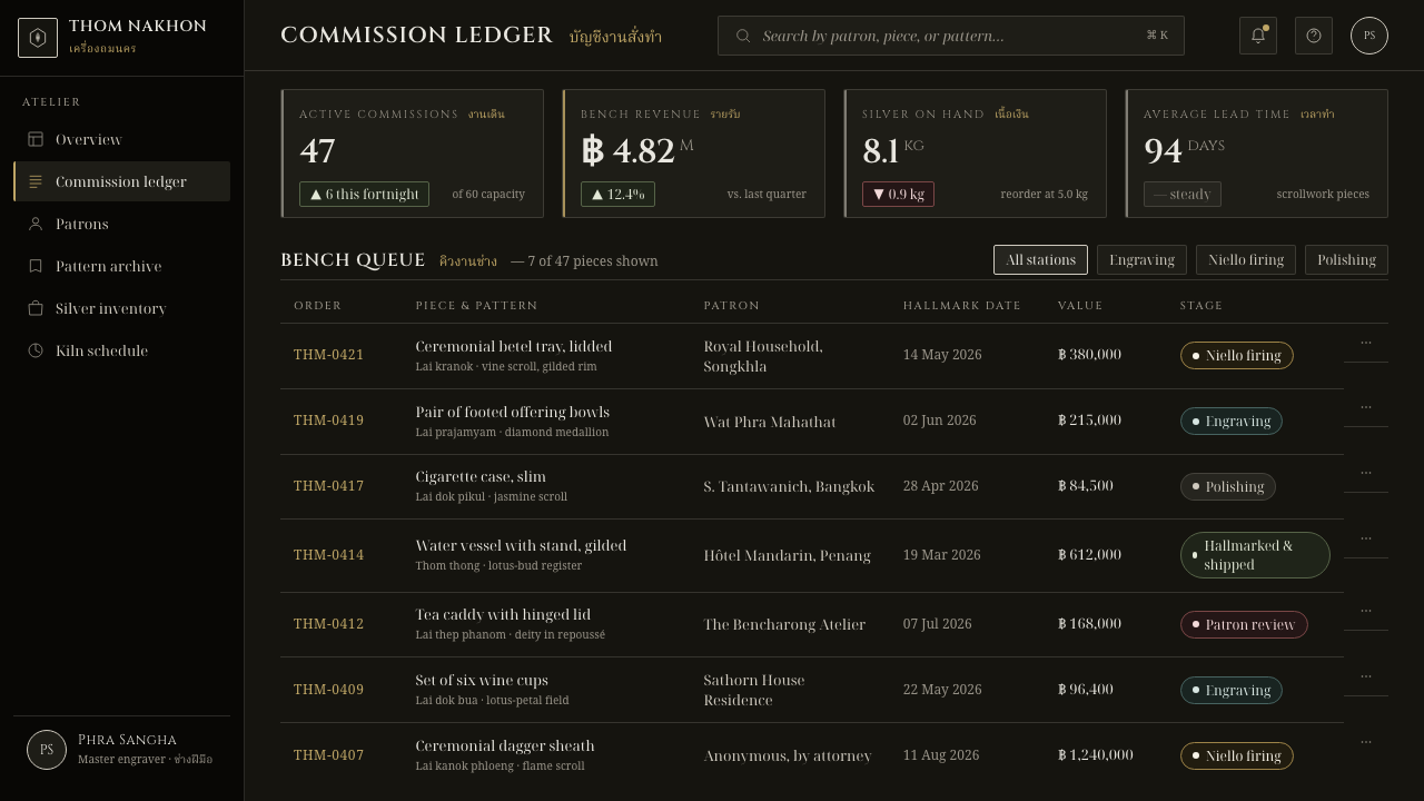
For web interfaces, the style is particularly suited to premium dashboards, account summaries, membership areas, and pricing experiences where trust, rarity, and measured attention are meaningful product values. Maintain a calm dark canvas, use silver-toned linework to define surfaces and states, and let bright details guide focus rather than filling every container. Navigation can use formal all-capital labels, while selected items receive a controlled engraved treatment. Gold should indicate only the highest tier, a verified distinction, or an action with unusual importance.
Editorial and marketing pages benefit from the style’s ability to make long-form information feel collected and ceremonial. Use a dark introductory field, silver section markers, and occasional ornamental boundaries to stage a reading rhythm. Product stories can alternate between generous dark intervals and focused content panels, as though moving around the decorated regions of an object. For campaigns, a single silver scroll motif is more persuasive than a wallpaper of repeated ornament; its incompleteness creates intrigue and leaves room for the message.
The common mistake is confusing nielloware with generic black-and-gold luxury. If gold is used everywhere, if silver becomes a glossy special effect, or if floral motifs spread across every surface, the craft logic disappears. Another frequent error is making the black ground theatrical with smoke, glitter, or heavy gradients. Begin instead with the thom dam standard: a clean, even dark field. Add silver only where it structures, directs, or dignifies information, then introduce gold only when the content truly deserves exceptional status.
Thai Nielloware — FAQ
Is Thai Nielloware simply a black-and-gold luxury style?
No. Its primary relationship is black and bright silver: dense black niello creates the ground, while engraved silver supplies the visible pattern. Gold belongs to thom thong, the gilded niello tradition, and is intentionally rare. A faithful application may contain very little gold or none at all. The style’s luxury comes from precision, contrast, and implied workmanship, not from covering an interface in metallic color.
How should silver be rendered in a digital interpretation?
Treat it as engraved metal, not as a glowing interface accent. It should be cool, bright, and sharply defined against the black ground, with enough edge variation to suggest tarnish or worked metal. Its most useful roles are outlining, framing, dividing, and drawing formal scrollwork. If silver becomes too luminous, too glossy, or too widespread, it loses the feeling of a deliberate incision.
Can the style support dense information such as dashboards and tables?
Yes, provided ornament remains secondary to hierarchy. The black ground can reduce visual noise, silver rules can establish grouping, and formal labels can make categories feel stable. Use scrollwork at major transitions or focal areas rather than inside every table cell. A dashboard should still be readable as a working tool before it is recognized as a nielloware-inspired composition.
When should thom thong gold appear?
Use it for genuinely exceptional meaning: a highest-status tier, a central seal, an honor, a verified distinction, or one result that needs to be remembered. It should not replace silver for routine labels, buttons, borders, or navigation. Its force depends on contrast with the prevailing black-and-silver system, so every ordinary use weakens the extraordinary one.
What most often makes a nielloware-inspired design feel inauthentic?
Usually excess. Generic luxury effects, broad gold coverage, noisy dark textures, luminous gradients, and indiscriminate floral wallpaper all obscure the defining relationship between a clean black ground and a precise silver engraving. Start by removing effects, then ask whether each remaining line behaves like a meaningful incision. If it does not structure, frame, direct, or dignify the content, it probably does not belong.
Related design styles
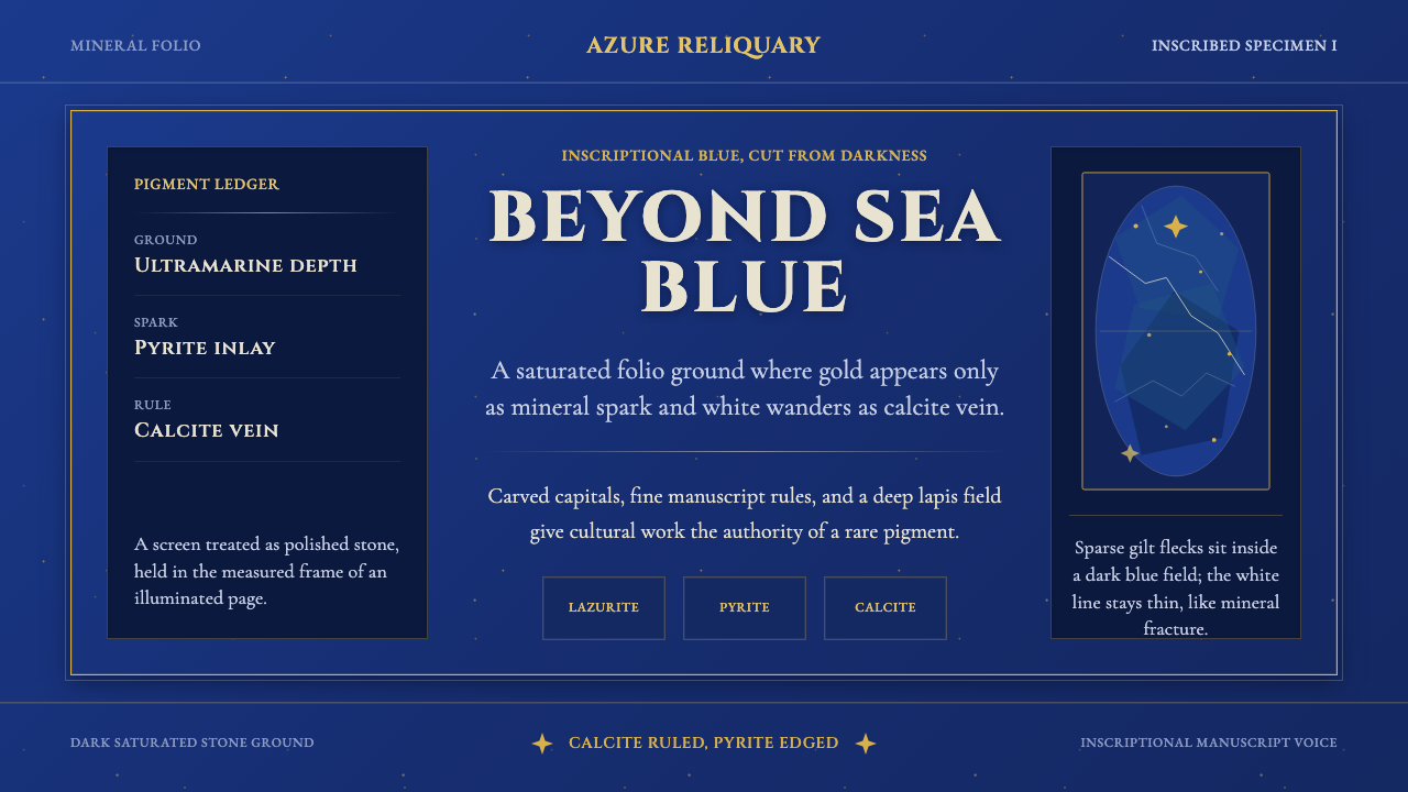 Badakhshan Lapis LazuliStone as manuscript. Ultramarine field, pyrite flecks, calcite veins, carved…
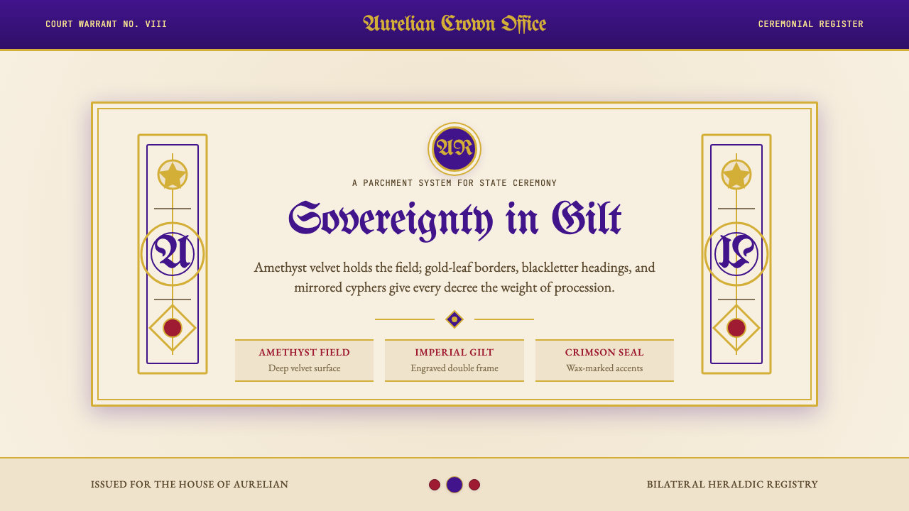 British Royal MonarchyCeremony becomes structure. Amethyst panels, gilt borders, blackletter, mirro…
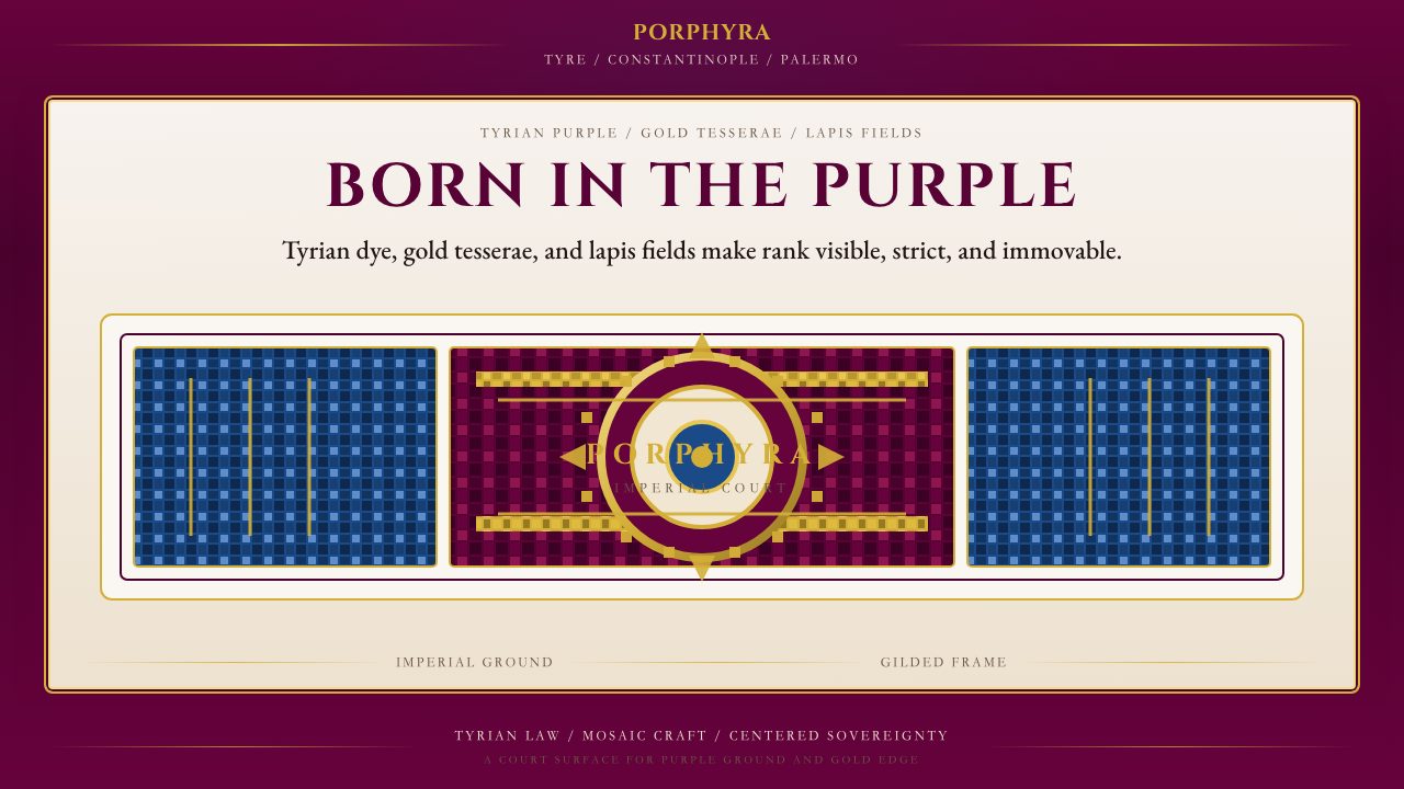 Byzantine Tyrian Purple (Imperial Court)Imperial rank made visible. Tyrian purple, gold tesserae, and centered symmet…
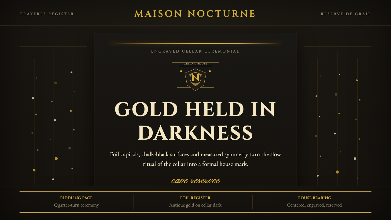 Champagne MaisonGrandeur without glitter. Cinzel capitals and gold foil rules glow in cellar…
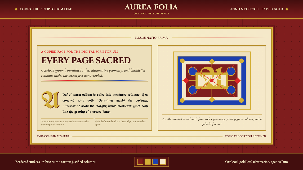 Medieval Illuminated ManuscriptTreats every page as sacred. Oxblood vellum, Cinzel capitals, gold-rule borde…
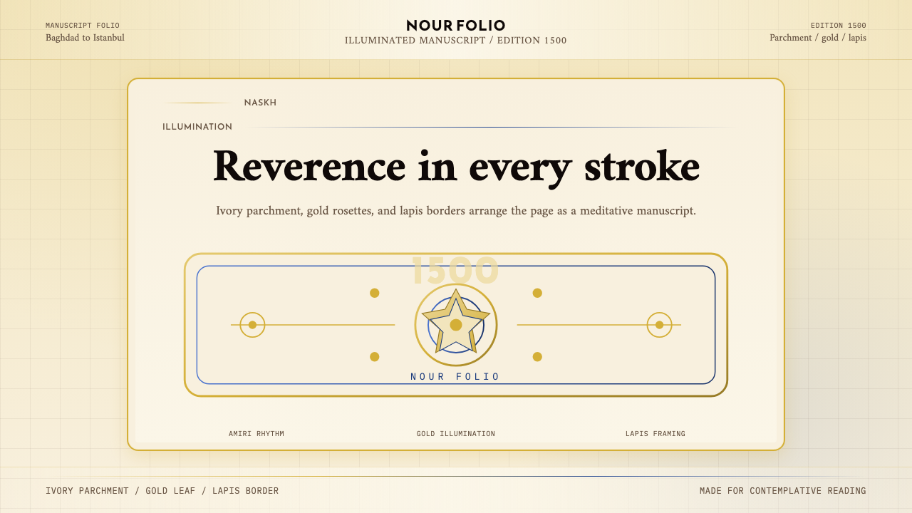 Naskh Quranic (1500)Reverence in every stroke. Ivory parchment, gold rosettes, and lapis framing.