What is Spencerian Penmanship?
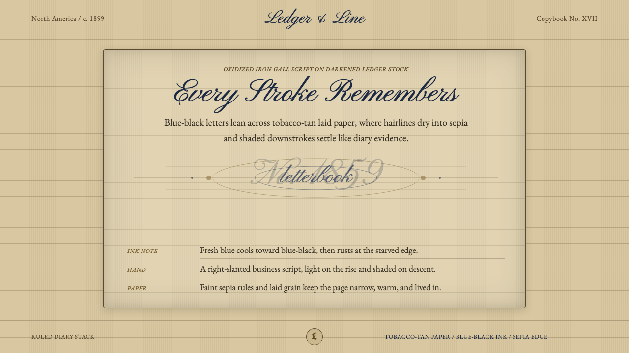
Spencerian Penmanship turns disciplined business writing into lyrical atmosphere — blue-black ink gliding, swelling, and catching across tobacco-tan ruled paper.
Spencerian Penmanship in brief
Spencerian Penmanship is a copperplate-derived American writing style taught widely from roughly 1850 to 1925, with its greatest cultural presence before 1900. It combines right-slanting letterforms, light connecting strokes, shaded descents, and expansive capital ovals. Although developed as a practical business hand, its controlled rhythm gives ordinary correspondence, ledgers, and diary pages an unmistakably lyrical character.
As a visual style, Spencerian Penmanship is more than ornate script. Its complete atmosphere comes from the meeting of hand, ink, and paper: oxidized iron-gall blue-black against warm, darkened journal stock; delicate up-strokes beside pressure-heavy down-strokes; dry steel-nib flicks interrupted by the grain of laid paper. Ruled lines keep the writing orderly while flourishes repeatedly test and cross those boundaries.
The resulting tension is essential. The page is disciplined but never mechanical, aged but not merely distressed, decorative yet anchored in use. Its beauty lies in evidence of movement: a stroke gathering pressure, a loop accelerating outward, an ink-rich curve fading into a brittle hairline. Digital interpretations succeed when they preserve that physical logic rather than treating handwriting as a decorative font placed on a generic antique background.
Where does Spencerian Penmanship come from?
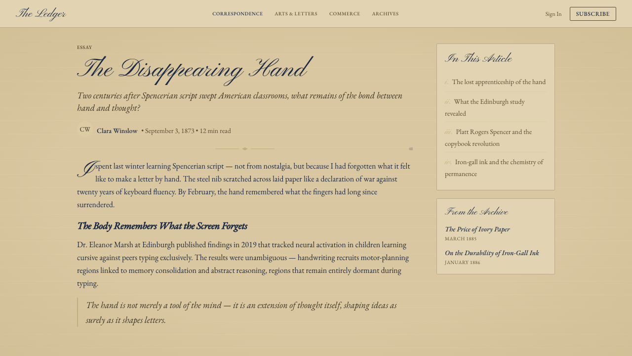
Spencerian Penmanship emerged in the United States within the nineteenth-century culture of American penmanship and business writing. Its central figure was Platt Rogers Spencer, whose name became attached to a system intended to make elegant handwriting teachable and repeatable. The hand drew from copperplate-derived script, but its identity rested on continuous written movement rather than the static appearance of engraved lettering.
The style belonged to a period when handwriting carried both practical and personal authority. Business records required clarity and consistency, while letters and journals preserved the individuality of the writer. Spencerian practice joined these demands: repeated slant, oval construction, and rhythmic spacing supplied discipline, while pressure changes and flourished capitals left room for performance. Its lyricism was therefore not separate from utility; it arose inside a system designed for sustained writing.
From roughly 1850 to 1925, the style was taught across America through the broader culture of penmanship instruction. Golden-age copybook penmen turned writing into a demonstrable craft, presenting carefully controlled examples that learners could study and repeat. The copybook ideal encouraged regularity, yet the steel nib ensured that every execution remained sensitive to speed, pressure, ink flow, and paper grain. Instruction standardized the hand without fully erasing the presence of the writer.
The material setting is inseparable from the historical form. Iron-gall and blue-black inks oxidized into complex, dark marks rather than remaining visually flat. Laid journal and ledger papers aged toward tobacco-tan, with ruled lines and visible grain shaping the path of the nib. This article's aesthetic is grounded in that period diary environment: not an abstract nostalgia for old handwriting, but a specific relationship between blue-black script, darkened paper, ruled order, and marks altered by time.
What defines the Spencerian Penmanship look?
Ink Color
The defining ink is an oxidized blue-black rather than neutral black. It may appear cooler and denser where the nib deposits more liquid, then drier and more muted along fast hairlines. Variation should follow the path of writing, giving heavy curves greater depth while allowing fine connections to feel brittle, aged, and partially absorbed by the sheet.
Paper Ground
The ground is tobacco-tan, recalling darkened ledger or journal stock rather than clean cream stationery. Its warmth should feel embedded in the paper, with restrained unevenness suggesting age and laid fibers. Ruled lines remain visible but subordinate, giving the page a working-document character instead of turning it into a theatrical antique prop.
Stroke Contrast
Hairline up-strokes expand into shaded down-strokes through changes in nib pressure. This contrast supplies both rhythm and hierarchy: light strokes connect and propel, while dark strokes stabilize the word. Uniform outlines destroy the effect. The lettering must seem written by a flexible tool responding continuously to direction and force.
Slant and Rhythm
Letters lean consistently to the right, creating forward motion across the ruled page. Repeated ovals, joins, and intervals establish a measured cadence, but slight human variation prevents sterility. The eye should sense a continuous hand traveling through each word, not a sequence of isolated glyphs arranged to resemble handwriting.
Capital Flourishes
Capital letters open into broad ovals, returning loops, and trailing flourishes. These gestures provide focal points and ceremonial emphasis, but they remain extensions of the stroke rather than detachable ornaments. A flourish should appear to grow from accumulated speed and confidence; arbitrary curls scattered around the page weaken the style's disciplined character.
Dry Stroke and Grain
Fast nib movement produces dry flicks where ink separates around the laid grain. These interruptions are directional and selective: they gather near swift exits, narrow turns, and fading terminals rather than covering every mark with uniform distress. Their purpose is to reveal friction between steel, liquid, and paper.
Ruled Order
Horizontal rules organize the field like a diary or ledger, giving flourishing script something firm to inhabit and occasionally exceed. Their spacing should feel calm and regular, while the writing supplies variation. This contrast between measured lines and animated ink keeps the composition legible even when capitals become expansive.
Who shaped Spencerian Penmanship?
Spencer is the central figure associated with the writing system that bears his name. His significance lies in treating elegant, rhythmic handwriting as a practical discipline that could be taught and repeated, not merely admired as virtuoso display. The resulting hand joined copperplate-derived grace to the demands of American business writing and became the foundation of a broad penmanship culture.
The golden-age copybook penmen transmitted the style through controlled exemplars. Their pages demonstrated how slant, oval construction, spacing, pressure, and flourishes could function as parts of one repeatable system. Collectively, they transformed a named method into a shared visual culture, balancing standardized instruction with the visible skill of an individual hand.
Business-writing instructors carried Spencerian practice into everyday American learning. Their role connected the refined copybook model to routine needs such as correspondence, records, and journals. By teaching rhythm and consistency as functional virtues, they preserved the style's central paradox: handwriting could be systematic enough for business while remaining expressive enough to reveal touch, speed, and temperament.
How do you use Spencerian Penmanship today?
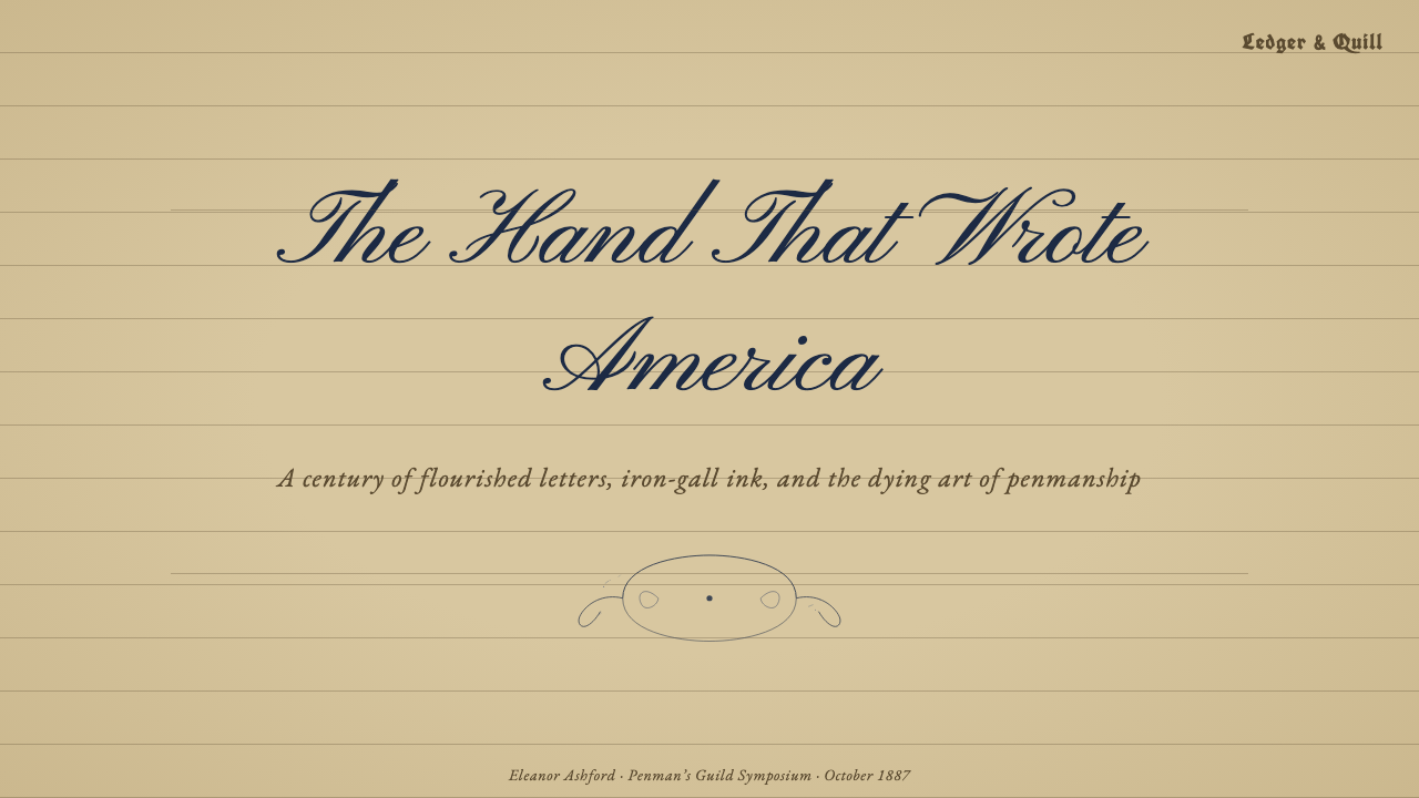
For presentation covers, Spencerian Penmanship works best as a concentrated gesture rather than an all-over texture. A short title or initial can sweep across an open field of tobacco-tan paper, accompanied by restrained ruled lines and a quieter secondary label. Content slides should reserve script for headings, quotations, or signatures while using a simpler reading face for sustained explanation. This preserves both historical atmosphere and practical legibility.
Data slides need an especially disciplined interpretation. Charts should remain clear and orderly, borrowing the manuscript palette and ledger-like horizontal structure without rendering every label in script. Blue-black marks can carry the principal series, while warmer, faded tones support context. Handwritten annotations may circle an exception or underline a conclusion, making the page resemble an attentive analyst's ledger rather than an ornamental scrapbook.
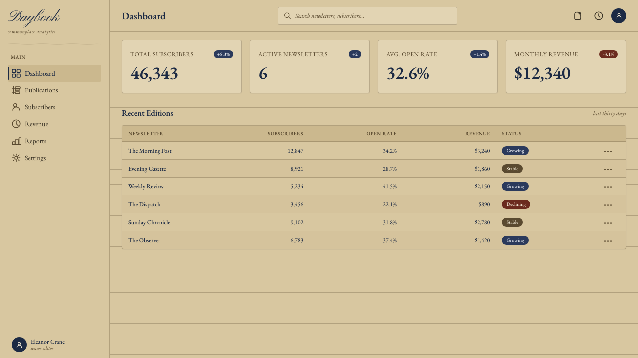
For dashboards and pricing interfaces, the style should influence surfaces and hierarchy more than controls. A warm paper ground, dark blue-black text, ruled separators, and occasional handwritten emphasis can establish identity while tabular information remains direct. Pricing tiers may read like entries in a carefully kept account book, with flourished initials marking featured choices. Buttons and navigation still need obvious states; historical character must never conceal action.
Editorial and marketing layouts can exploit the style's intimacy. Essays, heritage stories, invitations, stationery-inspired campaigns, and personal brand narratives benefit from the suggestion of preserved correspondence. Use enlarged script as a human focal point, then let ruled fields, generous margins, and small ledger-like notes organize supporting information. The emotional register is reflective and cultivated, making the style less suitable for messages that require technological speed or impersonal neutrality.
The common mistake is to equate Spencerian style with maximum ornament and generic aging. Excess flourishes, random stains, torn edges, uniformly distressed ink, and pale cream paper produce theatrical nostalgia rather than credible penmanship. Begin with the writing mechanics: consistent slant, pressure contrast, oval rhythm, and directional dry stroke. Add only enough paper age and ruling to establish context. The page should feel used and preserved, not artificially buried.
Spencerian Penmanship — FAQ
Is Spencerian Penmanship simply another name for copperplate script?
No. Spencerian Penmanship is copperplate-derived, so the two share slant, pressure contrast, and formal curves, but Spencerian identity depends on its development as an American business hand. Its connected movement, repeated oval rhythm, and balance between speed and elegance distinguish it from treating engraved copperplate appearance as the sole model. The relationship is one of inheritance, not equivalence.
Why is the paper tobacco-tan rather than cream?
Because this visual system is grounded in aged nineteenth-century laid journal and ledger paper. The darker warm tone establishes the material history against which oxidized blue-black ink becomes convincing. Cream suggests clean stationery or generalized vintage styling; tobacco-tan suggests paper altered by use and time. The distinction keeps the atmosphere tied to a specific manuscript setting.
Can the style be used without a handwriting typeface?
Yes, although script is its clearest signature. The style can be evoked through blue-black marks, warm ruled paper, ledger organization, restrained ink irregularity, and annotations that resemble nib gestures. A simpler typeface may carry most interface or editorial content, while a small amount of authentic script supplies identity. This often produces a more usable result than setting every sentence in elaborate handwriting.
How should digital distress be handled?
Distress should explain material behavior. Dry breaks belong along fast exits and narrow hairlines; darker pooling belongs where the nib slows or presses; slight paper variation belongs within the laid ground. Random speckles applied equally to every surface do not describe writing and quickly become visual noise. The most convincing age is selective, directional, and tied to the imagined action of the tool.
Where does Spencerian Penmanship work poorly?
It struggles where dense information, rapid scanning, or emotionally neutral presentation is the overriding requirement. Long passages of connected script slow reading, while aged paper and expressive flourishes can make a highly technical interface feel nostalgic or personal in the wrong way. The style is strongest when memory, authorship, craft, or cultivated intimacy supports the message, and weakest when decoration competes with urgent comprehension.
Related design styles
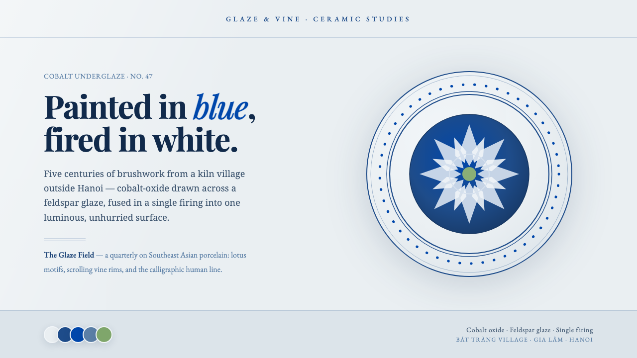 Bát Tràng Ceramic BlueCobalt brushed on glaze white. Muted underglaze blue, double-line plate rims,…
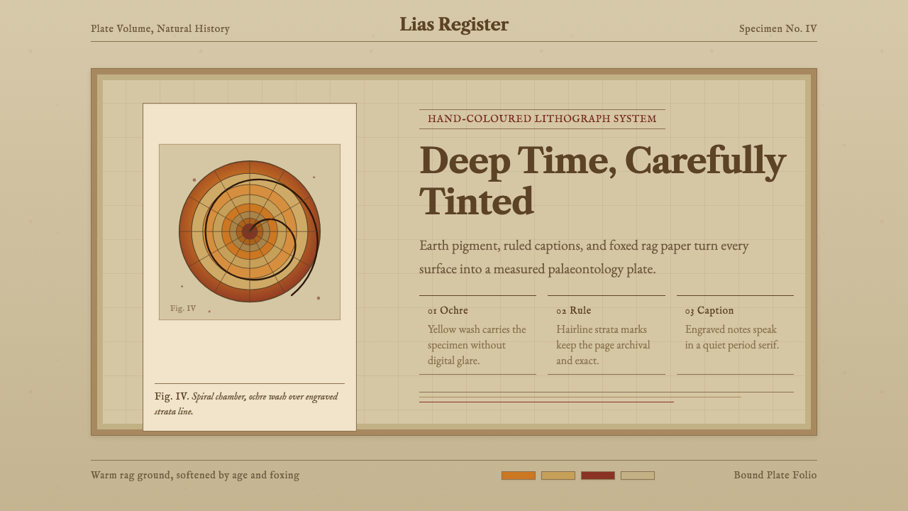 Ammonite Fossil PlateDeep time feels hand-tinted. Ochre spiral, foxed paper, and engraved captions…
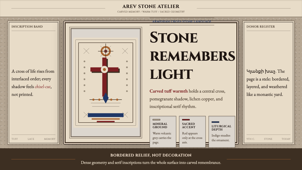 Armenian Khachkar Cross-StoneStone becomes memory. Tuff grey, pomegranate red, and carved borders hold the…
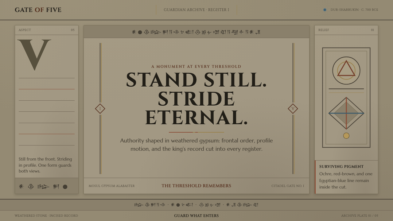 Assyrian Lamassu ReliefAuthority carved into silence. Buff-gray stone, monumental capitals, and cune…
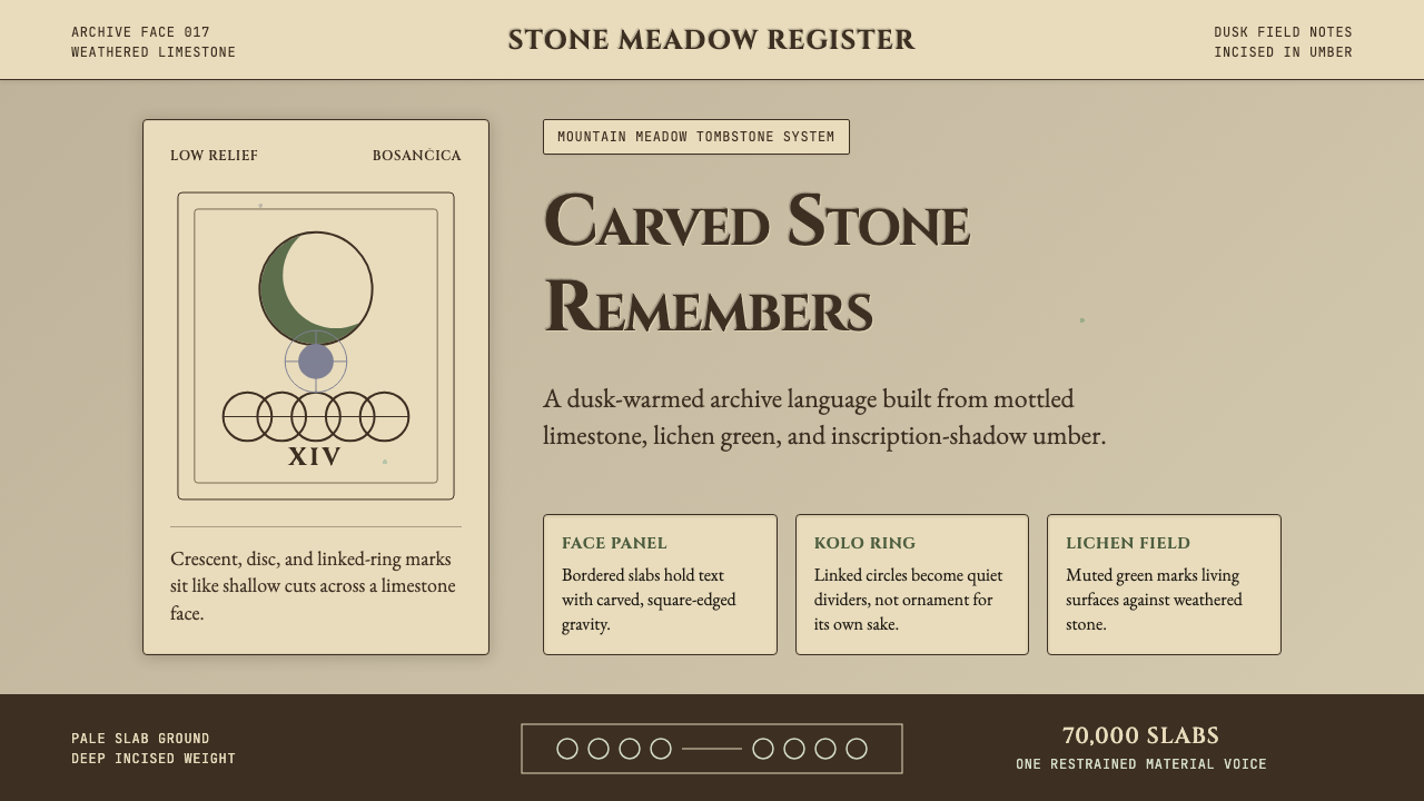 Bosnian Stećak Medieval TombstoneStone remembers quietly. Lichen green and Cinzel cuts sit on weathered limest…
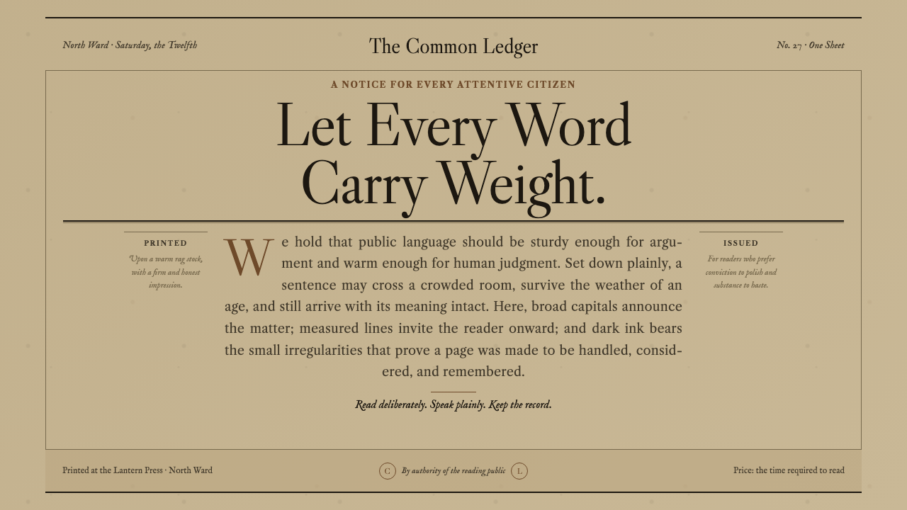 Caslon English Text SerifWarm authority, pressed into paper. Caslon capitals and engraved rules comman…