What is Indian Brinjal Temple Textile?
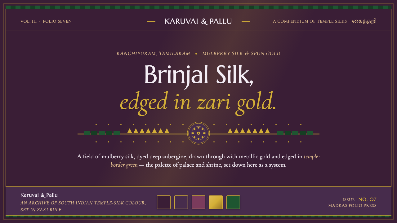
Indian Brinjal Temple Textile turns palace silk into a visual system: deep brinjal violet, real zari gold, and temple green held in disciplined borders.
Indian Brinjal Temple Textile in brief
Indian Brinjal Temple Textile distills the early-twentieth-century Kanjeevaram silks of Tamil Nadu into a dark, ceremonial design language. Its foundation is heavy mulberry silk dyed deep brinjal, or aubergine, violet; its defining glint comes from real metallic gold zari; and its borders draw on contrasting temple and peacock greens. The result feels less like a decorative palette than a textile architecture.
The system carries the atmosphere of palace and shrine cloth into digital form. A dark violet silk ground establishes depth, while aubergine and mulberry-rose surfaces create quieter layers within it. Zari-gold rule lines frame panels as though each interface were a saree border, and deep temple green appears as a controlled counterpoint. The visual richness comes from adjacency, material suggestion, and border discipline rather than from effects.
Its character is luxurious but ordered. Violet supplies the enveloping field, gold marks significance and structure, and green interrupts the darkness with an organic ceremonial accent. Typography must therefore remain composed and legible: serif forms echo the cultural setting, while restrained spacing and clear hierarchy prevent the surface from becoming theatrical noise. Every border should feel woven into the system, not added afterward.
Where does Indian Brinjal Temple Textile come from?
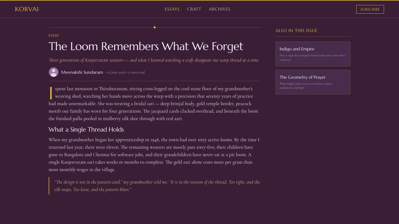
The source places Indian Brinjal Temple Textile within the Kanjeevaram, or Kanchipuram, silk-weaving tradition of South India, specifically Tamil Nadu. Its historical frame is 1900–1950, a period represented here not as a general history of Indian design but as the setting from which this particular palace-and-shrine vocabulary is distilled. Kanchipuram and Kanjeevaram name the regional and textile context at the same time.
Kanjeevaram silk saree weaving is the central movement behind the style. The material logic begins with heavy mulberry silk: substantial, lustrous, and able to carry a deep brinjal-violet ground without losing visual presence. The color is not a timid purple accent. It is the field, the atmosphere, and the dominant emotional register of the textile. Digital applications should preserve that enveloping quality rather than reducing violet to a small decorative mark.
The visual system also depends on the temple-textile zari tradition. Real metallic gold zari is threaded through the silk and translated digitally into narrow gold rules, border lines, and moments of emphasis. Gold therefore belongs to the structure of the style, not merely to its ornament. The contrasting temple and peacock borders establish a second principle: the richness of the ground is clarified by a firm edge and a disciplined green counterweight.
The source identifies hereditary Kanjeevaram master weavers and Devadasi temple textile patrons among the key figures of this tradition. Their presence keeps the style grounded in making and patronage rather than in an abstract mood board. The digital system is consequently best understood as a respectful distillation of woven relationships: silk against zari, violet against green, central field against border, and ceremonial richness against careful control.
What defines the Indian Brinjal Temple Textile look?
Brinjal Ground
The dominant field is deep brinjal violet, evoking dyed mulberry silk and giving the system its nocturnal, palace-like depth. It should occupy the visual ground generously, allowing lighter rules and accents to read as woven interventions rather than isolated interface components.
Silk Layering
Aubergine and mulberry rose create surface variation without breaking the dark atmosphere. These related hues are best used to distinguish panels, cards, or secondary fields subtly, preserving the sense that every layer belongs to the same cloth.
Zari Structure
Zari gold functions as a visual skeleton. Fine rules frame panels, mark divisions, and signal ceremonial importance. Gold should remain deliberate and linear; if it spreads across every surface equally, the distinction between structure and embellishment disappears.
Temple and Peacock Borders
Borders are not optional frames added around content. They are the style's organizing edge, inherited from temple and peacock textile borders. A border can close a panel, anchor a title, or create a threshold between layers, provided it remains continuous and visually intentional.
Serif Ceremony
Noto Serif Tamil, Marcellus, and Cormorant Garamond support the system's cultural and ceremonial register. Serif typography gives headings and labels a carved, inscriptional presence, while disciplined alignment and restrained hierarchy keep the writing authoritative rather than ornate.
Material Suggestion
The system suggests silk through depth, tonal layering, and controlled luminosity rather than simulated fabric texture. Gold lines should feel metallic because of their contrast with violet, not because of elaborate rendering. The material reference works best when it remains implied.
Ceremonial Contrast
The palette gains its authority from controlled contrast: dark violet establishes enclosure, gold introduces light and importance, and temple green provides a firm opposing accent. The system should feel rich through proportion and placement, never through indiscriminate brightness.

Who shaped Indian Brinjal Temple Textile?
These hereditary makers anchor the style in continuity of craft. Their presence explains why the system should be treated as a woven language of silk, border, and zari rather than as a loose collection of luxurious colors.
The temple textile patrons named in the source connect the palette to shrine culture and ceremonial use. They help explain the system's combination of darkness, gold, border discipline, and formal richness.
As the central movement behind the style, Kanjeevaram weaving supplies the relationship between a substantial silk field and carefully articulated borders. The digital interpretation preserves that relationship through surfaces, rules, and framing.
The zari tradition gives gold its structural role. It is not simply a luxury highlight; it is the thread-like device that outlines, separates, and gives ceremonial emphasis to the darker textile ground.
How do you use Indian Brinjal Temple Textile today?
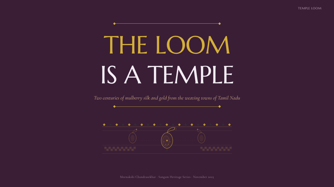
For presentation covers, let the dark violet ground carry most of the field and place the title in a composed serif voice, as if it were an inscription on a ceremonial textile. A zari-gold border can establish the outer threshold, while temple green supplies a restrained accent. On content slides, use related aubergine and mulberry-rose surfaces to separate sections without breaking the unified cloth-like atmosphere.
Data slides should treat rules and borders as part of the information architecture. Gold can frame a chart, underline a key figure, or mark the division between a title and its evidence; green can identify a contrast category or selected state. Keep the chart forms quiet and legible so the palette provides ceremony around the data rather than competing with it.
For web interfaces, the style suits dashboards, cultural archives, premium commerce, and pricing pages that need authority with a sense of heritage. Use the dark violet ground for the main canvas, aubergine or mulberry rose for elevated surfaces, and zari gold for active states, selected values, and key boundaries. Temple green works well for confirmation, contrast, or a deliberate secondary action. Navigation should remain typographic and calm.
Editorial and marketing work can use the style to frame stories about craft, luxury, hospitality, fashion, heritage, or ceremonial occasions. A narrow reading column enclosed by a gold rule can feel like a textile panel, while pull quotes or metadata may sit in a deeper rose surface. Campaign pages benefit from generous dark fields, clear serif headlines, and borders that repeat consistently across sections rather than changing as decoration.
The common mistake is to treat every element as an opportunity for gold ornament. When gold lines, green accents, elaborate borders, and multiple purple surfaces all compete at once, the textile logic becomes visual noise. Choose a dominant violet field, give gold a structural job, and let green appear selectively. The style depends on hierarchy and restraint as much as on richness.
Indian Brinjal Temple Textile — FAQ
What is Indian Brinjal Temple Textile?
It is a design system distilled from the early-twentieth-century Kanjeevaram silks of Tamil Nadu. Its visual identity combines a dark brinjal-violet silk ground, metallic gold zari structure, and contrasting temple or peacock green borders, then adapts those relationships for digital surfaces and typography.
Is this style meant to reproduce an actual saree literally?
No. It carries the palace-and-shrine palette and the logic of woven borders into digital form. The reference is most effective when translated through hierarchy, framing, tonal layering, and material suggestion rather than copied as a literal textile pattern on every component.
How should zari gold be used in a digital interface?
Use it as a structural accent: panel rules, boundaries, active states, selected values, title underlines, or ceremonial framing. Its strength comes from contrast with the dark violet ground. If it becomes a general fill or appears with equal intensity everywhere, it loses its role as the system's defining thread.
Can Indian Brinjal Temple Textile work on a light background?
The system is fundamentally dark, and its strongest identity comes from violet depth against gold and green accents. A light adaptation can work for a special editorial surface, but it should retain the brinjal family, the zari-like linear framing, and the temple-border logic. Without those relationships, it becomes a generic purple-and-gold palette.
What kinds of products suit this style best?
It works best where heritage, ceremony, craft, or premium authority are meaningful values: cultural archives, fashion, hospitality, luxury commerce, ceremonial events, and educational work about textile traditions. It may struggle in products that require extreme neutrality or a bright, casual, utilitarian mood, because the dark ground and zari framing naturally carry formality.
Related design styles
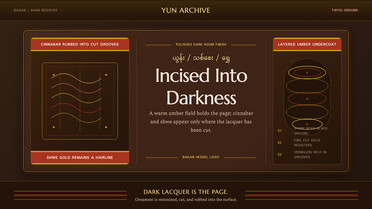 Burmese Shan Lacquer BrownDark lacquer leads. Cinnabar bands and shwe hairlines cut across a warm umber…
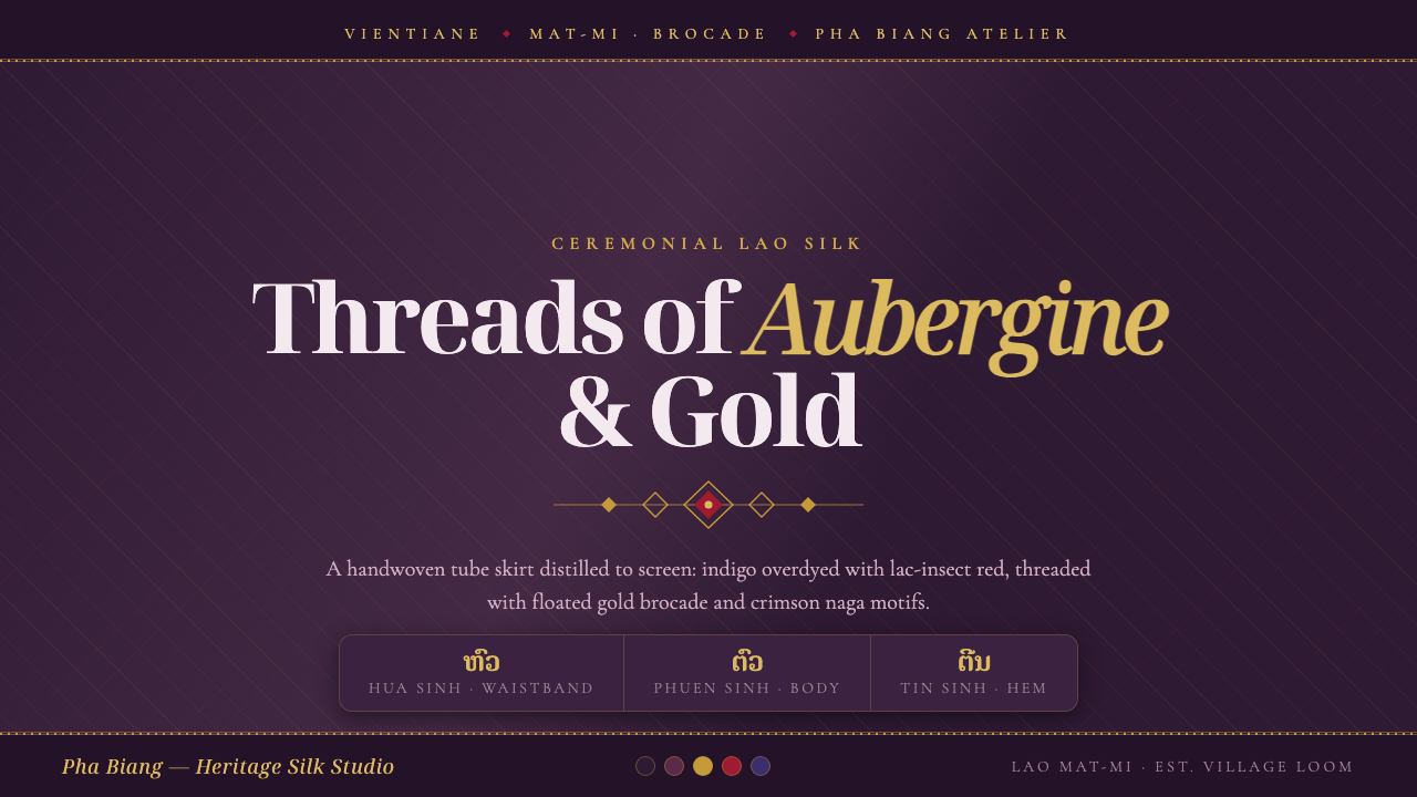 Lao Sinh Silk WeaveCeremonial Lao silk on screen. Dark aubergine ground threaded with gold mat-m…
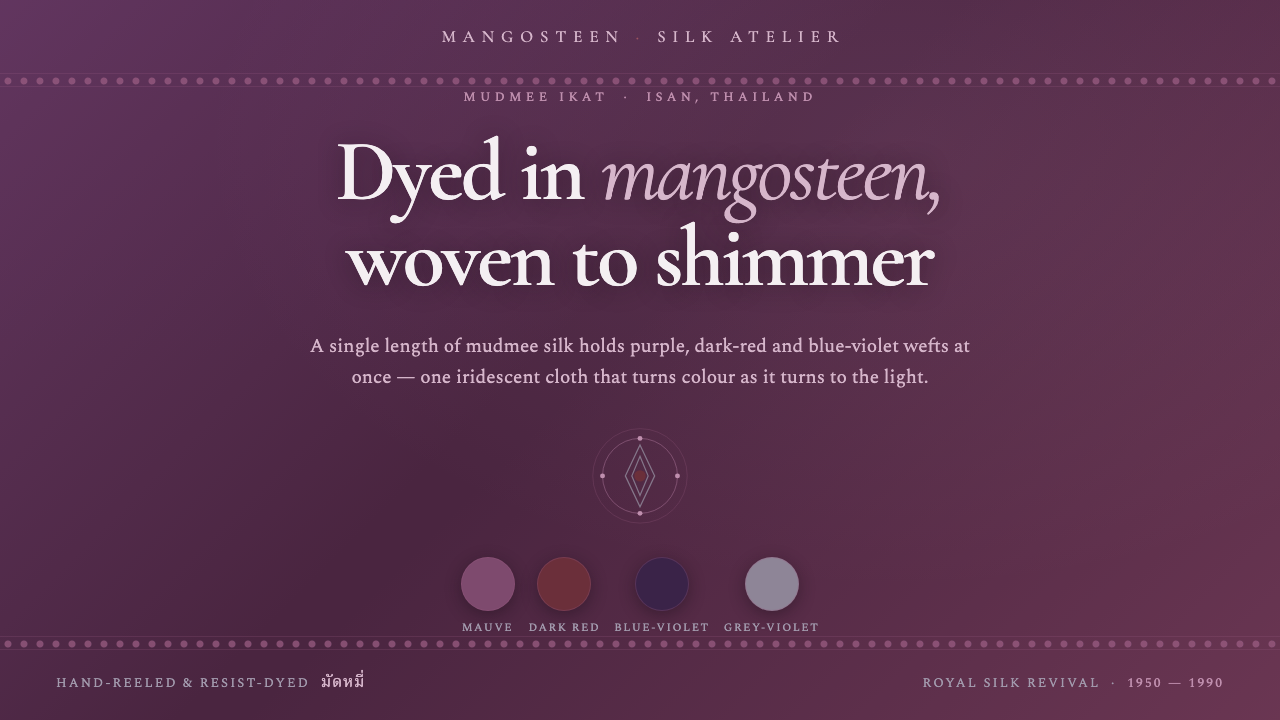 Thai Mangosteen SilkOne cloth, many colours. Mangosteen-dyed mauve ground, layered red and blue-v…
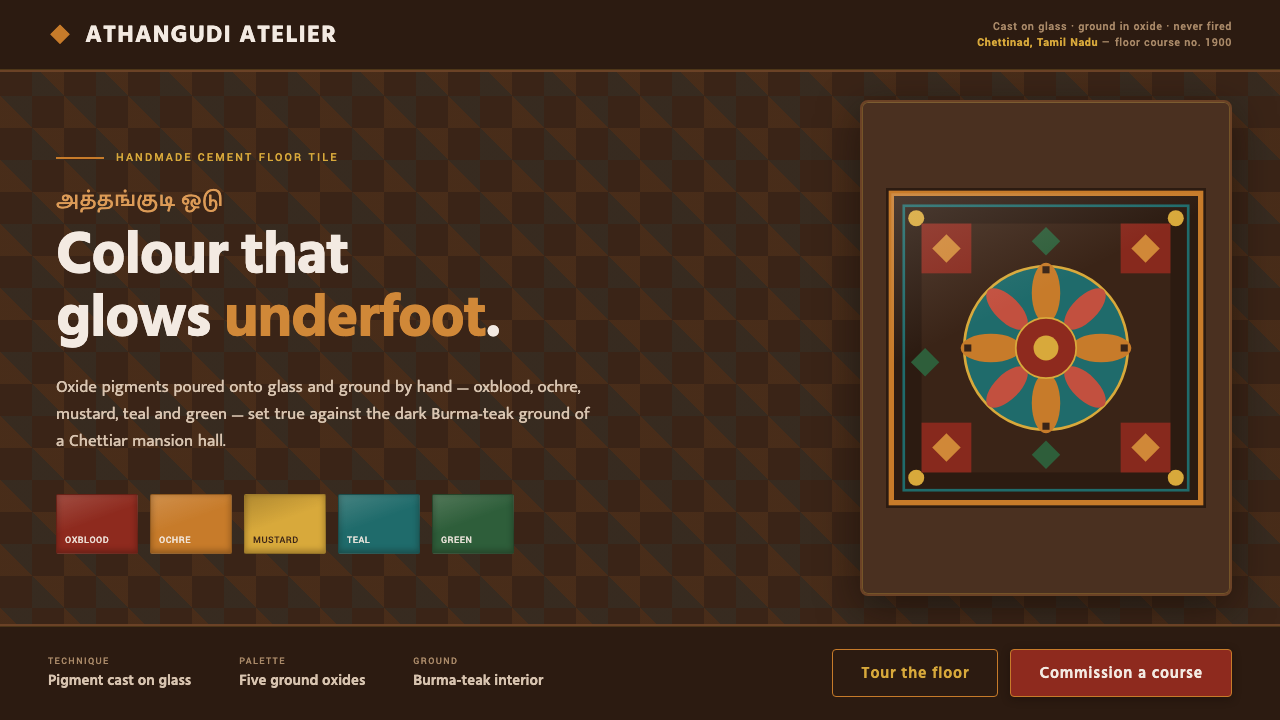 Chettinad Athangudi TilesColour that glows underfoot. Five ground-oxide tones on dark teak in bordered…
 Fatimid LustrewareOpulence fired into earth. Copper-gold lustre glows through dense medallions…
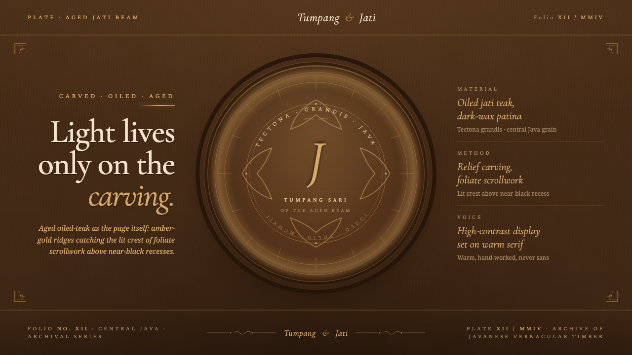 Javanese Teak JogloCarved warmth rules the page. Oiled teak-brown ground, near-black recesses, a…