What is Javanese Teak Joglo?
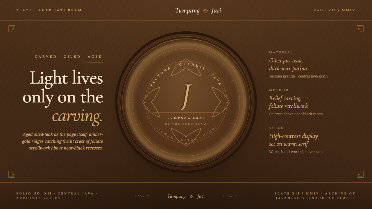
Javanese Teak Joglo turns the page into aged timber: deep oiled warmth, carved shadow, and amber light reserved for the edges that rise.
Javanese Teak Joglo in brief
Javanese Teak Joglo is a digital design language distilled from the joglo house of central Java and its carved jati teak relief panels. Its visual premise is direct: the screen should feel cut from dark, oiled wood rather than placed on a neutral surface. A teak-brown field acts as the material body of the composition, while nearly black recesses imply the grooves left by a carver’s tool.
The source image is architectural as much as decorative. Joglo houses are defined by their soaring tumpang sari roofs, carved teak walls, beams, and floral relief panels. In this system, those elements become an approach to interface depth: broad dark planes suggest timber mass, inset areas read as carved hollows, and only raised contours receive a warm amber-gold catchlight. Light is not spread evenly across the page; it belongs to the relief.
The resulting mood is intimate, weighty, and tactile. It avoids the blankness of pale contemporary interfaces and avoids polished metallic luxury as well. The value comes from apparent age and material density: golden-brown teak darkened by oil and wax, ornament emerging slowly from shadow, and a surface whose richness is created by carving rather than by visual noise.
Where does Javanese Teak Joglo come from?
The system draws from Java, Indonesia, where the joglo house is a central expression of Javanese vernacular architecture. Its tumpang sari roof rises in layered form above an architectural language built from timber, carved surfaces, and structural presence. Rather than treating the house as a source of isolated motifs, Javanese Teak Joglo takes its lesson from the way the whole building makes wood feel ceremonial, sheltering, and alive with depth.
Its material reference is jati teak, identified botanically as Tectona grandis. Across 1900–1950, master carvers worked this warm golden-brown wood into beams and floral relief panels. With age, the wood deepened into an oiled, dark-wax patina. That change over time matters to the visual system: its darkness is not sterile blackness, but the accumulated richness of timber that has absorbed handling, oil, and shadow.
Javanese carpenters and woodcarvers, joglo-house builders, and relief panel carvers form the human lineage behind the style. Their work joins structure and ornament in a single material act: a beam remains a beam while its face can carry relief; a wall remains a wall while its surface gathers floral movement. The digital interpretation should preserve this unity by making decoration appear to emerge from the page itself rather than float above it.
The contemporary translation is intentionally narrow. It does not attempt to reproduce a joglo house in miniature or turn every interface into a literal carving. Instead, it retains the essential visual relationship found in aged carved teak: dark oil-rich ground, recessed shadow, raised foliate contour, and amber light. This restraint lets the source remain legible even when the application is a presentation, dashboard, editorial layout, or marketing page.
What defines the Javanese Teak Joglo look?
Oiled Teak Ground
The background should read as dense, dark teak with a warm undertone, never as an empty neutral field. It establishes material continuity across the page: panels, margins, and broad negative space belong to one timber body. A little tonal variation can suggest oil and age, but the dominant impression must remain deep, waxed, and calm rather than glossy or marbled.
Carved Recesses
Depth begins in the recess. Near-black channels, inner borders, and protected corners should feel pressed down into the teak, as though a tool removed material from the surface. These dark areas are not generic shadows; they define the negative spaces that make the raised portions believable. Keep them contained and directional, so the page reads as relief rather than as a stack of floating cards.
Amber Edge Light
Amber-gold belongs on the raised edges of foliate scrollwork, selected dividers, and the most important interactive or editorial contours. It should resemble light catching worn carved ridges, not a uniform metallic outline. Because it is scarce, it creates focus with exceptional force. If every border glows, the illusion of hand-carved relief disappears.
Foliate Relief
Floral and foliate movement is the system’s ornamental vocabulary, but it should behave as relief rather than illustration. Scrollwork can frame a title, inhabit a corner, or mark a transition between sections. It is most convincing when partially submerged in darkness, with only its raised rhythm made visible. The motif should enrich the timber surface, never compete with the message placed on it.
Layered Structural Rhythm
The soaring, layered suggestion of the tumpang sari roof can guide composition without literal architectural drawing. Use nested frames, stepped information groups, and a clear upward or inward rhythm to make content feel supported by structure. Each layer should have a reason: a deeper layer carries context, a raised layer carries action, and the highest relief carries the primary message.
Warm Material Restraint
The palette and effects are disciplined by the idea of one material under one light. Warm brown, near-black, and amber-gold have distinct jobs: body, recess, and highlight. Introducing bright unrelated accents, cool glass-like surfaces, or broad pale fields breaks the material story. Richness should come from contour, overlap, and the contrast between recessed and raised wood.
Who shaped Javanese Teak Joglo?
Javanese carpenters and woodcarvers provide the foundational craft reference for the system. Their work makes timber structural and expressive at once: the same wood can define a house, form a beam, and receive carved relief. The digital style inherits that principle by treating surface treatment as part of the page’s construction rather than as an interchangeable decoration.
Joglo-house builders anchor the style in Javanese vernacular architecture. The soaring tumpang sari roof gives the system a model for layered order and protected depth. In digital work, that influence is best felt through composition: content appears held within nested structure, with the most important information raised into the available light.
Relief panel carvers supply the decisive visual mechanism: form becomes visible because some material remains raised while surrounding material is cut away. Their floral panels inform the system’s foliate scrollwork, recessed channels, and selective edge light. The goal is not to imitate every carved detail, but to preserve the logic through which carving organizes attention.
How do you use Javanese Teak Joglo today?
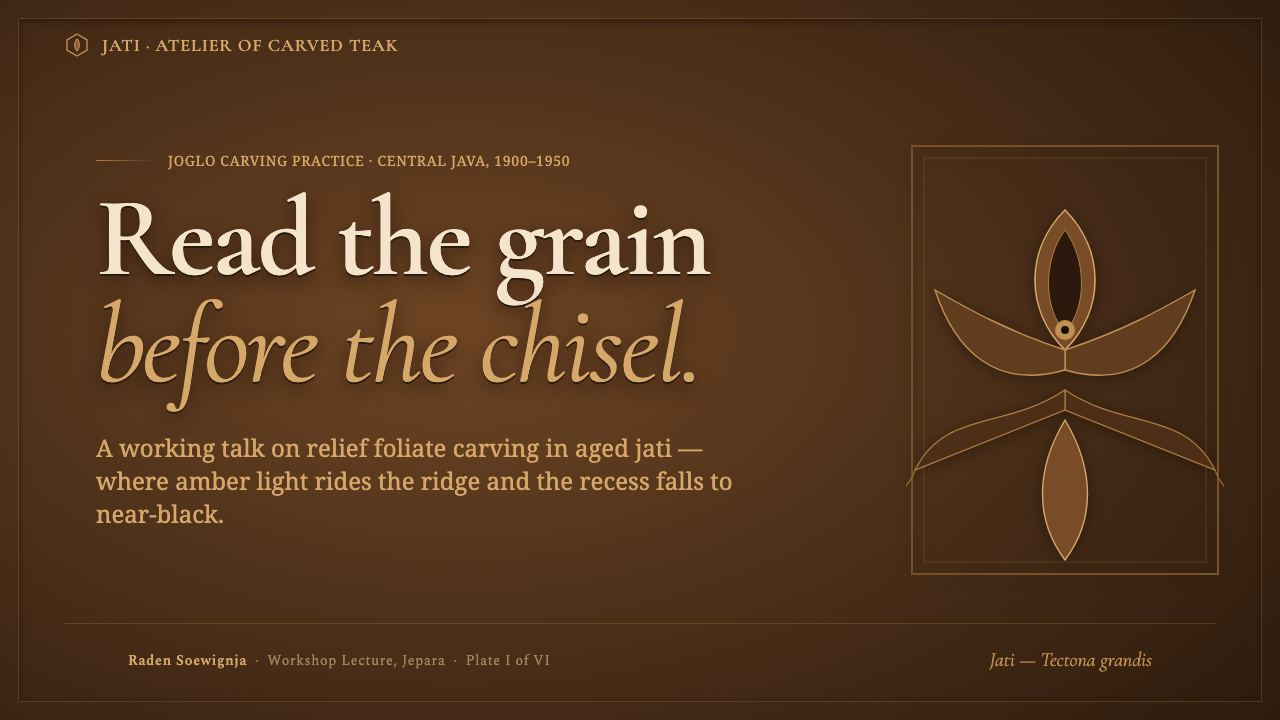
For presentation slides, treat the cover as a carved title plaque. Let a teak-brown field carry the title in a bright, restrained hierarchy, then place foliate relief along a margin or corner where amber edge light can define it. Avoid filling the cover with many decorative fragments; one deeply carved frame or crest-like contour is more persuasive than a border on every side.
Content slides need a clearer working surface within the dark material world. Use recessed panels for supporting explanation and a raised, amber-touched panel for the central assertion. For data slides, translate charts into a relief hierarchy: the main series rises toward the light, secondary values sit deeper in the wood, and labels remain calm and legible. The purpose is not to make data look antique, but to make importance physically apparent.
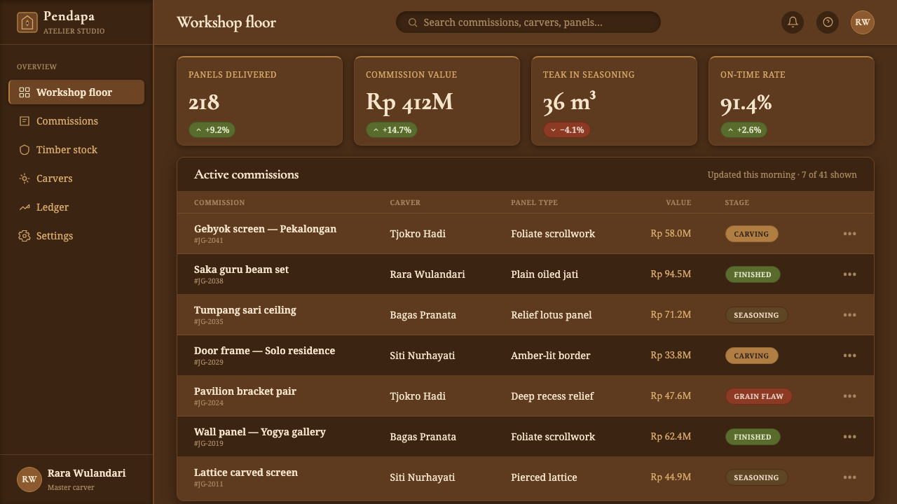
In web interfaces, the style suits dashboards, account areas, and pricing pages where durable hierarchy can feel more valuable than frictionless neutrality. Navigation can sit in a shallow carved band, while active destinations take a restrained amber edge. Pricing tiers work best as related panels cut from the same timber: one option may be raised and lit, while the others recede without becoming visually disposable.
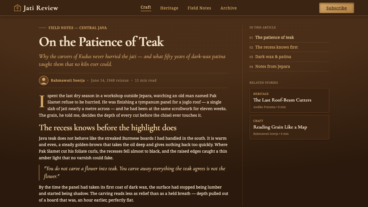
For editorial and marketing work, use the style to create a sense of invitation and permanence. An article can begin with a dark carved masthead, then move through inset passages, foliate section markers, and tactile callouts. Marketing pages benefit when the material story supports the offer: imagery and copy should appear housed by the teak rather than pasted over it, allowing the surface to imply care, continuity, and craft.
The common mistake is confusing carved richness with uncontrolled decoration. Covering every region with bright gold outlines, heavy grain, and visible floral motifs turns relief into wallpaper. A more faithful application lets darkness do substantial work, reserves edge light for selected rises, and leaves areas of unbroken teak where the eye can rest. The carving should guide attention, not become the entire message.
Javanese Teak Joglo — FAQ
Is Javanese Teak Joglo simply a dark wood texture style?
No. Wood is the material premise, but carved relief is the organizing principle. A dark wood surface without recessed channels, raised contours, and selective amber light will read as rustic decoration rather than as a Joglo-derived system. The essential relationship is between timber mass, carved absence, and illuminated relief.
Can the style use pale backgrounds?
A broad pale ground works against the source material. The system is built from the image of aged, oiled teak, with near-black recesses generating depth and amber-gold catching raised edges. Small light areas may be useful for contrast inside a component, but the page should remain rooted in warm dark wood rather than shift toward white or cream.
How should foliate ornament be used without overwhelming content?
Place it where a real relief panel could plausibly enrich an architectural surface: at a title edge, in a protected corner, around a transition, or behind a secondary ceremonial moment. Keep much of the motif in shadow and reveal only the raised path. When ornament has a clear boundary and a clear supporting role, it adds atmosphere without interrupting reading.
Does the style work for dense dashboards and analytical content?
Yes, provided relief is used to clarify rather than dramatize every container. Dense interfaces benefit from a stable teak ground, dark recesses that group supporting information, and a limited set of raised panels for priority actions or key findings. The amber highlight should function as an attention signal, not as an ambient effect spread throughout the interface.
Related design styles
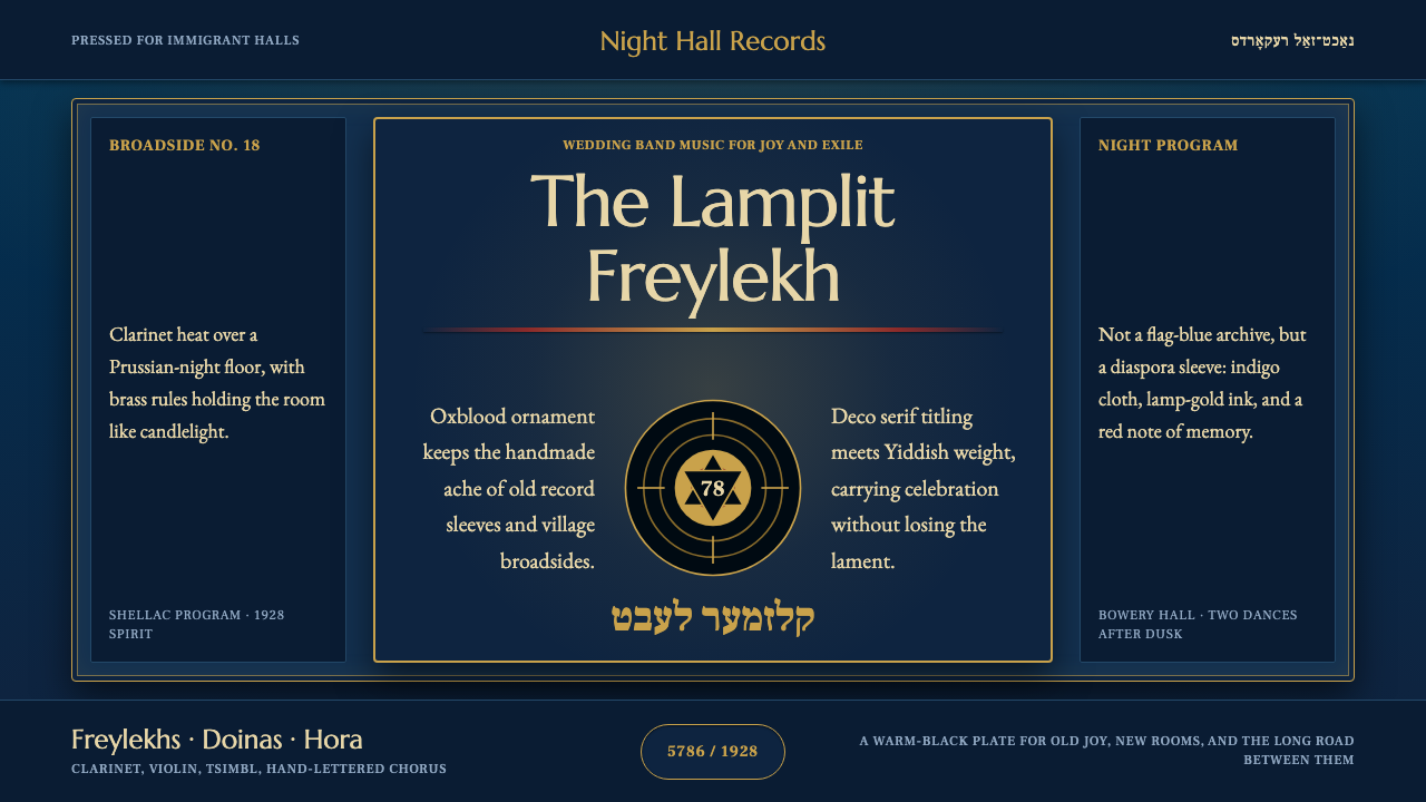 Klezmer RevivalLamplit diaspora memory. Prussian night, brass rules, oxblood ornament, Yiddi…
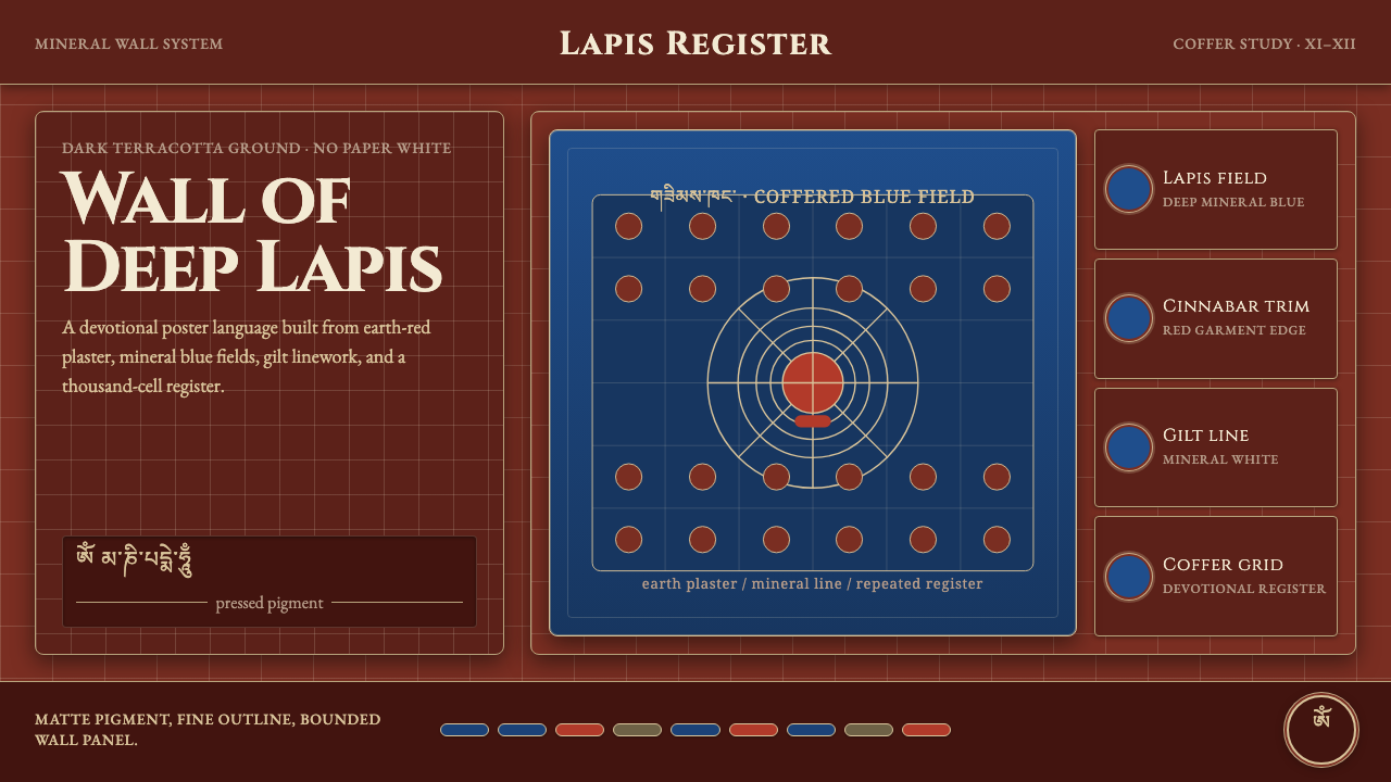 Alchi Monastery MuralDevotional depth. Lapis fields and coffered grids glow on terracotta plaster.
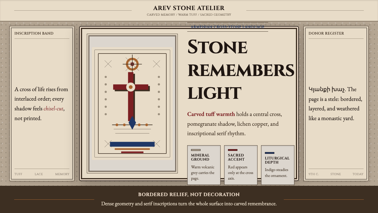 Armenian Khachkar Cross-StoneStone becomes memory. Tuff grey, pomegranate red, and carved borders hold the…
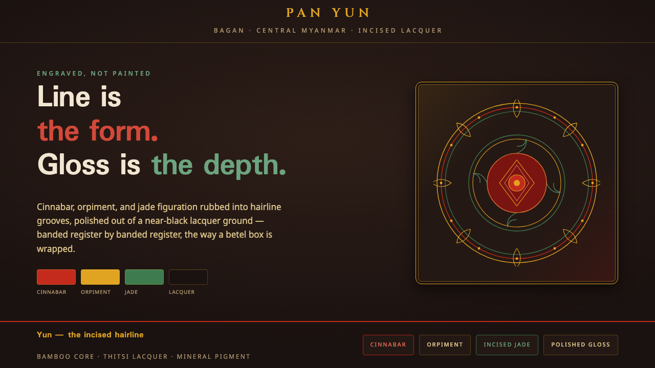 Bagan Yun LacquerwareEngraved, not painted. Cinnabar, orpiment and jade hairlines polished from ne…
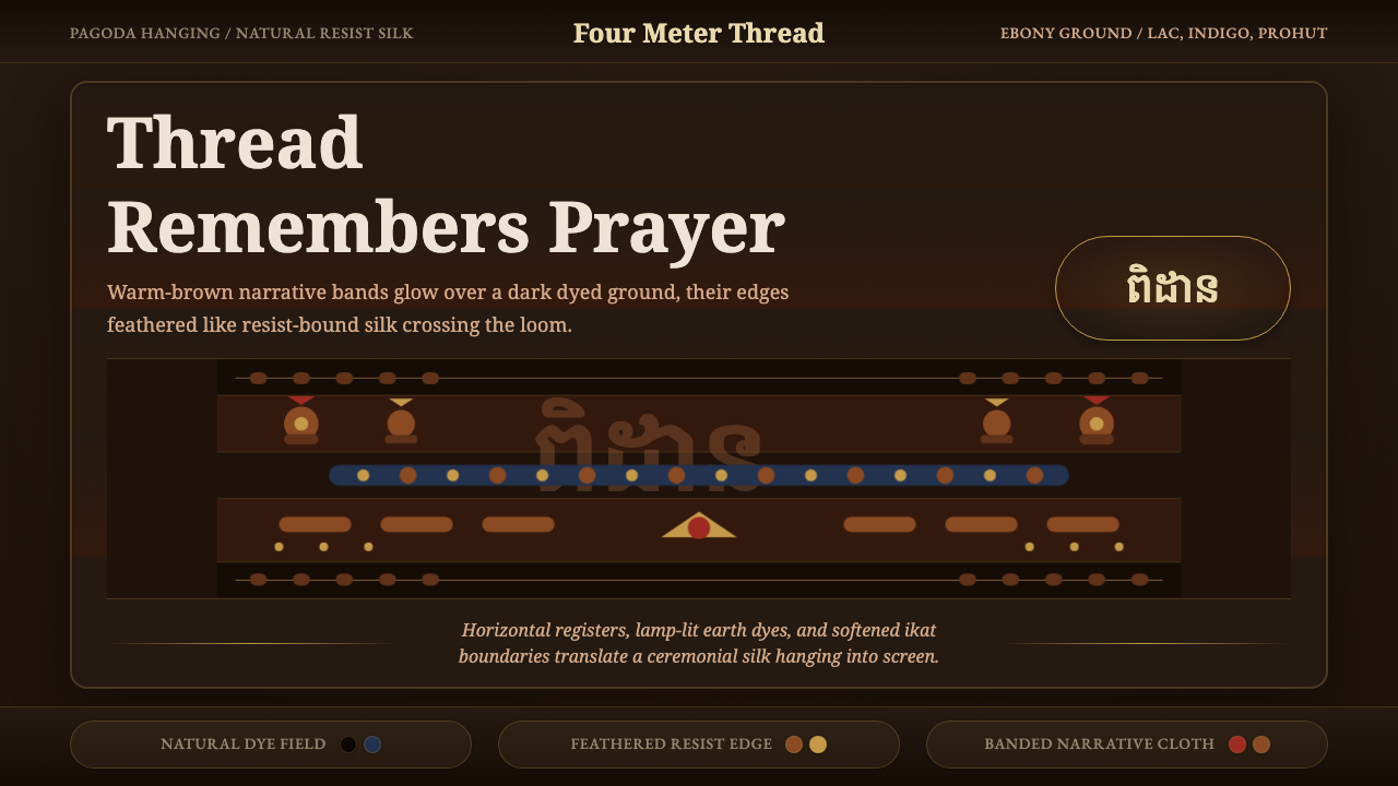 Cambodian Pidan IkatSacred cloth glows. Ebony-indigo bands carry warm-brown ikat figures with fea…
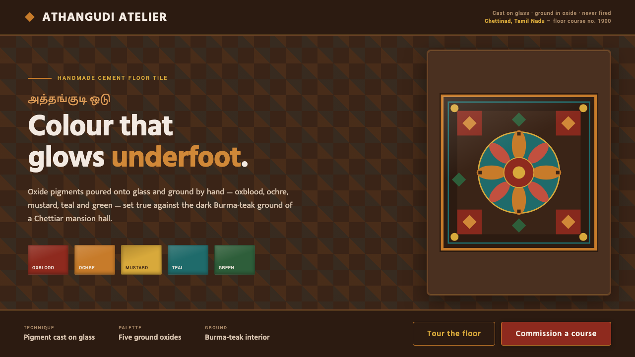 Chettinad Athangudi TilesColour that glows underfoot. Five ground-oxide tones on dark teak in bordered…