What is Bugis Pinisi?
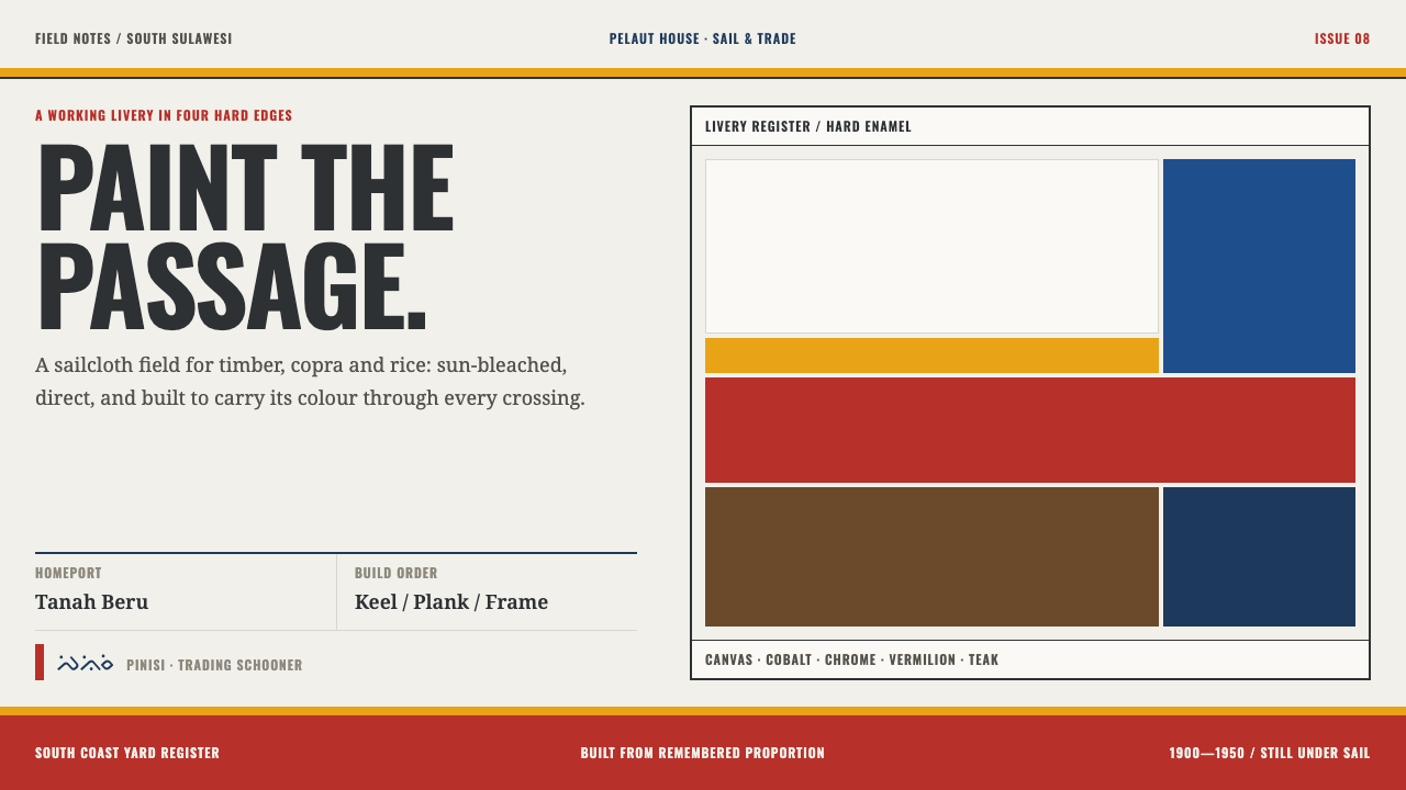
The pinisi style takes its whole look from a working Sulawesi schooner: warm sailcloth white, cut by vermilion, chrome-yellow and cobalt bands that follow a single hull curve and stop at hard edges.
Bugis Pinisi in brief
Bugis Pinisi is a light, warm-white design system modelled on the pinisi, the two-masted trading schooner of South Sulawesi in Indonesia. Its ground is the colour of sun-bleached cotton sailcloth, a faintly warm white rather than a clinical one. On that ground it lays hard painted bands of vermilion, chrome yellow and cobalt blue, with a strip of bare oiled plank below them. The effect is of a hull seen side-on in strong sun: a pale field, bold livery and firm edges.
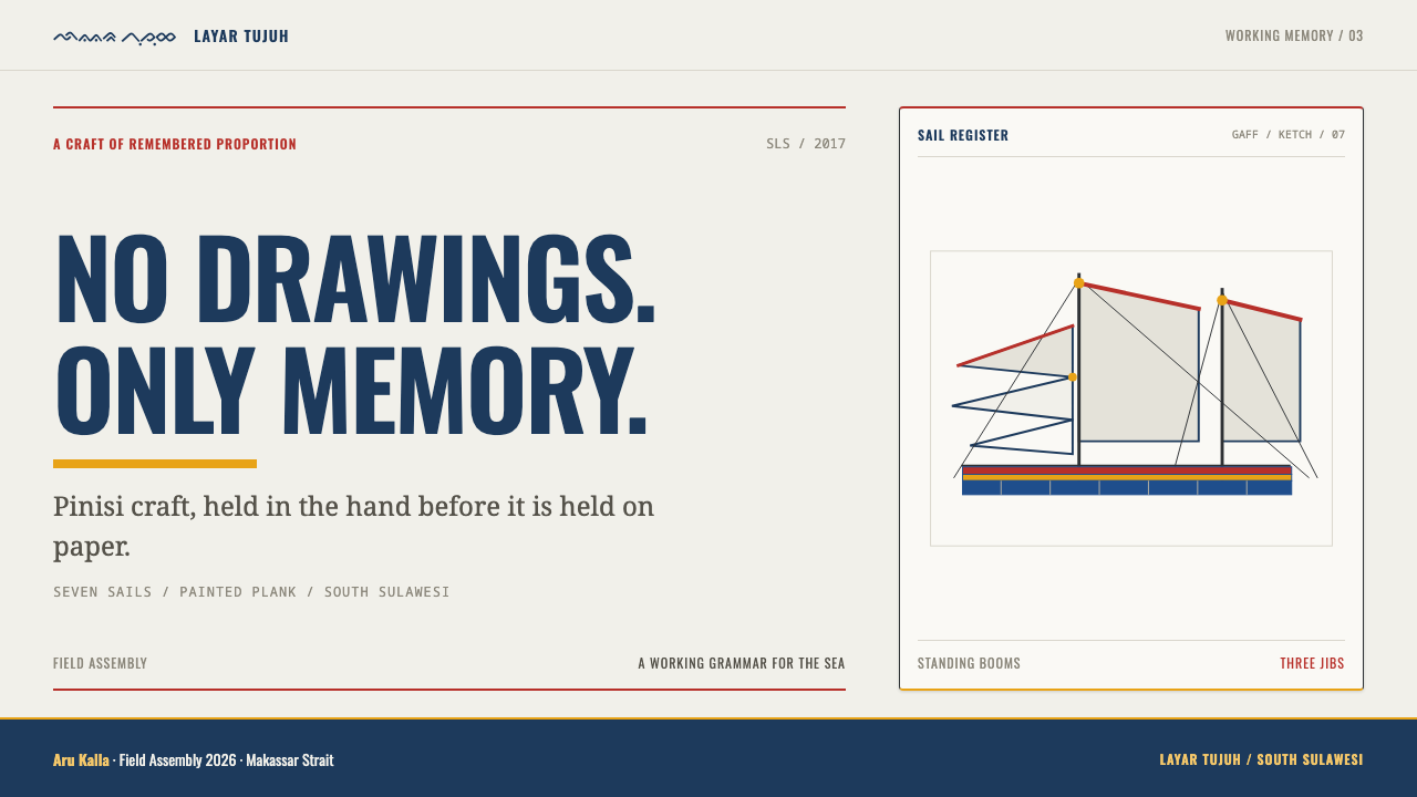
The vessel behind the style is specific. A pinisi carries seven or eight sails on a gaff-ketch rig, which means two masts with fore-and-aft sails hung from angled spars, and booms that stay permanently standing on the masts. Three jibs are set off a triangular bowsprit at the front. The same white that fills those sails also covers the topsides of a working hull, so sail and hull share one ground. The design system keeps that coincidence: the page is the canvas, and the bands are the paint.
It is also a style defined by what it leaves out. Nothing is airbrushed and nothing is rounded: no gradients, no soft vignettes, no artificial weathering noise, and none of the nautical clip-art, such as anchors, ship's wheels and knotted-rope borders, that usually decorates anything sea-themed. The only things allowed on the surface are the three things a boat is actually made of and fitted with, plank, paint and rope, each shown as what it is.
Where does Bugis Pinisi come from?
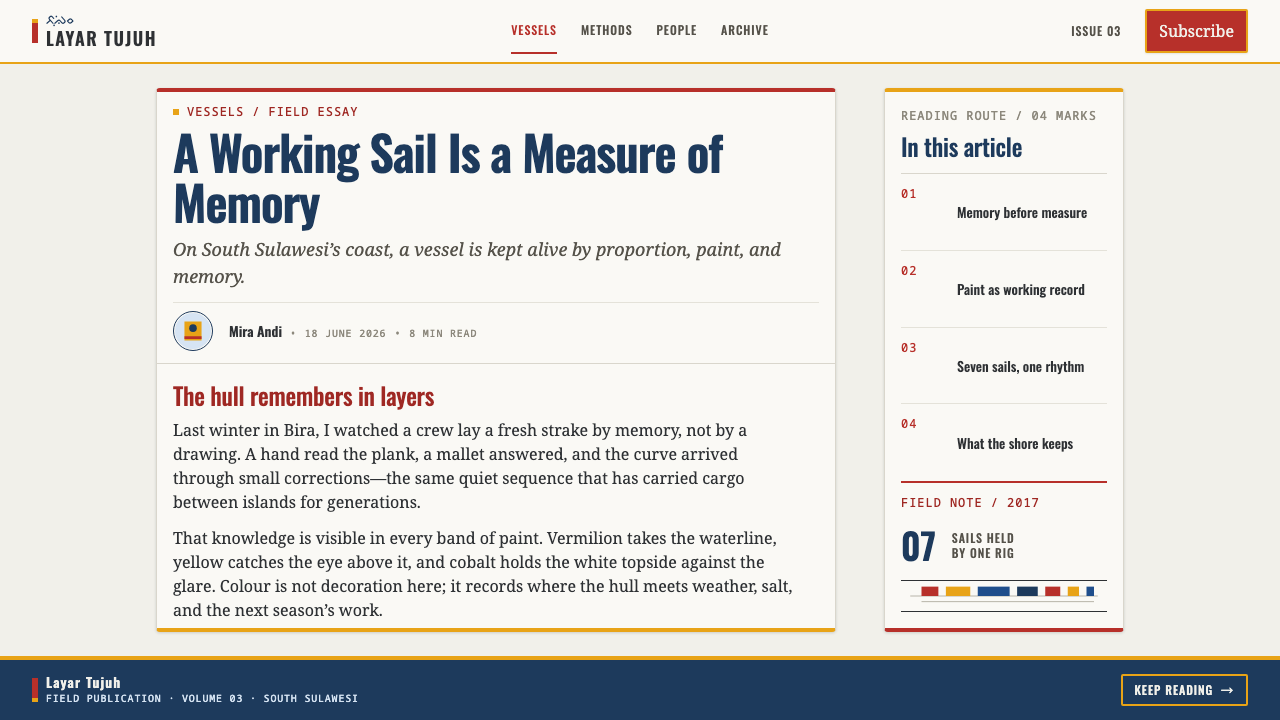
The pinisi belongs to South Sulawesi, the southern region of the island of Sulawesi in Indonesia. The shipbuilding places that matter most to its story are Bira, Tanah Beru and Ara in the Bulukumba area, and the vessels themselves are known in harbours across the archipelago, among them Sunda Kelapa, the old port of Jakarta. The era this design system looks back to is the working sailing fleet of roughly 1900 to 1950, when pinisi were everyday cargo carriers. The craft did not end there: hulls are still built at Tanah Beru today.
Three overlapping traditions sit behind the boat. Bugis and Makassar maritime trade supplied the purpose, which was carrying goods over long distances between islands, exactly what a two-masted trading schooner exists to do. Konjo shipwrighting, the boatbuilding tradition of the Bulukumba coast, supplied the hulls. Beneath both lies the much older Austronesian plank-built boat tradition, in which a vessel is made by joining shaped planks together instead of hollowing a single log.
The person who holds that craft together is the panrita lopi, the head shipwright. A panrita lopi works from remembered proportions and never from drawn plans: the boat exists first as a set of relationships in the builder's memory and only afterwards as timber. This matters for the design system because it explains its temperament. Proportion carries the composition, and decoration is never needed to rescue it.
The livery is the visible layer of that logic. Against the white topsides the hull carries hard painted bands: a vermilion boot-topping, a chrome-yellow strake, cobalt topsides, and bare oiled plank beneath. A strake is one continuous run of planking along the hull, and boot-topping is the painted band near the waterline. Every one of these bands follows the same sheer, the long upward sweep of the hull's top edge from the middle towards the ends, and stops at a hard edge. In 2017 UNESCO recognised this body of knowledge, listing the art of pinisi boatbuilding in South Sulawesi as intangible cultural heritage. That recognition belongs to the craft and the people who hold it; the design system is a respectful translation of the look, not a claim on the tradition.
What defines the Bugis Pinisi look?
Sailcloth Ground
Everything sits on a faintly warm white taken from sun-bleached cotton canvas, the same field as the white-painted topsides of a working hull. It is deliberately neither a cold screen white nor a cream: it is the white of cloth that has lived outdoors. Text and structure sit on it in dark, plain tones, and the warmth of the ground is what stops the strong colours from feeling clinical.
Painted Livery Bands
Three saturated paints do the visual work: vermilion for the boot-topping, chrome yellow for the strake and cobalt blue for the topsides. They are flat, opaque and used as bands rather than washes. Each has a job and a place, so they read as a livery, a coded set of stripes, more than as an accent palette, and they are never blended into one another.
One Sheer Curve
Every band follows the same sheer curve. This is the style's organising idea: instead of many unrelated lines, a single sweeping line governs how the parallel bands bend and where they end. In composition it means choosing one gesture, a long shallow arc or a clean horizontal run, and letting every coloured element obey it, so that the page has one rhythm instead of several competing ones.
Hard Edges, Nothing Airbrushed
Bands stop at a hard edge. There is no feathering, no gradient between colours, no glow, no soft ambient shadow, and nothing is rounded. Paint on a hull is cut in along a line, and the visual language carries that finality: a boundary is a decision, and the two colours either side of it never negotiate. This is the property that most separates the style from a generic seaside palette.
Bare Oiled Plank
Below the painted livery the hull shows plain oiled timber, a warm mid-brown that is not painted at all. In the design system this is the single earthy neutral, a quiet band that grounds the bright paints above it. It reads as material rather than colour, matte, dense and honest, and its presence stops the palette from becoming a row of poster colours.
Rig Geometry
The rig contributes shape. Sails are triangles and trapezoids hung from long straight spars, and three jibs fan out from a triangular bowsprit. Overlapping sails produce a lively sequence of angular shapes, all drawn with straight edges, while rope appears as thin straight or gently sagging lines. Where illustration is needed, this geometry of cloth and line is the vocabulary, rather than a literal picture of a ship.
Plank, Paint, Rope
The style is explicitly free of nautical cliché. There are no anchors, no ship's wheels, no compass roses, no faux-aged rope borders and no wear-and-tear noise. The three things that remain are plank, paint and rope, each shown as it looks in use. This restraint is what keeps a themed style from turning into a theme-park version of its subject.

Who shaped Bugis Pinisi?
The panrita lopi is the head shipwright, the figure at the centre of pinisi building. He works from remembered proportions and never draws plans, which means the whole craft is carried as knowledge in people rather than in documents. For a designer the panrita lopi is a useful model: proportion, held consistent by discipline, does most of the work that ornament does elsewhere.
Konjo shipwrighting is the hull-making tradition behind the vessel, centred on Bira, Tanah Beru and Ara in the Bulukumba area. Tanah Beru still builds pinisi today, which means the style points to a living workshop practice, not a vanished one. The planks, the oil on them and the paint over them all belong to this tradition.
Bugis and Makassar maritime trade gave the pinisi its job. These seafaring trading communities moved goods between islands, and the schooner's seven or eight sails and standing booms were arranged around that working life. The period the system looks to, the working sailing fleet of about 1900 to 1950, belongs to this trade under sail.
In 2017 UNESCO listed the art of pinisi boatbuilding in South Sulawesi as intangible cultural heritage. The inscription is the reason the craft is internationally visible today, and it frames the right attitude for a designer: credit the tradition by name, and borrow its look with care.
How do you use Bugis Pinisi today?
Bugis Pinisi is a light, high-legibility system that rewards confidence. Its strength is that a handful of flat colours on a warm white ground can organise a whole layout without gradients, shadows or illustration. Applying it well means treating the colours as livery, each with an assigned job and used in bands, rather than sprinkling them around as accents.
On presentation slides the cover is the best place to show the hull logic. Put the title on the warm white field and let one long band of vermilion, chrome yellow or cobalt run across the slide, following a single gentle curve or a clean horizontal and ending at a hard edge. Content slides should stay mostly white, with the title in a plain, sturdy sans-serif, the sort of letterforms that could be painted on a hull, and a single band acting as a section marker. Data slides suit the style well: bar and segment colours can be assigned from the livery as flat fills with crisp ends, and the bare plank brown can serve as the neutral series or baseline.
For web interfaces the style fits marketing sites, pricing pages and product dashboards that want to feel practical and confident rather than sleek. Keep the page background the sailcloth white, use dark plain text, and give each colour one job: cobalt for primary actions and links, vermilion for alerts and emphasis, chrome yellow for highlights and status. Cards and inputs should have square corners, flat fills and firm borders, and navigation should be set in plain type with a single coloured band marking the active section. Skip drop shadows, glassy blurs and rounded pills; the hull has none of them.
In editorial and marketing work, the style gives you a strong structural device: the coloured band. A long article can open with a full-width band at the top, divide sections with thin flat rules in livery colours, and finish with a closing band, so that the page reads like a painted hull seen from the side. For campaign pages, posters and social cards, pair a large field of warm white with a single decisive band and a short headline. Travel, trade, craft and logistics subjects suit the style naturally, with photography cropped to straight edges and placed beside the bands rather than under them.
The most common mistake is making it nautical. Anchors, ship's wheels, rope-frame borders, wave patterns and weathered-wood textures all contradict a system whose point is flat paint and honest material. The second mistake is softening it: adding rounded corners, gradient fills or a drop shadow to a band undoes the one thing the system promises, which is a hard edge. A third is using all three paints at full strength in every component. As on a real hull, each band should have its own place, and no more than one or two colours should dominate any single view.
Bugis Pinisi — FAQ
What exactly is a pinisi?
A pinisi is a two-masted trading schooner from South Sulawesi, Indonesia, rigged as a gaff ketch with seven or eight sails and three jibs set off a triangular bowsprit. Its booms stay permanently standing on the masts. These were everyday working craft, the cargo fleet of Bugis and Makassar traders, and they are still built today at Tanah Beru. UNESCO recognised the boatbuilding art in 2017.
Why is the background a warm white rather than pure white?
Because it is taken from the sailcloth: sun-bleached cotton canvas, a faintly warm white that is also the colour of the white-painted topsides of a working hull. A cold, pure white would remove the cloth reference and make the strong paints feel harsher. The warmth is slight, so text contrast stays crisp, but it is the reason the colours feel painted rather than printed on a screen.
Can I use all three colours in the same layout?
Yes, because the livery itself uses all three, but they must be arranged as bands with distinct jobs and hard edges between them, not scattered like confetti. A good rule is to let one colour dominate a view and use the others for smaller bands or specific states. Avoid blending them or setting them in competition at equal weight; a hull reads clearly because its stripes are sequential and orderly.
Does it work as a dark theme?
The system is built on the light, sail-white ground, and that ground is its anchor: the bands only read as livery against a field of canvas. A dark inversion would lose the sailcloth reference and make the vermilion and cobalt behave very differently. If you must work in a dark context, keep a large light area on the page and let the bands run across that, rather than flipping the whole ground.
Is it appropriate for a project unrelated to ships?
Yes. The style is not about boats as subject matter; it borrows a way of organising colour from a working vessel: a pale ground, flat bands, one governing curve and honest materials. It suits any product that wants to feel practical, durable and confident. What it asks is that you resist nautical decoration and, where relevant, credit the Bugis, Makassar and Konjo tradition it comes from.
Related design styles
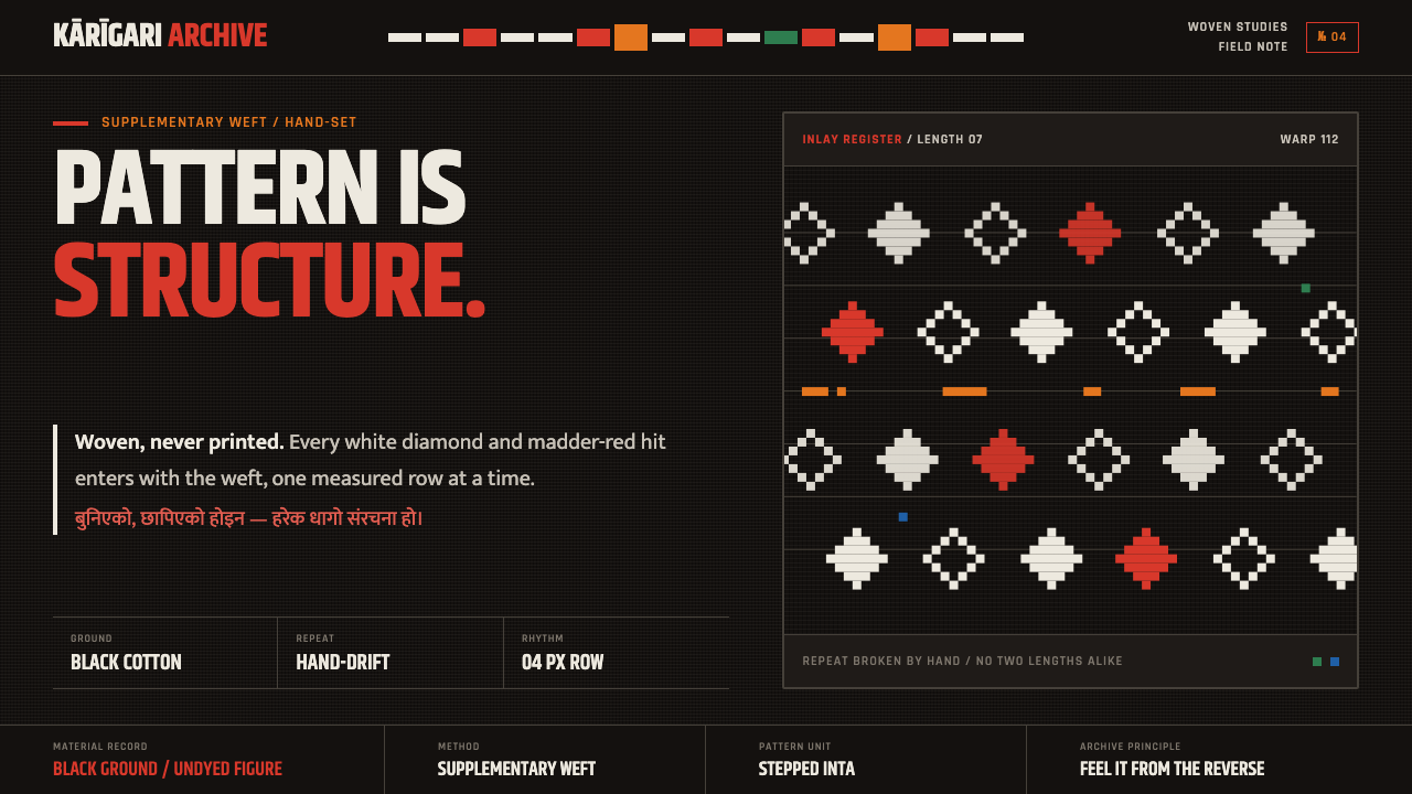 Nepali Dhaka TopiPattern becomes structure. White diamonds and madder-red hits advance row by…
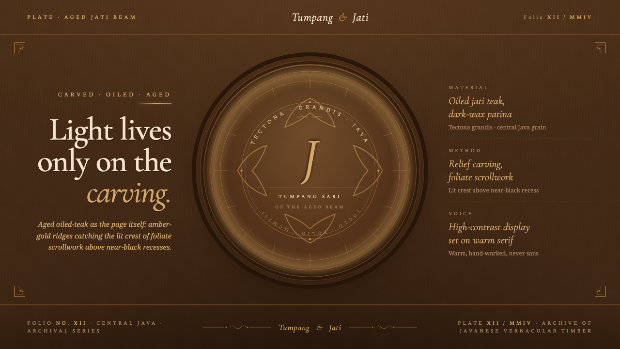 Javanese Teak JogloCarved warmth rules the page. Oiled teak-brown ground, near-black recesses, a…
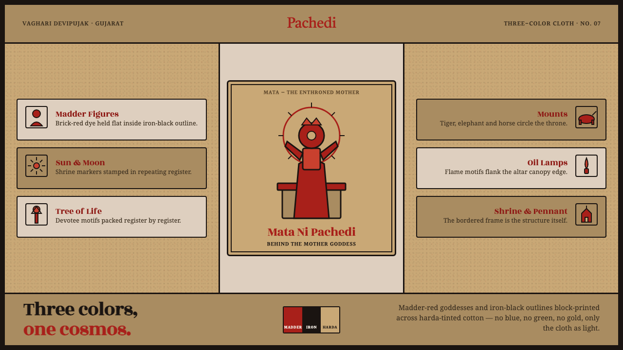 Mata Ni Pachedi Temple ClothThree colors, one cosmos. Madder-red goddesses, iron-black outlines, harda-ti…
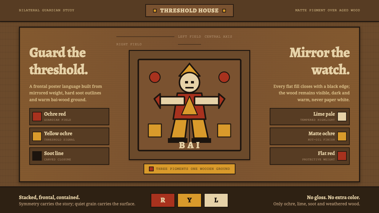 Palauan Dilukai Gable FigureGuardian symmetry on old wood. Ochre red, yellow and soot black lock each fla…
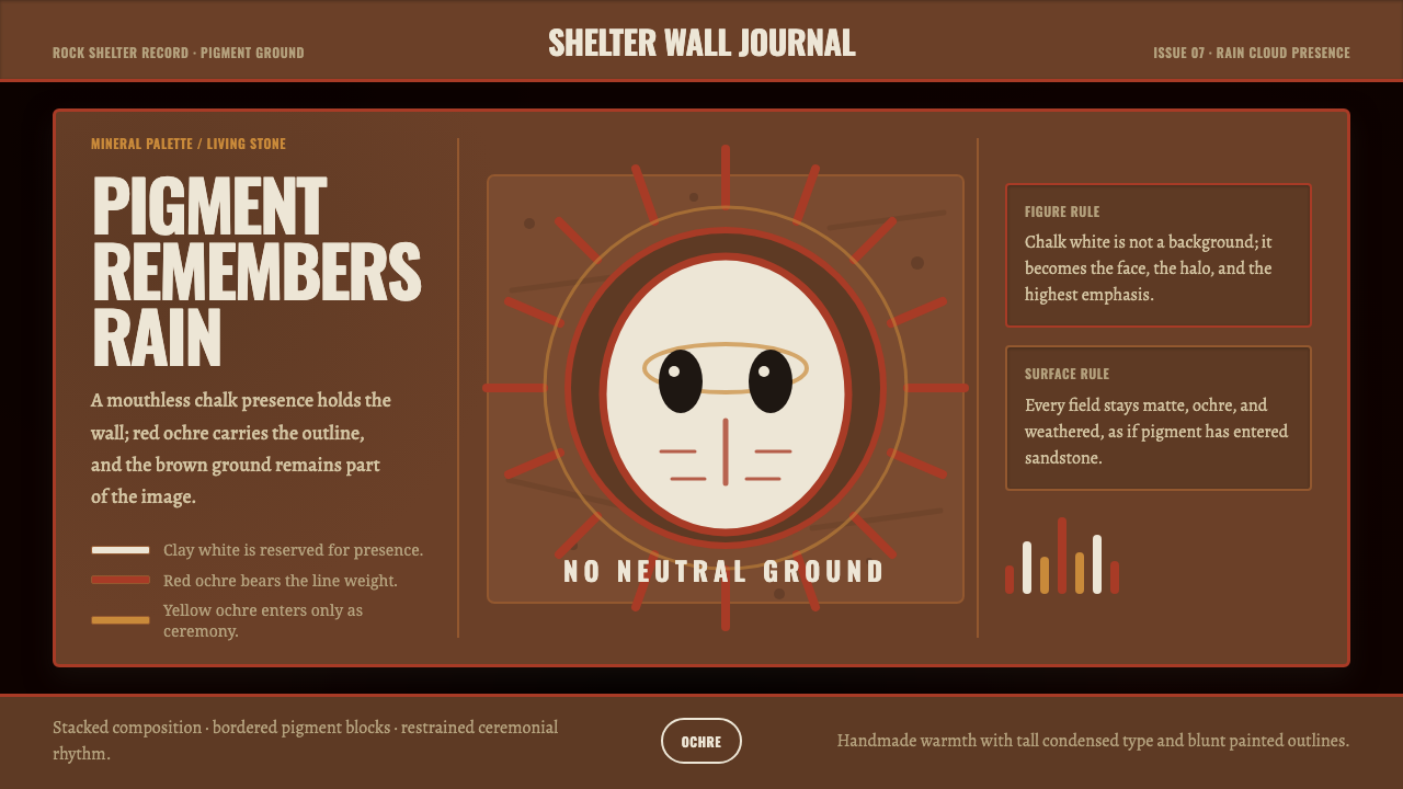 Aboriginal Wandjina KimberleyAncestral presence in stone. Chalk white haloes and red ochre outlines sit on…
 Cotton Boll HarvestHarvest contrast made matte. Off-white lint bursts from husk brown with field…