What is Palauan Dilukai Gable Figure?
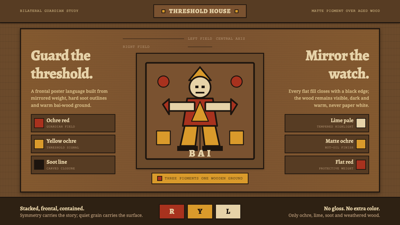
The Palauan dilukai gable figure turns a carved wooden threshold into a field of guardian symmetry, where ochre, soot black, and pale wood hold every outward-facing form in place.
Palauan Dilukai Gable Figure in brief
The dilukai is a carved and painted female guardian figure installed at the apex of the gable on a Palauan bai, the traditional chiefs’ meeting house of Micronesia. Spread across a plank of carved wood, her body is arranged in a decisive bilateral composition: the face confronts the exterior while the limbs extend outward to either side. The image is not a detached illustration. It belongs to the architecture of the bai and marks its threshold with a visible, protective presence.
Its visual language is unusually disciplined. Pale carved wood carries flat areas of lime white, soot black, and red-and-yellow ochre. The pigments are bound with parinarium-nut oil, producing a subdued matte surface rather than a glossy painted skin. Black outlines contain the colored fills and make the carved composition legible at a distance, while the wood remains an active part of the image rather than a neutral backing.
As a contemporary design system, the tradition translates into a dark, weathered carved-wood ground, a tightly limited ochre-and-soot palette, visible grain, and strict left-right symmetry. Its force comes from containment: color remains flat, outlines remain clear, and every shape feels attached to a larger wooden structure. The result is warm and earthen, but never soft or decorative in a casual sense.
Where does Palauan Dilukai Gable Figure come from?
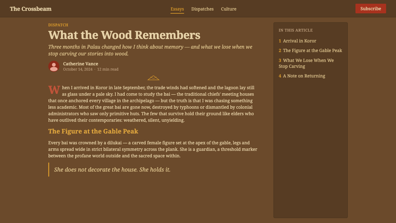
The visual source is traditional Palauan bai carving and painting, a pre-1900 tradition rooted in Palau in western Oceania. The bai is identified in the source material as a traditional chiefs’ meeting house, and the dilukai belongs specifically to its facade and gable architecture. That placement matters: the figure is encountered as part of a building and its threshold, not as an image removed from its original spatial role.
The dilukai’s guardian function is expressed through orientation and symmetry. Her outward stare faces those approaching the house, while the wide extension of the limbs spreads the composition across the gable plank. The bilateral structure gives the image a fixed center and a stable perimeter. Rather than relying on illusion, depth, or naturalistic movement, it makes protection visible through frontal presence, containment, and balance.
Its surface language is inseparable from its materials. Pale carved wood provides the field; lime white, soot black, and red-and-yellow ochre provide the painted vocabulary; parinarium-nut oil binds the pigments into a soft matte finish. The palette is therefore not an arbitrary collection of attractive colors. It is a material system in which mineral-like color, dark outline, and carved timber remain visibly related.
The tradition is associated with the master bai carvers of Palau and with bai facade and gable-figure painters. In a digital adaptation, that lineage should remain legible in the hierarchy of decisions: wood is the ground, black defines the drawing, ochres create emphasis, and symmetry governs the whole. A design can borrow these formal lessons only by retaining their architectural coherence rather than turning the figure into an interchangeable motif.
What defines the Palauan Dilukai Gable Figure look?
Weathered Wood Ground
The ground is always dark, warm carved wood, standing in for the aged plank of a bai. It should feel structural and materially present, with restrained grain visible beneath or between painted forms. Cream, paper-white, and generic blank canvas treatments break the system because they remove the image from the wood that gives it its architectural weight.
Bilateral Guardian Symmetry
Bilateral symmetry is the primary organizing principle. A central face or vertical axis holds the composition while limbs, marks, and color fields answer one another across it. This is not decorative mirroring for its own sake: it produces the frontal, threshold-bound stability associated with the outward-facing guardian figure.
Ochre, Lime, and Soot
The palette remains bound to lime white, soot black, and the red-and-yellow family of ochres. These colors should appear dense, earthen, and matte, not luminous, metallic, or digitally radiant. The limitation is essential: color acts as a set of clear carved-and-painted signals, while the wood and black outline keep the whole image grounded.
Flat Pigment Fields
Painted areas read as flat fills laid over carved wood. They do not model volume through gradual lighting or attempt to make the figure appear like a rendered body. The visual drama comes from adjacency: pale against dark, ochre against wood, and black around every decisive edge.
Black Containment Lines
Soot black functions as the containing line of the system. It separates pigment fields, clarifies silhouette, and prevents the palette from dissolving into a decorative surface. The outlines should feel firm and carved in intention, with a directness that makes every flat form appear deliberately locked into the wood.
Matte Material Presence
The parinarium-nut-oil binding described in the source gives the traditional pigments a soft matte character. A digital interpretation should preserve that restraint through subdued surfaces and visible material depth rather than shine. The aim is not photorealistic imitation of old wood, but a sense that pigment, outline, and grain belong to one durable surface.

Who shaped Palauan Dilukai Gable Figure?
The source identifies Palauan master bai carvers as key figures in the tradition. Their importance is carried by the carved plank itself: the figure’s symmetry, its broad silhouette, and the relationship between wood and painted fill all depend on carving as a structural act rather than a decorative backdrop.
The painters of bai facades and gable figures establish the painted vocabulary of lime white, soot black, and red-and-yellow ochre. Their contribution is not separable from the architecture: pigment clarifies the carved guardian form and gives the facade its visible, threshold-facing graphic order.
The dilukai itself is the central figure of the system: a female guardian spread symmetrically at the gable apex, facing outward from the bai. It gives the style its essential compositional logic, joining an architectural position, a protective role, carved wood, disciplined pigment, and frontal presence.
How do you use Palauan Dilukai Gable Figure today?
For presentation covers, use the dark wood ground as the full field and place one centered, bilateral guardian-inspired composition across it. Keep the title separate from the figure’s central axis so the writing remains legible without competing with the image. Content slides should retain the same anchored field but simplify the symmetry into paired columns, mirrored markers, or a calm central divider rather than reproducing a sacred architectural figure as decoration.
For data and explanatory slides, the strongest adaptation is structural rather than literal. Use matched bars, opposing groups, or paired labels around a stable center, with soot-black outlines and restrained ochre emphasis. Charts should remain easy to read; the style works when symmetry makes comparison clearer, not when texture or ornament overwhelms the information.
For web interfaces, the system suits dashboard and pricing surfaces that benefit from stable hierarchy and strong grouping. A weathered wood ground can frame the page or define major sections, while dark outlines contain cards, controls, and status fields. Reserve the ochre family for meaningful emphasis, such as a selected state, a key plan distinction, or an important alert, and allow the wood ground to keep the visual mood coherent.
For editorial and marketing work, favor broad banner-like compositions, frontal illustration, paired callouts, and a measured relationship between image and text. The style can give a campaign page or editorial feature a memorable material presence when copy, photography, and diagrams are kept subordinate to a clear carved-wood structure. It is particularly effective when the content needs an atmosphere of place, permanence, and threshold.
A common mistake is to treat the dilukai as a generic symmetrical pattern or to scatter its earth colors over a pale modern canvas. That removes the visual system from the bai, the carved plank, and its protective architectural role. Preserve the dark wood ground, flat pigment, black containment, and bilateral order; use abstract structural echoes when a literal guardian image is not appropriate.
Palauan Dilukai Gable Figure — FAQ
Is the Palauan dilukai style simply a dark version of a folk pattern?
No. Its defining logic comes from a specific architectural setting: the gable apex of a Palauan bai. The dark wood ground, carved plank, outward-facing guardian figure, disciplined pigments, and bilateral symmetry form one system. Removing those relationships leaves only a superficial palette and pattern.
Why should the background remain wood rather than white or cream?
The source describes the dilukai as carved and painted on a plank of pale wood, and the digital system specifically translates this into a dark, weathered carved-wood ground. Wood is not empty space behind the motif. It is the material field that connects outline, pigment, carving, and the bai facade.
Can the palette include bright modern colors?
The source-based system is deliberately limited to lime white, soot black, and red-and-yellow ochre. Introducing unrelated bright colors changes the relationship between pigment and wood and weakens the earthy, matte discipline of the composition. Emphasis should come from placement, outline, and symmetry before expansion of the palette.
How can a designer use this influence without turning the guardian figure into decoration?
Begin with the structural lessons: dark wood as ground, flat pigment bounded by black, bilateral balance, and a frontal threshold-like composition. Use paired modules, contained color fields, and visible grain where they support communication. When the literal figure is not necessary or appropriate, abstraction preserves the system more faithfully than casual repetition of the image.
Related design styles
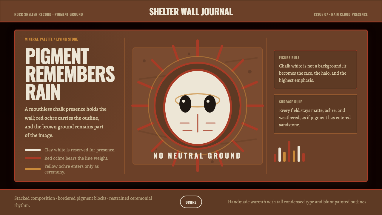 Aboriginal Wandjina KimberleyAncestral presence in stone. Chalk white haloes and red ochre outlines sit on…
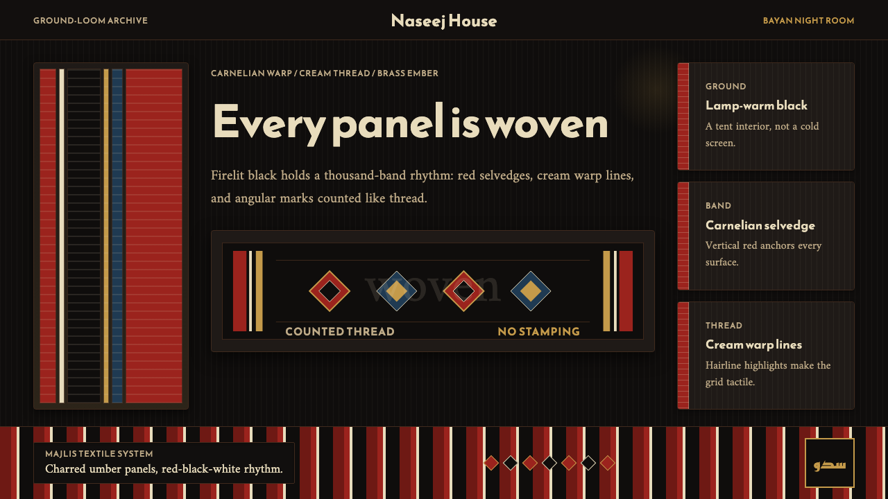 Kuwaiti Sadu Bedouin WeaveFirelit craft, not dark mode. Carnelian bands and cream warp lines make each…
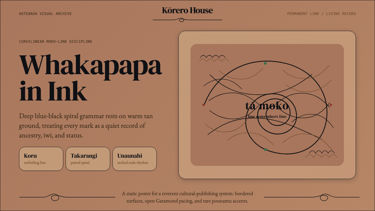 Māori Tā Moko (Facial Tattoo)Ancestry feels carved. Blue-black spirals on tan ground carry a restrained Ga…
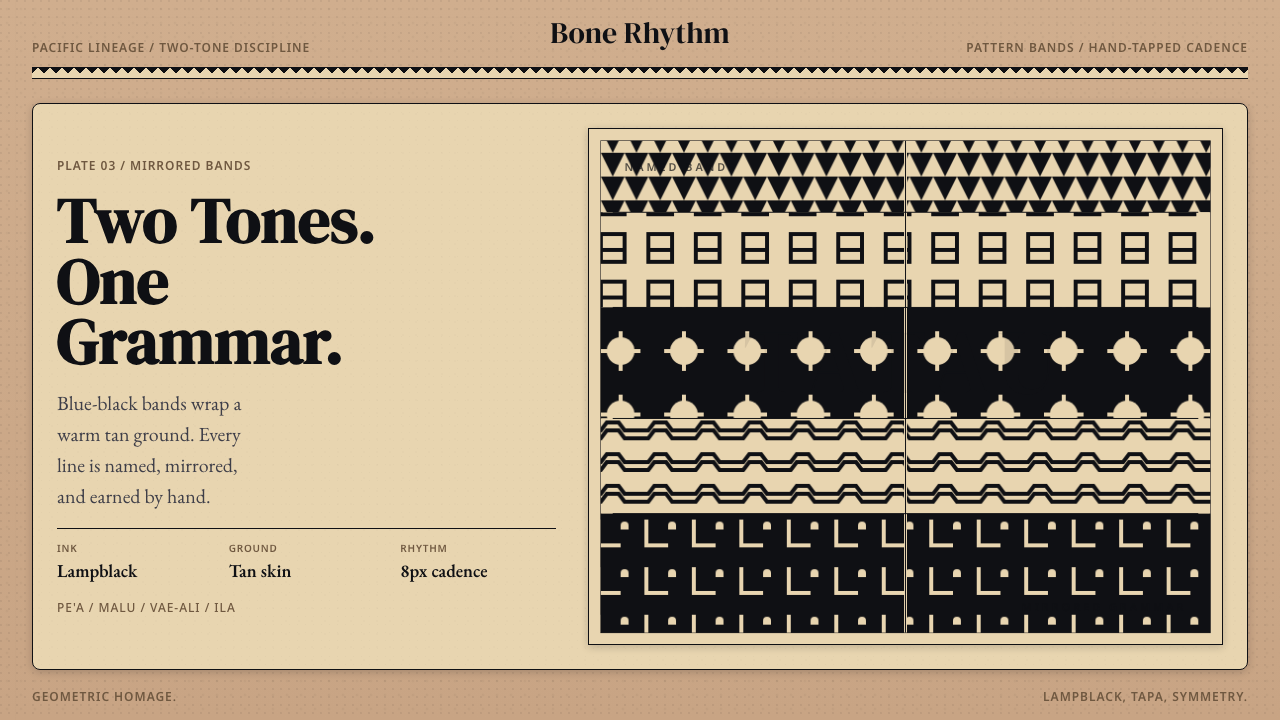 Samoan Tatau (Traditional Tattoo)Strict two-tone discipline. Tan ground, blue-black bands, hand-tapped symmetr…
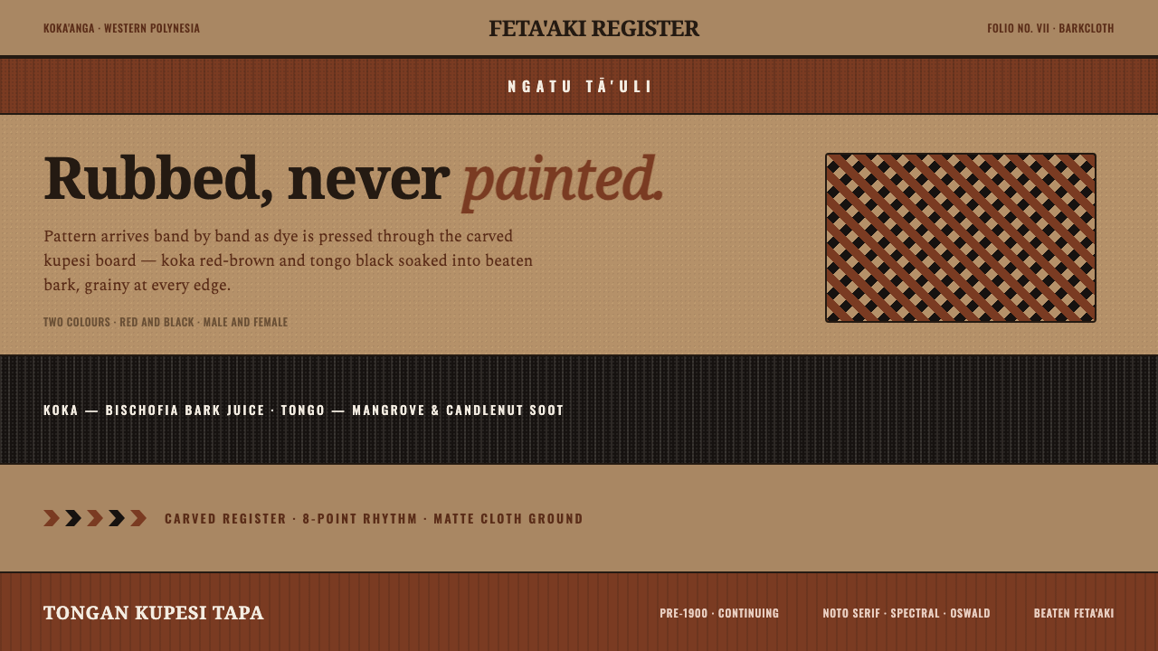 Tongan Kupesi TapaRubbed, never painted. Koka red and tongo black soak into beaten tan bark as…
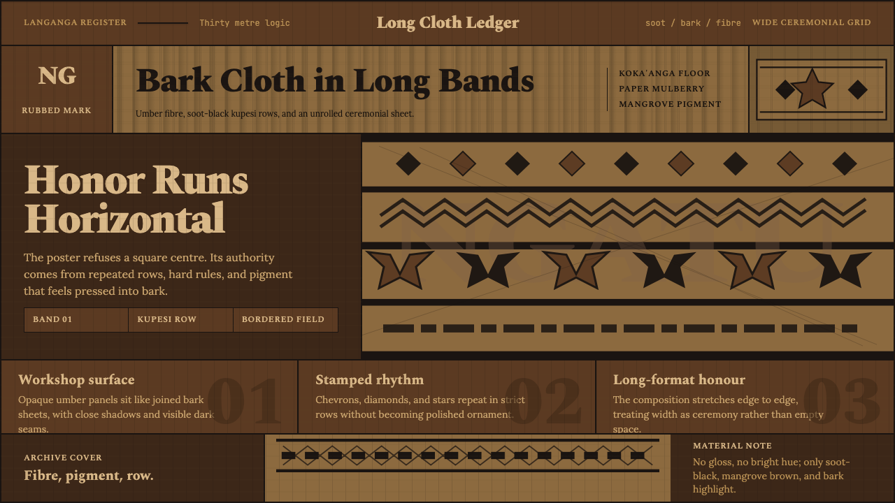 Tongan Ngatu (Tapa)Ceremony runs wide. Soot-black rows stamp umber bark with strict kupesi geome…