What is Cotton Boll Harvest?
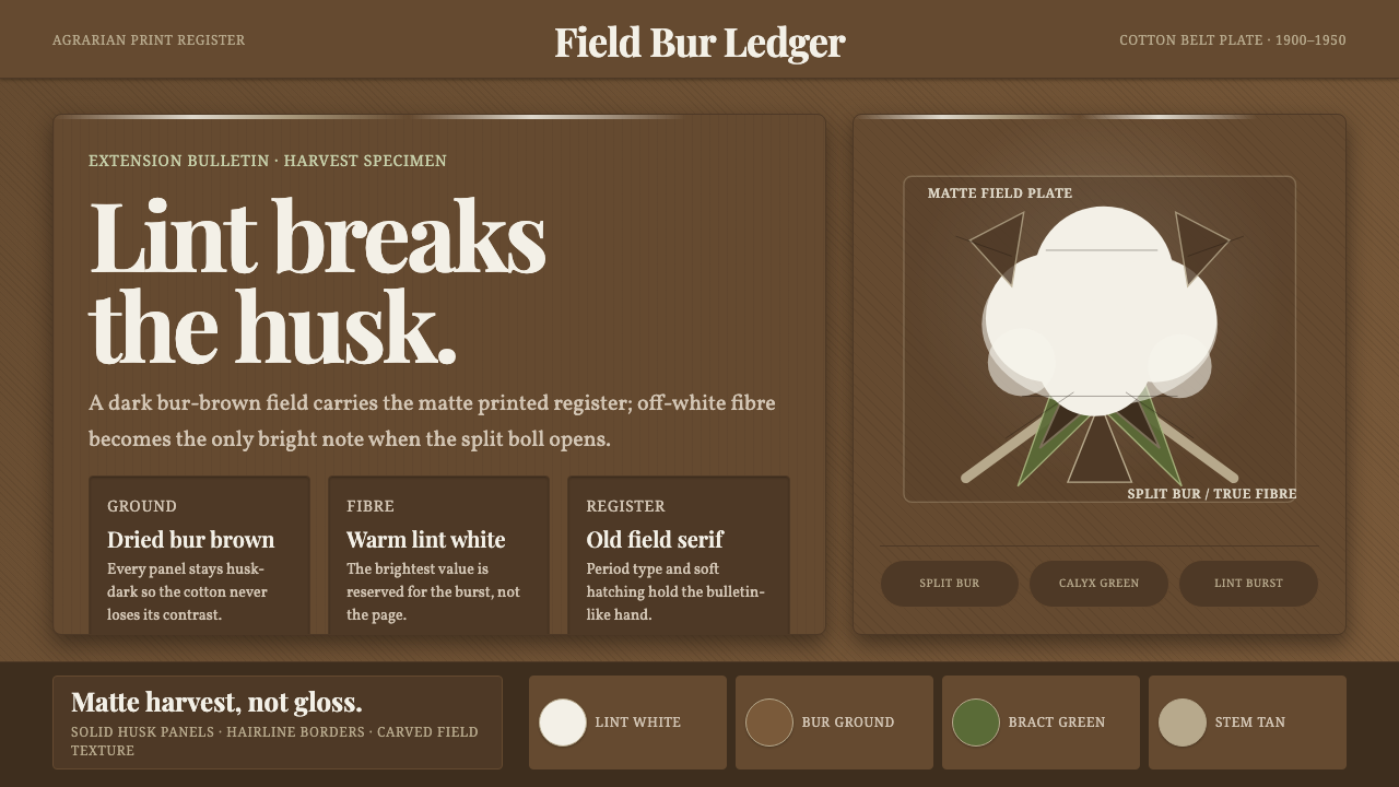
Cotton Boll Harvest turns the instant of release into a visual system: warm white lint breaking through a dark husk-brown field, printed with the quiet authority of an old agricultural bulletin.
Cotton Boll Harvest in brief
Cotton Boll Harvest is an agrarian print language built around the ripened cotton boll at the moment it splits open. The woody husk cracks apart in the field and exposes the true fibre inside. That contrast is the system’s central image: a dark, dried-brown shell carrying a burst of fluffy off-white lint, with the fibre becoming the brightest note in the composition.
The style draws from field-harvest woodcut imagery and agricultural-product illustration associated with the North American cotton belt from 1900 to 1950. Its mood is practical, rural, and tactile without becoming nostalgic decoration. Every surface feels matte and printed, as though transferred from an agricultural extension bulletin rather than illuminated on a screen.
Color remains restrained but not lifeless. Muted calyx and bract greens cradle the fibre, warm tan supports the stem, and husk brown establishes the dark ground. Period serifs give every line a field-manual character. The result is a dark visual language in which brightness is earned through contrast, not produced through shine, glow, or digital polish.

Where does Cotton Boll Harvest come from?
The source image is the cotton field at harvest, not the finished textile. The visual moment begins when the boll has ripened enough for its woody outer structure to split and reveal the fibre. This distinction matters: the style is about exposed agricultural material, field labor, and the physical evidence of a crop reaching maturity.
Its historical frame is the agricultural-print era from 1900 to 1950, centered on the cotton belt of the United States and the wider North American field context. The approved references are agrarian print, woodcut imagery, and agricultural-product illustration. Together they establish a visual culture concerned with identifying, explaining, and presenting what is grown in the field.
The cotton-belt grower is a key figure in this world, represented through the crop itself rather than through portraiture. The grower’s presence is suggested by the cultivated stem, the opened boll, and the practical clarity of the image. The field is not treated as an abstract landscape; it is a working environment whose materials are shown plainly.
Agricultural extension illustrators form the other defining group. Their role gives the style its instructional discipline: forms must remain legible, surfaces must reproduce with a matte printed register, and visual emphasis must help the reader understand the crop. The result is neither decorative rusticism nor a literal historical reconstruction. It is a system shaped by the meeting of harvest evidence, print reproduction, and clear agricultural communication.
What defines the Cotton Boll Harvest look?
Husk-Brown Ground
The ground is a dark, dried brown drawn from the cotton boll’s husk and outer field material. It gives the composition weight and establishes the dark character of the style. This brown should feel matte, fibrous, and weathered rather than glossy or luxurious. It is the visual soil from which the brighter cotton fibre emerges.
Off-White Lint
Off-white lint is the brightest element and the emotional center of the system. It should appear soft, irregular, and visibly released from the hard shell. The brightness is warm rather than sterile, preserving the feeling of natural fibre and printed paper. Used selectively, it creates immediate focus without requiring glow or artificial illumination.
Muted Botanical Greens
Calyx and bract greens act as a quiet cradle around the lint. They should remain muted and field-worn, never becoming a fresh ornamental green. Their function is connective: they link the white fibre to the brown husk and tan stem, making the crop read as one living structure rather than a collection of color patches.
Warm Tan Stem
Warm tan carries the stem and the transitional forms around the boll. It softens the passage between the deepest brown and the brightest lint without turning into a separate decorative accent. The tone should feel dry, sunlit, and agricultural, supporting the composition with a restrained middle register.
Field Serifs
Period serifs give the system its editorial voice. Letterforms should feel sturdy, printed, and suited to an agricultural bulletin, with enough authority to label a crop or explain a harvest detail. Typography is not nostalgic costume; it is part of the communication system, making the page feel documented, observed, and materially grounded.
Matte Print Register
Every element belongs to the same matte printed register. Surfaces should feel absorbent and slightly tactile, with contrast carried by ink-like blocks and clear silhouettes. Shine, glassiness, and luminous effects weaken the reference because they move the image away from agricultural illustration and toward a polished digital surface.
Harvest Contrast
The strongest compositional rule is the contrast between the opened dark boll and the exposed light fibre. The eye should encounter a clear act of release: hard against soft, dry against airy, enclosed against open. Supporting colors remain subordinate so that the harvest event reads immediately and the image never loses its agricultural subject.

Who shaped Cotton Boll Harvest?
Cotton-belt growers represent the human presence behind the harvest. In this visual language, they are understood through the cultivated crop, the opened boll, and the practical field setting rather than through invented portrait detail. Their significance lies in connecting the printed image to the labor and material conditions of cotton production.
Agricultural extension illustrators define the system’s explanatory clarity. Their imagined bulletin-like practice favors recognizable forms, restrained color, matte reproduction, and emphasis that supports understanding. They are responsible for the feeling that every image has been prepared to identify, describe, or teach something about the crop.
The ripened boll is the central subject and the style’s defining form. Its woody shell is not merely a background shape; it is the structure that makes the lint visible. The boll therefore carries both the image and the argument: harvest becomes legible when the hard outer form opens and reveals the fibre within.
The field-harvest bulletin is the cultural object implied by the style. It brings together agricultural observation, printed explanation, and a practical tone. Its presence encourages layouts that feel labeled and purposeful, with typography and imagery working together as evidence rather than as free-floating decoration.
How do you use Cotton Boll Harvest today?
For presentation slides, use the dark husk-brown ground as the consistent field and let the title or principal image emerge in warm off-white. Cover slides should center the opened boll or a strong fibre burst, with field serifs giving the title an authoritative printed voice. Content slides should preserve a clear reading order: one harvest image, one explanation, and muted green or tan details used only when they help identify the plant structure. Data slides should treat charts as agricultural diagrams, using the brightest lint-like tone for the key figure and keeping secondary information in restrained brown, green, or tan.
For web interfaces, the style suits dashboards and pricing pages that need a grounded, editorial sense of trust. A dark matte background can carry navigation and structural panels, while off-white marks primary content and the most important action. Muted greens can distinguish healthy or active states, and warm tan can separate supporting information without competing with the main signal. Cards, tables, and controls should feel printed and solid, with clear edges and restrained contrast rather than glossy surfaces or luminous effects.
For editorial and marketing work, Cotton Boll Harvest supports stories about agriculture, craft, materials, provenance, field research, and products whose value depends on physical origin. Pair a large crop image or lint-shaped silhouette with narrow blocks of explanatory text in field serifs. Marketing compositions can alternate dark husk fields with warm off-white information areas, using the opened boll as a recurring editorial mark. The strongest pages make the reader feel that a material has been observed closely and presented plainly.
For product storytelling, the style is useful when a process needs to be made visible. Show the relationship between shell, bract, stem, and fibre instead of presenting a finished object without context. Labels should read like practical annotations, and supporting copy should explain what the viewer is seeing. The visual language works especially well when the product or subject benefits from a sense of cultivation, harvest, or transformation from a hard outer state into a softer useful material.
The common mistake is to turn rural reference into generic rustic decoration. Burlap-like texture, excessive distressed effects, bright farm colors, and sentimental imagery can quickly obscure the precise contrast that defines the system. Another mistake is allowing the greens or tans to become as bright as the lint. Keep the dark husk, warm white fibre, and matte printed register dominant; every supporting choice should clarify the harvest rather than perform nostalgia.

Cotton Boll Harvest — FAQ
Is Cotton Boll Harvest a general rustic style?
No. Its reference is more specific: the opened cotton boll, North American cotton-belt agriculture, field-harvest woodcut imagery, and agricultural-product illustration from 1900 to 1950. Rustic cues may appear, but they should support the material contrast between husk and lint rather than create a broad countryside mood.
Why is the background dark rather than white?
The dark ground comes from the dried brown husk and outer field material documented in the source. It creates the visual condition for the off-white lint to become the brightest element. The darkness is therefore structural: it makes the act of opening and release immediately legible.
Can the style use brighter greens or additional colors?
The system depends on restraint. Muted calyx and bract greens, warm tan, husk brown, and off-white already describe the crop’s essential structure. Stronger or additional colors risk moving attention away from the lint and weakening the matte agricultural-print register.
Why are period serifs important?
The serifs connect the page to the agricultural extension bulletin implied by the source. They make labels and explanations feel printed, durable, and instructional. Their role is not to create decorative nostalgia but to reinforce the idea that the image is documenting a crop and communicating practical knowledge.
What should be the brightest element in a Cotton Boll Harvest layout?
The off-white cotton lint should normally carry the highest brightness. It is the visual equivalent of the boll opening and the crop revealing its true fibre. Other elements can guide, label, or support that moment, but they should remain subordinate so the harvest contrast stays unmistakable.
Related design styles
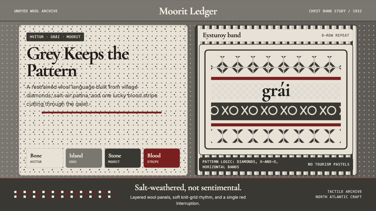 Faroese Knit Pattern Island GreyWeathered wool, not cozy kitsch. Island greys, Cormorant serif, one blood-red…
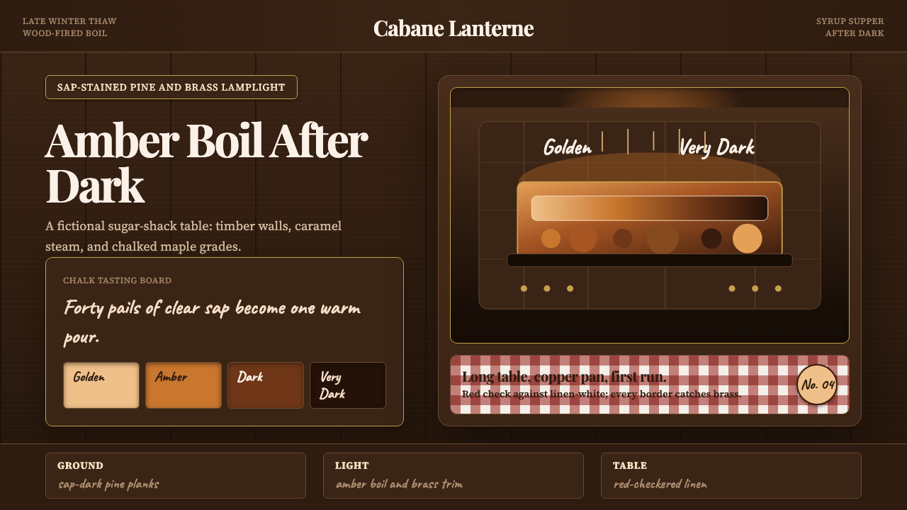 Québec Maple Sugar ShackWarmth boils in the dark. Amber serif type, brass borders, and gingham checks…
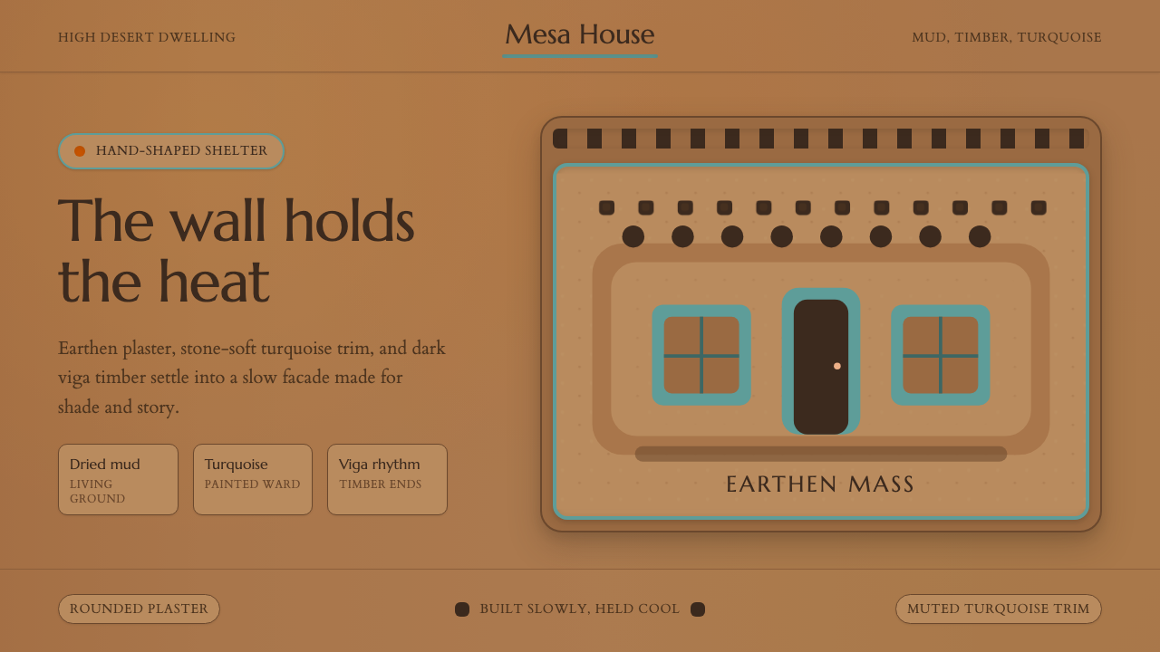 Adobe Pueblo SouthwestFeels made by hand. Earthen tan, turquoise trim, and viga rhythm shape the fr…
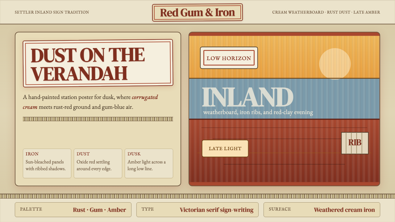 Australian Outback VernacularWeather is the voice. Rust dust, gum-blue bands, and serif sign-writing age t…
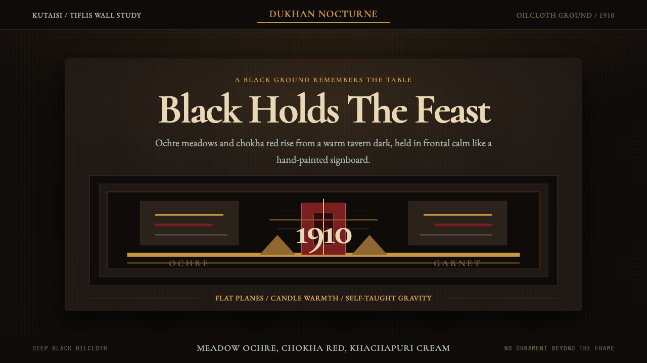 Georgian Pirosmani 1910Oilcloth black turns memory ceremonial. Ochre panels and Cormorant type hold…
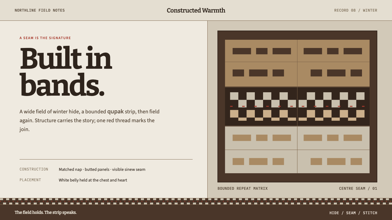 Iñupiat ParkaStructure carries the signature. Caribou-hide bands frame a bounded qupak rep…