What is Mata Ni Pachedi Temple Cloth?
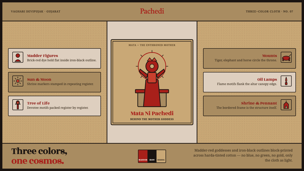
Three colors hold an entire shrine-world: madder-brick goddesses, iron-black drawing, and harda-tinted cotton treated as the ground’s white.
Mata Ni Pachedi Temple Cloth in brief
Mata-ni-Pachedi is the shrine cloth of the mother goddess made by the Vaghari community of Gujarat. Its visual system is deliberately narrow: madder-brick red carries the figures, iron black defines their contours and narrative detail, and cotton soaked in harda, or myrobalan, supplies a warm tan ground. The cloth is not a neutral background. Its natural tone is an active part of the image, completing the textile’s strict three-color cosmos.
The design language combines block printing with hand painting. A central enthroned goddess establishes the primary axis, while dense narrative registers gather around her in ordered bands. Figures are bold and legible, their silhouettes held together by dark outlines and matte printed marks. The result is devotional rather than decorative: every color, border, and repeated form supports the shrine-centered composition.
In digital form, Mata-ni-Pachedi becomes a system of warm ground, red symbolic figures, black linework, and compressed storytelling. It should feel tactile without becoming rustic pastiche: matte rather than glossy, printed rather than illuminated, dense rather than empty. Blue, green, and gold are excluded because restraint is not an accessory to the style; it is the structure that makes the three surviving elements speak.
Where does Mata Ni Pachedi Temple Cloth come from?
Mata-ni-Pachedi belongs to a centuries-old ritual textile tradition associated with Ahmedabad and Saurashtra in Gujarat, India. The source tradition is the mother-goddess shrine cloth of the Vaghari, also known as the Devipujak, community. Its context is therefore inseparable from the shrine: the cloth is conceived as a devotional image-bearing surface, not simply as a patterned textile for general decoration.
The making tradition joins Indian temple-cloth painting, block-printed devotional textile, and a dyeing practice related to Kalamkari mordant work. Block printing establishes repeated forms and strong graphic structure, while hand painting allows the goddess and surrounding narrative details to remain materially immediate. This combination gives the cloth both system and variation: the image has an ordered grammar, but the mark still carries the presence of the maker.
Its restricted palette is also a material history. Madder supplies the brick red of the goddess figures, iron black forms the outlines, and de-starched cotton is soaked in harda, or myrobalan, to create the warm tan that functions as the cloth’s white. The palette does not imitate colored light or polished luxury. It makes the textile’s fibers, dyes, and printed marks visible as part of the image.
The tradition is associated with the period from 1900 to 1950 in the supplied historical frame, while its current revival belongs to the 2000s. Vaghari shrine-cloth artisans and Chitara family painters of Ahmedabad remain the named human anchors of this lineage. A digital adaptation should therefore preserve the logic of the cloth rather than claim to reproduce its ritual life: warm ground, devotional centrality, narrative density, and the disciplined refusal of extra color.
What defines the Mata Ni Pachedi Temple Cloth look?
Three-Color Material Palette
The palette is madder-brick red, iron black, and harda-tinted cotton. Red carries the goddess and other charged figures; black supplies contour, separation, and narrative articulation; the tan cloth acts as the light field. The absence of blue, green, and gold is essential. Color is not added to enrich the surface but assigned a precise devotional and structural role.
Harda-Tinted Ground
The ground should read as cotton rather than as a generic beige canvas. Its warmth comes from harda, and its visual authority comes from being the cloth itself. In digital applications, the ground should remain matte, slightly earthy, and optically quiet enough to support red and black. It is the system’s equivalent of white, but with more material memory and less visual sterility.
Madder-Brick Figures
Red figures are broad, symbolic, and visibly printed. The color should feel mineral and vegetal at once, closer to a dyed brick tone than to a luminous screen red. It works best when reserved for the goddess, key figures, and selected narrative accents. Large red forms provide emotional and compositional weight without requiring gradients, highlights, or ornamental color variation.
Iron-Black Contour
Black is not merely body text or an outline color. It binds the entire composition together through firm contours, internal marks, borders, and repeated graphic details. Lines should feel cut, brushed, or stamped rather than mechanically perfect. Slight irregularity is valuable when it preserves the impression of a hand-printed surface, but the overall contour must remain decisive and legible.
Central Goddess and Registers
The central enthroned goddess is the compositional authority. Surrounding registers should frame, support, and elaborate that center rather than compete with it. Dense bands can carry repeated figures and narrative motion, but they need a clear relationship to the central axis. The layout should feel ceremonial and cumulative: meaning gathers through ordered repetition, not through isolated decorative motifs.
Matte Printed Texture
Texture should suggest ink meeting cotton: dry edges, modest variation, and a surface that absorbs rather than reflects light. The effect is tactile but controlled. Avoid glossy polish, luminous effects, and simulated luxury. The point of texture is to connect the digital surface to block printing and hand painting, allowing the visual system to feel made without becoming noisy or artificially distressed.
Who shaped Mata Ni Pachedi Temple Cloth?
The Vaghari, or Devipujak, community is the primary human anchor of Mata-ni-Pachedi. Its artisans are associated with the making of the mother-goddess shrine cloth in Gujarat. In the design system, their role is represented through the union of devotional purpose, block printing, hand painting, and material discipline. The style should honor that authorship by keeping the image direct, tactile, and centered on the goddess rather than turning it into generic folk decoration.
The Chitara family painters of Ahmedabad are named in the source material as key figures in the tradition’s current lineage. Their presence locates the practice in a specific regional making culture rather than an anonymous historical aesthetic. For digital work, this means the style should retain regional specificity: harda-tinted cloth, red and black devotional imagery, dense registers, and the visible logic of painting and printing together.
Mata-ni-Pachedi itself functions as the central figure of reference: a cloth made for the mother-goddess shrine, combining image, material, and devotional setting. It is not a loose collection of motifs. Its authority comes from the relationship between the central enthroned goddess, the surrounding narrative registers, the cotton ground, and the restricted palette. Every adaptation should preserve that relationship before borrowing individual symbols.
How do you use Mata Ni Pachedi Temple Cloth today?
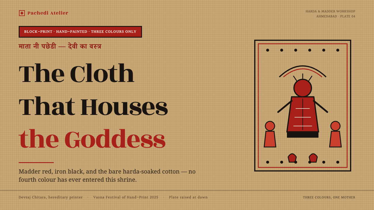
For presentation covers, use the harda-tinted ground as a quiet field and let one large madder-red goddess form establish the visual center. The title can sit within the iron-black contour system, aligned to the central axis or held in a surrounding register. Content slides should feel like cloth panels: a stable central structure, compact narrative bands, and clear separation between red image areas and black explanatory text. The cover should announce the shrine-world; the interior should unfold it.
For data slides, translate charts into devotional registers rather than glossy analytical widgets. Use the natural cloth tone for the field, black for labels and structural rules, and red only for the data that deserves emphasis. A central figure, seal-like form, or anchored symbol can give the slide a visual axis, while repeated marks can express sequence or comparison. Keep the information dense but ordered, so the slide feels printed and cumulative rather than crowded.
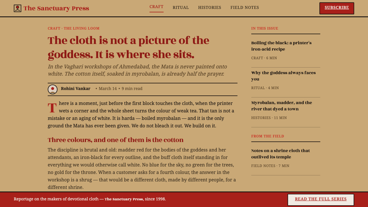
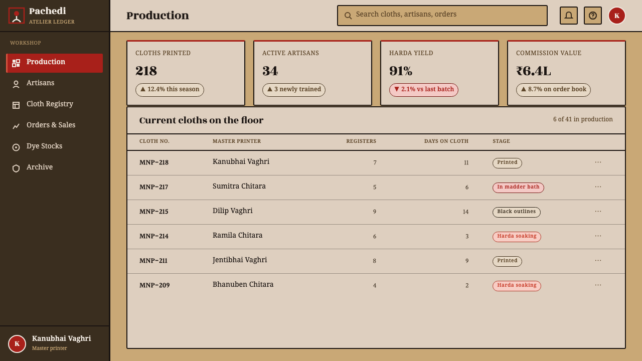
For web interfaces, the system suits dashboards, pricing pages, and other products that need strong hierarchy without corporate gloss. Use the warm cloth ground as the page field, iron black for navigation and text, and madder red for active states, selected plans, alerts, or key metrics. Cards should rely on firm borders and matte surfaces rather than soft luminous effects. The central-goddess logic can guide the page: one primary action or value proposition should govern the surrounding information.
For editorial and marketing work, Mata-ni-Pachedi supports an image-led, story-rich composition. Articles can place a dominant red illustration or title block at the center, with metadata and supporting material arranged in dense side registers. Campaign pages can alternate broad cloth-colored fields with black panels carrying red figures, while section breaks use printed borders or repeated narrative marks. The result should feel ceremonial and authored, not like a generic rustic craft theme.
The most common mistake is treating the style as a red, black, and beige palette applied to an ordinary layout. That misses the central relationship between shrine cloth, goddess, registers, and material surface. Another failure is adding blue, green, gold, glossy gradients, or decorative luxury effects to make the system feel richer. Mata-ni-Pachedi becomes stronger through limitation: keep the ground warm, let red carry meaning, let black organize it, and allow the cloth to remain visibly present.
Mata Ni Pachedi Temple Cloth — FAQ
Is Mata-ni-Pachedi simply a red, black, and tan color palette?
No. The palette matters because it belongs to a specific shrine cloth and material process. Red identifies the goddess and charged figures, black articulates contours and narrative structure, and harda-tinted cotton functions as the light ground. If those colors are detached from the central goddess, surrounding registers, block printing, hand painting, and matte surface, the result is only a superficial color reference.
Why is the natural cotton ground treated as the system’s white?
Because the ground is part of the cloth rather than an applied background color. De-starched cotton soaked in harda becomes a warm tan, and that material field gives the red and black their setting. Treating it as white preserves the logic of the original three-color system while avoiding the sterility of pure white. In digital work, the ground should remain warm and matte rather than becoming a generic neutral.
Can the style be used on a dark digital interface?
The supplied tradition is built around a harda-tinted cotton ground, so a dark inversion should be treated as an adaptation rather than the default. If a dark interface is necessary, preserve the hierarchy of iron black as contour and structure, madder red as the charged figure color, and the cloth tone as a visible material reference wherever possible. Avoid adding luminous effects that would make the surface feel polished or screen-native.
How should imagery be handled in a Mata-ni-Pachedi-inspired layout?
Imagery should be symbolic, outlined, and structurally connected to the central enthroned goddess. Use broad red forms, iron-black contours, repeated figures, and dense registers that support a clear center. Photography or unrelated decorative imagery should not be added merely to fill space. If an image does not strengthen the shrine-cloth relationship, the narrative field, or the material impression, it is probably working against the system.
What makes an adaptation feel inauthentic?
The strongest warning signs are decorative excess and loss of structure: extra colors, metallic accents, glossy surfaces, soft digital polish, random folk motifs, or a layout with no central authority. An adaptation does not need to imitate every physical irregularity, but it should preserve the governing relationships. The goddess, the registers, the red-black discipline, and the cotton-like ground must read as one system rather than as disconnected styling cues.
Related design styles
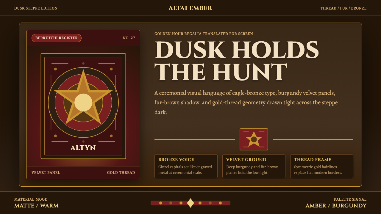 Kazakh Eagle HunterGolden hour feels handmade. Burgundy velvet, bronze type, and gold-thread bor…
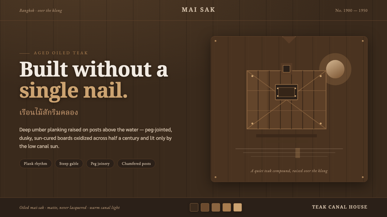 Thai Teak Canal HouseAged oiled teak, never fresh-sawn. Deep umber planks raised over the klong, l…
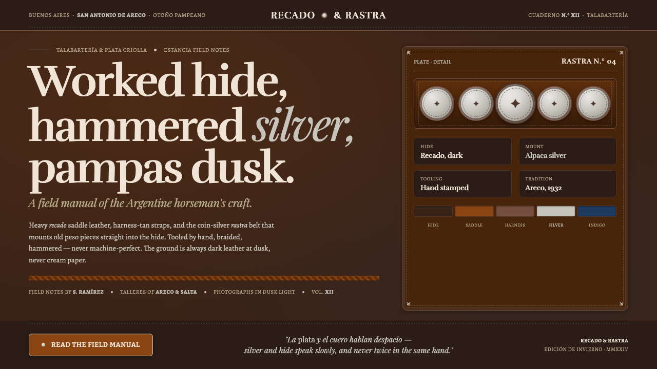 Gaucho LeatherHand-worked horseman craft. Dark recado leather, harness tan, coin-silver ras…
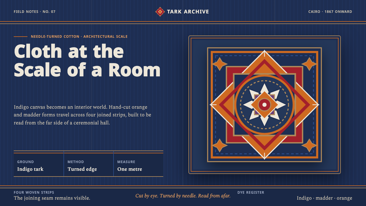 Khayamiya Tentmaker AppliquéCloth becomes architecture. Indigo canvas holds monumental orange and madder…
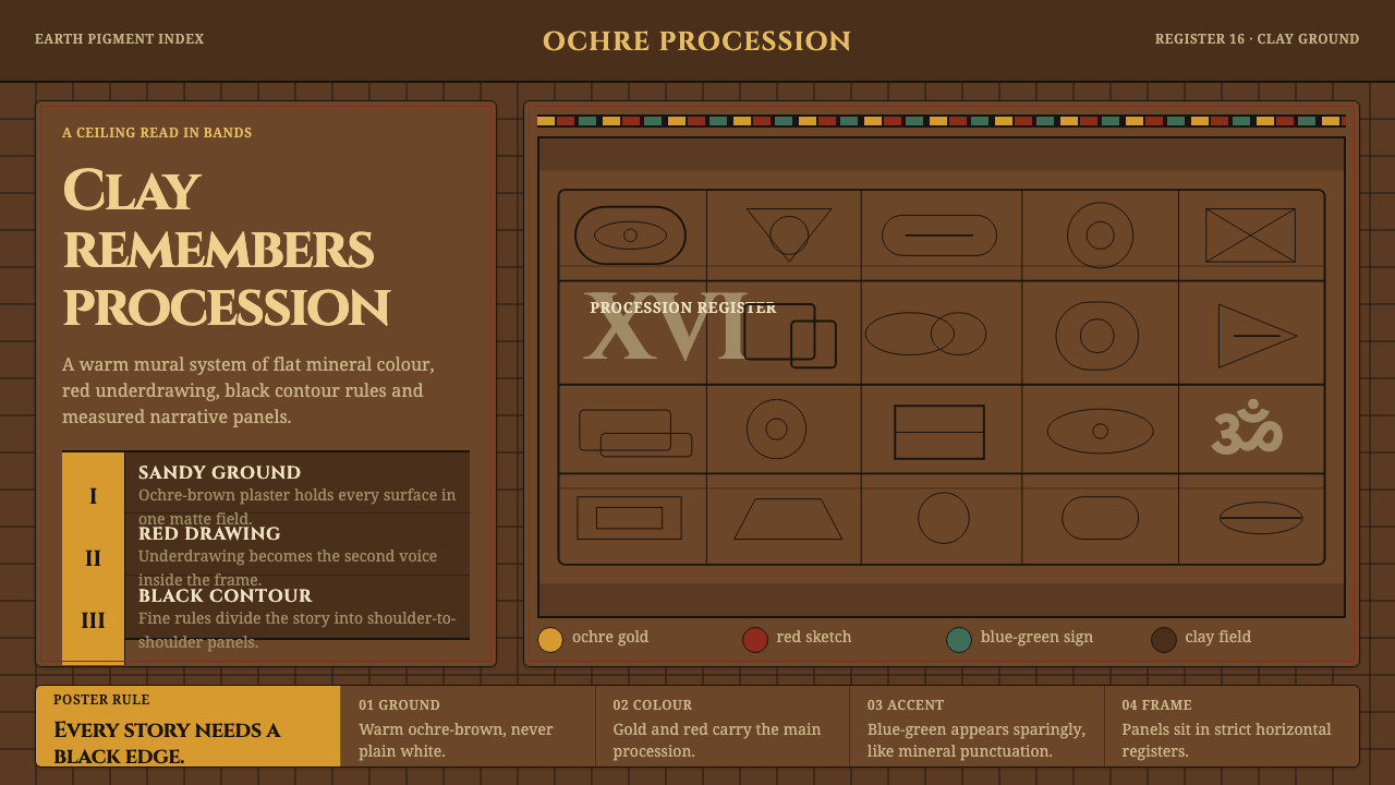 Lepakshi Vijayanagara CeilingEarth remembers in registers. Ochre gold, red underdrawing and black rules ma…
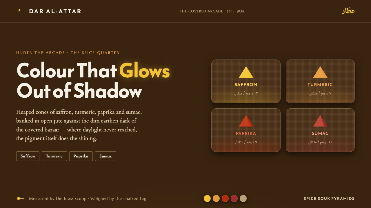 Spice Souk Market PyramidsColour glows out of shadow. Saffron-paprika-sumac heaps on dim earthen brown,…