What is Kazakh Eagle Hunter?
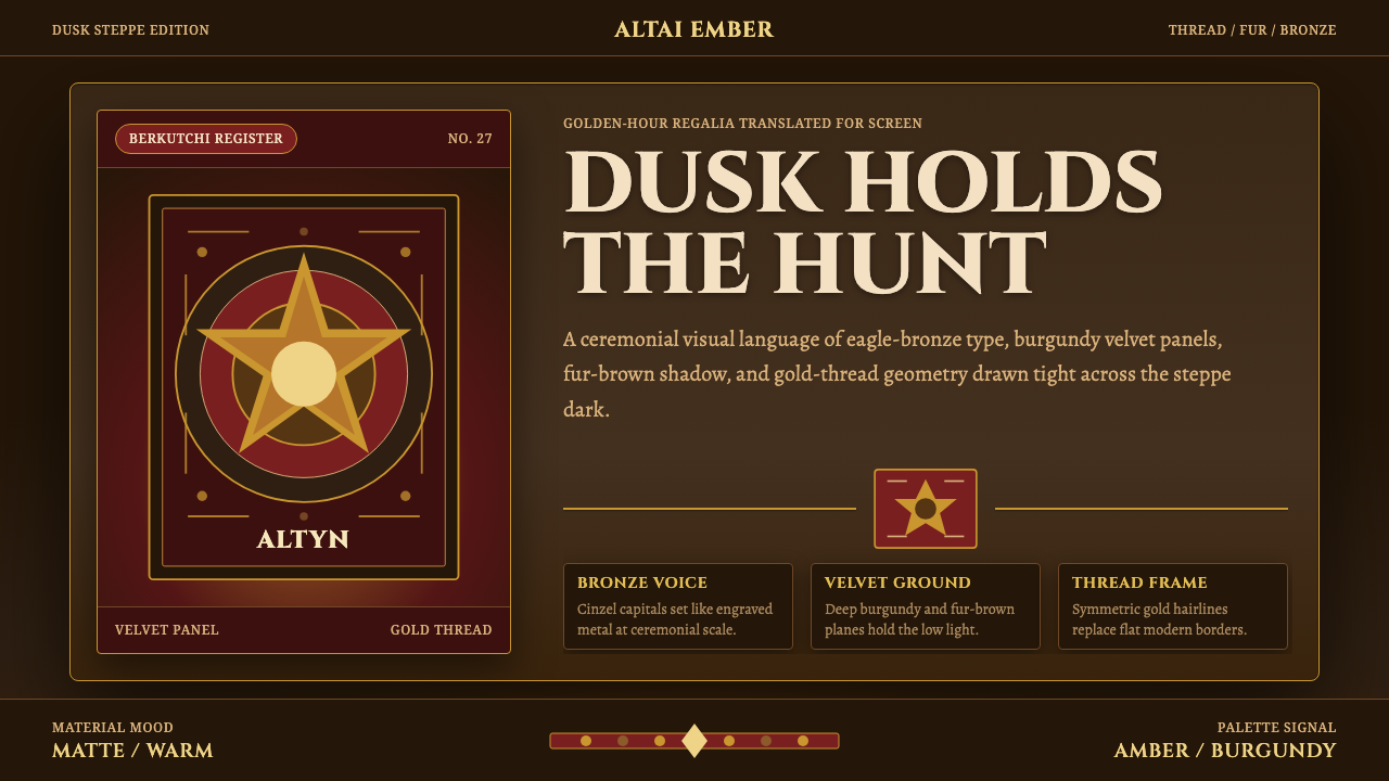
Kazakh Eagle Hunter design carries the golden hour of the Altai steppe onto the screen — burgundy velvet, bronze engraving, and gold-thread borders holding the last warm light of dusk.
Kazakh Eagle Hunter in brief
Kazakh Eagle Hunter is a design system built around one image: a berkutchi — a Kazakh eagle hunter of the Altai — riding out at dusk in fox- and wolf-fur regalia, a golden eagle balanced on the arm, the amber-brown steppe stretching behind. It is not a costume drama. It is a systematic translation of a specific, still-living tradition into type, color, and surface — engraved ceremonial display lettering, deep burgundy velvet grounds, gold-thread embroidery patterns used as border ornament, and the long, low, warm light of golden hour held constant across every screen.
The palette is earthy and metallic rather than cool or synthetic: eagle-bronze amber, layered fur browns, gold embroidery thread, and a burgundy that reads more like aged wine or oxblood leather than a corporate accent red. Nothing in this system is flat or clinical. Texture is treated as content in its own right — fur, feather, tooled leather, woven thread — always lit warm and matte, never glossy, with a dark dusk-steppe undertone sitting beneath every surface like a horizon line you can feel even when you can't see it.
The overall effect is ceremonial rather than casual: this is a system for things that want to feel earned, handmade, and slightly ancient — heritage brands, storytelling projects, anything that benefits from the weight of ritual rather than the speed of a product demo.
Where does Kazakh Eagle Hunter come from?
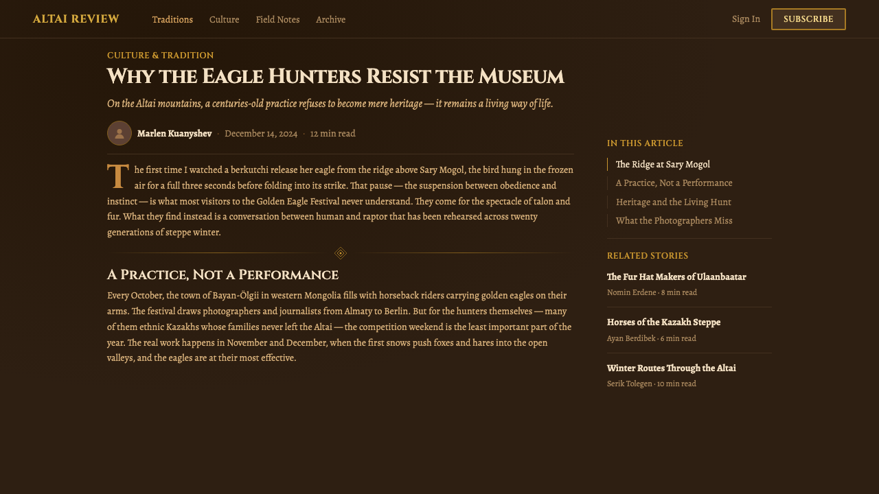
Eagle hunting with golden eagles is a living hunting tradition practiced for centuries by Kazakh communities across the Altai region of Central Asia — most visibly today among Kazakh herders in Bayan-Ölgii province in western Mongolia, and across Kazakhstan itself. A berkutchi (also transliterated burkitshi) trains and flies a female golden eagle, typically captured as a juvenile, to hunt foxes and hares across the open steppe and mountain foothills. The eagle is not a pet or a prop; the relationship is long and disciplined, and typically ends with the eagle released back into the wild after some years of partnership — a detail that says as much about the culture's relationship to the natural world as any visual motif does.
The regalia this design system draws from is real hunting and ceremonial dress, not costume invention: heavy fur coats and hats (fox and wolf being the most iconic), tooled leather gauntlets thick enough to bear an eagle's grip, and gold-thread embroidery applied to textiles as both decoration and a marker of status and craft. This is a nomadic material culture — everything worn has to survive on horseback, in open weather, at altitude — which is part of why the aesthetic reads as sturdy and tactile rather than delicate.
The tradition has a modern public face too: the Golden Eagle Festival, held in Bayan-Ölgii province, gathers berkutchi from surrounding communities to compete on eagle-handling skill, speed, and accuracy, riders in full regalia against the same amber steppe backdrop. The festival is the primary way this tradition is documented and photographed for audiences outside the region, and it is largely responsible for the modern visual shorthand — golden eagle, fur-clad rider, dusk light, open steppe — that this design system distills.
What makes the source material distinctive relative to other steppe aesthetics is the specificity of light and material together: this is not a generic "exotic" palette, it is dusk on a particular kind of high, dry, amber-brown grassland, filtered through fur, leather, and metal thread. The system keeps that specificity by refusing to cool the palette down or flatten the textures, even where a more generic system would default to something neutral.
What defines the Kazakh Eagle Hunter look?
Color
The palette lives in earth and metal, never in cool or synthetic territory. Deep burgundy — closer to oxblood leather or aged wine than a bright corporate red — anchors most large surfaces. Eagle-bronze amber and layered fur browns carry warmth and midtones, while gold, used sparingly and mostly in thread-like linework, marks status rather than filling large areas. Every hue sits on the same warm, low-light temperature, as if lit by the same setting sun.
Typography
Display type is treated as an engraving — ceremonial, weighty, deliberate, the kind of lettering you'd expect stamped into leather or cut into metal rather than typed on a keyboard. Headlines carry gravity and slow the eye down; body copy, by contrast, needs to stay legible and calm against the dark, textured grounds, so restraint matters more there than flourish. The register throughout is formal and unhurried — nothing about this system wants to feel fast.
Texture and Surface
Texture is not decoration here — it is the main subject. Fur, feather, tooled leather, and woven or embroidered thread are all treated as surfaces worth rendering in detail, lit warm and matte rather than glossy or synthetic. A card or panel in this system should feel like it has weight and grain, the way leather or heavy fabric does, rather than reading as a flat digital plane. Anything that looks slick, glassy, or synthetic works against the system's premise.
Ornament and Border
Gold-thread embroidery patterns supply the system's ornamental vocabulary, most often as borders framing a panel, a card, or a section break, rather than as isolated decorative flourishes scattered through a layout. The ornament reads as craft — the kind of border a hand would stitch onto a ceremonial garment — so it should stay disciplined to edges and frames, marking where one surface ends and another begins, instead of competing with the content it surrounds.
Light
Every surface in this system is lit as if by the same golden-hour sun: long, low, and warm, casting soft-edged warmth rather than the crisp cool light of midday. This isn't a lighting effect applied on top — it's the reason the whole palette holds together. A dashboard or card grid rendered in this system should feel like it's catching the same late light that falls across a rider and a bird on an open steppe, not lit by a generic studio softbox.
Depth and Grounding
Beneath the warm foreground palette sits a constant dark, dusk-steppe undertone — the sense of an open horizon fading into night just beyond the frame. This darker ground gives every warm surface something to sit against, the way a burgundy velvet reads richer against near-black than against white. Layouts should preserve this relationship rather than defaulting to bright, neutral backgrounds that flatten the warm tones into something closer to autumn stationery than dusk on the steppe.
Restraint in Application
Because the palette and textures are this rich, the system depends on restraint to avoid tipping into costume pastiche. Gold should stay a marking device — borders, small icons, a rule line — rather than a large fill; fur and leather textures work best as accents on key surfaces rather than applied everywhere at once. The goal is a system that feels ceremonial and specific, not a maximalist collage of every steppe motif at once.

Who shaped Kazakh Eagle Hunter?
The berkutchi are the practitioners at the center of this tradition — Kazakh eagle hunters who train, fly, and eventually release golden eagles across the Altai's open steppe and foothills. Their craft is generational, passed down through direct apprenticeship rather than formal schooling, and their regalia — fur coats, tooled leather gauntlets, embroidered textiles — is functional dress built to survive long days on horseback, not costume. Every visual element in this design system traces back to something a berkutchi actually wears or uses in the field.
The broader nomadic communities of the Altai region — spanning western Mongolia's Bayan-Ölgii province and Kazakhstan — supply the material culture this system draws from: fur garment-making, tooled leatherwork, and textile embroidery developed over generations for a life on horseback across open, high-altitude terrain. These are working materials shaped by climate and mobility first, decoration second, which is why the aesthetic reads as sturdy and lived-in rather than delicate.
Held annually in Bayan-Ölgii province in western Mongolia, the Golden Eagle Festival brings berkutchi together from surrounding communities to compete on eagle-handling skill against the backdrop of the open amber steppe. As the tradition's most photographed and internationally documented public event, the festival is largely responsible for the modern visual shorthand this design system distills — golden eagle, fur-clad rider, dusk light — and remains the clearest reference point for anyone wanting to see the source material directly.
How do you use Kazakh Eagle Hunter today?
Kazakh Eagle Hunter is a heavy, ceremonial system, and it rewards restraint more than most historical styles — the richness of palette and texture means small missteps (too much gold, textures spread everywhere instead of key surfaces) tip quickly into costume pastiche rather than considered heritage design.
For presentation cover slides, the system is strongest when it commits fully: a large burgundy-velvet-textured field, an engraved-style title in restrained gold or bronze, and a thin gold-thread border framing the whole composition rather than scattering ornament across it. Content and data slides should pull back on texture — keep body text calm and legible against a simpler dark ground, reserving fur, leather, and embroidery textures for dividers, covers, and callout panels rather than every slide. Data visualizations read best in the bronze-and-burgundy register rather than unrelated bright accents.
For web UI, this system suits dashboards and pricing pages that want to feel premium and ceremonial rather than fast and utilitarian — a luxury brand, a cultural platform, a storytelling product rather than a SaaS analytics tool. Cards benefit from a felt sense of weight and grain rather than flat neutral surfaces; gold-thread borders work well framing pricing tiers, marking the premium plan the way embroidery once marked status. Keep interactive chrome simpler and darker so the ornamental gold reads as intentional rather than constant.
For editorial and marketing work, the system has genuine storytelling power: long-form articles about craft, heritage, or travel benefit from engraved display type on section openers and a warm, textured mood throughout. Marketing pages built around one strong hero image — a rider, an eagle, an open steppe — pair naturally with this palette, letting the gold-thread border and burgundy ground do the framing rather than competing with the image.
The most common mistake is treating this as a generic "exotic steppe" or fantasy-adventure skin rather than a system rooted in a specific, living tradition — piling on unrelated motifs, cooling the palette to feel more "neutral," or flattening textures into plain color fills. Any of these strip out the specificity that makes the system work: the palette should stay warm and earthy, gold should stay a marking device rather than a fill, and texture should read as tactile and lit, not decorative-flat.
Kazakh Eagle Hunter — FAQ
Is this design system based on a real tradition, or is it a fantasy or costume aesthetic?
It is based on a real, still-living tradition: Kazakh eagle hunting (berkutchi) as practiced across the Altai region, most visibly in Bayan-Ölgii province in western Mongolia and in Kazakhstan. The regalia, materials, and light this system draws from are documented practice, not costume invention — which is also why treating it as generic fantasy "exotic steppe" decoration is the fastest way to get it wrong.
Can this palette work on a light or white background instead of a dark one?
The system is conceived as dark-grounded — the dusk-steppe undertone is part of what makes the burgundy and gold read as rich rather than muddy. A light-background adaptation is possible but needs care: burgundy and bronze tend to lose depth against bright white, reading closer to autumn stationery than dusk on the steppe. If a lighter variant is needed, lean on a warm cream or deep amber ground rather than pure white, keeping burgundy and bronze concentrated in type and borders rather than spread across a bright field.
How much gold ornament is appropriate before it starts to feel overdone?
Gold works best as a marking device rather than a fill: thread-like borders, small icons, rule lines, or accents on a single featured element. Once it starts covering large surfaces or competing in multiple places on one screen, it stops reading as embroidered craft and starts reading as gilding for its own sake. A useful check: is the gold marking a boundary or a status, the way embroidery marked status on real regalia — if it's just filling space, it's too much.
What kinds of products or brands is this system a poor fit for?
It struggles in contexts that want to feel fast, disposable, or coolly minimal — a checkout flow optimized for speed, a developer tool that wants to read as lightweight, or a youth-facing app chasing a bright, synthetic mood. The system's weight works against products where the goal is to get out of the user's way quickly. It also needs to be applied with respect for its origin; using it as decoration disconnected from any acknowledgment of the tradition it draws from undercuts the whole point.
How does this style differ from other steppe, nomadic, or Central Asian design references?
Its specificity is the difference. Rather than drawing on a generalized "nomadic" or "Central Asian" shorthand, it locks onto one precise scene — a berkutchi at dusk, golden eagle on the arm, fur and gold-thread regalia against amber steppe — and builds every color, texture, and lighting decision back to that scene. That specificity keeps the system coherent; broadening it toward a generic steppe mood tends to dilute exactly what makes it recognizable and grounded.
Related design styles
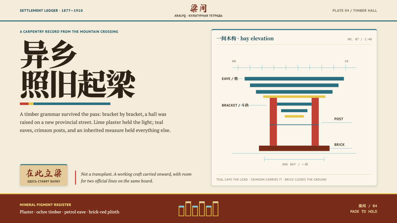 Dungan Settlement CraftCarpentry holds its ground. Teal eaves and crimson posts frame sunlit plaster…
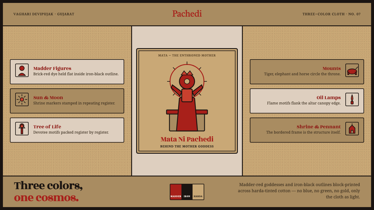 Mata Ni Pachedi Temple ClothThree colors, one cosmos. Madder-red goddesses, iron-black outlines, harda-ti…
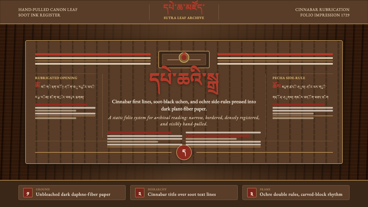 Derge Woodblock Sutra PrintHand-pulled scripture gravity. Cinnabar uchen and ochre rules press into dark…
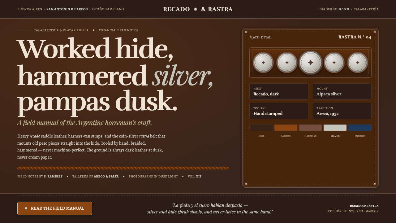 Gaucho LeatherHand-worked horseman craft. Dark recado leather, harness tan, coin-silver ras…
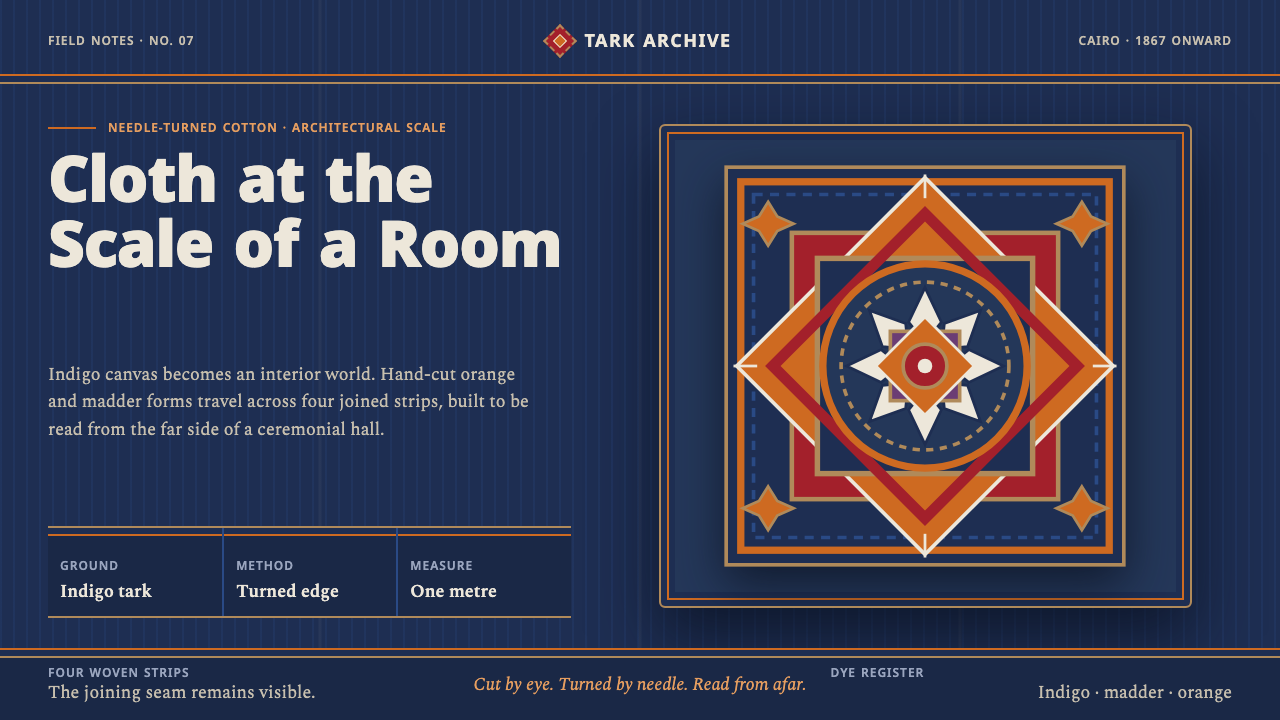 Khayamiya Tentmaker AppliquéCloth becomes architecture. Indigo canvas holds monumental orange and madder…
 Spice Souk Market PyramidsColour glows out of shadow. Saffron-paprika-sumac heaps on dim earthen brown,…