What is Dungan Settlement Craft?
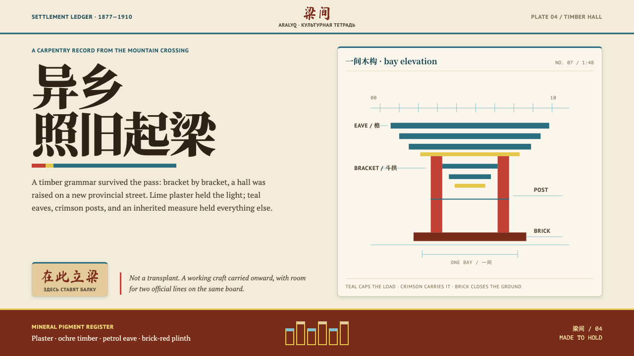
Dungan Settlement Craft is Qing timber carpentry doing its work on a Central Asian street: teal eaves, crimson posts and sunlit plaster, framed in a measured bay.
Dungan Settlement Craft in brief
Dungan Settlement Craft is a design style drawn from the built world of the Dungan, Hui Muslim communities from Shaanxi and Gansu who settled in Central Asia after 1877. Their villages in what are now Kyrgyzstan and Kazakhstan are not a transplant of China and not a fusion of cultures. They are Qing carpentry doing its job on someone else's street, with a nail-free timber frame, bracketed eaves and an upswept roof set on Russian brick footings.
The look can be read off a single building, the Karakol mosque of 1907 to 1910. Its walls are cream lime plaster carrying a brush-painted diamond lattice. Its columns are a soft butter ochre. Its carved eaves are a deep petrol teal, its posts are crimson, a mythical-animal yellow picks out the carving, and a brick-red skirt wall grounds the whole composition. Each colour belongs to a structural part of the building, so the palette is a map of how the hall is put together.
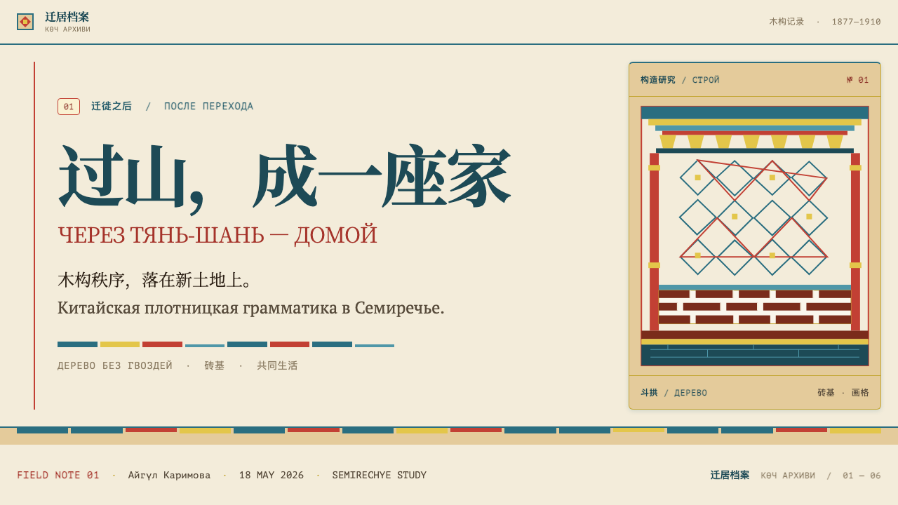
As a design language, the style prizes measure and clarity. A timber building is built bay by bay, and a layout can be built the same way: a sequence of modules, each framed by strong vertical posts, each carrying its own plaster field. Text on signs follows a parallel logic, with Chinese characters above Cyrillic letters, stacked, both official. The result is warm, sunlit, carefully proportioned, and rooted in a specific place and history.
Where does Dungan Settlement Craft come from?
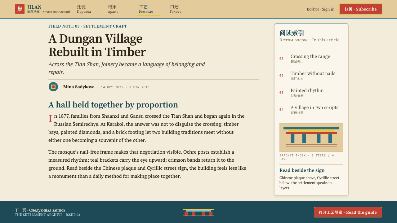
The story begins in the winter of 1877, when several thousand Hui from Shaanxi and Gansu crossed the Tian Shan and rebuilt their villages inside Russian Semirechye. In Central Asia this community came to be known as the Dungan. A winter crossing of a major mountain range is the kind of detail that explains the culture of the settlements: what was carried over was not goods but knowledge, the carpentry, the building rules, the food and the faith, and it had to be reassembled on arrival.
What they built there is a case of continuity rather than blending. The Karakol mosque of 1907 to 1910 is a timber hall assembled without nails, topped by bracketed dougong eaves that step outward to carry a hip-and-gable roof whose corners sweep upward. It stands on brick footings laid in the manner of Russian provincial building. The two traditions sit one above the other, each doing the job it is best suited to: Qing timber-frame carpentry for the structure and the roof, Russian brickwork for the foundation and the skirt.
The source places the main period of the built fabric between 1900 and 1950, and it names the places that still hold it: Karakol and Yrdyk in Kyrgyzstan, and Masanchi and Sortobe in Kazakhstan, with the families' origins in Shaanxi and Gansu. These are villages and small towns, not monumental capitals, so the style is domestic and communal in scale: houses, gates, mosques and storefronts, all built by a community that was settling for the long term.
Three traditions meet in the style, and the source names them as its movements: Hui Muslim vernacular architecture, Qing timber-frame carpentry, and Russian provincial brickwork. Hui vernacular architecture supplies the forms of a Muslim community's buildings in a Chinese carpentry language; Qing carpentry supplies the frame, the brackets and the roof; Russian brickwork supplies the base. The design lesson is to keep these roles distinct and to let each material and colour remain recognisably itself, rather than averaging them into a generic mix.
What defines the Dungan Settlement Craft look?
Sunlit Lime Plaster
The wall surface is cream lime plaster, warmed by sun and slightly irregular, the way hand-applied plaster is. It is the field on which everything else sits, a calm, warm ground that is neither stark white nor tinted. In design, this translates into a large, quiet, cream-toned area that carries content and pattern, with colour concentrated in the framing elements around it rather than in the field itself.
Brush-Painted Diamond Lattice
The plaster carries a diamond lattice painted by hand with a brush. It is a rhythmic, geometric pattern, but its stroke has the small variations of a painter's hand, so it never looks printed. This gives the style its characteristic mixture of order and warmth. A digital equivalent keeps the diamond structure while allowing slight irregularity in line and spacing, and uses the lattice as a band, panel fill or decorative field rather than a seamless wallpaper.
A Palette Mapped to Structure
Each colour belongs to a building part. Butter-ochre is the column, crimson is the post, deep petrol teal is the carved eave, mythical-animal yellow is the carved detail, and brick red is the skirt wall at the base. Because colour follows structure, the palette is easy to apply systematically: frames and verticals take one colour, horizontal bands and headers take another, base elements take the brick tone. Using colours at random breaks the logic.
The Teal Called Green
The carved eaves are a deep petrol teal that local speakers call green, a word associated with prosperity, though the colour is in truth more blue than green. This small fact matters to design: the hue sits in the blue-green borderland and should be held there, not nudged toward a bright, grassy green or a clean sky blue. It is a heavy, shaded colour, used for eaves and horizontal bands, where it casts a calm authority over the cream wall below.
The Measured Bay and Bracketed Eaves
A Chinese timber hall is measured out in bays, the spaces between posts, and the roof is carried by stepped brackets that project outward in layers. The upswept hip-and-gable roof finishes the structure with lifted corners. As layout principles these give a modular rhythm: vertical divisions of equal logic, a strong horizontal head, and an overhang that visually shelters what lies below. A page built this way feels proportioned and sheltered.
Brick Footings, Two Traditions Stacked
The timber frame stands on Russian brick footings, and a brick-red skirt wall runs along the base. The two traditions are stacked, not mixed: timber above, brick below, each in its own material and colour. In design this suggests a clear base layer, a footer, a plinth or a lower band in brick tone, beneath a framed upper structure. The join between them is visible and honest, which is the whole point of the style.
Stacked Bilingual Lettering
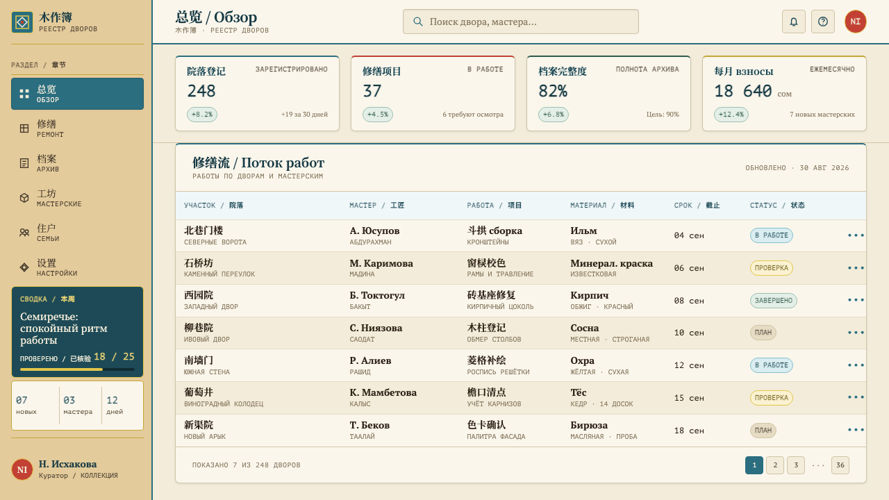
On signs, Chinese characters sit above Cyrillic, stacked, and both scripts are official. Neither is a translation of the other in rank; they share the same plane and similar weight. For interface and print design, this is a model for multilingual layouts: two languages carried at equal dignity, in a vertical stack, with careful matching of size and spacing, rather than one language in large type and the other as a footnote.
Who shaped Dungan Settlement Craft?
Bai Yanhu is the name associated with the 1877 crossing of the Tian Shan, the event that brought Shaanxi and Gansu Hui into Russian Semirechye and founded the Dungan settlements. He stands at the beginning of this style's story. Everything in the built tradition that followed, the villages, the mosque at Karakol and the storefronts of Yrdyk, descends from a community that crossed a mountain range in winter and chose to rebuild what it knew.
Ibrahim Aji is listed among the key figures of the Dungan building tradition. The honorific Aji, a form of hajji, marks someone who has made the pilgrimage to Mecca, which tells us that the community behind these buildings had a strong religious and social structure. His name stands for the settled community around the mosques and houses: the people who used and kept the buildings that this style documents.
Zhou Si is the third name in the roll of figures attached to this tradition, and he stands for its carpentry side: the framing, the bracketing and the joinery that make Dungan buildings recognisable, including the nail-free hall of the Karakol mosque. His name is a reminder that the style's visual rules, a bay-by-bay rhythm, projecting eaves and lifted roof corners, are the traditions of a trade, passed from hand to hand, before they are a look.
How do you use Dungan Settlement Craft today?
Dungan Settlement Craft suits cultural and heritage projects, travel and place-based storytelling, community and diaspora organisations, education, multilingual products, hospitality, food brands with a rooted story, and architecture or archive publishing. It is a weak choice for ultra-minimal or futuristic products. Applying it well means using the building's logic, the bay, the frame, the base and the stacked script, not scattering its colours as decoration.
For presentation slides, a cover can echo a facade: a cream field with a band of hand-painted lattice, framed by crimson verticals and a teal head band, with the title stacked in two scripts when the audience calls for it. Content slides can divide the page into bays, with equal vertical modules each carrying a single idea. For data, assign colours by role as the building does, one tone for structure, one for emphasis, and a brick tone for baseline categories, and avoid adding extra hues.
For web interfaces, the style is a strong fit for cultural portals, place guides, language-learning and community platforms. A header in deep teal can act as the eave, with a cream body as the wall and a brick-toned footer as the skirt. Cards become bays, framed by thin crimson vertical accents. Multilingual interfaces can stack labels in two scripts at similar weight. Keep the lattice for decorative bands and empty states, not behind running text.
For editorial and marketing work, the style supports photo-led stories about places and people. Photographs of facades, carved eaves and painted walls pair naturally with the cream and teal palette, and captions can follow the stacked-script model. Long pieces benefit from the bay rhythm: sections separated by consistent vertical divisions, each one framed. Calls to action work well in crimson against cream, because crimson is the post, the strongest vertical, and it should mark the strongest action.
The most common mistake is to use every colour at full strength at once, which turns a measured palette into a festival. A second is to treat the style as generic Chinese ornament, red and gold, or as a fusion of East and West, when the source is explicit that it is neither a transplant nor a blend. A third is to shift the teal toward a bright green, which loses the heavy, shaded quality. A fourth is to demote one of the two scripts to a footnote; the equality of both is part of the style's meaning.
Dungan Settlement Craft — FAQ
Who are the Dungan, and why is this style set in Central Asia?
The Dungan are the Hui Muslim community who came from Shaanxi and Gansu and settled in Central Asia after the winter crossing of the Tian Shan in 1877, rebuilding their villages inside Russian Semirechye. The style is set in places such as Karakol and Yrdyk in Kyrgyzstan and Masanchi and Sortobe in Kazakhstan because those are where the built fabric, mostly from 1900 to 1950, still stands.
Is this a Chinese style, a Russian style, or a fusion?
It is none of those exactly. The tradition is Qing carpentry, set to work in a new place: a nail-free timber frame with bracketed eaves and an upswept roof, standing on Russian brick footings. The two traditions are stacked and each keeps its own material and colour, so the style is better described as continuity with local adaptation than as a blend. The best designs keep the roles distinct.
Why is the teal described as green?
Local speakers call the colour of the carved eaves green, a word associated with prosperity, even though the actual hue is a deep petrol teal that is closer to blue than to green. For design the practical lesson is to respect the real hue, holding it in the blue-green borderland, while understanding that its name carries a positive meaning. The colour should feel heavy and shaded, not bright or grassy.
What does the measured bay mean for layout?
A bay is the space between posts in a timber frame, and a building is measured in bays. In layout it becomes a module: a vertical division with its own plaster field, framed by strong verticals, repeated with consistent logic. Pages built this way read as ordered and sheltered, with a clear head, a body of modules and a base. Variation is allowed in what each bay contains, but the framing stays regular.
How should I handle two languages in this style?
Follow the signs: set the two scripts stacked, one above the other, at the same level of importance. In the Dungan settlements, Chinese characters sit above Cyrillic and both are official. In an interface this means paired labels or headings of similar size and weight, matched spacing, and no hierarchy that treats one language as the main text and the other as a gloss. Equal dignity is a design decision as well as a cultural one.
Related design styles
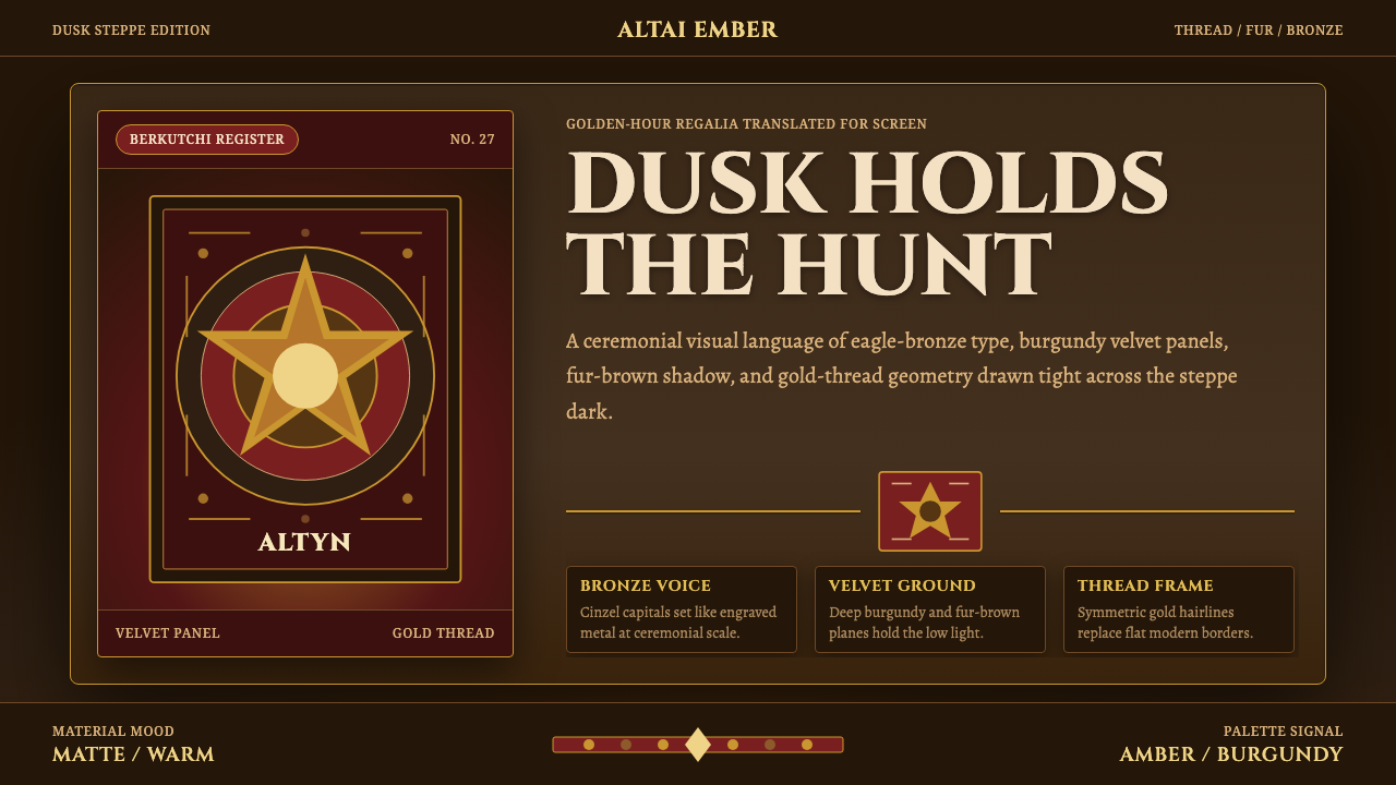 Kazakh Eagle HunterGolden hour feels handmade. Burgundy velvet, bronze type, and gold-thread bor…
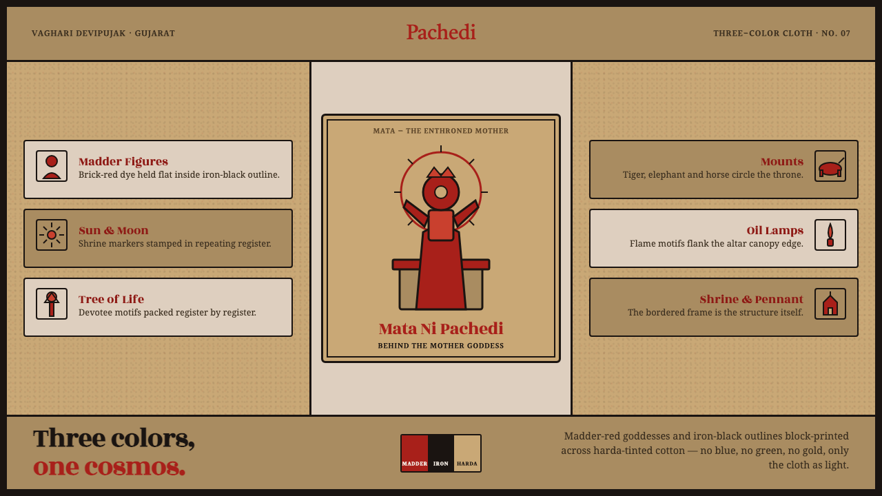 Mata Ni Pachedi Temple ClothThree colors, one cosmos. Madder-red goddesses, iron-black outlines, harda-ti…
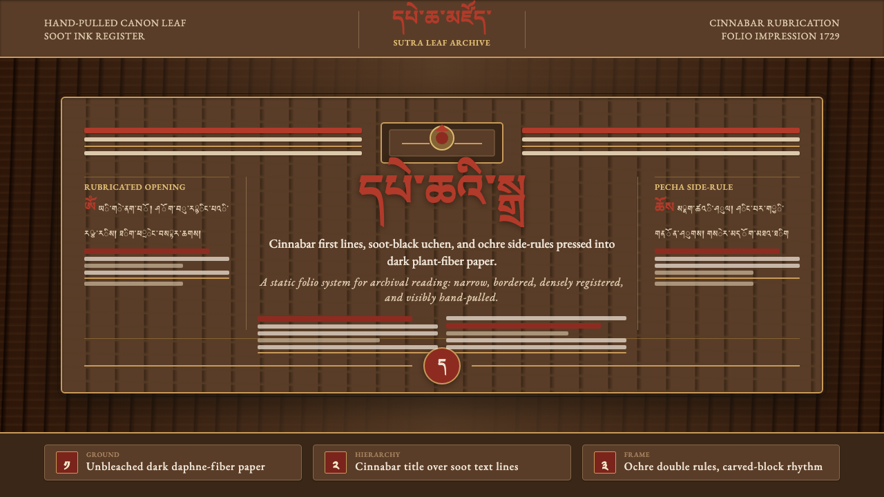 Derge Woodblock Sutra PrintHand-pulled scripture gravity. Cinnabar uchen and ochre rules press into dark…
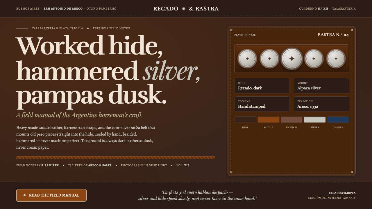 Gaucho LeatherHand-worked horseman craft. Dark recado leather, harness tan, coin-silver ras…
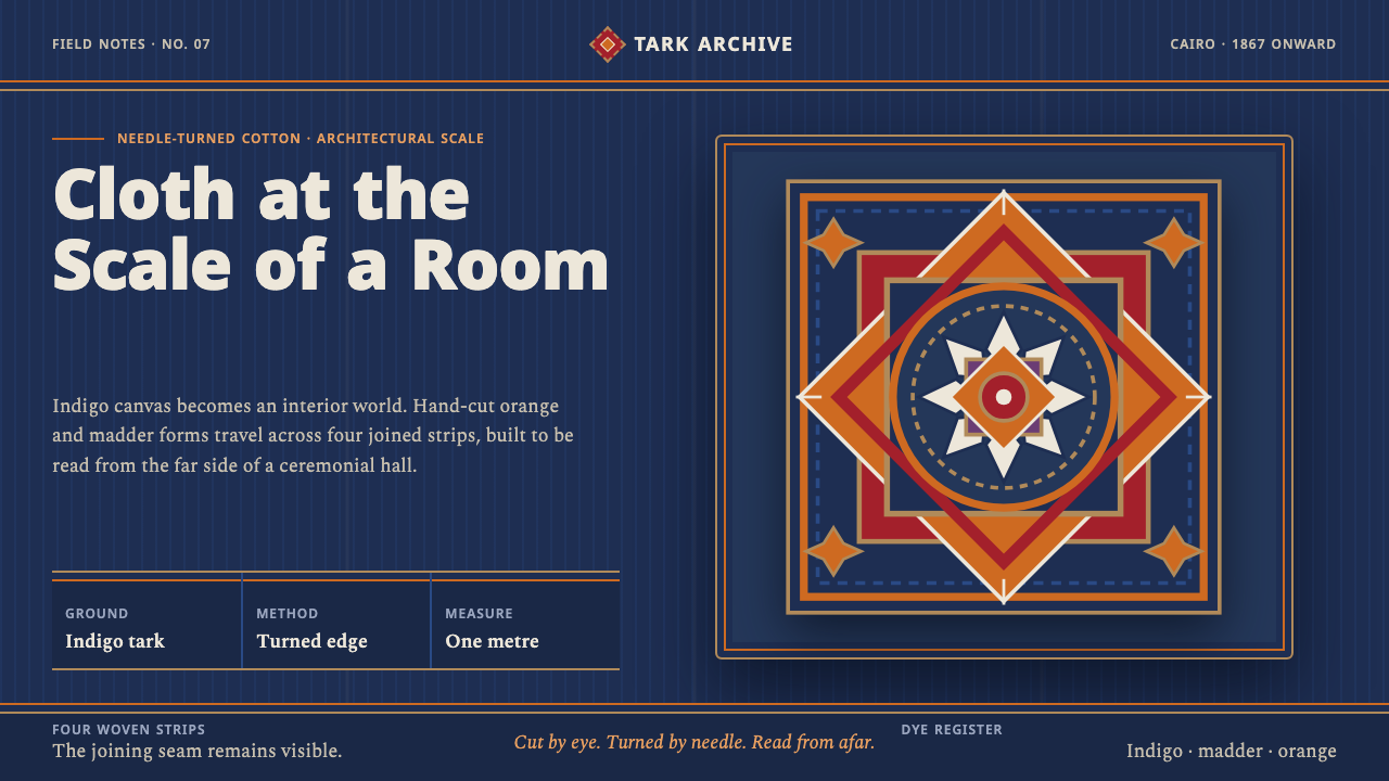 Khayamiya Tentmaker AppliquéCloth becomes architecture. Indigo canvas holds monumental orange and madder…
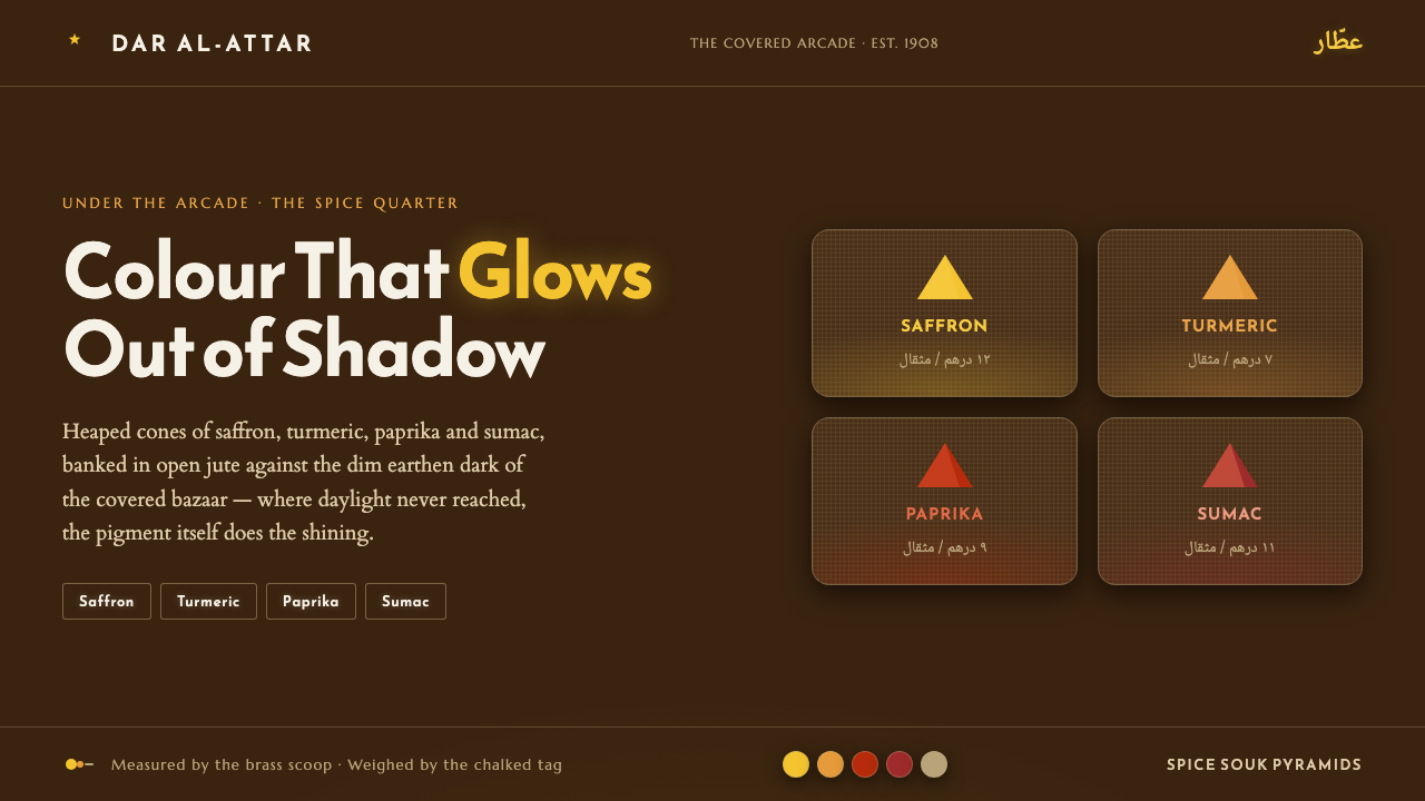 Spice Souk Market PyramidsColour glows out of shadow. Saffron-paprika-sumac heaps on dim earthen brown,…