What is Spice Souk Market Pyramids?
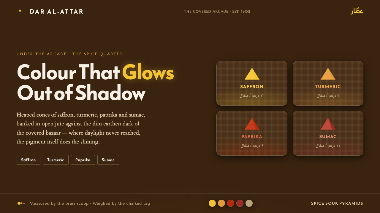
Spice Souk Market Pyramids lets saffron, paprika, and sumac glow from the shadow of a covered bazaar, where earthen darkness, chalk lettering, brass, and piled geometry turn commerce into atmosphere.
Spice Souk Market Pyramids in brief
Spice Souk Market Pyramids is a design language drawn from the covered spice bazaar of the early-twentieth-century Middle East, especially the Gulf and Levantine market world named in its source: Dubai Spice Souk, Damascus, and Cairo bazaars. Its central image is simple and powerful: open burlap sacks hold spices piled into high cones, while saffron-gold and turmeric sit beside paprika and sumac-crimson mounds. The market is narrow, arcaded, and dim, so the colour appears to shine from within the shadow.
This is not a bright marketplace translated onto a dark screen. Its warmth comes specifically from the contrast between saturated spice colour and dim earthen brown. The darkness is an active material, not an empty background. It gathers the eye around each mound, makes brass scoops feel warmer, and gives hand-chalked Arabic price tags the presence of small marks made by a person at a stall. The result is rich without becoming glossy: colour glows, but surfaces remain dusty, matte, and grounded.
The visual system turns merchandise into composition. Cones, heaps, open sacks, scoops, tags, and arcade shadows become a vocabulary of forms and layers. Reem Kufi chalk lettering supplies the human voice, while the palette stays close to saffron, turmeric, paprika, sumac, brass, and soil. Every saturated hue needs the earthen darkness around it; every bright mark should feel like something found in the market rather than an unrelated digital decoration.
Where does Spice Souk Market Pyramids come from?
The historical frame is the traditional covered souk and arcaded bazaar trade of the Middle East from 1900 to 1950. The reference is not a generalized fantasy of the region; it is anchored in spice-market commerce across Gulf and Levantine settings, including Dubai Spice Souk, Damascus, and Cairo bazaars. The design borrows the environmental conditions named by that lineage: narrow arcades, earthen dimness, open sacks, hand-marked prices, and merchandise displayed in visible heaps.
The covered market determines the style’s relationship with light. Daylight is not the main source of warmth. Instead, the roofed arcade creates deep shadow, and the spices become the luminous subject inside it. This reversal gives the system its distinctive mood. A gold mound is not merely yellow; it is yellow made legible by darkness. A crimson heap is not merely red; it is a concentrated signal emerging from brown, dust-soft surroundings.
The regional scope includes both Gulf and Levantine spice markets, so the style should feel mercantile and vernacular rather than tied to a single named city. Its visual references are shared elements of the bazaar: stall surfaces, burlap and jute sacks, brass scoops, chalked Arabic price signs, piled goods, and covered architectural passages. These components establish a coherent atmosphere without requiring literal illustration of a particular street.
Its social lineage is collective. Spice merchant guilds, bazaar stall-keepers, souk trade-route traders, and Arabic chalk sign-letterers are the key figures named by the source. Together they explain why the style feels handled and exchanged: goods are measured, labeled, arranged, and offered. The movement references traditional Middle Eastern bazaar commerce, Arabic vernacular signage, chalk price-lettering, and covered-arcade souk trade.
What defines the Spice Souk Market Pyramids look?
Spice-Led Color
The palette is built from saffron-gold, turmeric yellow, paprika red, and sumac crimson, supported by brass and earthen brown. These hues should feel concentrated and edible rather than polished or synthetic. Colour is the active visual voice, but it gains its intensity by appearing in selective heaps, labels, and accents against a restrained dark ground.
Earthen Darkness
The background is dim earthen brown, never cream or pure white. Darkness supplies depth without relying on polished gradients or theatrical gloss. It should feel like the low light of a covered arcade: heavy enough to hold the scene together, but warm enough that the spice colours remain inviting rather than severe.
Pyramidal Merchandising
The cone and mound are structural forms as much as they are images of merchandise. Piles rise, bank against one another, and create natural focal points. Their sloping edges give the composition a sense of abundance and direction, while open sacks establish a grounded base. The geometry should remain irregular enough to suggest hand-arranged goods.
Dust-Soft Materiality
Burlap, jute, brass, chalk, and spice powder create the material register. Surfaces should look matte, touchable, and lightly worn, with softness coming from dust and fabric rather than blur. Brass scoops may catch a muted warmth, but they should remain tools within the stall scene, not luxury ornaments detached from it.
Chalk Vernacular Typography
Typography takes its cue from hand-chalked Arabic price tags and Reem Kufi. Lettering should feel direct, visible, and made for a stall rather than a corporate office. Strong display words can act like labels on sacks or signs above a counter, while supporting text stays clear and quiet. The contrast is between human mark-making and orderly information, not between many competing type families.
Arcaded Layering
The composition works through recesses and overlaps: a dark arcade behind a sack, a brass scoop crossing a mound, a chalk tag interrupting a block of colour. Elements should feel close together, as they would in a narrow market passage, but each saturated object needs enough surrounding darkness to remain legible. Depth comes from placement and tonal contrast.
Who shaped Spice Souk Market Pyramids?
Spice merchant guilds represent the organized commercial backbone of the souk. In the visual system, their presence is expressed through families of goods, repeated stall markers, and a sense that every heap belongs to an established trade rather than a random collection of colours.
Bazaar stall-keepers supply the human scale of the style. Their open sacks, brass scoops, arranged mounds, and hand-marked prices make the interface feel handled and immediate. They keep the palette connected to exchange, measurement, and display.
Souk trade-route traders embody movement through the covered market. Their role appears as directional composition: mounds lead the eye, labels mark destinations, and layered stalls suggest goods arriving, being sorted, and moving through the arcade.
Arabic chalk sign-letterers provide the style’s most personal mark. Their hand-chalked price tags keep information close to the surface of commerce. Reem Kufi extends that reference into a readable display voice while preserving the sense of a sign made for a real stall.
How do you use Spice Souk Market Pyramids today?
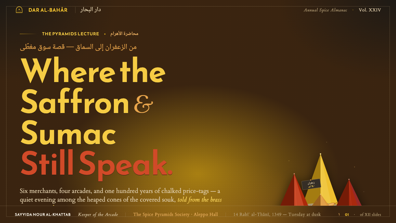
For presentation slides, use the market atmosphere as the organizing device across cover, content, and data pages. A cover can place a large saffron or paprika mound against the earthen dark, with the title treated like a chalk sign near the edge of the composition. Content slides should pair a quiet dark field with one dominant spice-colour block, a clear Reem Kufi heading, and restrained supporting copy. Data slides can turn bars, segments, or comparison markers into arranged heaps, using colour to separate categories while preserving the shadowed ground. The important principle is concentration: the brightest colour should carry the message, not decorate every surface.
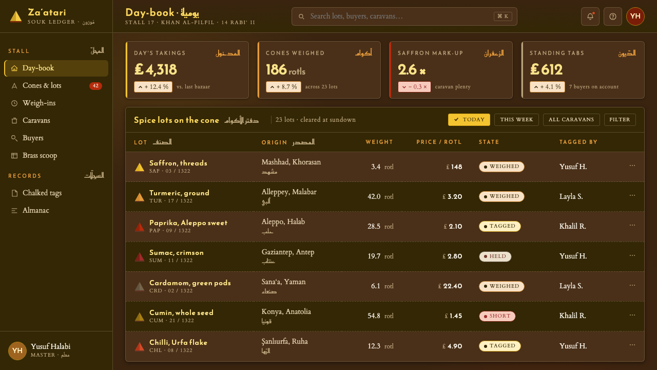
For web interfaces, the style suits dashboards, catalogues, and pricing pages where products or categories need to feel tangible. Use the dark earthen field as the continuous environment, then reserve saffron, turmeric, paprika, and sumac accents for active states, selected products, availability, or tier distinction. Cards can feel like stall trays or sacks, with muted borders and grounded depth rather than floating glass effects. Labels should be short and sign-like, while actions need strong contrast without losing the warmth of the market palette.
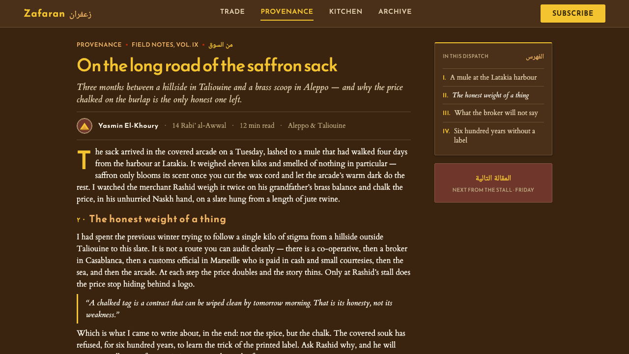
For editorial and marketing work, Spice Souk Market Pyramids creates a strong sense of place without requiring literal photography everywhere. Articles can open with a dark field, a single conical spice heap, and a chalk-like title treatment; section breaks can use small brass or paprika markers that feel like stall labels. Marketing pages can alternate dense product groupings with quiet earthen space, allowing a single saffron or sumac accent to direct attention toward an offer. The system is especially effective when copy describes selection, craft, ingredients, trade, or discovery.
The common mistake is making the style bright, glossy, and uniformly colourful. Covering every surface with saffron, red, and yellow removes the shadow that gives those colours their glow. Replacing burlap, chalk, brass, and dust-soft surfaces with polished gradients also breaks the material story. Another mistake is treating Arabic lettering as an exotic ornament. The lettering should perform a sign, label, or price function; when translated into another language, preserve its directness, placement, and hand-marked character rather than imitating a script without purpose.
Spice Souk Market Pyramids — FAQ
What creates the glow in Spice Souk Market Pyramids?
The glow comes from contrast, not from a bright background. Saturated saffron, turmeric, paprika, and sumac colours are placed inside a dim earthen environment modeled on a covered arcade. Because the surrounding field stays dark and restrained, each spice colour feels concentrated and luminous. Brass and chalk add smaller warm notes without competing with the mounds.
Can the style use cream or pure white backgrounds?
The source definition rules them out. The identity depends on earthen darkness as an active ground, because the covered souk is defined by dim light and the spice colour shining within it. A light background may still be useful for a separate product requirement, but it would describe a different visual direction. To remain faithful, keep the environment dark and let the saturated colour provide the light.
Are the pyramids only decorative shapes?
No. The cones and mounds come directly from how the merchandise is pictured: spices are piled high in open sacks and banked alongside one another. Their rising forms provide hierarchy, focal points, and direction. In an interface or layout, a mound can therefore represent a featured item, a grouped category, or a concentrated quantity. The shape should retain a sense of hand-arranged abundance rather than becoming a generic triangle.
Does using the style require Arabic text?
No, but the role of the lettering should remain clear. The reference is to hand-chalked Arabic price tags and Reem Kufi, so typography should feel like practical vernacular signage: direct, legible, and attached to an item or offer. Other languages can work when they adopt that function and material character. Decorative pseudo-Arabic lettering without readable information weakens the system and turns a commercial reference into surface effect.
Related design styles
 Gaucho LeatherHand-worked horseman craft. Dark recado leather, harness tan, coin-silver ras…
 Kazakh Eagle HunterGolden hour feels handmade. Burgundy velvet, bronze type, and gold-thread bor…
 Khayamiya Tentmaker AppliquéCloth becomes architecture. Indigo canvas holds monumental orange and madder…
 Mata Ni Pachedi Temple ClothThree colors, one cosmos. Madder-red goddesses, iron-black outlines, harda-ti…
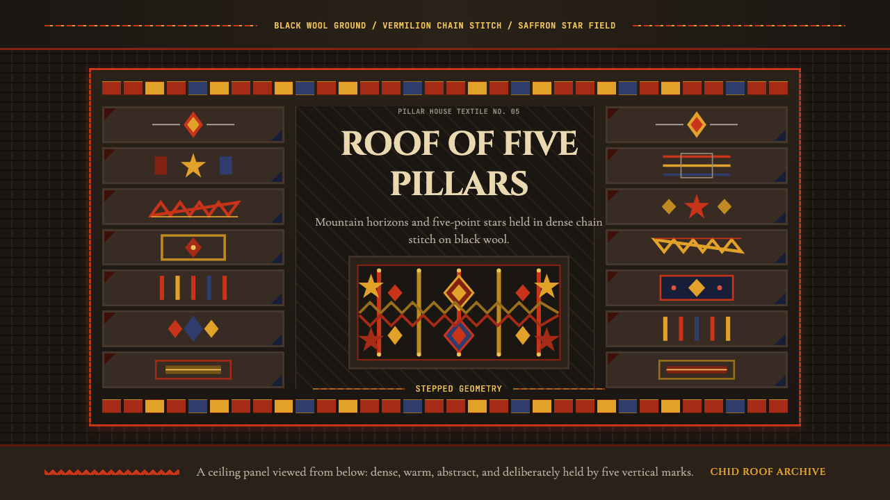 Tajik Pamir Needlework (Chid Roof)Cosmos stitched into wool. Vermilion diamonds and saffron stars hold a five-p…
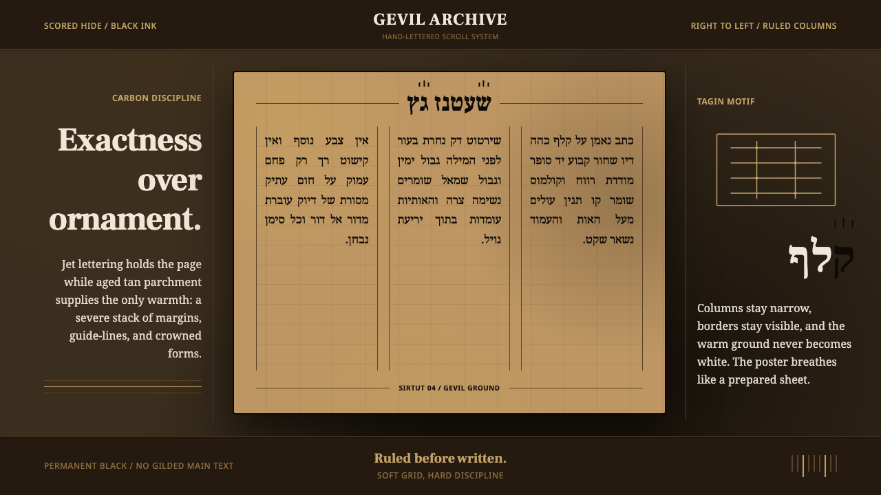 Hebrew STaM ScrollExactness over ornament. Jet ink, ruled Hebrew columns, and amber-tan parchme…