What is Derge Woodblock Sutra Print?
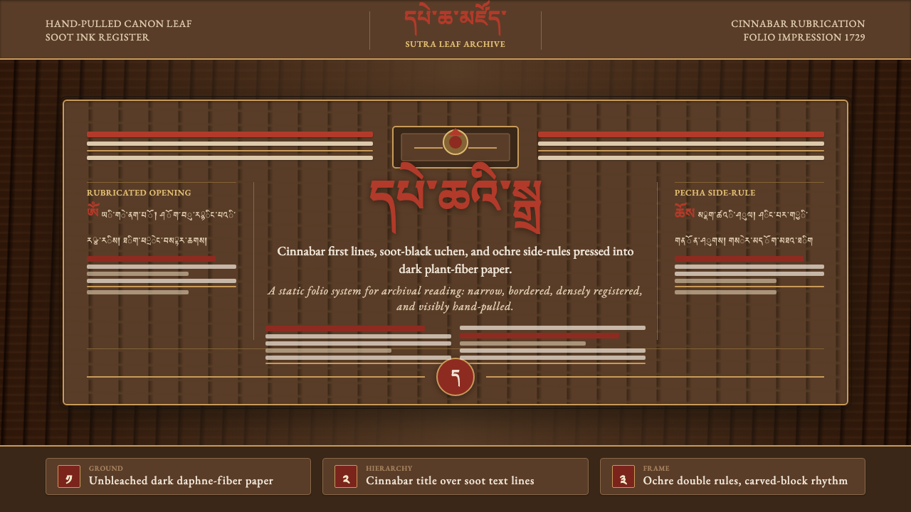
Derge Woodblock Sutra Print brings the solemn pressure of hand-pulled scripture into digital form: soot-black uchen, cinnabar openings, ochre rules, and dark paper that seems to remember the fiber it came from.
Derge Woodblock Sutra Print in brief
Derge Woodblock Sutra Print draws from the living printing tradition of Derge Parkhang, Tibet’s great woodblock printing house. Its visual language begins with a pecha folio page: a broad, warm, unbleached fiber-paper field carrying dense Tibetan uchen letters, narrow rules, carefully bounded text, and selective red rubrication. The result should feel pressed from a carved block, not assembled from pristine digital components.
Its central contrast is between absorption and revelation. Soot-black body text settles deeply into the paper ground, creating the gravity of sustained reading. Cinnabar vermillion appears only where the page must announce a threshold: a title, dedication page, opening line, or ceremonial marker. Ochre rules provide containment without becoming ornamental frames. The eye moves through ink, paper, and interval rather than through contemporary interface chrome.
The style does not imitate age through random damage or theatrical distress. Its texture comes from material memory: visible plant-fiber grain, slight unevenness in the field, the impression of ink meeting absorbent paper, and a page structure inherited from hand-pulled scripture printing. It is reverent, dense, tactile, and deliberately resistant to the frictionless brightness of screen-native design.
Where does Derge Woodblock Sutra Print come from?
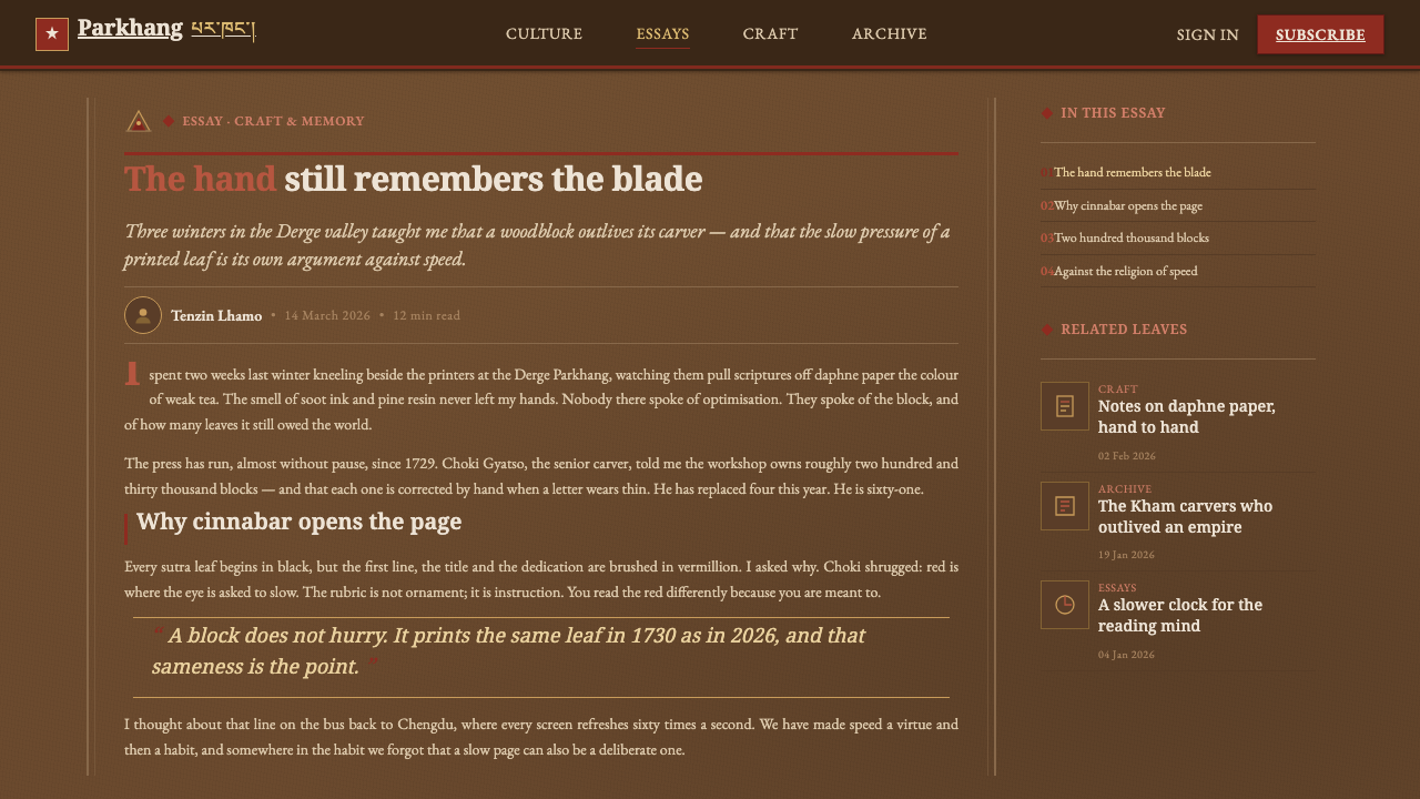
Derge Parkhang was founded in 1729 by the king and patron Tenpa Tsering in Derge, Kham, in eastern Tibet. It was established not as a retrospective archive but as a working center for carved wood, scripture reproduction, and hand-pulled pages. That continuing workshop condition matters to the style: the reference is a process with labor, tools, material limits, and repeated acts of reading.
The printing tradition belongs to Tibetan xylographic sutra production and to the reproduction of the Kangyur and Tengyur canon. A carved block fixes a page’s structure before ink reaches paper. Letters, margins, rules, and sacred opening material are therefore inseparable from the physical matrix that carries them. The visual discipline of the style comes from this unity of text and block rather than from free decorative composition.
Derge pages are printed onto natural paper made from daphne and Pennisetum plant fibers. Because the sheet is not treated as an empty white void, the paper remains an active visual participant. Its tan-brown warmth and fibrous grain soften the severity of dense black text while making every red intervention feel consequential.
The tradition is sustained by generations of Derge carvers, printers, and scribes. Their collective work connects carving, copying, inking, pulling, drying, and preserving the pecha folio as a single cultural practice. A digital adaptation should retain that chain of responsibility: visual choices should appear made, impressed, and placed with purpose, never merely added for atmosphere.
What defines the Derge Woodblock Sutra Print look?
Fiber Paper Ground
The ground is dark, warm, and absorbent in character rather than cleanly white or electronically flat. Let natural fiber grain remain perceptible across the field, with gentle variation that suggests daphne and Pennisetum paper. The texture must support reading, not become a photographic effect competing with scripture-like text.
Soot-Black Uchen
Dense soot-black Tibetan uchen is the visual mass of the page. It should read as impressed ink: compact, disciplined, and continuous across the folio. Avoid airy editorial spacing or playful lettering. The desired sensation is accumulated script, where the darkness of the text creates contemplation as much as information.
Cinnabar Rubrication
Vermillion is reserved for meaningful openings and distinctions: titles, dedication pages, rubricated first lines, and moments that require ceremonial emphasis. Its scarcity is essential. Red should not function as a general-purpose accent or interactive decoration; it is a signal that the page has crossed into a more deliberate register.
Ochre Rules and Bounds
Fine ochre rules establish the page’s container, echoing the bounded logic of a carved printing block. They are quiet but authoritative, guiding the eye along the folio and separating sacred text from surrounding space. Use them as structural traces, never as ornate borders with flourishes or ornamental corners.
Buddha-Niche Frontispiece
Page-head frontispieces draw on the Buddha-niche structure associated with the printed folio. They should feel framed, vertical, and devotional, creating a threshold before the text field begins. Their role is not illustration for atmosphere but a formal opening device that gives the page a ceremonial top edge.
Hand-Pulled Imperfection
The style accepts slight material irregularity: ink may appear absorbed rather than perfectly sealed, grain may interrupt an otherwise even field, and edges may feel pressed rather than digitally cut. This is controlled imperfection. It should suggest the evidence of hand work without turning the interface into a distressed antique prop.

Who shaped Derge Woodblock Sutra Print?
Tenpa Tsering, king and patron, founded Derge Parkhang in 1729. His role anchors the tradition’s institutional beginning: the printing house was established as a durable center for carving, scripture reproduction, and the preservation of a working woodblock practice in Kham.
Generations of Derge carvers gave the printed page its governing matrix. Their work turns text, rules, and page-head imagery into a single carved surface, making structure inseparable from reproduction. The style’s firm boundaries and impressed quality are digital echoes of that carved discipline.
The printers and scribes of Derge sustain the tradition through repeated acts of copying and hand-pulling. Their collective practice gives meaning to the style’s density, restraint, and material attention: a page is not merely displayed, but prepared to carry scripture across generations.
How do you use Derge Woodblock Sutra Print today?
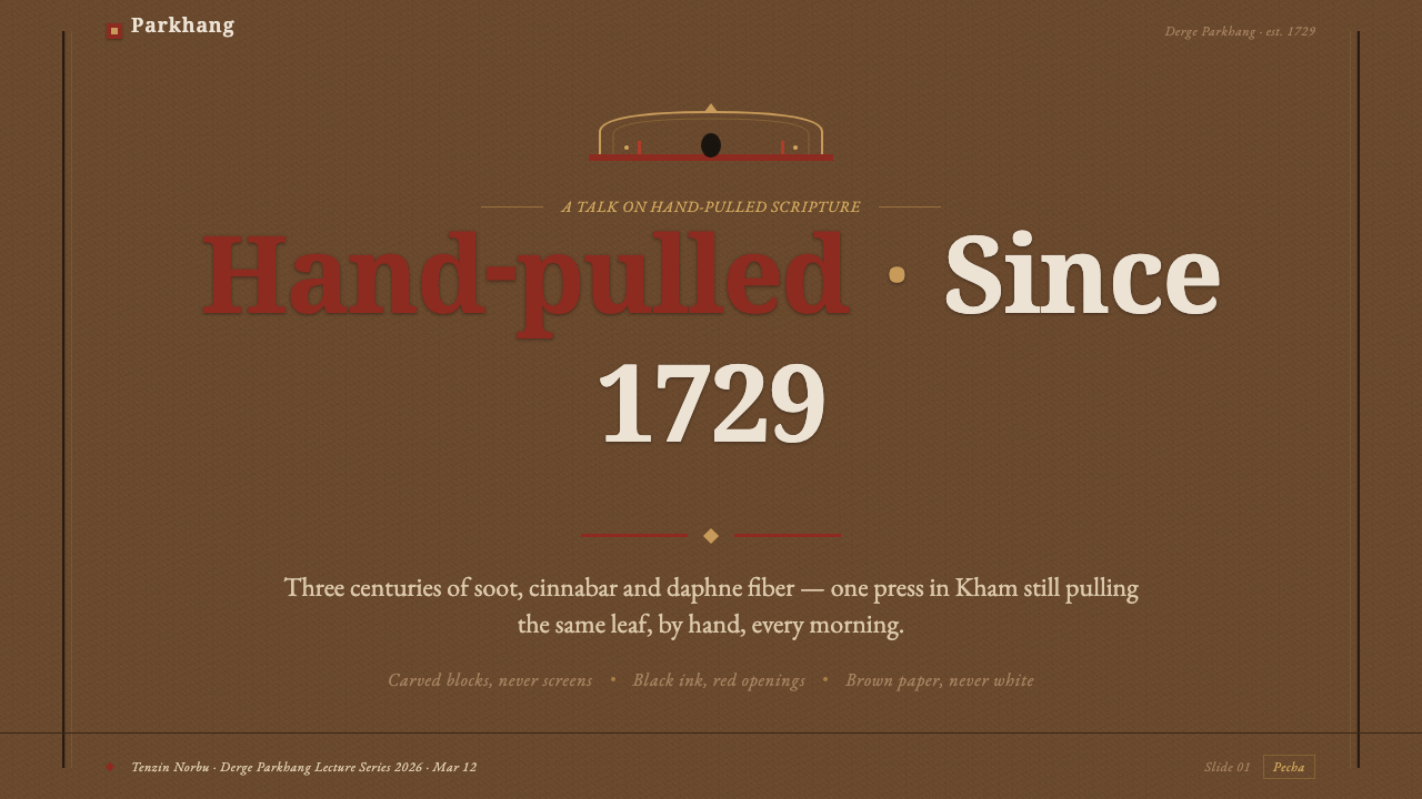
For presentation covers, use a dark fibrous field as the dominant atmosphere and place a restrained page-head niche or narrow ochre rule near the upper edge. Set the title as a deliberate opening rather than a promotional headline, with cinnabar reserved for a single rubricated phrase or marker. Content slides should maintain a folio rhythm: dense but readable text blocks, stable margins, and rules that divide passages without becoming generic presentation separators. Data slides can use soot-black marks as the primary informational layer, with vermillion identifying only the most consequential series, threshold, or annotation.
For web interfaces, this style is strongest in archives, reading environments, cultural collections, scholarly tools, and dashboards whose purpose is sustained attention rather than rapid consumption. Treat panels as pages or folios rather than floating cards. Let ochre rules establish regions, keep the navigation quiet, and make the reading surface feel materially continuous. On a dashboard, red should identify a meaningful state or priority, not decorate every control.
For pricing or membership pages, use the style with restraint. A plan or contribution level can be treated as a bounded leaf in a larger manuscript sequence, where the name, explanation, and commitment sit within one disciplined field. The visual character should convey stewardship and continuity rather than luxury. Preserve sufficient contrast and clarity so the paper texture never obscures essential choices or text.
For editorial and marketing work, Derge Woodblock Sutra Print suits exhibition pages, book launches, cultural programs, archival narratives, and long-form essays. A lead image or frontispiece may occupy the page head, while body copy follows a contained, scripture-inspired measure beneath it. Marketing language should remain measured and declarative. The style has little patience for urgent badges, glossy product spectacle, or a crowded collage of competing messages.
The common mistake is using dark textured paper and red text as a costume while retaining a generic modern interface underneath. If every button, tag, statistic, and heading is vermillion, rubrication loses its meaning. If fiber grain is noisy, the material ground becomes decorative clutter. The system succeeds when black ink carries the ongoing text, ochre establishes order, red marks true openings, and the page feels hand-pulled rather than merely antique.
Derge Woodblock Sutra Print — FAQ
Is this style simply an antique-paper aesthetic?
No. The paper ground is only one part of a broader woodblock logic. Derge Woodblock Sutra Print depends on the relationship among fiber paper, dense soot-black uchen, bounded folio structure, ochre rules, page-head imagery, and selective cinnabar rubrication. Removing that hierarchy and adding texture alone produces decoration, not a faithful design system.
Why should vermillion be used so sparingly?
In the source tradition, cinnabar vermillion opens titles, dedication pages, and rubricated first lines. Its power comes from contrast against the ongoing soot-black text. Used everywhere, it becomes an ordinary accent and erases the distinction between sustained reading and ceremonial entry. Treat it as a page-level signal, not a palette filler.
Can the style work with non-Tibetan content?
It can, provided the adaptation respects the source system instead of treating Tibetan visual culture as exotic surface decoration. Non-Tibetan content can use the folio structure, paper-led field, restrained rules, and meaningful color hierarchy. It should not imitate sacred text merely for mood, and it should preserve a clear distinction between functional typography and script used as culturally specific content.
How should texture behave in a digital reading interface?
Texture should establish material presence before it establishes visual interest. Keep it quiet enough that body text remains legible and the page feels continuous rather than noisy. A useful test is whether the reader notices the fiber grain as part of the paper after entering the text, not as a competing image demanding attention at the same time.
Related design styles
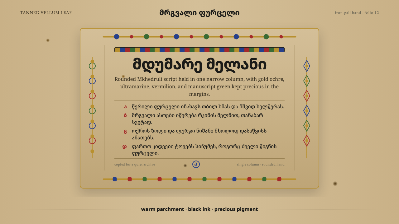 Georgian MkhedruliA manuscript breathes slowly. Tanned vellum, round Mkhedruli ink, ochre and u…
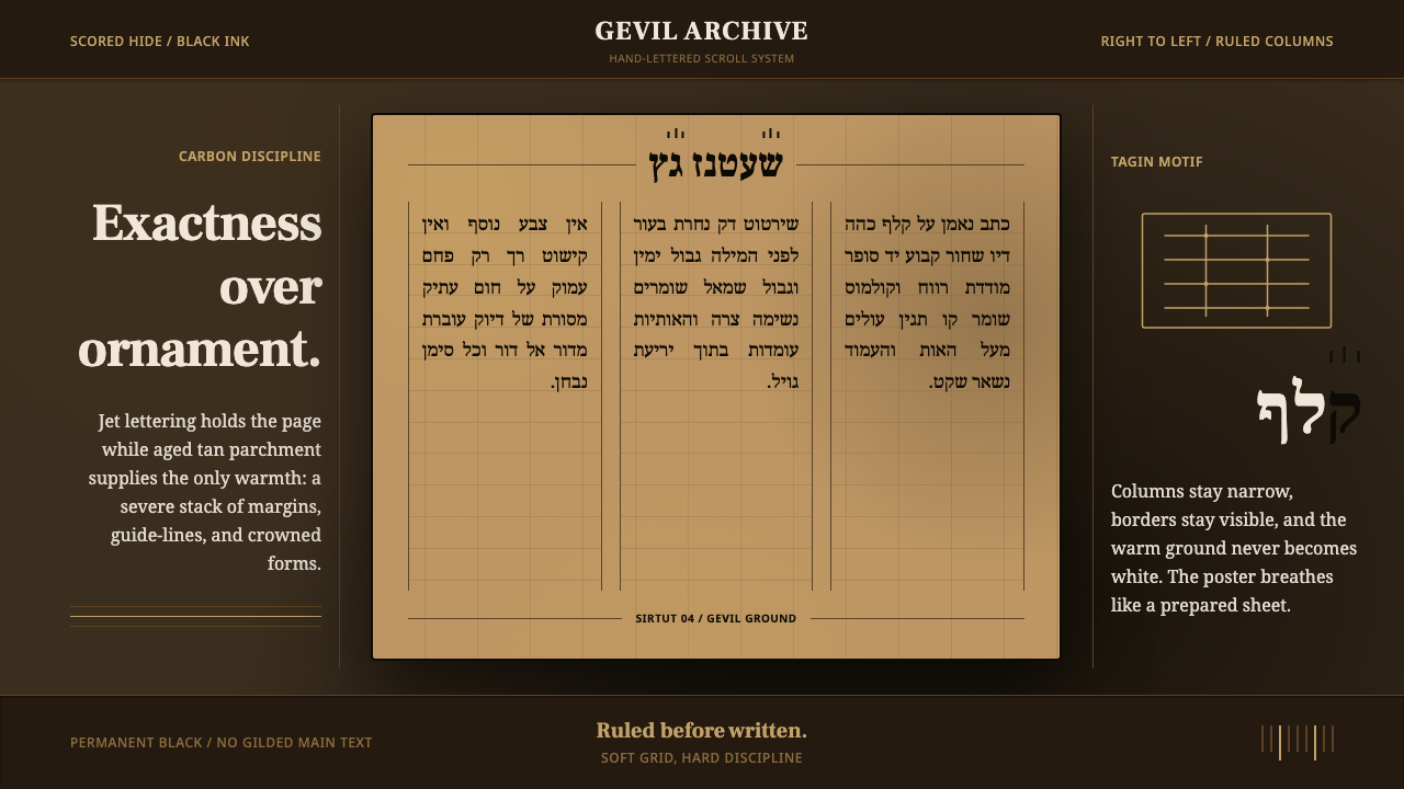 Hebrew STaM ScrollExactness over ornament. Jet ink, ruled Hebrew columns, and amber-tan parchme…
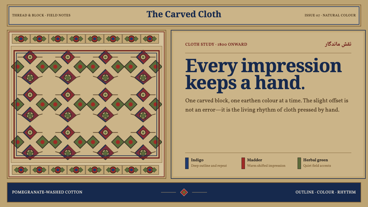 Isfahan Qalamkar PrintEvery impression keeps a hand. Indigo and madder repeats shift softly across…
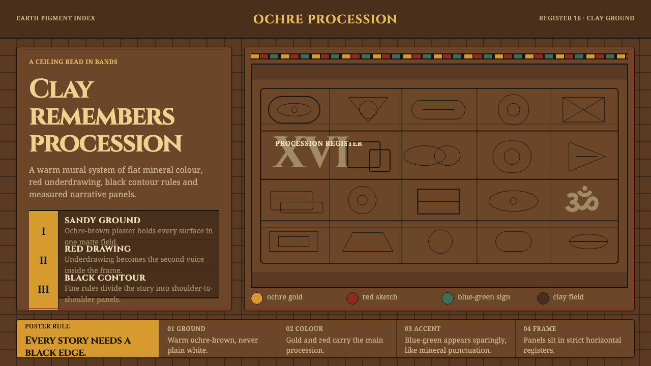 Lepakshi Vijayanagara CeilingEarth remembers in registers. Ochre gold, red underdrawing and black rules ma…
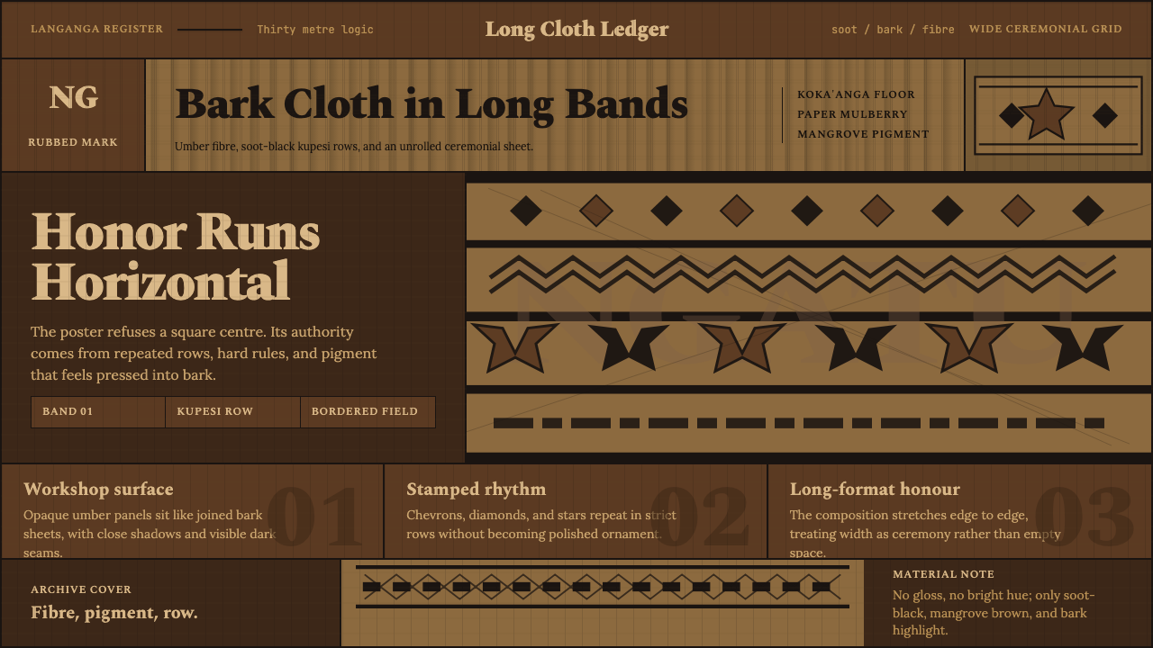 Tongan Ngatu (Tapa)Ceremony runs wide. Soot-black rows stamp umber bark with strict kupesi geome…
 Akan Adinkra (Ghana)Proverbs become cloth. Russet grids, lampblack serif marks, and gold-edge ban…