What is Crimean Tatar Ornek?
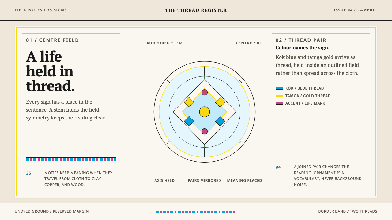
Crimean Tatar Örnek is ornament that can be read — a grammar of about thirty-five motifs, each tied to a stage of life, grown from a mirrored stem in kök blue and tamga gold on undyed cloth.
Crimean Tatar Ornek in brief
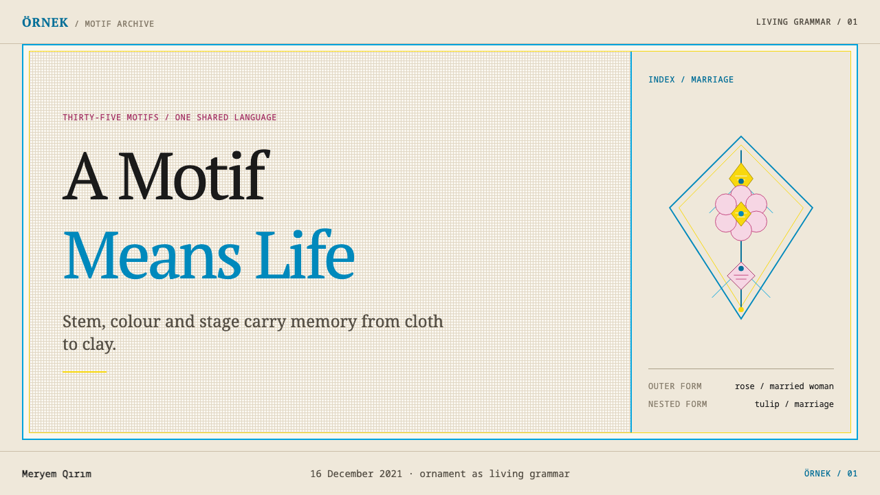
Örnek is the traditional ornament of the Crimean Tatars, and it is closer to a language than to a pattern library. It consists of a vocabulary of roughly thirty-five motifs, each with an assigned meaning. A rose says married woman. A cypress says adult man. A tulip says young man. An almond says unmarried girl. A tulip set inside a rose says marriage. The same signs travel from silk-on-cambric embroidery to maiolica, copper and carved wood without losing their meaning.
The design system built on it keeps that discipline. Everything grows from a stem on a mirrored axis, and every motif sits inside a frame: a rhombus, a medallion or a corner triangle. Border bands run along the edges, and one large motif holds the center of a field. Two colors do the naming: kök blue, which the source ties to the Crimean Tatar flag, and tamga gold, the gold of the emblem that stands for the people. The undyed cloth underneath does the breathing.
The visual effect is calm, symmetrical and quietly dense. Nothing is scattered. Nothing floats. Each ornament has a root, a direction and a place, and a viewer who knows the vocabulary can read the page the way they would read a sentence. For designers, the lesson is that decoration can carry information, and that restraint of form is what makes that information legible.
Where does Crimean Tatar Ornek come from?
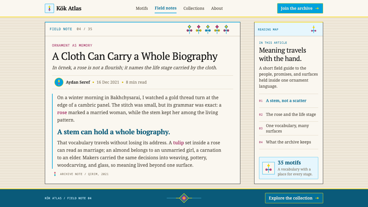
Örnek is a living tradition whose roots, according to the source, lie before 1900. It is a code with roughly thirty-five motifs in which each flower or tree stands for a stage of life. Besides the rose, the cypress, the tulip and the almond, the vocabulary includes the poplar, which like the cypress means an adult man, and the carnation, which belongs to the elderly. Combinations make compound statements: a tulip inside a rose is read as a marriage. It is an unusually legible system, because the meaning of a piece of ornament is fixed by convention and not left to the viewer's guess.
The same vocabulary appears across many crafts: embroidery, weaving, ceramics, glazed maiolica, jewelry, woodcarving and glass painting. That portability is the most striking fact about örnek, and it explains why the tradition has such a clear internal logic. The source locates it in Crimea, in towns such as Bakhchysarai, Yevpatoria and Karasubazar, and in the Crimean Tatar diaspora, where the tradition has been carried abroad by communities who kept making and reading it. On 16 December 2021 it was inscribed on UNESCO's Representative List of the Intangible Cultural Heritage of Humanity.
The visual grammar is as strict as the semantic one. Motifs must grow from a stem, and the stem sits on an axis with the two sides mirrored. The result is then enclosed inside a rhombus, a medallion or a corner triangle, so that the form is always bounded and self-contained. Repeating border bands run along the edges of a piece, and the middle of the field is kept for a single large motif. The arrangement tells the eye where to start, where to rest and where the edge of the composition lies.
The color and the ground complete the system. The base is undyed cotton cambric and linen, the natural pale tones of the cloth itself. The blue is the kök blue of the flag, and the gold is the tamga gold. White space in this tradition is not a technique chosen by a designer; it is the cloth showing through. The source names three lines of influence: Crimean Tatar applied arts, Ottoman-Turkic ornament and UNESCO's framework of intangible cultural heritage. It lists three key figures, Adaviya Efendiyeva, Mamut Çurlu and Zuleikha Bekirova, as people associated with the tradition.
What defines the Crimean Tatar Ornek look?
Mirrored Stem
Every motif grows from a stem, and the stem stands on a central axis with the left and right sides mirrored. This is the rule that makes ornament feel rooted instead of floating. Nothing in the composition is allowed to hang in space; each flower or leaf has a visible line back to the stem, and the symmetry gives the whole piece a settled, ceremonial calm.
Enclosing Frames
Motifs are held inside a rhombus, a medallion or a corner triangle. The frame is not a decorative border but a structural container that gives the motif its bounded, self-contained shape. Rhombuses and medallions suit central placements, while triangles fit into corners, so that the choice of frame also tells the viewer where on the field they are looking.
Border and Center
The field has a simple two-part order. Border bands of repeating motifs run along the edges and give the piece its outline. One large motif, and only one, holds the center. There is no scattered filler between them. The effect is hierarchical: the border says where the work ends, and the center says what it is about.
Kök Blue
The blue is kök blue, the blue of the Crimean Tatar flag. It is a clear, saturated, slightly cool blue that works as the primary naming color: it draws the stems, the frames and the key motifs. Because it is tied to an identity, it should be used with intent rather than as a general interface blue.
Tamga Gold
The gold is tamga gold, taken from the emblem that stands for the people. It is a warm, muted metallic yellow that reads as embroidery thread more than as shiny foil. Gold serves as the second naming color, used for emphasis, for the central motif's accents and for details that need to be noticed second, after the blue.
Undyed Cloth
The ground is the natural pale color of cambric and linen, with a warm, uncoated feel. It is not pure white and not a decorative cream; it is the cloth. The empty space around motifs is therefore never wasted. It is the surface that lets the two colors stand out, and it should be generous.
Ornament as Language
The deepest characteristic is that a motif carries a meaning. A rose, a cypress, a tulip and an almond are not interchangeable shapes, and a tulip inside a rose is not a decorative combination but a statement. A design that uses örnek well chooses motifs because of what they say, and never merely because of how they look.
Who shaped Crimean Tatar Ornek?
Adaviya Efendiyeva is named in the theme's reference list as a figure associated with the Crimean Tatar ornament tradition. Her place in the list is a reminder that örnek is held in living hands, passed on and interpreted by named people, rather than preserved only in museums. A designer drawing on the style is working with the output of that chain of transmission.
Mamut Çurlu is another name listed among the key figures of the tradition. The presence of several individual names in the source points to a shared craft culture in which knowledge of motifs, frames and colors is handed on person to person. For readers of this article it also signals that the tradition has recognizable custodians who deserve credit when its forms are reused.
Zuleikha Bekirova completes the set of three individual names the source gives for the tradition. Together with the other two, she anchors örnek in specific people and places, not in an anonymous folk past. The practical consequence for designers is a habit of care: learn what a motif means before using it, and present it in a way that respects the community that keeps it alive.
How do you use Crimean Tatar Ornek today?
Crimean Tatar Örnek is a good choice when a project wants calm, ceremony and meaning: cultural institutions, heritage storytelling, education, craft and textile brands, hospitality and any piece that honors family and life stages. Its strength is structure. Before using it, decide what the center of the composition is, because the style needs exactly one large motif and a restrained set of supporting edges.
For presentation slides, a cover can place one large motif inside a medallion at the center of an undyed field, with the title set quietly beneath it and a thin border band along the lower edge. Content slides can use corner triangles for section markers and a repeating border for page rhythm, with text in a single calm column. Data slides work well when the layout is mirrored: two sides of a comparison placed symmetrically about the central axis, with blue and gold distinguishing them.
For web interfaces, the style fits content-led sites, museum and archive pages, onboarding flows and product stories more than dense tools. Keep the background in the pale cloth tone, use blue for primary actions and headings, and keep gold for accents and selected states. Corner triangles can frame section headers, and a repeating border band can divide the page. Pricing or plan pages should borrow the structure, meaning frames and axes, and not assign the traditional life-stage motifs to tiers, since that would misuse their meaning.
For editorial and marketing work, örnek gives an unmistakable handmade voice. An article about a craft, a family recipe or a migration story can sit on the cloth ground with a border band of repeating motifs and a single large motif as the opening image. Captions can be short and warm. Campaigns should be specific about what they are honoring, and when the tradition itself is the subject, say where it comes from.
The most common mistake is to treat the motifs as generic floral wallpaper, scattering roses and tulips at random across a page. Because each motif has a meaning, careless use is not only visually weak but can also say something unintended. A second mistake is to break the grammar: motifs without stems, asymmetry in the axis, or several large motifs competing in the center. Finally, avoid using the blue and gold as general brand colors detached from the structure; they carry identity and should be used with that in mind.
Crimean Tatar Ornek — FAQ
What do the main motifs mean?
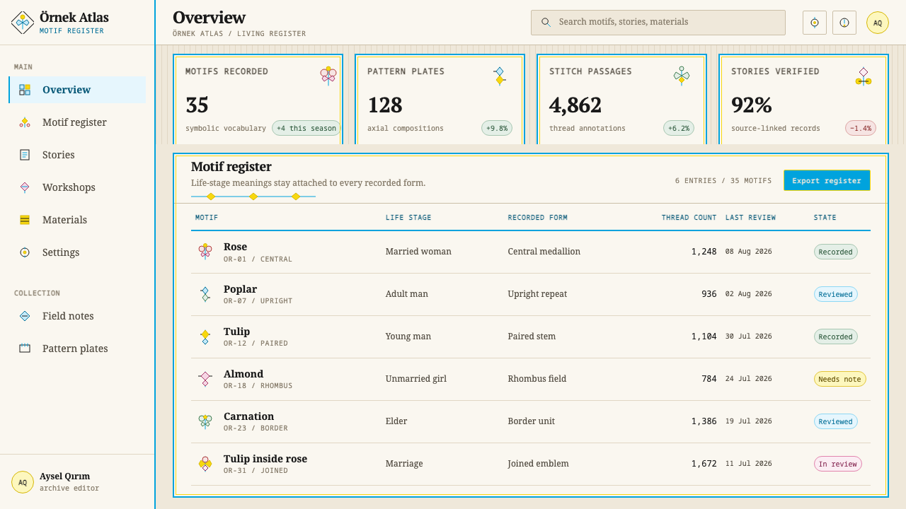
According to the source, a rose means a married woman, a cypress or poplar means an adult man, a tulip means a young man, an almond means an unmarried girl and a carnation belongs to the elderly. A tulip set inside a rose is read as a marriage. The vocabulary has roughly thirty-five motifs in total, and the meaning stays the same across embroidery, ceramics, metal and wood.
Is it appropriate to use these motifs in commercial design?
Örnek is a living cultural tradition and was inscribed on UNESCO's intangible heritage list in December 2021, so care is warranted. Learn what a motif means before using it, do not apply it decoratively against its meaning, name the tradition when you draw on it, and prefer collaboration with Crimean Tatar makers where a project depends on the heritage itself.
Why is the background not pure white?
Because the ground is meant to be undyed cambric and linen, the natural pale tone of the cloth. The empty space is the cloth showing through, not a neutral canvas, and it gives the blue and gold a warm, tactile setting. A pure white or a cold grey would take away the handmade quality that defines the style.
Can I use a dark background?
It is not recommended. The system rests on a pale cloth ground with blue and gold stitched onto it, and the idea of white space as cloth does not survive inversion. If a dark surface is unavoidable, keep the grammar of stems, axes and frames, but understand that you are making a derivative that loses part of the original logic.
How is it different from generic Ottoman or floral ornament?
Örnek shares ground with Ottoman-Turkic ornament, which the source lists among its influences, but its defining features are a fixed semantic vocabulary and a strict grammar: motifs grow from a mirrored stem, sit inside a rhombus, medallion or corner triangle, and appear as borders with one central motif. General floral decoration has none of those constraints.
Related design styles
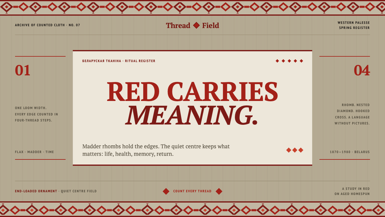 Belarusian RushnykRed carries meaning. Madder rhombs crowd aged flax edges while the woven cent…
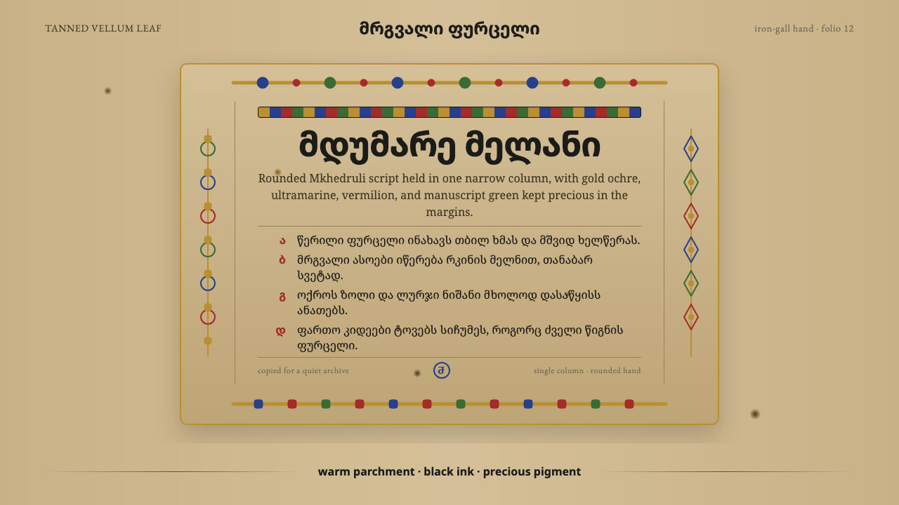 Georgian MkhedruliA manuscript breathes slowly. Tanned vellum, round Mkhedruli ink, ochre and u…
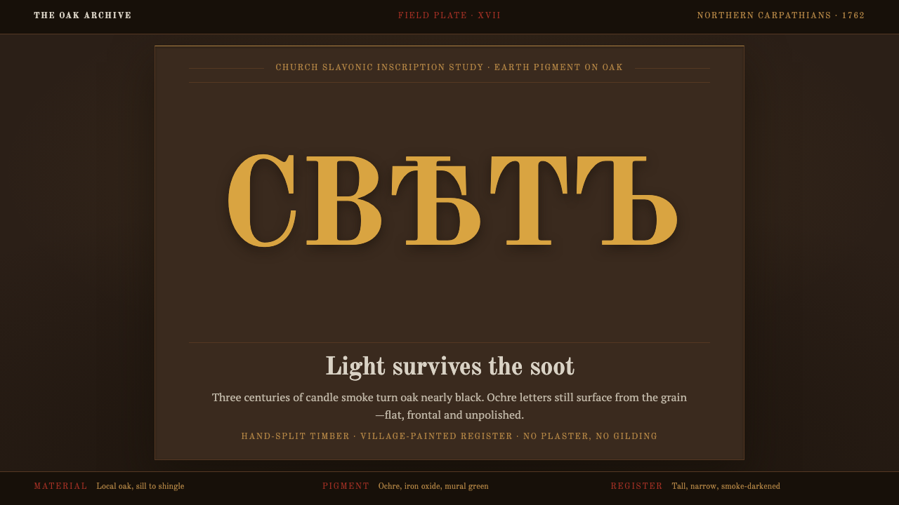 Maramureș Wooden ChurchLight survives the soot. Ochre type and earth-red geometry rise through smoke…
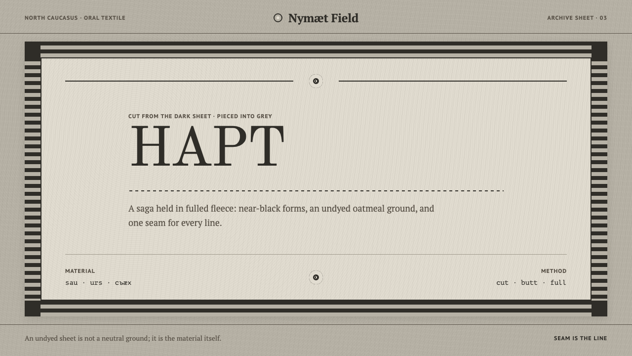 Ossetian Nart FeltThe seam is the line. Near-black cut forms sit on an undyed oatmeal field ins…
 Čičmany Painted House OrnamentWhite is the ornament, not the page. Lime-white folk geometry on dark weather…
 Derge Woodblock Sutra PrintHand-pulled scripture gravity. Cinnabar uchen and ochre rules press into dark…