What is Ossetian Nart Felt?
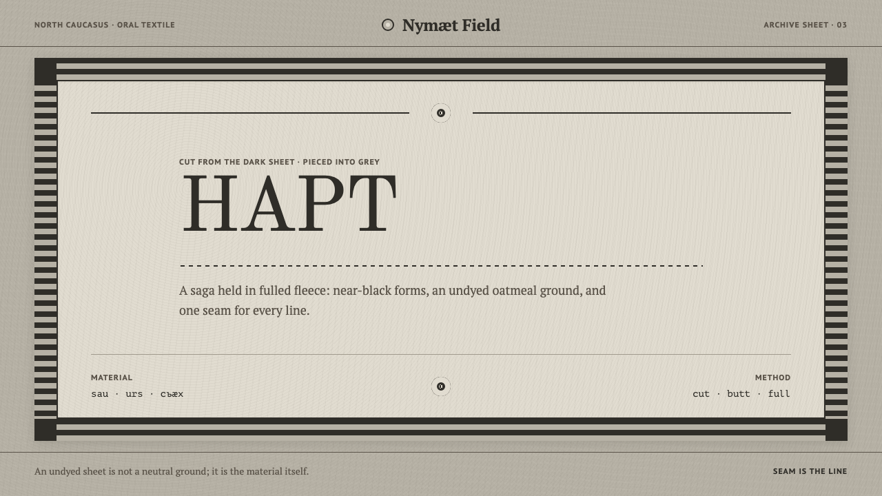
Ossetian Nart Felt turns cloth into a drawing without a single stroke: near-black pieces cut and inlaid into an oatmeal field, held in a mirrored frame, with the seam as the only line.
Ossetian Nart Felt in brief
Ossetian Nart Felt is a design language drawn from the felt hangings and mats of the Ossetians of the North Caucasus, and from the Nart saga whose horses and household objects those felts carry. Felt here is neither printed, woven nor drawn. Mountain-sheep fleece cut in late summer is rolled and fulled into a single sheet, and a second, darker sheet is cut up and pieced into it. The seam is the only line there is.
Visually, the system is near-black cut forms on an undyed grey-oatmeal field, set inside a wide mirrored frame. The forms are silhouettes: horses, the three-legged fyng table, ram's-horn spirals, solar signs, zigzags. There are no outlines because there is nothing to outline. Every edge is a cut or a seam, and every shape is a piece of cloth laid into cloth, so the whole surface feels dense, matte and quietly monumental.
Two hard rules govern everything. Shapes are cut, never traced, and the composition is always symmetrical about its central axis, with a broad border around it. The result is serene, heavy and surprisingly modern: a layout language of solid masses, controlled symmetry and deliberate quiet, useful wherever gravity and heritage are wanted without nostalgic decoration.
Where does Ossetian Nart Felt come from?
Ossetian felt belongs to the North Caucasus, to North Ossetia–Alania and South Ossetia, and to a craft practice older than the record of 1900. Its raw material is local: fleece from mountain sheep, cut in late summer, then rolled and fulled, worked wet and pressed until the fibres lock into one sheet. There is no loom and no thread. The sheet itself is the textile, which is why a decorated felt is built by cutting and inlay rather than by drawing across a surface.
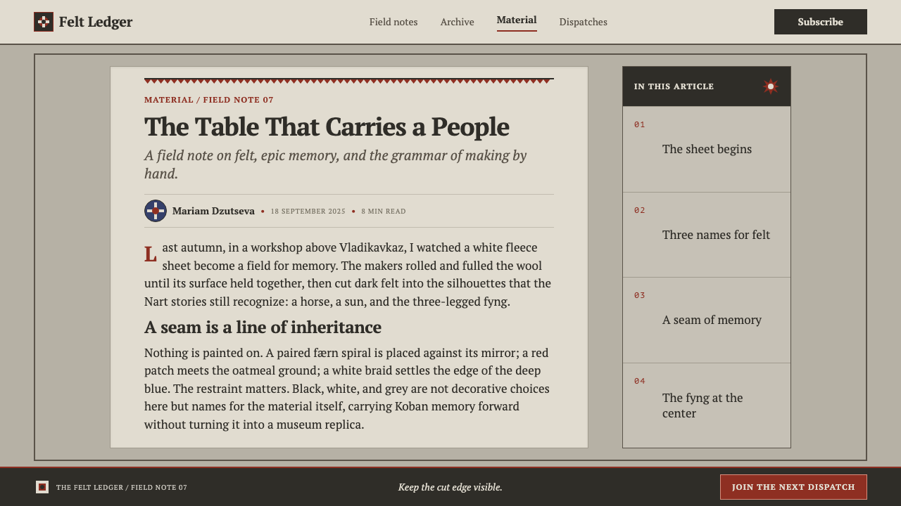
The Ossetian language is exact about its materials. It gives felt three names, sau, urs and cъæх: black, white and grey. Felt that is meant to be dyed is made only from white wool, which is why the undyed ground is that greyish oatmeal tone rather than a clean white. The ornamental technique follows from this. A darker sheet is cut into figures and pieced into the lighter one, so a design is a mosaic of cut cloth rather than a drawing, and the joint between pieces is the line.
The imagery comes from the Nart saga, an oral cycle counted among the oldest Indo-European epics. The horses and the three-legged fyng belong to its world, and around them go the ram's-horn spiral called færn, solar signs, spirals and zigzags. These motifs run back through Alan, Sarmatian and Scythian ornament, and further to Koban bronze, which is why the record speaks of Alan ornamental continuity: a vocabulary of signs that survived by being passed from hand to hand and from one medium to the next, from bronze to cloth.
Scholars and institutions stand behind the record. Kosta Khetagurov, Vasily Abaev and the State Museum of Oriental Art in Moscow are the names it lists, alongside three strands of tradition: Caucasian felt-making, the Nart saga as oral tradition, and the continuity of Alan ornament. For a designer, the lesson of that lineage is not antiquarian. It is the discipline of a visual language that has changed its material several times without changing its logic: simple signs, strong silhouettes, and a symmetry that holds the whole thing still.
What defines the Ossetian Nart Felt look?
Undyed Oatmeal Ground
The field is the grey-oatmeal of undyed felt, warm and slightly dull, never a clean white. Because dyed felt is made only from white wool, an undyed ground is the honest material colour of the craft. It should fill the page generously and stay flat, with no paper texture, glow or gradient laid over it.
Near-Black Cut Forms
Figures are solid, dark, near-black silhouettes, as if cut from a heavier sheet. They carry no internal line work and no outline. Detail comes only from the shape of the cut and the narrow gaps between pieces. A figure should be recognisable from its outline alone, the way a horse is recognisable from a single cut profile.
The Seam as Line
The only line in the system is the joint where one piece meets another, which appears as a thin gap or a change of tone. Do not stroke shapes to make them stand out. If something needs separating, separate it the way a felt-maker would: by cutting it as its own piece and leaving a seam.
Mirror Symmetry
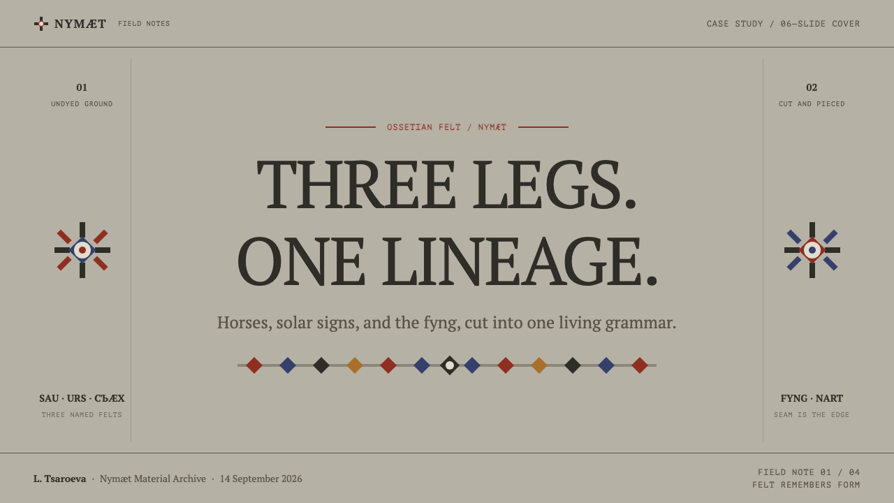
Compositions are symmetrical about a vertical central axis. Whatever sits on the left is repeated, reversed, on the right, and the central motif sits exactly on the axis. Symmetry here is not decorative polish but the organising law, and it gives even a sparse page a settled, ceremonial weight.
Wide Frame
A broad border surrounds the central field, often built from repeated small pieces such as zigzags or spirals. The frame is part of the picture, not a margin. It contains the composition, gives it a threshold, and keeps the interior calm. A thin or token border misses the point; the frame should be generous enough to be read as its own band.
Ancient Sign Vocabulary
The ornament comes from a short list: ram's-horn spirals (færn), solar signs, simple spirals and zigzags, with horses and the three-legged fyng as the main figures. These signs trace back through Alan, Sarmatian, Scythian and Koban work. Use them with restraint and in their intended roles, as border bands or central emblems, rather than as filler pattern.
Matte Density
Felt is dense, matte and without sheen, so the system avoids gloss, glow and soft shadow. Depth comes only from overlap and from the contrast between dark pieces and the pale field. The surface should feel pressed and solid, as if you could run a hand across it, but it should never imitate wool fibres with a literal texture.
Who shaped Ossetian Nart Felt?
A poet and painter regarded as a foundational voice of modern Ossetian culture. He appears in the record as a key figure because he stands at the point where the Ossetian oral and visual world was written and drawn into the modern period. For a design system, his presence signals that Ossetian imagery is a continuing national tradition, not only an archaeological one.
A linguist who studied the Ossetian language and its folklore, including the Nart tradition. His work is part of the reason the Nart saga can be discussed as one of the oldest Indo-European oral cycles, and why words such as sau, urs and cъæх, the three names of felt, can be traced and explained. Language scholarship is what lets a visual system speak in its own terms.
A museum in Moscow listed in the record alongside the individual scholars. Its inclusion points to museum collections as one of the places where tradition-bearing objects are kept and studied. For designers, it is a reminder that much of what survives of a craft like felt-making reaches us through collections, catalogues and photographs, and that those sources deserve credit.
The unnamed carriers of the tradition: the people who kept the Nart saga alive as spoken narrative, and the makers who cut and pieced felt in the mountains. The record does not name them, but the whole system depends on them, because a craft passed from hand to hand and a saga passed from mouth to mouth are exactly what allowed these signs to survive from bronze to cloth.
How do you use Ossetian Nart Felt today?
Ossetian Nart Felt works best when a project wants weight, stillness and heritage without ornament. Its rules are few and firm, which makes it easy to apply well and easy to spoil. Think of every element as a piece of cloth cut and laid in place, and ask of each decision whether a felt-maker could have made it that way.
On cover slides, build a mirrored composition: a single central motif on the axis, flanked by matching pieces, inside a wide band that frames the whole slide, with the title centred on the axis in plain type. Content slides can keep the frame and organise text in one centred column or two mirrored columns, never in a ragged asymmetrical grid. Data slides suit mirrored charts, such as back-to-back bars, where the central axis does real work and each bar is a solid dark block with no outline or gradient.
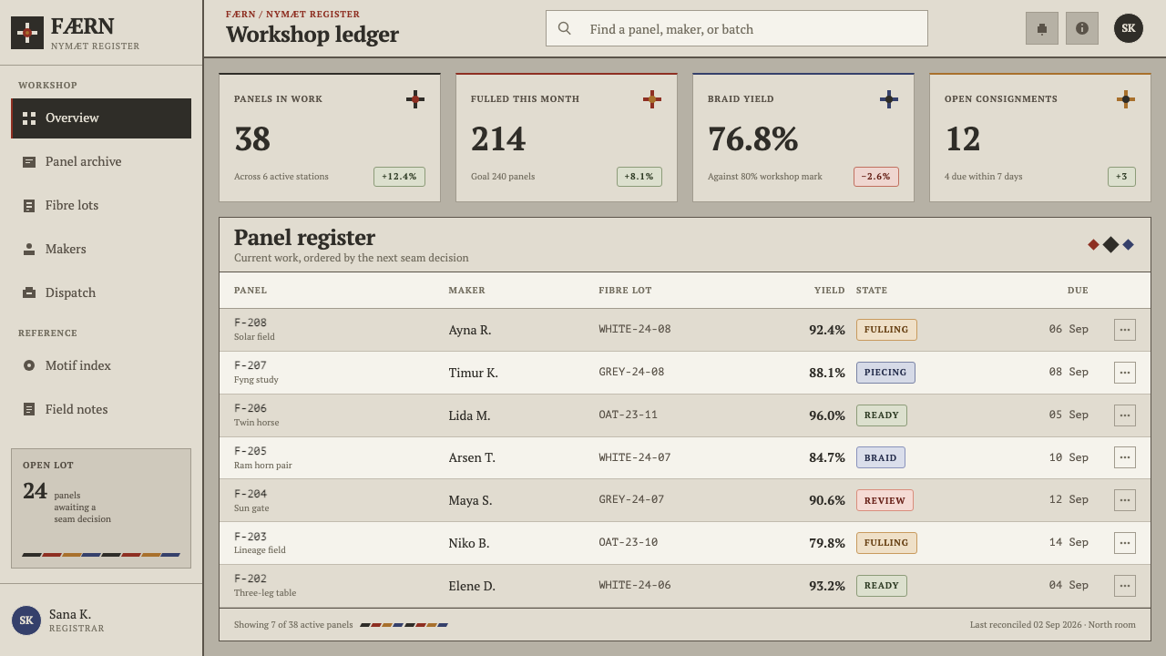
In product interfaces, treat panels as pieced sheets: dark or pale blocks sitting directly against the field, separated by narrow gaps instead of borders and shadows. Dashboards benefit from a generous outer frame that contains the whole workspace, with content balanced about a central line. Pricing pages have a natural structure in the three felts, black, white and grey, which can serve as three plan levels, each a solid cut panel with the recommended one placed on the axis. Buttons are plain solid blocks; hover states change tone, not outline.
In editorial and marketing work, the style suits heritage crafts, cultural institutions, mountain and outdoor brands, regional food and drink, museum catalogues and long-form essays with a ceremonial tone. Centre the title and the key line on the axis, use a zigzag or spiral band as a divider, and let large areas of the oatmeal field breathe. Promotional pieces can carry a single large emblem in near-black and little else, which is exactly how a felt wall hanging works.
The most common mistake is outlining. A stroke around a shape turns a cut piece into a drawing and destroys the central rule that the seam is the only line. A second mistake is breaking the symmetry for the sake of a dynamic layout, which makes the system lose its stillness. A third is adding wool-like texture, gradients or drop shadows to make the page look like felt; the felt effect comes from flat cut shapes on a matte field, not from simulating fibre. Finally, avoid cluttering the frame with too many motifs: a few signs, repeated with discipline, are stronger than a crowd.
Ossetian Nart Felt — FAQ
What is Ossetian felt and what is the Nart saga?
Ossetian felt is a craft of the North Caucasus in which mountain-sheep fleece, cut in late summer, is rolled and fulled into a sheet, and darker pieces are cut and inlaid to form designs. The Nart saga is an oral epic cycle counted among the oldest Indo-European ones, and its horses and household objects, such as the three-legged fyng table, appear in the felt's imagery. The design system draws on both: the technique supplies its rules, the saga supplies its signs.
Why does the style avoid outlines?
Because in felt there are no outlines. A design is made by cutting a darker sheet into shapes and piecing them into a lighter one, so the only line is the seam between pieces. Adding a stroke would make the shape look drawn instead of cut, and it would remove the sense of solid material that gives the style its weight. If shapes need separating, leave a narrow gap, the digital equivalent of a seam.
Does every layout have to be symmetrical?
The central composition should be. The system's second hard rule is that the picture is always mirrored about its central axis and surrounded by a broad border. Within that, content can vary, and a long page can contain several mirrored sections stacked one after another. If a layout genuinely needs asymmetry, such as dense data tables, keep the outer frame and the central axis in the surrounding elements so the page still reads as a felt.
Can I add colour to this style?
The core system is two values: near-black pieces on an undyed oatmeal field. If a project needs a third, treat it the way felt treats dye: as a flat, matte piece, cut and inlaid in the same way as the dark pieces, and used sparingly in one place. Remember that the craft dyes only white wool, so a colour accent is a deliberate exception, not a default. Avoid gradients, glowing accents and multiple competing hues.
Where does Ossetian Nart Felt work best, and where does it struggle?
It works best for heritage, craft, cultural and outdoor subjects, ceremonial or monumental communication, and interfaces that want calm, dense structure: dashboards with strong framing, three-tier pricing, long-form essays. It struggles with products that need lightness, speed, playful motion or many colours, such as consumer entertainment, children's products or dense analytics with many series. Its strength is stillness, and it should not be forced to move quickly.
Related design styles
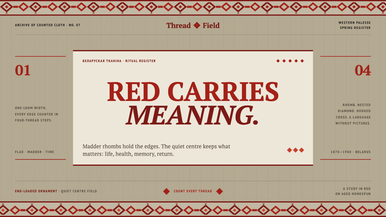 Belarusian RushnykRed carries meaning. Madder rhombs crowd aged flax edges while the woven cent…
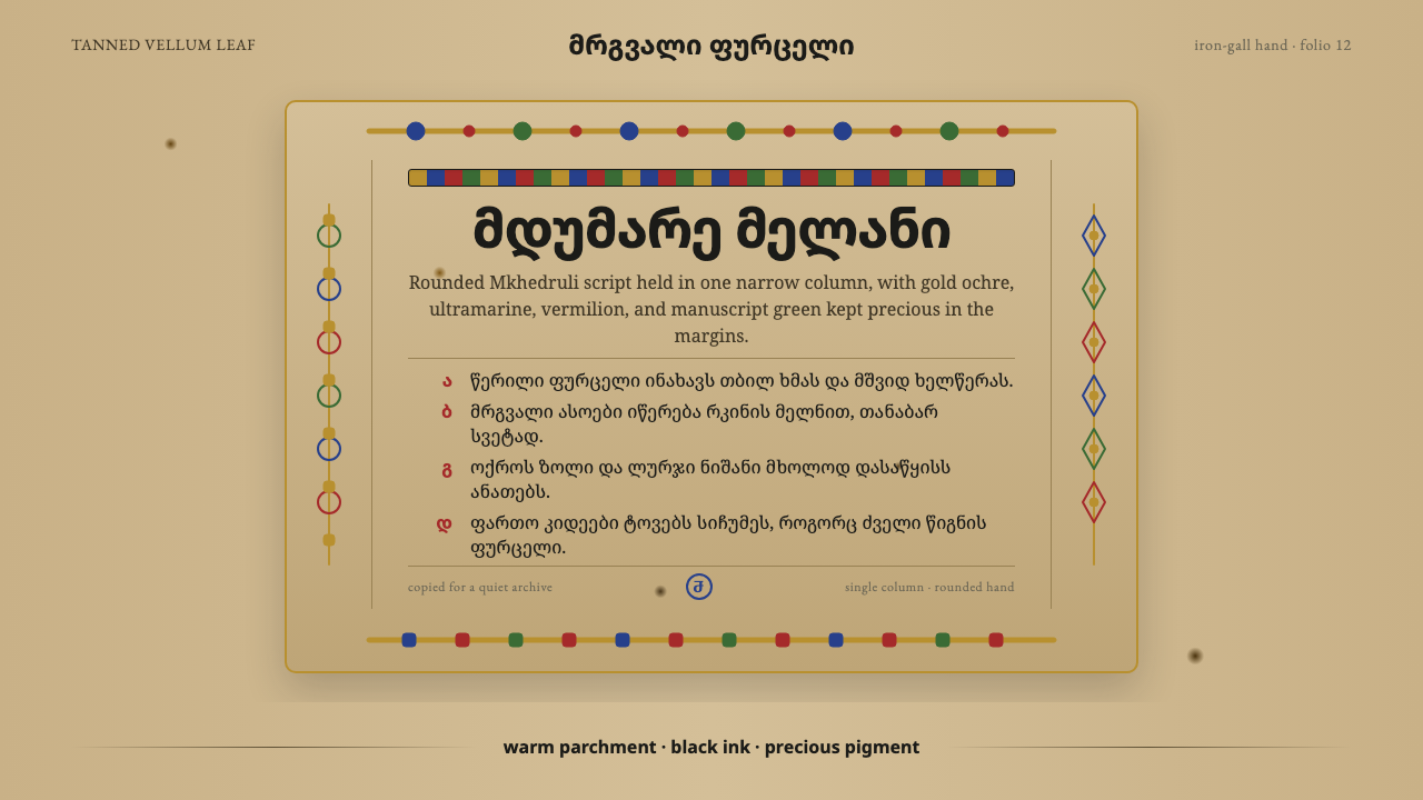 Georgian MkhedruliA manuscript breathes slowly. Tanned vellum, round Mkhedruli ink, ochre and u…
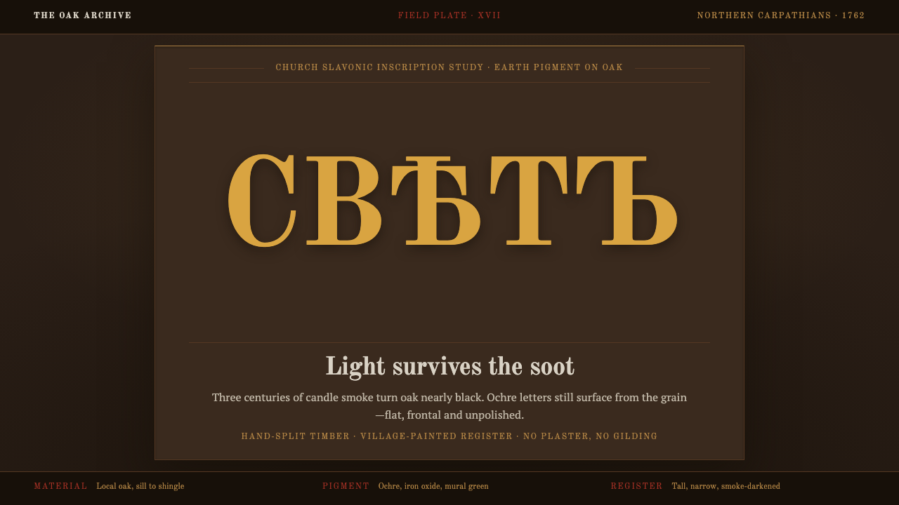 Maramureș Wooden ChurchLight survives the soot. Ochre type and earth-red geometry rise through smoke…
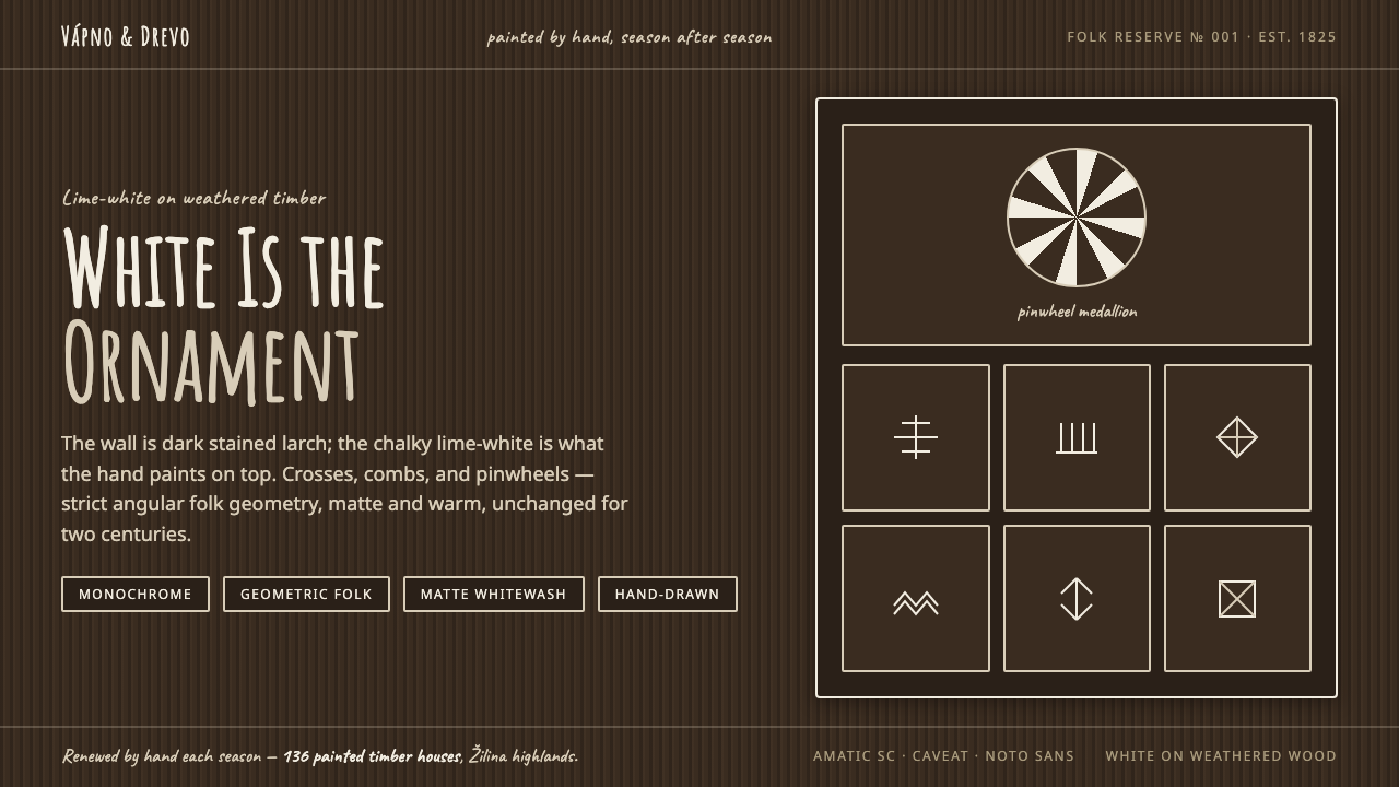 Čičmany Painted House OrnamentWhite is the ornament, not the page. Lime-white folk geometry on dark weather…
 Derge Woodblock Sutra PrintHand-pulled scripture gravity. Cinnabar uchen and ochre rules press into dark…
 Hebrew STaM ScrollExactness over ornament. Jet ink, ruled Hebrew columns, and amber-tan parchme…