What is Isfahan Qalamkar Print?
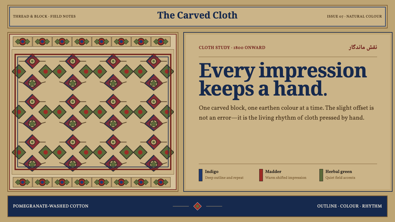
Isfahan Qalamkar Print turns ornament into a living surface: indigo, madder, and black bloom across pomegranate-tan cotton with the slight, unmistakable shifts of a human hand.
Isfahan Qalamkar Print in brief
Qalamkar is the hand block-printed cotton associated with Isfahan, Iran. Its visual language is built through successive impressions from carved wooden blocks and natural dyes: a black outline establishes the drawing, madder-red fills selected forms, and indigo adds depth and cool contrast. The result is neither an illustration laid on top of fabric nor an abstract pattern detached from material. It is a printed textile system in which cloth, dye, carved line, and repeated ornament are inseparable.
The ground is central to the style. Qalamkar cloth is not bleached into a blank white field; repeated baths in pomegranate peel leave a warm khaki-tan base. That subdued ground makes the darker outline and mineral-feeling colors appear absorbed into the cotton rather than sharply imposed upon it. Indigo reads as settled and cool, madder as earthy and alive, while black gives vines, boteh motifs, rosettes, and borders their legible architecture.
Visually, Qalamkar is dense but not chaotic. Scrolling floral vines create continuity, boteh forms introduce a recognizable curved rhythm, and rosettes punctuate the field with moments of circular order. Running border bands frame the central repeat and make the textile feel composed rather than merely filled. Slight registration offsets and hand-cut edges are not flaws to conceal; they are evidence that each impression was made by a person working with a carved block, absorbent cloth, and natural color.
Where does Isfahan Qalamkar Print come from?
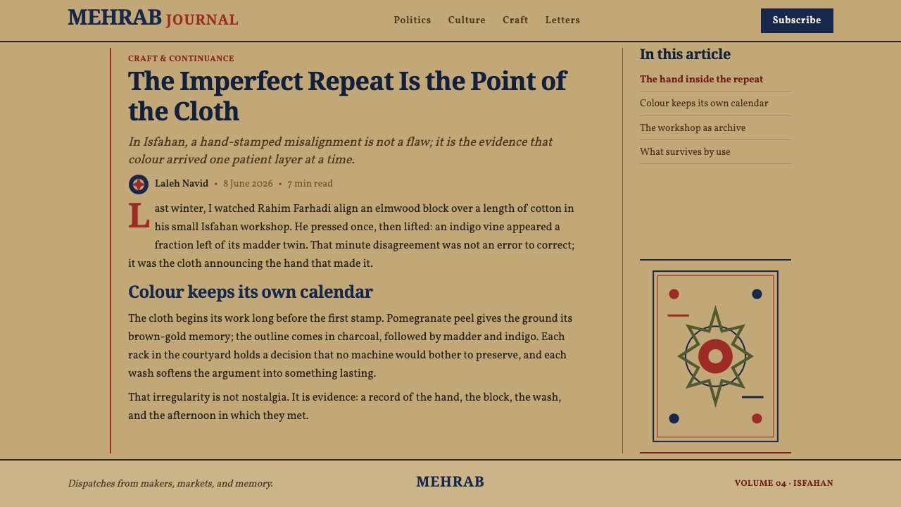
Qalamkar belongs to the block-printing tradition of Isfahan in the Middle East, a craft described as Safavid-rooted from the seventeenth century onward and still alive in the bazaar. Its history is therefore not best understood as a closed historical style recovered from a museum image. It is a continuing workshop practice whose visual identity remains tied to making: carving, stamping, dyeing, bathing cloth, and repeating the process across a textile field.
The Safavid connection matters because the style is rooted in Persian textile ornament rather than in a modern decorative trend. Floral-arabesque movement gives the pattern its continuous, unfurling character. Vines do not simply decorate empty space; they link motifs, redirect the eye, and carry the repeat across the cloth. Boteh forms and rosettes operate within that same ornamental grammar, allowing variation and recurrence to coexist.
The craft is associated with hereditary Isfahan qalamkar block-carvers, whose carved wooden blocks make repetition possible without making it mechanically identical. A block can establish a contour or a portion of a motif, but the act of applying it to woven cotton leaves room for pressure, alignment, dye absorption, and the small deviations that distinguish an impression from a digital duplicate. The hand survives in the result precisely because the process does not erase material variation.
Isfahan bazaar printing workshops keep the system social as well as visual. The style depends on a sequence rather than on a single decorative gesture: black outline, then madder-red, then indigo, on a cloth already shaped by pomegranate-peel baths. This order creates a hierarchy of line, color, and ground. It also explains why authentic Qalamkar feels grounded and matte: its richness comes from layered natural-dye impressions on cotton, not from glossy effects, sterile backgrounds, or perfectly uniform reproduction.
What defines the Isfahan Qalamkar Print look?
Pomegranate-Tan Ground
The unbleached khaki-tan ground is the atmosphere of Qalamkar. Repeated pomegranate-peel baths give the cotton warmth before the ornamental system appears. This base prevents indigo, madder, and black from reading as detached graphic inks; instead, every color feels moderated by the cloth. A convincing adaptation preserves that sense of aged natural fiber and avoids brilliant blank white fields.
Layered Natural Dye
Color arrives in a sequence rather than all at once. Black creates the outline, madder-red brings selected areas forward, and indigo establishes a cooler counterweight. This produces a clear hierarchy without relying on glossy contrast or artificial depth. The palette should feel absorbed, matte, and slightly softened by cotton, with each color doing a distinct structural job.
Floral-Arabesque Repeat
Scrolling vines are the connective tissue of the composition. They travel through the cloth, linking floral forms instead of isolating them into separate decorative badges. Dense repetition creates abundance, but the curving routes preserve flow and reading direction. The pattern should feel capable of extending beyond any crop, as though the textile carries a continuous ornamental garden.
Boteh and Rosette
Boteh motifs introduce tapered, curling movement, while rosettes provide compact circular rests within the larger field. Together they prevent the floral repeat from becoming visually flat. The boteh can guide the eye along an arc; the rosette can anchor a local cluster. Their value lies in rhythm and continuity, not in being enlarged into isolated logos.
Hand Registration
Slight offsets between color passes and irregularities at hand-cut edges are intrinsic to the style. They reveal the relationship between carved block, cloth weave, pressure, and dye. These marks should remain subtle enough for the motif to read clearly, yet visible enough to resist sterile perfection. Qalamkar gains credibility from controlled variation, not from immaculate alignment.
Border as Structure
Running border bands do more than decorate an edge. They establish a frame, create a transition between center and perimeter, and give the textile a sense of completion. Borders may repeat floral or boteh language at a different cadence from the central field. In application, they work best as deliberate bands with enough visual weight to organize the composition.
Who shaped Isfahan Qalamkar Print?
The hereditary block-carvers associated with Isfahan are the makers behind the carved wooden blocks that define Qalamkar’s repeat. Their work turns floral-arabesque ornament into a printable system while retaining the hand-cut edge and material irregularity that distinguish the cloth from a mechanically uniform pattern.
Bazaar printing workshops are the living setting in which Qalamkar remains a craft rather than a historical reference. Their process joins carved blocks, woven cotton, pomegranate-peel baths, and successive color impressions into a single production language. The workshop matters because the style’s visual richness depends on this sequence of material decisions.
The carved wooden block is the central instrument of Qalamkar. It makes ornamental repetition possible while preserving the physical character of each impression. Rather than producing a frictionless duplicate, it records contact: the edge of the carving, the pressure of stamping, the weave of the cotton, and the slight shifts that make the pattern feel handled.
How do you use Isfahan Qalamkar Print today?
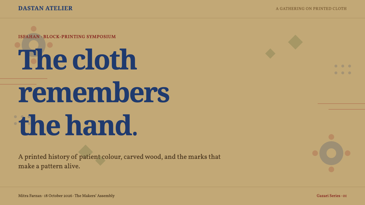
For presentation covers, Qalamkar works best when treated as a textile field rather than a decorative sticker. Let a warm unbleached ground carry a cropped floral-arabesque repeat, with a border band placed along an edge or used to frame a title zone. The title should remain calm and clearly separated from the densest motif areas. For content slides, reduce the pattern to a restrained side band, header strip, or corner field so written information retains a quiet, readable surface.
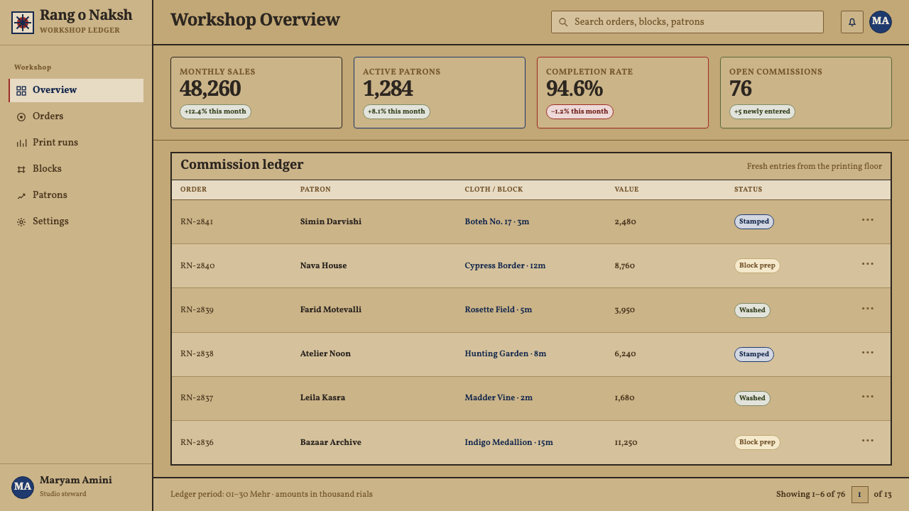
Data slides need particular restraint. Use Qalamkar’s color relationship as a qualitative guide: dark outline for primary structure, madder for emphasis, indigo for comparison or secondary groups, and the tan ground as the unifying field. Charts should remain plain and legible rather than being filled with busy repeats. A rosette or boteh can serve as a section marker, but the data itself should not be forced into ornamental forms.
For web interfaces, the style is strongest on cultural storefronts, editorial collections, product storytelling, and catalog-like browsing spaces where texture and provenance matter. A dashboard or pricing page can borrow the warm ground, deep ink contrast, and border logic without covering every surface in pattern. Keep information panels clear, reserve dense print for headers or transitional sections, and use small moments of offset texture to suggest handwork without reducing interface clarity.
In editorial and marketing work, Qalamkar can organize a page through alternating patterned fields and open textile-colored space. Long-form articles benefit from border bands as section dividers, while product pages can use cropped motifs to lead from one story block to another. The style supports material-led messaging especially well: it makes craft, continuity, touch, and place visible without needing glossy visual effects.
The common mistake is to convert Qalamkar into generic paisley wallpaper. That approach removes its layered dye sequence, pomegranate-tan ground, black structural outline, and visible hand registration. Another mistake is making every surface equally dense, which turns the pattern into noise. Use ornament as structure: allow vines to connect, borders to frame, colors to differentiate, and open areas to give the printed field room to breathe.
Isfahan Qalamkar Print — FAQ
Is Qalamkar simply a paisley pattern?
No. Boteh, often recognized in contemporary design as paisley, is one motif within the Qalamkar vocabulary. Qalamkar is a full textile system: carved wooden-block impressions, natural dyes, black outline, madder-red and indigo layering, a pomegranate-tan cotton ground, floral-arabesque repeats, and border bands. Reducing it to one motif loses the relationship between process, material, and composition.
Why is the ground tan rather than bright white?
The cloth is not bleached. Repeated pomegranate-peel baths create the warm khaki-tan ground that defines the style’s atmosphere. This ground is not a neutral absence of color; it is an active part of the printed result. It softens the contrast of black, madder, and indigo and makes the ornament feel embedded in woven cotton rather than placed on a blank surface.
Should slight misalignment be corrected in a modern adaptation?
Not automatically. Slight registration offset and hand-cut irregularity are meaningful signs of the block-printing process. They should not be exaggerated into a distressed effect, but removing them completely can make the work feel digitally sterile and detach it from Qalamkar’s material logic. The useful balance is controlled variation: motifs remain readable while the hand remains perceptible.
Can Qalamkar be used in a minimal interface?
Yes, if its ornamental density is concentrated rather than spread uniformly. Use the pomegranate-tan ground, a quiet border band, a cropped floral field, or a small boteh-derived marker while keeping controls and information areas open. A minimal interface should borrow the style’s material warmth and structural framing, not reproduce every repeating motif across every panel.
Related design styles
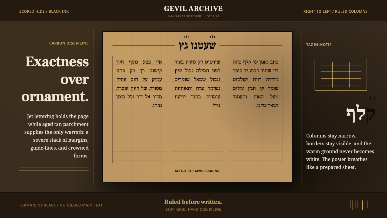 Hebrew STaM ScrollExactness over ornament. Jet ink, ruled Hebrew columns, and amber-tan parchme…
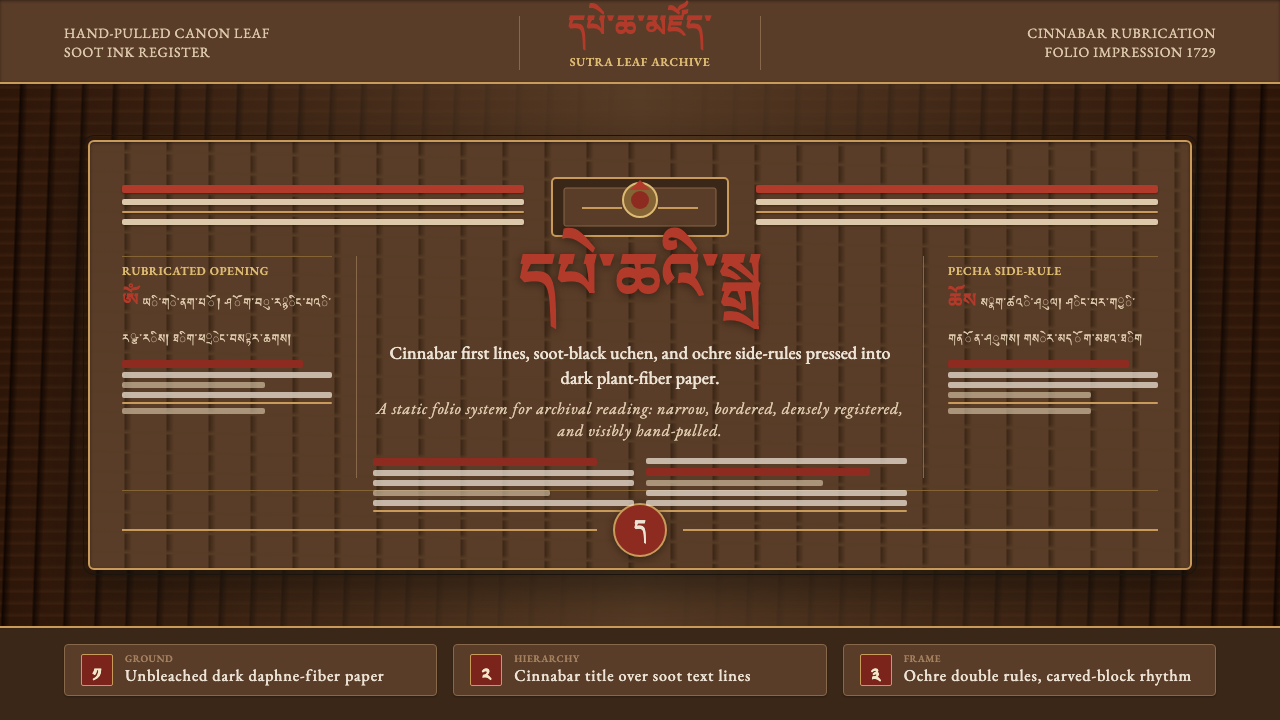 Derge Woodblock Sutra PrintHand-pulled scripture gravity. Cinnabar uchen and ochre rules press into dark…
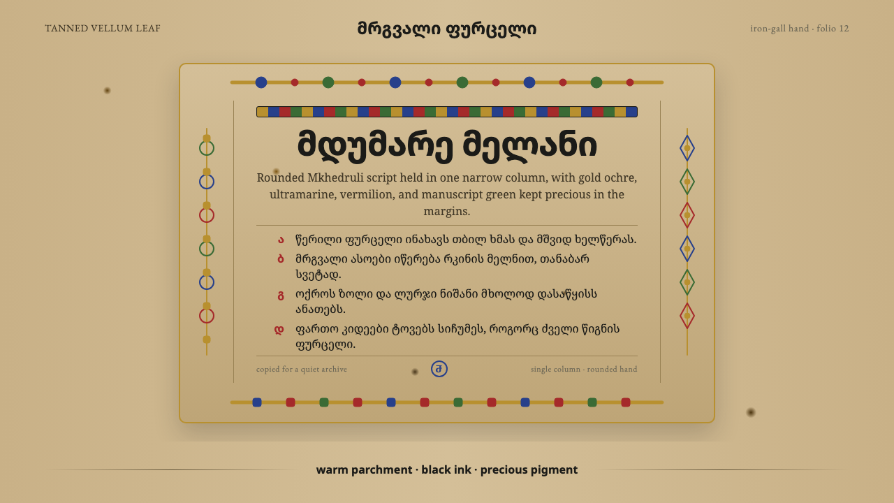 Georgian MkhedruliA manuscript breathes slowly. Tanned vellum, round Mkhedruli ink, ochre and u…
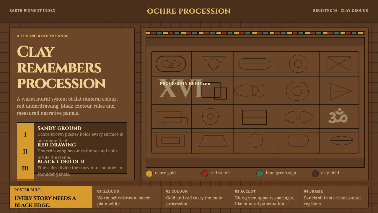 Lepakshi Vijayanagara CeilingEarth remembers in registers. Ochre gold, red underdrawing and black rules ma…
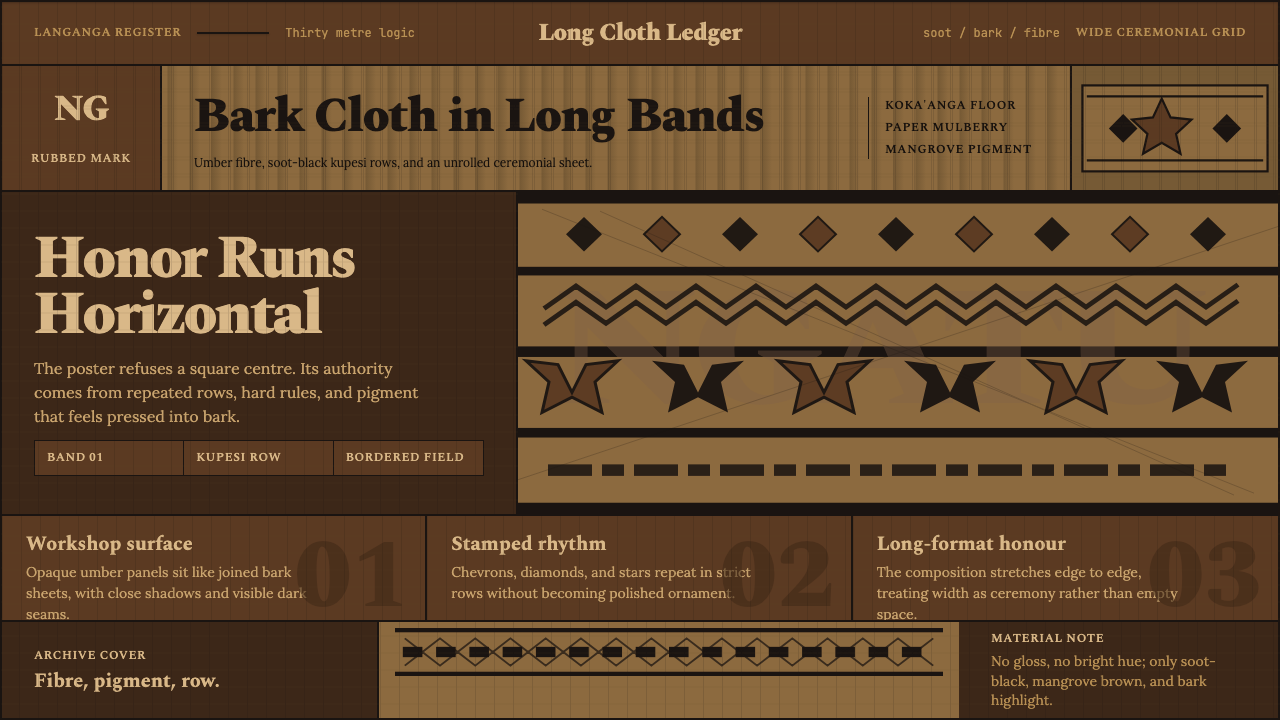 Tongan Ngatu (Tapa)Ceremony runs wide. Soot-black rows stamp umber bark with strict kupesi geome…
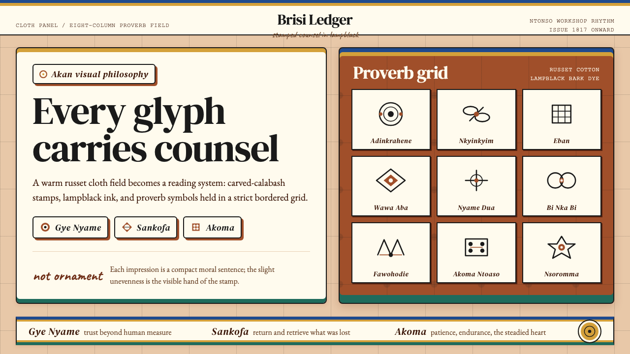 Akan Adinkra (Ghana)Proverbs become cloth. Russet grids, lampblack serif marks, and gold-edge ban…