What is Lepakshi Vijayanagara Ceiling?
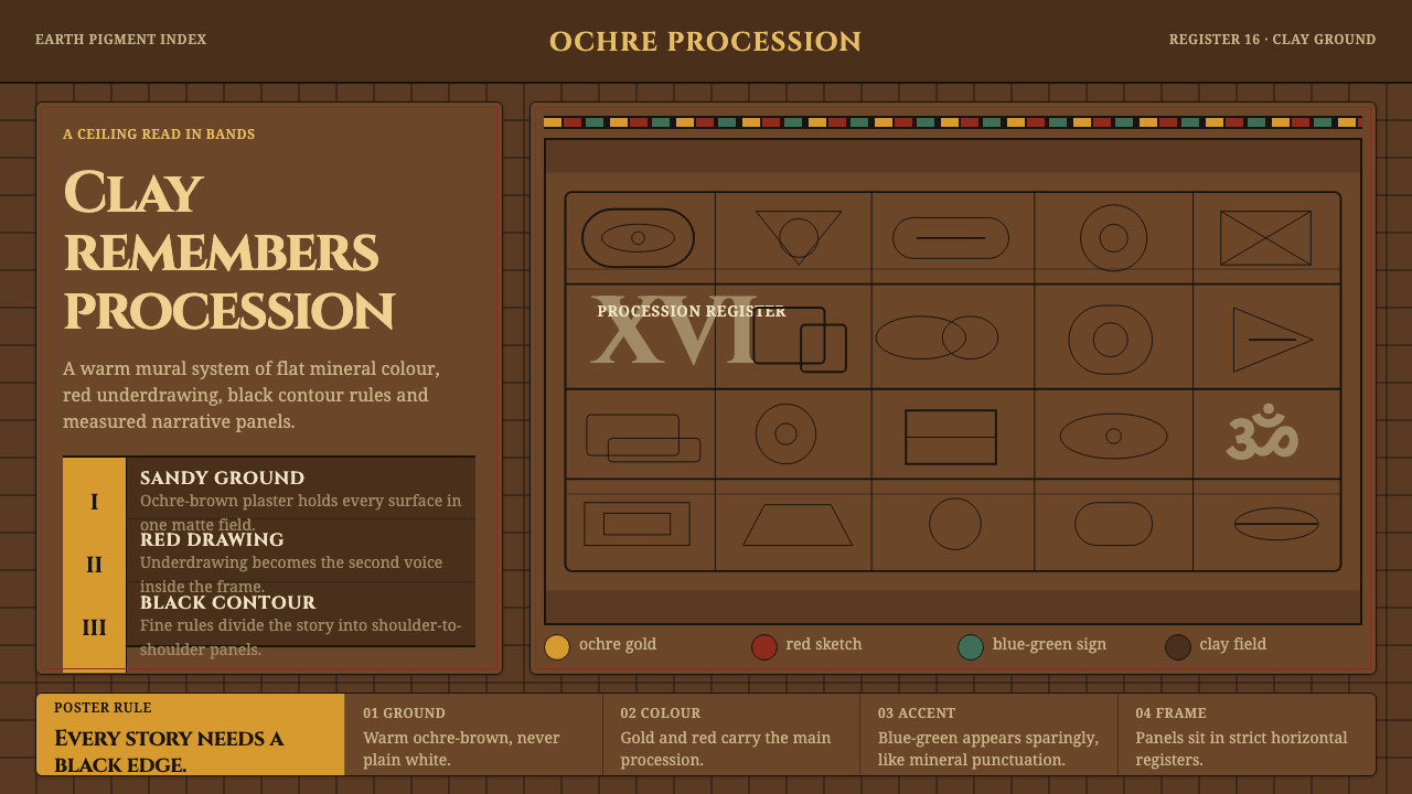
Earth remembers in registers: ochre gold, red underdrawing, and black rules turn the Lepakshi ceiling into a procession of painted narrative.
Lepakshi Vijayanagara Ceiling in brief
The Lepakshi Vijayanagara Ceiling is drawn from the painted ceiling of the Virabhadra temple mahamandapa at Lepakshi in Andhra Pradesh. It is the largest surviving mural ensemble of the Vijayanagara empire, created by anonymous sixteenth-century painters over a ground of sandy river clay mixed with red ochre, lime, and molasses. Long-eyed deities in profile move through compartmentalised registers, turning the ceiling into a sustained narrative field.
Its visual language is built from process as much as appearance. Painters first sketched the composition in red ochre, filled forms with flat earth colour, and then enclosed every figure with fine black outlines. The resulting system is warm, dark, and materially grounded: an ochre-brown field carries yellow-ochre gold, deep red, and restrained blue-green, while black rules separate one narrative panel from the next.
On screen, the style should feel like a ceiling translated into an ordered interface rather than a historical illustration pasted onto a modern layout. Content moves in framed registers, figures and symbols remain legible in profile or silhouette, and every panel feels connected to a larger procession. The atmosphere is ceremonial without becoming polished or glossy; its authority comes from repetition, line, earth colour, and the memory of hand-applied paint.

Where does Lepakshi Vijayanagara Ceiling come from?
The source is the painted ceiling of the Virabhadra temple mahamandapa at Lepakshi, in the South Asian region now identified with Andhra Pradesh. It belongs to the Vijayanagara period and survives as an extensive ceiling ensemble rather than as an isolated emblem or decorative fragment. Its scale matters to the design language: the viewer encounters a field of connected scenes, not a single central image.
The anonymous temple painters worked with a materially direct sequence. A ground of sandy river clay, red ochre, lime, and molasses established the surface. Red ochre supplied the first drawing, flat earth colours built the figures and scenes, and fine black lines clarified the edges. This sequence explains why the style feels both earthy and highly controlled: colour fills the narrative, while line preserves its structure.
The ceiling belongs to Vijayanagara mural painting, Deccan temple ceiling narrative, and the later Nayaka-period continuation of that visual world. Its design logic therefore carries both devotional procession and architectural order. Registers, framed compartments, repeated outlines, and profile figures make the ceiling readable as a sequence that extends across the surface, allowing the screen adaptation to behave like a connected mural rather than a collection of unrelated cards.
What defines the Lepakshi Vijayanagara Ceiling look?
Earth Ground
The ground is warm, muted, and mineral rather than neutral. Ochre-brown establishes the atmosphere of clay and aged plaster, giving every brighter figure the feeling of having been painted into an architectural surface. The background should carry quiet variation and depth without becoming a texture spectacle; it is the soil from which the narrative emerges.
Ochre and Vermilion
Yellow-ochre gold and deep red carry the main visual weight. Gold feels sacred and illuminating without becoming metallic; red retains the memory of the underdrawing and gives figures a grounded, bodily presence. The palette should remain compact and related, with colour acting as narrative emphasis rather than decorative variety.
Fine Black Rules
Black is used as a disciplined enclosing line. It clarifies profiles, separates adjacent scenes, and turns the whole surface into a legible architecture of frames. The line should feel hand-controlled and continuous, never like a heavy modern border. Its authority comes from precision and repetition, not visual mass.
Profile and Procession
Figures are read through profile, elongated eyes, repeated contour, and directional movement. Rather than presenting isolated portraits, the system makes bodies participate in a procession across the page. Interface elements can inherit this logic by facing toward adjacent content, creating a sense that information is moving through a ceremonial sequence.
Narrative Registers
The composition is divided into connected registers and framed panels. Each register can hold a scene, statement, metric, or product tier, but no panel should feel detached from the larger field. Repetition of rules, ground colour, and visual direction creates continuity, allowing the reader to scan laterally as though looking along a painted ceiling.
Flat Material Presence
Forms should remain flat, matte, and visibly related to earth colour. Depth comes from framing, overlap, and the contrast between fill and outline rather than from polished modelling or luminous effects. The screen adaptation can suggest age and material memory, but it should never imitate damage so aggressively that readability is lost.

Who shaped Lepakshi Vijayanagara Ceiling?
The anonymous painters are the central makers of the visual system. Their method is preserved through the sequence of red ochre drawing, flat earth-colour filling, and fine black outlining. Because individual names are absent, the style is understood through collective discipline: repeated profiles, controlled registers, and a shared material vocabulary across the ceiling.
The mahamandapa atelier represents the architectural setting in which the ceiling became a collective narrative surface. Its importance is not a single signature but the relationship between painting and structure: panels, registers, and procession are designed to be encountered overhead as part of the temple environment.
The surviving ceiling ensemble acts as a figure in its own right because its scale and continuity determine the design language. It is not merely a source of motifs. It teaches the screen to behave as a field of linked scenes, where an individual panel gains meaning from the procession surrounding it.
How do you use Lepakshi Vijayanagara Ceiling today?
For presentation slides, use the style as a sequence of painted registers. A cover can establish the ochre-brown ground with a framed procession, a deep-red figure, or a strong black rule guiding the eye toward the title. Content slides should preserve the same narrative direction, using panels for distinct ideas rather than scattering unrelated objects across an empty field. Data slides can turn charts into framed scenes: bars, labels, and annotations should read as parts of one ordered mural rather than as floating interface components.
For web dashboards and pricing pages, the system is especially effective when information has to feel structured but not sterile. Use the dark earth ground as the containing atmosphere, reserve yellow-ochre gold for primary emphasis, use deep red for decisive states, and let blue-green appear as a measured counterpoint. Dashboard modules can be arranged as connected registers, while pricing tiers can sit in related framed panels whose differences come from colour, title, and narrative position rather than decorative effects.
For editorial and marketing work, the style creates a strong sense of place and continuity. Articles can move through horizontal narrative bands, with each section enclosed by fine black rules and supported by a narrow range of earth colours. A campaign page can treat product stories as successive scenes, allowing imagery, claims, and calls to action to appear as parts of one procession. The result should feel ceremonial and tactile, but still readable enough for practical information.
The common mistake is to treat the style as a generic dark palette with a few Indian-inspired ornaments added on top. That loses the essential relationship between material ground, red underdrawing, flat earth colour, black contour, and compartmentalised narrative. Another mistake is to make every panel equally loud. The ceiling’s authority depends on restraint: let the ground remain present, let the rules organize, and allow colour to mark importance rather than fill every available space.

Lepakshi Vijayanagara Ceiling — FAQ
Is this style simply a dark historical theme?
No. Darkness is only the atmosphere. The identity comes from the relationship between the clay-like ground, ochre gold, deep red, blue-green accents, fine black rules, and connected narrative registers. Remove the material logic and the procession, and the result becomes a generic dark interface rather than a Lepakshi-inspired system.
Why are the black outlines so important?
The outlines preserve legibility and connect the surface to the painting process. They define profiles, separate neighbouring scenes, and make each colour field feel enclosed rather than casually placed. They should remain fine and disciplined; a heavy border would replace the memory of hand-drawn contour with the language of modern packaging.
Can the style support information-heavy dashboards?
Yes, provided the information is organized as registers rather than compressed into a crowded collage. Use framed modules, repeated alignment, and a clear procession from one panel to the next. Colour should identify priority or state, while the ochre ground and black rules create continuity. The style supports density through order, not through adding more ornament.
How should imagery be adapted for contemporary use?
Treat imagery as a flat narrative figure rather than a glossy photographic window. Profiles, silhouettes, cropped forms, and repeated contour lines are more faithful to the system than realistic modelling or luminous effects. Contemporary images can be included, but they should be framed, simplified, and made to participate in the same procession as the surrounding text and data.
Related design styles
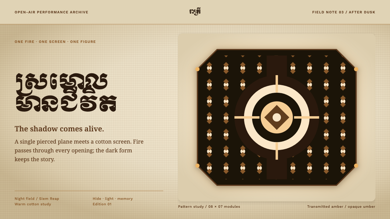 Sbek Thom Shadow PuppetShadow becomes ceremony. Pierced umber geometry holds firelight on a warm cot…
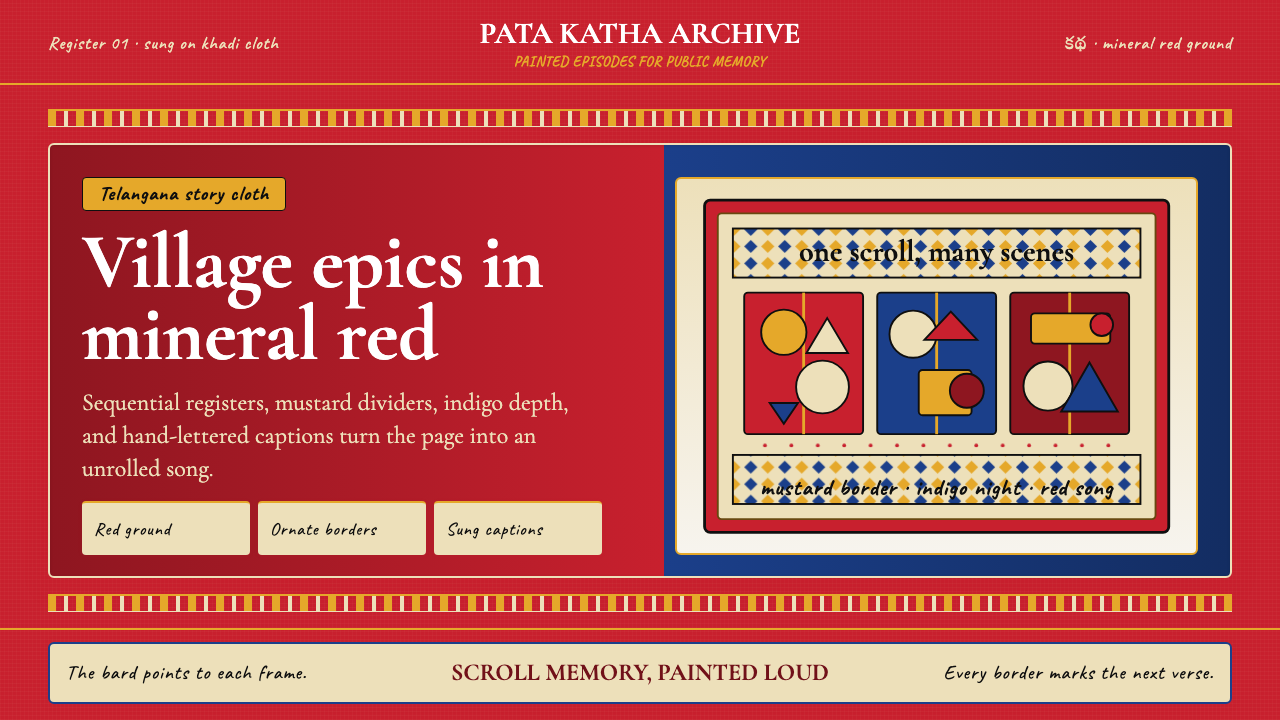 Andhra Cheriyal Scroll PaintingSaturated oral memory. Mineral red registers, mustard diamonds, and serif son…
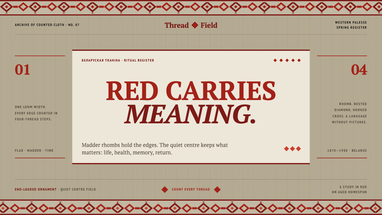 Belarusian RushnykRed carries meaning. Madder rhombs crowd aged flax edges while the woven cent…
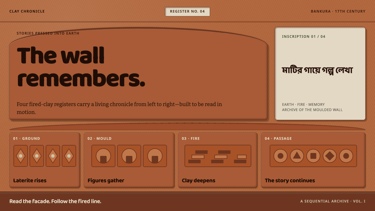 Bishnupur Terracotta TemplesThe wall tells the story. Fired-clay relief panels unfold in warm horizontal…
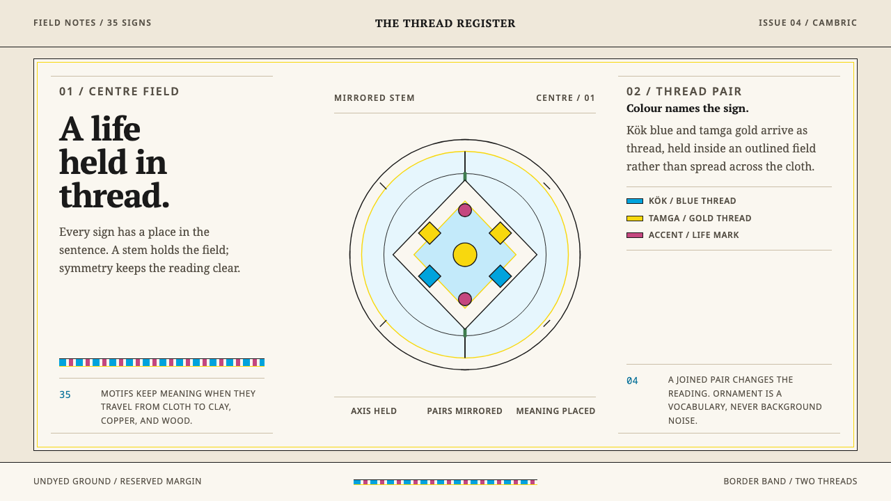 Crimean Tatar OrnekOrnament that can be read. Kök blue and tamga gold hold a mirrored stem on un…
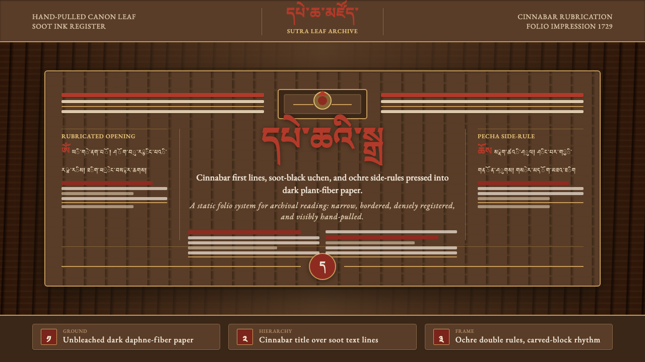 Derge Woodblock Sutra PrintHand-pulled scripture gravity. Cinnabar uchen and ochre rules press into dark…