What is Thai Teak Canal House?
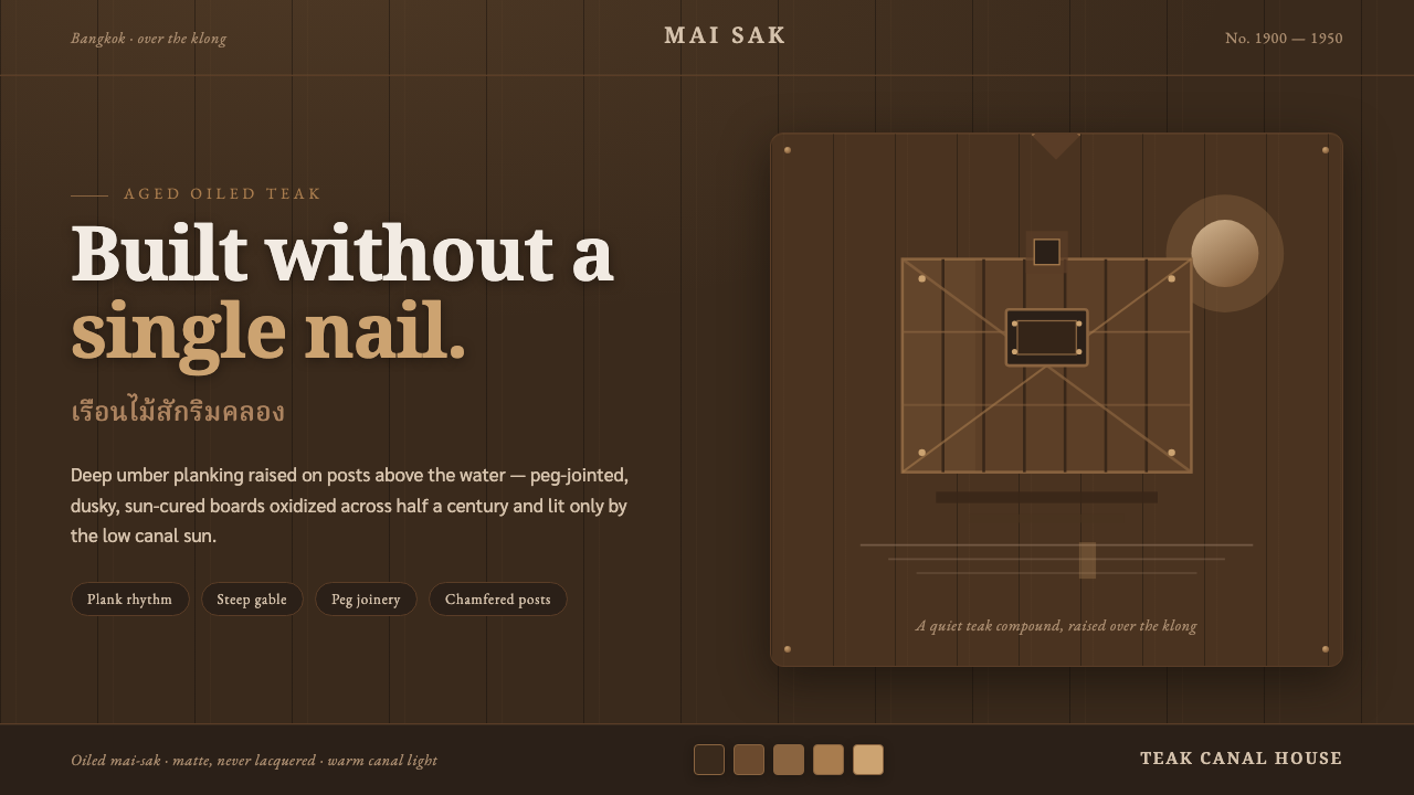
Thai Teak Canal House turns the weathered calm of Bangkok’s canal dwellings into a dark digital language of oiled wood, hand-built rhythm, and low amber light.
Thai Teak Canal House in brief
Thai Teak Canal House draws from the dark stilt houses that stood above Bangkok’s klong communities during the classic teak-house era. Their surfaces were not the pale timber associated with newly cut lumber. They were sun-cured mai-sak planks that had oxidized, absorbed oil, and deepened over time into a dusky umber. Raised posts, steep gables, peg joinery, and chamfered post heads gave these houses a feeling of practical refinement: built for a waterside life, but shaped by patient craft rather than industrial uniformity.
As a design style, it translates that architectural atmosphere into an interface system. The ground should feel like aged, oiled plank surfaces rather than a generic dark screen. Vertical board rhythm introduces an underlying cadence; carved-panel framing gives major regions a sense of enclosure; warm directional illumination suggests canal sunlight arriving low across wood grain. The result is dark, but never metallic, futuristic, or theatrical. Its darkness has material depth and accumulated history.
The style depends on restraint. It does not use wood as a novelty texture pasted behind content. Instead, it treats teak as a structural metaphor: panels have weight, divisions resemble fitted boards, and highlights behave like light catching an edge worn smooth by use. A successful composition feels sheltered, quiet, and constructed by hand. A failed one turns the same references into a rustic theme, with decorative grain overwhelming legibility or fresh-looking wood contradicting the central idea of age.
Where does Thai Teak Canal House come from?
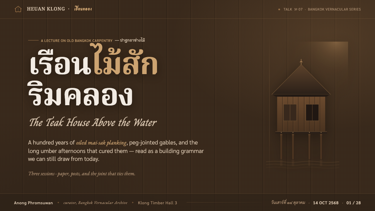
The source is vernacular Thai stilt-house architecture in Bangkok and the canal communities connected by the klong. These houses rose on posts above the water and used teak construction suited to a life organized around waterways. Their identity came from construction as much as silhouette: wall surfaces were assembled from planking, rooflines rose into steep gables, and structural members were finished with practical, visible care. The house was not an isolated object on a blank site; it belonged to a waterside setting of reflection, shade, and changing low light.
The relevant period is the classic teak-house era from 1900 to 1950. During this period, sun-cured mai-sak planking could weather, oxidize, and take on oil until its appearance became deeply umber rather than newly milled and bright. That transformation matters because the style is rooted in patina. The visual authority of the wood comes from age, exposure, maintenance, and use. It should therefore suggest a surface that has matured gradually, not one that has been artificially darkened for instant drama.
Thai master carpenters, known as chang mai, are central to the underlying craft language. Peg joinery and other hand-built details express a way of making in which parts are fitted, aligned, and resolved through workmanship. Chamfered post heads and carved-panel framing are not interchangeable ornaments. They make edges feel intentional, soften the transition between substantial pieces of wood, and show how utility can retain ceremonial care. In a digital interpretation, these qualities become disciplined framing, deliberate seams, and tactile hierarchy rather than literal imitation.
The Jim Thompson teak-house compound is a classic reference point for this atmosphere. Assembled around 1959 from period houses, it preserves the visual continuity between older canal-house construction and the way teak architecture came to be recognized more widely. Its relevance is not as a license to copy individual decorative motifs. It is a reminder that the style works through a whole environment: aged timber, elevated structure, sheltered shadow, and warm light held together as one coherent experience.
What defines the Thai Teak Canal House look?
Aged Oiled Teak
The dominant visual field is deep umber teak that feels sun-cured, oxidized, and repeatedly oiled. It should read as quiet density rather than black emptiness. Variation is subtle and directional, like neighboring planks that have aged together but never become perfectly identical. Fresh-sawn brightness, glossy lacquer, and exaggerated rustic grain all weaken the effect because they replace accumulated patina with novelty.
Vertical Board Rhythm
Vertical planking provides the system’s quiet order. It can organize a background, guide a page edge, or establish a rhythm behind a large content region, but it should remain subordinate to information. The boards imply elevation and craftsmanship without requiring literal architectural illustration. Their repetition is measured rather than mechanical, helping the interface feel constructed from fitted material.
Carved-Panel Framing
Important content belongs inside frames that recall carved panels and fitted joinery. These borders should feel substantial, slightly softened by workmanship, and clearly responsible for separating regions. They are not ornamental picture frames placed around every card. Used selectively, they give titles, summaries, and key modules the protected feeling of a room within a house.
Low Canal Light
Illumination comes from a low, warm, directional source, like sun moving across a canal near the end of the day. It catches upper edges and leaves lower planes in restrained shadow. The light should reveal structure, not create spectacle. Broad, diffuse glow and cool theatrical contrast are out of place; the intended effect is a slow warmth settling on aged wood.
Hand-Built Edges
Chamfered post heads and peg joinery suggest an approach to edges that is shaped, fitted, and useful. Digital surfaces can echo this through eased corners, visible seams, and layered joins that clarify how regions meet. The key is precision without sterile perfection. Every boundary should appear resolved, but none should feel like a mass-produced plastic component.
Sheltered Darkness
Darkness in this style is architectural shelter. It makes bright content, warm highlights, and selected details feel gathered under an eave rather than isolated on a void. Contrast must remain legible, but the atmosphere should stay hushed. Excessive glow, sharp neon emphasis, or aggressive color competition breaks the sense of a calm canal house at dusk.
Who shaped Thai Teak Canal House?
Jim Thompson is associated with the teak-house compound assembled around 1959 from period houses. The compound serves as a classic reference for the enduring visual character of Thai teak architecture: aged timber, elevated domestic structure, shaded enclosure, and a setting shaped by warm natural light.
Thai master carpenters, or chang mai, represent the craft knowledge behind peg joinery, fitted timber work, and carefully finished structural details. Their importance to the style lies in the idea that wood construction can be visibly made without becoming crude: joints, edges, and panels communicate care, durability, and material understanding.
The builders working with sun-cured mai-sak teak established the material basis of the look. Their planking did not remain visually fixed at installation; sunlight, oxidation, and oil changed it across years. That long material life is the essential lesson for contemporary applications: teak is not simply brown wood, but a surface made convincing by maturity.
How do you use Thai Teak Canal House today?
For presentation slides, Thai Teak Canal House is strongest when the cover feels like one composed architectural panel rather than a collage. Use a deep aged-teak field, a restrained framed title zone, and one warm directional highlight that establishes the imagined source of light. Keep the title generous and calm. Supporting details can sit along a board rhythm or within a smaller fitted panel, but the cover should retain the stillness of a waterside house at dusk.
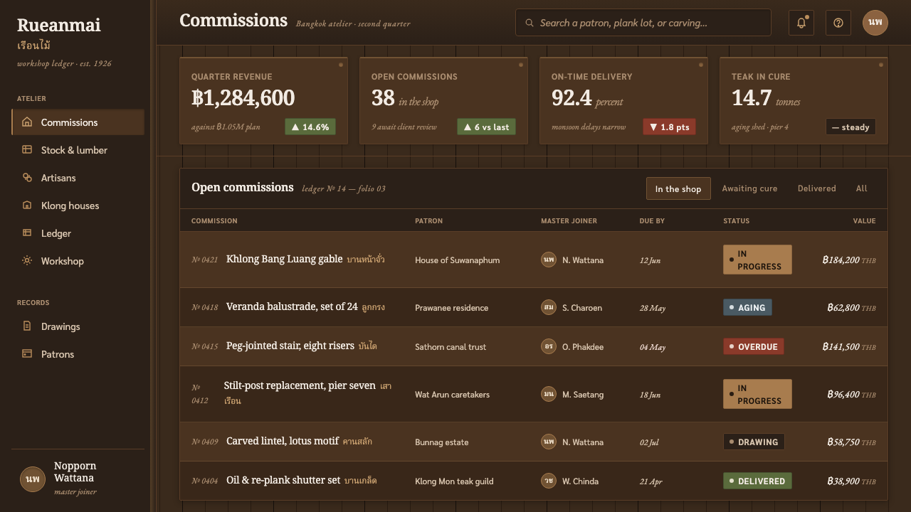
Content slides should use the style to make hierarchy feel sheltered and deliberate. Treat the page as a timber interior with one principal reading surface, a secondary note region, and carefully chosen seams between them. For data slides, charts should remain clear and functional while their containers inherit the material language: headings can sit within carved-panel bands, comparison groups can be separated by structural dividers, and emphasis can arrive as a warm edge-lit region rather than a loud decorative color. The wood atmosphere must never obscure labels or relationships.
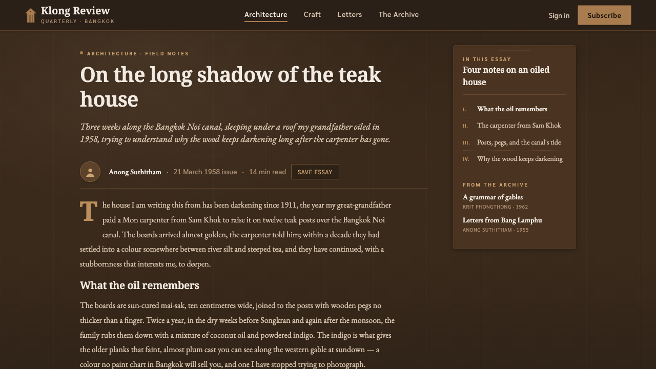
For web interfaces, the style suits dashboards, account spaces, and pricing pages that benefit from calm authority and a sense of crafted permanence. A dashboard can use dark plank-informed foundations with framed work areas for navigation, metrics, and actions. A pricing page can present each offering as a carefully joined panel, using light and enclosure to distinguish the recommended path without turning the entire page into a marketplace of competing highlights. Interaction should feel measured, tactile, and readable.
For editorial and marketing work, the style is especially effective when the story involves place, provenance, craft, hospitality, or long-term value. An article can alternate open dark wood fields with protected reading panels, letting section transitions resemble movement between shaded rooms. Marketing compositions should focus on atmosphere and material confidence: a few strong framed statements, an uncluttered narrative sequence, and warm directional emphasis. Avoid filling every open area with texture; negative space is what allows the teak surface to feel expansive rather than busy.
The most common mistake is confusing Thai Teak Canal House with generic tropical decoration. Fresh pale timber, excessive leaf motifs, bright resort colors, bamboo clichés, glossy surfaces, and dense ornamental borders all move away from the reference. Another error is making every component look carved or wooden. The system needs quiet grounds and selective craft signals. Its character comes from aged teak, vertical order, fitted framing, and low canal light working together, not from an accumulation of themed details.
Thai Teak Canal House — FAQ
Is Thai Teak Canal House simply a tropical style?
No. Its source is specifically the vernacular teak stilt houses of Bangkok’s klong communities, not a broad collection of tropical symbols. The essential cues are aged oiled mai-sak planking, elevated construction, peg-joinery craft, steep gables, panel framing, and low warm canal light. Generic foliage, beach imagery, and bright resort styling can distract from that more precise architectural character.
Why must the wood look aged rather than newly cut?
Because the style’s material identity comes from teak that was sun-cured, oxidized, and oiled through time. Deep umber surfaces communicate duration, care, and exposure. Newly cut wood suggests a different emotional register: freshness, rawness, and immediate manufacture. Thai Teak Canal House is built around the opposite impression, in which the material has already lived through weather and use.
Can the style work without literal wood texture?
Yes. Literal grain is optional, while material logic is essential. A dark umber ground, restrained vertical board rhythm, fitted-panel framing, and low directional warmth can establish the style without photographic wood texture. In many interfaces this is preferable, because it preserves readability and prevents the surface from becoming overly decorative. The goal is to evoke teak construction, not simulate every fiber.
How should light and shadow be handled?
Use light as a structural guide. It should arrive from a low, warm, consistent direction, revealing upper edges and allowing recessed regions to remain calm. The effect should resemble late sun crossing wood near a canal, not a spotlight in a dramatic interior. Gentle contrast is more faithful than broad glow, and shadow should support panel depth and reading order rather than become a decorative effect.
Where does this style work best, and where should it be avoided?
It works best where material continuity, craft, calm authority, or a sense of place supports the product’s message: hospitality experiences, cultural editorial work, premium account spaces, dashboards, and considered pricing pages. It is less suitable when the product needs a bright clinical mood, rapid high-energy visual urgency, or an intentionally weightless and playful character. The style carries gravity and shelter, so it should be chosen when those values are genuinely useful.
Related design styles
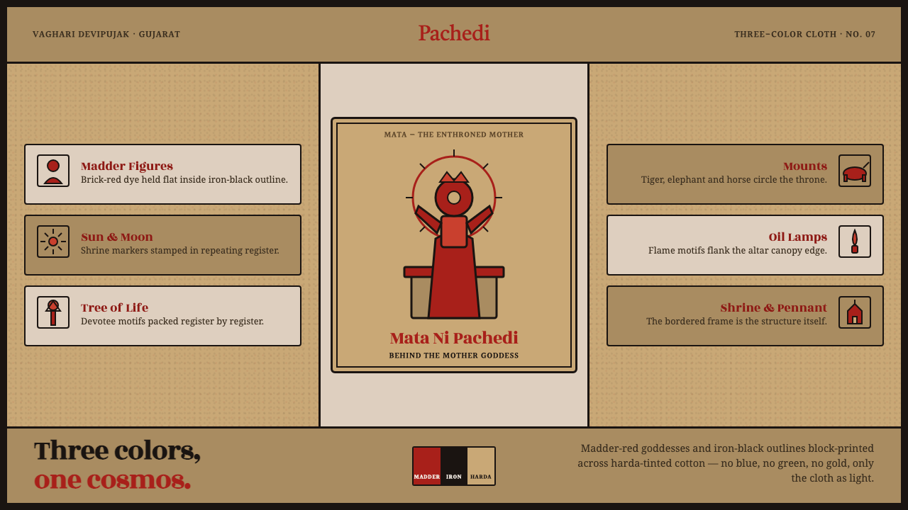 Mata Ni Pachedi Temple ClothThree colors, one cosmos. Madder-red goddesses, iron-black outlines, harda-ti…
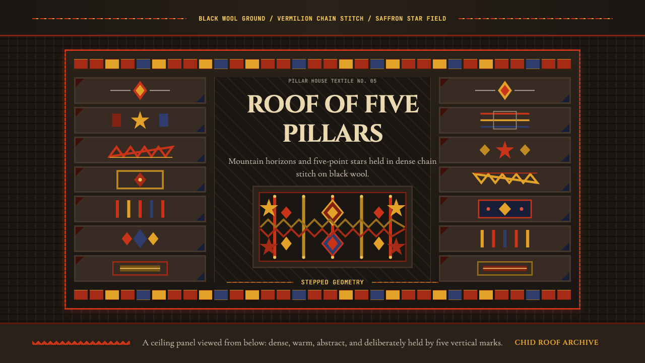 Tajik Pamir Needlework (Chid Roof)Cosmos stitched into wool. Vermilion diamonds and saffron stars hold a five-p…
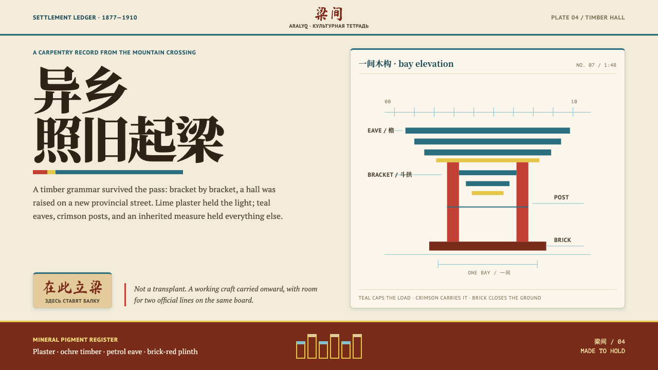 Dungan Settlement CraftCarpentry holds its ground. Teal eaves and crimson posts frame sunlit plaster…
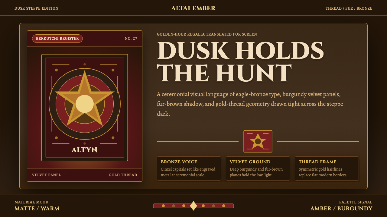 Kazakh Eagle HunterGolden hour feels handmade. Burgundy velvet, bronze type, and gold-thread bor…
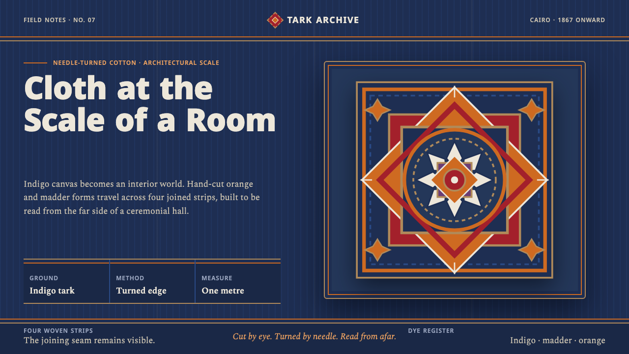 Khayamiya Tentmaker AppliquéCloth becomes architecture. Indigo canvas holds monumental orange and madder…
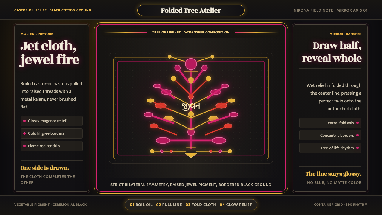 Kutch Rogan Castor-Oil PaintingGlossy symmetry holds the dark. Magenta castor-oil lines mirror across black…