What is Thai Mangosteen Silk?
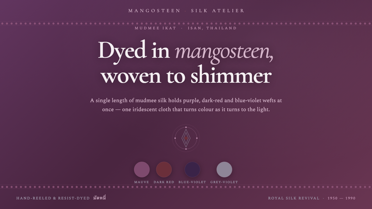
Thai Mangosteen Silk turns natural dye, hand-woven irregularity, and shifting shot color into a dark, tactile design language that seems to glow from within.
Thai Mangosteen Silk in brief
Thai Mangosteen Silk refers to the visual character of Thai hand-woven mudmee, or ikat, silk made from Thai silkworms and resist-dyed with mangosteen rind. Its ground is a deep mauve-purple, but the cloth never reads as a single flat color. Purple, dark red, blue-violet, and grey-violet wefts intersect across the surface, producing a layered shot-silk effect that changes as light moves over it.
The central idea is not ornament added to a surface, but color held inside a material process. Resist dyeing creates edges that are softened, feathered, and slightly irregular rather than mechanically exact. Hand weaving gives the cloth a sense of touch: variation is evidence of making, not a defect to be corrected. The resulting aesthetic is refined without being polished smooth, and luxurious without becoming glossy or ostentatious.
On screen, the system translates this textile behavior into a dark dyed-silk ground, softly feathered transitions, and restrained accents drawn from the supporting weft hues. Typography combines Noto Serif Thai with Cormorant Garamond for display and Spectral for body text, creating a multilingual, literary voice that feels rooted in craft, ceremony, and material depth.
Where does Thai Mangosteen Silk come from?
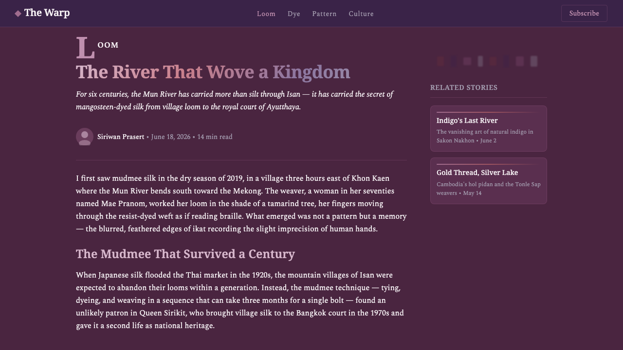
The historical referent is Thai mudmee silk weaving, a resist-dye practice rooted in Thailand’s Isan and other mudmee-producing regions of Southeast Asia. In this method, sections of silk are bound or otherwise resisted before dyeing, so color enters the thread unevenly and produces a patterned, softened boundary. The thread is then woven into cloth, allowing the dyed structure to emerge through the interaction of warp, weft, and light.
Mangosteen rind provides the defining chromatic starting point. Rather than treating dye as a synthetic surface treatment, this approach begins with a natural material and accepts the depth and variation that emerge from it. The resulting ground is described as deep mauve-purple, a color with enough darkness to feel ceremonial and enough warmth to remain alive. Layered red and blue-violet wefts prevent the ground from settling into a uniform field.
The style is associated with the mudmee silk revival from 1950 through 1990, when royal-supported artisan workshops helped sustain and renew Thai silk weaving. The revival is important to the design language because it connects visual richness to skilled labor and regional textile knowledge. Thai mudmee master weavers are therefore not incidental references; their practice is the source of the irregular edges, shifting color, and disciplined patience that the system carries into digital form.
Thai Mangosteen Silk should be understood as a design interpretation of this textile lineage rather than a literal reproduction of a single cloth. Its purpose is to preserve the qualities that make the material compelling: a dark dyed ground, color that changes through juxtaposition, edges softened by resist dyeing, and a surface whose beauty depends on looking closely. The digital expression remains quiet and atmospheric because the textile itself does not announce every color at once.
What defines the Thai Mangosteen Silk look?
Dyed-Silk Ground
The foundation is a deep mauve-purple field inspired by mangosteen-rind dyeing. It should feel saturated and nocturnal rather than merely blackened, with enough warmth to suggest a living natural pigment. Large areas of this ground provide visual quiet, allowing the shifting accents to appear as woven depth rather than surface decoration.
Iridescent Color
Color is layered rather than isolated. Purple, dark red, blue-violet, and grey-violet work together as neighboring weft impressions, creating a surface that appears to change with angle and illumination. No single accent should dominate permanently; the beauty lies in the balance between colors that emerge and colors that recede.
Feathered Ikat Edges
Boundaries should soften as though color has traveled through thread before settling. Edges may blur, break, or feather slightly, but they should remain intentional and controlled. This quality keeps the system from feeling digitally sterile and gives transitions the character of resist dyeing rather than the smoothness of a generic gradient.
Textile Depth
Depth comes from overlapping color impressions and restrained tonal movement, not from simulated gloss. Surfaces should suggest threads crossing under light, with a quiet sense of density and touch. The effect is sumptuous but matte in spirit: richness is carried by variation, not by reflective effects.
Serifed Thai-Latin Voice
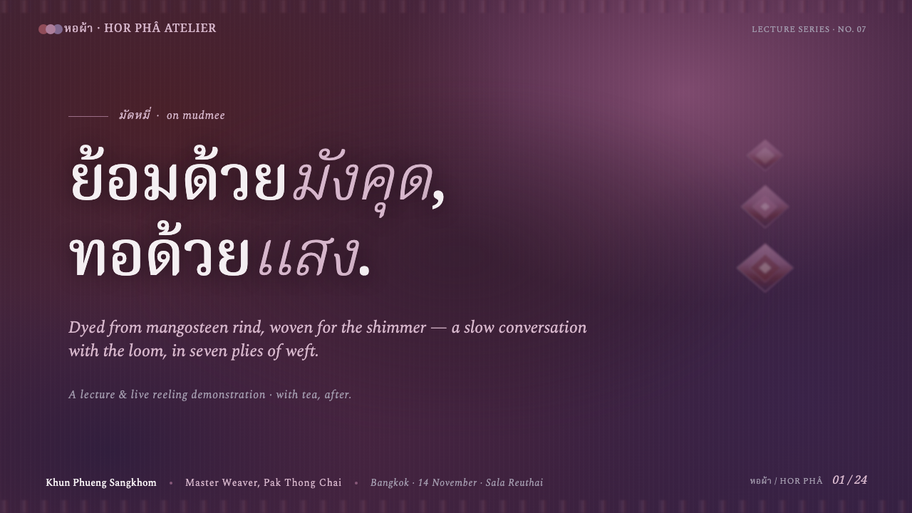
Noto Serif Thai anchors Thai-language text with a rooted, readable presence. Cormorant Garamond gives display moments an elegant, calligraphic lift, while Spectral keeps longer passages literary and composed. The pairing should feel like a conversation between regional textile tradition and a broader editorial culture, not like unrelated typefaces assembled for contrast.
Quiet Opulence
The style is luxurious through concentration, not excess. Dark grounds, selective color, soft boundaries, and generous breathing room create an atmosphere of ceremony without theatrical display. Decorative additions should be rare and subordinate to the material story; the cloth-like color behavior must remain the main event.

Who shaped Thai Mangosteen Silk?
Thai mudmee master weavers are the primary creative figures behind the referent. Their resist-dye and hand-weaving practice produces the softened boundaries, layered weft color, and subtle variation that define the textile. The design system honors their work by treating irregularity as skilled material expression rather than visual noise.
The artisans working in royal-supported workshops during the Thai silk revival helped sustain mudmee weaving from 1950 through 1990. Their role connects the style to continuity, renewal, and the preservation of regional craft knowledge. They represent a collective lineage rather than a single named designer.
The Thai silkworms and the people who reel their silk form the material beginning of the system. Their contribution is quieter than the finished pattern but essential to its character: the cloth depends on silk thread that can hold dye, gather light, and reveal variation through weaving.
Mangosteen-rind dyeing is treated as a collective craft figure: a body of material knowledge rather than an individual personality. It establishes the mauve-purple ground and gives the palette its natural depth. In the design language, this tradition is the reason color feels embedded, layered, and slightly unpredictable.
How do you use Thai Mangosteen Silk today?
For presentation slides, the style works best when the cover establishes the textile atmosphere before the content becomes informational. A dark mauve-purple ground can carry a restrained title in Cormorant Garamond, with a feathered band or woven color shift creating the opening gesture. Content slides should preserve generous breathing room, use Spectral for sustained reading, and introduce dark red, blue-violet, or grey-violet only when a distinction or emphasis is needed. Data slides can treat bars, fields, or markers as threads crossing a darker ground, with variation used to clarify rather than decorate.
For web interfaces, Thai Mangosteen Silk suits dashboards, research tools, cultural archives, and premium pricing pages that need depth without visual noise. Keep navigation and core information highly legible, then reserve the textile accents for active states, selected categories, status cues, or important thresholds. Cards should feel like layered cloth panels rather than floating glass surfaces. A pricing page can use mauve-purple as the shared ground, dark red for the chosen tier, and blue-violet or grey-violet for supporting distinctions, while maintaining a calm reading rhythm.
For editorial and marketing work, the system supports stories about craft, provenance, culture, fashion, hospitality, and other subjects where material quality matters. Long-form pages benefit from a dark opening field, serif display type, and transitions that resemble softened ikat boundaries. Product or campaign blocks can alternate between quiet dyed-silk fields and lighter reading areas, with one weft hue recurring as a thread through captions, calls to action, and metadata. Imagery should feel close, tactile, and attentive to surface rather than overly glossy.
A common mistake is to interpret the style as permission to make every element shimmer. If purple, red, blue-violet, and grey-violet all compete at once, the cloth-like depth collapses into noise. Another mistake is replacing hand-made irregularity with random digital distortion. The edges should feel like controlled resist dyeing, not damage or visual error. The system is strongest when the dark ground remains quiet and the changing color appears selectively, like a woven surface discovered through movement.
The style also requires typographic discipline. Noto Serif Thai, Cormorant Garamond, and Spectral already provide enough contrast across scripts, display moments, and body copy. Adding unrelated typefaces, decorative scripts, or excessive letter effects would pull attention away from the material reference. Let hierarchy come from scale, placement, and density, while color remains a measured thread running through the composition.
Thai Mangosteen Silk — FAQ
Is Thai Mangosteen Silk a literal historical textile name?
It is a design-style interpretation based on Thai mudmee silk, mangosteen-rind dyeing, and the visual behavior of layered shot-silk color. The reference is specific, but the system is not claiming that every historical mudmee cloth used the same palette or construction. Its purpose is to carry the material qualities of that tradition into a contemporary visual language.
Why does the palette feel dark instead of bright and tropical?
The starting point is mangosteen-rind dyeing, which establishes a deep mauve-purple ground. The supporting red, blue-violet, and grey-violet hues are layered into that darkness rather than placed on a bright field. This creates a sense of concentrated color and allows the surface to shift quietly, like silk catching light.
How should the feathered edges be used in an interface?
Use them to mark transitions, bands, selected states, or changes between related surfaces. They should remain soft and deliberate, with enough structure to support orientation. If every panel has a feathered edge, the effect loses its textile specificity and becomes atmospheric decoration. Selective use makes the edge feel like evidence of resist dyeing.
Why are the typefaces part of the style rather than a separate choice?
The type pairing extends the material and cultural reference into language. Noto Serif Thai supports Thai text with a grounded presence, Cormorant Garamond gives display text an elegant lift, and Spectral keeps body copy readable and literary. Together they create a coherent voice across scripts and reading contexts, which is essential to a style built on continuity and craft.
Where does Thai Mangosteen Silk work less well?
It is less effective when a product requires bright neutrality, technical sterility, or extremely rapid visual scanning. Its dark ground and material richness naturally ask for attention and atmosphere. It can also feel misplaced when the subject has no relationship to craft, culture, depth, or tactile quality. The style should support the product’s values, not merely make an interface look luxurious.
Related design styles
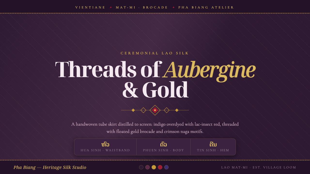 Lao Sinh Silk WeaveCeremonial Lao silk on screen. Dark aubergine ground threaded with gold mat-m…
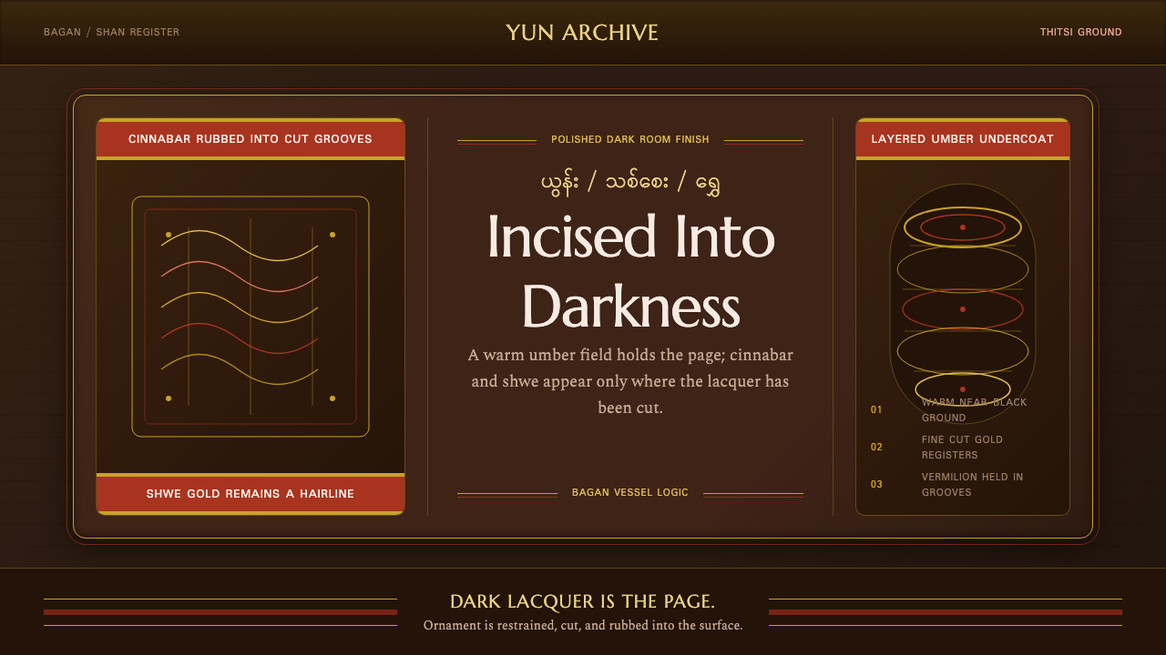 Burmese Shan Lacquer BrownDark lacquer leads. Cinnabar bands and shwe hairlines cut across a warm umber…
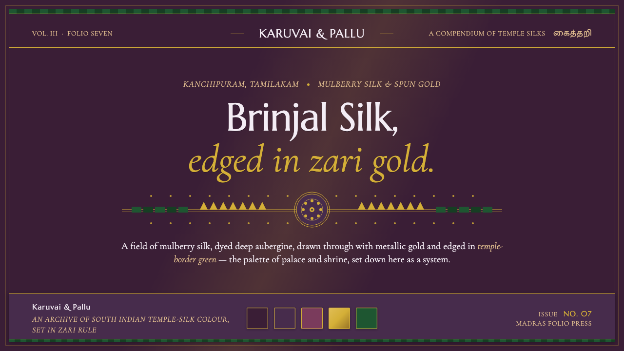 Indian Brinjal Temple TextilePalace silk, systematised. Brinjal violet ground edged in zari gold, korvai g…
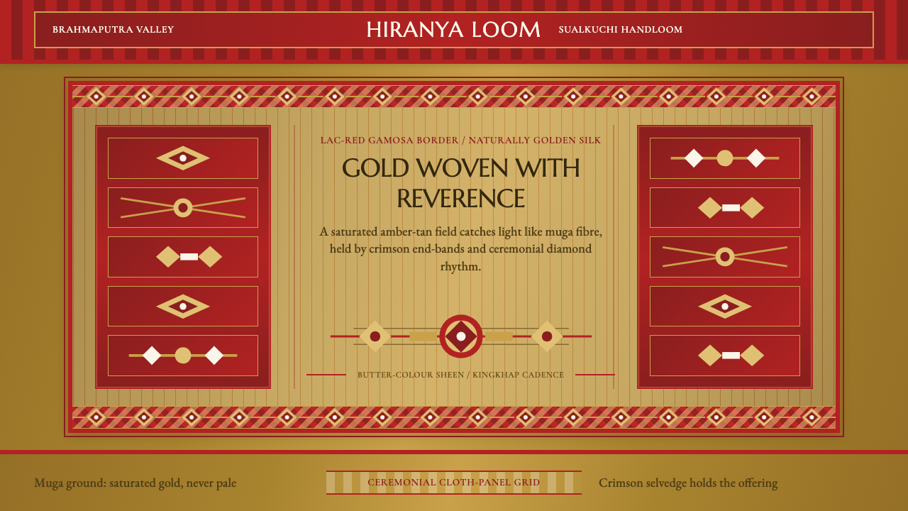 Assam Muga Silk & GamosaWarm ceremony in silk. Muga gold sheen meets crimson borders and woven diamon…
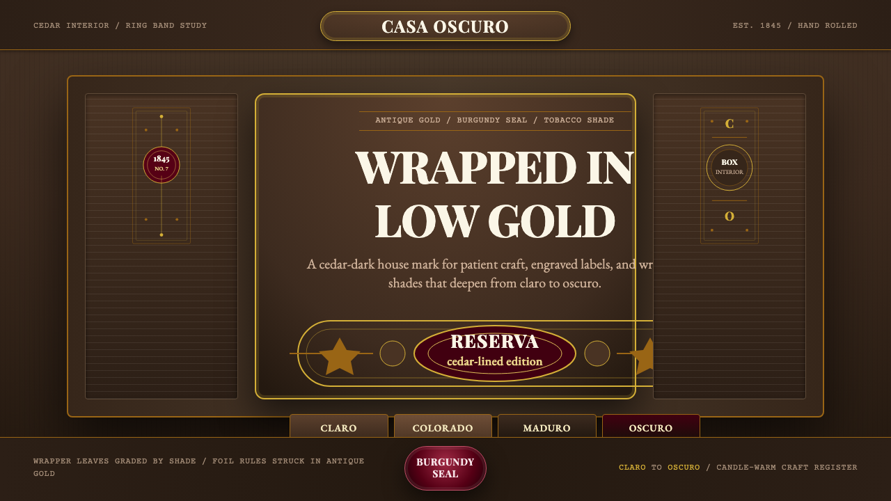 Cuban Habano CigarLuxury sleeps in shadow. Tobacco brown, antique gold rules, and burgundy seal…
 Fatimid LustrewareOpulence fired into earth. Copper-gold lustre glows through dense medallions…