What is Chettinad Athangudi Tiles?
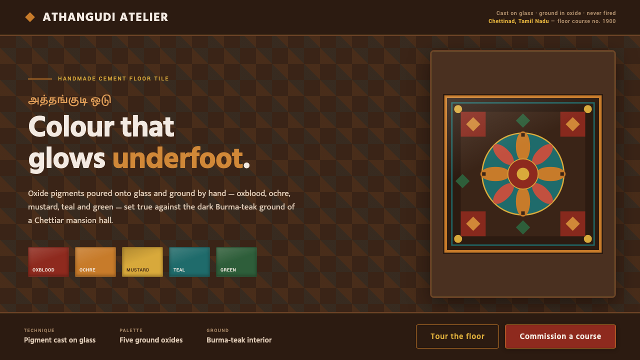
Chettinad Athangudi tile design brings hand-cast craft indoors: oxide colours glow against dark teak, while square grids and bordered medallions turn ornament into structure.
Chettinad Athangudi Tiles in brief
Athangudi tiles are handmade cement floor tiles produced in Athangudi village in Tamil Nadu, India. Coloured cement is cast on glass and ground with oxide pigments; the tiles are never fired. Between 1900 and 1950, they became part of the grand halls of Chettiar merchant mansions, where glossy geometric-floral patterns held their colour against Burma-teak pillars and limewashed walls.
The visual language is built from contrast. A warm, dark teak-brown ground gives the composition the depth of an interior, while oxblood, ochre, mustard, teal, and green behave like concentrated mineral colour under polished light. The result is saturated but earthy: vivid pigments without the artificial brightness of a synthetic palette, and ornament that remains anchored to the architectural setting around it.
As a digital design system, the style translates the logic of the floor rather than copying a single tile. Square modules establish rhythm, bordered medallion fields create focal zones, and colour is allowed to glow inside a dark structural frame. The interface should feel assembled from crafted surfaces: patterned, tactile, and ceremonial, but governed by repetition, enclosure, and clear visual hierarchy.
Where does Chettinad Athangudi Tiles come from?
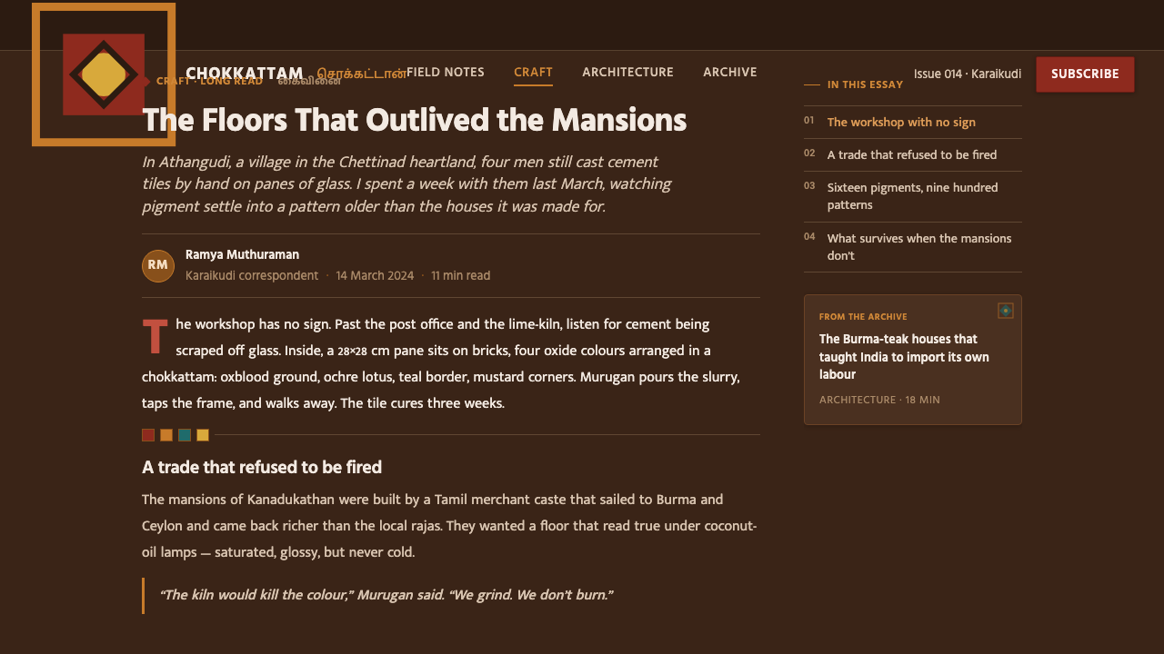
The tradition belongs to Chettinad, a region in South Asia associated here with Athangudi village in Tamil Nadu. Its defining period was the Chettiar mansion-building boom from 1900 to 1950. Nattukottai Chettiar merchant-bankers were the principal patrons of these grand residences, commissioning interiors in which architecture, material, and ornament were treated as a unified environment rather than separate layers.
Athangudi tiles are distinguished by their making process. Cement and oxide colour are cast on a glass surface, allowing the finished face to take on a smooth, glossy character before it is ground. Because the tiles are not fired, their identity is not that of ceramic ware; it belongs to an oxide-pigment cement-tile tradition whose beauty comes from casting, grinding, polish, and colour held in a solid surface.
The mansion interior supplied the visual setting that made the tiles legible. Dark Burma teak established a deep architectural counterpoint, while limewashed walls opened a pale field around the saturated floor. Against that contrast, geometric-floral patterns could read as both decoration and ordering device: a repeated surface that connected the hall into a coherent whole.
The digital interpretation keeps this relationship intact. It takes the tile grid, the bordered medallion, the dark teak ground, and the oxide palette as a system of rules for screens. The goal is not historical reconstruction in every detail, but a faithful transfer of the original atmosphere: craft carried by repetition, mineral colour intensified by darkness, and pattern disciplined by architectural framing.
What defines the Chettinad Athangudi Tiles look?
Oxide Colour
The palette centres on oxblood, ochre, mustard, teal, and green: five saturated earth tones with a mineral rather than synthetic character. They should appear dense and pigment-rich, as though colour has been ground into the surface. The palette is expressive, but its warmth keeps it connected to the craft tradition and to the dark timber interiors where the tiles originally appeared.
Teak Ground
Dark teak-brown is the compositional ground and the main source of depth. It should feel warm, timber-like, and architectural rather than neutral black. Against it, the oxide tones gain luminosity and the patterned fields become enclosed objects. The ground also prevents the saturated palette from becoming weightless or playful; it gives every colour the gravity of an interior surface.
Square Tile Rhythm
The square is the basic unit of movement. Repeated tile-like modules create a measured rhythm across backgrounds, cards, panels, or navigational regions. The repetition should remain visible enough to suggest assembly, but quiet enough to support information. A grid is not merely a pattern behind content; it is the structural memory of the floor and the reason the ornament feels orderly.
Bordered Medallions
Medallion fields provide moments of ceremony inside the grid. A bordered square or enclosed motif can mark a title, a featured value, a navigation group, or a call to action. The border should feel crafted and deliberate, not like a generic container. Its role is to frame significance, giving selected content the visual status of an inlaid tile within a larger floor.
Gloss and Glow
The tiles are glossy, so colour should appear polished rather than dusty or chalky. Light is suggested through contrast and saturation, not through soft atmospheric effects. A dark field beside a clean oxide tone can create the impression of pigment glowing underfoot. The surface remains graphic and solid: the glow belongs to the relationship between colour and ground, not to a simulated light source.
Geometric-Floral Craft
The pattern language joins geometry with floral suggestion. Shapes should feel composed, repeated, and held within the tile logic, while the floral quality brings softness and cultural specificity. Neither side should dominate completely. Pure geometry loses the handmade atmosphere; uncontrolled florals lose the architectural discipline. The distinctive character comes from their coexistence inside a bounded module.
Who shaped Chettinad Athangudi Tiles?
The Nattukottai Chettiar merchant-bankers were the patrons associated with the Chettiar mansion-building boom from 1900 to 1950. Their grand residences created the architectural context in which Athangudi tiles became more than a floor material: they became part of a coordinated interior of dark Burma teak, limewashed walls, glossy surfaces, and patterned halls.
The anonymous artisans of Athangudi are represented through the process embedded in every tile: casting coloured cement on glass, working with oxide pigments, grinding the surface, and achieving polish without firing. Their contribution is not a signature style attributed to one named designer, but a durable craft language in which material process determines the appearance.
Vernacular Chettinad craft is the broader design tradition surrounding the tiles. It joins local making, merchant-house architecture, teak, limewash, and patterned surfaces into a recognizable interior world. In a digital interpretation, this tradition matters because the style is not just a palette of five colours; it is the relationship between pigment, module, border, material contrast, and inhabited space.
How do you use Chettinad Athangudi Tiles today?
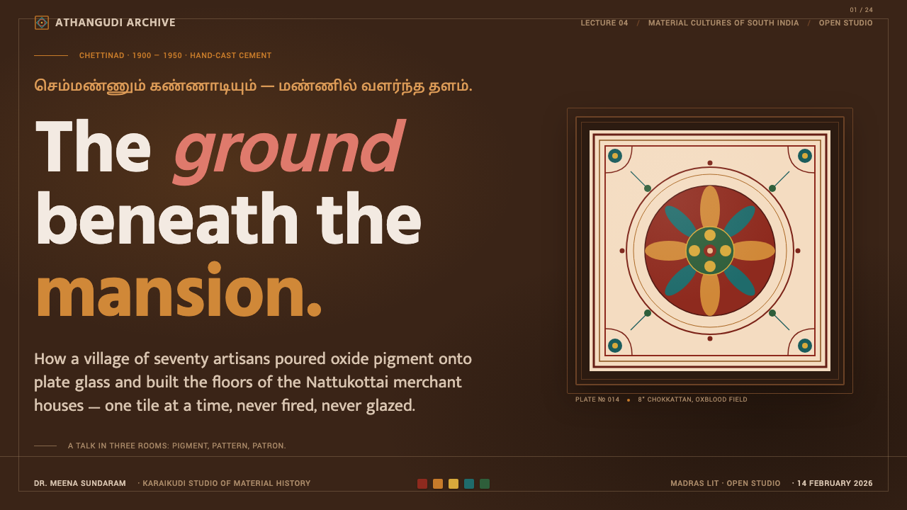
For presentation covers, let the design feel like a single ceremonial tile field: a dark teak-brown ground, one dominant oxide colour, and a bordered medallion or geometric-floral anchor around the title. Content slides should preserve the square rhythm through aligned panels and restrained pattern fragments. Data slides can treat charts as inlaid tiles, using oxblood, ochre, mustard, teal, and green as meaningful categories against the dark ground rather than scattering colour for decoration.
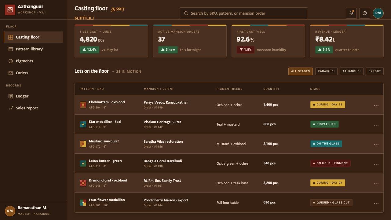
For web dashboards and pricing pages, use the tile grid to establish a strong family resemblance across navigation, cards, and comparison areas. Dark teak-brown can carry the main shell, while oxide tones distinguish active states, plan tiers, or important measures. Bordered medallions work well for featured plans and summary values. Keep body content on calmer fields within the dark frame so the interface remains legible and the patterned language stays architectural.
For editorial and marketing work, the style supports a rich contrast between dense patterned moments and quiet limewashed space. Open an article with a framed medallion, then let the reading column remain comparatively calm. Use geometric-floral accents to mark sections, pull quotes, or product details, and reserve the strongest oxide tones for moments that deserve emphasis. Marketing pages can alternate dark timber-like fields with pale, wall-like areas to create the sense of moving through a Chettinad interior.
For brand storytelling, the material process should be part of the visual language. Explain casting, glass, oxide grinding, and the absence of firing through compact captions, process panels, or framed detail views. This gives the style cultural and tactile meaning instead of reducing it to an exotic colour scheme. The strongest applications make the reader feel that every border and module has been placed, polished, and made to belong to a larger surface.
The common mistake is using the five oxide tones as unrelated bright accents on a light digital canvas. That removes the dark teak ground, weakens the sense of mineral glow, and turns crafted repetition into generic decoration. Another mistake is filling every available region with pattern. Athangudi-inspired design needs enclosure and rest: let the grid organize, let the medallion mark importance, and allow quieter fields to make the saturated colour feel deliberate.
Chettinad Athangudi Tiles — FAQ
Are Athangudi tiles ceramic?
No. They are handmade cement floor tiles cast on glass and ground with oxide colours. They are never fired, which is central to their material identity. Their glossy appearance comes from the casting and grinding process rather than from ceramic firing, so a digital interpretation should suggest polished cement and mineral pigment instead of glazed pottery.
Why does the style use such a dark ground?
The dark teak-brown ground comes from the interior relationship described by the source material: oxide colours were read against dark Burma-teak pillars and limewashed walls. In the digital system, the ground gives the pigments depth and makes them appear to glow. It also keeps the design connected to the architecture of the Chettiar mansion rather than presenting the palette as isolated swatches.
Do all five oxide colours need to appear at once?
No. The five colours form the vocabulary of the system, but a coherent composition can let one tone lead while the others support structure, category, or emphasis. What matters is that the colours remain earthy, saturated, and grounded by the teak-brown field. Using every colour at equal intensity can flatten hierarchy and make the surface feel busy rather than crafted.
How can the style stay useful instead of becoming decorative?
Treat every patterned element as part of the tile structure. A square module can organize content, a border can identify a meaningful group, and a medallion can focus attention on a featured value. Pattern should not sit independently behind the interface. When colour, border, and repetition each carry a navigational or editorial role, the craft language becomes an information system rather than a surface treatment.
Where does Chettinad Athangudi style work best?
It works best where a product needs cultural specificity, material warmth, and a strong sense of place: editorial platforms, hospitality stories, craft brands, architecture, interiors, and presentation systems that benefit from memorable visual framing. It is less suitable when the goal is anonymous neutrality or weightless minimalism. The style asks the product to acknowledge texture, pattern, and heritage rather than hide them.
Related design styles
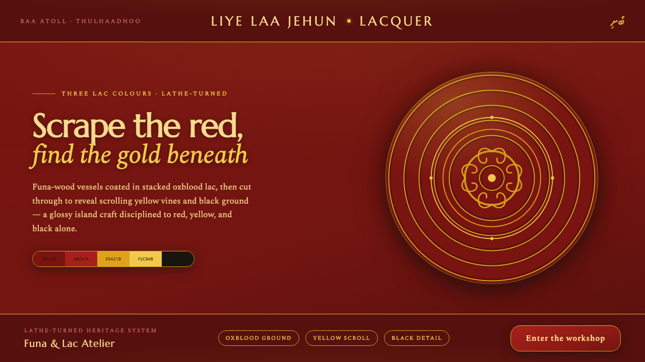 Maldivian Liye Laa Jehun LacquerThree lac colours, nothing else. Glossy oxblood scraped through to yellow scr…
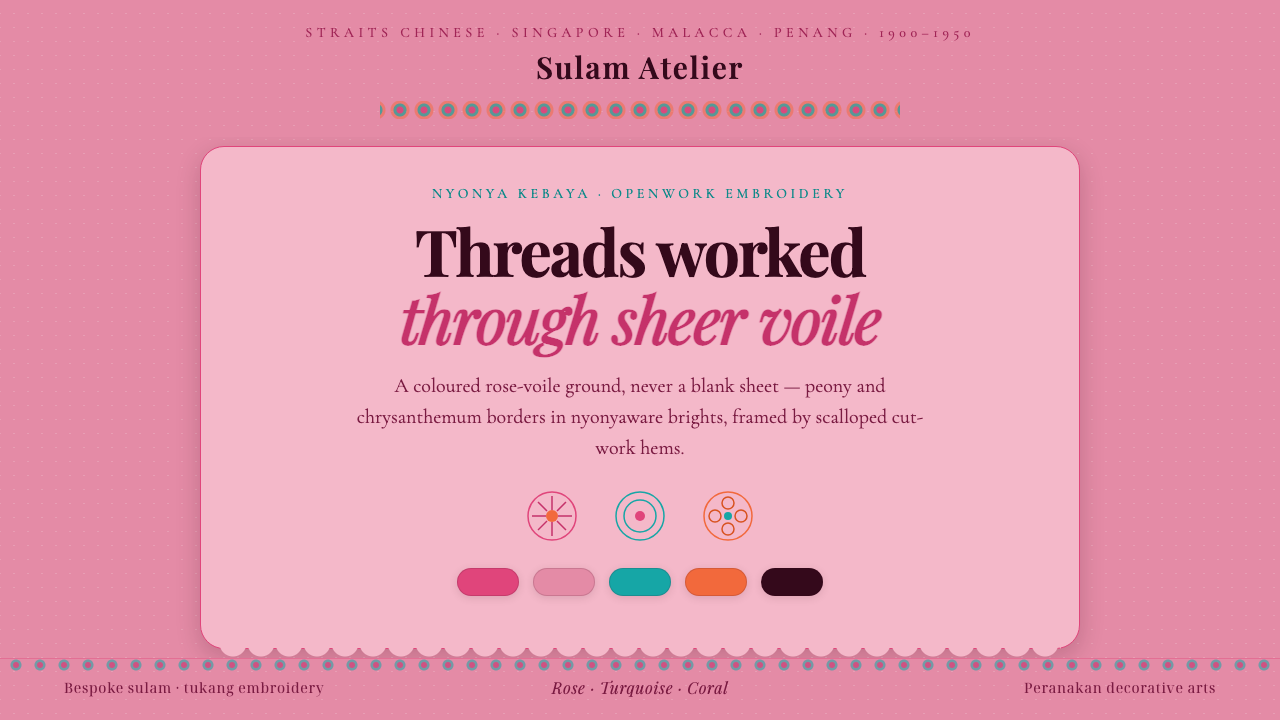 Nyonya Kebaya EmbroideryCraft, never a blank sheet. Rose-voile ground in turquoise sulam openwork, hi…
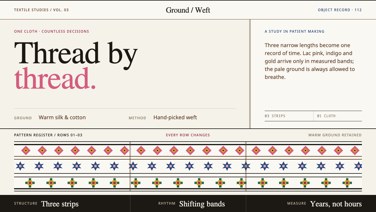 Bhutanese KushutharaPatience made visible. Lac pink and indigo bands shift across a warm silk gro…
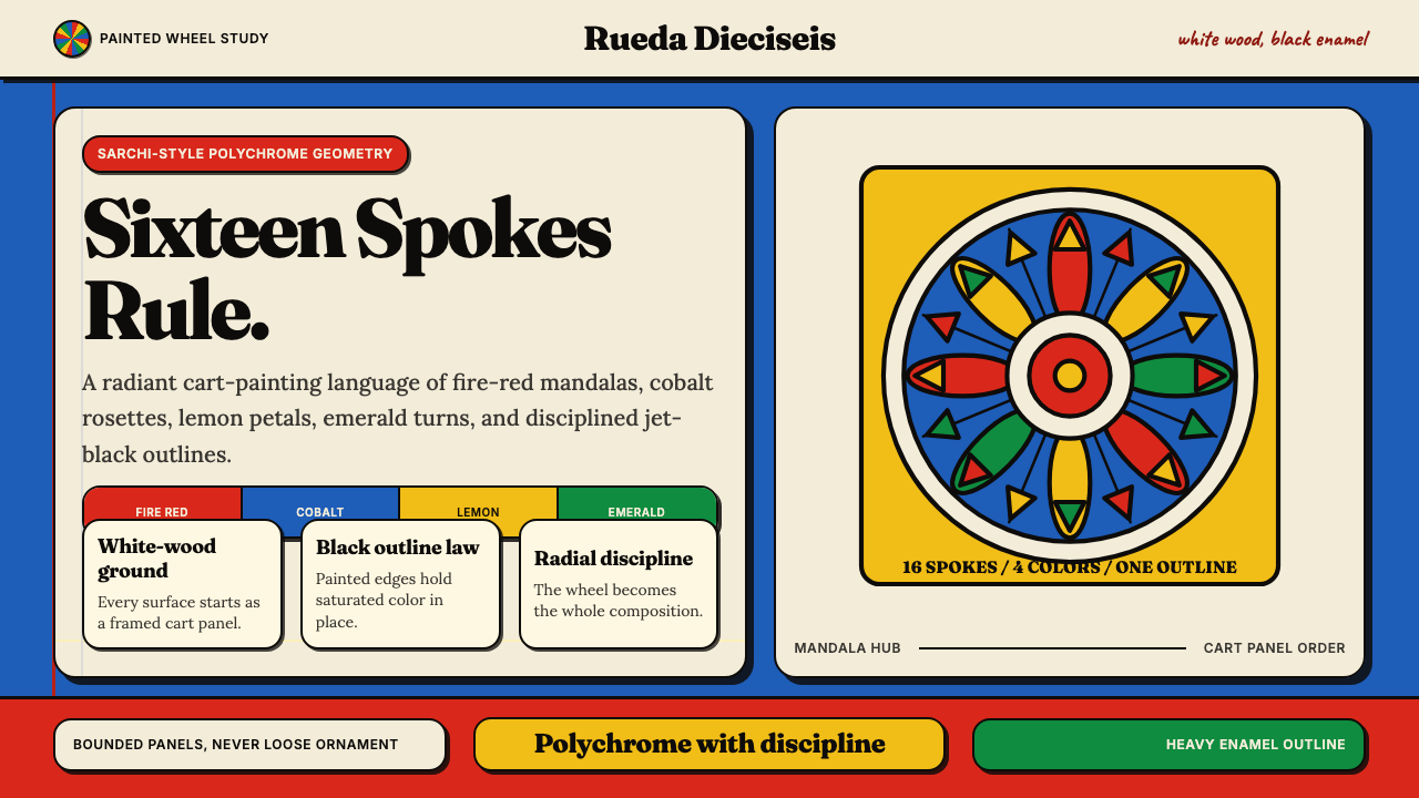 Costa Rican Oxcart Sarchí 1900Geometry sings. Fire red, cobalt, lemon and black outlines turn the wheel int…
 Kazakh Tuskiiz Wall HangingNothing flat, nothing empty. Crimson velvet, gold-green ram's-horn scrolls, a…
 Nabeul Ceramic TealGlaze over fired clay. Peacock teal and white reserve banded in black on terr…