What is Maldivian Liye Laa Jehun Lacquer?
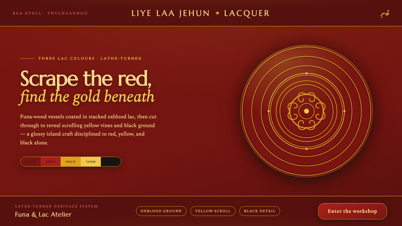
Maldivian Liye Laa Jehun turns three lacquer colours into a world of depth, gloss, scraped ornament, and hypnotic concentric rhythm.
Maldivian Liye Laa Jehun Lacquer in brief
Liye laa jehun is the Maldivian art of lathe-turned lacquerwork, a documented traditional craft associated with the islands of the Maldives in South Asia. Funa hardwood vessels are shaped on a lathe, coated with successive layers of coloured lac, and then scraped through so that patterns hidden beneath the outer surface become visible.
Its visual identity is concentrated rather than expansive. Deep oxblood red dominates the vessel, while scraped yellow scrollwork and black details emerge through the lacquer. The result is glossy, dark, and intensely decorative without relying on a broad palette: complexity comes from the interaction of curved lines, exposed layers, and the repeated circular movement of the turning process.
As a digital design language, the craft becomes a disciplined three-colour system. Oxblood establishes the ground, lacquer red creates the polished surface, yellow carries the exposed floral movement, and black supplies definition. Concentric bands, curling motifs, and controlled contrast recreate the quiet persistence of an object shaped by rotation and handwork.
Where does Maldivian Liye Laa Jehun Lacquer come from?
The documented traditional craft belongs to the period from 1900 to 1950 and remains living heritage. Its setting is the Maldives, where island-based making traditions developed around local materials and forms of skilled hand production. Liye laa jehun is specifically identified with lacquer turning, linking the movement of the lathe to the layered surface of the finished vessel.
The process begins with funa hardwood. The wood is turned into a vessel on a lathe, establishing the rounded body and the circular logic that governs the final decoration. Rather than treating the surface as a neutral shell, the craft builds its image through accumulation: coloured lac is applied in stacked layers, creating a concealed sequence that can later be revealed by scraping.
The defining act is the controlled removal of the outer lacquer. Scraping exposes yellow scrollwork and black detail beneath the dominant oxblood coat, allowing floral curls to appear as if drawn into the red surface. The pattern is therefore not simply painted on top. It is produced by revealing a prepared material history, with the tool cutting into the surface to uncover what has already been placed below.
Liye laa jehun belongs to a broader Maldivian craft context that includes coir, tortoiseshell, and lac traditions. Its contemporary visual language should preserve that relationship between material, repetition, and skilled making. The essential figures are the island lathe-turners and funa-wood lacquer artisans whose work sustains the practice, while the vessel itself remains the clearest record of the system: rounded wood, layered colour, scraped ornament, and the memory of rotation.
What defines the Maldivian Liye Laa Jehun Lacquer look?
Three-Colour Lacquer
The palette is deliberately narrow: deep oxblood red, lacquer red, yellow, and black are the complete visual vocabulary. Oxblood carries the dominant field, red suggests polished lacquer and surface richness, yellow reveals the scraped scrollwork, and black sharpens fine detail. No additional colour is needed; variation comes from placement, exposure, and contrast.
Gloss and Depth
The surface should feel lacquered rather than merely coloured. Gloss creates the sense of a finished object, while the darker oxblood ground gives the composition weight. Depth comes from layered appearance and reflected richness, not from atmospheric shading or soft illumination. A digital interpretation should look polished, sealed, and tactile in imagination.
Scraped Scrollwork
Yellow floral scrollwork is the signature event of the system. It should appear as something uncovered from beneath the red surface, with curling lines that suggest continuous growth and patient handwork. The motif is ornamental, but its irregular reveal keeps it tied to process. It should never feel like a generic floral illustration pasted on top.
Concentric Rhythm
Lathe turning leaves a meditative circular logic in the design. Rings, curved bands, and repeated arcs can organize panels, backgrounds, and supporting details. This rhythm should feel rotational rather than mechanical: steady, layered, and almost hypnotic. The circle is not merely a shape; it is the trace of how the vessel came into being.
Turned Geometry
Forms should acknowledge the vessel's rounded body. Containers, cards, image frames, and decorative fields can use curved profiles, nested circles, and bands that imply a lathe-turned object. Geometry is softened by rotation but not made vague. Edges remain intentional, and every curve should contribute to the sensation of something shaped around a central axis.
Restrained Ornament
The craft is richly ornamental, but its richness comes from a limited system repeated with discipline. Scrollwork, rings, gloss, and contrast should be enough. Avoid adding unrelated textures, extra hues, or decorative symbols that compete with the lacquer logic. The style feels abundant because the same few elements are worked deeply, not because the vocabulary is large.
Who shaped Maldivian Liye Laa Jehun Lacquer?
Island lathe-turners are the movement's central makers. Their work is expressed through rotation: the lathe establishes the vessel's rounded body and supplies the concentric rhythm that remains visible in the final visual language. In this system, their presence is represented by circular bands, controlled repetition, and the quiet patience implied by a surface shaped around an axis.
Funa-wood lacquer artisans build the visible image through layers. They work with funa hardwood vessels, apply coloured lac in succession, and scrape through the dominant outer coat to expose the pattern beneath. Their contribution is not only decorative; it is architectural, because the final image depends on a hidden order of material placed before it is revealed.
The funa hardwood vessel is the clearest embodiment of Liye laa jehun. Its rounded form holds the entire sequence together: turned wood, stacked lac, oxblood exterior, yellow scrollwork, and black detail. It is both object and record, showing how material, tool, colour, and repeated movement can become a unified visual identity.
How do you use Maldivian Liye Laa Jehun Lacquer today?
Liye laa jehun is most effective when treated as a material system rather than a decorative theme. Begin with the dark oxblood ground and establish hierarchy through surface contrast, curved rhythm, and selective exposure of yellow and black. The design should feel made, coated, and revealed. Every accent should appear to belong to the lacquer process or to the circular structure of the turned vessel.
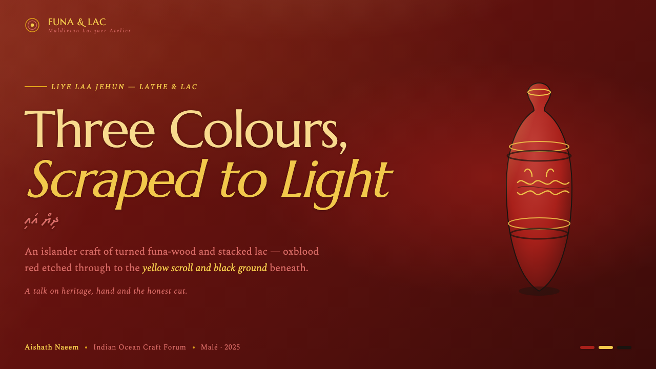
For presentation slides, the cover can use a near-black oxblood field with a glossy lacquer-red surface or a large circular vessel-like form anchoring the composition. Title type should remain clear and restrained, while yellow scrollwork can act as the visual entry point. Content slides should use dark grounds, strong bands, and repeated arcs to organize sections. Data slides can treat rings, bars, and circular diagrams as turned forms, using yellow for emphasis and black for definition rather than introducing more colours.
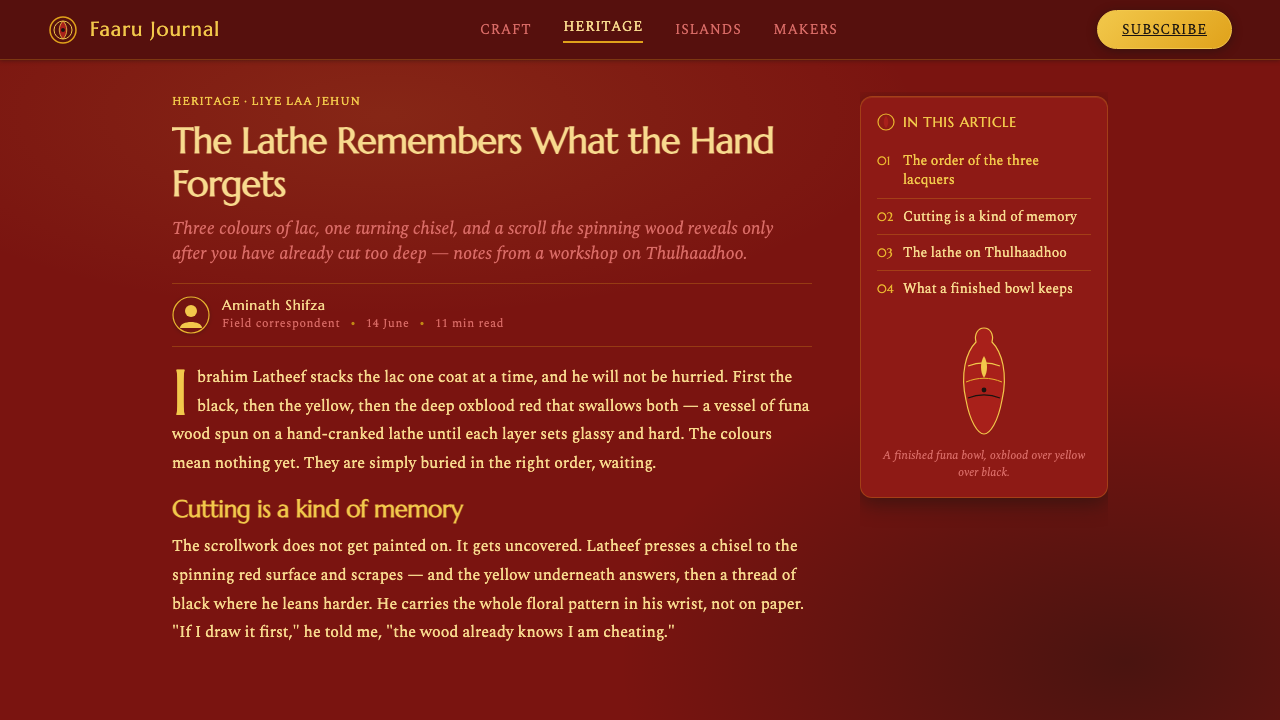
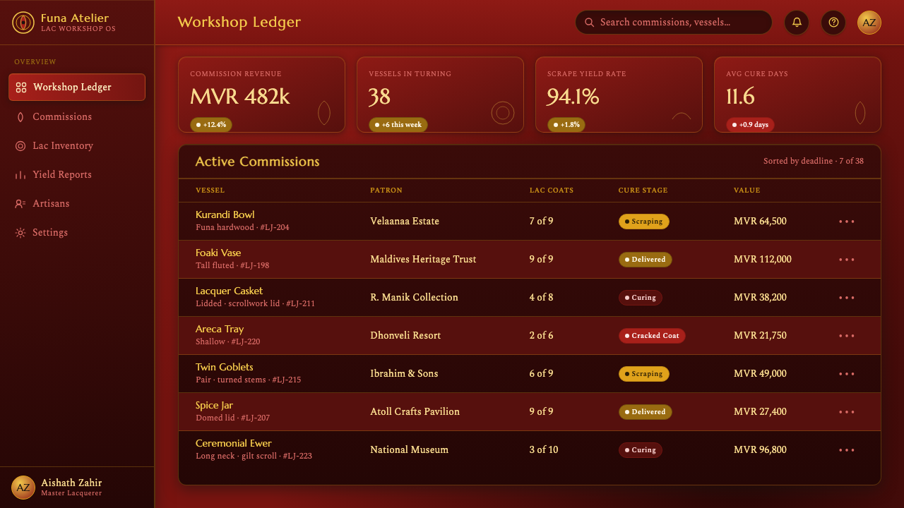
For web interfaces, the style suits dashboards and pricing pages that need a dark, crafted, premium atmosphere. Use oxblood as the environmental ground, lacquer red for active surfaces or selected panels, yellow for calls to action and meaningful status, and black for quiet structural detail. Cards can be nested like lacquer layers, while circular indicators and curved separators recall the lathe. Keep navigation legible and let ornament remain secondary to information.
For editorial and marketing work, the system supports a strong contrast between dark fields and revealed pattern. An article can place a restrained column of text beside a broad area of concentric bands or scraped scrollwork, making the margin feel like a carved or lacquered surface. Marketing pages can use a single yellow motif to lead the eye toward a product or message, while oxblood sections create a sense of depth and continuity across the campaign.
The common mistake is adding too much. Extra colours, unrelated textures, busy floral illustrations, or soft decorative effects weaken the identity because they obscure the limited logic of the craft. Another mistake is treating the yellow pattern as a sticker placed above a red background. It should feel scraped through, partially revealed, and structurally related to the circular movement of the vessel.
Maldivian Liye Laa Jehun Lacquer — FAQ
Is Liye Laa Jehun simply a red, yellow, and black palette?
No. The colours are inseparable from the process that gives them meaning. The red is the dominant lacquer coat, the yellow appears through scraping as scrollwork, and black clarifies detail. Without layering, reveal, gloss, and circular rhythm, the palette alone becomes a generic colour scheme rather than a translation of the craft.
Why should the digital version use a dark ground?
The deep oxblood ground reflects the dominant outer coat of the lacquered vessel and gives the exposed yellow pattern maximum presence. It also preserves the dark, glossy character identified with the system. A lighter variant is possible, but it should still maintain the contrast between a substantial ground, a polished surface, and selectively revealed ornament.
How should the scrollwork appear in an interface?
It should behave like a revealed layer, not a separate illustration. Use it to frame a panel, lead the eye, or mark a meaningful transition, while allowing parts of the motif to disappear into the red field. The strongest interpretation preserves the sensation of scraping through a surface rather than displaying a complete botanical drawing.
Does the style work for information-heavy dashboards?
Yes, if ornament remains subordinate to structure. Dark grounds and lacquer-like panels can create a strong environment, while yellow highlights and black details support scanning. Concentric indicators can reinforce the theme, but they should not replace clear labels or meaningful hierarchy. The craft's discipline is useful precisely because it limits visual noise.
What distinguishes an authentic interpretation from a decorative imitation?
An authentic interpretation connects colour, form, and surface to the making process. It uses the limited palette with intention, lets curves recall the lathe, and treats yellow as something scraped into view. A decorative imitation may borrow red, yellow, and black while adding unrelated patterns or effects. The difference is whether the design carries the logic of layered lacquerwork.
Related design styles
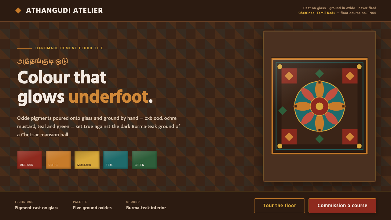 Chettinad Athangudi TilesColour that glows underfoot. Five ground-oxide tones on dark teak in bordered…
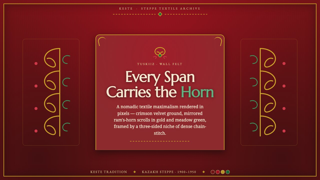 Kazakh Tuskiiz Wall HangingNothing flat, nothing empty. Crimson velvet, gold-green ram's-horn scrolls, a…
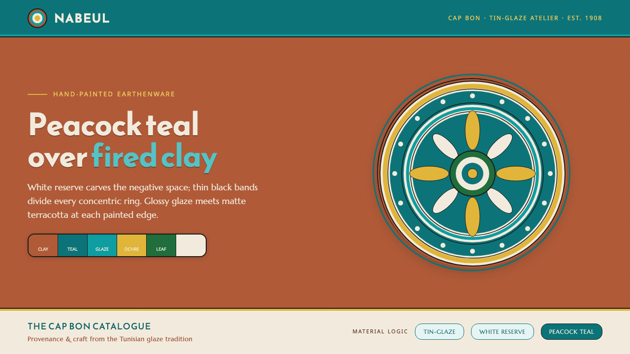 Nabeul Ceramic TealGlaze over fired clay. Peacock teal and white reserve banded in black on terr…
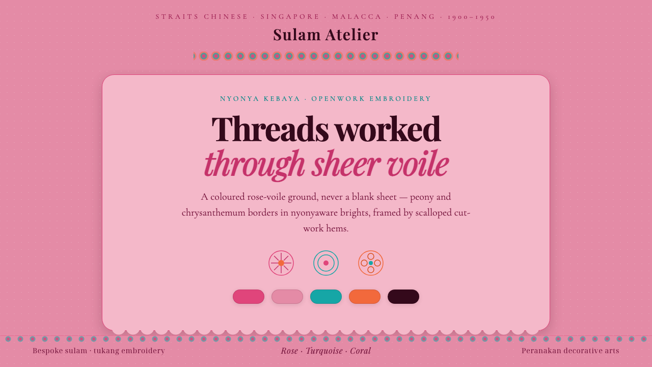 Nyonya Kebaya EmbroideryCraft, never a blank sheet. Rose-voile ground in turquoise sulam openwork, hi…
 Bhutanese Yathra Wool WeaveHighland wool made digital. Brown-maroon bands carry cyan diamonds and spare…
 Christmas ClassicTradition glows warmly. Evergreen panels, berry-red notes and burnished-gold…