What is Bhutanese Yathra Wool Weave?
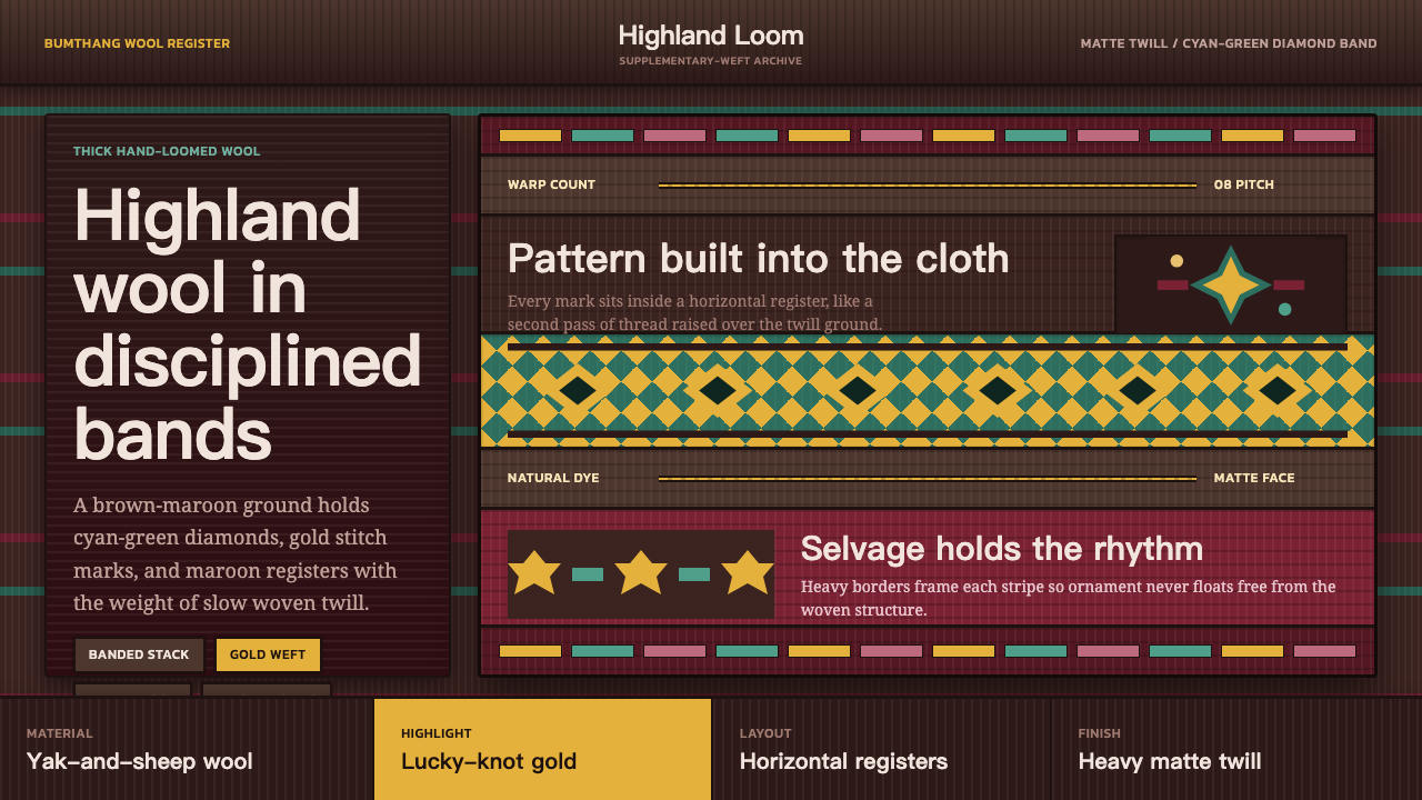
Yathra turns highland wool into a digital language of dark woven ground, cyan-green diamonds, disciplined bands, and restrained gold.
Bhutanese Yathra Wool Weave in brief
Yathra is a thick, naturally dyed twill weave made from yak and sheep wool in Bumthang, the highland heart of central Bhutan. It is hand-woven on backstrap and pedal looms, and its visual identity comes from the loom rather than from surface printing. A dark brown-maroon ground establishes the field, while supplementary weft builds bands of diamonds, eight-pointed stars, yungdrung, long-life vases, and lucky knots. The result is dense, tactile, and unmistakably textile: color appears as interlaced structure, not as a smooth digital coating.
The digital interpretation preserves that logic through a deep brown-maroon foundation, a signature cyan-green diamond band, and restrained stripes of gold-yellow, pink, and maroon. These accents are not scattered freely across the page. They are organized into horizontal bands that create rhythm, hierarchy, and visual continuity. The palette feels highland and material because the dark ground carries most of the weight, while the brighter colors appear as woven interruptions rather than decorative highlights.
Yathra is therefore more than a palette or a motif library. It is a system of density, repetition, and material honesty. Its surfaces should feel matte, heavy, and slightly irregular, as though the eye were reading the crossing of warp and weft. Geometry is present, but it is softened by craft: diamonds align into bands, edges remain disciplined, and repeated symbols carry the quiet authority of a pattern made to endure.

Where does Bhutanese Yathra Wool Weave come from?
Yathra belongs to the traditional highland weaving culture of Bumthang in central Bhutan. The source material describes it as a living craft rather than a historical revival or a decorative reconstruction. Its identity is inseparable from the region, the wool, the natural dyes, and the looms used to form it. The material is thick and warm, and the twill structure gives the cloth a directional surface that can carry strong horizontal bands without becoming visually flat.
The craft depends on two loom traditions named in the source: backstrap weaving and pedal-loom weaving. These are not merely production details. They explain why the digital system should feel assembled through repeated crossings rather than painted in a single gesture. The backstrap and pedal-loom weavers of Bumthang are therefore central figures in the style, because their work establishes the relationship between tension, repetition, banding, and touch.
Bumthang natural-dyers are equally important to the visual language. The colors are not presented as glossy digital brightness but as dyed material embedded in a woolen ground. Brown-maroon supplies the depth of the field; cyan-green, gold-yellow, pink, and maroon appear as controlled supplementary accents. The palette gains its character from restraint and contrast, not from a large range of hues.
The pattern vocabulary comes from Bhutanese Buddhist iconography and from Himalayan supplementary-weft patterning. Diamonds, eight-pointed stars, yungdrung, long-life vases, and lucky knots are woven into the cloth as organized motifs. In digital form, they should remain part of a banded textile grammar: repeated, aligned, and materially grounded. Their strength comes from belonging to the whole weave rather than from appearing as isolated symbols.
What defines the Bhutanese Yathra Wool Weave look?
Woolen Ground
The foundation is deep brown-maroon, dense and matte rather than bright or polished. It should feel like a thick woolen field with visual weight, allowing every brighter accent to read as a thread inserted into the ground. The dark base is not empty space; it is the dominant material presence of the system.
Horizontal Banding
Color and motif are organized into horizontal bands that behave like structural rows in a loom. Bands may separate sections, carry repeated symbols, or establish a steady visual cadence. Their discipline is essential: the composition should feel woven across the page, not decorated on top of it.
Cyan Diamond Rhythm
The cyan-green diamond band is the signature movement within the palette. Diamonds should repeat with calm regularity, creating a recognizable rhythm without becoming ornamental noise. Their geometry provides clarity against the dark ground, while their placement inside a band keeps the motif connected to the textile structure.
Supplementary Motifs
Eight-pointed stars, yungdrung, long-life vases, and lucky knots belong to the supplementary-weft vocabulary. They should be treated as woven signs within an established pattern field, not as isolated icons. Repetition, alignment, and partial cropping can make them feel integrated into a larger cloth rather than placed as illustrations.
Matte Twill Texture
Surface treatment should suggest thick, hand-woven twill: matte, tactile, and slightly irregular. Any texture should support the sense of fiber and crossing threads. Glossy fills, slick gradients, and polished digital surfaces work against the character because they make the material appear printed or synthetic.
Restrained Contrast
Contrast comes from the relationship between the dark brown-maroon ground and a small family of brighter supplementary colors. Gold-yellow and pink should remain selective, while cyan-green carries the most recognizable accent role. The palette gains authority when the dark field remains dominant and the brighter threads appear with purpose.

Who shaped Bhutanese Yathra Wool Weave?
The backstrap-loom weavers of Bumthang represent the intimate, tension-driven side of Yathra production. Their work supports the digital system’s sense of hand-held structure: bands should feel deliberate, repeated, and materially connected, with enough irregularity to suggest craft without losing pattern discipline.
The pedal-loom weavers embody the rhythmic and systematic side of the craft. Their presence in the source helps explain the style’s ordered horizontal movement: repeated rows, controlled bands, and a surface that feels constructed through steady mechanical and human coordination.
The natural-dyers of Bumthang anchor the palette in material rather than spectacle. Their role is reflected digitally through the preference for deep brown-maroon, muted textile depth, and carefully rationed accents of cyan-green, gold-yellow, pink, and maroon instead of glossy, unlimited color.
The Himalayan supplementary-weft tradition provides the pattern logic through which diamonds, stars, yungdrung, long-life vases, and lucky knots become part of the cloth. It is best understood as a grammar of inserted bands and repeated signs, not as a collection of detachable symbols.
How do you use Bhutanese Yathra Wool Weave today?
For presentation covers, Yathra works best when the dark brown-maroon ground occupies most of the field and a single cyan-green diamond band establishes recognition immediately. The title can sit within or beside the band, while gold-yellow or pink appears as a small woven interruption. The cover should feel like a strong textile panel: horizontal, grounded, and tactile, with the motif doing structural work rather than acting as surface decoration.
Content slides should use the banding system to separate sections and establish reading rhythm. A title may occupy a quiet dark field, while body text sits in a lighter or more open woven zone. Data slides can translate charts into textile logic: bars become aligned bands, repeated markers become supplementary motifs, and accent colors distinguish categories without making the page feel glossy or technological. The important quality is continuity across slides, as though every page belongs to the same length of cloth.
For web interfaces, Yathra suits dashboards, pricing pages, and tools that need a strong sense of identity without relying on bright digital effects. Panels can read as woven blocks, with dark surfaces carrying pale text and cyan-green reserved for active states, selected rows, or the main visual signal. Gold-yellow and pink should remain occasional accents. Navigation should be calm and legible, using horizontal separators and repeated band logic instead of excessive icons or decorative ornament.
Editorial and marketing work can use Yathra as a material narrative. Feature sections may alternate between deep brown-maroon fields and quieter textile grounds, with a recurring diamond band acting as a visual refrain. Pull quotes, metadata, and campaign labels can be placed inside narrow woven strips, while larger imagery should be cropped or framed so it feels embedded in the cloth rather than floating above it. The style is especially effective when the story concerns craft, place, material, continuity, or careful making.
The common mistake is treating Yathra as a generic dark theme with a few colorful diamonds added on top. Too much cyan-green, gold-yellow, or pink destroys the hierarchy; smooth gradients and glossy surfaces erase the woolen character; and scattering every motif independently makes the page feel like a symbol sheet. Keep the ground dominant, bind accents into bands, and let texture remain quiet enough that the structure can be read before the decoration.

Bhutanese Yathra Wool Weave — FAQ
Is Yathra simply a dark color palette?
No. The dark brown-maroon ground is essential, but the system also depends on horizontal banding, supplementary-weft motifs, restrained accent colors, and a matte twill-like surface. Without those relationships, the result becomes a generic dark interface rather than a digital translation of Yathra weaving.
Why are the motifs kept inside bands?
Because the source material describes motifs as supplementary weft woven into an organized cloth. Keeping them in bands preserves the loom logic and prevents the symbols from turning into detached decoration. The band is the structure that gives the motif its textile identity.
Can Yathra use bright digital effects?
It can use contrast, but brightness should remain subordinate to material depth. Gloss, smooth gradients, and unlimited saturated color conflict with the thick, naturally dyed, matte character of the source. Accents work best when they feel like inserted threads rather than light emitted from the screen.
How should the Bhutanese iconographic motifs be used?
Use them as repeated woven elements within the established band system. Diamonds, stars, yungdrung, long-life vases, and lucky knots should support rhythm and continuity rather than become unrelated decorative icons. Their cultural presence is strongest when the whole surface respects the logic of the weave.
Where does this style work best?
Yathra works best where material identity, craft, place, and continuity matter: editorial stories, cultural platforms, dashboards with a strong visual voice, pricing pages that need warmth without softness, and presentations built around a clear narrative. It is less effective when a product depends on glossy futurism, weightless minimalism, or unrestricted color.
Related design styles
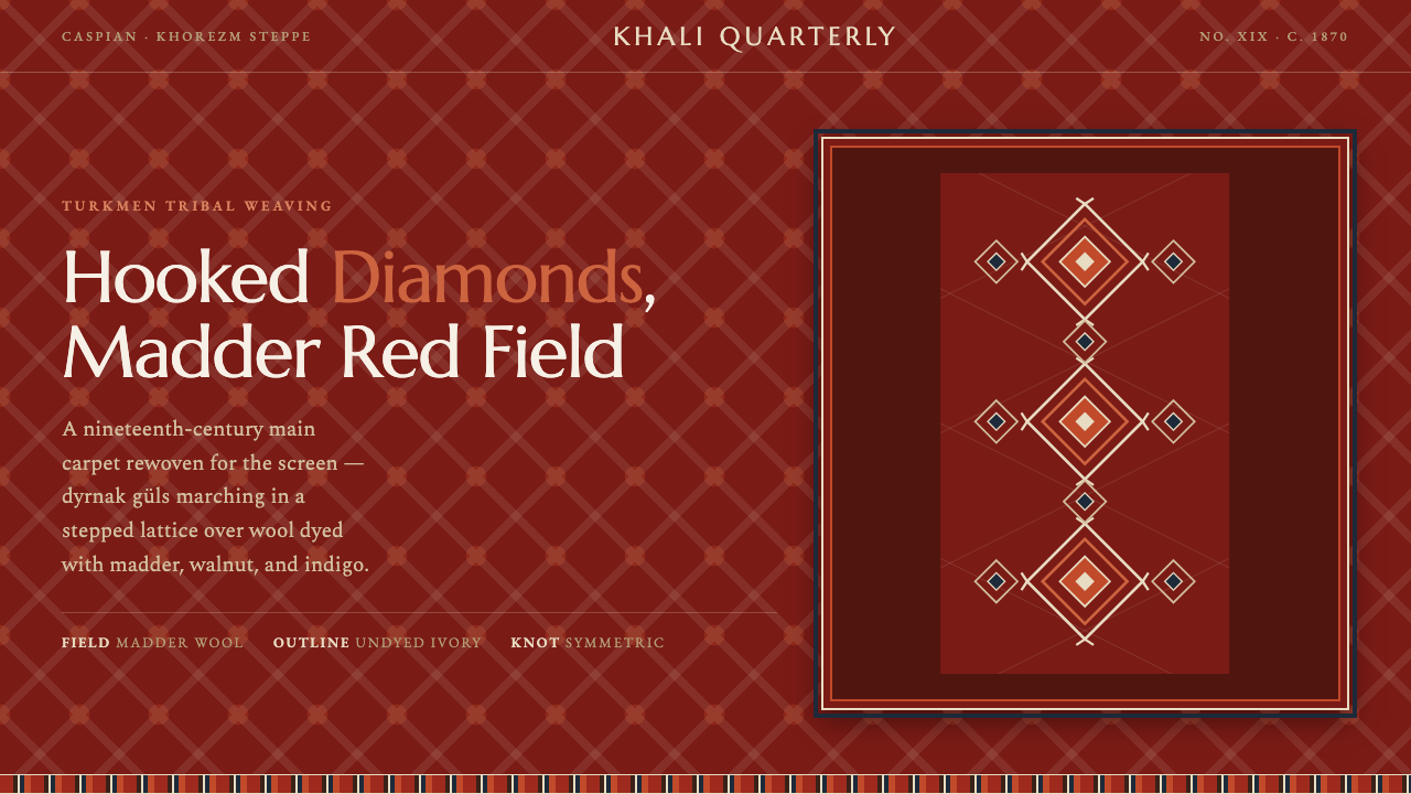 Yomut Gül CarpetHand-knotted authority on screen. Hooked dyrnak diamonds lattice a madder-red…
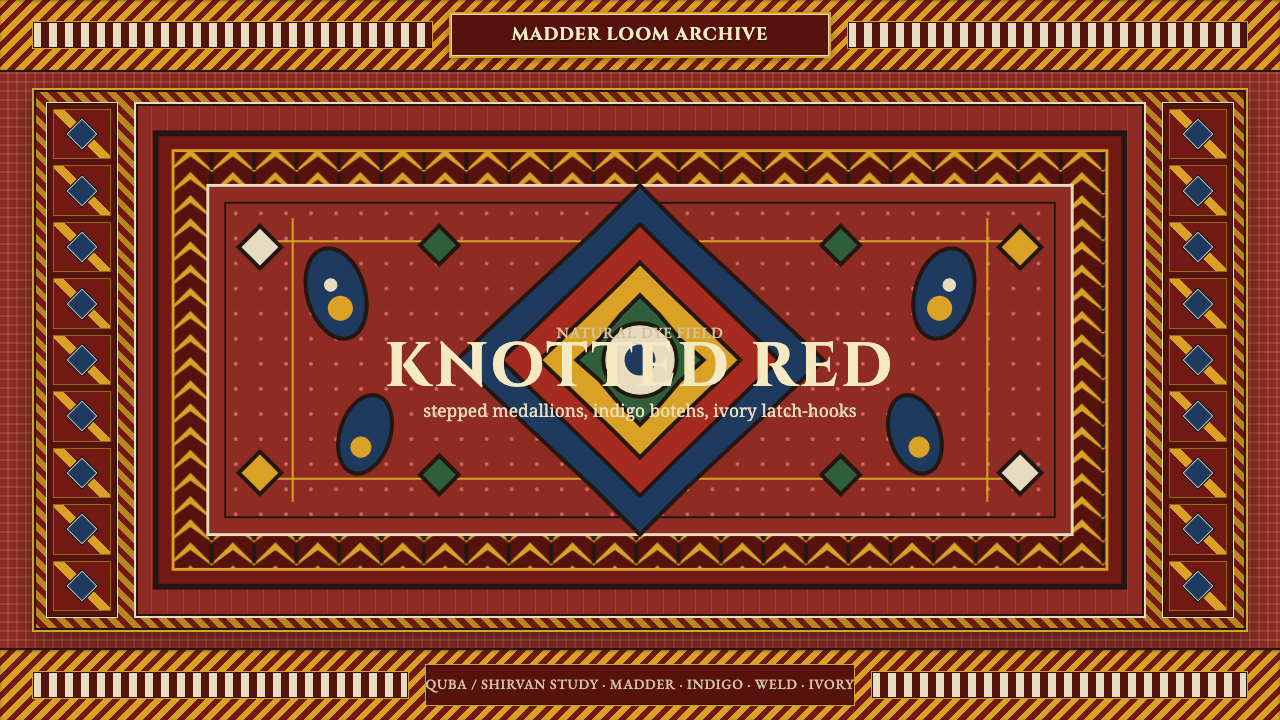 Azerbaijani Quba CarpetRed is the field. Indigo botehs and ivory latch-hooks orbit a stepped medalli…
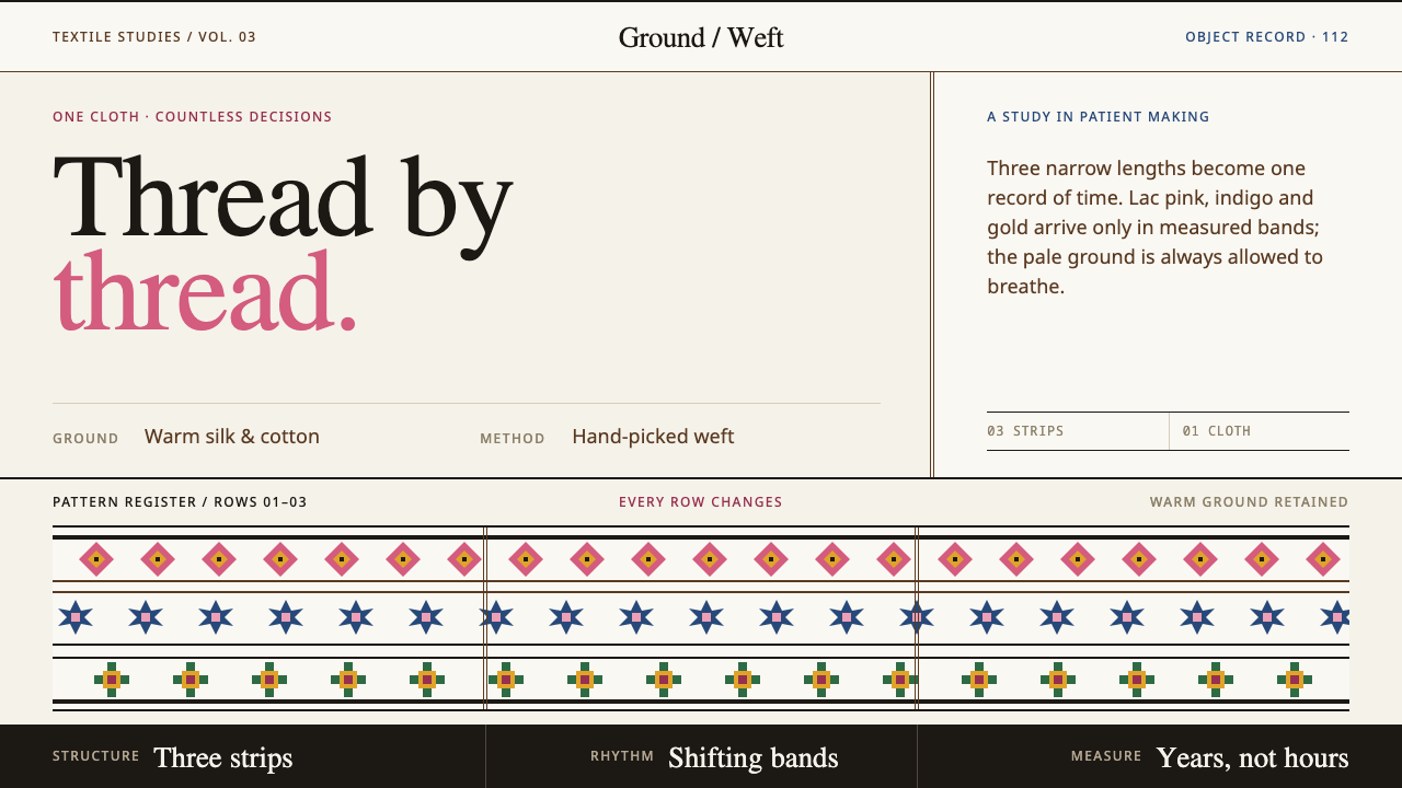 Bhutanese KushutharaPatience made visible. Lac pink and indigo bands shift across a warm silk gro…
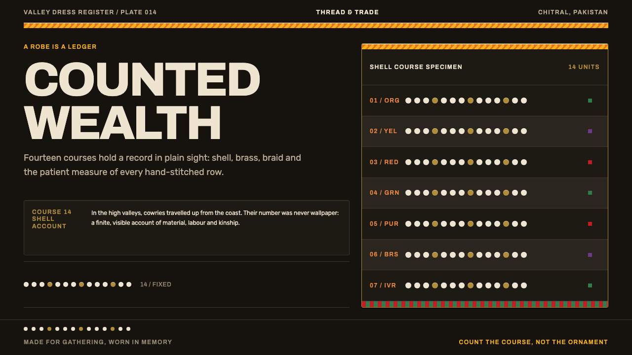 Kalash KupasDensity carries value. Ivory shell courses and orange braid are counted on wa…
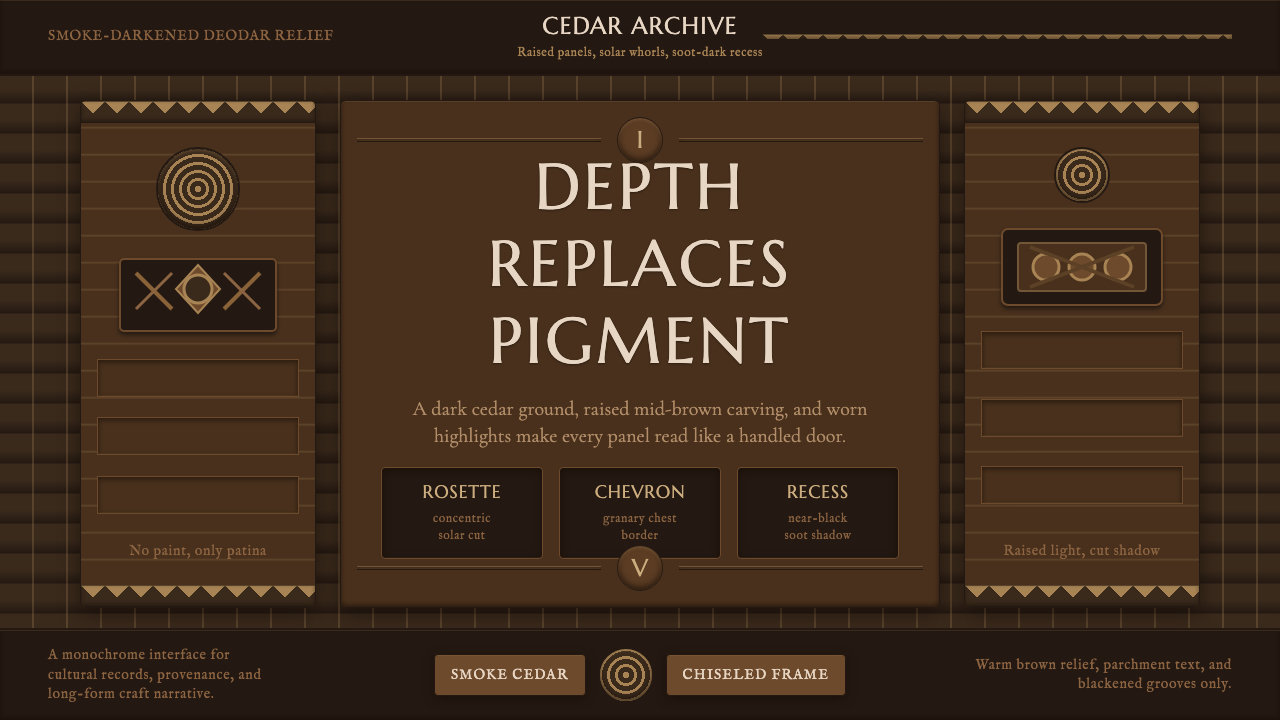 Nuristani Carved CedarDepth replaces pigment. Smoke cedar, chevrons, and rosettes carve light from…
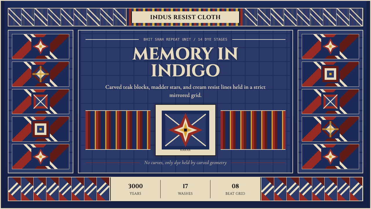 Sindh Ajrak Block PrintAncient cloth feels exact. Indigo fields, madder stars, and cream grids repea…