What is Yomut Gül Carpet?
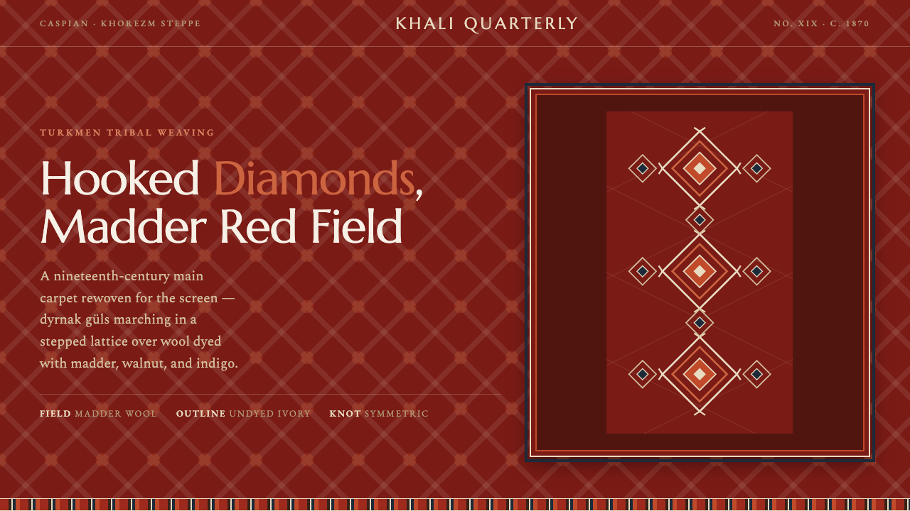
Yomut Gül Carpet brings the authority of hand-knotted tribal wool to the screen: hooked diamonds, layered borders, and a madder-red field that feels earned rather than applied.
Yomut Gül Carpet in brief
The Yomut main carpet, or khali, is a nineteenth-century Turkmen tribal weaving associated with the Yomut people of the Caspian and Khorezm steppe. Its defining field is built from dyrnak güls: diamond-shaped tribal medallions whose edges turn outward in hooked, nail-like forms. Repeated across the carpet, they create a stepped lattice that is simultaneously decorative, structural, and unmistakably rhythmic.
The original visual language is materially grounded. A deep madder-red wool field carries motifs outlined in ivory, while rust, walnut, and indigo introduce earthy variation. Symmetric knots give the surface physical density; the pattern does not merely sit on top of a background but appears embedded in it. The result feels rugged rather than delicate, ceremonial rather than polished, and alive with the slight visual pressure of repeated handmade form.
As a digital design style, Yomut Gül Carpet translates that authority without pretending a screen is a loom. It uses a luminous madder-red ground, pale gül outlines, warm dark accents, and several guard-border bands to create enclosure and rhythm. Bookish serif type belongs naturally in the system, because it carries the same sense of inherited weight: text should feel impressed into a textile field, not pasted over a generic interface.
Where does Yomut Gül Carpet come from?
The source of the style is nineteenth-century tribal weaving, around 1870, rather than a named studio, manifesto, or commercial design movement. It emerged in Central Asia among the Yomut Turkmen of the Caspian and Khorezm steppe. That setting matters because the carpet is not an isolated graphic composition: it belongs to a hereditary craft tradition in which pattern, material, dye, and knotting method work as one visual language.
Its makers were Yomut tribal women weavers, working anonymously within inherited craft knowledge. Their anonymity is not a lack of authorship; it is part of the form’s character. The motif system persists because it can be remembered, repeated, and varied through making. A digital interpretation should preserve that sense of accumulated knowledge rather than treating the gül as a detached ornamental icon.
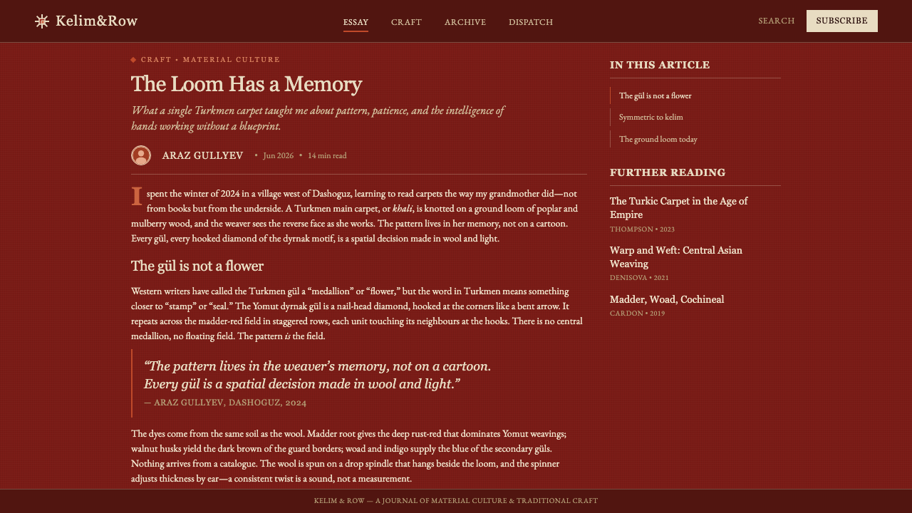
The gül tradition provides the carpet’s central organizing principle. A gül is a tribal medallion, and in this Yomut form the dyrnak gül becomes a hooked diamond with a firm, legible silhouette. Repetition turns the medallion into a lattice. The step-like relation between neighboring motifs gives the field directional movement without requiring naturalistic imagery, perspective, or a separate illustrative scene.
Natural madder, rust, walnut, and indigo establish an earthy family of color, while symmetric knots bind the visual order into wool. For contemporary designers, this origin suggests a useful discipline: hierarchy should come from field, motif, border, and type working together. The style becomes superficial when its colors are borrowed but its dense, nested structure and handmade sense of repetition are discarded.
What defines the Yomut Gül Carpet look?
Madder Field
The dominant ground is a deep, glowing madder red that reads as dyed wool rather than synthetic display color. It should carry warmth, mineral depth, and slight visual density. The field is never empty background: it is the fabric from which every other decision emerges. Pale motifs gain authority because they are held against this dark, earthy pressure.
Hooked Dyrnak Gül
The dyrnak gül is the central motif: a diamond whose edge is broken into hooked, nail-like turns. It should remain crisp enough to be recognized at a glance, but it must feel repeated rather than logo-like. Its power comes from recurrence across a field, where each motif reinforces a shared lattice and creates the sensation of a hand-worked surface.
Ivory Outline
Ivory is used as a contouring and clarifying color, not as a broad decorative wash. Around the gül it sharpens the hooked silhouette; in type it can make a heading feel like a woven label or an inscription. Its restraint is important. If pale color spreads too freely, the grounded authority of the madder field collapses into contrast for contrast’s sake.
Guard Borders
Several narrow border bands frame the main field and make containment visible. Their role is not merely ornamental. They establish a threshold between outer edge and interior pattern, give a page or component a finished textile logic, and allow repeated marks to introduce secondary rhythm. Borders should feel layered and continuous rather than like isolated decorative rules.
Earth-Dyed Contrast
Rust, walnut, and indigo belong as supporting notes within an earthy family. Their job is to deepen the field, distinguish layers, or add a rare accent without breaking the dominance of madder and ivory. The palette should feel extracted from dye materials and wool, with muted complexity beneath the strong central contrast.
Bookish Serif Type
Warm serif typography gives the system a literary and inherited quality. It should be sturdy enough to coexist with dense pattern, not sleek enough to suggest a detached luxury brand. Clear hierarchy comes through contrast in scale, spacing, and placement. Type belongs inside the woven order, often framed by borders or allowed generous quiet space against the field.

Who shaped Yomut Gül Carpet?
The anonymous women weavers named in the source are the central authors of the tradition. Their hereditary craft makes the carpet more than a visual reference: its motifs, natural dyes, wool field, and symmetric knots are inseparable parts of a practiced making system. Design adaptations should acknowledge that collective authorship through repetition, material weight, and disciplined structure.
Within the Yomut weaving tradition, the makers preserve the gül as a repeatable tribal medallion rather than a free-floating illustration. The dyrnak form demonstrates how a strong silhouette can survive repetition across a large field. For a design system, this is a lesson in motif discipline: the pattern earns meaning through recurrence and placement, not through novelty.
The same hereditary craft context joins naturally dyed madder, rust, walnut, and indigo with the density of symmetric knots. This union explains the carpet’s earthy authority. It is not a palette applied after composition; color and construction reinforce one another. Contemporary work should likewise make color, surface, borders, and typography feel mutually dependent.
How do you use Yomut Gül Carpet today?
For presentation covers, treat the screen as a carpet field rather than a neutral canvas. Let the madder ground carry the composition, place a cropped or repeated dyrnak gül as the main visual authority, and use ivory serif type with deliberate breathing room. A guard-border treatment can frame the title or the full page, giving an opening slide the contained, ceremonial feeling of a textile rather than the look of a standard template.
Content slides need more restraint than covers. Use a quieter portion of the field, keep the gül as a watermark-like structural presence or reserve it for section markers, and make the reading order unmistakable with warm serif headings and disciplined blocks of copy. On data slides, charts should remain legible first. Madder can hold the background while ivory, rust, walnut, and indigo distinguish meaningful groups; borders and motif fragments can frame the chart instead of competing with it.
For web interfaces, the style is strongest in dashboards, collections, premium membership pages, and pricing views that benefit from enclosure and richness. Use the carpet field for a hero region, side panel, selected state, or major summary card rather than covering every surface in pattern. Interfaces still need calm operational zones. Pale panels, dark text, and restrained motif use can preserve usability while letting the more saturated textile language signal importance.
Editorial and marketing applications benefit from the style’s narrative weight. An article can open with a full textile field, then move into quieter reading areas with border bands marking section breaks, pull quotes, or metadata. Marketing pages can use the gül lattice to communicate heritage, collectibility, and craft, while imagery and product details remain clearly separated from the pattern. The style works best when it feels like a frame around a story, not a costume covering every message.
The most common mistake is using a red background and a decorative diamond, then assuming the result is Yomut. The style depends on a relationship among the dense field, hooked repetition, ivory restraint, layered guard borders, earth-dyed supporting tones, and text with real visual weight. Avoid making every region equally patterned, equally bright, or equally outlined. The original authority comes from hierarchy: a dominant field, a repeatable motif, and carefully bounded accents.
Yomut Gül Carpet — FAQ
Is Yomut Gül Carpet simply a red patterned background?
No. The madder field is essential, but it works only with the hooked dyrnak gül, ivory outlining, guard-border structure, earthy supporting dyes, and the dense logic of hand-knotted repetition. Removing those relationships leaves a decorative surface. The style should feel constructed from a textile grammar, where field, motif, edge, and text each have a distinct responsibility.
How should the hooked gül be used in a digital layout?
Use it as a repeatable structural motif. It can establish a lattice in a hero area, mark a section, frame a card, or appear as a cropped detail at an edge. It is less convincing as a single isolated badge. The dyrnak gül gains its character from hooked contour and recurrence, so preserve both its silhouette and its relation to neighboring motifs.
Can the style support practical dashboards and data-heavy pages?
Yes, if the textile language is concentrated where hierarchy benefits from it. Use the rich field for navigation, summaries, selected views, or framing regions, then give dense controls and charts quieter surfaces. Charts should not imitate the carpet pattern. Instead, let the earthy palette distinguish information and let border bands define zones without obscuring labels or values.
Why is serif typography a better fit than sleek modern type?
The source system is rooted in wool, natural dye, and hereditary handwork. Warm serif type can carry comparable density and literary gravity, allowing text to feel integrated with the carpet field. A very sleek or weightless type treatment can make the pattern feel like an unrelated backdrop. The goal is not historical imitation, but a consistent balance between text and textile authority.
What makes a Yomut-inspired implementation feel inauthentic?
Treating the style as generic exotic decoration is the central failure. It becomes inauthentic when motifs are scattered without lattice logic, ivory is used indiscriminately, borders are reduced to arbitrary trim, or the palette becomes glossy and synthetic. Keep the work grounded in the approved source: a Yomut tribal carpet, hooked diamond güls, natural-dye earthiness, symmetric-knot density, and a clearly bounded field.
Related design styles
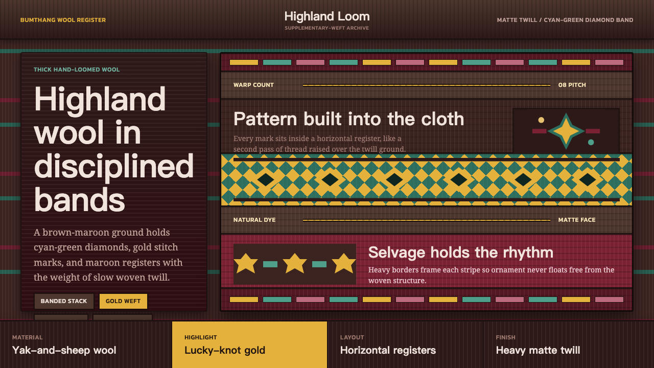 Bhutanese Yathra Wool WeaveHighland wool made digital. Brown-maroon bands carry cyan diamonds and spare…
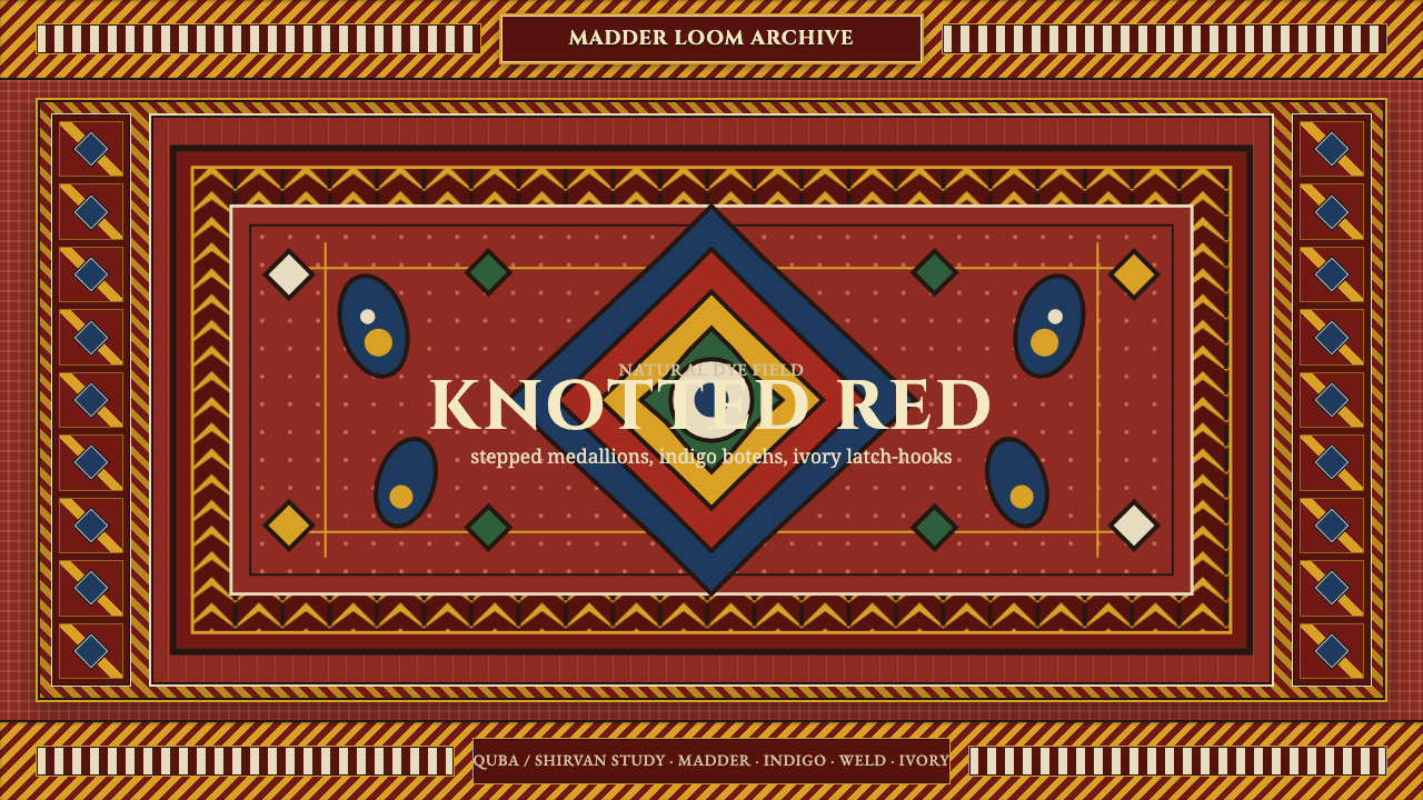 Azerbaijani Quba CarpetRed is the field. Indigo botehs and ivory latch-hooks orbit a stepped medalli…
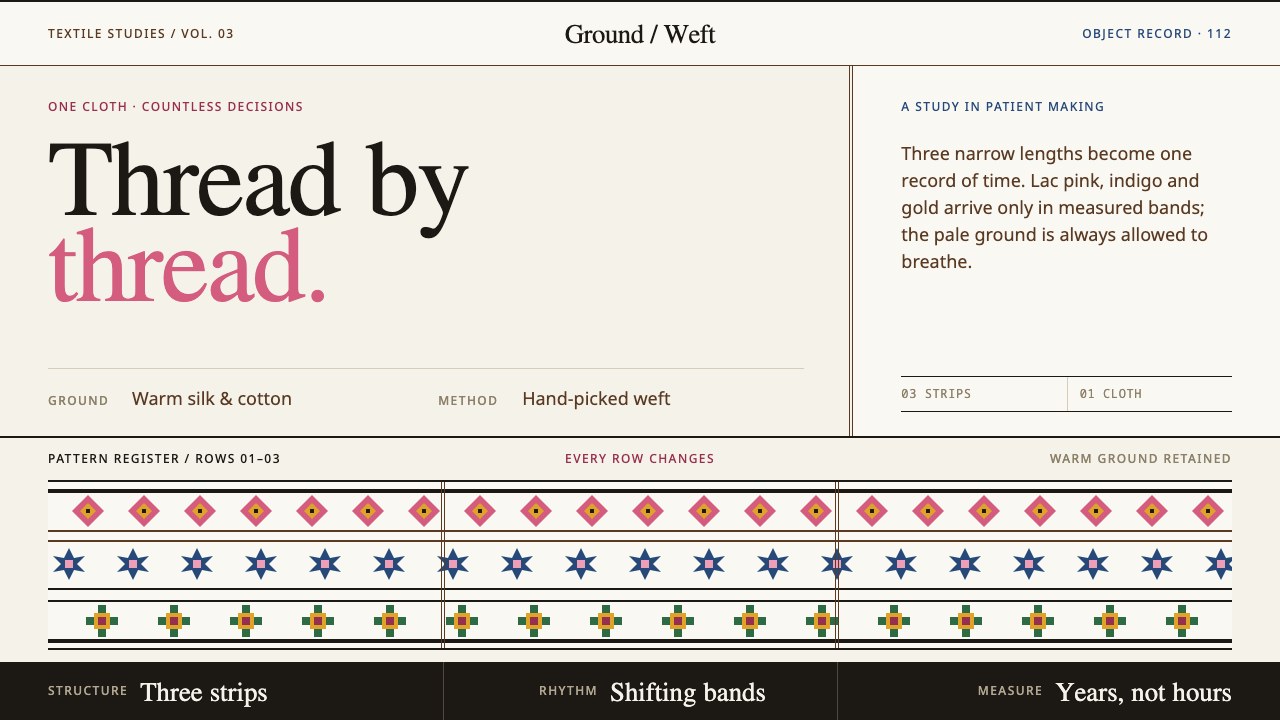 Bhutanese KushutharaPatience made visible. Lac pink and indigo bands shift across a warm silk gro…
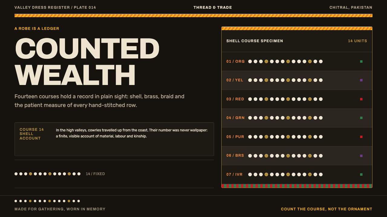 Kalash KupasDensity carries value. Ivory shell courses and orange braid are counted on wa…
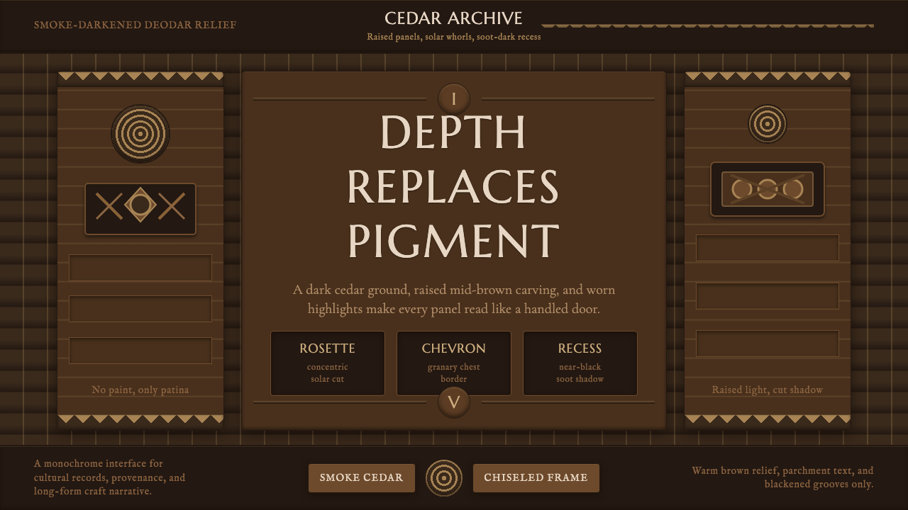 Nuristani Carved CedarDepth replaces pigment. Smoke cedar, chevrons, and rosettes carve light from…
 Sindh Ajrak Block PrintAncient cloth feels exact. Indigo fields, madder stars, and cream grids repea…