What is Azerbaijani Quba Carpet?
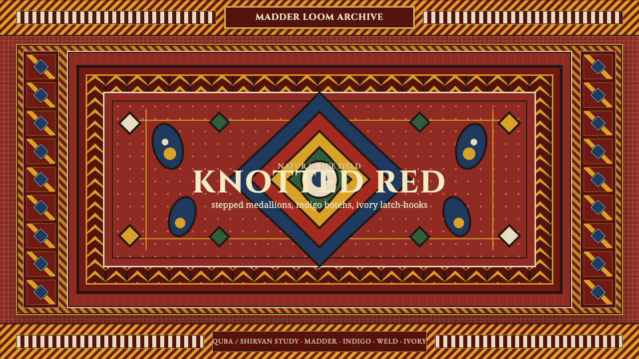
In a Quba carpet, red is not a color choice but the ground itself — a whole woven world of stepped medallions, indigo paisleys, and ivory latch-hooks knotted into a deep madder-dyed field.
Azerbaijani Quba Carpet in brief
The Quba (also spelled Guba) and neighboring Shirvan carpets are knotted-pile weavings from the northeastern Caucasus, the mountainous corner of Azerbaijan between the Caspian Sea and the Greater Caucasus range. Woven before 1900 on village and workshop looms, they are built around a saturated red field — dyed with madder root — that is almost never left empty. Instead it carries a dense arrangement of geometric ornament: stepped diamond medallions stacked along a central axis, small hooked paisley motifs called botehs scattered across the open ground, and a nested sequence of border bands running the full perimeter of the rug.
Every color in a historical Quba carpet comes from a plant, root, or mineral, not a chemical dye vat. Madder root gives the dominant red; indigo, imported along old trade routes, gives a deep saturated blue used for the botehs and secondary medallions; undyed ivory-white wool is left in its natural state for the sharp latch-hook borders; weld yields gold and forest greens appear as smaller accents. Every motif, no matter how small, is drawn with a dark outline that keeps each shape crisp against its neighbors — nothing in the composition is allowed to blur into anything else.
The overall effect is dense but disciplined: an entire surface covered in pattern, yet every pattern element sits inside its own clearly bounded cell. There is no negative space in the Western sense — the red field itself functions as the 'background,' but it is as saturated and present as any of the motifs drawn on top of it. This is ornament understood as structure rather than decoration layered onto a neutral base.
Where does Azerbaijani Quba Carpet come from?
The carpets of Quba belong to the wider tradition of Caucasian knotted-pile weaving, a craft practiced across the mountainous region straddling present-day Azerbaijan, Armenia, Georgia, and southern Dagestan for centuries before commercial export markets or written design records existed. Quba itself is a town in the northeastern foothills of Azerbaijan, historically home to a mix of ethnic and religious communities including Azerbaijani Turks, mountain Jews, and Lezgins, all of whom contributed to the region's weaving culture. Shirvan, the neighboring historical province to the south along the Caspian coast, produced a closely related but distinguishable body of work, and the two names are often grouped together by collectors and scholars because their motifs and construction overlap so heavily.
These carpets were not made for museums or for an export trade in their earliest phase — they were made by village women, largely anonymous to history, on vertical or horizontal looms set up in homes or small workshop settings, to furnish their own households or to be sold or traded regionally. Designs were passed down through direct transmission from mother to daughter or within a workshop lineage, memorized rather than drawn from a pattern book, which is why closely related villages produced carpets with recognizable family resemblances in medallion structure and border sequence while still varying in the fine details of color and proportion.
The dyeing itself was a specialized craft in its own right, requiring knowledge passed down among dye masters who knew how to extract consistent, colorfast red from madder root, how to fix indigo blue through repeated dye baths, and how to source or trade for the specific minerals and plants that produced gold and green. This dye knowledge is part of why the carpets have aged the way they have: natural dyes fade and mellow in characteristic, harmonious ways over a century or more, which is part of what distinguishes an antique Caucasian piece from a later carpet made with synthetic aniline dyes, introduced later in the nineteenth century and often less stable.
By the time European and American collectors began seriously studying Caucasian carpets in the late nineteenth and early twentieth centuries, Quba and Shirvan pieces were already recognized as a distinct regional idiom within the broader Caucasian weaving tradition — prized for the density of their ornament, the confidence of their color, and a geometric precision that later modernist designers and artists would come to admire as a kind of folk-art parallel to their own abstract, non-representational ambitions.
What defines the Azerbaijani Quba Carpet look?
Color
A deep, saturated madder red dominates as the field color, never used as a mere accent. Indigo blue provides the strongest secondary presence, carried mainly by the botehs and inner medallion outlines. Ivory-white, left undyed, marks the borders and fine detail work, while gold and forest green appear only in small, careful doses. Every hue reads as mellowed and organic rather than flat or synthetic, a quality that comes directly from natural plant and mineral dyes.
The Stepped Medallion
The central ornament is a large geometric medallion built from stepped, staircase-like edges rather than smooth curves — a diamond or octagonal shape whose outline advances in small rigid increments. Medallions are typically stacked in a repeating sequence along the carpet's long axis, each one a variation on the same stepped geometry, anchoring the entire composition around a clear vertical spine.
The Boteh Motif
Small hooked, teardrop-shaped motifs known as botehs — an ancestor of the paisley pattern familiar from later textile traditions — scatter across the open field between and around the medallions. Rendered in indigo against the red ground, they are drawn with the same crisp, angular precision as every other element, never softened into a curving, organic paisley shape.
Latch-Hook Borders
The outermost bands of the composition are built from a repeating latch-hook device — a small stepped hook shape, usually rendered in ivory against a darker ground, that interlocks along the border like a chain of small mechanical teeth. Multiple border bands nest inside one another, each with its own scale and rhythm, framing the central field the way a series of concentric picture frames might.
Dense, All-Over Pattern
There is essentially no undecorated space in the composition. The red field is itself a saturated presence rather than a neutral backdrop, and every available area — field, border, corner — carries some form of geometric ornament. Density is treated as a virtue: an empty area would read as unfinished rather than restrained.
Dark Outlining
Every motif, regardless of its own color, is bordered with a thin dark outline that separates it crisply from whatever sits beside or beneath it. This outlining is what allows such a dense composition to remain legible — without it, the closely packed medallions, botehs, and borders would visually merge into an undifferentiated field.
Rigid Geometric Construction
Every shape in the composition — medallion, boteh, border hook — is built from straight lines and stepped diagonals dictated by the structure of the knotted weave itself. There are no true curves anywhere in the design; what reads as a curved outline from a distance is, up close, a staircase of small right-angle steps, a direct consequence of weaving on a fixed grid of knots.
Who shaped Azerbaijani Quba Carpet?
The vast majority of historical Quba and Shirvan carpets were woven by women whose names were never recorded, working within households or small local workshops. Design knowledge passed down through direct transmission — memorized medallion structures, border sequences, and color choices carried from one generation to the next — rather than through any written or published pattern system.
The town of Quba and its surrounding villages developed a recognizable local idiom within the broader Caucasian tradition, known among collectors for a particular density of stepped medallion arrangement and a confident, saturated use of the red field that distinguishes it from carpets of other nearby weaving centers.
Specialist dyers, distinct from the weavers themselves, held the accumulated knowledge of extracting stable color from madder root, indigo, weld, and local minerals. Their expertise in fixing colorfast, evenly saturated dyes is a large part of why antique pieces have aged into the harmonious, mellowed palette collectors prize today.
The neighboring Shirvan region, along the Caspian coast south of Quba, produced closely related carpets sharing much of the same motif vocabulary. Because the two regional idioms overlap so heavily in medallion structure and border design, scholars and dealers often discuss Quba and Shirvan work together as a single closely related weaving tradition.
How do you use Azerbaijani Quba Carpet today?
This style translates the density and confidence of a knotted textile into flat digital and print surfaces, and it works best when the red field is treated as genuinely dominant rather than as one color among several — the carpets themselves never hedge on how saturated and present that ground color is.
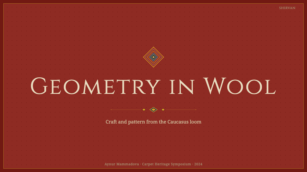
For presentation slides, the style suits a cover page built around a deep red field with a single stepped-medallion motif centered or anchored in a corner, rendered in the same crisp, outlined geometric manner as the source carpets. Content slides should keep a dense, bordered feel — a thin geometric border framing the text area, and section dividers styled as scaled-down latch-hook or boteh motifs rather than plain rules. Data visualizations can borrow the stepped-diamond logic directly: bar charts and progress indicators rendered with hard right-angle steps rather than smooth curves read as native to this visual world.
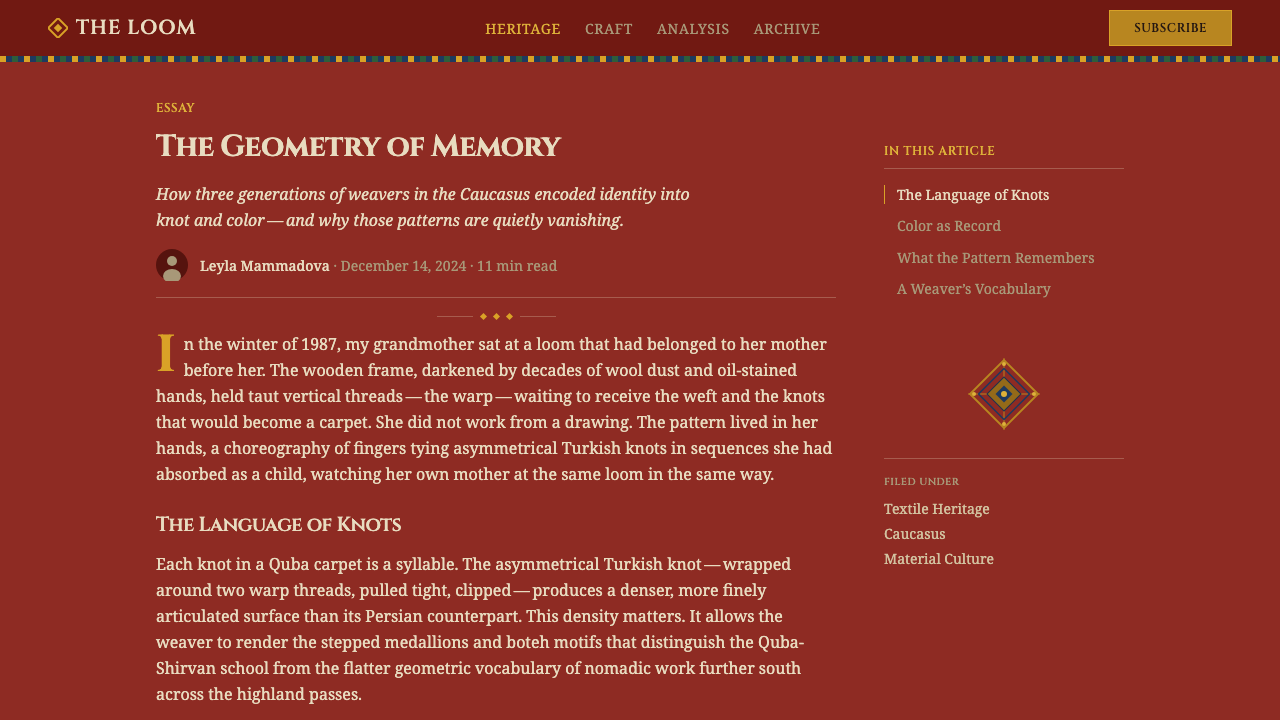
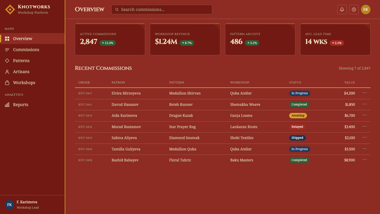
For web interfaces, the red-field approach suits marketing and landing pages more naturally than dense data dashboards, since the pattern language wants to breathe across a large surface rather than compress into small UI components. Where it is used in dashboards or pricing pages, it works best confined to a header band, a decorative border treatment, or a hero section, with the working interface beneath it shifting to a calmer, more neutral surface so the ornament does not compete with functional controls.
In editorial and marketing contexts, the style is naturally suited to feature spreads, brand storytelling pages, and anything that wants to evoke craft, heritage, and hand-made density. A red-field hero section with a bordered, medallion-anchored composition reads as confident and rooted rather than generic; pull-quotes and section breaks can borrow the latch-hook border device as a framing motif without needing to reproduce a full carpet pattern.
The most common mistake is treating the motifs — medallion, boteh, latch-hook — as isolated decorative stickers scattered across a neutral background rather than committing to the saturated red field and the dense, all-over composition that gives them meaning. A second common error is softening the geometry into curves; every element in this tradition is built from straight lines and stepped diagonals, and rounding them off erases the specific structural logic that comes from a knotted weave.
Azerbaijani Quba Carpet — FAQ
Why is the field always red rather than another color?
Madder root, the source of the red dye, was widely available and reliably colorfast across the Caucasus, making deep red the most practical and durable choice for the largest area of the carpet — the field that would see the most wear. Over generations this practical choice hardened into a regional convention: red became the expected, recognizable ground for Quba and Shirvan work specifically, distinguishing it at a glance from carpets woven in regions where indigo, cream, or other grounds were more customary.
What is the difference between the stepped medallion here and a smooth, curved medallion in other carpet traditions?
The stepped, staircase-edged medallion is a direct consequence of the knotting technique itself — each knot occupies a fixed grid position, so any outline can only advance in small horizontal or vertical increments, never a true diagonal curve. Some other weaving traditions, particularly city workshops using finer knot counts or curvilinear cartoons, could approximate smoother curves. The Caucasian village tradition largely embraced the stepped geometry as its own aesthetic rather than trying to disguise it, which is why the angularity reads as deliberate rather than a technical limitation.
Are the botehs in these carpets the same as paisley patterns used in later Western textiles?
They share a common ancestry — the boteh motif spread from Persian and wider Central and West Asian textile traditions and eventually influenced the curving paisley pattern that became popular in nineteenth-century European shawls and fabrics, named after the Scottish town of Paisley. But the Caucasian boteh, as woven in Quba and Shirvan carpets, keeps the sharp, hooked, geometric form dictated by the knotted weave rather than the softer, more flowing curve that paisley took on once it was reproduced in printed or woven European textiles.
How can you tell an antique natural-dye piece from a later carpet with synthetic dyes?
Natural dyes such as madder and indigo age in a characteristic way — colors mellow and soften gradually and somewhat unevenly across the surface, with slight variation from knot to knot that reads as organic rather than uniform. Synthetic aniline dyes, introduced later in the nineteenth century, tend to hold a flatter, more uniform tone or fade unevenly in less harmonious ways, sometimes shifting toward harsher or unexpected hues over time. Collectors and scholars generally treat this aging behavior, along with weave structure and motif style, as one of several diagnostic clues to a carpet's dye origin and approximate age.
Does this dense, saturated style suit every kind of digital product?
No. It excels in contexts that benefit from a sense of craft, heritage, warmth, and confident density — hospitality, cultural and heritage brands, editorial storytelling, and marketing pages that want to feel rooted and handmade rather than manufactured. It is a poor fit for data-dense productivity tools, technical dashboards, or any interface where scanability and low visual noise are the priority, since the all-over pattern language actively competes with functional UI elements rather than receding behind them. Reserve it for moments that can afford to slow the eye down.
Related design styles
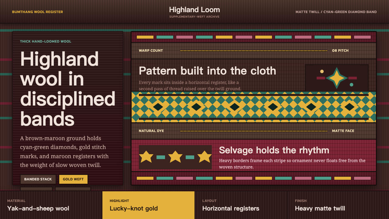 Bhutanese Yathra Wool WeaveHighland wool made digital. Brown-maroon bands carry cyan diamonds and spare…
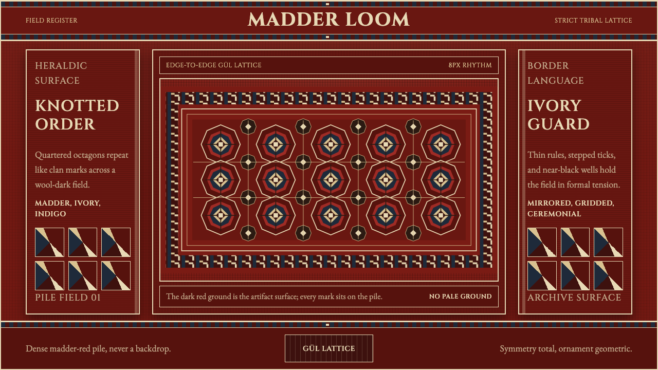 Turkmen Bukhara RugHeraldic and earthbound. Madder red, ivory hairlines, and octagonal güls lock…
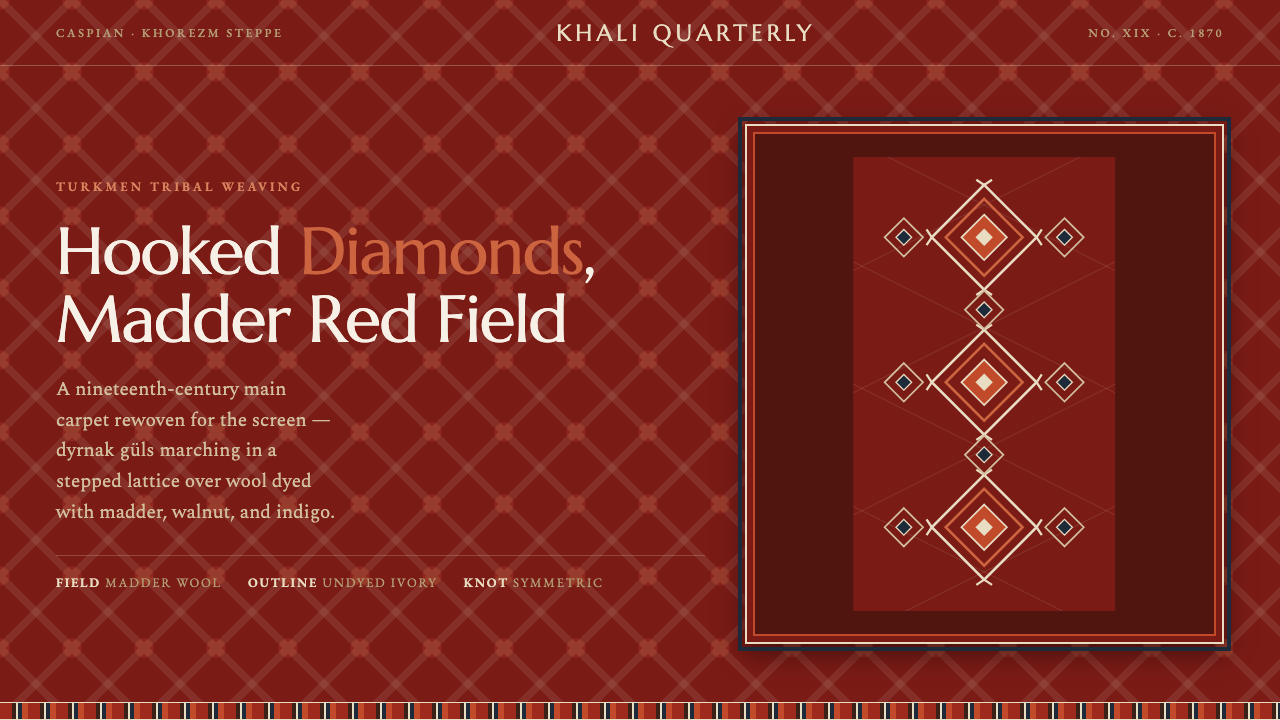 Yomut Gül CarpetHand-knotted authority on screen. Hooked dyrnak diamonds lattice a madder-red…
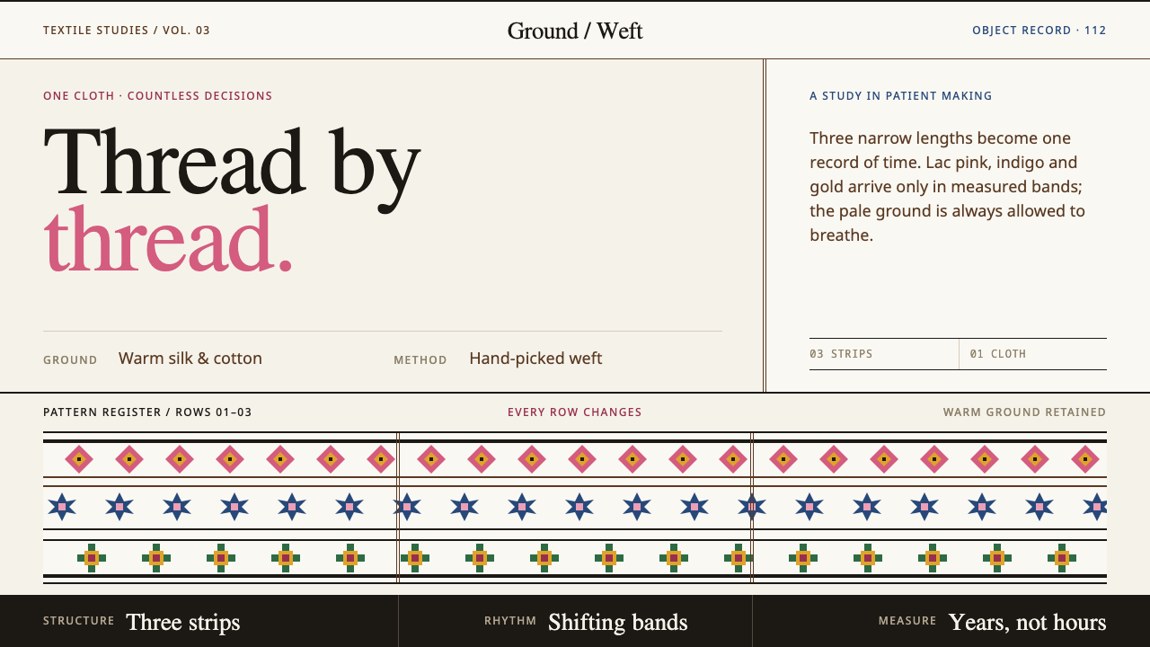 Bhutanese KushutharaPatience made visible. Lac pink and indigo bands shift across a warm silk gro…
 Karakalpak Kimeshek DressA cloth worn red. Crimson keste cross-stitch on indigo wool, set with silver-…
 Nuristani Carved CedarDepth replaces pigment. Smoke cedar, chevrons, and rosettes carve light from…