What is Slovacko Kroj?
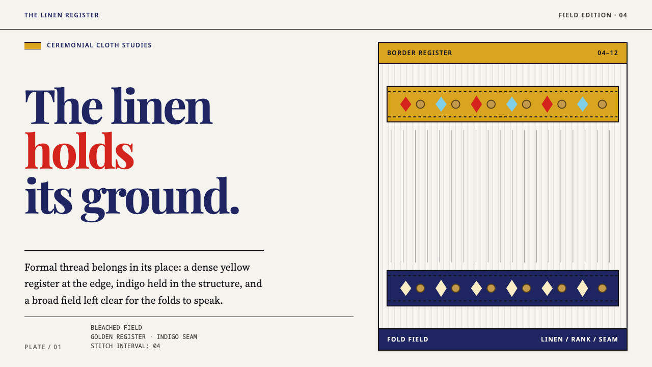
The Slovácko kroj is festival dress built on one ground — bleached linen pleated into standing folds — where golden yellow is not decoration but rank, and the whole system is ordered by what is stitched where.
Slovacko Kroj in brief
Slovácko Kroj is a design style drawn from the festival dress of Slovácko, in the southeastern corner of Moravia, in the Czech lands. Kroj is simply the Czech word for costume, but in this region it names a specific, highly articulated tradition: bleached white linen, crimp-pleated into vertical folds that stand up and keep their own shadow, and worked with embroidery in carefully chosen positions. As a visual reference it is a study in how a surface can be calm and rich at once.
Two ideas govern the style. The first is that colour carries rank. Golden yellow in this costume is not a freely chosen decorative colour: yellow embroidery is the most formal, and the formal back apron is white or golden yellow. The second is that the ground is never flat. Linen is always pleated, so even an empty area carries structure and a faint rhythm of light and shadow. A design that ignores either idea borrows the colours of the kroj without borrowing its logic.
In practice the style is a light, warm, fibre-textured field with ornament massed at fixed positions and clean space everywhere else. Golden yellow bands and indigo seams give the field its order. Nothing about it is glossy or digitally smooth: the hand shows in every embroidered area, worked by hand and never quite mirrored. It suits designers who want richness without noise, because the richness is concentrated and the calm is allowed to be calm.
Where does Slovacko Kroj come from?
Slovácko and its neighbour Horňácko lie in southeastern Moravia, in the east of the Czech Republic. The festival kroj as recorded through the nineteenth century, and as it is still worn at the Ride of the Kings (Jízda králů), is the source of this style; the source material places the tradition before 1900. It is festival dress in the proper sense: worn on the occasions when a village shows itself, such as processions and ceremonial days, rather than for ordinary work.
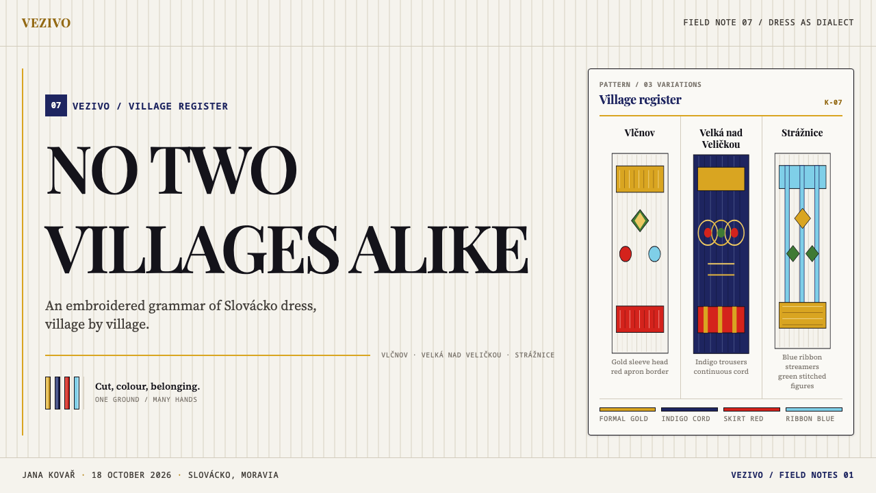
There is no single Czech folk pattern in this region, and the style's first principle follows from that fact. Cut, stitch type and thread colour change from village to village. The people of Vlčnov and of Velká nad Veličkou do not wear each other's kroj; each village's costume is a local dialect, recognisable to those who know it and distinct from its neighbours. For a designer the lesson is that the style is not a generic pattern library. It is a set of rules about where ornament goes, how it is worked and what its colours mean, applied with local variation.
Rank is written in the stitch. Golden yellow embroidery is the most formal, and the formal back apron is white or golden yellow, which is why the colour is read as rank rather than as taste. The ground that carries this information is bleached linen, crimp-pleated into folds that stand upright. Pleating gives the white a visible structure: each fold catches the light on one side and shades the other, so the surface always has a rhythm of fine vertical stripes, even where there is no ornament at all.
The tradition's modern visibility owes much to the nineteenth-century Czech national revival, in which folk culture was collected, described and valued as part of national heritage, and to the folk-costume ethnography that recorded regional dress in detail. Joža Uprka, a painter of Slovácko life, carried the region's festival dress into painting. The Ride of the Kings, a ceremonial procession in which the kroj is still worn and which is recognised on UNESCO's intangible heritage list, is the living context of the style, and Vlčnov, one of the villages named above, is widely associated with it. This is a tradition in use, not a historical costume, and anything built on it should be written in the present tense.
What defines the Slovacko Kroj look?
Bleached Linen Ground
The ground is a warm, matte white with the faint grain of woven flax: not paper white, not screen white, but linen white. It is the main field and takes up most of the area. Its job is to be calm, and to make every piece of colour on it legible by contrast. Nothing glossy or reflective is allowed on this surface; texture is fibre, not finish.
Crimp-Pleated Folds
The linen is always pleated into standing vertical folds, each fold holding its own small shadow. The ground is therefore never a flat colour: it reads as a field of fine vertical stripes made of light and shade. This is the style's signature texture and its reason for quietness at the same time. Even a blank area has rhythm, and the rhythm runs vertically, lending the whole page a gentle sense of drop and fall.
Golden Yellow as Rank
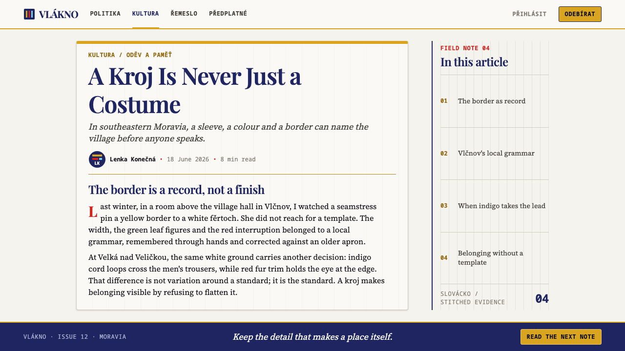
Golden yellow is the colour of formality, not of decoration. It appears in embroidery bands and in the formal back apron, and the more of it a piece carries, the more ceremonial the piece is. Because it encodes rank, it must be used sparingly and consistently: the same yellow for the same level of importance. A screen with golden yellow scattered over it as a mood colour has lost the grammar of the system.
Indigo Seams
Where golden yellow says how formal a piece is, indigo says where its parts meet. Dark blue seams run along the joins of the garment and mark out the field into zones: sleeve, chest, apron, hem. In a layout this becomes the structural line, the colour of dividers, borders and the thin rules that keep a page orderly. It is deeper and cooler than the ornament, so structure and decoration never compete.
Massed Ornament at Fixed Positions
Ornament is not sprinkled across the field. It is massed at fixed positions: sleeve heads, cuffs, the chest opening and the edges of the apron. Within those places the embroidery is dense, and everywhere else the linen is left clean. The effect is of concentrated richness against generous calm, and it gives the eye a predictable map of where decoration lives and where text can rest.
Hand-Worked, Never Quite Mirrored
Every ornamented area is treated as hand embroidery. The left and right sides of a garment share a pattern but are not pixel-perfect copies; stitches vary slightly, and edges are never ruled. That small irregularity is part of the style's warmth. It is why a perfectly mirrored, mechanically tiled layout looks wrong in this system, and why a slight difference between two halves looks right.
Who shaped Slovacko Kroj?
Uprka was a Moravian painter who made Slovácko his subject, painting its processions, fairs and people in festival dress. His canvases are among the best-known images of the region and helped make the kroj visible to audiences far from the villages. For a designer he is a useful reminder of how the costume has been seen from outside: as a mass of strong colour set against sunlit white. The source material names him as the key figure of this style.
These two villages are named in the source as examples of how local the kroj is: their costumes differ in cut, stitch type and thread colour, and neither wears the other's. They stand for the principle that the style is a family of local dialects, not a single national pattern. In design practice they are the reason not to mix motifs from different villages as though they were interchangeable.
The Ride of the Kings is a ceremonial procession in Slovácko in which the festival kroj is still worn. It is where the costume is seen today as a living thing, outdoors and in motion, and it is recognised on UNESCO's intangible heritage list. It connects the style to the present: this is dress in use, and its meanings belong to the communities that practise it.
How do you use Slovacko Kroj today?
Slovácko Kroj suits work that wants warmth, craft and a clear internal order. Applying it well means adopting its grammar: a pleated linen field, rank expressed by golden yellow, structure expressed by indigo, ornament concentrated at fixed positions and absent elsewhere. It does not call for floral wallpapers or all-over folk patterning.
For presentation slides, the cover is a linen field with a single dense band of golden yellow ornament at one edge, like a cuff, and the title set in the clean space beside it. Content slides keep ornament to the margins and header edge and leave the centre empty for text; indigo carries the dividers and underlines. Data slides can borrow the logic of rank directly: colour the top-ranked item in golden yellow and everything else in indigo or neutral, so the ranking is read at once, and keep chart backgrounds calm and lightly textured rather than flat.
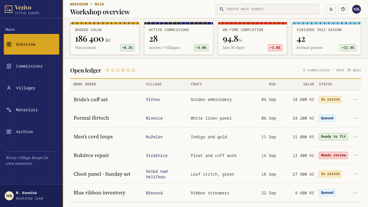
For web interfaces, dashboards work well in a light, quiet register, with the cards on a softly pleated linen ground and golden yellow reserved for the one status or metric that outranks the rest. Pricing pages are a natural fit because rank is the point: express the tier level through the amount of ornament and the presence of golden yellow rather than through size, so the most formal plan carries the richest embroidery and the simplest plan is plain linen. Navigation stays typographic, with indigo underlines in place of boxes.
In editorial and marketing work the style suits heritage food and wine, regional travel, craft and textile brands, folk and cultural festivals, and anything whose story is about the care put into making. Photography works best when it shows fabric, hand-work, white cloth and sunlight, cropped close. Section headings can carry a short band of ornament at one end, never across the whole width, and body text sits in the clean space with generous margins.
A common mistake is to scatter ornament everywhere. All-over folk patterns defeat the principle of fixed positions and bury the calm that makes the ornament valuable. A second mistake is flattening the ground into plain white, which removes the pleat rhythm that defines the surface. A third is treating golden yellow as a mood colour rather than a rank colour, or mixing patterns from different villages as if they were one generic Czech folk style. Finally, keep the hand: a mechanically mirrored layout is out of character, and a slight asymmetry is the right answer.
Slovacko Kroj — FAQ
What does 'kroj' mean, and where is Slovácko?
Kroj is the Czech word for costume or traditional dress. Slovácko is a region in the southeastern corner of Moravia, in the east of the Czech Republic, and with neighbouring Horňácko it is the home of the festival dress this style draws on. The source material places the tradition before 1900, with the kroj recorded through the nineteenth century and still worn today at the Ride of the Kings.
Why is golden yellow used so sparingly?
Because in the costume it signals rank. Yellow embroidery is the most formal, and the formal back apron is white or golden yellow, so the colour only means something if it is rare and consistent. Scatter it freely and every element looks equally important, which is the opposite of what the system is for. Reserve it for the one thing in a view that should outrank the rest.
How do I show pleated linen on a screen without a heavy texture?
Think of it as rhythm rather than image. A very faint, evenly spaced vertical banding of light and shade across the ground is enough to read as standing folds, particularly if the bands are slightly uneven. Keep the contrast low so that text remains legible, avoid glossy highlights, and let the ground stay warm and matte. What matters is that the surface is never a perfectly flat colour.
Is this the same as 'Czech folk' style?
No. There is no single Czech folk pattern in Slovácko. Cut, stitch type and thread colour change from village to village, and the people of Vlčnov and Velká nad Veličkou do not wear each other's kroj. This style captures the shared grammar of the region's festival dress, not a national pattern, and should not be used as a stand-in for Czech folk art in general.
Can the style handle dense content such as tables and long text?
Yes, because it keeps ornament out of the way. With ornament massed at fixed positions such as header edges and margins, the central area stays clean linen, ideal for tables, forms and long text. Use indigo for rules and borders, and golden yellow only for the row or figure that outranks the others. The result is orderly and readable without losing the warmth of the surface.
Related design styles
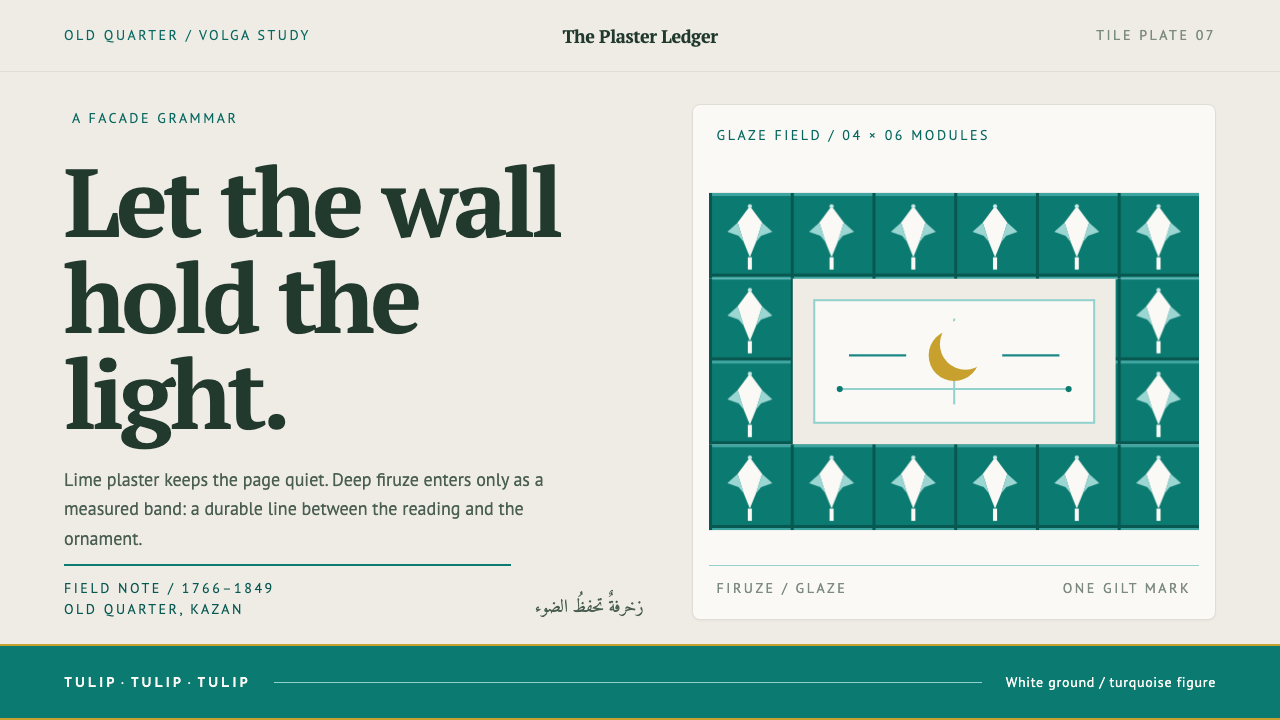 Kazan Tatar TileworkOrnament held to its proper place. Turquoise tulip bands cut across quiet lim…
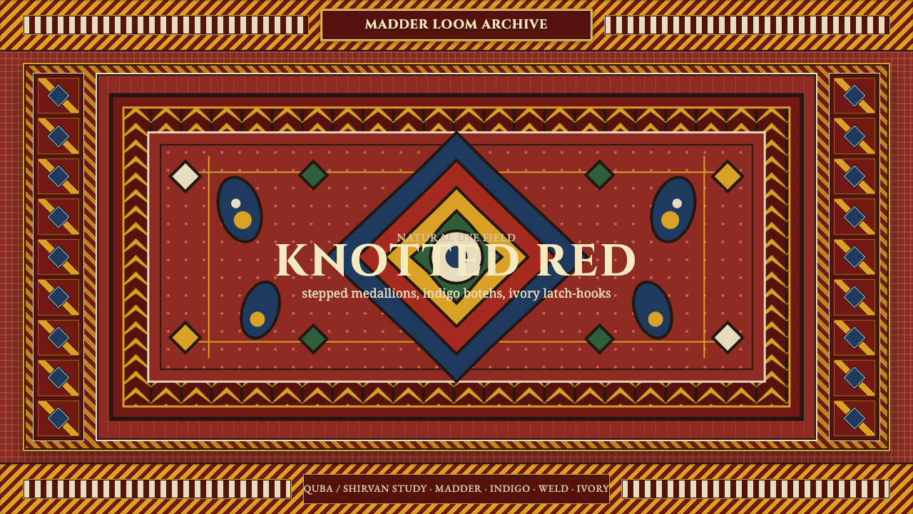 Azerbaijani Quba CarpetRed is the field. Indigo botehs and ivory latch-hooks orbit a stepped medalli…
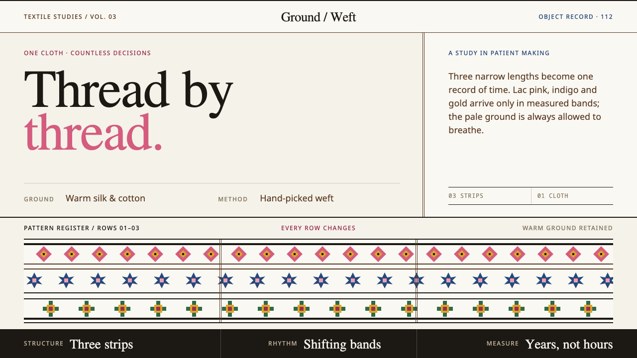 Bhutanese KushutharaPatience made visible. Lac pink and indigo bands shift across a warm silk gro…
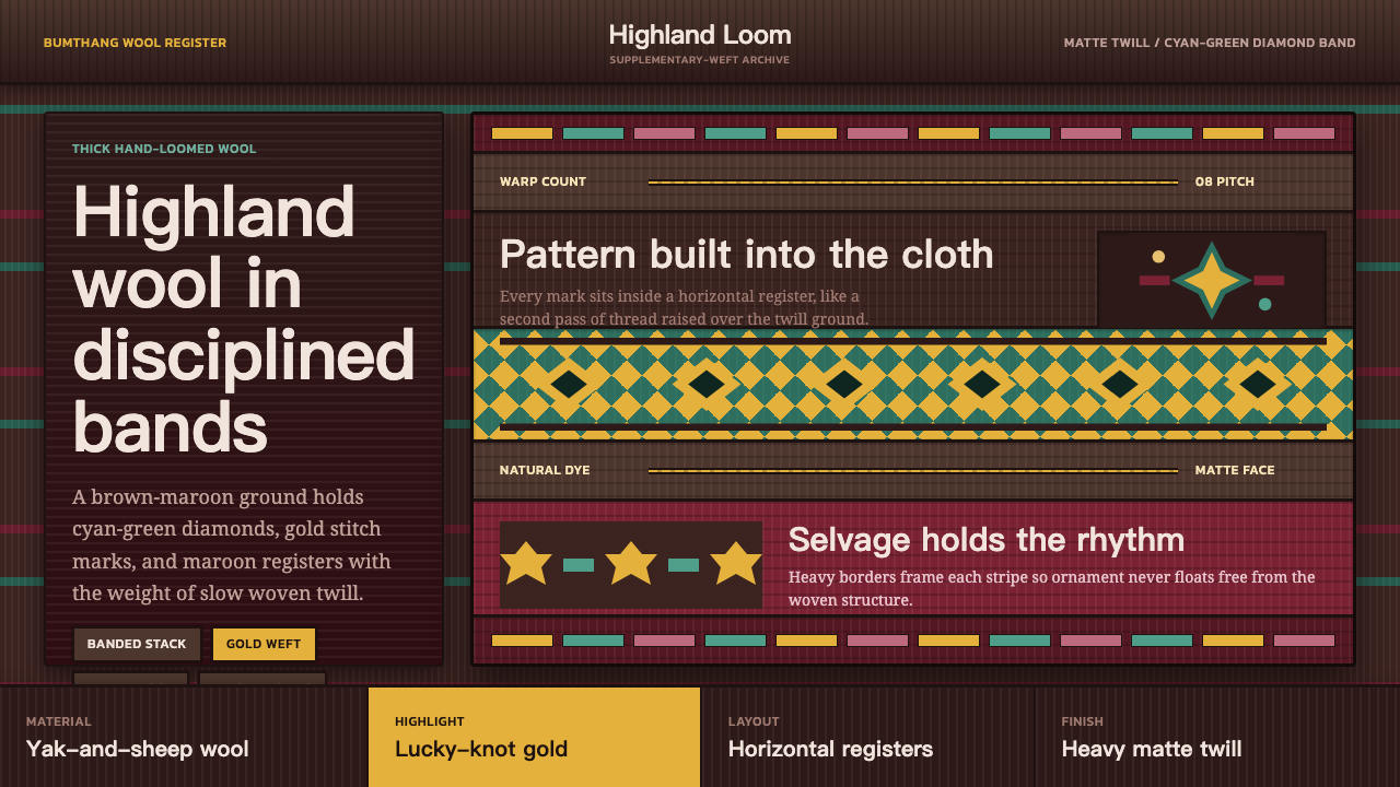 Bhutanese Yathra Wool WeaveHighland wool made digital. Brown-maroon bands carry cyan diamonds and spare…
 Kalash KupasDensity carries value. Ivory shell courses and orange braid are counted on wa…
 Karakalpak Kimeshek DressA cloth worn red. Crimson keste cross-stitch on indigo wool, set with silver-…