What is Karakalpak Kimeshek Dress?
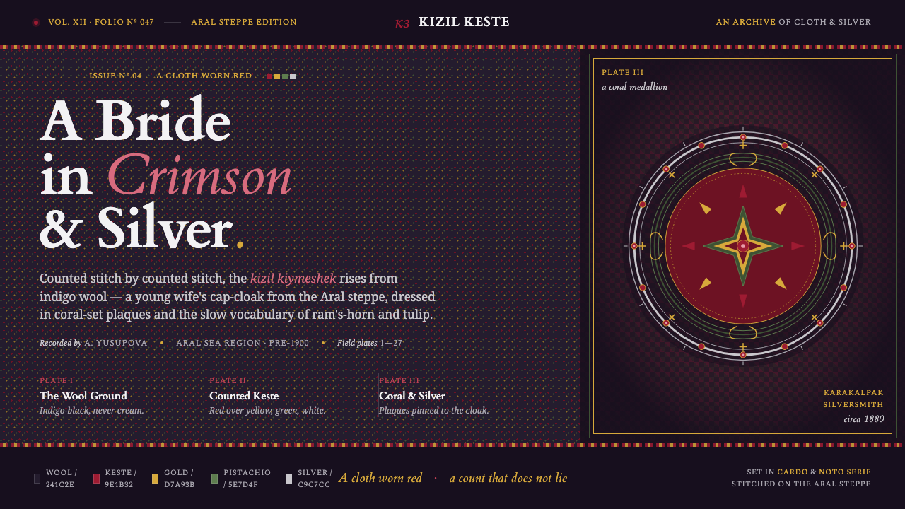
Karakalpak Kimeshek turns red into a garment: crimson keste stitched densely across indigo-black wool, then warmed by silver and coral jewelry.
Karakalpak Kimeshek Dress in brief
The kizil kiymeshek is a Karakalpak young married woman’s embroidered cap-cloak from the pre-1900 Aral Sea region. Its defining ground is dark indigo-black wool, never cream or pale cloth. Against that deep field, dense crimson keste cross-stitch becomes the dominant visual force, joined by yellow, green, and white contrasts. Warm silver-and-coral tribal jewelry completes the ensemble.
This is a textile system built through accumulation rather than reduction. The surface is not an empty ground carrying a few decorative marks; it is a dense field in which stitch, wool, and ornament work together. Crimson gives the garment its visual identity, while the lighter stitch colors and jewelry create points of warmth against the darkness.
Translated to the screen, the Kimeshek design language favors depth, density, and tactile suggestion. Indigo-black establishes the enclosing woolen field. Crimson carries emphasis and continuity. Golden yellow, pistachio green, and white act as stitch-like interruptions, while silver and coral appear as small, warm highlights. The result should feel woven and inhabited rather than glossy, weightless, or digitally sterile.

Where does Karakalpak Kimeshek Dress come from?
The name kizil means red, and the color is not a minor accent within the garment. It names the visual character of the kiymeshek itself: a red-centered embroidered cap-cloak worn by a young married woman. The object belongs to pre-1900 Karakalpak costume from the Aral Sea region, placing its design language within Central Asia and within the material culture of Karakalpakstan.
Its construction begins with the ground. Dark indigo-black wool provides the base, establishing a heavy, enclosed surface before any embroidery is added. Keste cross-stitch then builds a dense field of predominant crimson, with yellow, green, and white used as contrasting stitch colors. The ordering matters: the dark wool is foundational, crimson is dominant, and the lighter colors clarify and enliven the embroidery without displacing it.
The ensemble joins two kinds of skilled making. Karakalpak women embroiderers establish the visual density through keste cross-stitch, while Karakalpak silversmiths contribute the warm silver-and-coral tribal jewelry. The source material identifies these practices alongside Aral-region tribal costume, cross-stitch keste embroidery, and coral-set silver jewelry. Together they produce a language in which cloth and adornment are not separate layers but one coordinated presence.
The screen adaptation preserves this origin by translating material relationships rather than copying a surface pattern. Wool becomes a dark, absorbing field; embroidery becomes concentrated color and repeated visual rhythm; silver and coral become restrained points of reflected warmth. The design should therefore remain visibly textile-led. Any treatment that replaces the dark ground with cream, or turns the jewelry into cold metallic gloss, breaks the lineage of the source.
What defines the Karakalpak Kimeshek Dress look?
Indigo Wool Ground
The ground is dark indigo-black wool, and that darkness is structural rather than incidental. It gives the embroidery something to emerge from and prevents the palette from becoming airy or decorative. On screen, the field should feel dense and absorbent, with enough tonal variation to suggest wool without becoming a literal fabric simulation. Cream or pale grounds belong outside this system.
Crimson Dominance
Crimson keste is the visual center of the garment. It should occupy the strongest accents and carry the first visual read, while remaining visibly stitched rather than behaving like a smooth digital fill. Crimson can outline, cluster, repeat, or gather attention, but its authority comes from density and placement against indigo-black, not from covering every available surface.
Stitched Contrast
Yellow, green, and white function as contrasting stitches within the crimson field. They are supporting colors, not competing primary blocks. Their most convincing use is intermittent and rhythmic: small interruptions, clustered marks, or narrow bands that make the dominant red feel hand-built. The palette gains warmth when contrast is distributed like embroidery rather than poured into large uninterrupted areas.
Density and Repetition
The system depends on a densely worked surface. Repetition should feel close, patient, and accumulated, recalling cross-stitch without requiring every interface element to display an obvious motif. Repeated marks can organize borders, labels, cards, or background texture. Empty space still matters, but it should read as a deliberate pause within a woven field rather than as the default condition of the whole composition.
Silver and Coral Warmth
Silver-and-coral tribal jewelry introduces a second material register. Silver contributes cool brightness and definition; coral contributes warmth and a more organic visual note. Together they should appear as concentrated highlights around important moments, never as a blanket of metallic decoration. Their purpose is to make the wool-and-stitch system feel worn, assembled, and embodied.
Woven Depth over Gloss
The visual finish should suggest interlaced material, not polished glass. Layered color, compact marks, and restrained highlights create depth through accumulation. Glossy gradients, immaculate surfaces, and excessive reflective effects weaken the reference because they replace woolen warmth with synthetic smoothness. Depth here is tactile and chromatic: it comes from how materials meet, not from theatrical lighting.

Who shaped Karakalpak Kimeshek Dress?
The women embroiderers are the makers most directly responsible for the garment’s visible rhythm. Through keste cross-stitch, they build the dense crimson field and introduce yellow, green, and white as carefully placed contrasts. In the design system, their contribution is represented by repetition, patience, and material accumulation: color should feel made through many marks rather than deposited as a single effortless surface.
Karakalpak silversmiths contribute the jewelry that crowns the dark wool and embroidery. Silver gives the ensemble a defined, cool glint, while coral keeps the ornament warm and grounded. Their role in the visual language is not to add generic luxury but to establish a distinct counterpoint to the textile: reflective metal and organic color set against dense, absorbent cloth.
The young married woman is the wearer who gives the kiymeshek its human scale. The cap-cloak is not merely a pattern sample; it is a garment designed to be worn, seen, and carried as part of a complete presence. Digital applications should preserve that sense of enveloping form. Interfaces can use the system for strong framing and identity, but they should not reduce it to disconnected red motifs floating on a dark background.
How do you use Karakalpak Kimeshek Dress today?
For presentation slides, the cover should establish the garment’s enveloping darkness immediately: an indigo-black field, a concentrated crimson stitch-like form, and a restrained silver or coral highlight. Content slides can use repeated stitch bands to separate sections and warm contrast colors to mark important terms. Data slides should feel assembled rather than glossy, with dense crimson structures and lighter accents used to distinguish categories without turning the page into a multicolored textile collage.
For web interfaces, the system suits dashboards and pricing pages that need a strong identity and a dark visual environment. Keep the indigo-black field continuous, use crimson for active states and primary actions, and reserve golden yellow, pistachio green, and white for supporting distinctions. Silver-like highlights can define selected surfaces, while coral can soften moments that would otherwise feel too cold. Cards and panels should suggest layered cloth or mounted adornment, not glassy floating modules.
For editorial and marketing work, the Kimeshek language supports immersive storytelling. Long-form pages can place dense crimson stitch textures beside quiet dark wool areas, allowing the surface to alternate between concentration and pause. Campaigns can treat coral and silver as focal details within a predominantly crimson-and-indigo composition. Product narratives should emphasize making, material, and wearability, because the strongest meaning comes from the relationship between the textile and the person who wears it.
For brand covers, posters, and launch moments, a single large crimson gesture can establish recognition before smaller stitch-like details appear. The dark ground provides authority and continuity, while jewelry colors create a more intimate register at points of emphasis. This makes the system useful when a brand needs to feel culturally grounded, tactile, and warm without abandoning a dramatic dark field.
The common mistake is to treat the palette as a collection of fashionable dark colors and bright accents. A convincing application keeps the hierarchy intact: indigo-black wool first, crimson keste second, lighter stitch contrasts after that, and silver-and-coral jewelry as concentrated highlights. Replacing the wool ground with cream, spreading every color evenly, or adding glossy effects turns a material language into generic ornament.
Karakalpak Kimeshek Dress — FAQ
What is the kizil kiymeshek?
It is a Karakalpak embroidered cap-cloak worn by a young married woman, originating in the pre-1900 Aral Sea region. Kizil means red, and the garment is defined by predominant crimson keste cross-stitch on a dark indigo-black wool ground, with yellow, green, and white stitch contrasts and silver-and-coral tribal jewelry.
Why must the ground remain dark indigo-black rather than cream?
The dark wool is part of the garment’s identity, not a neutral background choice. It gives the crimson embroidery depth, makes the lighter stitch colors feel concentrated, and provides the absorbent material contrast needed for silver and coral highlights. A cream ground changes the visual logic from dense woolen garment to light decorative textile.
How should the lighter colors be used?
Yellow, green, and white should behave like contrasting stitches within the dominant crimson field. They are most effective when intermittent, clustered, or carefully placed, rather than spread evenly across the composition. Their job is to clarify rhythm and add warmth while allowing crimson and indigo-black to remain the governing relationship.
How can the system suggest textile texture on screen?
Use layered color, repeated compact marks, restrained tonal variation, and concentrated jewelry-like highlights. Texture should be implied through accumulation and contrast, not through glossy effects or theatrical reflections. The aim is to make the surface feel woven and absorbent, with depth created by material relationships rather than simulated luxury.
Does this style suit every kind of product?
No. It is strongest when a product needs a dark, tactile, culturally grounded identity with clear color hierarchy and a sense of crafted material. It is less suitable when the intended experience depends on pale airiness, clinical neutrality, or polished technological gloss. The important question is whether the product can support the Kimeshek values of density, warmth, textile depth, and embodied presence.
Related design styles
 Nuristani Carved CedarDepth replaces pigment. Smoke cedar, chevrons, and rosettes carve light from…
 Uyghur Xinjiang Suzani EmbroiderySilk glows like memory. Cochineal and lapis medallions orbit brass on indigo…
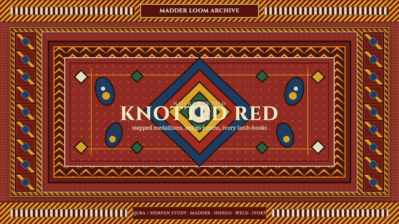 Azerbaijani Quba CarpetRed is the field. Indigo botehs and ivory latch-hooks orbit a stepped medalli…
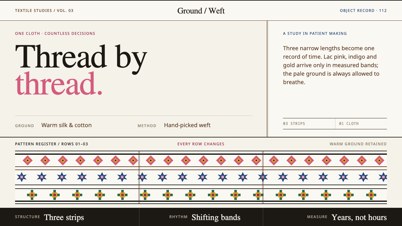 Bhutanese KushutharaPatience made visible. Lac pink and indigo bands shift across a warm silk gro…
 Bhutanese Yathra Wool WeaveHighland wool made digital. Brown-maroon bands carry cyan diamonds and spare…
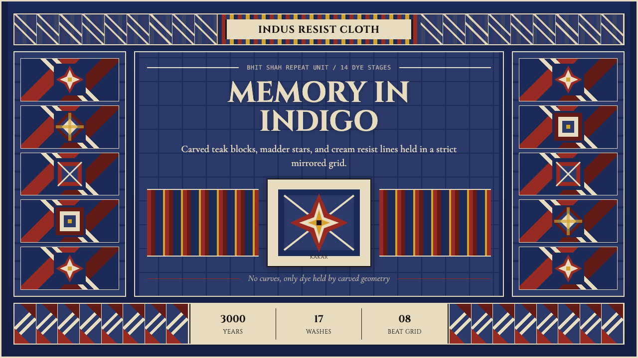 Sindh Ajrak Block PrintAncient cloth feels exact. Indigo fields, madder stars, and cream grids repea…