What is Setesdal Bunad?
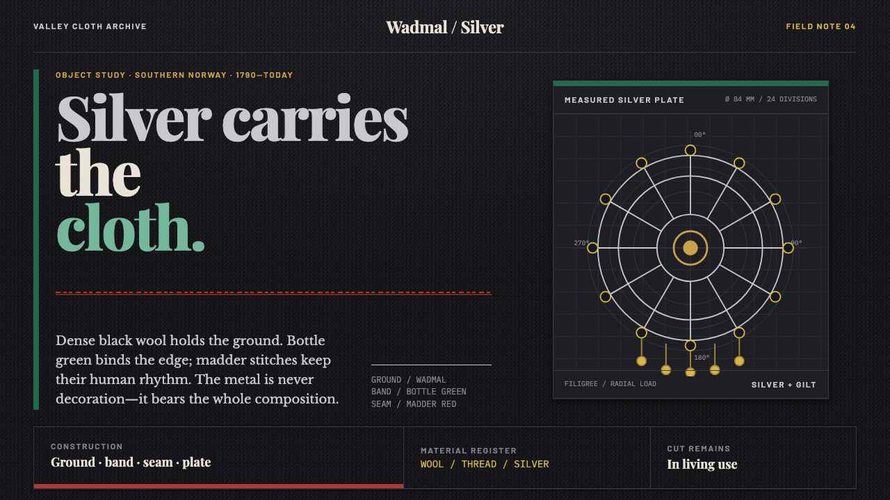
Setesdal's bunad is a garment on which cloth, thread and silver each have a job: heavy black wool as the ground, bottle green and madder red as quiet structure, and filigree silver as the weight that holds the whole outfit up.
Setesdal Bunad in brief
The Setesdal Bunad design system takes its visual language from the regional dress of Setesdal, a narrow valley in Aust-Agder in southern Norway. The valley kept a medieval cut of clothing alive long after much of Scandinavia had moved on to other fashions. The garment is made of black homespun wadmal, a heavy fulled wool with a dense, nonreflective surface, banded with bottle-green broadcloth at the hem and on the man's bib, and stitched around every opening with madder-red løyesaum worked freehand.
Setesdal is also Norway's silversmith country, and that decides the character of the whole ensemble. The silver is not trim added to a finished garment; it carries the outfit. Domed buttons, a worked belt buckle and the sølje brooch with its trembling gilt spoons supply the highlights, the rhythm and the visual weight, while the cloth supplies depth and calm.
As a design language this translates into a dark, matte ground, a few precise colour bands, a thick layering of detail and a metallic accent that is used structurally rather than decoratively. The result is dense, tight and unmistakably handmade. The unevenness of freehand stitching is part of the charm, not a flaw waiting to be corrected.

Where does Setesdal Bunad come from?
The costume belongs to Setesdal, the valley running through Valle, Bykle and Hylestad in Aust-Agder, southern Norway. The form described here dates from the late eighteenth century through the nineteenth century and is still cut, sewn and worn today. That continuity is the first thing to understand about it. In many places regional dress survives only as an archive or a revival; in Setesdal the older cut never entirely went out of use.
The structure of the dress is old and clear. For men there is the klaffebukse, a short trouser with a flap front. For women there is the stakk, a black wool dress worn over an off-white underskirt called the kvitstakk. The cloth is wadmal, thick, fulled and matte, so that it takes light rather than throwing it back. Bottle-green broadcloth is laid on as bands at the hem and on the man's bib. Around every opening runs the løyesaum, madder-red stitching worked freehand, without a pattern drawn on beforehand and without strict symmetry.
Metalwork is the other half of the story. Setesdal is Norway's silversmith valley, and its filigree is part of what gives the costume its identity. Domed silver buttons fasten the garment, a worked belt buckle sits at the waist, and the sølje, a brooch hung with gilt spoons that tremble when the wearer moves, closes the neckline. These are not ornaments applied to a finished design; in the finished outfit, cloth and metal read as a single construction.
The wider context is the bunad revival, a movement rooted in Norwegian national romanticism that turned regional dress into a symbol of cultural identity. Hulda Garborg and Klara Semb are the names most closely associated with that revival, one as a writer and organiser, the other as a researcher of costume. Setesdal is often held up as the example in which the older dress had never fully gone out of use, which is part of why its visual language is so concentrated: cloth, stitch and silver, each doing exactly one job.
What defines the Setesdal Bunad look?
Color
The palette is anchored by black and enriched by only three accents: bottle green, madder red and the cool, bright tone of silver with touches of warm gilt. Black is the field, not a mood; the other colours appear as bands, stitches and metal, never as large areas. Each accent has a fixed role, so the colours read as a structure rather than a scheme.
Matte Black Wool
Wadmal is heavy, fulled and dense, with almost no shine. A dark matte ground of this kind absorbs light and makes everything laid on it look sharper: the silver gleams, the green band looks deeper, the red stitches seem to glow. The surface has weight and a slightly rough, tactile quality that smooth digital black does not have by default.
Broadcloth Banding
Bottle-green broadcloth is laid as flat bands along the hem and across the man's bib. The bands are structural: they edge the form, divide it and give the eye a place to rest between areas of dense stitching. Their colour is deep and slightly muted, so they sit calmly against the black rather than competing with the silver.
Freehand Stitch Rhythm
Løyesaum is stitched freehand around every opening, in madder red, without a drawn guide. The result is a rhythm rather than a pattern: spacing breathes, curves wander slightly, and no two runs are identical. This visible irregularity is what separates a handmade textile from a printed one, and it is the quality a faithful digital translation should keep.
Silver as Structure
Domed buttons, the belt buckle and the sølje brooch do not decorate the outfit; they hold it together and give it focal points. Filigree gives the metal a lace-like intricacy that stays crisp against the dark wool. In a layout, silver should therefore appear at the places that bear load: fastenings, junctions and anchors for the eye.
Layered Density
Garment layers sit one on another: the black stakk over the off-white kvitstakk, bands over cloth, stitches over bands, metal over all of it. There is very little empty space. The effect is rich and slightly heavy, closer to an illuminated surface than to an airy one, and it rewards close inspection.
Motion in Metal
The gilt spoons hung on the sølje tremble whenever the wearer moves, so the brightest part of the outfit is also the only part that is alive. This is a small, physical, slightly irregular movement. It suggests that any motion in a digital translation should be tiny, secondary and tied to the silver, not spread across the whole interface.

Who shaped Setesdal Bunad?
Hulda Garborg is the writer most closely associated with the bunad revival. Working at the time when Norwegian national romanticism was turning regional dress into a symbol of identity, she helped make the costume a cultural cause as well as a garment. Her name is a reminder that the bunad's modern prestige owes as much to advocacy as to the unbroken craft practised in valleys like Setesdal.
Klara Semb is the costume researcher whose name is tied to the documentation and understanding of Norwegian regional dress. Her work stands for the careful, record-keeping side of the revival: looking closely at how garments were cut, assembled and worn. That attention to construction is exactly what a design translation of Setesdal needs, since the structure is the beauty.
The valley's silversmiths are the collective authors of the outfit's metal. Domed buttons, belt buckles and the sølje brooch with its gilt spoons all come from a tradition of filigree work that gives Setesdal its reputation as Norway's silver country. In the design system their contribution appears as precise, bright, finely worked accents set against a dark ground.
The stitchers who work løyesaum freehand around every opening give the garment its pulse. Without a drawn pattern, each run of madder-red thread is an act of judgement, so the line of the stitch is slightly alive. This human irregularity, repeated across a whole garment, is what makes the red read as handwork rather than ornament.
How do you use Setesdal Bunad today?
The Setesdal style is a good fit when a project wants richness without noise: a dark, grounded base, a handful of disciplined accents and a metallic highlight that earns its place. It values texture and handmade quality over polish, and it works best when each colour and each bright detail has a clear job.
On a cover slide, use a deep matte black field, a single band of bottle green along one edge, and a thin run of red detail evoking stitching near the margin. Set the title in a pale silvery tone with a small ornamental accent that echoes the brooch. Content slides should keep the black ground and rely on light type, with green used to divide sections and red reserved for emphasis. On data slides, let silver or light grey carry the most important series, and use green and red as the secondary colours with fixed meanings so the chart never turns into a rainbow.
For web interfaces the style suits dark-mode dashboards, premium product pages, craft and heritage brands, and tools for collectors or archives. Keep surfaces matte and dark, set borders as thin stitched or dashed lines rather than glows, and reserve the bright metallic tone for primary actions, focus states and key figures. A pricing page can mark the featured plan with silver detailing and quiet green banding, leaving the other plans as plain dark panels. Motion, if any, should be small and attached to the silver, in the spirit of the trembling spoons.
For editorial and marketing work, use dense but orderly layouts with a clear typographic hierarchy, dark pages, and banding to separate stories. Short ornamental details can mark section openers or captions, as long as they stay small and functional. The style is well suited to packaging, catalogues, exhibition material and travel or cultural features where authenticity and craft are the message.
A common mistake is to push the silver towards chrome or glitter. Setesdal's silver is worked filigree against dark wool, and it should look crafted, not shiny. Other errors include regularising the stitched lines until they look machine-made, spreading red or green across large areas so the dark ground loses its authority, and turning the whole thing into generic Nordic fantasy imagery. This is a living textile tradition, and it should look like cloth, thread and metal, not like a game interface.

Setesdal Bunad — FAQ
What is a bunad, and what makes the Setesdal one distinctive?
A bunad is a Norwegian regional costume, worn on festive and formal occasions and tied to a specific place. Setesdal's is distinctive because its medieval cut stayed in use long after other regions changed, and because the valley's silversmithing is built into the outfit. Black wool, bottle-green banding, freehand red stitching and heavy filigree silver together give it a unique, immediately recognisable character.
Why is the design system dark?
Because the garment is. The ground is black wadmal, and the silver, green and red are read against it. A dark matte base makes the metal and the stitching look more vivid and gives the system its weight. Moving to a light background would lose the key relationship between dark cloth and bright silver, and the accents would no longer feel like they were carrying the structure.
What is løyesaum, and how do I translate it into a screen?
Løyesaum is the freehand madder-red stitching worked around every opening of the garment. On screen, it translates into thin, slightly irregular red lines used at edges and openings, such as card borders, input outlines or section dividers. The key is to avoid perfect regularity and to use the red sparingly, so the stitching stays an accent rather than a colour scheme.
Is this the same as Viking or generic Nordic style?
No. It is based on a particular place and a living garment tradition from late eighteenth- and nineteenth-century Setesdal, not on myth, runes or Scandinavian minimalism. Its colours, materials and silver work are specific and documented. Treating it as generic Nordic imagery would erase the very specificity, the black wool, banding, stitching and filigree, that makes the style worth using.
Where does the style struggle?
It struggles with products that need airiness, speed or bright playfulness: light-hearted consumer apps, pastel wellness brands or minimal utility tools. Its density can also tire the eye in long reading sessions. And since it is a dark system, small light-on-dark details need careful contrast, especially silver accents, so that the richness never costs legibility.
Related design styles
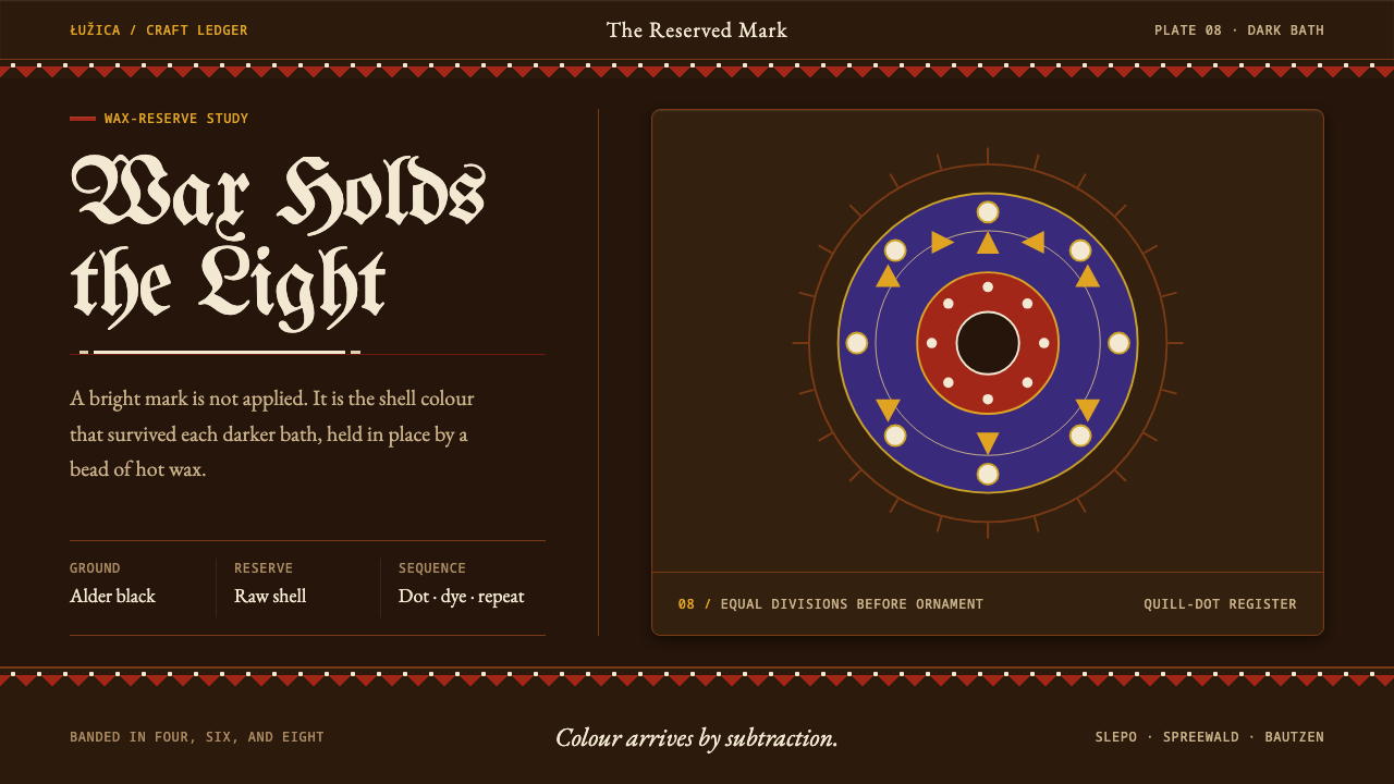 Sorbian Easter EggLight survives by reserve. Raw-shell dots and strict rosettes rise from veget…
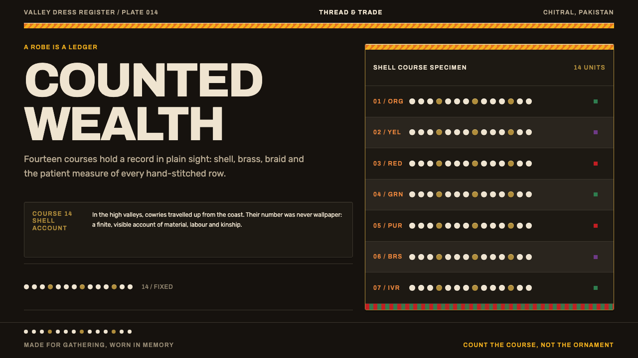 Kalash KupasDensity carries value. Ivory shell courses and orange braid are counted on wa…
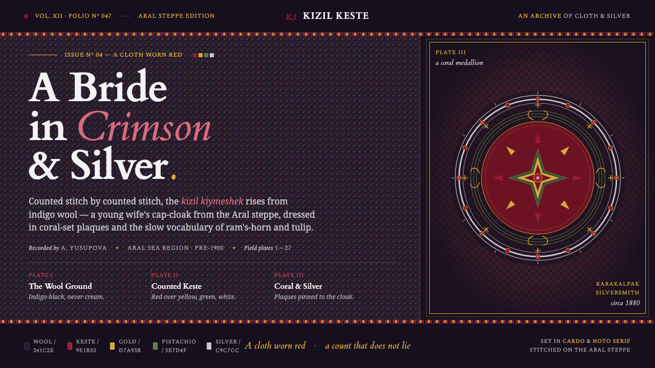 Karakalpak Kimeshek DressA cloth worn red. Crimson keste cross-stitch on indigo wool, set with silver-…
 Lahic CoppersmithCopper becomes light. Soot-black bands, Amiri type, hammer facets and tin rev…
 Nuristani Carved CedarDepth replaces pigment. Smoke cedar, chevrons, and rosettes carve light from…
 Sambalpuri BandhaDouble ikat resists gloss. Iron-black, mineral red, and stepped cream motifs…