What is Kazan Tatar Tilework?
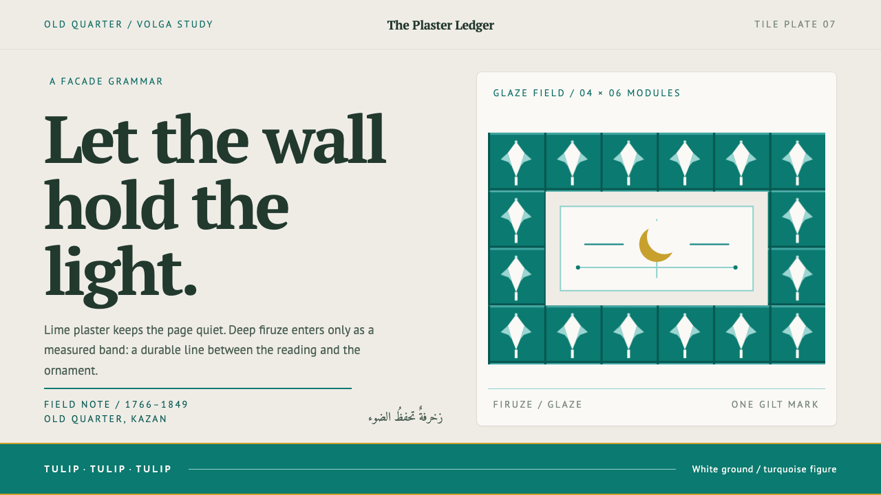
Kazan Tatar tilework holds ornament to its proper place: deep turquoise glaze bands and a single gilded crescent on a quiet ground of white lime plaster.
Kazan Tatar Tilework in brief
Kazan Tatar tilework is the architectural look of the Old Tatar Sloboda, the Tatar quarter of Kazan in Tatarstan on the Middle Volga. Its recipe is consistent: matte lime-plaster walls, a deep turquoise-green glaze set into them as bands and spandrels, gilded crescents on the roofs, and a slender minaret standing against a low horizontal mass.
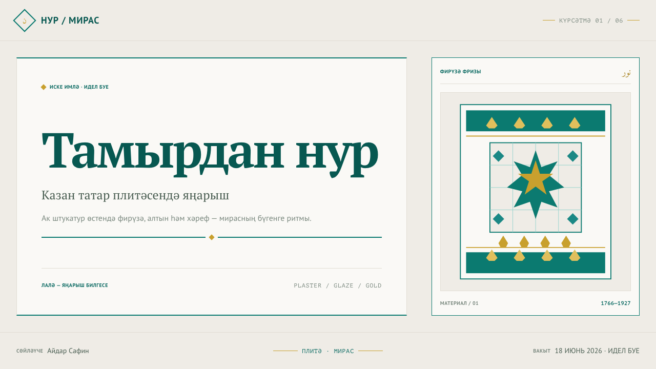
The ornament is Volga Bulgar, and above all it is the tulip, cut as window openings and repeated through every frieze. What makes the style distinctive is not the amount of decoration but its ratio. White plaster is the ground and carries the reading. The glaze is the figure, and it stays a border, a band or a header. Gold appears once per view, like the crescent on a roof.
As a design language it is light, restrained and structured. Nothing is tiled edge to edge, nothing competes with the plaster for area, and ornament is placed where it earns its place. It is a style of proportion rather than of pattern, which is why it translates so well into layouts that need warmth without noise.
Where does Kazan Tatar Tilework come from?
The Old Tatar Sloboda has a specific history behind its look. After 1552, the Tatars of Kazan were pushed into this quarter of the city, and for more than two centuries they were not allowed to build in stone. In 1766 that permission came back, and the Al-Marjani mosque, begun in that same year, is the earliest of the three buildings the library dates. The tradition recorded here therefore starts as a return to building, not as an unbroken line of construction.
The library dates the style as pre-1900 and anchors it with three mosques: Al-Marjani (1766 to 1770), Apanaev (1768 to 1771) and Nurulla (1845 to 1849). They span almost a century, yet they share one face: plaster, glaze, gilt and a slender minaret. That consistency suggests a settled local vocabulary that was repeated and adapted rather than reinvented with each new building.
The ornament has older roots. The library describes the style as resting on a Volga Bulgar ceramic tradition, and lists its movements as a Volga Bulgar ornament revival, the Tatar national style and provincial Russian Baroque. The tulip, a symbol of the Volga Bulgars, returns as a reborn old sign, cut into the walls as window openings and repeated in bands. The buildings sit within the architectural manners of provincial Russian Baroque, which the Tatar builders filled with their own symbols.
Names attach to the buildings and the people behind them. The Al-Marjani mosque carries the name of Şihabetdin Märcani, and the library lists Qol Şärif and the Yunusov and Apanaev families among the key figures. The pattern is one of memory and household: an old Kazan remembered in a symbol, and a quarter built mosque by mosque by its own community.
What defines the Kazan Tatar Tilework look?
Lime-Plaster Ground
The ground is white lime plaster, matte and slightly warm, with no gloss of its own. It is the part of the composition that carries the reading: the largest area, the quietest surface, the place where text and content live. A designer should treat it as the main subject, not as empty space between ornament.
Turquoise-Green Glaze
The glaze is a deep turquoise-green, dark enough to read almost as a colour of depth, and glossy in contrast to the matte walls. It is set into the plaster as bands and spandrels, never spread across it as a wash. In a layout it belongs in the border, the header block and the rule, where it gives structure and a single point of colour.
Ornament Held to Its Place
The governing ratio is plaster as ground, glaze as figure. Glaze stays a border, a header block or a rule and is never tiled edge to edge. Ornament here has a job: it frames, divides and marks the top of things. When the glaze begins to cover more area than the plaster, the ratio has been inverted and the style is lost.
The Tulip
The central motif is the Volga Bulgar tulip, cut as window openings and repeated through every frieze. It is a single form, stylised and repeated, not a catalogue of flowers. Its repetition is rhythmic and quiet, and it serves as a band rather than as a field. Used sparingly, it gives a design a specific local signature without clutter.
Gold Once per View
Gilding is rare: crescents on the roofs. The design equivalent is one gold element per screen or slide, like the crescent on a wall's head: a logo mark, a key number, a single call to action. Gold repeated everywhere stops being gold and becomes just another colour.
Matte Against Gloss
The surfaces are paired on purpose. The wall is matte and absorbs light; the glaze is glossy and holds it. That contrast does the work that shadows and gradients do in other styles, separating figure from ground without any soft effects. In a layout, it means keeping the ground genuinely flat and quiet, and letting the coloured elements be the only places where the surface looks finished and deep.
Low Mass, Slender Vertical
The buildings combine a low horizontal mass with one slender minaret. In layout terms this is a wide, calm horizontal composition with a single vertical accent, such as a narrow column, a tall heading or a thin line. The horizontal sets the tone of everything else, and the vertical gives it direction.
Who shaped Kazan Tatar Tilework?
The Al-Marjani mosque, dated 1766 to 1770 in the library, carries the name of Şihabetdin Märcani, a nineteenth-century Tatar scholar and imam. His name represents the intellectual side of the Old Tatar Sloboda: the quarter was a place of learning as well as of building. In the library he is the figure most closely tied to the earliest of the three dated mosques.
Qol Şärif is remembered in Tatar tradition as the imam and poet who died when Kazan fell in 1552, the event after which Tatars were pushed into the Old Tatar Sloboda. His name stands for the older, pre-conquest city that the later quarter remembers. His presence among the key figures places memory at the centre of the style.
The Yunusov family is listed among the key figures. A family name rather than a single master's is typical of this tradition: the quarter was built by households and communities over generations. For a design system, this is a useful lesson in authorship, since the look is a shared vocabulary held in common rather than the signature of one architect.
The Apanaev mosque, dated 1768 to 1771, bears the family's name. It was begun two years after Al-Marjani and finished a year after it, and it shares the same plaster, glaze and gilt vocabulary. Its place in the record shows that the style was not a single building's invention but a repeated local convention.
How do you use Kazan Tatar Tilework today?
Kazan Tatar Tilework is a light, reading-first style. It suits products and publications that want warmth and cultural specificity without visual noise: libraries, educational platforms, publishing, travel and heritage, ceramics, food and craft, and financial or legal services that want to look settled rather than slick.
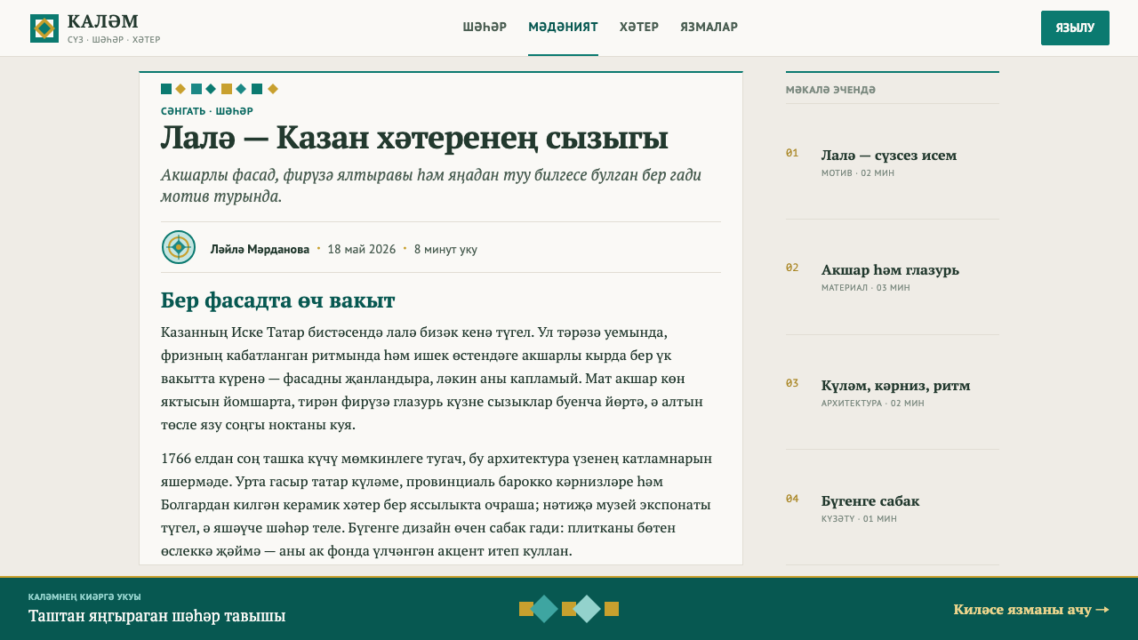
For slides, set the cover on a pale plaster field with one band of glaze along an edge, the title large in the pale area and a single gold mark in a corner. Content slides use the glaze only for the header block and the thin rules between sections. Data slides should keep charts quiet: a single glaze-coloured series on the plaster ground, with gold reserved for the one number the slide is about.
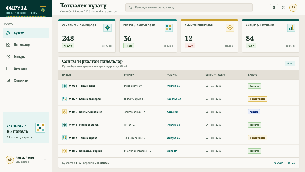
For web interfaces, make the page plaster and the navigation or header a glaze block. Cards stay pale with glaze-coloured borders or top rules, tables use glaze rules rather than heavy fills, and the primary action gets the one gold accent per view. Dashboards and pricing pages benefit from the style's calm: the recommended plan can carry the single gold touch, and everything else stays in the ground and the glaze.
For editorial and marketing work, use wide horizontal bands of glaze to mark sections, a repeating tulip band as a divider, and a tall narrow column for pull quotes. Photography should sit inside the plaster ground without competing with it. This is a good style for long-form features, institutional reports and cultural campaigns.
The common mistake is to flood the page. Tiling the tulip edge to edge as wallpaper, filling the background with glaze, or scattering gold across the layout all abandon the ratio that defines the style. The second mistake is to flatten the tradition into generic 'Islamic pattern' decoration. This is a specific Tatar, Volga Bulgar vocabulary from Kazan, and the tulip, the plaster and the proportions are what make it so.
Kazan Tatar Tilework — FAQ
Is this Islamic geometric ornament or arabesque?
No. The ornament here is Volga Bulgar, centred on the tulip, and its forms come from the Old Tatar Sloboda in Kazan. The system deliberately avoids tiling and wallpaper-like fields. The decoration is sparse and local, and it sits in bands against a quiet wall rather than filling the surface.
How much glaze is too much?
A good test is area. The plaster should clearly outweigh the glaze, and the glaze should appear as a border, header block or rule. If the glaze starts to compete with the plaster for area, or fills a background, the ratio has been inverted. The restraint is what makes each band of colour read as deliberate.
What does 'gold once per view' mean in practice?
It means one gilded element per screen, slide or section. It might be a logo mark, a single key figure or the main action. The reference is the crescent on a wall's head: one bright accent that finishes the composition. Repeating it dilutes it and turns the accent into a competing colour.
Is the style Russian or Tatar?
It is the Tatar national style, which the library records as sitting on provincial Russian Baroque forms and on a Volga Bulgar ceramic tradition. After 1766 the Tatars of Kazan built within the architectural manners of the surrounding provinces and filled them with their own symbols. That layering of local and regional, rather than a single origin, is part of what the style is.
Can the style work as a dark theme?
Not without changing its logic. The style depends on pale plaster being the largest and quietest area, with glaze and gold as small, deliberate figures on it. Inverting the ground to a dark colour turns the glaze from a figure into part of the field and weakens the single gold accent. If a dark version is required, the plaster-to-glaze ratio should still be the organising idea, with the glaze kept to borders and rules.
Where does the tulip come from?
The tulip in this system is a Volga Bulgar ornament, recorded by the library as an old symbol brought back into use. It is cut as window openings and repeated through the friezes of the Old Tatar Sloboda's mosques. In design terms it should stay a single, stylised form used in bands, rather than a decorative flower scattered across a page.
Related design styles
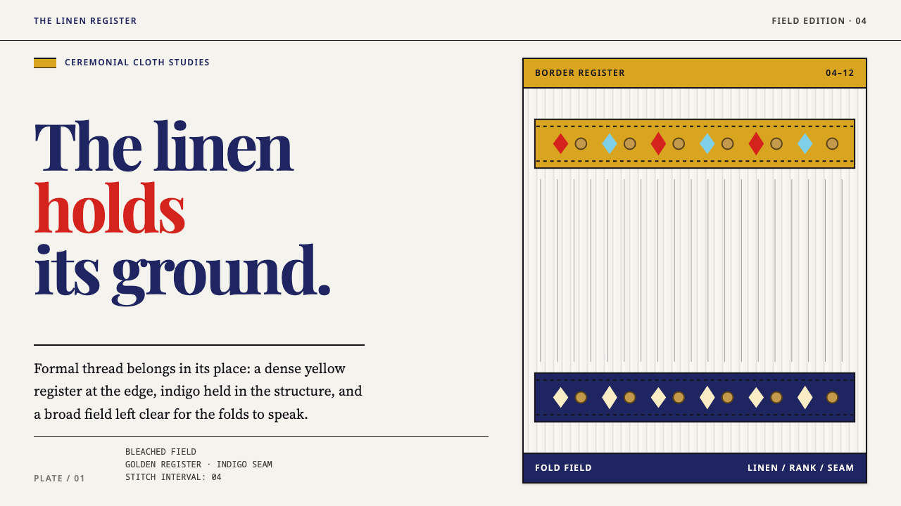 Slovacko KrojRank lives in the stitch. Golden bands and indigo seams order a pleated linen…
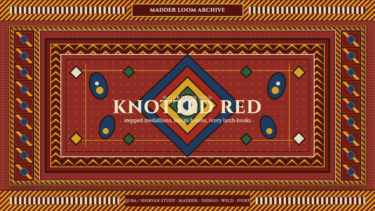 Azerbaijani Quba CarpetRed is the field. Indigo botehs and ivory latch-hooks orbit a stepped medalli…
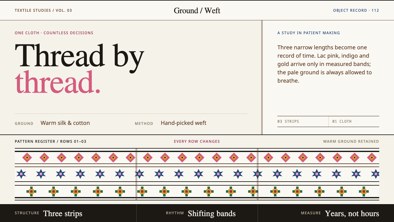 Bhutanese KushutharaPatience made visible. Lac pink and indigo bands shift across a warm silk gro…
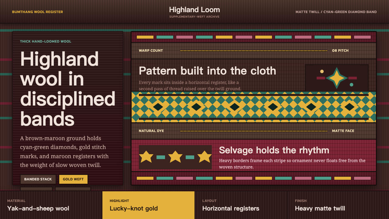 Bhutanese Yathra Wool WeaveHighland wool made digital. Brown-maroon bands carry cyan diamonds and spare…
 Kalash KupasDensity carries value. Ivory shell courses and orange braid are counted on wa…
 Karakalpak Kimeshek DressA cloth worn red. Crimson keste cross-stitch on indigo wool, set with silver-…