What is Udmurt Monisto?
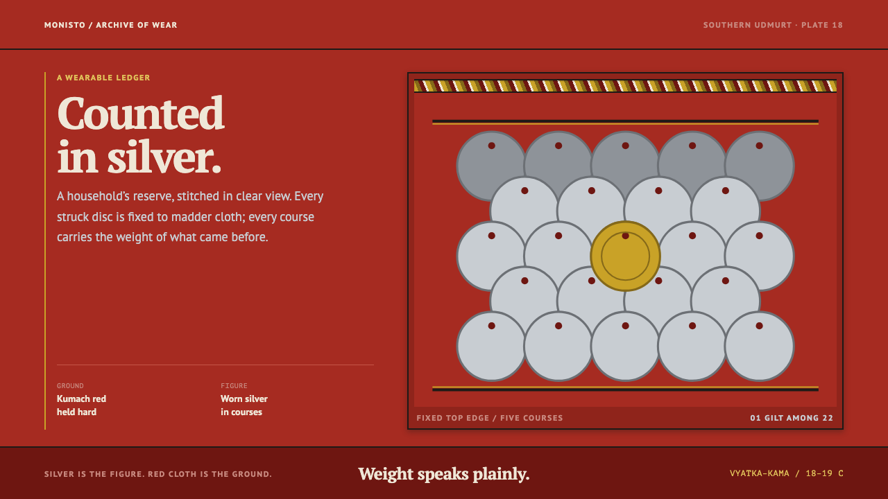
The monisto turns a family's silver into a garment: real coins sewn in overlapping courses onto red cloth, worn where everyone can count them and heard with every step.
Udmurt Monisto in brief
The monisto is a breast ornament worn by southern Udmurt women in the Vyatka–Kama basin of Volga-Ural Russia. It is made of real silver coins, each one pierced and sewn in overlapping courses onto a panel of bright red cotton cloth known as kumach, trimmed with braid and velvet, and pinned over a white linen tunic called the dérém. The Udmurts are a Finno-Ugric people, and the monisto belongs to the wider family of Volga-Ural coin jewellery, in which money is worn rather than stored.
As a design style, the monisto is about value made visible. It is jewellery and account book at once: a family's silver displayed where anyone can count it, ringing as the wearer moves. The visual logic that follows is blunt and honest. Silver is always the figure and red cloth is always the ground. Nothing floats free of its fixing; every unit hangs from a fixed edge and is held in place by the one above it.
Visually the style reads as heavy, dense and restrained. Repeated, near-identical units overlap downward like roof shingles. Hard horizontal bands of braid separate one course from the next. Contrast comes from cool metal meeting warm cloth, never from glow, gradient or sparkle. The style persuades by weight and plain accounting, and it deliberately declines the shine that the word 'jewellery' might suggest.
Where does Udmurt Monisto come from?
The monisto belongs to Udmurtia and the wider Vyatka–Kama river basin, the forested country between two great tributaries of the Volga where the Udmurts have lived for centuries. Udmurt dress is part of the larger world of Finno-Ugric folk costume: linen tunics, braid and woven bands, and a taste for ornament concentrated on the chest and head. Within that world, the southern Udmurts developed a distinctive coin tradition. Its formation is placed in the eighteenth and nineteenth centuries, and its pre-1900 character is the reason the style is read as inherited heritage rather than as a modern invention.
The southern tradition took shape under Tatar influence. Turkic-speaking neighbours along the Volga and Kama had long favoured coin ornaments, and southern Udmurt women adopted and adapted the idea, folding it into their own costume rather than copying a foreign dress wholesale. That is why the style is described as Tatar-influenced southern Udmurt dress: a Finno-Ugric foundation carrying a borrowed grammar of silver. The coin work remains characteristically southern, which makes the monisto a marker of regional identity as well as of family wealth.
The object itself is a lesson in construction. Silver coins are pierced so they can be sewn, not cast or soldered, and they are stitched in overlapping courses onto a panel of red kumach, an inexpensive cotton cloth dyed a strong, saturated red. Braid and velvet trim the edges and mark the divisions between courses. The finished panel is pinned to the front of the white dérém, so that red and silver sit against pale linen at the one place on the costume where the eye is certain to land. The wearer is, in effect, a display case for the household.
Why coins at all? In village economies, silver was the most portable and most legible form of savings. Sewing it into a garment meant a family's wealth travelled with its daughters, appeared on festive occasions and could be counted at a glance. The ring of metal on metal added an acoustic layer, so a woman in a full monisto announced herself before she was seen. The design system built on this tradition keeps all three facts, wealth, display and sound, and translates them into layout: dense stacked units, visible repetition, and a quiet weight that stands in for the noise.
What defines the Udmurt Monisto look?
Color: silver on red
Silver is the figure and red cloth is the ground, and the relationship never reverses. The red is a deep, cloth-dyed madder red rather than a bright screen red, and the silver is a cool, slightly dull metal that gains its presence from quantity instead of shine. The pale tone of the linen appears only as a margin and as a resting place for type, and trim colours appear only in the braid. Because the pairing is fixed, hierarchy never depends on introducing another hue.
Structure: overlapping courses
Panels hang from a fixed top edge and overlap downward, each course partly covering the next, like roof shingles or fish scales. The surface is therefore built from repeated units rather than one large field. Cards, panels and rows are all understood as coins on cloth: the same family of shape, repeated, stacked and anchored from above. Nothing floats, drifts or hovers; if a unit exists, it is attached to something.
Dividers: braid as hard bands
Separation comes from braid, hard horizontal bands that run edge to edge and mark where one course ends and the next begins. These are structural lines, not decorative flourishes, and they are flat and unshadowed. Where other styles would use open whitespace or a soft shadow to separate groups, this one uses a trim that looks as though it had been sewn on.
Weight and surface
The overall impression is felt as much as seen: heavy, dense and low-lit. Spacing is tight, because coins sit close together, and elements seem to carry mass, so the page has a lower centre of gravity than most contemporary interfaces. There are no glows, gradients or sparkle effects. Metal is shown as matte, minted and slightly worn, and any highlight is small, hard-edged and tied to a real edge, the way a coin catches light only on its rim.
Typography: a pair that can spell Udmurt
Type is a serif and sans-serif pair that were designed for the many languages of Russia's peoples, and that is exactly why they were chosen: they can set the extra Cyrillic letters Udmurt needs, such as ӝ, ӟ, ӥ, ӧ and ӵ. The serif takes headings and anything that should feel inscribed, while the sans handles labels, numbers and small text. The point is legitimacy rather than display flair, because the typography must be able to spell the culture it illustrates.
Plain accounting
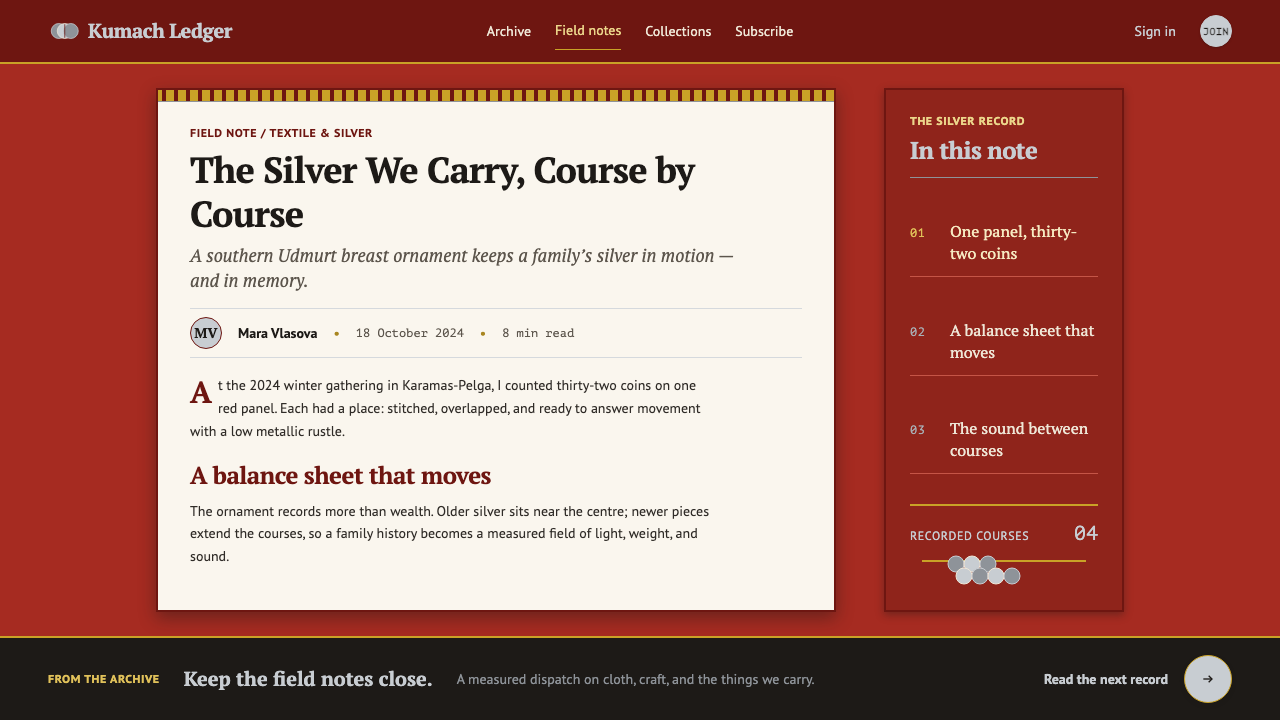
Because the monisto is also an account book, information is presented as something countable. Numbers are large, units are repeated, and quantity is allowed to be the message. Lists and tables read as rows of coins, and a long list is not a problem to be hidden but the whole point. The tone is that of an honest ledger: nothing is inflated, and everything on the cloth can be counted.
Who shaped Udmurt Monisto?
Kuzebay Gerd is the one individual named as a key figure for this style, and he belongs to the Udmurt cultural world rather than to jewellery-making as a trade. He is remembered chiefly as an Udmurt poet and writer, a name that stands for Udmurt cultural self-awareness. His place in the story is as an emblem of the culture the monisto comes from: the reminder that this ornament is the living heritage of a people with its own language and literature, not a decorative motif.
The true authors of the style are the women who wore, repaired and added to the monisto. They pierced and sewed the coins, chose the trim and carried the finished panel on their own bodies. Every rule in the design system, from the fixed top edge to the visible count, comes from the practical logic of a garment that had to hang well, survive daily wear and hold a household's silver safely.
Tatar dress culture is the neighbouring influence the source material names for southern Udmurt costume. It supplied the idea of silver coin as the principal material of an ornament, and the southern Udmurts turned that idea into something recognisably their own. For a designer it is a useful model of borrowing done well: adopt the technique, keep the grammar of your own costume, and let the result remain local.
The broader tradition of Finno-Ugric folk costume gives the monisto its foundation: white linen, braid, bands of ornament and a habit of concentrating decoration on the chest. The coin panel sits on top of that foundation as an added layer of wealth. Understanding the base garment explains why the style uses so much restraint around its silver, with the pale linen and the trim acting as quiet frames for the metal.
How do you use Udmurt Monisto today?
The monisto system works wherever the content is about accumulation, provenance or worth, and it resists subjects that want to feel light, fast or playful. Its principles are structural: a fixed pair of figure and ground, units that attach to an edge, hard dividers, and a deliberate weight. Applying it well means keeping those four rules rather than scattering silver-coloured highlights over an ordinary layout.
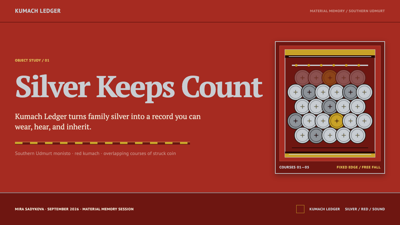
For presentation slides, a cover works best as a deep red field with one braid-like band across it and a title in the serif, with a few overlapping silver-toned units anchored to the top edge. Content slides can be treated as courses: one band per idea, each hanging from the one above, with the sans for supporting text. Data slides suit the style especially well, because counts can be drawn literally as rows of repeated units and tables can read as ledgers, with the total given the largest, plainest type on the slide.
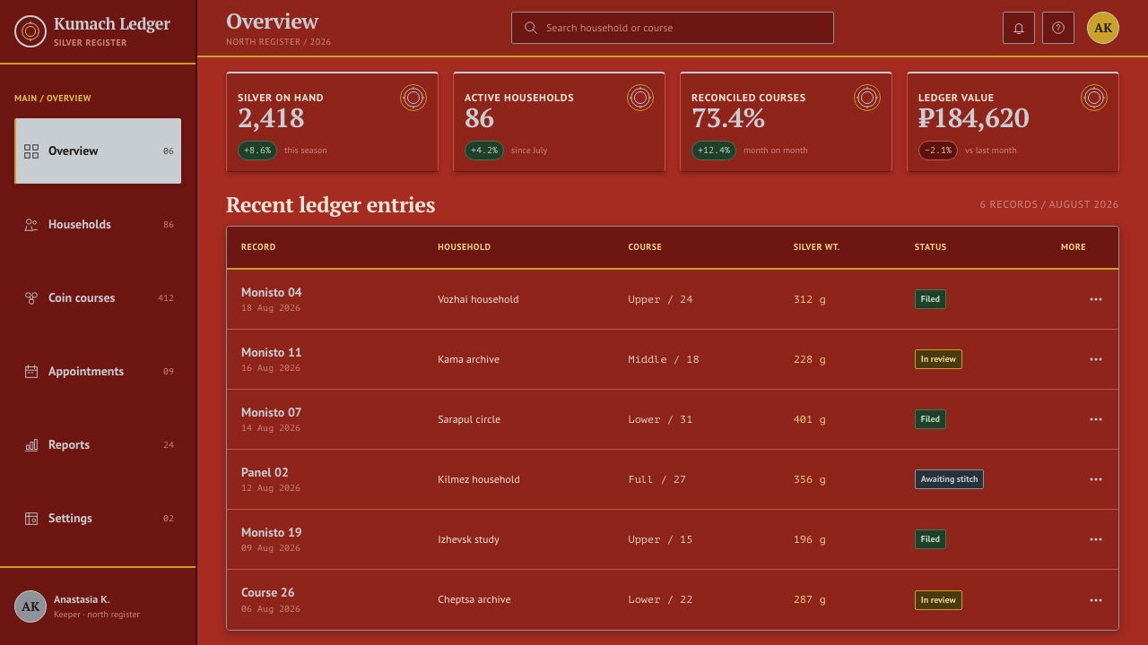
For web interfaces, the style fits pricing pages and account overviews particularly well. Tiers can be arranged as stacked courses ordered by value from the top down, separated by flat bands rather than shadows. On dense dashboards, keep cards adjacent and anchored under their dividers instead of overlapping them, since legibility comes first, and reserve true overlap for headers and hero areas. Navigation should be sober and typographic, with the red ground behind the page chrome rather than behind long reading text.
For editorial and marketing work, the style suits heritage brands, museum and collection catalogues, stories about savings or inheritance, craft goods, and long-form pieces about regional culture. Braid-like rules make strong section breaks, and a column of repeated figures can carry a statistic far better than a decorative chart. Because the language is dark and weighty, marketing copy should match it: plain statements of what something is worth, not exclamation.
A common mistake is to make the silver shiny, which turns a matte, minted metal into generic luxury. Others are adding gold, letting soft-shadowed cards float above the cloth, or using the red as a bright alert colour instead of a ground. The most serious mistake is cultural: using the style as a generic ‘folk’ flavour. The monisto is the real costume of a specific people, so credit it by name, set Udmurt text with a typeface that supports its letters, and avoid decorating unrelated content with it.
Udmurt Monisto — FAQ
What exactly is a monisto?
In Russian the word monisto means a necklace of coins or beads, but the Udmurt object is more than a string. It is a breast panel of red kumach cotton on which pierced silver coins are sewn in overlapping courses, trimmed with braid and velvet and pinned over a white linen dérém tunic. It is worn by southern Udmurt women and functions as both jewellery and a visible record of a family's silver.
Why is the palette limited to silver and red?
Because that pairing is the object. The silver coins are the figure and the red cloth is the ground, and the relationship works as a rule: value is always the thing you look at, and the cloth is always what holds it. Adding more hues would blur that hierarchy and make the style read as generic folk decoration. Variety comes from quantity, rhythm and the trim of the braid instead.
Does the style work on a light background?
It is designed as a dark, low-lit system, with a deep red ground carrying cool silver. A light version is possible if the red cloth stays the ground for the panels themselves, with pale linen used only as the surrounding page. What breaks the style is silver on white, where the metal loses its presence and becomes grey type. Keep the cloth behind the coins and the weight returns.
Is the overlapping layout practical for real interfaces?
Used with care, yes. The overlap works best in headers, hero areas, pricing tiers and decorative groupings, where the order of units matters more than reading every one in full. In dense data views, keep the same anchored-from-above logic but let units sit side by side, separated by braid-like bands. The principle is attachment, not literal overlap: nothing floats, and each unit hangs from an edge.
Can I use the style for content unrelated to Udmurt culture?
Its principles travel well to any subject about accumulated worth, such as savings products, archives, inventories or craft collections. The imagery does not travel as easily. Avoid using it as a decorative skin for unrelated material, and where the subject really is Udmurt or Finno-Ugric dress, name the tradition and the people it belongs to rather than treating it as anonymous folk pattern.
Related design styles
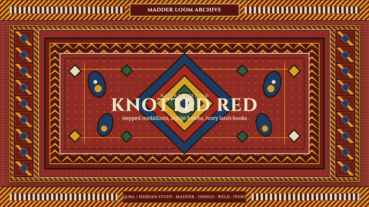 Azerbaijani Quba CarpetRed is the field. Indigo botehs and ivory latch-hooks orbit a stepped medalli…
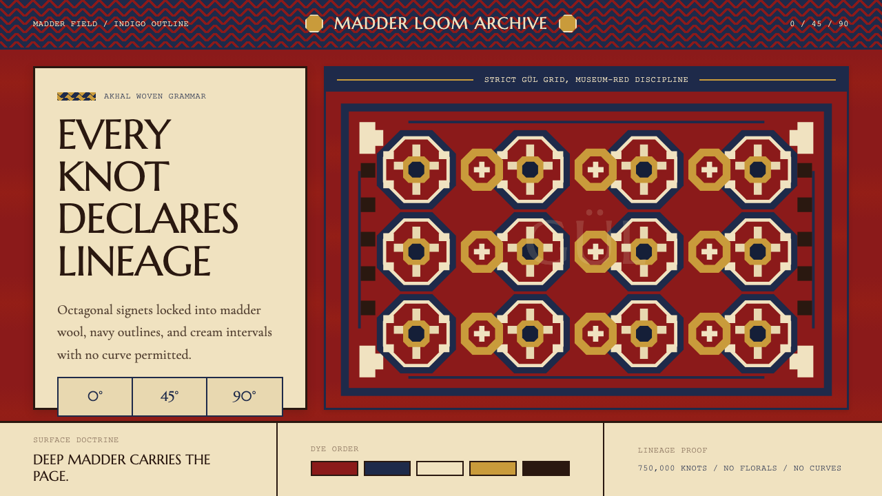 Turkmen Tekke Carpet (Gül Medallion)Disciplined red geometry. Madder field, indigo outlines, cream gül grid.
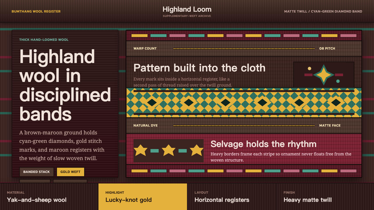 Bhutanese Yathra Wool WeaveHighland wool made digital. Brown-maroon bands carry cyan diamonds and spare…
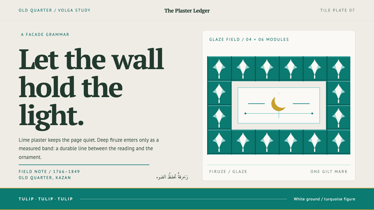 Kazan Tatar TileworkOrnament held to its proper place. Turquoise tulip bands cut across quiet lim…
 Slovacko KrojRank lives in the stitch. Golden bands and indigo seams order a pleated linen…
 Talavera Poblana CeramicBaroque craft breathes. Cobalt scrollwork on warm tin-glaze cream frames stri…