What is Nabeul Ceramic Teal?
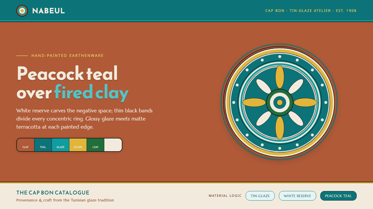
Nabeul Ceramic Teal turns the warmth of fired terracotta into a glazed digital language: peacock teal, white reserve, black-divided medallions, and the patient rhythm of hand-painted pottery.
Nabeul Ceramic Teal in brief
Nabeul Ceramic Teal draws from the hand-painted tin-glazed earthenware associated with Nabeul, the pottery center on Tunisia’s Cap Bon peninsula. Its defining visual contrast is material as much as color: a fired red-terracotta body supports luminous peacock teal-cyan glaze, while white reserve areas interrupt the color with crisp breathing space. The result is neither purely rustic nor purely ornamental. It feels made, fired, glazed, and handled.
The style is organized around ceramic bands and medallions rather than a flat field of decoration. Concentric rings create a steady visual cadence, with thin black dividers holding each band apart so that teal, white, foliage green, and ochre yellow do not dissolve into one another. Arabesque-inspired floral fills can occupy the spaces between the bands, but the composition remains legible because every field has a clear boundary.
In digital use, Nabeul Ceramic Teal should preserve the tension between glossy glaze and matte clay. Peacock teal is the visual pool into which the eye falls; terracotta supplies warmth and weight; white reserve keeps the composition open; black supplies the drawn structure. The style is strongest when it feels like a ceramic surface translated into an interface or publication, rather than a generic tropical palette placed over decorative patterns.
Where does Nabeul Ceramic Teal come from?
The style belongs to the ceramic tradition of Nabeul on Tunisia’s Cap Bon peninsula. Nabeul is identified as the country’s pottery capital, a place where the ceramic object is not an abstract reference but the source of the visual system itself. The plate and tile provide the essential compositional model: a clay ground, a painted surface, a center of gravity, and patterned zones held within a rim.
Between 1900 and 1950, workshops in Nabeul produced hand-painted tin-glazed earthenware plates and tiles. The period matters because it gives the style a specific craft horizon rather than an imagined antique past. Fired red-terracotta clay, peacock teal-cyan glaze, and white reserve are not arbitrary contemporary choices; together they describe the material and painted character of this named ceramic tradition.
The tradition is associated with Nabeul master potters, Cap Bon glaze-painters, and Moknine workshop artisans. These names describe custodians of a workshop practice rather than a single authorial school. The visual language therefore carries the logic of repeated handwork: drawn dividers, filled bands, controlled variation, and a surface that rewards close looking without losing its overall order from a distance.
Tunisian tin-glazed earthenware, Nabeul hand-painted pottery, and the Moknine ceramic tradition meet here as related sources of form. The digital adaptation should not pretend to reproduce every physical feature of a plate or tile. Its task is more precise: preserve the relationship between fired clay, opaque color, white reserve, fine dark separation, and concentric ornament so that the source remains recognizable even when the final object is a screen, slide, page, or card.
What defines the Nabeul Ceramic Teal look?
Glazed Teal
Peacock teal-cyan is the style’s principal glazed field. It should read as deep, cool, and glasslike against the warmth of terracotta, not as a neutral interface accent. Large teal areas create the sense of pooled glaze, while smaller teal marks can guide the eye through an ornamented composition. Its visual richness comes from contrast with clay and white reserve, not from excessive variation.
Terracotta Ground
The fired red-terracotta ground gives the system its physical anchor. It is warm, earthy, and matte in character, making the cooler glaze appear more luminous by comparison. Terracotta works best as a broad ground, border, vessel-like frame, or restrained structural field. When it disappears entirely, the style loses the ceramic tension that distinguishes it from a conventional teal-and-white decorative scheme.
White Reserve
White reserve is active negative space, not unfilled leftover area. It separates painted fields, lets medallion structures breathe, and sharpens the boundary between the teal glaze and the terracotta body. In dense compositions, reserve areas should remain visibly calm. Their job is to make ornament readable and to preserve the tactile impression that the painter deliberately left portions of the ceramic surface uncovered.
Concentric Bands
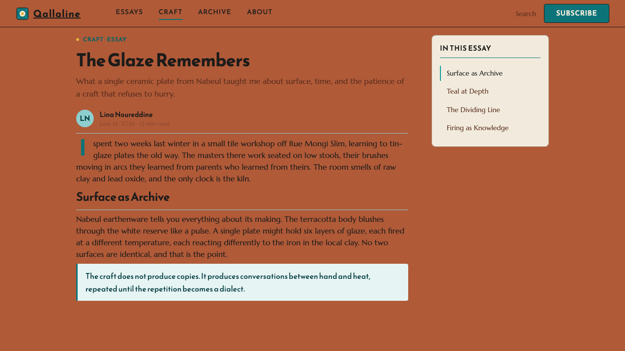
Concentric medallion bands supply the style’s characteristic rhythm. They can frame a title, image, emblem, chart, or focal piece of information, moving the eye inward or outward without relying on perspective. The rings should feel drawn onto a ceramic face rather than engineered as a sterile target. Slightly varied fills and carefully placed arabesque details keep the repetition alive while the overall center remains stable.
Black Dividers
Thin black lines divide adjacent bands and establish the hand-drawn structure beneath the glaze. They are not decorative outlines added after the fact. Their purpose is to prevent color fields from bleeding together, clarify the hierarchy of rings and fills, and give typography a firm counterpart. The linework should remain fine and deliberate, never heavy enough to overpower the glazed colors or the terracotta ground.
Arabesque Punctuation
Foliage green and ochre yellow appear as punctuation within arabesque fills. They bring vegetal and sun-warmed notes to the stronger teal, white, and terracotta structure, but they should not compete for dominance. Use them where a ring, corner, label, or ornamental gap needs life. Their value is rhythmic: they make a patterned surface feel painted and cultivated instead of mechanically repeated.
Who shaped Nabeul Ceramic Teal?
Nabeul master potters represent the workshop knowledge behind the city’s identity as Tunisia’s pottery capital. In this style, their significance is inseparable from the clay body and ceramic format: the warm fired terracotta ground, plate-like center, rim-like boundaries, and the sense that decoration belongs to a made object rather than a floating graphic layer.
Cap Bon glaze-painters stand for the painted surface of the tradition: peacock teal-cyan glaze, white reserve, dark dividing lines, and carefully placed accent colors. Their contribution is best understood as a discipline of separation and balance. Each painted zone remains distinct enough to read, while the whole surface maintains the richness expected of hand-painted earthenware.
Moknine workshop artisans connect the style to the wider Moknine ceramic tradition named in its source material. Their presence discourages an overly singular reading of the aesthetic. Nabeul Ceramic Teal is a workshop-derived language, shaped by repeated making, painted ornament, and ceramic surfaces, rather than a style attributable to one isolated designer or one fixed graphic composition.
How do you use Nabeul Ceramic Teal today?
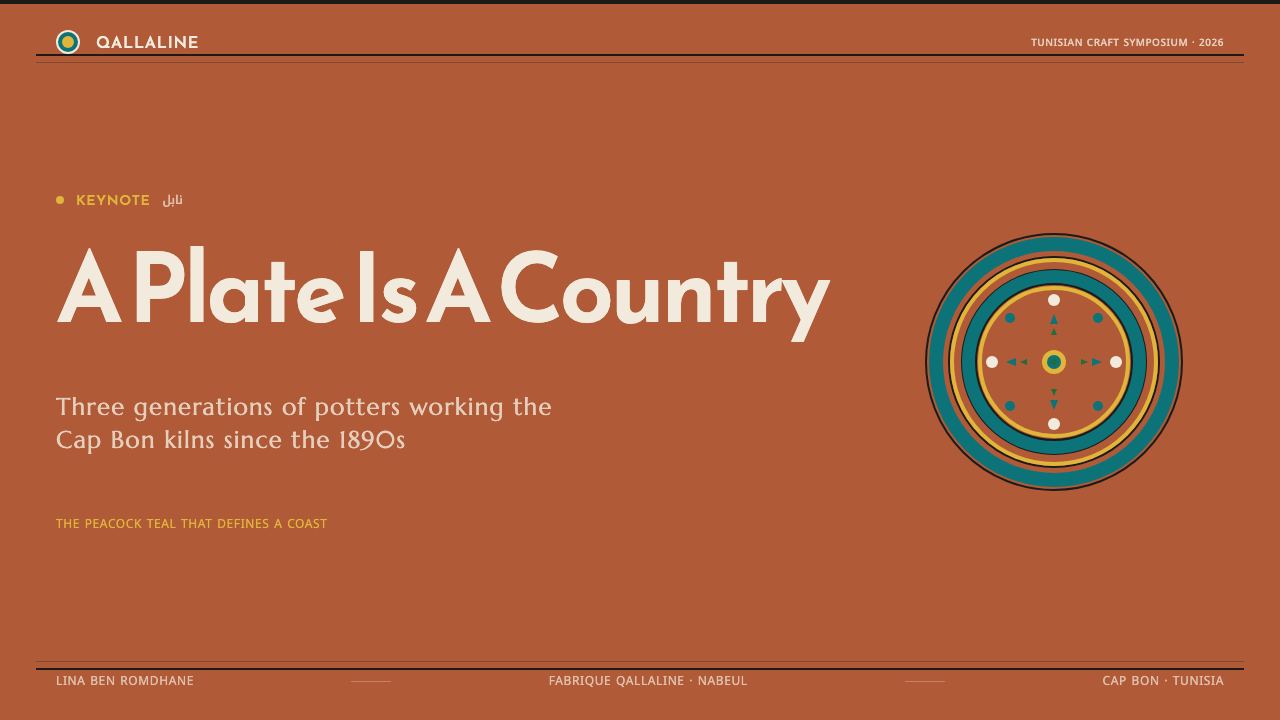
For presentation covers, let a terracotta field or a broad peacock teal medallion establish the object-like presence of a ceramic plate. Put the title in a clear white reserve area or against a quiet dark divider, then allow concentric bands to frame rather than crowd it. The cover should feel ceremonial and composed, with ornament directing attention toward the subject instead of becoming the subject itself.
Content slides should use the style as a system of bounded zones. A calm white reserve area can carry explanatory text, while teal bands, terracotta edges, and fine black separators establish section hierarchy. On data slides, circular charts, comparative rings, and grouped values can borrow the medallion logic. The important distinction is functional: use ornament to organize information, not to disguise unclear data or make every chart resemble a decorative plate.
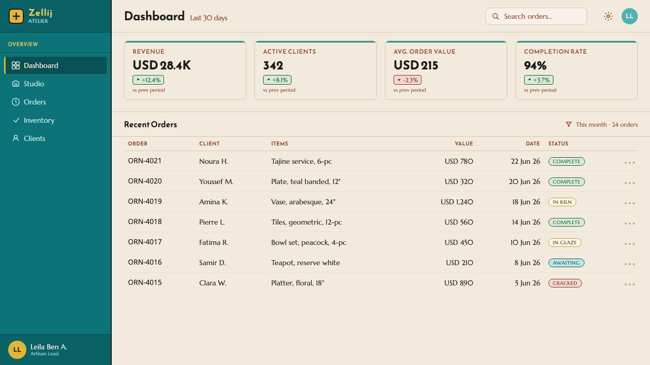
For web interfaces, Nabeul Ceramic Teal suits dashboards, collection browsers, cultural catalogues, and pricing views that benefit from a crafted but disciplined identity. Treat panels as ceramic fields with clear borders and generous reserve space. Peacock teal can signal selected or high-attention regions; terracotta can ground navigation or framing; black dividers can make categories and forms easier to scan. Repeated medallion motifs work best in focal modules, badges, summaries, or empty-state illustrations rather than behind every control.
In editorial and marketing work, the style can turn a feature page into a sequence of glazed surfaces. Use terracotta to introduce warmth at openings and transitions, place large images or key messages inside white reserve, and use concentric fragments to mark quotations, product stories, categories, or calls to action. Foliage green and ochre yellow should remain occasional accents that animate the page without weakening the teal-and-terracotta foundation.
The common mistake is treating the style as a license to fill every available area with ornamental rings, teal blocks, and floral marks. That erases the white reserve and makes the work feel more like generic pattern decoration than Nabeul ceramic language. Keep the clay ground visible, let black lines do real structural work, and give each medallion or arabesque fill a reason to exist. The surface should feel abundant, but never indiscriminate.
Nabeul Ceramic Teal — FAQ
Is Nabeul Ceramic Teal a Mediterranean tile style?
It can be applied to tile-like surfaces, but its source is broader and more specific: hand-painted tin-glazed earthenware plates and tiles from Nabeul on Tunisia’s Cap Bon peninsula. The essential reference is the relationship between fired terracotta, teal-cyan glaze, white reserve, dark linework, and medallion bands. A grid of repeated tiles alone does not reproduce that relationship.
How should teal and terracotta be balanced?
Let terracotta establish warmth and material presence, then use peacock teal as the stronger glazed field or focal contrast. White reserve must remain visible enough to prevent the pair from becoming heavy, while black dividers keep their boundaries crisp. The balance should suggest glaze sitting on fired clay, not cool color and warm color competing with equal intensity everywhere.
Can the style work without circular medallions?
Yes, provided the remaining elements still preserve the ceramic logic. A cropped band, a partial arc, a framed reserve field, or a sequence of dark dividers can imply the same source without showing a complete medallion. What should remain is the sense of bounded painted zones on terracotta, rather than a flat ornamental pattern detached from an object-like surface.
Where do foliage green and ochre yellow belong?
They belong in the arabesque fills and smaller moments of punctuation. Their role is to enrich the surface around the dominant teal, white, terracotta, and black structure. If they become broad competing fields, the composition loses its hierarchy. Used sparingly, they make a medallion or ornamental band feel more cultivated, vegetal, and hand-painted.
Related design styles
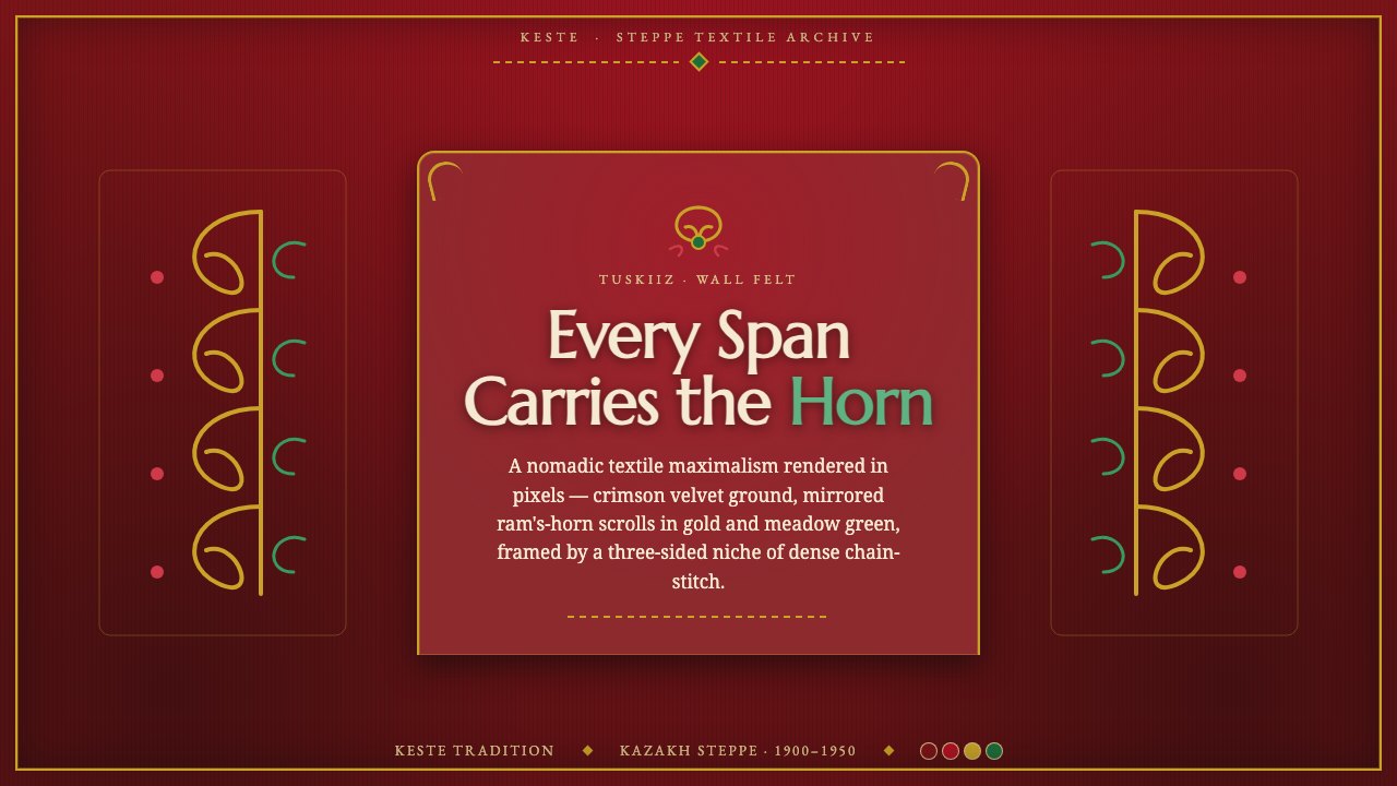 Kazakh Tuskiiz Wall HangingNothing flat, nothing empty. Crimson velvet, gold-green ram's-horn scrolls, a…
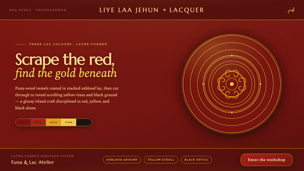 Maldivian Liye Laa Jehun LacquerThree lac colours, nothing else. Glossy oxblood scraped through to yellow scr…
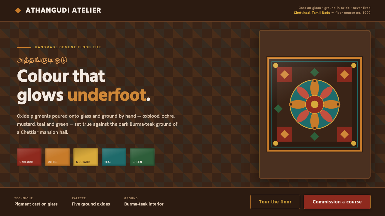 Chettinad Athangudi TilesColour that glows underfoot. Five ground-oxide tones on dark teak in bordered…
 Christmas ClassicTradition glows warmly. Evergreen panels, berry-red notes and burnished-gold…
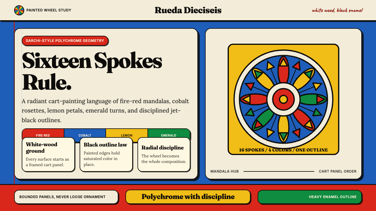 Costa Rican Oxcart Sarchí 1900Geometry sings. Fire red, cobalt, lemon and black outlines turn the wheel int…
 Nyonya Kebaya EmbroideryCraft, never a blank sheet. Rose-voile ground in turquoise sulam openwork, hi…