What is Christmas Classic?
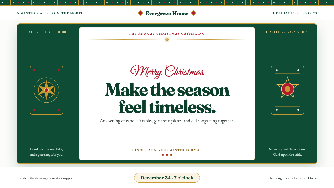
Christmas Classic turns the holiday image into a visual inheritance: evergreen depth, berry-red warmth, snow-white clarity, and burnished gold gathered into the generous language of the greeting card.
Christmas Classic in brief
Christmas Classic is the traditional holiday palette rendered with the confidence of a well-loved Christmas card. Its visual world is built from deep evergreen, berry red, snow white, and burnished gold: fir garlands wound with satin ribbon, holly sprigs carrying lacquer-red berries, gold baubles catching candlelight, and Fair Isle knit borders running along the edges of the composition. The result feels immediately familiar without becoming careless or generic.
The style is generous and ornamented rather than minimal. It welcomes gilding, ribbon, snow, foliage, patterned borders, and small signs of celebration, but these details are arranged with the composure of inherited tradition. The page should feel like a linen-stock card placed on a carefully set table: crisp white ground, evergreen panels, gold-foil serifs, and one unmistakable stroke of berry red. Nothing needs to shout because the visual vocabulary already carries cultural memory.
Christmas Classic is traditional rather than ironic. It does not parody the holiday or strip it down to a seasonal symbol. It presents Christmas as a complete atmosphere: good table linen, candlelight, a decorated tree, printed wishes, winter greenery, and the quiet pleasure of receiving something made to be kept. The aesthetic is warm through material suggestion and restrained through hierarchy, allowing ornament to feel intentional rather than crowded.
Where does Christmas Classic come from?
The canon of Christmas Classic took shape between the Victorian revival of Christmas cards and the height of mid-century American card culture, with its strongest visual inheritance running from the 1840s through the 1950s. Its geographic story belongs primarily to Britain and the United States. Across that period, Christmas moved from a private religious observance and family custom into a widely shared visual culture of cards, shop windows, printed illustrations, seasonal advertisements, knitwear, wrapping, and domestic decoration.
In Britain, the modern greeting-card tradition was established through the partnership of Henry Cole and John Callcott Horsley. Their early Christmas card helped define the idea of a seasonal image that could carry a personal message across distance. Victorian card engraving contributed the sense of occasion that still distinguishes Christmas Classic: formal lettering, framed compositions, winter foliage, symbolic color, and an affection for printed surfaces that feel ceremonial rather than disposable.
Chromolithography expanded the reach and richness of seasonal imagery. Louis Prang became associated with the American development of color printing, helping establish a visual culture in which Christmas could be reproduced with saturated color, decorative borders, and illustrated scenes. Thomas Nast contributed to the consolidation of familiar American Christmas imagery through his illustrations, giving the holiday a more expansive domestic and cultural presence. The style’s later confidence depends on this combination of print technology and recurring seasonal symbols.
By the mid-century, commercial illustration made Christmas imagery warmer, more polished, and more widely recognizable. Haddon Sundblom’s work belongs to this period of commercial illustration, when holiday figures, gift-giving scenes, rich reds, evergreen settings, and luminous highlights became part of the shared seasonal imagination. Alongside printed cards and advertising, the Fair Isle knitwear tradition supplied another important visual source: repeating winter motifs, bands of pattern, snow-like geometry, and a handmade sense of warmth. Christmas Classic is therefore not one isolated style but a compact inheritance assembled from card engraving, color printing, commercial illustration, and winter textile tradition.
What defines the Christmas Classic look?
Color
The palette is organized around deep evergreen, berry red, snow white, and burnished gold. Evergreen provides the grounded field of winter foliage and panels; snow white supplies crispness and air; berry red acts as the unmistakable seasonal accent; gold adds the reflective warmth of foil, ornament, candlelight, and heirloom decoration. The colors should feel rich and material rather than fluorescent, with red used as emphasis instead of an undifferentiated wash.
Typography
Serif typography carries the style’s sense of ceremony and inheritance. Letterforms should feel printed, composed, and slightly formal, especially in greetings, titles, and gift-like statements. Gold lettering can function as a visual ornament when placed against evergreen or snow white, while body copy benefits from a calmer dark tone and generous breathing room. Typography should resemble a beautifully printed card, not a novelty holiday sign.
Ornament
Decoration is essential, but it should arrive as a collection of recognizable seasonal materials: fir branches, holly, satin ribbon, baubles, snow, stars, and woven winter motifs. These elements work best when they frame, border, or punctuate the content rather than obscure it. Ornament should feel gathered and cared for, like a table arranged for guests, not scattered as visual confetti.
Borders and Pattern
Borders give Christmas Classic its greeting-card identity. Fair Isle-inspired bands, repeating snow motifs, holly lines, stitched-looking edges, and narrow gold rules can establish a perimeter around the page. Pattern is especially effective when it creates a threshold between the ordinary and the celebratory, making the content feel wrapped, presented, or set apart for the season.
Material Warmth
The style depends on the suggestion of touch. Snow white can feel like card stock or folded paper; evergreen can recall velvet, painted panels, or dense foliage; gold should suggest foil, brushed metal, or an ornament catching a nearby flame. Satin ribbon, linen, knitwear, wax, and polished lacquer all belong to the same material vocabulary. Even on a screen, the design should imply something that could be held, wrapped, hung, or placed on a table.
Hierarchy
Christmas Classic can be richly decorated without becoming unreadable because its hierarchy is clear. Snow white creates open space, evergreen establishes major fields, gold marks ceremony or importance, and berry red directs attention to the single message that must be remembered. Large greetings, supporting details, and small seasonal notes should each have a distinct role. Ornament supports the hierarchy when it behaves like a frame or accent; it weakens the hierarchy when every element competes for attention.
Who shaped Christmas Classic?
Henry Cole helped establish the modern Christmas-card tradition in Britain. His importance to Christmas Classic lies in the idea that a seasonal image could be both a designed object and a vehicle for personal correspondence. The greeting card’s compact format, ceremonial border, printed message, and sense of occasion remain central to the style’s emotional structure.
John Callcott Horsley collaborated with Henry Cole on the early Christmas card that helped define the genre. His contribution represents the Victorian preference for framed illustration, symbolic seasonal imagery, and a carefully presented message. Christmas Classic inherits from this model its belief that a holiday greeting should feel composed, gift-like, and worthy of keeping.
Louis Prang is associated with the development of American color printing and the wider circulation of richly colored seasonal imagery. His place in the lineage of Christmas Classic reflects the role of chromolithography in making decorative Christmas scenes, saturated color, illustrated borders, and printed ornament available to a broad audience.
Thomas Nast contributed to the consolidation of familiar American Christmas imagery through illustration. His work helped give the holiday a broader domestic and cultural presence, connecting seasonal figures, family settings, and printed narratives. Christmas Classic draws from this expansion of Christmas into a shared visual language rather than a private observance alone.
Haddon Sundblom belongs to the mid-century period of commercial illustration, when Christmas became increasingly polished, luminous, and recognizable across mass media. His role in this lineage represents the influence of commercial storytelling on the style: warm holiday figures, gift-giving scenes, evergreen settings, red accents, and highlights that make printed imagery appear touched by candlelight.
How do you use Christmas Classic today?
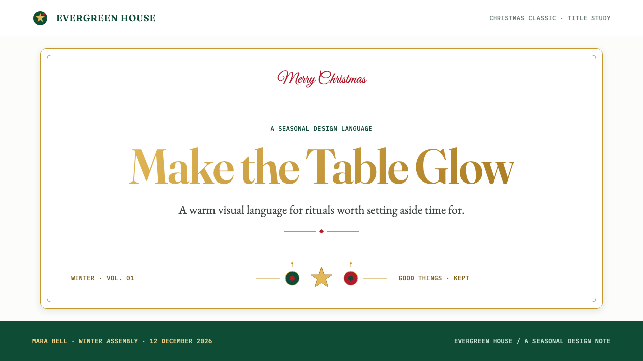
For presentation slides, Christmas Classic works especially well when the cover behaves like a formal greeting card and the content pages behave like coordinated stationery. A cover can place a large seasonal message against snow white, surround it with an evergreen field or border, and reserve burnished gold for the title or a small emblem. Content slides should keep the decorative language consistent: evergreen panels can organize sections, gold rules can mark transitions, and berry red can identify the one conclusion or invitation that deserves immediate attention. Data slides benefit from a calm white field, deep green structures, gold highlights for selected values, and red used only for an important contrast or warning.
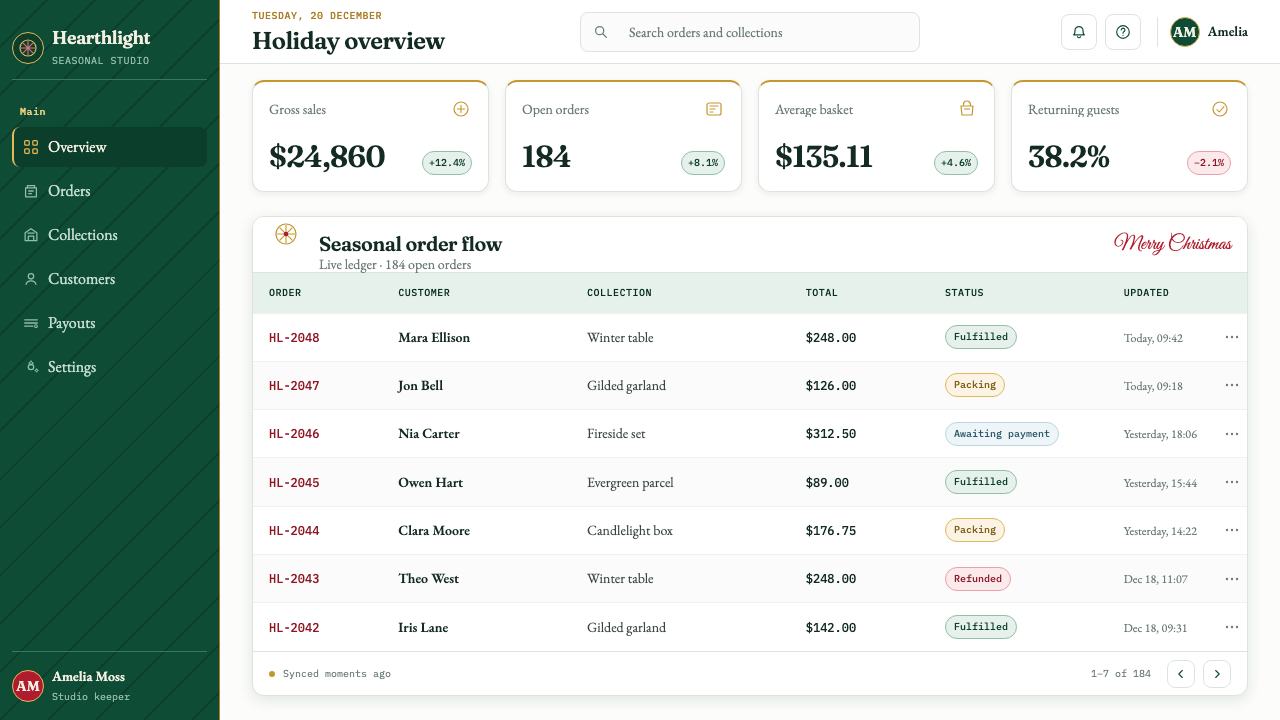
For web interfaces, the style suits dashboards and pricing pages that want to feel established, generous, and seasonal without becoming childish. Use snow white as the reading ground, evergreen for navigation or major panels, and burnished gold for selected states, premium tiers, or ceremonial emphasis. Berry red should remain scarce so that buttons, alerts, or key actions feel purposeful. Cards can suggest paper, folded stationery, velvet panels, or ornaments, while borders and small winter motifs provide warmth around otherwise functional information.
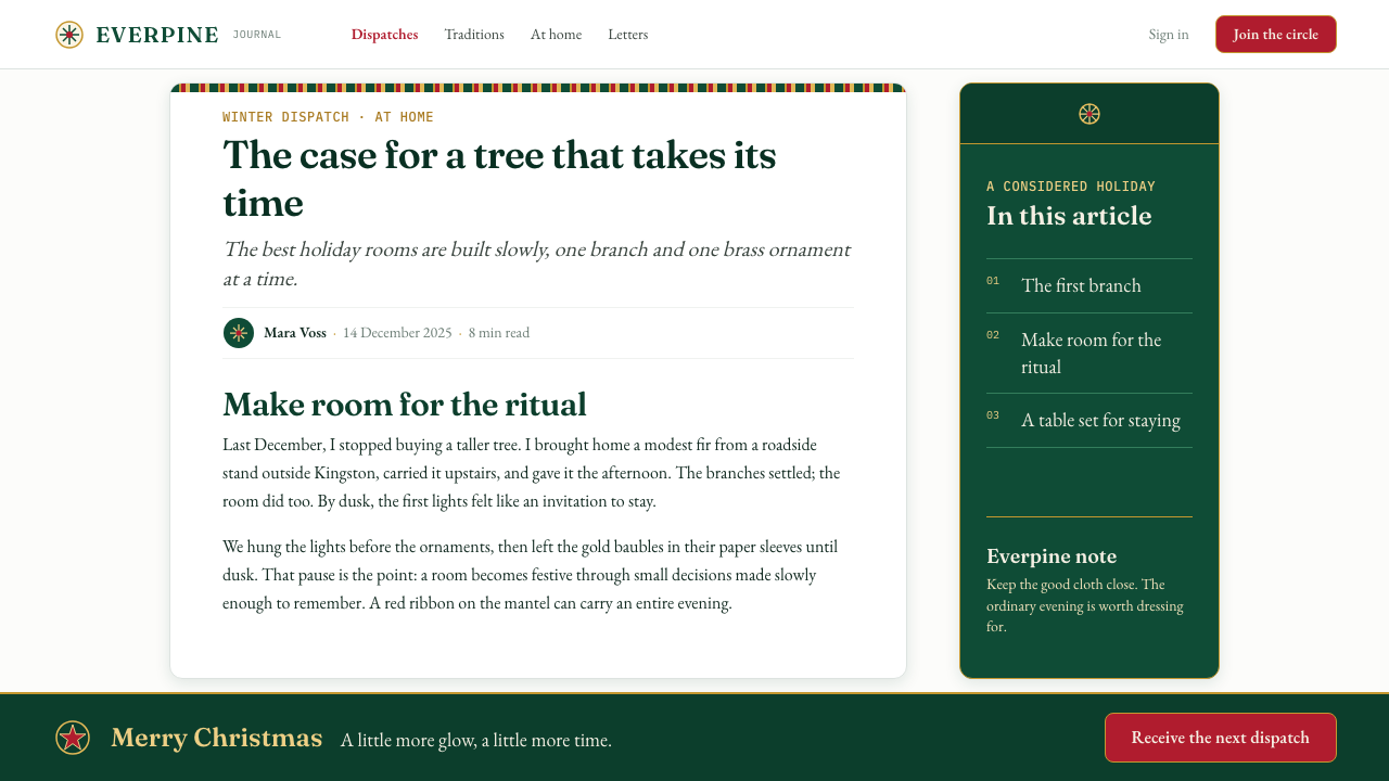
For editorial and marketing work, Christmas Classic gives seasonal content an immediate sense of occasion. Articles can use a crisp white reading field, evergreen section bands, gold rules, and small holly or snow motifs at the beginning or end of a section. Marketing pages can frame gift guides, holiday offers, invitations, or year-end messages with card-like borders and generous decorative margins. The strongest compositions allow one dominant seasonal image or message to lead, while ribbons, foliage, and patterned edges reinforce the story rather than competing with it.
For packaging, invitations, and social graphics, the style is strongest when it makes the viewer feel that something has been prepared with care. A dark evergreen field can carry a gold greeting; a snow-white card can hold a single berry-red message; a repeated knit pattern can wrap the outer edge like a textile trim. Material cues should remain coherent across the system. If the surface suggests paper, let the typography and borders support that fiction; if it suggests foil and ornament, keep the highlights selective and ceremonial.
The common mistake is treating Christmas Classic as permission to use every holiday symbol, every shade of red and green, and every shiny effect at once. The style needs editing. Choose one dominant ground, one main seasonal structure, and one clear accent message. Gold should feel like foil or heirloom metal rather than generic glitter; red should punctuate rather than flood the page; greenery should frame or organize rather than become an undifferentiated forest. Traditional abundance only feels elegant when the composition still knows what matters most.
Christmas Classic — FAQ
Is Christmas Classic only suitable for Christmas cards?
No. The style originated through greeting cards, but its visual logic also suits invitations, packaging, editorial layouts, seasonal campaigns, gift guides, pricing pages, and presentation decks. Its defining qualities are not the card format itself but the combination of winter greenery, ceremonial typography, material warmth, clear seasonal hierarchy, and carefully edited ornament. It can therefore support any experience that wants to feel traditional, generous, and prepared with care.
How much decoration is too much?
Decoration becomes excessive when it competes with the message, flattens the hierarchy, or makes every edge equally loud. Christmas Classic can be rich, but richness should come from a small number of coherent materials and motifs rather than constant novelty. If the viewer cannot tell whether the evergreen panel, gold rule, berry accent, ribbon, or greeting is the primary focus, the composition needs editing. The goal is a prepared and abundant atmosphere, not visual clutter.
Can Christmas Classic use a dark background?
Yes, and deep evergreen is especially natural as a dark ground because it already suggests fir branches, velvet, and winter depth. The key is to preserve contrast and restraint. Snow white can carry the main reading information, burnished gold can provide ceremonial emphasis, and berry red can appear as a controlled accent. Avoid allowing every decorative element to glow or shine equally. A dark Christmas Classic layout works best when the darkness provides intimacy and the lighter elements provide clarity.
How should gold be handled so it does not look cheap?
Gold should behave like a material with a history: foil on a card, a polished ornament, brushed metal, or candlelight touching an edge. Use it to mark titles, rules, small emblems, selected details, or moments of ceremony. Avoid spreading it evenly across every surface or combining it with too many competing shine effects. The impression should be burnished and intentional, not glittery. Gold gains authority when the surrounding snow white and evergreen fields give it enough quiet space.
What makes Christmas Classic feel traditional rather than nostalgic pastiche?
Tradition comes from consistency of values, not from collecting old-looking symbols. The style feels convincing when its typography, color hierarchy, borders, material cues, and seasonal motifs all support the same idea of a carefully prepared holiday object. Nostalgic pastiche usually adds references without deciding what role they play. Christmas Classic should make every ribbon, sprig, rule, and red accent serve the atmosphere and the message. Its confidence comes from coherence, not from the number of historical references displayed.
Related design styles
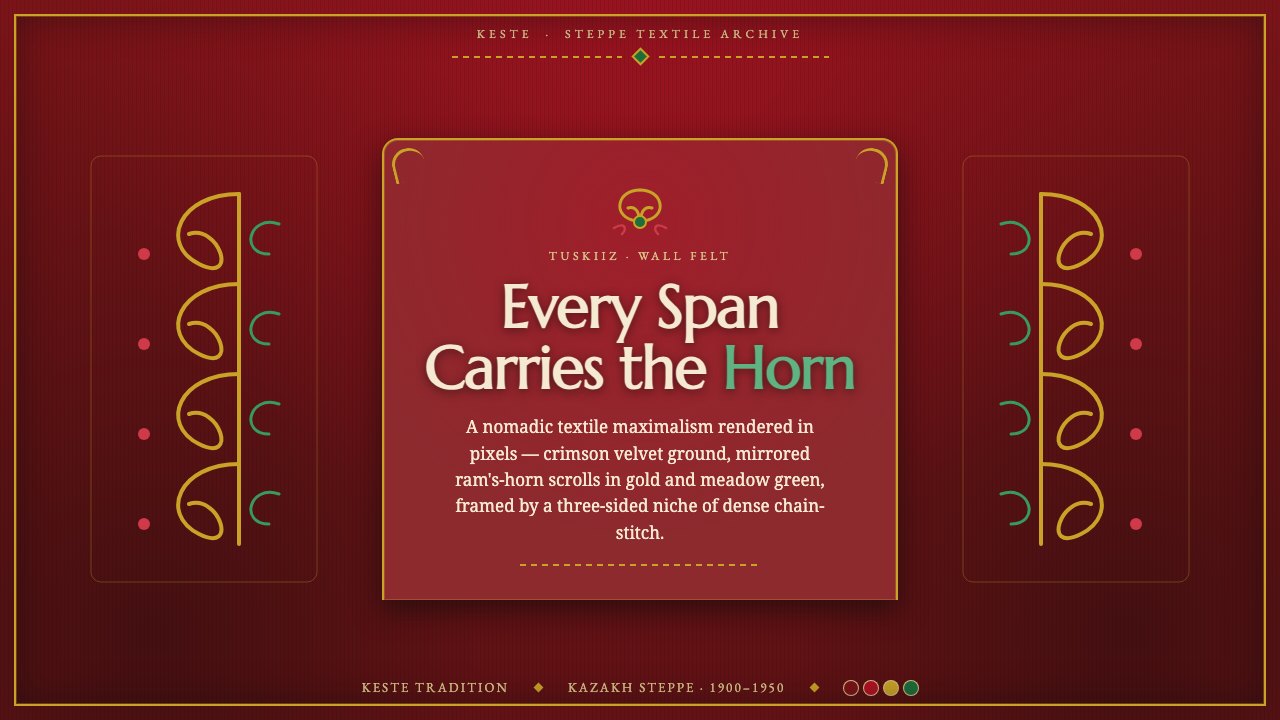 Kazakh Tuskiiz Wall HangingNothing flat, nothing empty. Crimson velvet, gold-green ram's-horn scrolls, a…
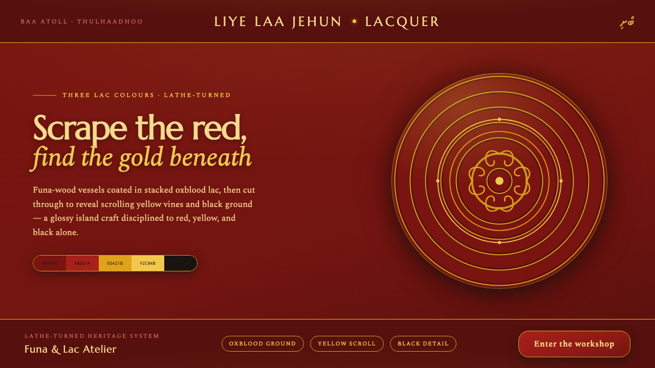 Maldivian Liye Laa Jehun LacquerThree lac colours, nothing else. Glossy oxblood scraped through to yellow scr…
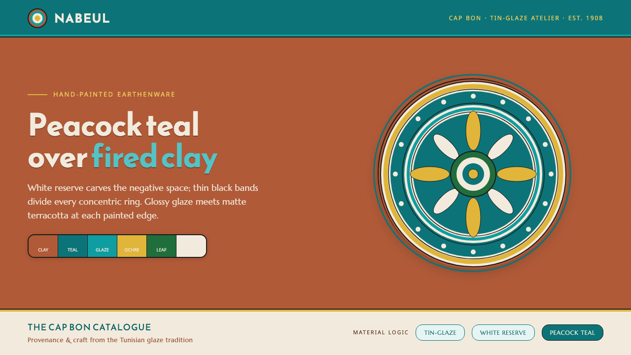 Nabeul Ceramic TealGlaze over fired clay. Peacock teal and white reserve banded in black on terr…
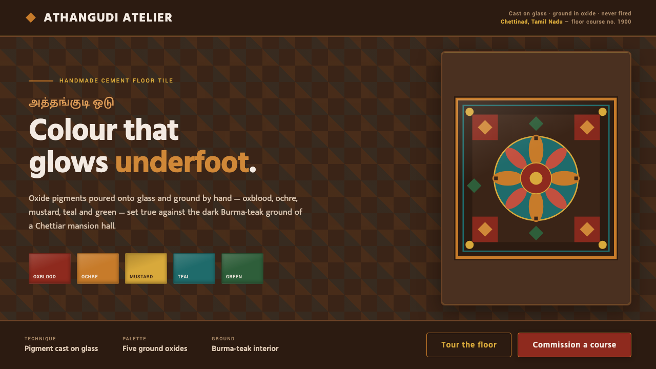 Chettinad Athangudi TilesColour that glows underfoot. Five ground-oxide tones on dark teak in bordered…
 Costa Rican Oxcart Sarchí 1900Geometry sings. Fire red, cobalt, lemon and black outlines turn the wheel int…
 Mongolian Deel & Ger FeltTextile gravity. Smoke-black felt frames crimson silk, brass knot borders, an…