Design style guide设计风格指南
What is Mongolian Deel & Ger Felt?什么是 Mongolian Deel & Ger Felt?
Mongolian Deel & Ger Felt weaves the layered material gravity of the steppe — smoke-dark felt, crimson silk, old gold embroidery, and endless-knot trim — into a digital design language that feels less like a screen and more like a ceremonial robe folded for a great occasion.蒙古袍与毡房毡布将草原层叠的物质厚重感——烟黑毡布、绯红丝绸、古金刺绣与无尽结纹样——编织成一套数字设计语言,令人想到的不是屏幕,而是为盛典折叠收存的礼袍。
Mongolian Deel & Ger Felt in briefMongolian Deel & Ger Felt 速览
Mongolian Deel & Ger Felt is a design system rooted in the layered material culture of the Mongolian steppe — the silk deel robe with its burnt-orange sash, the felt-walled ger lined with painted wooden chests, and the soyombo emblem pressed in deep crimson and old gold. It translates these tactile, ceremonially weighted forms into a coherent visual language for digital surfaces.蒙古袍与毡房毡布是一套根植于蒙古草原层叠物质文化的设计体系——以焦橙腰带束紧的丝绸蒙古袍、排列着彩绘木箱的毡壁蒙古包,以及以深红与古金印制的索永布徽记。它将这些触感鲜明、礼仪意味深重的形态转化为数字界面的连贯视觉语言。
Where many historical-revival styles borrow only the surface palette, this system draws on structural principles: the way a deel's embroidered border frames the garment rather than decorating it, the way a ger's painted furniture uses symmetry and geometric motif as symbolic encoding rather than mere ornament. The result is a dark-ground aesthetic dense with cultural signal — brass-button closures rendered as UI affordances, ulzii endless-knot patterns shaping decorative frames, cobalt accent rails echoing the painted chest-bands that ring a ger's interior.许多历史复兴风格只是借用表层色板,而这套体系则深入结构原则:蒙古袍的刺绣边饰是如何框定整件服装而非单纯装饰,蒙古包内的彩绘家具又是如何将对称与几何纹样作为象征编码而非单纯装饰。最终呈现的是一套深色底面美学,充满文化信号——铜扣造型转化为界面元素,乌力吉无尽结图案构成装饰框架,钴蓝强调色轨道呼应蒙古包内壁彩绘木箱的横向带饰。
Visually, the system reads as opulent restraint. The palette is deep and warm — smoke black as the dominant ground, crimson as the primary chromatic anchor, old gold for hierarchy signals, and cobalt as a cool counterpoint. Surface texture is implied through layering rather than photographic simulation, keeping the system legible on screen while preserving the felt-and-silk weight of its source material.这套体系在视觉上呈现出华丽与克制并存的气质。色板深沉而温暖——烟黑色为主导底面,深红作为首要色彩锚点,古金传递层级信号,钴蓝则作为清冷的对位色。表面质感通过层叠而非照片模拟加以暗示,使体系在屏幕上保持清晰可读,同时保留了其源头材料的毡与丝的厚重感。
See the Mongolian Deel & Ger Felt design system →查看 Mongolian Deel & Ger Felt 完整设计系统 →
Where does Mongolian Deel & Ger Felt come from?Mongolian Deel & Ger Felt 从何而来?
The visual vocabulary of this design system spans seven centuries of Mongolian material culture. The deel robe — a wrapped garment with a distinctive asymmetric front closure fastened by knotted buttons — appears in court paintings from the Yuan dynasty (1271–1368), when the Mongol empire governed the largest contiguous land mass in history. The robe's palette of deep reds, blacks, and gold embroidery was not decorative whim but heraldic encoding: color and trim announced rank, clan affiliation, and ceremonial context to anyone who could read the system.这套设计体系的视觉词汇横跨七个世纪的蒙古物质文化。蒙古袍——一种以系扣盘扣固定的独特斜襟长袍——在元朝(1271—1368年)宫廷画作中已有记载,彼时蒙古帝国统辖着历史上最大的连续陆地版图。袍服的深红、黑色与金色刺绣并非装饰随想,而是纹章编码:色彩与边饰向任何能读懂这套体系的人宣示着等级、部族归属与礼仪语境。
The felt ger — the circular dwelling assembled from a lattice frame and thick wool felt panels — is an older form still, documented in texts and tomb figures from at least the first millennium. Its interior painting tradition reached a visual high point under the patronage of the Bogd Khan VIII (1869–1924), Mongolia's last theocratic ruler, whose Ulaanbaatar palace accumulated lacquered chests, embroidered hangings, and ritual objects whose color and pattern density represent one of the most concentrated archives of traditional Mongolian decorative arts.毡房蒙古包——由格栅骨架与厚实羊毛毡板拼装而成的圆形居所——是更古老的形式,至少在公元第一千年的文献与墓葬陶俑中已有记载。其室内彩绘传统在第八世哲布尊丹巴(1869—1924年)的赞助下达到视觉高峰——蒙古最后一位神权统治者的乌兰巴托宫殿中积累了描漆木箱、刺绣帐幔与礼仪器物,其色彩与图案的密度构成了传统蒙古装饰艺术最集中的档案之一。
The soyombo symbol — a vertical column of geometric forms representing fire, sun, moon, earth, and water — was created by the scholar-monk Zanabazar in 1686. It functions simultaneously as a religious cipher, a national emblem, and a design motif. Its graphic economy — a complex idea rendered through the clear stacking of geometric shapes — anticipates the concerns of twentieth-century information design, and its appearance in this system anchors the aesthetic to Mongolian sovereignty rather than generalized Central Asian ornament.索永布符号——由代表火、日、月、地、水的几何形态垂直叠加而成的图形——由学者僧侣扎那巴扎尔于1686年创制。它同时具有宗教密码、国家徽记与设计母题三重功能。其图形的经济性——通过几何形态的清晰堆叠表达复杂理念——预示了二十世纪信息设计的核心关切,其在本体系中的呈现将美学锚定于蒙古主权,而非泛化的中亚装饰。
The post-1990 cultural revival in Mongolia, following the end of Soviet-era restrictions on traditional dress and practice, generated a new wave of craft workshops and fashion houses in Ulaanbaatar. Designers including Bolortuya Damdinjav and others working in the contemporary Mongolian fashion scene recontextualized the deel for urban wear, recombining traditional materials — cashmere, silk, embroidered felt — with contemporary silhouettes. This revival is the proximate source for translating steppe material culture into a design system legible to international audiences: it gave the tradition a contemporary visual language without erasing its ceremonial weight.1990年后蒙古的文化复兴——跟随苏联时代对传统服饰与习俗限制的解除——在乌兰巴托掀起了一批工艺工坊与时装屋的新浪潮。包括宝乐图雅·达木丁扎布在内的设计师及当代蒙古时装界的从业者,将蒙古袍重新置于都市语境中,把传统材料——羊绒、丝绸、刺绣毡布——与当代廓形重新组合。这场复兴是将草原物质文化转化为国际受众可读设计体系的直接来源:它为传统赋予了当代视觉语言,同时未消解其礼仪厚重感。
What defines the Mongolian Deel & Ger Felt look?Mongolian Deel & Ger Felt 的视觉特征是什么?
Palette色板
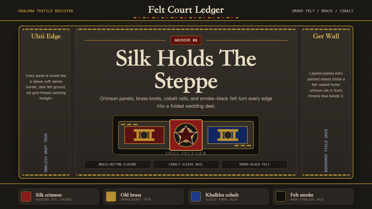
The palette operates in the register of dyed textiles and lacquered wood rather than screen luminosity. Smoke black functions as the dominant ground — not a pure digital black but a slightly warm, depth-suggesting dark that recalls charred felt and night-sky ger silhouettes. Crimson anchors the system as the primary chromatic voice, derived from the silk of ceremonial deel robes and the lacquer of painted chests. Old gold signals hierarchy and boundary, appearing at embroidered borders, knotted closures, and heading levels. Cobalt serves as a cool accent, echoing the blue rails and painted medallions found in ger interiors. Together the palette reads as warm, weighty, and heraldically precise.色板工作于染色织物与描漆木器的调性之中,而非屏幕光亮度。烟黑色作为主导底面——不是纯粹的数字黑,而是略带暖意、暗示深度的暗色,令人联想到烧焦的毡布与夜空中的蒙古包剪影。深红作为首要色彩声部锚定整套体系,源自礼仪蒙古袍的丝绸与彩绘木箱的漆色。古金传递层级与边界信号,出现于刺绣边饰、盘扣与标题层级之处。钴蓝作为清冷强调色,呼应蒙古包内壁的蓝色轨道与彩绘圆形纹样。整体色板读来温暖、厚重,具有纹章般的精确性。
Texture and Surface质感与表面
Texture is referenced rather than simulated. The system evokes the weight of compressed wool felt and woven silk through layering depth, tonal variation within dark grounds, and the suggestion of woven structure in border patterns — but it does not apply photographic fabric scans or realistic weave overlays. The tactile memory is carried by the color relationships and the density of decorative framing, not by surface noise. This keeps the system crisp and legible on screen while preserving the material register of its source culture.质感是被引用的,而非被模拟的。体系通过层叠深度、深色底面内的色调变化以及边框图案中对编织结构的暗示,唤起压缩羊毛毡布与织造丝绸的重量感——但不应用织物照片扫描或写实的编织叠加层。触觉记忆由色彩关系与装饰框架的密度承载,而非表面噪点。这使体系在屏幕上保持清晰可读,同时维持了源文化的材料调性。
Decorative Borders and Framing装饰边饰与框架
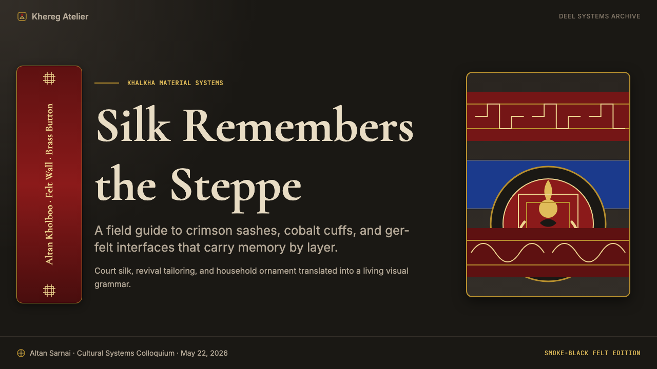
Where the Bauhaus system uses negative space as the primary organizational device, this system uses the active border. The embroidered hem of a deel, the painted frame of a lacquered chest, the woven band at a ger's crown ring — all operate as structural demarcators that announce content zones and assign ceremonial weight to what they contain. In digital application, this translates to richly bordered containers, decorative section rules derived from endless-knot geometry, and headers that carry the visual density of embroidered trim rather than the lightness of a ruled line.包豪斯体系以留白作为主要组织手段,而本体系则以活跃的边饰为核心。蒙古袍的刺绣衣边、描漆木箱的彩绘框架、蒙古包顶环处的编织带饰——所有这些都作为结构性分界,宣示内容区域,并赋予其所框定内容以礼仪厚重感。在数字应用中,这转化为装饰丰富的容器边框、源自无尽结几何的装饰分节线,以及承载刺绣边饰视觉密度而非纤细直线轻盈感的标题处理。
Geometric Pattern and Symbolic Motif几何图案与象征母题
Mongolian decorative arts carry a grammar of symbolic geometry: the ulzii endless knot represents good fortune and continuity; the soyombo's stacked forms encode cosmological hierarchy; the interlaced meander patterns that ring painted furniture establish visual cadence and territorial boundary simultaneously. In this design system, these motifs appear as framing elements, background registers, and icon-scale glyphs rather than as purely decorative fill. Their presence signals cultural specificity — distinguishing the system from generic dark-luxury aesthetics — while their geometric discipline keeps them compatible with digital legibility requirements.蒙古装饰艺术携带着一套象征几何的语法:乌力吉无尽结代表吉祥与连续;索永布叠加的形态编码宇宙论层级;环绕彩绘家具的交织回纹同时建立视觉韵律与领域边界。在这套设计体系中,这些母题作为框架元素、背景层与图标尺度字符出现,而非纯粹的装饰填充。它们的存在传递文化特殊性——将体系与泛化的深色奢华美学区别开来——同时其几何纪律使其兼容于数字可读性需求。
Typography Hierarchy字体排印层级
The system treats type with the same ceremonial weight it brings to textiles. Display headings carry the heaviness of embroidered script — substantial, confident, and spaced with deliberate generosity — while body text is set at a comfortable reading size against the dark ground with sufficient contrast to sustain long reading. The tonal relationship between old-gold headings, lighter-value subheadings, and near-white body text mirrors the hierarchy of a deel's trim: the gold border reads first, the silk body second, the lining last. No element competes for attention; the reading order is enforced by chromatic weight.体系以与纺织品同等的礼仪厚重感处理文字。展示性标题承载着刺绣铭文的厚重感——饱满、自信,间距舒展而刻意——而正文则以舒适的阅读字号置于深色底面上,对比度充足以支持长篇阅读。古金标题、较浅子标题与近白正文之间的色调关系,镜像了蒙古袍边饰的层级:金色边框首先被读到,丝绸袍身其次,衬里最后。没有元素争夺注意力;阅读顺序由色彩重量强制执行。
Compositional Density构图密度
Unlike minimalist systems that use generous white space as a signal of refinement, this system reads its density as richness. A ger interior is not sparse — every surface carries painted motif, embroidered panel, or lacquered object. The design system inherits this tolerance for visual fullness: interfaces built in this language can carry more information per viewport than a spare Swiss-derived system without feeling cluttered, because the layering logic itself provides organizational coherence. The key constraint is that every element must belong to an established visual register — border, ground, accent, or motif — rather than floating without structural assignment.与以大量留白传递精致感的极简体系不同,这套体系将其密度理解为丰盛。蒙古包内部并不简陋——每个表面都承载着彩绘纹样、刺绣挂板或描漆器物。这套设计体系继承了对视觉丰满度的包容:以此语言构建的界面每视口能承载比简洁瑞士风格更多的信息而不显杂乱,因为层叠逻辑本身提供了组织连贯性。关键约束在于每个元素都必须归属于既有的视觉层——边框、底面、强调色或母题——而非无结构归属地漂浮。
Dark Ground as Foundation深色底面作为基础
The dark ground is not a mode or a variant — it is the system's canonical state, in the same way that a felt ger's interior is naturally dim and the night sky over the steppe is the primary celestial reference. Elements are designed to emerge from the dark rather than sit on a light field: gold and crimson read as luminous rather than saturated, cobalt pulses against the dark rather than receding into it. This inversion of the light-ground convention produces an interface that feels enclosed and ceremonial rather than open and neutral — appropriate to a design system whose source culture treats interiors as sacred, bounded, and warmly lit.深色底面不是一种模式或变体——它是体系的规范状态,正如毡房蒙古包内部自然幽暗、草原上的夜空是首要的天穹参照。元素被设计为从暗处浮现,而非置于明亮底面之上:古金与深红读来发光而非饱和,钴蓝在暗处跳动而非消退其中。这种对浅色底面惯例的颠覆,产生了一种令人感到内敛而礼仪性的界面,而非开阔而中性的——对于一套将内部空间视为神圣、有界而温暖发光的源文化的设计体系而言,这是恰当的。
See the Mongolian Deel & Ger Felt design system →查看 Mongolian Deel & Ger Felt 完整设计系统 →
Who shaped Mongolian Deel & Ger Felt?谁塑造了 Mongolian Deel & Ger Felt?
The eighth Jebtsundamba Khutughtu (1869–1924), Mongolia's last theocratic ruler, presided over the Bogd Khan Palace in Ulaanbaatar, now a museum. His court accumulated the most concentrated archive of traditional Mongolian decorative arts in existence: lacquered furniture, embroidered throne covers, ritual objects, and painted pavilions whose color and pattern density constitute a living reference for the visual system. The Bogd Khan era (roughly 1911–1924) represents a final flowering of classical Mongolian court aesthetics just before Soviet influence restructured the country's cultural production.第八世哲布尊丹巴(1869—1924年),蒙古最后一位神权统治者,主持乌兰巴托的博格达汗宫(今已为博物馆)。其宫廷积累了现存最集中的传统蒙古装饰艺术档案:描漆家具、刺绣宝座覆盖物、礼仪器物以及彩绘亭阁,其色彩与图案密度构成了本视觉体系的现存参照。博格达汗时代(约1911—1924年)代表了古典蒙古宫廷美学在苏联影响重组蒙古文化生产之前的最后繁荣。
Balduugiin Sharav (1869–1939), known as Marzan (meaning 'the witty one'), is the most celebrated painter of classical Mongolian art. His large-format scroll paintings — particularly the encyclopedic 'One Day in Mongolia' — document the full visual world of the pre-Soviet steppe: deel robes in accurate heraldic color, ger interiors with their painted chests and embroidered hangings, festival gatherings where pattern and palette are on maximal display. His work is the primary documentary source for the color relationships and compositional density that define this design system's source culture.巴尔杜金·沙热夫(1869—1939年),人称「玛尔赞」(意为「机智者」),是古典蒙古艺术最负盛名的画家。他的大幅卷轴画——尤其是百科全书式的《蒙古一日》——记录了苏联前草原生活的完整视觉世界:纹章色彩精确的蒙古袍、陈设着彩绘木箱与刺绣挂幔的蒙古包内部、图案与色板得到极致展示的节庆聚会。他的作品是定义这套设计体系源文化的色彩关系与构图密度的首要文献来源。
Zanabazar (1635–1723) was a scholar, sculptor, and theologian who created the soyombo script and its eponymous symbol in 1686. The soyombo — a vertical composition of geometric forms encoding fire, sun, moon, two triangles (pointing up for victory, down for defeat of enemies), two horizontal bars, a yin-yang, and two vertical bars — demonstrates how a complex symbolic argument can be expressed through rigorously geometric visual means. As a sculptor, Zanabazar also produced some of the finest Buddhist bronze casting in Central Asian history, combining Tibetan iconographic conventions with distinctly Mongolian formal sensibilities.扎那巴扎尔(1635—1723年)是一位学者、雕塑家与神学家,于1686年创制了索永布文字及同名符号。索永布——由编码火、日、月、两个三角形(上指代胜利,下指代战胜敌人)、两条横杆、阴阳与两条竖杆的几何形态垂直组成——展示了复杂的象征论证如何通过严格的几何视觉手段加以表达。作为雕塑家,扎那巴扎尔还创作了中亚历史上最精美的佛教铜铸作品之一,将藏式图像学惯例与独特的蒙古形式感性相结合。
A leading figure in contemporary Mongolian fashion design, Damdinjav has been central to the post-1990 revival of the deel as a form suitable for urban and international contexts. Her work combines traditional Mongolian materials — cashmere, embroidered felt, silk — with contemporary construction, demonstrating that the formal vocabulary of steppe dress is not a historical artifact but a living system capable of absorbing new contexts without losing its cultural specificity. The visual logic she applies to garments — maintaining heraldic color relationships and geometric trim while updating silhouette — is the same logic this design system applies to digital surfaces.达木丁扎布是当代蒙古时装设计的领军人物,在1990年后将蒙古袍复兴为适合城市与国际语境的形式方面发挥了核心作用。她的作品将传统蒙古材料——羊绒、刺绣毡布、丝绸——与当代裁构相结合,证明草原服饰的形式词汇并非历史文物,而是一套能够在不失去文化特殊性的前提下吸纳新语境的活体系统。她应用于服装的视觉逻辑——在更新廓形的同时维持纹章式色彩关系与几何边饰——与这套设计体系应用于数字界面的逻辑一脉相承。
A contemporary Mongolian jewelry and craft designer whose work has focused on the translation of traditional Mongolian metalworking techniques — filigree silver, coral inlay, gilded brass — into contemporary objects. Her practice documents the material logic of traditional Mongolian ornamentation at a scale where individual techniques become legible: how a brass clasp is formed, how a knotted toggle is assembled, how coral beads are strung against silver wire. The micro-level material grammar she works with informs the detail-scale design decisions — closure shapes, border weights, accent densities — that distinguish this system from surface appropriation.阿玛荣卡·奈丹苏伦是一位当代蒙古首饰与工艺品设计师,其工作专注于将传统蒙古金属工艺技术——银丝细工、珊瑚镶嵌、镀金铜器——转化为当代器物。她的实践在个别技术可读的尺度上记录了传统蒙古装饰的材料逻辑:铜扣如何成形,系扣榫如何组装,珊瑚珠如何穿串于银丝之上。她所操作的微观材料语法,为区别本体系与表面挪用的细节层面设计决策——扣件形状、边框粗细、强调色密度——提供了依据。
How do you use Mongolian Deel & Ger Felt today?今天怎么用 Mongolian Deel & Ger Felt?
Mongolian Deel & Ger Felt is a high-specificity system — it brings a strong cultural and aesthetic point of view that works best when that point of view is an asset rather than an interference. The clearest fit is for products positioned around heritage, craft, depth, or ceremonial significance: luxury goods platforms, cultural institutions, premium editorial, high-end travel experiences, or any brand where the user is expected to spend time with the interface rather than scan and exit.蒙古袍与毡房毡布是一套高度特殊性的体系——它带来强烈的文化与美学观点,在这种观点是资产而非干扰时效果最佳。最清晰的适配场景是围绕传承、工艺、深度或礼仪意义定位的产品:奢侈品平台、文化机构、高端编辑内容、高端旅行体验,或任何期望用户花时间与界面相处而非扫视后离开的品牌。
For presentation slides, the system performs best in contexts where visual authority and memorability matter more than neutrality. A cover slide benefits from the system's capacity for heraldic boldness: a crimson ground with old-gold display type and a soyombo-derived geometric motif in the corner will stop attention in a way that no light-background deck can. Content slides should be treated as lacquered panels — borders define the content zone, a consistent dark ground holds all text, and hierarchy is navigated by color weight (gold for headings, lighter values for subheadings, near-white for body) rather than by decorative bullets or dividers. Data visualization slides should use the chromatic register purposefully: the primary data series in crimson, comparison series in cobalt, annotations in gold.在演示文稿方面,体系在视觉权威性与记忆性比中性更重要的场景中表现最佳。封面幻灯片得益于体系的纹章式大胆感:深红底面配以古金展示字体,角落放置一个源自索永布的几何纹样,其吸引注意力的效果是任何浅色底面方案都无法企及的。内容幻灯片应当被当作描漆面板处理——边框定义内容区域,一致的深色底面承载所有文字,层级通过色彩重量导航(标题用金色,子标题用较浅色值,正文用近白色),而非通过装饰性项目符号或分割线。数据可视化幻灯片应有目的地运用色彩寄存器:主数据系列用深红,对比系列用钴蓝,注释用古金。
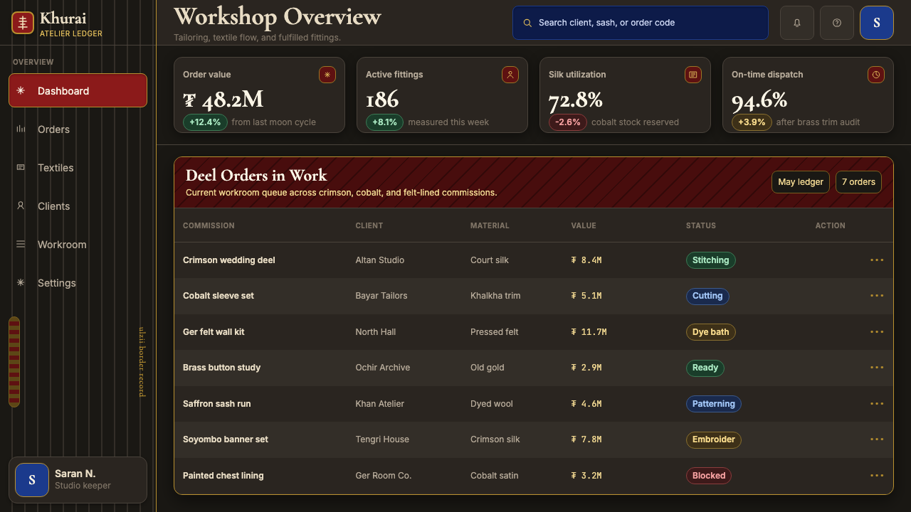
For web interfaces, the system is well-suited to landing pages, editorial surfaces, and premium product showcases where the intention is to project depth and cultural specificity. Dashboard and productivity applications are harder contexts — the high decorative density can reduce scanning speed in data-intensive environments. When using the system for a dashboard, restrict decorative border elements to navigation and section headers, and keep data-display areas close to the ground color with only accent-level chromatic marking. Pricing pages work well: the ceremonial weight of the system maps naturally onto the register of presenting options of different value.对于网页界面,体系非常适合登陆页、编辑界面以及意在投射深度与文化特殊性的高端产品展示。仪表板与生产力应用是较难的场景——高装饰密度会降低数据密集环境中的扫描速度。在仪表板中使用本体系时,应将装饰性边框元素限制于导航与分节标题,数据展示区域则保持接近底面色,仅使用强调级色彩标记。定价页面效果很好:体系的礼仪厚重感自然对应展示不同价值选项的调性。
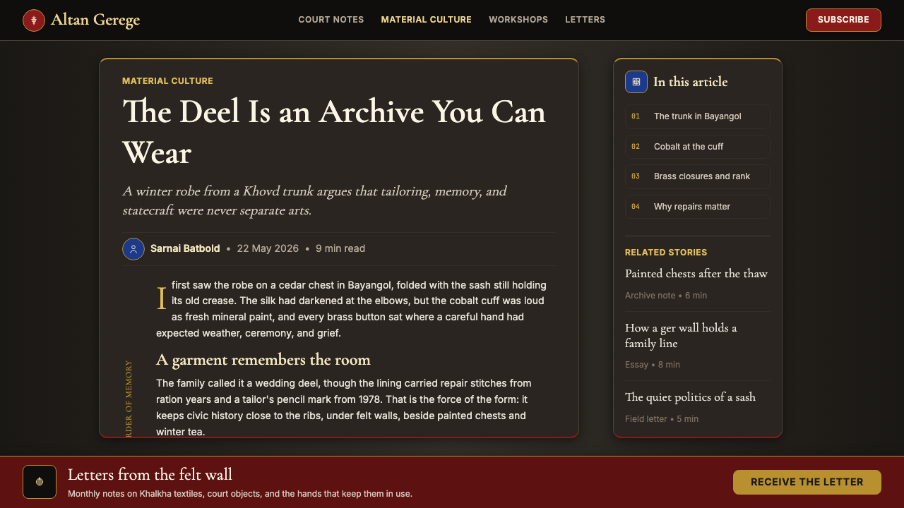
For editorial and marketing work, the system's richness is an advantage. Long-form editorial pages built in this language have a sense of occasion that rewards careful reading — the visual density signals that what is inside is worth the attention the format asks for. Marketing pages can deploy the system's boldness in full: hero sections with crimson grounds and gold display type, feature blocks with cobalt accent rails, and call-to-action elements that use the brass-button closure logic (solid fill, weighty border, ceremonial placement) to signal irreversibility and value.对于编辑与营销内容,体系的丰盛感是优势。以此语言构建的长篇编辑页面有一种值得细读的庄重感——视觉密度传递出内容值得这种形式所要求的专注。营销页面可以全力部署体系的大胆感:深红底面配金色展示字体的英雄区块、带钴蓝强调色轨道的特性区块,以及运用铜扣逻辑的行动召唤元素(实心填充、厚重边框、礼仪性置放)来传递不可逆转感与价值感。
The most common mistake when applying this system is treating the decorative elements as interchangeable ornament rather than structured vocabulary. The endless-knot border and the soyombo glyph are not generic Asian motifs — they carry specific cultural valence that should be used precisely. Placing them arbitrarily as background texture or fill decoration is visually incorrect and culturally disrespectful. Similarly, fighting the system's dark-ground premise by introducing large light-ground sections destroys the enclosed, ceremonial quality that makes the system distinctive. If a use case genuinely requires a predominantly light interface, this system is not the right choice — there are better tools for that job.应用这套体系时最常见的错误,是将装饰元素视为可互换的装饰物,而非有结构的词汇。无尽结边框与索永布字符不是泛化的亚洲纹样——它们携带着特定的文化分量,应当精确使用。将它们随意用作背景肌理或填充装饰,在视觉上是错误的,在文化上是不尊重的。同样,通过引入大面积浅色区域来对抗体系的深色底面前提,会破坏使体系具有独特性的内敛、礼仪品质。如果某个使用场景确实需要以浅色界面为主,这套体系并非正确的选择——那种工作有更合适的工具。
See the Mongolian Deel & Ger Felt design system →查看 Mongolian Deel & Ger Felt 完整设计系统 →
Mongolian Deel & Ger Felt — FAQMongolian Deel & Ger Felt · 常见问题
Is this system appropriate for non-Mongolian brands, or does it risk cultural appropriation?这套体系适合非蒙古品牌使用吗?是否有文化挪用的风险?
The question is genuine and worth taking seriously. The system works best when the cultural register is earned or contextually appropriate — a platform serving Mongolian users, a brand with demonstrated material connection to Central Asian craft traditions, a cultural institution mounting an exhibition, or a product whose values (heritage, craft, depth, ceremony) authentically align with the system's source culture. The risk of appropriation increases when the decorative elements are used as pure exotic ornament without any contextual grounding. A reasonable heuristic: use the geometric structure and chromatic grammar freely, but deploy specific motifs like the soyombo or the ulzii knot with intentionality — knowing what they mean and choosing them because that meaning serves the work.这个问题是真实的,值得认真对待。当文化调性是有依据或语境适当时,体系效果最佳——服务于蒙古用户的平台、与中亚工艺传统有真实材料联系的品牌、举办展览的文化机构,或其价值观(传承、工艺、深度、礼仪)真实地与体系源文化对齐的产品。当装饰元素被用作纯粹的异域装饰物而缺乏任何语境基础时,挪用风险就会增加。一个合理的判断标准:自由运用几何结构与色彩语法,但以意图性部署索永布或乌力吉结等具体纹样——了解它们的含义,并因这种含义服务于作品而选择它们。
How does this system handle light-mode requirements?这套体系如何处理浅色模式的需求?
The system is canonically dark-ground. A light inversion is possible but requires significant re-calibration: on a cream or parchment ground, crimson remains workable but old gold nearly disappears (it reads as pale straw rather than warm metal), and the sense of enclosed ceremonial depth that defines the system is substantially reduced. If a light-mode variant is required, the most successful approach is to treat it as a fundamentally different visual register — using the same geometric motifs and border logic but rebuilding the chromatic relationships from scratch for the light context. The dark and light modes should not be generated by simple color inversion; they should be designed as parallel systems that share motif vocabulary but not color relationships.这套体系的规范状态是深色底面。浅色翻转版本是可能的,但需要大幅重新校准:在奶油色或羊皮纸底面上,深红仍可行,但古金几乎消失(它读来像淡稻草色而非温暖金属色),而定义体系的内敛礼仪深度感也会大幅减弱。如果需要浅色模式变体,最成功的方式是将其视为根本不同的视觉层——使用相同的几何纹样与边框逻辑,但为浅色语境从头重建色彩关系。深色与浅色模式不应通过简单的色彩反转生成;它们应当被设计为共享纹样词汇但不共享色彩关系的平行体系。
Can this system work alongside a more neutral or minimal system in a multi-brand context?在多品牌语境中,这套体系能否与更中性或极简的体系并用?
Yes, but the combination requires a clear hierarchy of contexts. Mongolian Deel & Ger Felt is a high-signal system — it broadcasts cultural identity loudly and continuously. In a multi-brand or multi-product context, it works best as the governing system for one defined context (a premium tier, a cultural sub-brand, a specific product line) rather than as a component layer mixed with neutral systems across the same surface. The boundary between the systems should be absolute: where the ceremonial dark-ground language ends, the neutral system begins, with no gradual transition or mixed-register elements.可以,但这种组合需要清晰的语境层级。蒙古袍与毡房毡布是一套高信号体系——它持续而响亮地广播文化身份。在多品牌或多产品语境中,它最适合作为某一明确语境的主导体系(高端层级、文化子品牌、特定产品线),而非作为组件层与中性体系在同一界面上混合。体系之间的边界应当绝对明确:礼仪性深色底面语言结束之处,中性体系开始,之间没有渐进过渡或混合调性元素。
How should the decorative border elements be scaled across different viewport sizes?装饰性边框元素应当如何在不同视口尺寸之间缩放?
The border logic of this system is structural rather than decorative, so it should scale with content rather than being fixed at an absolute weight. At large viewport sizes, borders can be generous — mirroring the wide embroidered hems of a formal deel. At mobile or small viewport sizes, borders should thin proportionally, but they should not disappear: the border is the organizational device, and removing it entirely to 'clean up' a mobile view destroys the system's compositional grammar. A useful rule of thumb: the border should remain visible and rhythmically consistent at all sizes, but its visual weight relative to the content area should remain roughly constant across breakpoints.这套体系的边框逻辑是结构性的而非装饰性的,因此它应随内容缩放,而非固定于绝对粗细。在大视口尺寸下,边框可以宽厚——镜像正式蒙古袍宽阔的刺绣衣边。在移动端或小视口尺寸下,边框应按比例变细,但不应消失:边框是组织性装置,为了「整洁」移动端视图而完全去除它,会破坏体系的构图语法。一个实用的判断准则:边框在所有尺寸下都应保持可见且有节奏感,但其相对于内容区域的视觉重量应在各断点之间保持大致恒定。
What distinguishes this system from other dark-luxury or ornamental dark aesthetics?这套体系与其他深色奢华或装饰性深色美学有何区别?
The distinguishing factor is cultural specificity and symbolic precision. Generic dark-luxury aesthetics typically draw on Art Deco geometry, Western haute couture black, or undefined 'premium dark' conventions — they signal luxury without cultural content. This system signals a specific place, time, and material culture: the Mongolian steppe, several centuries of textile and lacquerwork tradition, and the heraldic color logic of deel robes and ger painting. The motifs are not interchangeable with other ornamental systems — a soyombo is not a mandala, an ulzii knot is not a Celtic knot, a Mongolian border band is not a Greek meander. Used with knowledge and intention, this specificity is the system's primary differentiating value.区别因素是文化特殊性与象征精确性。泛化的深色奢华美学通常借鉴装饰艺术几何、西方高定时装的黑色,或未经定义的「高端深色」惯例——它们传递奢华感而无文化内容。这套体系传递的是一个具体的地点、时代与物质文化:蒙古草原、数个世纪的纺织与漆器传统,以及蒙古袍与蒙古包彩绘的纹章式色彩逻辑。这些纹样与其他装饰体系不可互换——索永布不是曼陀罗,乌力吉结不是凯尔特结,蒙古边饰带不是希腊回纹。以知识与意图使用,这种特殊性是该体系的首要差异化价值。
Related design styles相关设计风格
 Costa Rican Oxcart Sarchí 1900Geometry sings. Fire red, cobalt, lemon and black outlines turn the wheel int…几何在歌唱。火红、钴蓝、柠黄与黑描边让车轮成为法则。
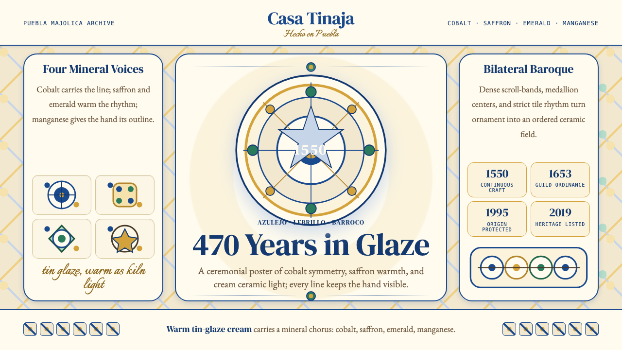 Talavera Poblana CeramicBaroque craft breathes. Cobalt scrollwork on warm tin-glaze cream frames stri…巴洛克手工有呼吸。钴蓝卷草在暖锡釉米底上框出对称。
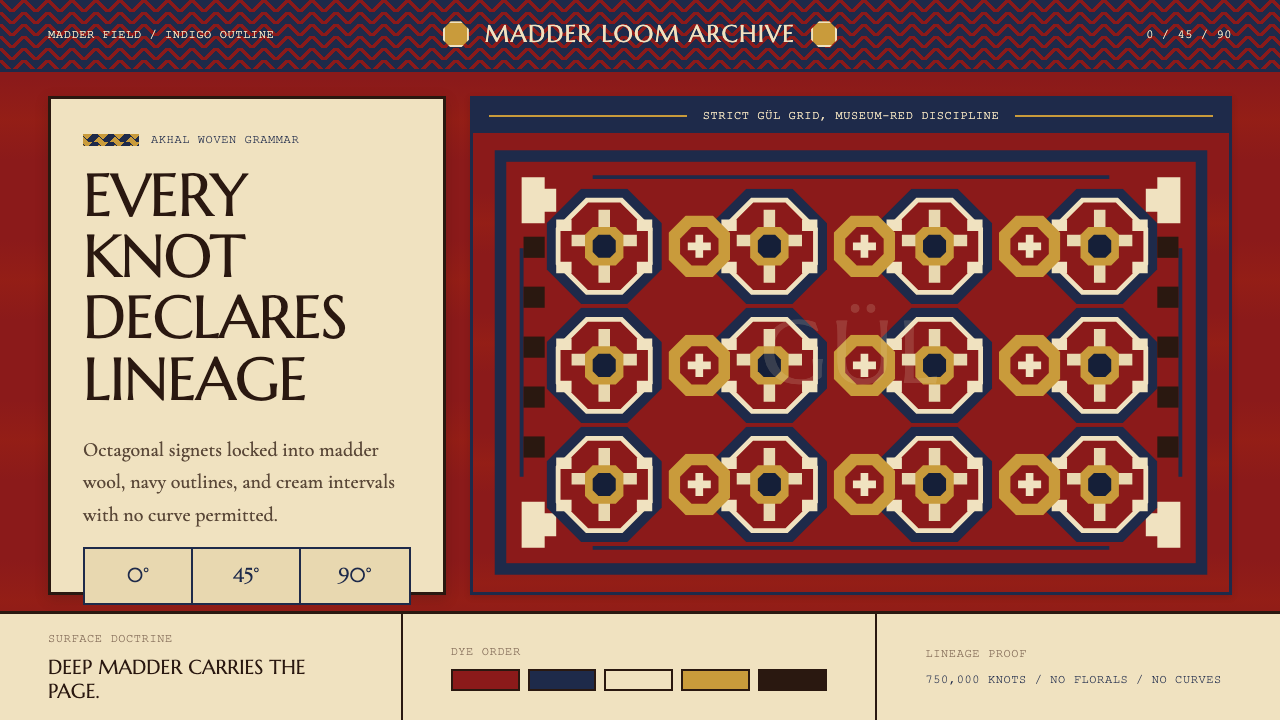 Turkmen Tekke Carpet (Gül Medallion)Disciplined red geometry. Madder field, indigo outlines, cream gül grid.红色几何有纪律。茜草红底、靛蓝线、奶白格尔阵列。
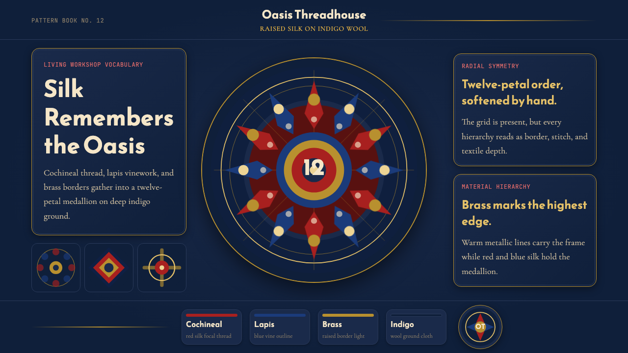 Uyghur Xinjiang Suzani EmbroiderySilk glows like memory. Cochineal and lapis medallions orbit brass on indigo…丝线像记忆发光。靛蓝羊毛上,胭脂红与青金石纹章环绕黄铜。
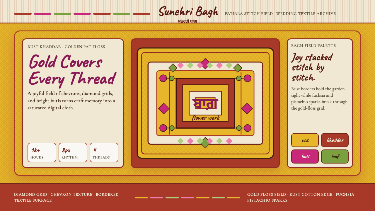 Punjabi Phulkari (Floral Bagh)Joyful density wins. Gold chevrons, rust borders, fuchsia-pistachio butis fil…喜庆密度取胜。金色人字纹、锈红边框与紫红开心果花点铺满画面。
 Sindh Ajrak Block PrintAncient cloth feels exact. Indigo fields, madder stars, and cream grids repea…古老棉布也精准。靛蓝底、茜红星、米白格反复如雕版。