What is Toraja Pa'ssura' Carving?
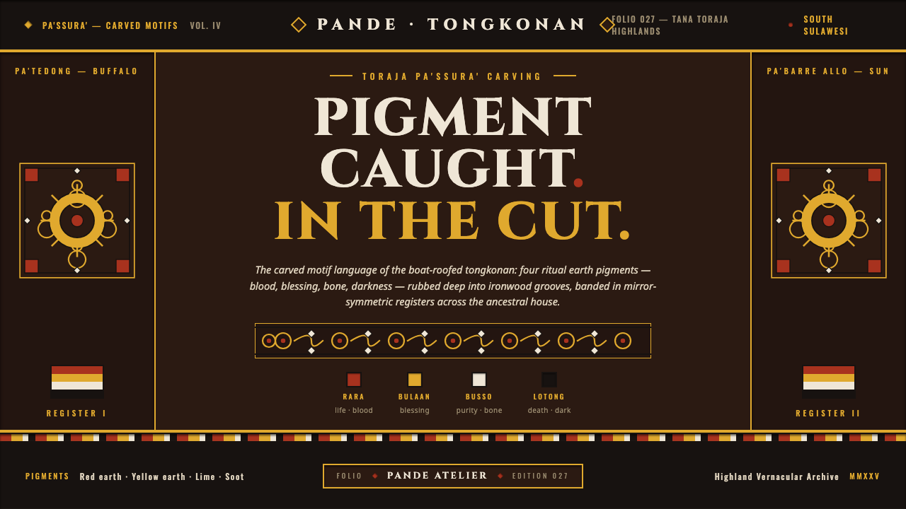
Pa'ssura' makes color feel excavated rather than applied — bright earth pigment caught inside dark ironwood, held in dense symmetry and ritual code.
Toraja Pa'ssura' Carving in brief
Toraja pa'ssura' is the carved-motif language of the tongkonan, the boat-roofed clan houses of Tana Toraja in highland Sulawesi. Its visual identity comes from tight interlocking spirals, geometric registers, dark-stained ironwood, and four natural earth pigments worked into deep incised grooves. The result is not a painted surface but a carved one: color appears where the material has been cut away.
Translated to a screen, the system depends on the tension between a near-black recessed-wood ground and bright earth color locked into hard-edged relief. The composition should feel dense, deliberate, and axially balanced, with motifs repeating across a facade-like field. Red signifies life, yellow divine favor, white purity, and black death, so color is never merely decorative. Every band, groove, and pigment mark should feel connected to structure and meaning.
The style is strongest when its material logic remains visible. Flat fills should suggest pigment rubbed into cuts; borders should read as carved registers; shadows should be crisp and shallow, like relief catching light. The screen may be smooth, but the visual language should imply pressure, grain, recess, and hand-work. Pa'ssura' is therefore a study in controlled density: intricate at close range, ordered from a distance, and always grounded in the darkness of the wood.
Where does Toraja Pa'ssura' Carving come from?
Pa'ssura' belongs to a pre-1900 living tradition rooted in Tana Toraja, South Sulawesi, Indonesia. It is inseparable from the tongkonan, whose boat-shaped roofs and clan-house identity provide the architectural setting for the carved language. The motifs are not isolated graphic ornaments; they form part of a facade system in which bands, panels, and repeated signs establish a public visual order.
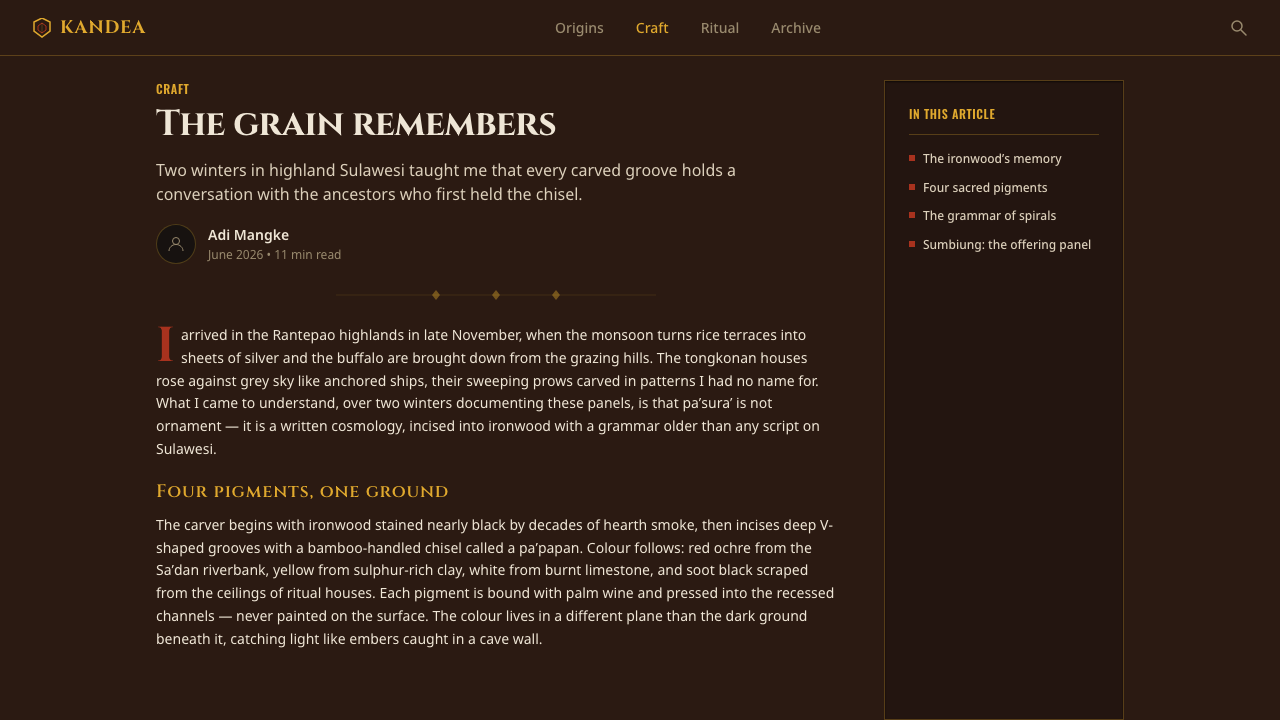
The craft is carried by Toraja master carvers, known as pande, and by artisans working on tongkonan facades. Their process begins with dark-stained ironwood and a controlled act of incision: spirals and geometric registers are cut into the surface, then natural pigments are rubbed into the grooves. The darkness of the wood gives the colors their force, while the cuts determine where color can remain. Relief, pigment, and architecture operate as one system.
The tradition is associated with Toraja vernacular architecture and Austronesian relief carving. Antique panels documented around 1900–1920 show the durability of this carved-motif language, but the source describes pa'ssura' as a living tradition rather than a museum style. A responsible digital interpretation should therefore preserve its material sequence — dark wood first, incision second, pigment third — and its coded use of color, instead of reducing it to a generic pattern or an exotic surface treatment.
What defines the Toraja Pa'ssura' Carving look?
Recessed Earth Color
Color should appear embedded in the ground rather than floating above it. Red, yellow, lime-white, and soot-black pigments sit inside dark grooves, creating a palette that feels mineral, rubbed, and materially bound. The strongest compositions let the wood remain dominant and use brightness as a signal emerging from the recesses.
Incised Relief
Edges are hard and intentional. Motifs should suggest cuts made by a tool: narrow channels, stepped contours, and shallow relief that catches light without becoming glossy or sculptural. The visual depth is structural, not atmospheric. A surface may imply grain and pressure, but it should never dissolve into soft texture.
Interlocking Motifs
Pa'ssura' relies on spirals and geometric registers that lock into one another. The eye should travel through connected bands rather than encounter isolated icons. Repetition creates continuity, while small changes in direction keep the pattern alive. The motif field should feel woven by incision, even though its vocabulary is carved and geometric.
Axial Symmetry
The composition is dense but not chaotic because it is organized around a visible axis. Mirrored registers, paired spirals, and balanced color interruptions give the facade its stability. Symmetry should feel constructed through labor and alignment, not produced by a sterile digital mirror. Slight material variation can preserve the sense of a hand-cut surface.
Ritual Color Code
Color carries a symbolic reading: red for life, yellow for divine favor, white for purity, and black for death. This makes palette decisions inseparable from hierarchy. A color should not be added simply to fill an empty area. Its presence should mark vitality, blessing, clarity, or mortality, while the dark ground holds these meanings in a single architectural field.
Dense Field, Clear Breath
The carved field can be richly occupied, but its surrounding space should remain calm. Density belongs inside the registers; breathing room belongs around the registers. On screen, this contrast prevents the pattern from becoming wallpaper. Quiet margins, restrained typography, and carefully isolated motifs allow the intricate work to remain legible and ceremonial.

Who shaped Toraja Pa'ssura' Carving?
The pande are the central makers of the pa'ssura' language. Their work joins incision, pigment, and architectural placement into a single practice. In a digital interpretation, they represent the discipline of making every groove purposeful and every color materially anchored.
The artisans who work on tongkonan facades give pa'ssura' its architectural scale. Their contribution is not merely the carving of individual motifs but the arrangement of registers across a clan house, where repetition and symmetry make the surface read as a unified structure.
Pa'ssura' itself is a cultural figure within the system: a living tradition linking Toraja vernacular architecture, Austronesian relief carving, dark ironwood, and coded earth pigment. Treating it as a system rather than a decorative asset keeps the digital result connected to its source.
How do you use Toraja Pa'ssura' Carving today?
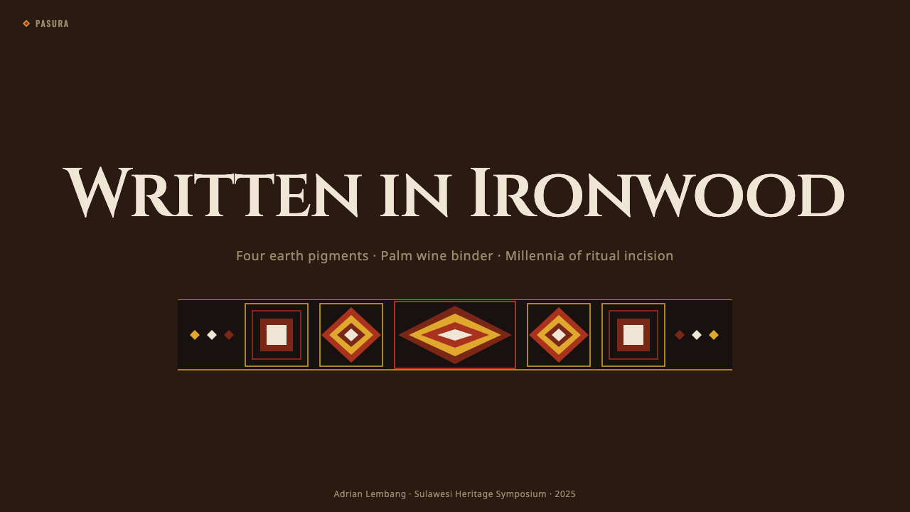
For presentation covers, use the near-black wood ground as the primary field and let one carved register or mirrored motif enter from an edge. The title should be clear and restrained, with the pattern carrying atmosphere rather than competing for attention. Content slides can use smaller carved bands as section markers, framing devices, or quiet anchors around text. The contrast should be between dense ornamented structure and calm reading space.
For data slides, treat charts as carved registers rather than floating software objects. Bars, rings, or directional marks can be organized around a strong axis, with color reserved for meaningful distinctions. Red may signal life or activity, yellow a favorable condition, white clarity, and black absence or mortality where the subject makes that reading appropriate. The wood ground should remain visible so the slide does not become a bright infographic pasted onto darkness.
For web dashboards and pricing pages, pa'ssura' works best when the interface has a clear architectural frame. Use dark surfaces, hard-edged borders, recessed panels, and repeated horizontal or vertical bands to establish order. Cards can feel like carved compartments, while selected states emerge through bright pigment accents. Pricing tiers should be differentiated through hierarchy and coded color, not through a collection of unrelated decorative illustrations.
For editorial and marketing work, the style supports strong campaign covers, cultural essays, product stories, and identity systems that need a sense of heritage and craft. A headline can sit in a quiet field beside a concentrated motif band, while long-form pages alternate between dark wood-like sections and open reading areas. Marketing imagery should emphasize material, incision, and pigment; the message becomes more credible when the design suggests a real making process rather than a generic ethnic pattern.
The common mistake is to place bright red, yellow, white, and black shapes on a light background and call the result pa'ssura'. That reverses the system's logic. The color must feel caught in a cut, the dark ground must carry the composition, and symmetry must be built through registers rather than pasted on as an effect. Avoid excessive texture, random pattern mixing, and color used without symbolic or structural purpose.
Toraja Pa'ssura' Carving — FAQ
What is pa'ssura'?
Pa'ssura' is the carved-motif language of the tongkonan, the boat-roofed clan houses of Tana Toraja in highland Sulawesi. It uses interlocking spirals and geometric registers carved into dark-stained ironwood, with natural earth pigments rubbed into the grooves. Its identity comes from the union of architecture, relief, pigment, symmetry, and coded color.
Is pa'ssura' simply a decorative pattern?
No. It is a structured tradition connected to Toraja vernacular architecture and tongkonan facades. Its registers organize a surface, its symmetry establishes order, and its colors carry ritual meanings: red for life, yellow for divine favor, white for purity, and black for death. Treating it as an arbitrary pattern removes the system that gives it significance.
Can this style work on a light background?
It can be adapted, but the result will lose the material tension that defines the system. Pa'ssura' depends on bright pigment being held inside a dark recessed-wood ground. A light version should therefore retain some dark architectural field, deep framing, or carved-register contrast. Without that relationship, the palette risks becoming painted decoration rather than pigment embedded in cut wood.
How should the four colors be used?
Use them as a coded system rather than a complete decorative palette. Red signifies life, yellow divine favor, white purity, and black death. Their use should follow the meaning and hierarchy of the content. The dark ground can remain continuous, while the brighter pigments appear selectively inside grooves, registers, indicators, or focal motifs.
What makes a digital interpretation feel authentic?
Authenticity comes from preserving the sequence and relationships of the source: dark ironwood ground, incised relief, pigment in the cuts, dense axial symmetry, and ritual color. It does not require simulating every grain or adding heavy texture. A restrained screen system with hard edges, clear registers, and meaningful color will feel closer to the tradition than a richly textured surface with no structural logic.
Related design styles
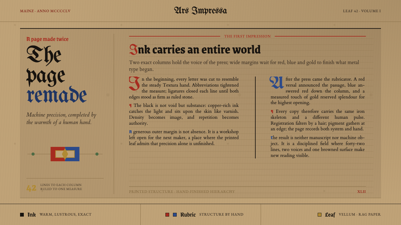 Gutenberg 42-Line BiblePrecision awaits the hand. Dense black columns open into red, blue and gold o…
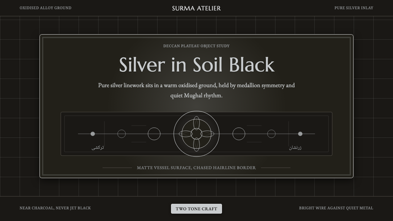 Bidar Bidriware VesselsSoil-black luxury. Crisp silver medallions and hairline borders cut the warm…
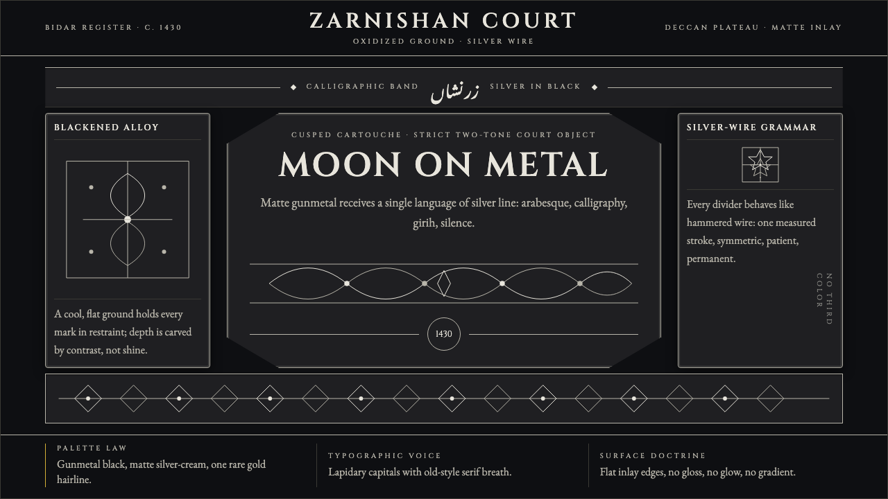 Bidri Deccan MetalworkCourtly darkness, tooled by silver. Cinzel caps and hairline arabesques cut g…
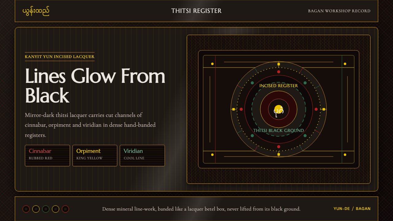 Burmese Yun LacquerwareLacquer glows in cut lines. Cinnabar, orpiment and viridian band a mirror-bla…
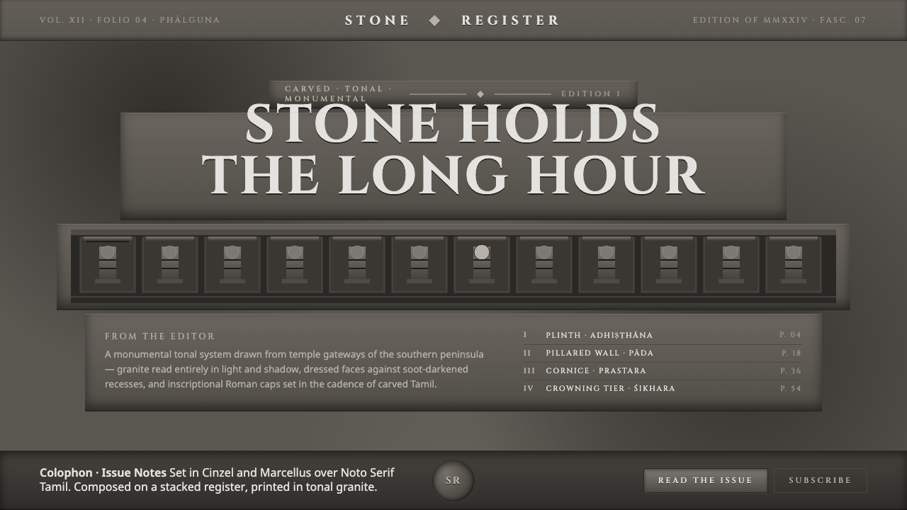 Dravidian Granite GrayscaleRead entirely in grayscale. Soot-dark recesses against dressed granite, Cinze…
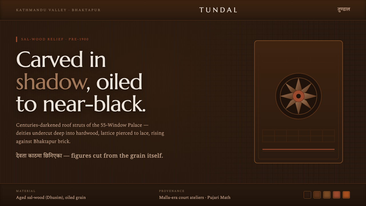 Newar Tundal Strut CarvingCenturies-darkened sal-wood. Carved deities and pierced lattice in mid-brown…