What is Sacred Geometry Platonic Solids?什么是 Sacred Geometry Platonic Solids?
Where ancient Greek mathematics meets contemplative design — warm cream paper, deep-indigo wireframes, and the five Platonic solids treated not as decoration but as philosophy.当古希腊数学与沉思式设计相遇——温润奶油纸面、深邃靛蓝线框,五种柏拉图立体不作装饰,而作哲学。
Sacred Geometry Platonic Solids in briefSacred Geometry Platonic Solids 速览
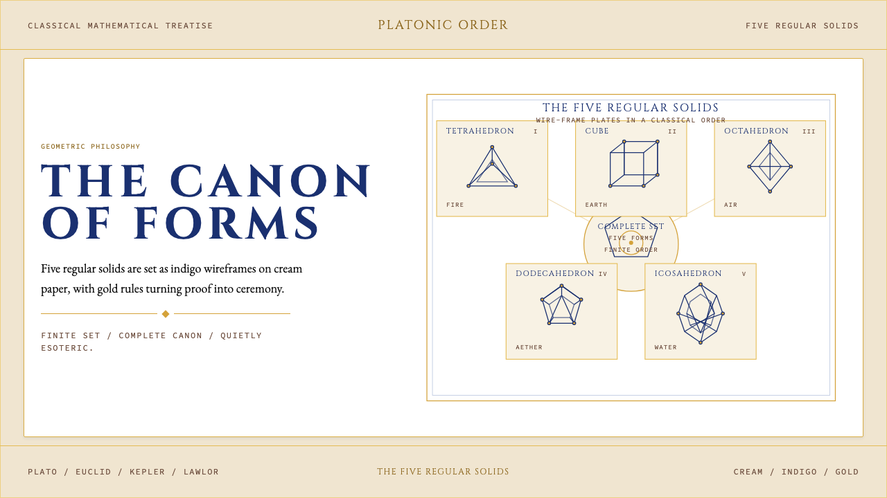
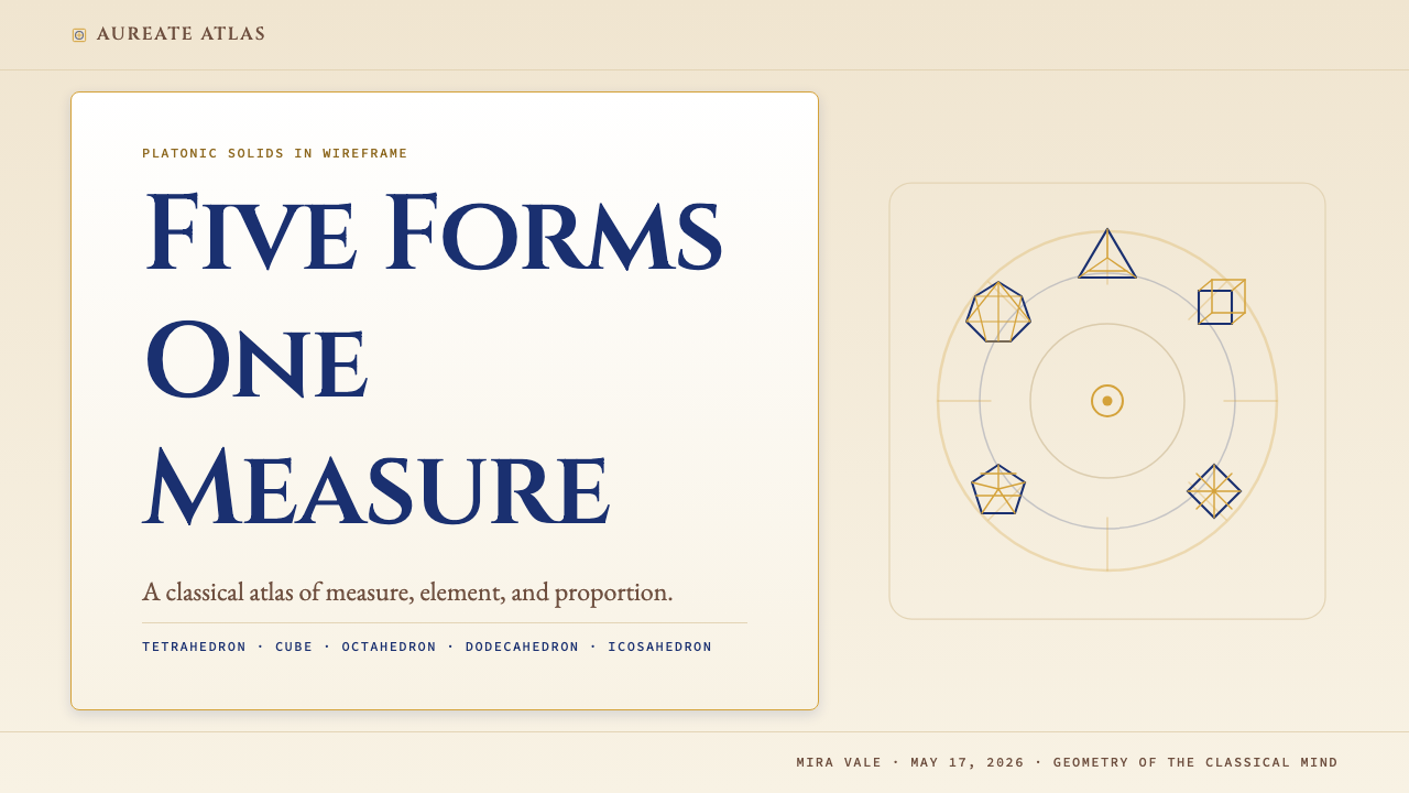
Sacred Geometry Platonic Solids is a design system modeled on the visual language of a classical mathematical treatise. Its palette centers on warm cream grounds, deep-indigo ink, and warm-gold filigree — the colors of aged vellum and fine engraving. The five Platonic solids — tetrahedron, cube, octahedron, dodecahedron, and icosahedron — appear as three-dimensional wireframes, rendered with the precision of Renaissance geometric manuscripts. Every compositional decision communicates that geometry is not ornament but cosmological structure.神圣几何·柏拉图立体是一套以古典数学论著视觉语言为蓝本的设计体系。其色板以温润奶油色底面为核心,辅以深邃靛蓝墨色与温暖金色花饰——如同陈年羊皮纸与精细版画的颜色。五种柏拉图正多面体——四面体、立方体、八面体、十二面体、二十面体——以三维线框形态呈现,具备文艺复兴几何手稿的精确感。每一个构图决定都在传达:几何不是装饰,而是宇宙结构。
The system reads like Plato's Timaeus set in fine metal type: generous letter-spacing, classically-proportioned serif headings, readable body text with open counters, and monospace letterforms reserved for formulae and annotations. Nothing is casual. Every page is measured, restrained, and quietly esoteric — a contemplative object, not a promotional screen. The aesthetic belongs to the tradition of the illustrated scientific folio: diagrams carry the same weight as prose, and white space is not emptiness but silence.整套体系读来如同活字排印的《蒂迈欧篇》:宽裕的字距、比例典雅的衬线大字、行文流畅的正文、等宽字形专用于公式与注释。没有任何随意之处。每一页都度量分明、克制内敛、幽然出世——是供人凝思的器物,而非推销用的屏幕。这一美学归属于图解科学对开本的传统:图表与文字具有同等分量,留白不是虚空,而是沉默。
Unlike maximalist mystical design that reaches for fantasy through texture and illustrative excess, this system achieves its sense of the sacred through precision and restraint. The wireframe solids are never filled with color — they remain structural, transparent, almost diagrammatic. This discipline is what separates the style from decorative geometry: the solids are shown as Euclid would have drawn them, not as a poster artist would embellish them.与那些借助繁复纹理和插画堆砌来营造神秘感的极致风格不同,这套体系通过精确与克制来实现神圣之感。线框立体从不以色彩填充——它们始终是结构性的、透明的、近乎示意图式的。正是这种自律将此风格与装饰性几何区别开来:这些正多面体按照欧几里得的方式呈现,而非海报艺术家的装点方式。
See the Sacred Geometry Platonic Solids design system查看 Sacred Geometry Platonic Solids 完整设计系统
Where does Sacred Geometry Platonic Solids come from?Sacred Geometry Platonic Solids 从何而来?
The Platonic solids take their name from Plato's dialogue Timaeus, written around 360 BCE, in which the philosopher assigned each of the five regular convex polyhedra to one of the classical elements: the tetrahedron to fire, the cube to earth, the octahedron to air, the icosahedron to water, and the dodecahedron to the cosmos itself. This was not casual metaphor — it was a cosmological claim. Plato argued that the universe was fundamentally geometric, that the material world was composed of triangular faces arranged into these five perfect forms, and that understanding the solids was therefore a form of understanding creation. The mathematical rigor of the Timaeus established the Platonic solids as objects of both scientific inquiry and philosophical veneration for the next two millennia.柏拉图立体得名于柏拉图约写于公元前360年的对话录《蒂迈欧篇》。在这篇对话中,哲学家将五种正凸多面体分别对应古典元素:四面体对应火,立方体对应土,八面体对应气,二十面体对应水,十二面体对应宇宙本身。这并非随意的隐喻——而是一种宇宙论主张。柏拉图论证宇宙在根本上是几何性的,物质世界由三角形面片组合而成的五种完美形态构成,因此理解这些正多面体就是理解造物之道。《蒂迈欧篇》的数学严密性使柏拉图立体在此后两千年间始终是科学探究与哲学崇敬的双重对象。
Euclid's Elements, compiled around 300 BCE, provided the geometric foundation that Plato's cosmology required. Book XIII of the Elements — the culminating book — is entirely devoted to the construction and proof of all five Platonic solids. For Euclid, the solids were not philosophical symbols but mathematical objects with provable properties: fixed numbers of faces, edges, and vertices; unique face geometries; inscribable in a sphere. The austere precision of Euclidean proof shaped how later generations would visualize and represent the solids — as diagrams, not illustrations — and this diagrammatic tradition is central to the aesthetic that the design system inherits.欧几里得约于公元前300年编纂的《几何原本》为柏拉图的宇宙论提供了所需的几何基础。《原本》的最后一卷——第十三卷——完全用于证明和构造全部五种柏拉图立体。对欧几里得而言,这些立体不是哲学符号,而是具有可证明性质的数学对象:固定数量的面、棱与顶点,唯一的面几何形,可内切于球。欧几里得证明的朴素精确性塑造了后世如何视觉化与呈现这些立体——作为图示,而非插画——这一图示传统正是这套设计体系所继承的美学核心。
During the Renaissance, the Platonic solids experienced a dramatic revival. The Florentine Neoplatonists, led by Marsilio Ficino and Pico della Mirandola, revived Platonic philosophy and with it a deep interest in mathematical mysticism. Luca Pacioli's De Divina Proportione (1509), illustrated by Leonardo da Vinci, presented the solids in meticulous perspective drawings that combined mathematical accuracy with artistic mastery. These images — solid edges rendered as fine lines, interiors left open or shown as skeletal wireframes — became the visual archetype for all subsequent sacred geometry illustration. The Renaissance understanding of the solids as simultaneously scientific fact, artistic subject, and spiritual symbol is precisely the blend that the design system cultivates.文艺复兴时期,柏拉图立体经历了一次戏剧性的复兴。以马尔西利奥·费奇诺和皮科·德拉·米兰多拉为代表的佛罗伦萨新柏拉图主义者复兴了柏拉图哲学,并由此唤起了对数学神秘主义的深切兴趣。卢卡·帕乔利的《神圣比例》(1509年)由列奥纳多·达芬奇配图,以精确的透视图展现了这些立体,将数学准确性与艺术造诣融为一体。这些图像——棱线以细线勾勒、内部留空或呈现骨架线框——成为此后所有神圣几何插图的视觉原型。文艺复兴对立体的理解——同时作为科学事实、艺术题材与精神象征——正是这套设计体系所培育的那种融合。
Johannes Kepler, writing in Mysterium Cosmographicum (1596), attempted to model the orbits of the six then-known planets using a nested arrangement of the five Platonic solids. Though his planetary model proved incorrect, the ambition of the project — to find a geometric key to cosmic order — exemplifies the tradition of treating the solids as profound, not merely curious, mathematical objects. Robert Lawlor's Sacred Geometry: Philosophy and Practice (1982) brought this long tradition into the late twentieth century, arguing that geometric proportion underlies art, architecture, and nature across cultures. Lawlor's work, along with the broader sacred geometry revival of the 1970s and 1980s, established the visual vocabulary — cream-toned paper, precise line drawings, contemplative layout — that the design system directly channels.约翰内斯·开普勒在《宇宙的神秘》(1596年)中尝试用五种柏拉图立体的嵌套排列来模拟当时已知的六颗行星轨道。尽管他的行星模型后来被证明有误,但这一宏图——寻找宇宙秩序的几何密钥——完美诠释了将这些立体视为深刻而非仅是奇妙的数学对象的传统。罗伯特·劳勒的《神圣几何:哲学与实践》(1982年)将这一绵延已久的传统带入二十世纪末,论证几何比例在跨文化的艺术、建筑与自然中普遍存在。劳勒的著作,以及1970至80年代更广泛的神圣几何复兴运动,确立了这套视觉词汇——奶油色调纸面、精确线条图示、沉思式版面——而这套设计体系正是对这一词汇的直接承接。
What defines the Sacred Geometry Platonic Solids look?Sacred Geometry Platonic Solids 的视觉特征是什么?
Color Palette色板
The palette is built from three sources: a warm cream that reads as aged parchment rather than digital white; a deep indigo that functions as the primary ink color for text, wireframe lines, and structural rules; and a warm gold used sparingly for decorative filigree, ruling lines, and accent marks. The relationship between these three is one of temperature harmony — all three share a warmth that avoids the cold precision of pure scientific illustration. On dark variants, the cream becomes a near-black and the indigo lightens to a mist, while the gold retains its luminosity. Saturation throughout is deliberately restrained; no color reads as vivid or electric.色板由三个来源构建:一种温润的奶油色,读来如陈年羊皮纸而非数字白;一种深邃靛蓝,作为文字、线框与结构线条的主色墨水;一种温暖金色,克制地用于装饰花饰、标尺线与强调标记。三者之间是温度和谐的关系——同共一种温润,避免了纯科学插图的冰冷精确。在深色变体中,奶油色趋近深黑,靛蓝变浅为雾灰,金色则保持其光泽。全局饱和度刻意克制,没有任何颜色显得鲜艳或电光。
Wireframe Solids线框立体
The five Platonic solids appear as three-dimensional wireframe drawings — edges rendered as fine lines, faces left open and transparent. This choice is both historically grounded and philosophically significant: it follows the tradition of Euclid's geometric diagrams and Leonardo's illustrations for De Divina Proportione, where the internal structure of a solid matters as much as its outer silhouette. The wireframes are never filled with color or texture. They are structural objects, shown as if cut from fine wire and suspended above the page. Rendered at varying scales and orientations, they create a sense of rotation and contemplation without simulation.五种柏拉图立体以三维线框图形呈现——棱线以细线勾勒,面片留空透明。这一选择既有历史依据,也有哲学意涵:它沿袭了欧几里得几何图示与列奥纳多为《神圣比例》所作插图的传统,在那里,立体的内部结构与外轮廓同等重要。线框从不以色彩或纹理填充,它们是结构性对象,仿佛以细铁丝弯折后悬浮于页面之上。以不同尺寸和方向呈现时,它们创造出旋转与凝思之感,无需依赖任何模拟效果。
Typography Scale and Spacing字体层级与间距
Typography is set with the generosity of an illuminated manuscript. Headings use classically-proportioned serif letterforms with high stroke contrast — the kind of type associated with Renaissance title pages and mathematical treatises. Body text is set in an open, readable serif with comfortable leading, evoking the feel of a scholarly edition rather than a display piece. Monospace letterforms handle formulae and labels, their uniform rhythm contrasting with the organic variation of the serif text. Letter-spacing is wide throughout — titles are tracked broadly, even subcaptions breathe — reinforcing the contemplative, unhurried register of the system.排版以彩饰手稿的大方感设定。标题采用笔画对比度高、比例典雅的衬线字形——与文艺复兴书名页和数学论著相关联的字体气质。正文以开放易读的衬线字体排印,行距宽裕,令人联想到学术版本而非展示性印刷品。等宽字形处理公式与标注,其均匀节奏与衬线文字的有机变化形成对比。全局字距宽裕——标题大幅追踪,甚至副说明文字也有呼吸空间——强化了这套体系沉思而不急迫的格调。
Gold Filigree and Ruling Lines金色花饰与标尺线
Gold is deployed with the precision and restraint of a scientific instrument maker applying decoration to a brass astrolabe. It appears as thin ruling lines framing text blocks, as fine filigree borders at page margins, and as accent marks separating sections. It never floods a surface or functions as a background tone — it is always linear, always delicate. This use of gold signals the tradition of the illuminated codex and the engraved plate, where gold leaf or burnished detail appeared at the periphery of scholarly diagrams as evidence of care and devotion, not as graphic fill.金色的运用具备科学仪器制造者在黄铜星盘上施加装饰的精确与克制。它以细细的标尺线框住文字块,以精细花饰边框装点页边,以强调标记分隔章节。它从不泛漫于表面,也不作为背景色调——始终是线性的,始终是精致的。这种金色的使用方式指向彩饰抄本与版画铜板的传统,在那里,金箔或抛光细节出现在学术图示的边缘,是用心与虔敬的证明,而非图形填充。
Compositional Structure构图结构
Layouts follow the logic of the scholarly folio: a centered or near-centered text column with generous outer margins for annotations and labels, figures placed with deliberate geometric relationships to the surrounding text, and section breaks marked by horizontal rules rather than whitespace alone. The composition is symmetrical in a classical rather than contemporary sense — centered axes, balanced margins — which distinguishes it clearly from modernist asymmetric grid systems. This classical symmetry contributes to the sense of authority and permanence the style communicates.版面遵循学术对开本的逻辑:居中或接近居中的文字栏,宽阔外边距留给注释与标注,图形以与周围文字具有刻意几何关系的方式放置,章节分隔以横向标尺线而非单纯留白标记。构图在古典而非当代意义上是对称的——居中轴线、平衡边距——这使其与现代主义非对称网格体系形成清晰区别。这种古典对称性强化了这一风格所传达的权威感与永恒感。
Restraint Over Richness克制胜于丰富
The system consistently chooses precision over abundance. A single wireframe solid at large scale communicates more than a field of many small ones. A single gold ruling line carries more weight than a decorative border filled with interlocking pattern. This restraint is not minimalism in the contemporary product-design sense — the system is not sparse or stark. It is measured: every element earns its place by contributing to the sense that geometry is a serious, studied subject, not a visual trend to be consumed.这套体系始终选择精确而非丰盛。一个放大的线框立体传达的信息,多于一片密布的小立体。一条金色标尺线承载的分量,重于一条填满交织图案的装饰边框。这种克制并非当代产品设计意义上的极简主义——这套体系并不稀疏或冷峻。它是有度量的:每一个元素都通过对以下感受的贡献来赢得自己的位置——几何是一门严肃的、经过深思熟虑的学科,而非一种可被消费的视觉潮流。
Absence of Photographic Imagery无摄影图像
Photography and representational illustration have no place in this system. The visual vocabulary is entirely constructed from geometric line, text, and the minimal application of flat color. This exclusion mirrors the tradition of the geometric treatise, where diagrams were the sole visual language because they were the only form of image that could be as precise as mathematical proof. In contemporary application, this means the system relies on its typographic and diagrammatic elements to carry all communicative and aesthetic weight — there is no photographic backdrop, no lifestyle image, no textured scene-setting.摄影图像与具象插画在这套体系中没有容身之处。视觉词汇完全由几何线条、文字与平涂色彩的克制运用构成。这种排除呼应了几何论著的传统——图示是唯一的视觉语言,因为它是唯一能与数学证明同等精确的图像形式。在当代应用中,这意味着这套体系依赖其字体排印与图示元素承载所有传达与审美分量——没有摄影背景,没有生活方式图像,没有纹理化的场景铺陈。

See the Sacred Geometry Platonic Solids design system查看 Sacred Geometry Platonic Solids 完整设计系统
Who shaped Sacred Geometry Platonic Solids?谁塑造了 Sacred Geometry Platonic Solids?
Plato's Timaeus, written around 360 BCE, is the foundational text for all subsequent sacred geometry tradition. In it, Plato assigns each of the five regular polyhedra to a classical element and argues that the cosmos is literally built from geometric forms. This was not metaphor but ontology — Plato believed the material world was constructed from triangular faces assembled into the five perfect solids. The Timaeus established geometry as a branch of philosophy, not merely mathematics, and that dual status — rigorous and contemplative simultaneously — is the precise cultural inheritance that the design system claims.柏拉图约写于公元前360年的《蒂迈欧篇》是此后所有神圣几何传统的奠基文本。在这篇对话中,柏拉图将五种正多面体分别对应古典元素,并论证宇宙从字面意义上由几何形态构成。这并非隐喻,而是本体论——柏拉图相信物质世界由组合成五种完美立体的三角形面片建构而成。《蒂迈欧篇》将几何确立为哲学的一个分支,而不仅仅是数学,正是这种双重地位——同时严格且沉思——是这套设计体系所承接的文化遗产。
Euclid's Elements, compiled around 300 BCE, provides the mathematical proof structure that transforms the Platonic solids from philosophical speculation into rigorously demonstrated geometry. Book XIII, the final and culminating book, constructs all five solids from first principles and proves their completeness — that no other regular convex polyhedra exist. The Euclidean tradition of diagram-as-proof, where a figure is not illustrative but argumentative, is the direct ancestor of the diagrammatic visual style the design system employs. The aesthetic of precise, unlabeled geometric construction lines is a visual quotation of Euclidean methodology.欧几里得约于公元前300年编纂的《几何原本》提供了数学证明结构,将柏拉图立体从哲学推测转化为严格证明的几何对象。第十三卷——最后也是最终章——从第一原理出发构造全部五种立体,并证明其完备性——不存在其他正凸多面体。欧几里得图示即证明的传统——图形不是说明性的,而是论证性的——是这套设计体系所采用的图示视觉风格的直接先祖。精确、无标注几何构造线的美学,是对欧几里得方法论的视觉引用。
Pacioli's De Divina Proportione (1509) and Leonardo's illustrations for it represent the moment when the Platonic solids became an art subject as well as a mathematical one. Leonardo drew the solids in open-faced perspective — faces shown as transparent wireframes rather than opaque surfaces — establishing the visual convention that the design system directly inherits. The collaboration between the mathematician and the artist exemplifies the Renaissance belief that geometric proportion was the link between divine order and human beauty. These illustrations, circulated widely through print, made the wireframe solid a recognizable cultural symbol across European intellectual culture.帕乔利的《神圣比例》(1509年)及列奥纳多为其所作的插图,代表了柏拉图立体成为艺术题材的时刻,与此同时它也是数学对象。列奥纳多以开面透视图绘制这些立体——面片呈现为透明线框而非不透明表面——确立了这套设计体系直接继承的视觉惯例。数学家与艺术家之间的合作体现了文艺复兴信念:几何比例是神圣秩序与人类美感之间的纽带。这些插图通过印刷广泛流传,使线框立体成为欧洲知识文化中可辨识的文化符号。
Kepler's Mysterium Cosmographicum (1596) attempted to explain the spacing of planetary orbits by nesting the five Platonic solids inside one another, each inscribed within a sphere corresponding to a planetary orbit. The model proved astronomically incorrect once Kepler himself derived his elliptical orbit laws, but its ambition — to find that the cosmos is secretly a geometric construction — remained deeply influential. Kepler's willingness to pursue this idea with full mathematical rigor, rather than mere poetic intuition, exemplifies the intellectual tradition the design system inhabits: geometry as a discipline serious enough to stake cosmological claims on.开普勒的《宇宙的神秘》(1596年)尝试通过将五种柏拉图立体相互嵌套——每种立体内切于对应行星轨道的球——来解释行星轨道间距。当开普勒本人推导出椭圆轨道定律后,这一模型被证明在天文学上有误,但其雄心——发现宇宙秘密地是一种几何建构——依然影响深远。开普勒以完整数学严密性而非单纯诗意直觉来追求这一想法的意愿,体现了这套设计体系所栖居的知识传统:几何作为一门严肃到足以承载宇宙论主张的学科。
Lawlor's Sacred Geometry: Philosophy and Practice (1982) brought the 2,400-year tradition of mathematical mysticism into the modern design consciousness. The book's visual style — cream-toned paper, precise technical line drawings, meditative layout with generous margins — established the aesthetic vocabulary that contemporary sacred geometry design inherits and updates. Lawlor argued that geometric proportion is a universal language underlying art, architecture, music, and nature across cultures, giving the tradition a cross-cultural legitimacy that extended its influence well beyond Western esotericism. His work effectively defined what sacred geometry looks like for late twentieth and early twenty-first century practitioners.劳勒的《神圣几何:哲学与实践》(1982年)将这一绵延两千四百年的数学神秘主义传统带入现代设计意识。这本书的视觉风格——奶油色调纸面、精确技术线条图示、留白宽裕的沉思式版面——确立了当代神圣几何设计所继承并更新的美学词汇。劳勒论证几何比例是跨文化存在于艺术、建筑、音乐与自然之中的普遍语言,赋予这一传统超越西方秘术的跨文化合法性,使其影响力延伸至更广阔的领域。他的著作在实质上为二十世纪末至二十一世纪初的实践者定义了神圣几何的视觉面貌。
How do you use Sacred Geometry Platonic Solids today?今天怎么用 Sacred Geometry Platonic Solids?
Sacred Geometry Platonic Solids is a high-context, deliberately slow aesthetic — it rewards attention and communicates seriousness, depth, and intellectual credibility. Applying it correctly means understanding that it belongs to the register of the scholarly publication, not the tech launch. It works best for products, events, and communications that genuinely benefit from an association with ancient mathematical tradition: scientific education, philosophy, contemplative practice, premium publishing, archival or heritage institutions, and high-concept creative studios. Applied to contexts that do not share these values, the style reads as costume rather than character.神圣几何·柏拉图立体是一种高语境、刻意缓慢的美学——它回报专注,传达严肃、深度与知识可信度。正确应用它,意味着理解它属于学术出版的语域,而非科技产品发布。它最适用于那些真正能从与古代数学传统相关联中获益的产品、活动与传播内容:科学教育、哲学、沉思修习、高端出版、档案或遗产机构,以及高概念创意工作室。应用于不共享这些价值的语境时,这种风格读来是戏服,而非性格。
For presentation slides, the system lends itself to keynotes and lectures where the speaker wants to position complex ideas within a tradition of serious inquiry. A cover slide benefits from a large wireframe solid centered on the cream ground, with the title in wide-tracked serif type below it and a thin gold ruling line separating title from subtitle. Content slides should treat diagrams and text as co-equal — not slides with bullet points, but pages where a geometric figure and explanatory text occupy the same compositional plane. Data visualizations take on the quality of mathematical diagrams: clean line charts and precisely labeled scatter plots rather than heavily styled infographics.对于演示文稿,这套体系适合主旨演讲与讲座——演讲者希望将复杂想法置于严肃探究的传统之中。封面幻灯片适合将一个大型线框立体居中放置于奶油底面,标题以宽字距衬线字体置于其下,一条细金色标尺线将标题与副标题分隔。内容页应将图示与文字视为同等地位——不是带有列表的幻灯片,而是几何图形与解释性文字占据同一构图平面的页面。数据可视化呈现数学图示的品质:简洁折线图与精确标注的散点图,而非风格繁重的信息图表。
For web interfaces and dashboards, the style suits research tools, scientific platforms, educational portals, and any product where the user is expected to spend extended time reading and thinking rather than quickly scanning and acting. The page structure follows the folio model: a narrow centered column for primary content, wide outer margins for supplementary information, and typographic hierarchy defined by size contrast and spacing rather than color variety. Interactive elements — buttons, links, form fields — should be typographic and linear, with hover states that shift a ruling line's color from indigo to gold rather than introducing animation or shadow effects.对于网页界面与仪表板,这种风格适合研究工具、科学平台、教育门户,以及任何用户被期待花费较长时间阅读与思考而非快速扫描与行动的产品。页面结构遵循对开本模型:主内容以窄居中栏呈现,宽阔外边距容纳补充信息,字体层级由尺寸对比与间距而非色彩多样性来定义。交互元素——按钮、链接、表单字段——应当是字体性的和线性的,悬停状态通过将标尺线颜色从靛蓝变为金色来体现,而非引入动效或阴影效果。
For editorial design — long-form articles, research reports, book interiors — the system is close to its natural habitat. Running text benefits from the wide tracking and generous leading that the style prescribes, making long reading sessions comfortable. Section headers can use the solid's geometry as a visual divider: a small wireframe tetrahedron or octahedron placed at the opening of a section creates spatial rhythm without relying on decorative ornament. Pull quotes and marginalia should be set in the same serif at a lighter weight, placed in the outer margin to preserve the folio-style composition.对于编辑设计——长篇文章、研究报告、书籍内页——这套体系接近其自然栖境。正文得益于这种风格所规定的宽字距与充裕行距,使长时间阅读变得舒适。章节标题可以将立体几何作为视觉分隔符:在章节开头放置一个小型线框四面体或八面体,无需依赖装饰性花饰便能创造空间节奏。引言摘录与边注应以同一衬线字体的较细字重排印,置于外边距以保持对开本式构图。
The most common mistake when applying this style is treating it as a mystical mood board — pulling in starfield backgrounds, gradient auras, or crystalline textures alongside the wireframe solids. This destroys the quality that makes the style distinctive: its analogy to a rigorous academic diagram. The second common mistake is applying it to fast-paced consumer contexts — e-commerce product pages, social media templates, quick-scan dashboards — where its contemplative pace becomes a liability. The third mistake is using the gold liberally as a fill color rather than a line element; gold as background or button color collapses the careful hierarchy the system is built on. Use the style where slowness, precision, and intellectual weight are genuinely desirable, and use it sparingly enough that the wireframe solids retain their capacity to stop a viewer and prompt a second look.应用这种风格时最常见的错误,是将其当作神秘氛围情绪板——在线框立体旁边引入星空背景、渐变光晕或水晶纹理。这破坏了使这种风格独特的品质:它对严格学术图示的类比。第二个常见错误是将其应用于节奏快速的消费场景——电商商品页、社交媒体模板、快速扫描仪表板——在那里,它沉思的步调成为负担。第三个错误是将金色大量用作填充色而非线条元素;金色作为背景或按钮颜色会破坏这套体系所建立的精心层级。在缓慢、精确与知识分量真正是可取属性的场合使用这种风格,并保持足够的节制,使线框立体保有其让观者停驻、引发二度审视的能力。
See the Sacred Geometry Platonic Solids design system查看 Sacred Geometry Platonic Solids 完整设计系统
Sacred Geometry Platonic Solids — FAQSacred Geometry Platonic Solids · 常见问题
How is this different from generic 'sacred geometry' or new-age design?这与泛化的「神圣几何」或新纪元风格设计有何不同?
Generic sacred geometry design typically leans into cosmic mysticism through gradient starfields, layered mandalas, neon color, and illustrative excess. Sacred Geometry Platonic Solids is deliberately counter to that tradition. Its reference points are Euclid's diagrams, Leonardo's De Divina Proportione illustrations, and the visual language of the scholarly scientific treatise — not new-age spirituality. The palette is restrained and warm, not vivid and cosmic. The wireframes are structural and diagrammatic, not decorative or glowing. The style communicates intellectual precision that happens to carry spiritual weight, not spiritual atmosphere dressed up in geometry.泛化的神圣几何设计通常借助渐变星空、叠层曼陀罗、霓虹色彩与插画堆砌来传达宇宙神秘感。神圣几何·柏拉图立体刻意与那一传统相对。它的参照点是欧几里得的图示、列奥纳多为《神圣比例》所作的插图,以及学术科学论著的视觉语言——而非新纪元灵性。色板是克制而温润的,而非鲜艳而宇宙感的。线框是结构性的和图示化的,而非装饰性的或发光的。这种风格传达的是恰好承载精神分量的知识精确性,而非以几何装扮的灵性氛围。
Can this style work in digital interfaces, or is it too print-derived?这种风格能用于数字界面吗,还是过于偏向印刷媒介?
The style is rooted in the print tradition of the folio and the engraved plate, which means it requires adaptation for digital contexts. The adaptations that work: replacing physical paper texture with a warm off-white screen background, using thin hairline rules and vector wireframe solids that render crisply at any resolution, and ensuring that the typographic hierarchy is strong enough to guide reading without physical page cues. The adaptations that fail: adding drop shadows or hover glows to the wireframe solids, introducing transition animations that undermine the contemplative static quality of the style, or compressing the generous spacing to fit more content per screen. Digital applications of this style succeed when they resist the temptation to make the interface feel responsive and immediate, and instead commit to the slower register of a fine printed page.这种风格植根于对开本与版画铜板的印刷传统,这意味着它需要为数字语境作出调整。有效的调整:以温润的近白屏幕背景替代实体纸面质感,使用在任何分辨率下都能清晰渲染的细发线与矢量线框立体,以及确保字体层级足够强劲,能够在没有实体页面提示的情况下引导阅读。失败的调整:为线框立体添加投影或悬停光晕,引入破坏这种风格沉思静态品质的过渡动效,或压缩宽裕间距以在每屏内塞入更多内容。这种风格的数字应用在抗拒让界面感觉响应迅速与即时的诱惑时取得成功,转而坚守精美印刷页面较缓慢的语域。
Why are the Platonic solids important — can I replace them with other geometric forms?柏拉图立体为何重要——我能用其他几何形态替代它们吗?
The five Platonic solids are culturally and mathematically specific in a way that other geometric forms are not. They are the only convex polyhedra in which every face is an identical regular polygon — a property that Euclid proved is satisfied by exactly five and no more. Their cultural significance in the Platonic and Neoplatonic traditions, the Renaissance mathematical arts, and two millennia of esoteric geometry gives them a semantic weight that a generic sphere, cube, or pyramid does not carry alone. Using other geometric forms — fractals, nested circles, star polygons — shifts the reference frame toward either modernist geometry or generic sacred geometry illustration. The five solids together, with their historic names and their relationship to each other, are what distinguishes this specific design system from any other geometry-based aesthetic.五种柏拉图立体在文化和数学上具有其他几何形态所不具备的特殊性。它们是唯一的凸多面体,其中每个面都是相同的正多边形——欧几里得证明这一性质恰好由五种且仅由五种立体满足。它们在柏拉图与新柏拉图主义传统、文艺复兴数学艺术以及两千年秘术几何传统中的文化意义,赋予了它们单独的球体、立方体或棱锥所不具备的语义分量。使用其他几何形态——分形、嵌套圆、星形多边形——会将参照框架转向现代主义几何或泛化神圣几何插图。五种立体在一起,以其历史名称和相互关系,正是使这套特定设计体系区别于任何其他以几何为基础的美学的所在。
Does the style work for brands that are not academic or scientific?这种风格适用于非学术或科学领域的品牌吗?
It can, but the fit depends on whether the brand genuinely benefits from association with tradition, depth, and contemplative precision — rather than simply wanting to look learned or esoteric. Luxury goods, fine craft studios, philosophical publishing imprints, and meditation or mindfulness platforms can plausibly borrow this register because their values overlap with what the style communicates. Consumer brands that rely on warmth, accessibility, and visual energy will find the style too austere and remote. Technology brands that want to signal intellectual seriousness can use elements of the system — particularly the typographic conventions and the measured color palette — while perhaps reducing the wireframe solids to background or accent roles. The key test: does the brand benefit from the connotation of ideas that were worth two thousand years of serious attention?可以,但契合度取决于该品牌是否真正得益于与传统、深度和沉思精确性的关联——而非仅仅想要看起来博学或神秘。奢侈品、精细工艺工作室、哲学出版品牌,以及冥想或正念平台,可以合理地借用这一语域,因为它们的价值观与这种风格所传达的内容有所重叠。依赖温暖感、亲近性与视觉活力的消费品牌会发现这种风格过于严肃而疏离。希望传达知识严肃性的科技品牌可以使用这套体系的部分元素——尤其是字体排印惯例与有度量的色板——同时或许将线框立体降格为背景或点缀角色。关键考验:这个品牌是否得益于那些值得两千年严肃关注的思想的联想?
How do I avoid the style looking dated or overly niche?如何避免这种风格看起来过时或过于小众?
The risk of looking dated comes from leaning too heavily on obvious period markers — elaborate filigree borders, overly ornate initial capitals, sepia-heavy color grading that evokes aged paper too literally. The style remains current when it uses the historical vocabulary with restraint: the cream ground reads as warm and considered rather than antique, the gold appears as a precise linear accent rather than a gilding flourish, and the wireframe solids are rendered with contemporary vector precision rather than hand-drawn imprecision. The risk of looking overly niche comes from applying the style without apparent purpose — using sacred geometry as pure aesthetic preference rather than as a system whose values serve the product's communication goals. When the geometry is motivated and the execution is precise, the style reads as authoritative across audiences, not as the private language of a specialist subculture.看起来过时的风险来自于过度依赖明显的时代标志——繁复的花饰边框、过度装饰的首字母大写、过重的棕褐色调色彩处理,字面意义上唤起陈旧纸面。当这种风格以克制方式运用历史词汇时,它保持当代感:奶油底面读来温润而考究,而非古旧;金色作为精确线性点缀出现,而非镀金装饰;线框立体以当代矢量精确度渲染,而非手绘的不精确感。看起来过于小众的风险来自于无明显目的地应用这种风格——将神圣几何用作纯粹的审美偏好,而非一套其价值服务于产品传播目标的体系。当几何形态有其动机、执行又足够精确时,这种风格在各类受众眼中读来具有权威性,而非某个专家亚文化的私有语言。
Related design styles相关设计风格
 Vesalius AnatomyScience feels hand-pressed. Bistre Cinzel, hatchwork, and warm laid paper hol…科学像手压成页。褐黑Cinzel、排线与暖灰褐纸定住气质。
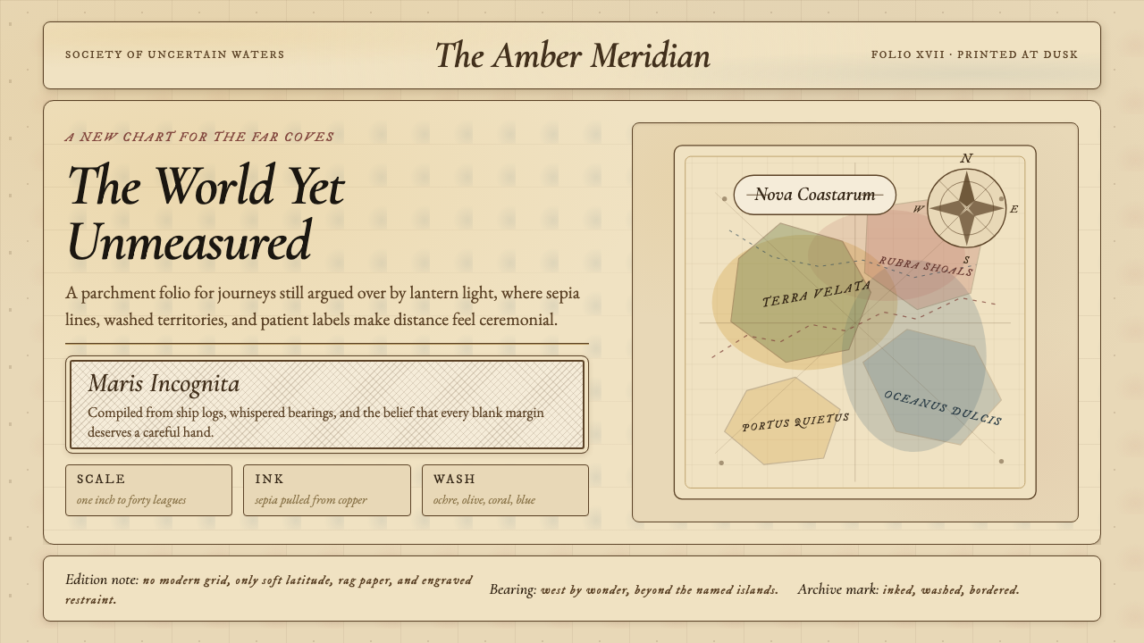 Vintage CartographyDiscovery feels ceremonial. Sepia copperplate on aged parchment, framed by co…发现如仪式。旧羊皮纸上的棕褐铜版线与罗盘几何。
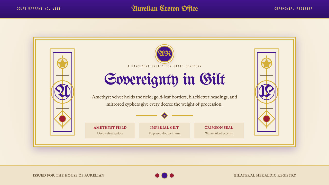 British Royal MonarchyCeremony becomes structure. Amethyst panels, gilt borders, blackletter, mirro…仪式成为结构:紫晶面板、鎏金边框、哥特黑体与镜像纹章。
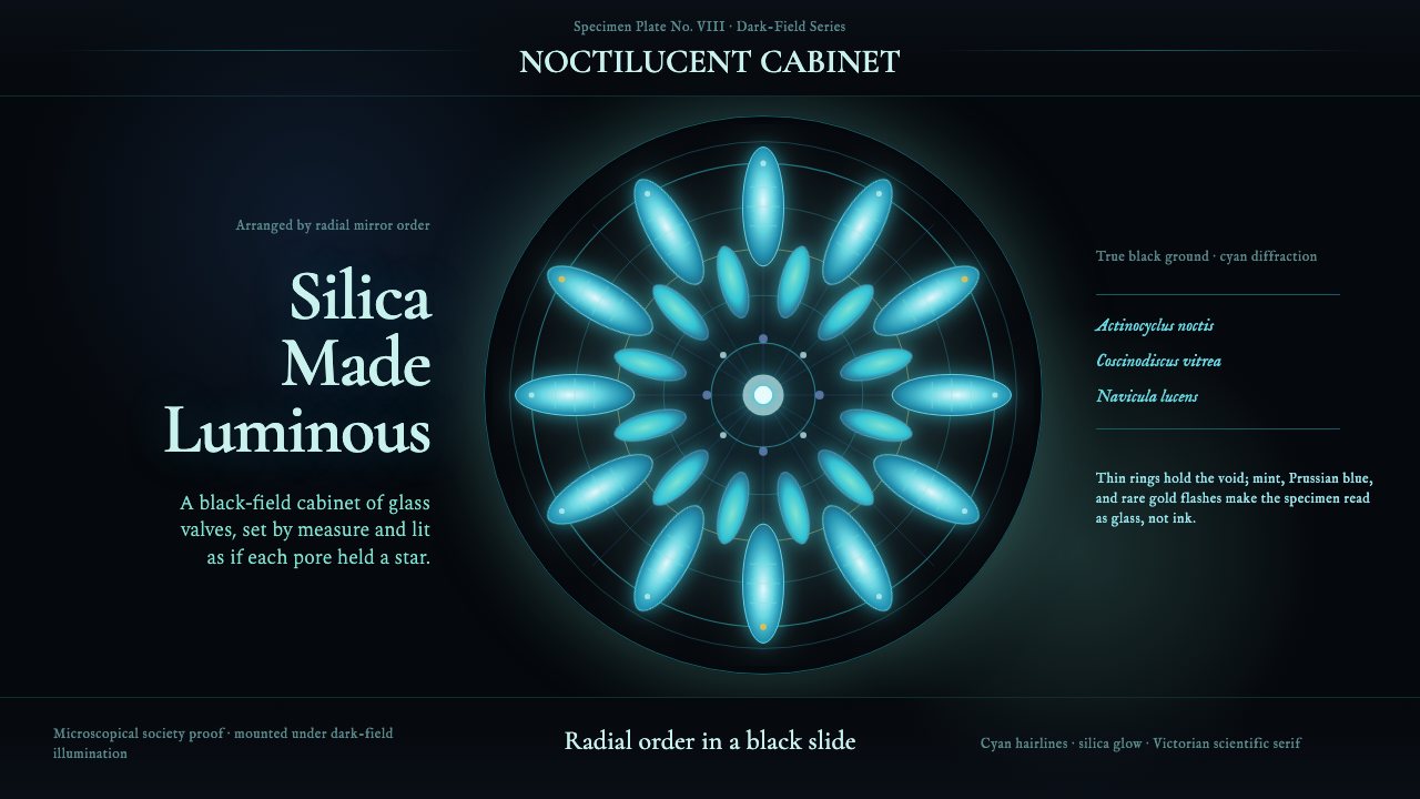 Diatom ArrangementDark-field order. Cyan and mint rosettes glow inside Victorian hairline rings.暗场中的秩序。青蓝与薄荷花环在维多利亚细线圆环内发光。
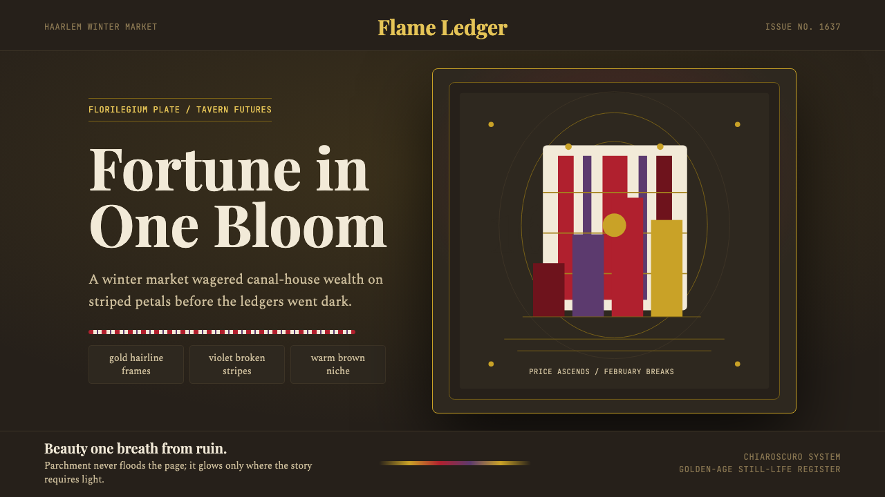 Dutch Tulip ManiaSpeculation burns in shadow. Flame red petals, violet stripes, gold frames on…投机在暗处燃烧:暖棕壁龛中,火红花瓣、紫纹与金框发光。
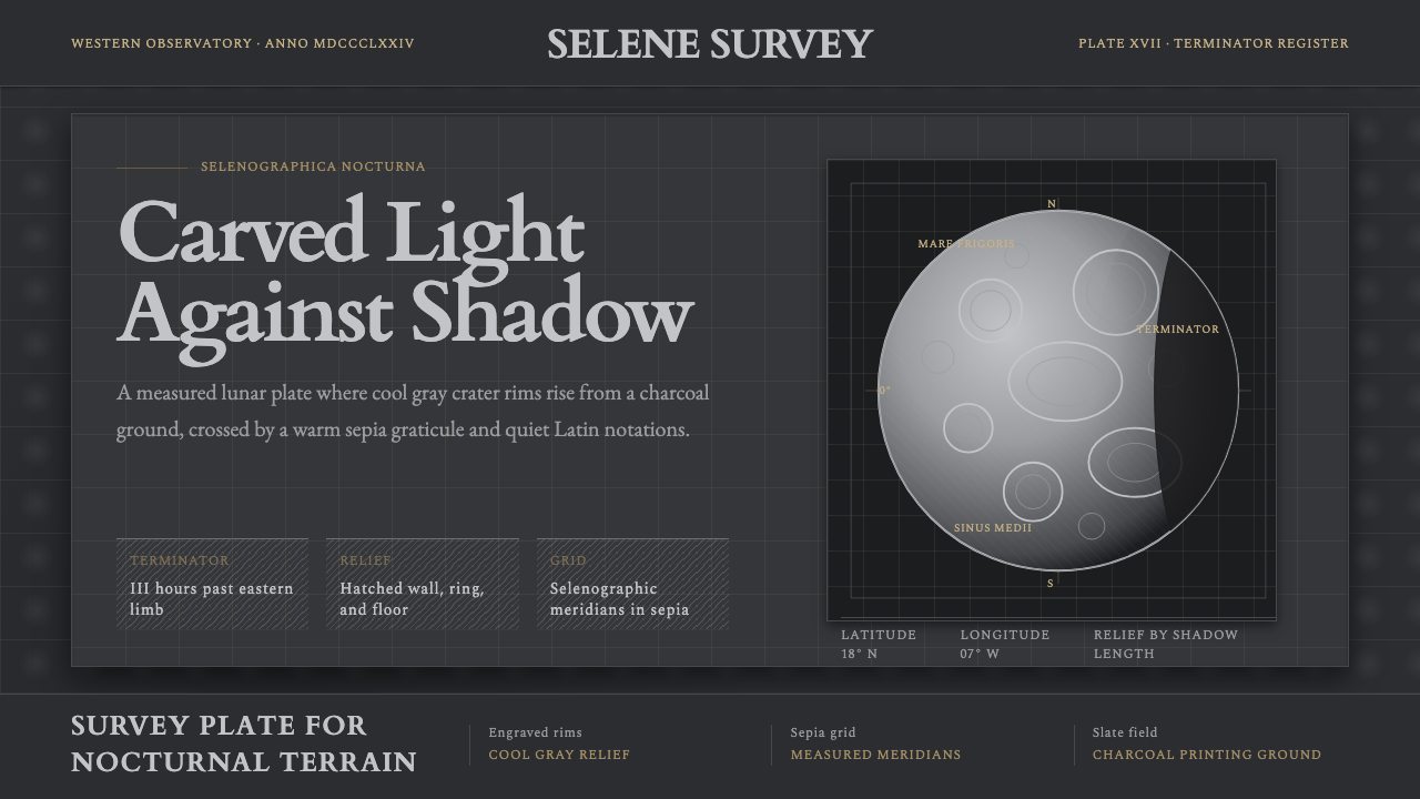 Lunar SelenographyMoonlight becomes measurement. Slate ground, sepia grid, and hatched gray cra…月光成为测量:石板灰底、赭石经纬网、排线灰环形山。