What is Diatom Arrangement?
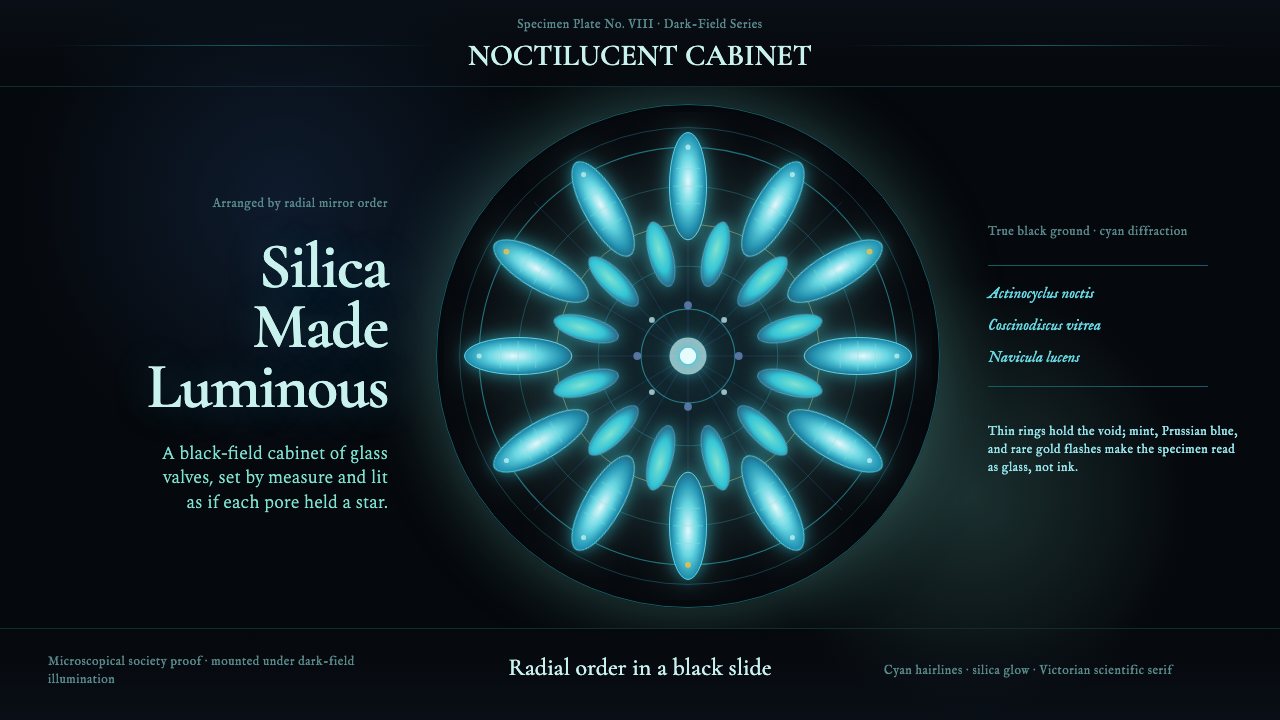
Victorian microscope-mounters turned single-celled algae into jewels — arranging their glass-like silica shells into radial rosettes that glow from within under dark-field illumination. Diatom Arrangement inherits that discipline exactly: luminous forms on a near-black void, mathematical symmetry, and the refined gravity of nineteenth-century scientific typography.
Diatom Arrangement in brief
Diatom Arrangement is a design system rooted in the Victorian practice of ornamental diatom mounting — the art of arranging microscopic silica shells (frustules) of single-celled algae into perfectly symmetrical compositions on a single glass slide. Under dark-field illumination, the black background becomes a void and the frustules glow with structural iridescence, producing blues, cyans, mints, and occasional flashes of gold through the diffraction of light through their finely patterned pores.
The visual logic is that of a scientific instrument turned into an art object. Forms are radially symmetric, jewel-like in their internal luminosity, and framed by concentric hairline rings — the style of Victorian mounting that separated and displayed each rosette. Typography draws from the period's scientific publications: refined serif letterforms with moderate contrast, set with the measured spacing of a natural-history atlas rather than the urgency of a commercial poster.
What distinguishes this system from generic dark-mode design is its commitment to a specific kind of light: not neon glow, not flat-colored shapes on black, but forms that appear to emit cold, structural light from within — the peculiar radiance of biological optics under a microscope. The overall effect is simultaneously antique and precise, scholarly and luminous.
Where does Diatom Arrangement come from?
The art of ornamental diatom mounting emerged in Britain and Germany between roughly 1840 and 1900, carried out by the members of the burgeoning microscopical societies that flourished during the Victorian era. Diatoms — single-celled photosynthetic organisms encased in two-part silica shells called frustules — had been catalogued by European naturalists since the early nineteenth century, but it was the development of the achromatic compound microscope in the 1830s and 1840s that made the fine detail of their pore structures visible for the first time. What microscopists discovered astonished them: each species produced a shell of extraordinary geometric regularity, the rows and hexagonal arrays of pores spaced with a precision that rivalled the finest mechanical engraving.
The practice of arranging multiple frustules into decorative compositions appears to have been pioneered in Germany, most notably by Julius Diedrich Möller of Wedel, who produced elaborately symmetric diatom slides throughout the second half of the nineteenth century. Möller's arrangements — some containing hundreds of individual shells positioned with a single hair or eyelash under a low-power microscope — were regarded as both scientific specimens and demonstrations of extraordinary manual virtuosity. His slides were traded, exhibited at society meetings, and treasured by collectors across Europe and North America. The technical challenge of the work lay not only in the patience required — a complex arrangement might take weeks — but in the optical properties of the shells themselves, which had to be cleaned of all organic matter and dried before they would display their diffraction colours under dark-field illumination.
Dark-field illumination, the technique of lighting a subject from the side so that only scattered and diffracted light reaches the objective, was the key to unlocking the visual drama of diatom arrangements. Under bright-field illumination the shells appear as delicate outlines on a white ground; under dark-field they become self-luminous objects against absolute black, their pore structures acting as natural diffraction gratings and producing the iridescent structural colours that define the aesthetic. This optical transformation — the same biological object becoming something entirely different depending on how light falls on it — is the foundational principle the design system inherits.
By the late twentieth century, the practice of ornamental diatom mounting had all but vanished. It was revived almost single-handedly by Klaus Kemp, a British microscopist who spent decades re-learning the techniques from surviving Victorian slides and from Möller's original illustrated catalogues. Kemp's arrangements, documented in the 2012 short film 'The Diatomist' by Matthew Killip, introduced the aesthetic to a new global audience and established the visual canon — black background, radial symmetry, concentric framing rings, cyan and mint iridescence — that this design system translates into typographic and compositional terms.
What defines the Diatom Arrangement look?
Ground and Light
The foundation of the system is a near-black field — not pure digital black, but a deep void that reads as the absence of light rather than a filled colour. Against this ground, all foreground elements are luminous rather than opaque: they appear to emit light rather than reflect it. This distinction is critical. Forms should look like they are glowing from within, which means they carry their own internal brightness rather than being uniformly filled with a bright colour. The effect is achieved through careful gradation at edges and through the use of cool, slightly desaturated highlights rather than pure white.
Palette: Structural Iridescence
The colour vocabulary derives from the diffraction colours produced by real diatom frustules under dark-field illumination: cyan as the dominant hue, shifting toward mint and pale aquamarine in highlights, with Prussian blue in mid-tones and occasional flashes of warm gold in accent positions. This is not a flat palette but an optical one — colours should read as if they result from light passing through fine structure rather than from pigment applied to a surface. Warm colours (gold, amber) appear sparingly and only as punctuation; the overall temperature is cool and precise.
Radial Symmetry
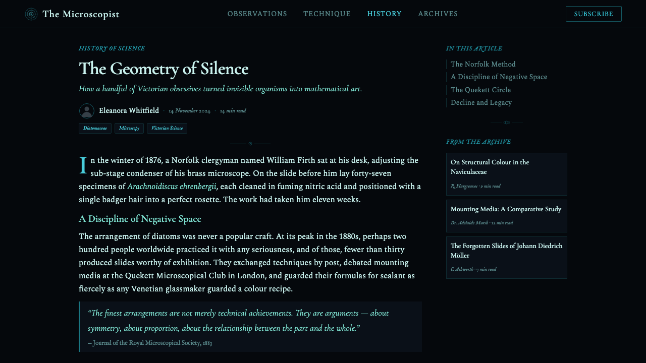
Victorian diatom arrangements were built on radial mirror symmetry — the same logic as a kaleidoscope or a Gothic rose window. Individual frustules were positioned so that the whole composition could be rotated by a set number of degrees and land on itself exactly. This mathematical regularity is the system's spatial principle. Compositions are organized around central points rather than left-to-right axes; layout elements radiate outward from or converge toward a focal hub. Even in rectangular formats (slides, web pages), this radial sensibility should be felt in how visual weight is distributed — pulling toward the centre rather than anchored to corners or edges.
Hairline Rings and Precision Framing
Victorian mounters framed each arrangement within one or more concentric rings drawn with a ruling pen — thin, perfectly circular borders that separated and dignified each composition. This framing device is a signature element of the system. In application, it translates to circular or elliptical outlines of very fine weight, used to contain, separate, or emphasize compositional elements. The rings should read as precision instruments rather than decorative motifs — their function is to impose boundary and order, in the same spirit as the graticule of a scientific eyepiece. Multiple concentric rings, slightly varied in brightness, increase the sense of depth and lens-like focus.
Scientific Serif Typography
The typographic register draws from Victorian natural-history publications and scientific atlases: serif letterforms with moderate stroke contrast, generous letter-spacing in display sizes, and a quiet authority that signals classification and precision rather than commerce or urgency. Type is never distressed or stylized into the decorative Victorian vernacular of broadsides and circus posters; it belongs instead to the sober tradition of the Linnaean binomial — the language of scientific naming. In practice, this means preferring classical oldstyle or transitional serifs, setting labels and captions in small caps or tracked uppercase, and keeping line-length and leading generous enough that each line reads as a distinct, measured statement.
Mathematical Spacing and Pore-Array Logic
Diatom frustules owe their optical properties to the extreme regularity of their pore arrays — rows of openings spaced with a consistency that no human craftsman could match by hand. This numerical precision translates into the system's approach to spacing. Gutters, margins, and the intervals between elements should follow a strict proportional sequence rather than being adjusted by eye. Repetitive small elements — dots, rules, tick marks — should be spaced with mechanical evenness so that the pattern reads as an array rather than a cluster. Irregular groupings and organic spacing feel wrong in this system because they contradict the fundamental character of the biological forms it references.
Antique Precision Aesthetic
The system sits in a historically specific register: it is neither fully historical pastiche nor contemporary dark-mode design. The period is the late Victorian era of scientific instruments — the brass of a compound microscope, the ruled margins of a natural-history plate, the careful penmanship of a specimen label. This registers as antique without being nostalgic: the precision is real, the materials are honest, the attention to detail is scientific rather than decorative. In application, this tone should be felt in the finish quality — edges are sharp, rings are true circles, type is unhurried — rather than in explicit historical motifs like ornate borders or serif flourishes.

Who shaped Diatom Arrangement?
A pharmacist by trade and microscopist by vocation, Möller operated from Wedel, near Hamburg, in the second half of the nineteenth century. He became the most celebrated practitioner of ornamental diatom mounting in Europe, producing arrangements of extraordinary complexity and symmetry that were traded internationally among collectors and scientific societies. His illustrated catalogues, listing hundreds of diatom species and their arrangements, served as reference documents for mounters across the continent. The visual conventions that define this design system — radial symmetry, concentric framing rings, dark-field display — are largely his invention or his systematization of earlier experiments.
A Somerset-based British microscopist, Kemp spent the better part of forty years teaching himself to recreate the Victorian diatom arrangements that had all but vanished as a living practice. Working from Möller's catalogues and from the few surviving Victorian slides still held by natural history museums, he reconstructed the techniques — the cleaning of frustules in acid, the use of a single eyelash as a positioning tool, the chemistry of dark-field illumination — and pushed the craft further, producing arrangements of greater intricacy than most Victorian practitioners had achieved. His work was documented in the 2012 short film 'The Diatomist', which introduced the aesthetic to a global digital audience and provided the direct visual inspiration for this design system.
The ornamental diatom practice was sustained and shaped by the network of microscopical societies that flourished in Britain and Germany between roughly 1840 and 1900 — the Quekett Microscopical Club in London (founded 1865), the Royal Microscopical Society, and their German equivalents. These societies organized exhibitions, published journals, and maintained slide libraries that circulated specimens among members. The competitive culture of the exhibitions — in which mounters' slides were judged for complexity, symmetry, and optical quality — drove the refinement of the aesthetic. The visual conventions of the system descend as much from this institutional culture of display and connoisseurship as from any individual practitioner.
The frustules themselves deserve acknowledgement as the material authors of the aesthetic. Diatoms have been producing geometrically regular silica shells for approximately 185 million years; the pore arrays that create their iridescence under dark-field illumination are the result of biological processes, not human craftsmanship. Each species produces a characteristic frustule geometry — some round and radially symmetric, some elongated and bilaterally symmetric, some with branching raphe structures — and the Victorian mounters selected and combined species specifically for their geometric compatibility. The design system inherits this selection logic: the forms it uses are not invented but chosen.
How do you use Diatom Arrangement today?
Diatom Arrangement is a high-specificity style: it rewards context-awareness and punishes casual application. Before reaching for it, the designer should ask whether the product genuinely benefits from an aesthetic of precise, luminous antique science — research platforms, natural history archives, precision instruments, high-end data visualization, or branding that wants to signal rigour, depth, and a connection to the empirical tradition. Applied to the wrong context, the dark field and scientific serif read as costume rather than character.
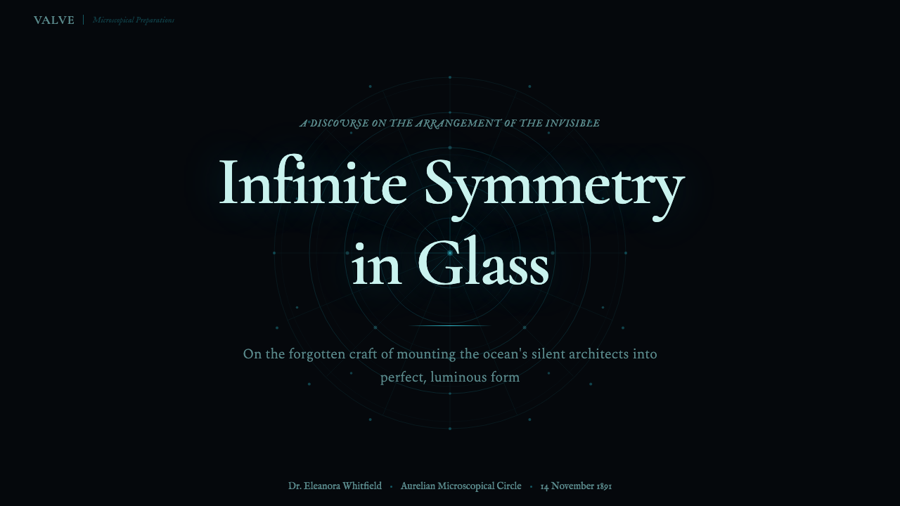
For presentation slides, the style works most powerfully on cover and section-break pages rather than on dense content slides. A cover might show a single diatom-like rosette centred on a near-black ground, with the title set in a classical serif with generous letter-spacing below or around it — the composition feeling like a title page from a Victorian natural-history atlas. Content slides should be treated conservatively: the dark background is preserved, but layout becomes more utilitarian — left-aligned text, hairline rules as section dividers, a restrained use of cyan for emphasis only. Data visualization benefits enormously from the palette: line charts and scatter plots on a dark ground with cyan traces and pale mint accent points naturally invoke laboratory instrumentation.
For web interfaces and dashboards, the style suits platforms where data density and legibility at small sizes are paramount. The dark background reduces eye strain in long-session environments. The typographic palette — scientific serif for headers, a complementary monospaced or geometric sans for data readouts — creates a clear hierarchy without relying on colour alone. Interface elements (buttons, borders, selection states) in the diffraction-colour range (cyan, mint, soft gold) against the dark field create a clear visual language that feels precise without feeling aggressive.
For editorial and marketing applications, the system works well for printed or digital publications in the fields of science communication, natural history, luxury instruments, or high-end academic publishing. A feature spread might centre an arrangement-like composition as the lead image, with body text in a high-quality oldstyle serif and captions in tracked small caps. Marketing materials should use the style's poster potential: a full-bleed dark field with a single luminous element at the centre can carry enormous visual weight even at small reproduction sizes.
The most common mistake when applying this style is treating the dark background as merely a container and ignoring the luminosity principle. Diatom Arrangement is not dark-mode design with a cyan accent; it is a specific kind of light — cold, structural, biological — emanating from within forms. Designers who paste bright-coloured flat shapes onto a dark background and call it done will produce results that look like generic dark-mode UI rather than like the Victorian scientific aesthetic the style references. The effort must go into making each element appear to glow, which requires gradation, careful edge work, and a palette that emphasizes cool spectral light over saturated flat colour.
Diatom Arrangement — FAQ
Is this style only appropriate for science-themed projects?
Not strictly, but the style carries a very specific register — Victorian scientific precision, dark-field luminosity, antique rigor — that will feel incongruous in contexts that require warmth, playfulness, or cultural informality. It works well beyond strictly scientific subjects: luxury watchmaking, astronomical instrumentation, archival and heritage projects, high-end data products, and even certain kinds of speculative fiction or world-building that wants a sense of an alternate Victorian empirical tradition. The key question is whether the product's identity benefits from the aesthetic qualities of rigour and antique luminosity, regardless of subject matter.
How do I handle colour in text-heavy layouts without losing legibility?
Legibility on a dark ground is the central technical challenge of this system. The answer lies in tonal management rather than brightness maximisation. Body text should be set in a slightly warm off-white — a tone that reads as luminous against the dark field without the harshness of pure white at extended reading distances. Reserve the cyan and mint palette for display type, structural elements, and data highlights only. Use the cool spectral colours as punctuation rather than as a pervasive tint. Captions and secondary information can drop in brightness and step toward a medium grey, reinforcing hierarchy through luminosity rather than through size alone.
Can this style support illustration or photography, or is it purely abstract?
The historical practice was almost entirely abstract — the forms were biological structures, not representations of scenes or figures. Contemporary application can include photography and illustration, but only on strict terms. Photography should be treated as a scientific specimen: high-contrast, isolated against the dark field, with colour shifted toward the cool spectral range rather than reproduced naturalistically. Illustration should avoid the organic line quality of sketching and favour the precision of scientific draughtsmanship — the engraved line of a natural-history plate, the sharp contour of a technical drawing. Any imagery that reads as casual, warm, or spontaneous will conflict with the system's fundamental register.
What is the difference between this style and general dark-mode or cyberpunk aesthetics?
Dark-mode UI design uses a dark background primarily as a contrast and strain-reduction tool, with no particular reference to a historical visual tradition. Cyberpunk aesthetics share the dark ground but load it with saturated neon colour, urban density, and references to circuit boards, graffiti, and dystopian technology. Diatom Arrangement is neither: its dark field is not a contrast hack but a specific kind of void — the optical black of dark-field microscopy — and its luminous elements reference the cold biological glow of microscopic structures, not neon signage or electronic circuits. The palette is cooler and narrower than cyberpunk, the forms are symmetric and organic-geometric rather than rectilinear and technological, and the typography is antique rather than futuristic. In short: the system's darkness is nineteenth-century, not twenty-first-century.
How strictly does the radial symmetry principle need to be followed?
The radial symmetry is a disposition rather than an absolute rule. In purely decorative or display contexts — a cover page, a section break, a hero image — full radial symmetry with a single centred focal point is both achievable and powerful. In functional layouts — a web page, a data dashboard, a content slide — rigid radial symmetry would make the layout unreadable for text-heavy content. The principle should be felt as a gravitational pull toward the centre: compositions should look as if visual weight is drawn inward rather than distributed across a left-right axis. A grid-based layout can honour this principle by centring key elements, avoiding strong left-alignment, and treating margins as equal breathing space rather than as spatial anchors. The symmetry is a sensibility, not a constraint.
Related design styles
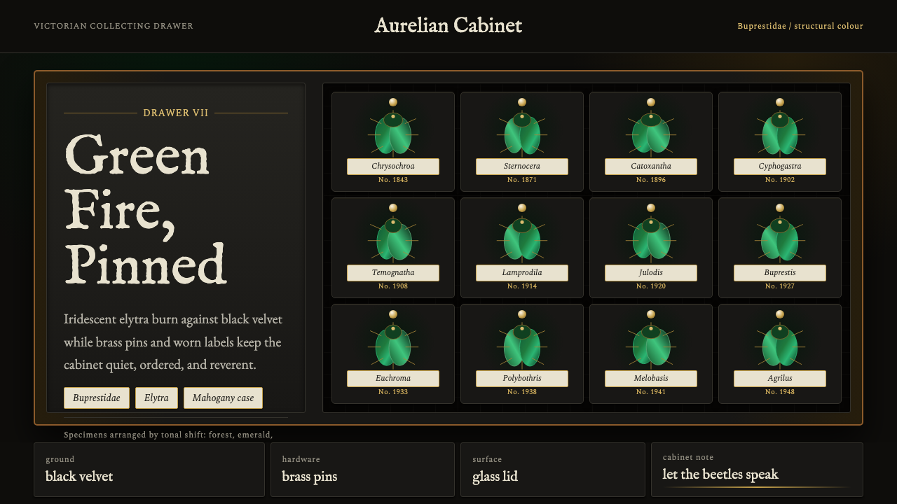 Beetle Specimen CabinetGreen burns in darkness. Emerald elytra grids glow under brass keylines and b…
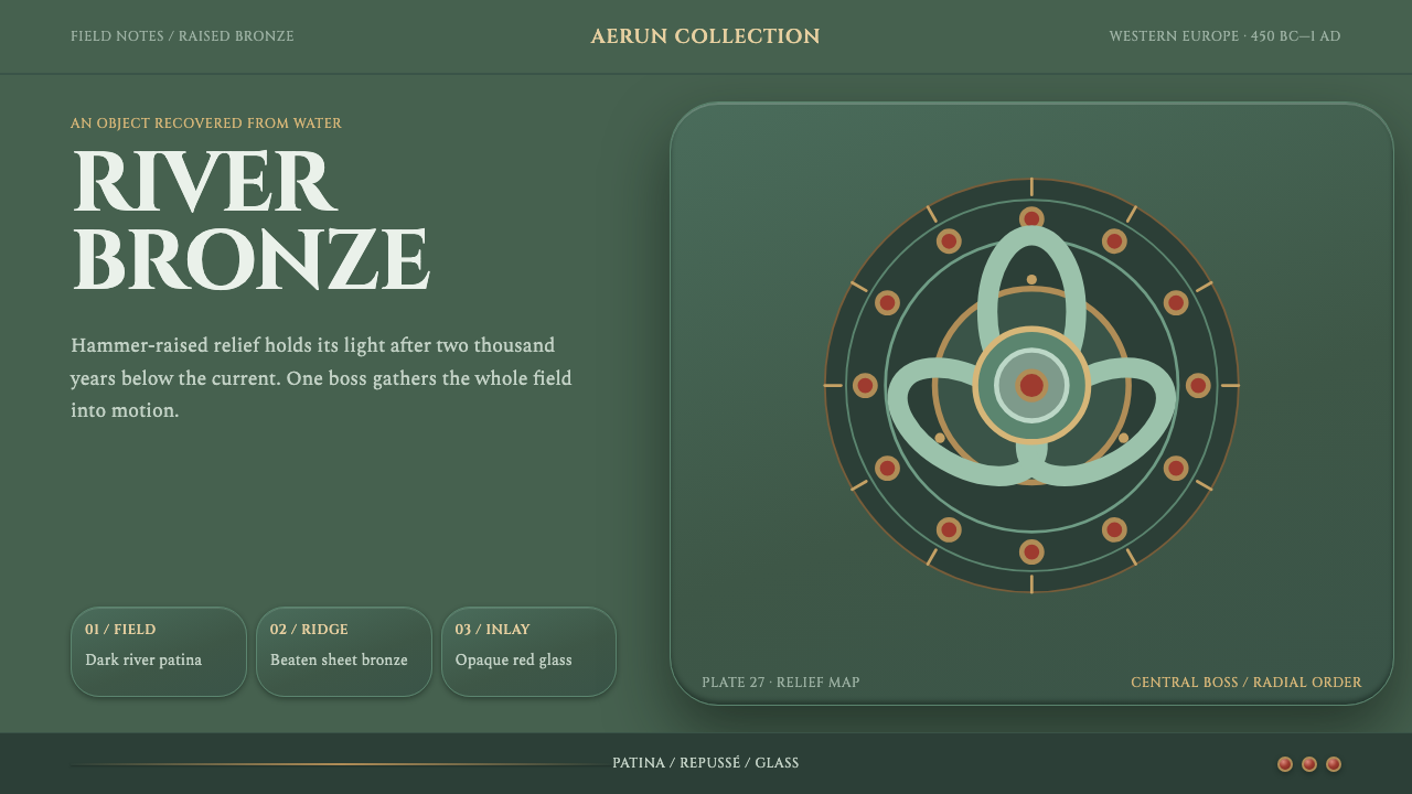 La Tène Celtic MetalworkMetalwork that still moves. Patina-green relief radiates from a bronze boss,…
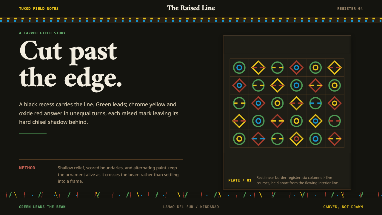 Maranao OkirCarving commands the field. Green, yellow and oxide-red lines rise from black…
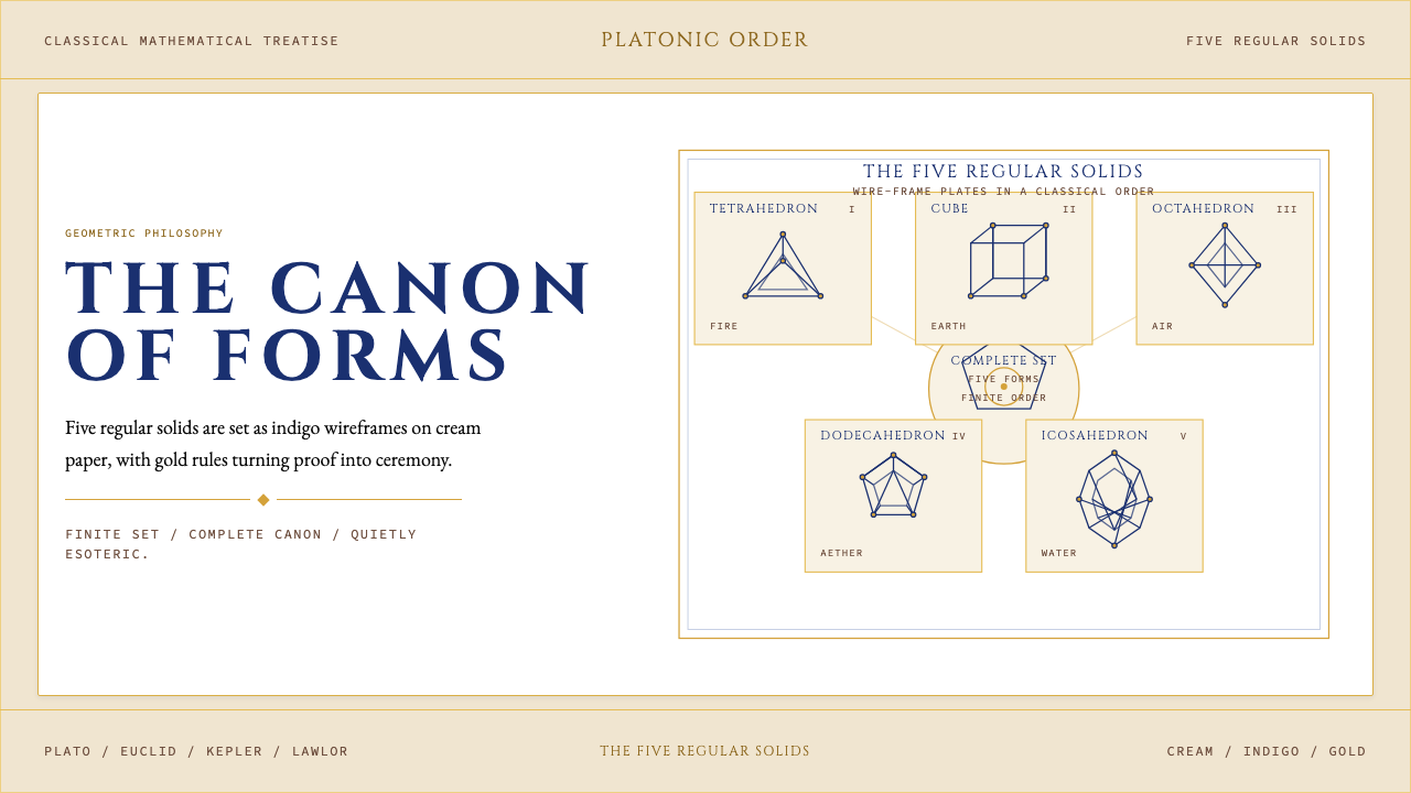 Sacred Geometry Platonic SolidsGeometry feels ritual. Cream paper, indigo wireframes, gold rules stage the f…
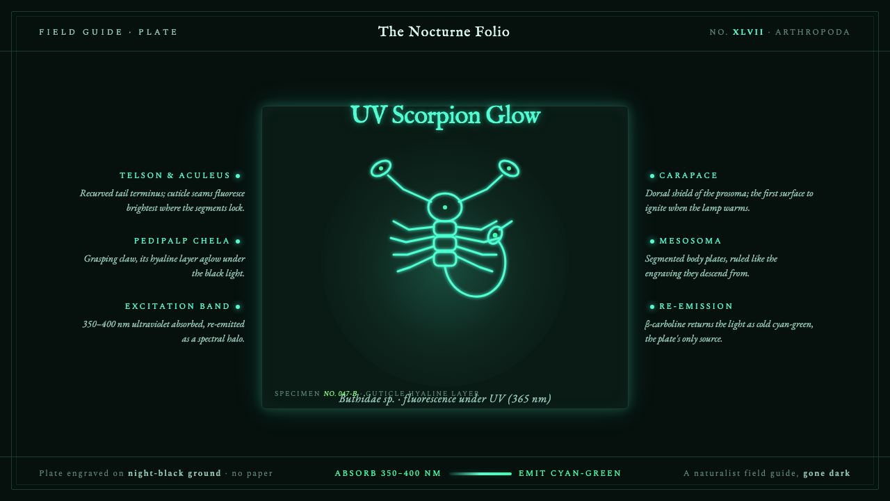 UV Scorpion GlowA field guide gone dark. A scorpion fluoresces cyan-green on night-black, rin…
 William Morris Arts & CraftsOrnament is the argument. Forest green wallpaper frames cream pages, gold rul…