What is Edo Rinpa (Kōrin)?
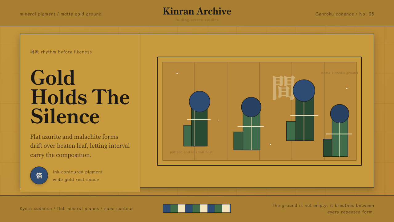
Edo Rinpa is the decorative school of Ogata Kōrin: mineral pigments blocked flat against beaten gold leaf, where the gold itself serves as negative space, and pattern moves across folding screens the way music moves through time — by rhythm and repetition, not by depiction.
Edo Rinpa (Kōrin) in brief
Edo Rinpa (also written Rimpa) is the early eighteenth-century flowering of a decorative tradition that began in Kyoto a century earlier. The name is a contraction of Kōrin-ha — the school of Kōrin — referring to Ogata Kōrin (1658–1716), the lacquerer, textile designer, and painter who gave the style its defining character. Rinpa is neither a guild nor an academy but a transmission: artists across generations studied the same classical waka motifs, absorbed the same compositional intelligence, and then reinvented the idiom in their own hands.
The visual logic is based on three commitments held simultaneously. First, the ground is treated as luminous material, not empty space: kinpaku (gold leaf) grounds shimmer and breathe, turning negative space from an absence into an active substance. Second, color is mineral and opaque — azurite blue (gunjo), malachite green (rokushō), and vermilion (shu) sit flat on the surface without shading, modeling, or perspective. Third, form is rhythmic: motifs do not illustrate a scene but choreograph an interval, with petals, waves, and leaves repeating in patterns that reward extended looking.
The result is a visual system that is simultaneously opulent and disciplined. Rinpa work is sumptuous in material — gold leaf, silver leaf, fine mineral pigments — but ascetic in illusion. There is no atmospheric depth, no cast shadow, no foreshortening. The composition is the surface; the surface is the composition. This double nature — luxury without illusionism — is what distinguishes Rinpa from both Western decorative traditions and from the more painterly schools of Japanese art that ran alongside it.
Where does Edo Rinpa (Kōrin) come from?
The Rinpa lineage begins not with Kōrin but with two Kyoto artists of the early seventeenth century: Hon'ami Kōetsu (1558–1637), a master calligrapher and lacquer designer from a family of sword polishers, and Tawaraya Sōtatsu (active c. 1600–1640), a painter and fan decorator whose revival of Heian-period imagery set the visual terms that the tradition would follow. Kōetsu and Sōtatsu collaborated in a village artistic community at Takagamine on the outskirts of Kyoto, where Kōetsu's calligraphy was written onto paper that Sōtatsu had decorated with gold-and-silver underpainting. Their collaboration established the foundational grammar: classical literary themes, gold-and-silver grounds, flat mineral pigment, and an interval-based rather than narrative composition.
Ogata Kōrin inherited this tradition a generation later and intensified it. Born into a wealthy Kyoto textile merchant family that had personal connections to Kōetsu, Kōrin grew up surrounded by the lacquer, textiles, and painted screens that Rinpa had already produced. After the family fortune collapsed, he turned to painting professionally and quickly developed a style marked by radical simplification: the famous irises of the Kakitsubata screens reduce azurite petals and malachite leaves to almost abstract bands of color — no individual leaf anatomy, no perspective, just the interval between forms and the gold between them. He moved to Edo (present-day Tokyo) between approximately 1704 and 1709, where his work attracted wealthy merchant patrons and spread the Kyoto style into the commercial capital of the Tokugawa shogunate.
The Genroku era (1688–1704) in which Kōrin came to prominence was an extraordinary moment in Japanese cultural history: the merchant class had accumulated wealth and cultural ambition, Confucian restraints on luxury were selectively applied, and the decorative arts — lacquer, ceramics, textile design, screen painting — became vehicles of conspicuous refinement. Rinpa thrived in this environment because it offered luxury without pretension. Its motifs were classical and literary (irises from the tenth-century Tales of Ise, red and white plum from winter poems), which gave patrons cultural credibility; its gold grounds and rare mineral pigments were materially costly, which demonstrated wealth; but its rejection of complex illusionistic technique placed skill in the design of the pattern rather than in the simulation of nature.
After Kōrin's death in 1716, the tradition continued through his brother Ogata Kenzan (a ceramicist who adapted Rinpa motifs to fired clay), and later through the Kyoto painter Sakai Hōitsu (1761–1828), who revived Kōrin's legacy in the early nineteenth century and codified the canon through careful copying and documentation. This pattern of revival — later artists not studying directly from masters but returning to earlier works in the tradition — is itself part of what makes Rinpa unusual: it is a lineage held together by shared aesthetics rather than direct apprenticeship.
What defines the Edo Rinpa (Kōrin) look?
Gold Ground (Kinpaku)
The kinpaku ground — sheets of beaten gold leaf applied to silk or paper — is not background in the Western sense but an active material presence. It reflects light differently at different angles, making the surface shift and breathe as the viewer or the light source moves. In Rinpa work, this luminosity is the source of the compositional energy: it is what makes flat mineral pigment look suspended rather than painted on, and what gives the rhythm of repeated motifs its sense of floating duration. When applying this principle digitally, the goal is not to simulate gold foil but to treat the base color as materially significant — something that carries its own light rather than receiving light from objects placed on top of it.
Flat Mineral Color
Azurite blue and malachite green are the chromatic signatures of Rinpa: dense, opaque, and slightly gritty in texture when applied as actual mineral pigment. They are never blended into gradients, never shaded to model volume, and never mixed to produce intermediate tones — each color sits as a discrete, bounded plane. The formal effect is that color describes shape, not light. Vermilion and white appear as accents; black ink defines contours and internal structures. The palette is simultaneously restricted and sumptuous — precious materials used with compositional discipline.
Rhythmic Repetition
Rinpa does not compose a scene — it orchestrates a pattern. Irises appear in clusters that repeat across a screen; waves alternate in arcs; plum branches cross and recross at intervals. The repetition is not mechanical (no two units are identical) but rhythmic: there is a beat, and then a variation, and then a return to the beat. This choreographic logic means that the eye does not read a Rinpa composition from left to right as a narrative but inhabits it, moving at the pace of the pattern. Scale shifts — large motifs, then smaller ones, then large again — create breathing room and prevent the surface from becoming monotonous.
Classical Motif Vocabulary
Rinpa draws almost exclusively from a small set of motifs canonized by the classical waka poetry tradition: irises (kakitsubata), referenced in the Tales of Ise; red and white plum (kohaku ume), associated with winter and poetic longing; autumn grasses (akikusa); waves (nami), often in the stylized form known as seikaiha or 'blue ocean wave'; and cranes (tsuru), emblematic of longevity. These are not decorative choices made for visual interest alone — each carries layers of literary and seasonal association that the educated viewer of the Edo period would read immediately. Applying Rinpa aesthetics means honoring this economy: a few motifs, deeply charged, rather than a rich variety of images lightly used.
Interval as Composition
Perhaps the most counterintuitive principle in Rinpa is that the spaces between motifs are as designed as the motifs themselves. The gap between one cluster of irises and the next is not empty — it is gold ground activated by proximity. Rinpa artists paid close attention to the shape and size of these intervals, adjusting them to control the speed at which the pattern moves and the weight it carries at each moment. This is composition in the musical sense — where a rest is as structural as a note — rather than the architectural sense, where structure is typically about where things are placed rather than what lies between them.
Ink Contour Without Modeling
Rinpa uses fine ink lines (mokkotsu or tarashikomi techniques in some works; clear ink outlines in others) to define the edges of forms and their internal structures — the veining of a leaf, the curve of a petal. What the ink never does is model volume through hatching, cross-hatching, or graduated tone. The contour marks where one flat plane ends and another begins; it is a map line, not a light line. This means that Rinpa forms read as silhouettes animated by color — they have a graphic clarity that makes them scale well, from intimate album leaves to panoramic six-panel folding screens.
Asymmetric and Off-Center Composition
Despite the strongly patterned quality of Rinpa work, its compositions are never symmetrical. The cluster of irises crowds to one side of the screen; the plum branch enters from below and exits at an unexpected angle; the wave pattern begins strong and then dissipates. This asymmetry is inherited from the ma principle in Japanese aesthetics — the productive use of empty space — and from the compositional ideals of classical byōbu (folding screen) painting. The eye is invited not to the center but to follow the movement of the pattern, which often exits or enters at the edge, implying a continuation beyond the frame.

Who shaped Edo Rinpa (Kōrin)?
The defining figure of the Edo phase and the artist whose name gives the school its contraction. Kōrin trained in Kano-school painting before finding his own language through deep study of Sōtatsu's work. His Kakitsubata-zu Byōbu (Irises) at the MOA Museum in Atami and his Red and White Plum Blossoms screens at MOA are among the most reproduced works in Japanese decorative art — not because they are elaborate but because they achieve radical clarity through compositional discipline. He was also an accomplished lacquer designer and kimono pattern maker, bringing the same flat-color, rhythm-based aesthetic across multiple materials.
The founder of the visual system that Kōrin would later intensify. Sōtatsu ran a painting workshop called the Tawaraya in Kyoto, initially producing decorated paper and fans for the aristocracy. His large-scale byōbu screens — including the Wind God and Thunder God screens (Kaminari Fujin-zu) at Kennin-ji, Kyoto — established the kinpaku ground, the flat mineral pigment, and the compositional asymmetry that became Rinpa's defining features. His tarashikomi technique (dropping wet ink or pigment into a still-wet surface to create organic blooms) introduced a controlled element of chance that gave Rinpa its only concession to natural process.
The calligrapher and lacquer designer who, with Sōtatsu, established the founding idiom of the Rinpa school. Kōetsu came from the Hon'ami family, who were professional sword connoisseurs and polishers with direct access to Japan's warrior aristocracy, and he himself became one of the most celebrated calligraphers of his age. His lacquer writing boxes — which incorporated mother-of-pearl, gold, and lead inlay — applied the same principles of materially sumptuous, formally restrained composition that his calligraphy collaborations with Sōtatsu demonstrated on paper. The Takagamine village community he established outside Kyoto, granted to him by Tokugawa Ieyasu, was the first organized Rinpa creative environment.
Kōrin's younger brother and the ceramicist who translated Rinpa aesthetics into fired clay. Kenzan's pottery — bowls, dishes, and sake cups decorated with the same iris, plum, and grass motifs as his brother's screens — demonstrated that the flat-color, ink-contour, interval-based composition could operate at intimate scale and in a tactile medium. His work at the kiln he established at Narutaki outside Kyoto brought Rinpa out of the luxury screen-painting context and into the everyday ritual of the tea ceremony and table setting, broadening the aesthetic's reach without diluting its visual logic.
The Edo-period artist responsible for the nineteenth-century revival of the Rinpa tradition and for codifying its canon. Hōitsu, born into a daimyo family, gave up samurai status to become a painter and devoted decades to studying, copying, and documenting Kōrin's work. His Summer and Autumn Grasses screens, painted on the reverse of Kōrin's Wind God and Thunder God screens (with Hōitsu's own panels displayed when Kōrin's were stored), are considered among the most refined statements of the tradition. By publishing catalogues of Kōrin's works and establishing the Edo Rinpa circle, Hōitsu ensured that the school would survive into the nineteenth century and eventually influence Nihonga painters, the Japonisme movement in Europe, and, ultimately, international decorative design.
How do you use Edo Rinpa (Kōrin) today?
Applying Edo Rinpa to contemporary design work requires understanding what the system actually does: it creates a sense of suspended time through rhythmic pattern, material luminosity, and the disciplined absence of illusionism. The challenge is not replicating gold leaf or azurite pigment but capturing the underlying compositional logic — foreground that floats, ground that glows, and interval that breathes.
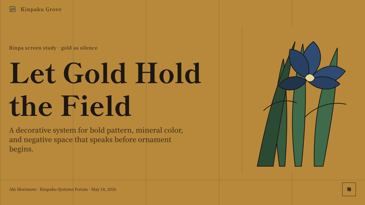
For presentation slides, the Rinpa approach transforms both cover and content pages. A cover works with an asymmetric composition: a single major motif — an abstract floral form, a wave pattern — occupies roughly two-thirds of the horizontal surface, entering from one edge and implying continuation beyond the other, against a warm, luminous base. The title enters at the remaining third, in clean, unornamented type. Do not center the composition or introduce symmetry; the power comes from the off-balance arrangement. Content slides should be treated as kinpaku grounds — the background is not neutral but carries weight. Text is minimal, set in generous white space, with no decorative borders. If data appears, treat each chart element as a discrete colored plane, not as a three-dimensional object.
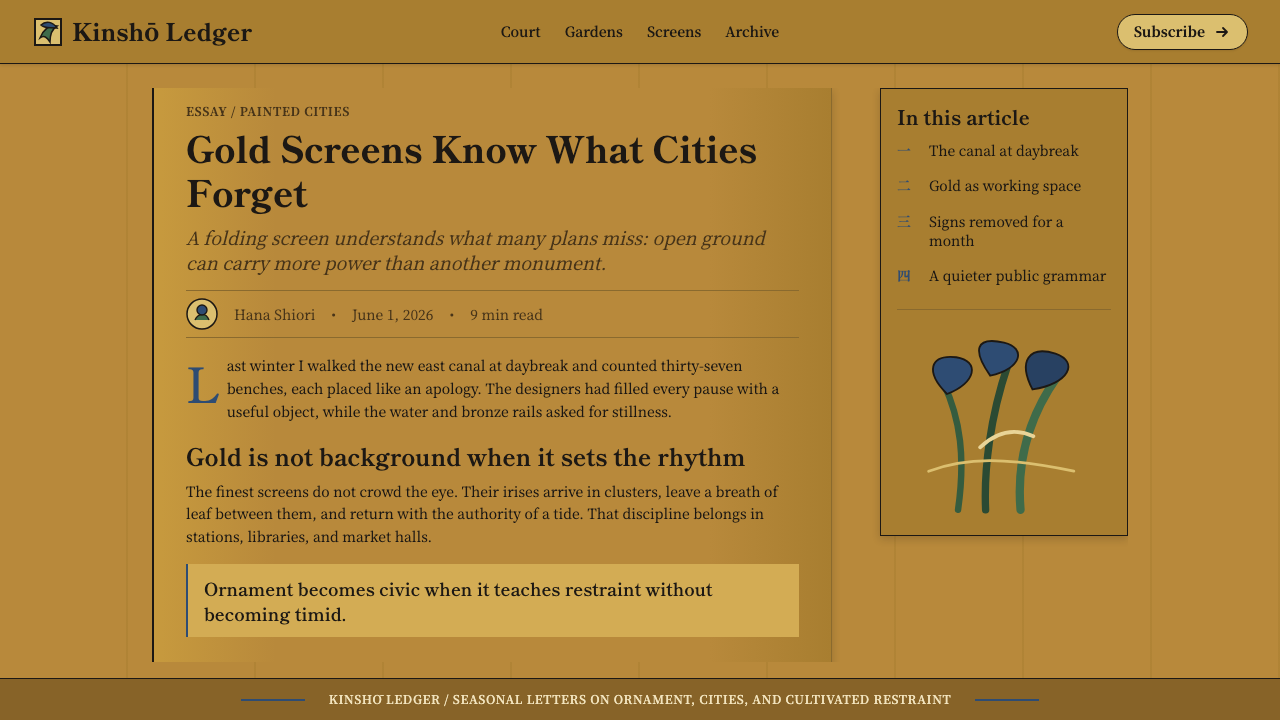
For web UI, Rinpa logic works well in contexts that reward slowed-down attention: editorial landing pages, portfolio headers, luxury brand product pages, and heritage-culture institutional sites. Implement it through a rich, warm background tone with high-contrast, flat-color elements that appear to rest on rather than recede into the surface. Navigation and body text should be typographically clean and restrained — the pattern carries the richness; the type should not compete. Avoid drop shadows, bevels, or anything that introduces illusionistic depth. Horizontal scrolling panels or parallax effects can evoke the experience of viewing a folding screen if handled with care, but movement should be slow and interval-conscious.
For editorial and marketing materials, Rinpa is suited to seasonal campaigns, cultural institutions, luxury packaging, and any context where the creative brief calls for a sense of timeless craft. The motif vocabulary — abstracted florals, wave forms, botanical patterns — transfers readily to print and digital; what must be preserved is the discipline of the interval (generous spacing between elements) and the flatness of color (no gradients, no dimensional shading). In marketing headlines, consider the Rinpa principle of letting the ground do work: ample space around and between words reads as luxury, not emptiness.
A common mistake when applying Rinpa is to treat it as general 'Japanese aesthetics' and mix it with unrelated Japanese design idioms — Zen minimalism, ukiyo-e woodblock conventions, or anime color palettes. Rinpa is specific: it is aristocratic, not ascetic; pattern-based, not emptiness-based; materially sumptuous, not spare. The other common error is over-motif: cramming the surface with botanical imagery until every interval is filled. Authentic Rinpa gives the intervals as much care as the motifs themselves. The gold between the irises is half the composition.
Edo Rinpa (Kōrin) — FAQ
Is Rinpa the same as wabi-sabi Japanese aesthetics?
They are nearly opposite sensibilities that happen to share a cultural origin. Wabi-sabi values irregularity, imperfection, modest materials, and the visible marks of age and use. Rinpa values formal pattern, precious materials, compositional control, and a kind of decorative perfection. Where wabi-sabi finds beauty in a cracked tea bowl, Rinpa finds it in azurite irises suspended on gold leaf. Both aesthetics are authentically Japanese; they represent different responses — aristocratic decorativeness versus rustic contemplation — to the same cultural inheritance of Buddhist impermanence. When people invoke 'Japanese minimalism,' they are usually thinking of wabi-sabi or Zen design; Rinpa is the corrective example that Japan also produced exuberant, materially rich, pattern-dense decorative art.
How does Rinpa relate to Art Nouveau, which also features botanical motifs and flat color?
The relationship is direct and historically documented. European Japonisme in the 1860s to 1900s was substantially driven by exposure to Rinpa screens and lacquerware, which arrived in Europe through the trade routes opened after Japan's 1853 reopening. Artists including Gustav Klimt, Émile Gallé, and many of the designers associated with the Vienna Secession studied Japanese screens closely and absorbed the Rinpa principles of flat color, botanical pattern, and gold ground into their own work. Klimt's gold-ground paintings are among the most obvious transpositions. The difference is that Art Nouveau introduced flowing, organic line work and symbolic naturalism that Rinpa avoided — Rinpa never interprets nature, it patterns it.
Can Rinpa work in a dark-background digital context?
Yes, but with significant care. The historic Rinpa ground is gold leaf — luminous but warm, not dark. A dark inversion replaces the luminous ground with a deep neutral and risks losing the essential quality of the system: the feeling that foreground elements are suspended in light rather than placed on a surface. If a dark background is required, the closest equivalent is a deep indigo or charcoal ground that carries its own warmth, with the azurite and malachite tones pushed into their lightest, most mineral quality. Avoid pure black backgrounds — they read as void rather than ground, and the Rinpa aesthetic depends on the ground being active. Gold or pale accent elements become more critical in a dark version and should be used sparingly to preserve their material significance.
What makes Rinpa distinct from other Japanese painting schools like Kanō or Yamato-e?
Kanō school painting — the dominant official style from the fifteenth through the nineteenth centuries — combined Chinese ink painting traditions with Japanese decorative sensibility, producing powerfully bold but compositionally varied work that included landscape, figures, and ambitious architectural backdrops. It was associated with the warrior class and shogunal patronage. Yamato-e is the even older indigenous Japanese painting style, primarily narrative and associated with illustrated handscrolls depicting court life and classical literature. Rinpa is different from both: it is not narrative, not associated with Chinese ink painting conventions, and not interested in figures or landscape for their own sake. Rinpa treats nature as pattern material and classical literature as a source of motif vocabulary rather than as subject matter to be depicted.
Is Rinpa suitable for brand identity work?
It can work exceptionally well for the right kind of brand, but the style has strong directional constraints. Rinpa communicates aristocratic heritage, timeless craft, material richness, and a Japanese or East Asian cultural register. Brands in luxury goods, tea, sake, ceramics, high-end hospitality, cultural tourism, traditional crafts, or any sector where heritage positioning is a core asset can deploy Rinpa motifs and compositional principles with strong results. The style is less suited to brands that need to communicate speed, technology, global universality, democratic accessibility, or urban contemporaneity. The most common successful application takes one or two specific Rinpa motifs — a stylized wave, an abstracted iris — and uses them as a pattern signature without attempting to replicate the full system, which can read as pastiche rather than genuine aesthetic engagement.
Related design styles
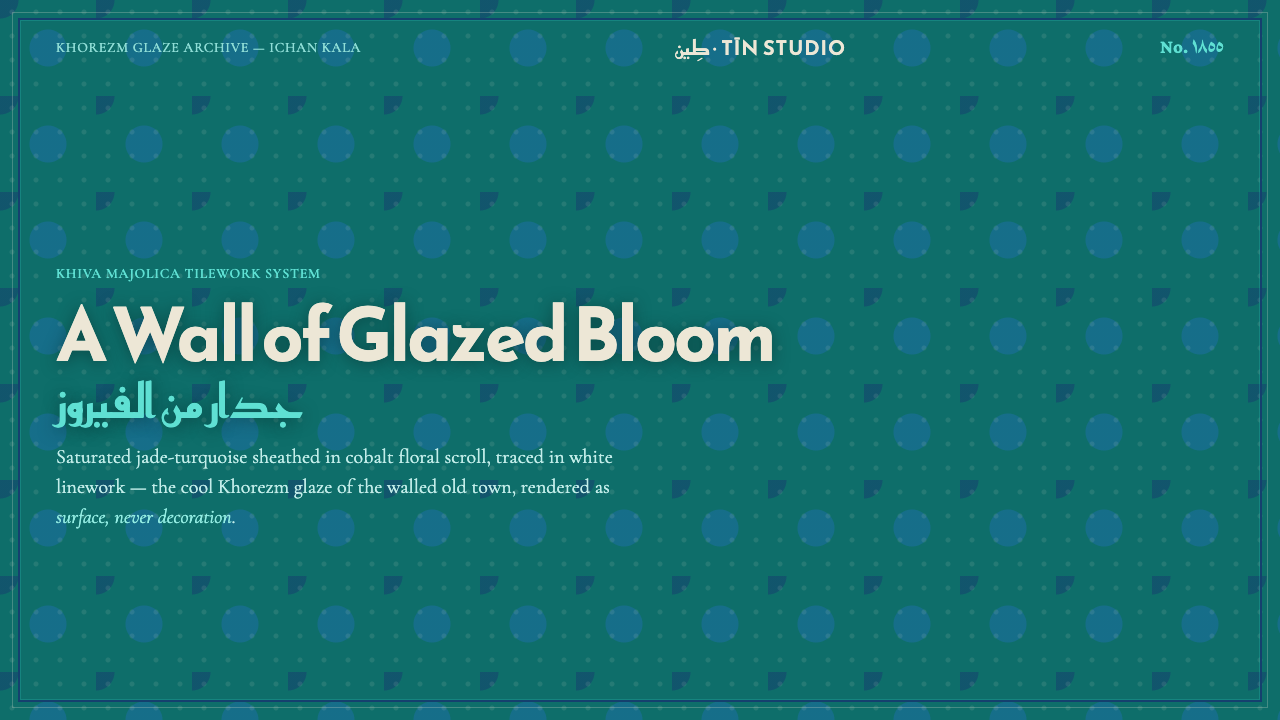 Khiva Ichan-Kala MajolicaJade becomes architecture. Cobalt bands and white tracery lock the surface in…
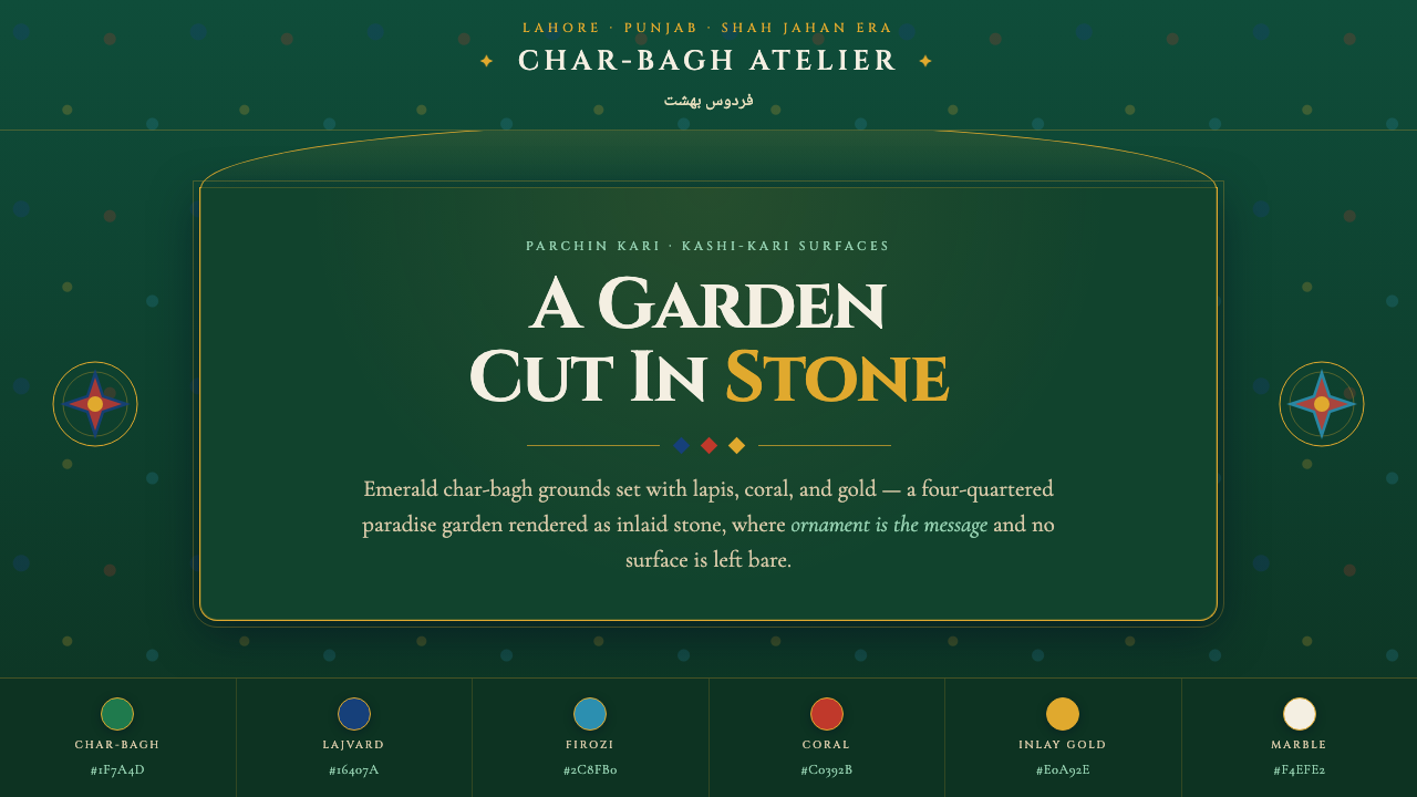 Shalimar Mughal Pietra DuraA paradise garden cut in stone. Emerald char-bagh ground inlaid with lapis, c…
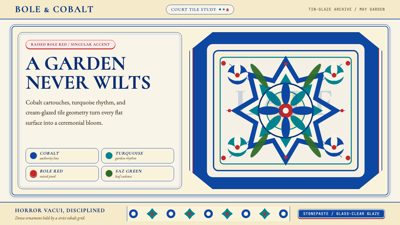 Turkish İznik CeramicBlooms with discipline. Cobalt grid and cream glaze hold turquoise motifs wit…
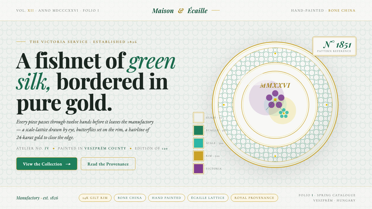 Herend PorcelainRoyal porcelain, drawn by hand. Cool glaze, écaille fishnet, gilt rim, Playfa…
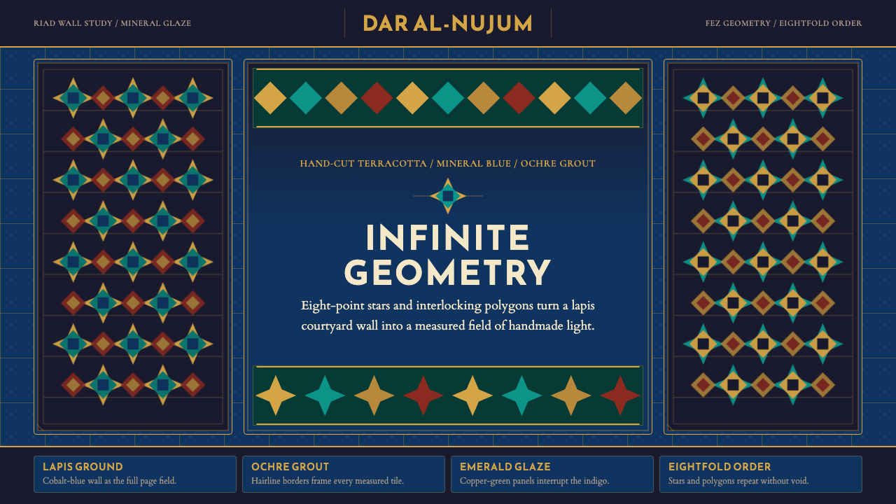 Moroccan Zellige TileLuxurious geometry without void. Lapis ground, ochre borders, and eight-point…
 Armenian Illuminated ManuscriptGilded maximalism. Burnished gold, lapis frames, and vermilion initials build…