What is Turkish İznik Ceramic?什么是 Turkish İznik Ceramic?
İznik ceramic is horror-vacui made glorious — every surface a garden of cobalt tulips, Armenian-bole red carnations, and saz leaves coiling beneath a glass-clear tin glaze.伊兹尼克陶瓷是「恐惧虚空」的极致荣光——每一寸平面都是钴蓝郁金香、博罗红康乃馨与萨兹叶在透明锡釉之下铺展的花园。
Turkish İznik Ceramic in briefTurkish İznik Ceramic 速览
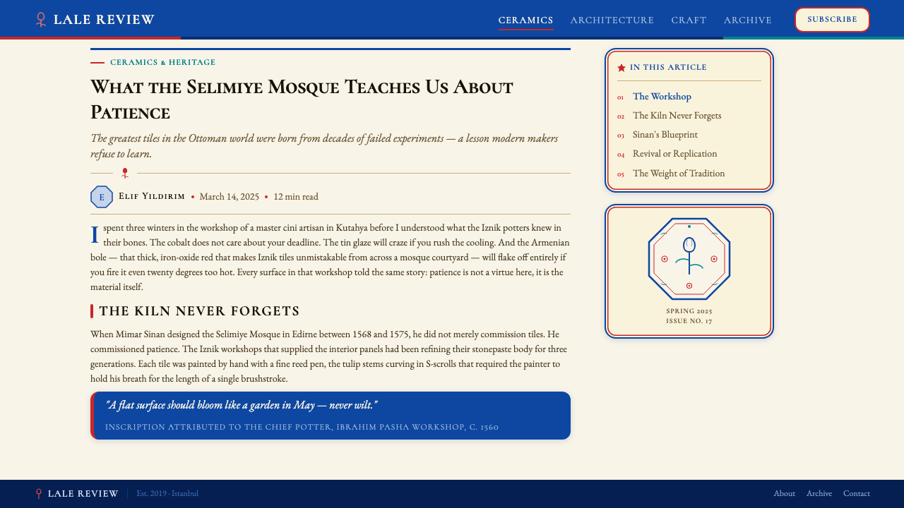
Turkish İznik Ceramic refers to the stonepaste tilework and vessel-painting tradition that flourished in the town of İznik — ancient Nicaea — in northwestern Anatolia between roughly 1480 and 1620. At its height, under the patronage of Süleyman the Magnificent and Selim II, İznik workshops produced some of the most technically perfect painted ceramics ever fired: a dense, symmetrical garden of tulips, carnations, hyacinths, and saz leaves rendered in cobalt, turquoise, sage green, and the inimitable raised Armenian-bole red, all sealed beneath a glassy tin glaze of extraordinary clarity.土耳其伊兹尼克陶瓷,是指1480至1620年间在安纳托利亚西北部伊兹尼克(古称尼西亚)的窑场中发展成熟的石胎釉下彩砖与器皿绘画传统。在苏莱曼大帝与塞利姆二世的宫廷赞助下,伊兹尼克的工匠烧制出了伊斯兰制陶史上技术最为精湛的彩绘陶器:郁金香、康乃馨、风信子与萨兹叶在钴蓝、绿松石、鼠尾草绿,以及举世无双的微凸亚美尼亚博罗红的组合下,构成一座对称而繁密的花园,并以透明度极高的锡釉封存其上。
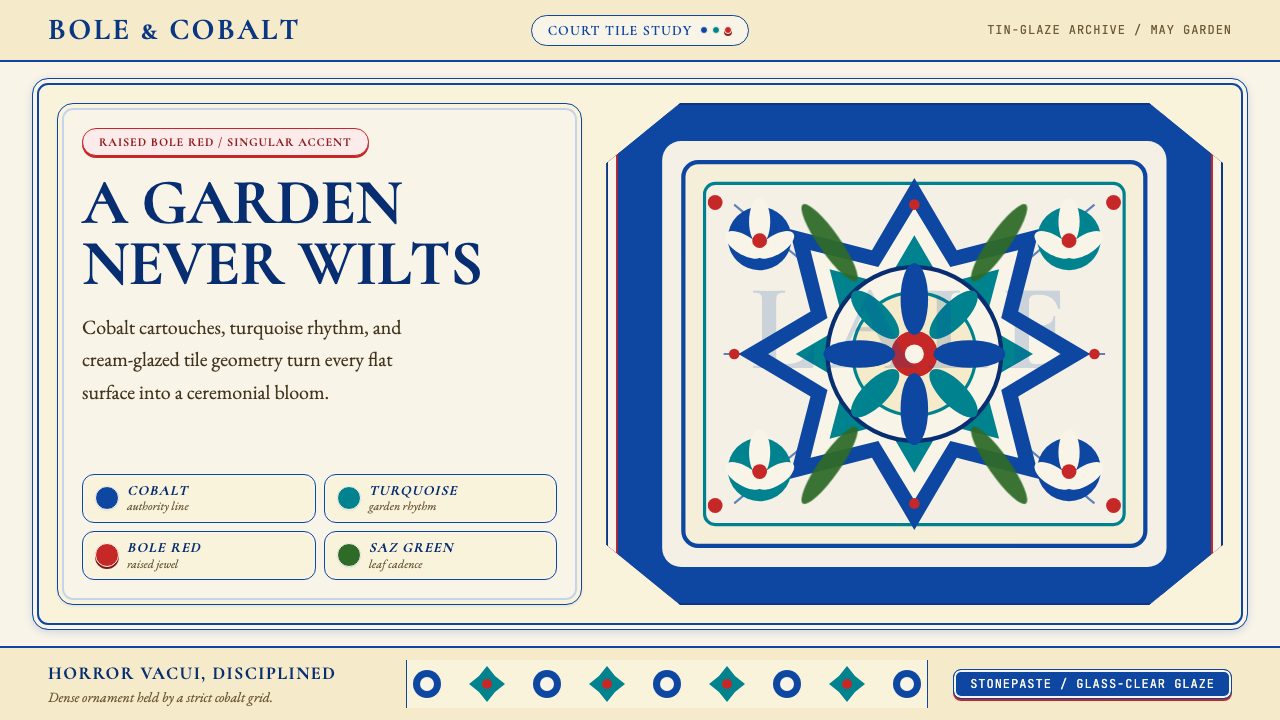
The visual system that takes its name from this tradition distills the Ottoman court aesthetic into a set of rules for the screen: a warm tin-glaze cream acts as the ground, cobalt commands authority and structure, Armenian-bole red provides singular emphasis — never repeated, never diluted — saz green supplies organic accent, and calligraphic cartouche shapes serve as framing devices. The result is a surface that blooms without disorder: every element has assigned weight, position, and color, and the whole composes with the density of a tilework panel.以这一传统命名的设计系统,将奥斯曼宫廷美学凝练为一套可用于屏幕的规则体系:温暖的锡釉奶油色充当底面,钴蓝统领权威与结构,亚美尼亚博罗红提供唯一焦点——不重复,不稀释,萨兹绿点染有机的枝叶气息,书法华饰的轮廓则作为版块的框架装置。其结果是一个繁花而不失秩序的表面:每个元素都有指定的分量、位置与色彩,整体以砖面板般的密度构图。
What makes İznik design unusual among historical pattern systems is its discipline within abundance. The compositions are horror-vacui in intention — they resist empty space — yet they never become chaotic, because the hierarchy between primary motifs (large floral heads), secondary motifs (saz leaves and vine stems), and ground color is maintained with exacting consistency. Translated to contemporary design, this principle argues for richness through repetition and rule, not through arbitrary layering.在众多历史纹样体系中,伊兹尼克设计的独特之处在于「丰盛中的纪律」。构图在意图上是恐惧虚空的——它们抵抗空白——然而从不陷入混乱,因为主要母题(大型花头)、次要母题(萨兹叶与藤蔓茎干)与底色之间的层级关系始终以精确的一致性维持。移植到当代设计中,这一原则主张通过重复与规则来实现丰富感,而非通过任意的堆叠分层。
See the Turkish İznik Ceramic design system查看 Turkish İznik Ceramic 完整设计系统
Where does Turkish İznik Ceramic come from?Turkish İznik Ceramic 从何而来?
The İznik ceramic tradition did not emerge in isolation. It grew from a convergence of three earlier influences: the blue-and-white Chinese porcelain that reached the Ottoman court via Silk Road trade, the Timurid and Persian manuscript painting traditions with their elaborate floral margins, and the indigenous Anatolian pottery workshops that had long supplied the region with functional wares. By the late fifteenth century, Ottoman court taste had developed a clear appetite for hard-paste-like vessels with vivid underglaze painting, and the workshops of İznik — positioned near major clay deposits and timber for kilns — became the preferred producers.伊兹尼克陶瓷传统并非凭空而生,而是三种前驱影响交汇的产物:经丝绸之路贸易抵达奥斯曼宫廷的中国青花瓷、帖木儿与波斯细密画传统(尤其是其精致的花卉页边装饰),以及长期为该地区供应日用陶器的安纳托利亚本土窑场。到十五世纪晚期,奥斯曼宫廷的审美已形成对仿硬质瓷胎、釉下彩绘鲜艳器物的明确偏好,而伊兹尼克的窑场——毗近优质陶土产地与窑炉所需木材——由此成为首选的生产中心。
The first distinctive İznik phase, roughly 1480 to 1525, worked primarily in blue and white, absorbing the Chinese porcelain aesthetic but translating it into an Ottoman vocabulary: arabesques replaced dragon motifs, stylized floral scrolls replaced cloud-band borders. The second phase, from around 1525 onward, introduced turquoise and then sage green, expanding the palette while maintaining the cobalt ground. The defining development came in the 1550s and 1560s, when Armenian-bole red — a pigment derived from an iron-rich clay found near Erzincan — appeared as a thick, slightly raised slip that fired to a vivid tomato-red under the tin glaze. This technical achievement, seemingly impossible to reproduce outside the specific combination of İznik stonepaste body and local bole clay, set the peak-period tiles apart from every earlier and later ceramic tradition.伊兹尼克的第一个鲜明阶段(约1480至1525年)以蓝白两色为主,吸收了中国瓷器的美学,但将其转译为奥斯曼语汇:阿拉伯藤蔓纹取代龙纹,程式化花卉卷草取代云纹边框。第二阶段(约1525年起)引入绿松石色,继而加入鼠尾草绿,在保持钴蓝基调的同时扩充了色板。决定性的突破发生在1550至1560年代:亚美尼亚博罗红出现了——一种从埃尔津詹附近富铁黏土中提取的颜料,以厚浆微凸的形式施于釉下,烧成后在锡釉之下呈现出鲜艳的番茄红。这一技术成就似乎只能在伊兹尼克特有的石胎配方与当地博罗土的特定组合下才能实现,使得全盛期的瓷砖与任何其他陶瓷传统都判然有别。
The Ottoman court's relationship with İznik production was direct and interventionist. The Topkapı Palace workshops, under the direction of the Chief Court Painter (Nakkaşbaşı), supplied pattern drawings — called nakış — directly to the İznik kilns. Kara Memi, who served as Nakkaşbaşı under Süleyman and is credited with perfecting the Quatre Fleurs style of naturalistic Ottoman floral painting, is believed to have supplied many of the tulip, carnation, and hyacinth designs that define the peak İznik aesthetic. The architect Mimar Sinan, who built or supervised hundreds of Ottoman structures, specified İznik tile extensively for interior cladding — most visibly in the Rüstem Pasha Mosque in Istanbul (completed 1563) and the Selimiye Mosque in Edirne (completed 1575), both of which remain the most comprehensive extant examples of İznik tile in architectural context.奥斯曼宫廷与伊兹尼克生产之间的关系是直接而干预性的。托普卡帕宫的御用画坊在宫廷首席画师(纳卡什巴什)的主持下,直接向伊兹尼克窑场提供名为「纳卡什」的纹样图稿。曾在苏莱曼治下担任首席画师的卡拉·迈米,被认为是奥斯曼自然主义花卉绘画「四花风格」的集大成者,并为定义伊兹尼克全盛期美学的郁金香、康乃馨与风信子图案提供了大量设计。建筑师米马尔·锡南主持建造了数百座奥斯曼建筑,在内壁装饰上大量指定使用伊兹尼克瓷砖——最典型的见于伊斯坦布尔的鲁斯泰姆帕夏清真寺(1563年竣工)与埃迪尔内的塞利米耶清真寺(1575年竣工),两者至今仍是伊兹尼克瓷砖建筑应用中保存最完整的实例。
Production declined sharply after around 1620. The reasons were several: shifts in court patronage toward other materials, increased competition from imported Chinese and later Dutch Delftware, and the loss of the specific technical knowledge — particularly the Armenian-bole preparation method — that had made the peak-period tiles irreproducible. Later İznik and imitation ware tends toward flatter reds, more loosely drawn motifs, and less precise glaze application. The kilns eventually fell silent in the early eighteenth century, and the tradition survived only through the surviving tiles on Ottoman monuments and the collections of major European museums, where İznik pieces arrived as diplomatic gifts and later as acquisitions during the nineteenth-century vogue for Orientalist collecting.约1620年后,生产急剧衰退。原因是多方面的:宫廷赞助转向其他材料,来自中国进口瓷器及后来荷兰代尔夫特陶器的竞争加剧,以及特定技术知识的失传——尤其是亚美尼亚博罗的制备方法,而正是这一方法使全盛期的瓷砖无法复制。后期的伊兹尼克仿制品往往红色较平、纹样较为松散、釉面涂覆精度也有所下降。窑炉最终在十八世纪初彻底熄灭,这一传统只存续于奥斯曼建筑遗迹上留存的瓷砖,以及欧洲各大博物馆的收藏之中——这些藏品最初以外交礼物的方式流入欧洲,其后又在十九世纪东方主义收藏热潮中被系统性地购入。
What defines the Turkish İznik Ceramic look?Turkish İznik Ceramic 的视觉特征是什么?
Color Architecture色彩结构
The İznik palette is built on a strict hierarchy of four roles. Tin-glaze cream — warm, slightly ivory — serves as the ground, providing the luminous base from which all other colors read. Cobalt anchors the composition, drawn as outlines, fill, and structural motifs; it is the most present color and carries the visual weight of authority. Armenian-bole red appears as a singular accent: one carnation head, one border stripe, never repeated until it has fully resolved. Turquoise and sage green occupy the middle register, filling leaves, secondary petals, and cartouche interiors. Nothing in the palette is cool, harsh, or industrial — the entire range reads as warm, saturated, and court-calibrated.伊兹尼克色板建立在严格的四角色层级之上。锡釉奶油色——温暖、略带象牙感——充当底面,提供令其他所有颜色显色的发光基底。钴蓝锚定构图,以轮廓线、填充与结构母题的方式贯穿全图;它是出现最多的颜色,承载着权威的视觉分量。亚美尼亚博罗红作为唯一焦点出现:一个花头,一条边框条纹,绝不重复,直至完整收束。绿松石与鼠尾草绿占据中间层,填充叶片、次要花瓣与华饰内部。整个色板没有一丝冰冷、刺眼或工业感——所有色调都是温暖的、饱和的、为宫廷量身校准的。
Horror-Vacui Composition恐惧虚空的构图
İznik tile panels resist empty space not through randomness but through an interlocking system of motif scales. Large floral heads — tulips, carnations, hyacinths — occupy the primary positions, their stems branching into saz leaves that fill the middle distance, while tiny rosettes and filler buds close any remaining gap. The effect is total coverage, yet each motif remains individually readable because the hierarchy of scale and color is consistently maintained. The rule, translated to screen: fill the surface, but never confuse the eye about what is primary.伊兹尼克砖面板抵抗空白,凭借的不是随机铺排,而是一套母题尺度相互咬合的系统。大型花头——郁金香、康乃馨、风信子——占据主要位置,茎干伸展出填满中景的萨兹叶,而细小的玫瑰花结与填充花蕾则封闭剩余的空隙。效果是全面覆盖,然而每个母题依然单独可辨,因为尺度与色彩的层级始终被稳定维持。移植到屏幕上的规则是:填满表面,但绝不让眼睛混淆什么是主体。
Floral Vocabulary花卉词汇
The İznik floral canon is specific rather than generic. The tulip — long before its association with the Netherlands — was an Ottoman royal emblem, drawn with a sharp, elongated profile and slender petals. The carnation appears as a dense, ruffled globe. The hyacinth reads as a tight vertical spike. The saz leaf, signature to the Ottoman court style, is a long, undulating blade with serrated edges that coils through the composition, connecting motifs and filling negative space simultaneously. These forms are not naturalistic sketches but highly conventionalized symbols, instantly recognizable even at small scale.伊兹尼克的花卉图典是具体而非泛泛的。郁金香——远在其成为荷兰象征之前——就已是奥斯曼的皇室徽章,以尖锐细长的轮廓和纤细的花瓣绘制。康乃馨呈现为密集的蓬松球形。风信子是紧凑的垂直穗状。萨兹叶是奥斯曼宫廷风格的标志,是一片带锯齿边缘的长形波动叶片,蜿蜒穿行于构图之中,同时连接各个母题并填充负空间。这些形态不是自然主义的写生,而是高度程式化的符号,即便在极小的尺寸下也立刻可辨。
The Cartouche Frame华饰框
Calligraphic cartouches — elongated, cloud-shouldered, or ogival frames derived from Ottoman manuscript borders — serve as the primary organizing device in İznik compositions. On architectural tiles, cartouche bands separate registers of pattern; on vessels, they contain inscriptions or isolated floral panels. In design application, the cartouche logic translates to contained zones: information blocks gain identity through their bordered shape rather than through color alone, giving the layout a quality of deliberate compartmentalization without rigid grid lines.书法华饰框——从奥斯曼手稿页边衍生出的细长、云肩或尖拱形框架——是伊兹尼克构图中主要的组织装置。在建筑瓷砖上,华饰带分隔着不同层次的纹样;在器皿上,它们容纳铭文或单独的花卉面板。应用于设计时,华饰的逻辑转化为有界区域:信息块通过其边框形状而非单纯通过色彩获得身份感,赋予版面一种刻意分隔的质感,而无需生硬的网格线。
Surface as Garden表面即花园
Unlike Western decorative systems that treat ornament as a frame around a central image, İznik compositions treat the entire surface as the subject. There is no hierarchy between center and edge — the tulips in the corner are as resolved as the tulips at the heart of the panel. This all-over approach means that any portion of an İznik composition is self-sufficient; the pattern is not interrupted by the boundary, merely paused. For design, this principle suggests that backgrounds should be designed with as much intention as foreground elements, and that surface detail is itself a form of content.与将装饰视为中心图案边框的西方装饰体系不同,伊兹尼克构图将整个表面视为主体本身。中心与边缘之间没有层级差异——角落里的郁金香与面板中心的郁金香同样完整。这种全面覆盖的做法意味着,伊兹尼克构图的任何局部都是自给自足的;纹样并非被边界打断,只是被暂停。对设计而言,这一原则提示:背景应当以与前景元素同等的意图来设计,而表面细节本身就是内容的一种形式。
Raised Red and Tactile Depth凸起的红色与触感深度
The Armenian-bole red of peak İznik tiles is not merely a color choice — it is a material phenomenon. The bole pigment was applied in a thick slip that raised slightly from the surface before being covered with tin glaze, creating a barely perceptible relief that catches raking light differently from surrounding painted areas. This tactile dimension reinforced the color's role as singular accent: the red was not only visually dominant but physically present. In flat digital work, this translates to treating one accent tone with extra compositional weight — through scale, isolation, or deliberate contrast — so that its presence registers with a similar quality of emphasis.全盛期伊兹尼克瓷砖上的亚美尼亚博罗红不仅仅是一种色彩选择——它是一种材料现象。博罗颜料以厚浆形式施于砖面,略微隆起于表面,再覆以锡釉,形成一种几乎难以察觉的浮雕,在斜射光下呈现出与周围彩绘区域截然不同的光泽。这种触感维度强化了红色作为唯一焦点的角色:它不仅在视觉上居主导,在物理上也真实存在。移植到平面数字设计中,这意味着:应赋予一个强调色调额外的构图分量——通过尺度、孤立或刻意对比——使其存在感呈现出同等质量的强调效果。
Symmetry with Organic Variation对称中的有机变化
İznik compositions are formally symmetrical — motifs repeat on axes and in registers — yet they never read as mechanical, because each hand-painted repetition carries slight variations in petal angle, stem curve, and color saturation. The system is symmetric; the execution is organic. This balance between rule and hand produces the particular warmth that distinguishes İznik from geometric Islamic abstraction. In design terms, this argues for modular systems where the structure is consistent but individual modules are permitted — even encouraged — to breathe differently from one another.伊兹尼克构图在形式上是对称的——母题沿轴线与带状重复——然而从不呈现出机械感,因为每一次手绘重复都带有花瓣角度、茎干曲线与色彩饱和度上的细微差异。系统是对称的,执行是有机的。这种规则与手感之间的平衡,产生了区别伊兹尼克与几何伊斯兰抽象的特殊温度。在设计语言中,这意味着:构建模块化系统,让结构保持一致,但允许——甚至鼓励——各个模块彼此之间以略不相同的方式呼吸。
See the Turkish İznik Ceramic design system查看 Turkish İznik Ceramic 完整设计系统
Who shaped Turkish İznik Ceramic?谁塑造了 Turkish İznik Ceramic?
Kara Memi served as Nakkaşbaşı — Chief Court Painter — under Süleyman the Magnificent and is credited with developing the Quatre Fleurs style: the naturalistic rendering of tulips, carnations, hyacinths, and roses that became the defining floral vocabulary of peak İznik production. Earlier Ottoman court painting had relied on more abstract, Persianate floral conventions; Kara Memi's innovation was to observe actual Ottoman garden flowers and stylize them into a consistent formal language rigorous enough to be reproduced by workshop painters from pattern drawings. His designs traveled from Topkapı Palace to the İznik kilns as transfer drawings called nakış, and from the kilns to the walls of mosques, palaces, and mausoleums across the empire. He is the most direct link between Ottoman court aesthetic intention and the physical tiles that survive.卡拉·迈米在苏莱曼大帝治下担任纳卡什巴什——宫廷首席画师——并被认为是「四花风格」的开创者:将郁金香、康乃馨、风信子与玫瑰以自然主义的方式描绘,这套花卉词汇由此成为伊兹尼克全盛期生产的决定性语言。此前的奥斯曼宫廷绘画依赖更为抽象的波斯花卉程式;卡拉·迈米的创新在于观察真实的奥斯曼花园植物,并将其程式化为一套足够严谨、可由工坊画工依据纹样图稿复制的正式语言。他的设计以名为「纳卡什」的转绘图稿从托普卡帕宫传至伊兹尼克窑场,再从窑场流向帝国各地清真寺、宫殿与陵墓的墙壁。他是奥斯曼宫廷美学意图与现存实物瓷砖之间最直接的纽带。
Mimar Sinan served as Chief Ottoman Architect from 1538 until his death in 1588, during which time he designed or supervised the construction of over three hundred structures across the empire. His relationship to İznik ceramic was that of the principal specifier: Sinan's interior programs called for tile cladding on a scale that drove demand and shaped the production priorities of the İznik workshops for decades. The Rüstem Pasha Mosque in Istanbul, completed around 1563, is considered the most tile-saturated of Sinan's works, with İznik panels covering not only the interior walls but the portico piers and even some of the exterior surfaces. The Selimiye Mosque in Edirne, completed in 1575 and widely considered Sinan's masterpiece, uses İznik tile in more selective but equally authoritative registers. Without Sinan's commissions, the peak-period İznik industry would have had neither the scale nor the architectural context that defined its highest achievements.米马尔·锡南从1538年起担任奥斯曼首席建筑师,直至1588年辞世,在此期间他设计或监造了帝国境内逾三百座建筑。他与伊兹尼克陶瓷的关系是主要指定者的关系:锡南的室内方案以大规模的瓷砖覆层为特征,这一需求推动了市场,并在数十年间塑造了伊兹尼克窑场的生产重心。伊斯坦布尔的鲁斯泰姆帕夏清真寺约于1563年竣工,被认为是锡南作品中瓷砖密度最高的一座,伊兹尼克砖面不仅覆盖内墙,连门廊柱墩乃至部分外表面也有铺设。埃迪尔内的塞利米耶清真寺于1575年竣工,被普遍视为锡南的杰作,其伊兹尼克瓷砖的运用更为选择性,却同样具有权威感。若无锡南的委托,全盛期的伊兹尼克产业既不会拥有定义其最高成就的生产规模,也不会拥有相应的建筑语境。
Süleyman I, who reigned from 1520 to 1566, presided over the political and cultural apex of the Ottoman Empire. His patronage was the essential condition for peak İznik production: he funded the construction of the mosques and palaces that Sinan designed and İznik filled, established the court workshops that employed Kara Memi and supplied pattern drawings to the kilns, and created the political stability in which long-term craft traditions could mature without interruption. Süleyman was himself a poet under the pseudonym Muhibbi, and his court valued refinement in applied arts as an expression of imperial legitimacy. The tulip — which his court favored above all other flowers and which appears as the dominant motif in İznik tile — carried associations with paradise and divine order in Ottoman poetic imagery, a symbolic weight that anchors the entire floral canon.苏莱曼一世(1520—1566年在位)主持了奥斯曼帝国政治与文化的巅峰时期。他的赞助是伊兹尼克全盛期生产的根本条件:他资助了锡南设计、伊兹尼克填装的清真寺与宫殿的建设,建立了雇用卡拉·迈米并向窑场提供纹样图稿的宫廷画坊,并创造了工艺传统得以在无间断中长期成熟的政治稳定环境。苏莱曼本人以「穆希比」为笔名从事诗歌创作,他的宫廷将应用艺术的精致视为皇权合法性的表达。郁金香——他的宫廷最钟爱的花卉,也是伊兹尼克瓷砖中居主导地位的母题——在奥斯曼诗歌意象中承载着天堂与神圣秩序的象征分量,这一象征重量锚定了整套花卉图典。
Selim II, who reigned from 1566 to 1574, inherited Süleyman's imperial apparatus and continued the patronage of İznik production at its peak intensity. His name is most directly associated with the Selimiye Mosque in Edirne, which Sinan designed for him and which is considered the fullest expression of classical Ottoman architecture. The tile program of the Selimiye — coordinated in cobalt, turquoise, and carefully rationed Armenian-bole red — represents the most self-aware and theoretically resolved application of İznik ceramic in any surviving building. Selim II's short reign coincided exactly with what historians of Ottoman ceramics regard as the single finest decade of İznik production, the 1570s, when technical mastery, design vocabulary, and court patronage converged at maximum intensity before the slow decline of the following generation.塞利姆二世(1566—1574年在位)承继了苏莱曼的帝国体制,并以同等的强度延续了对伊兹尼克生产的赞助。他的名字最直接地与埃迪尔内的塞利米耶清真寺相连——锡南为他设计的这座建筑被认为是古典奥斯曼建筑的最完整表达。塞利米耶的瓷砖方案——在钴蓝、绿松石与经过审慎配给的亚美尼亚博罗红之间协调统一——代表了伊兹尼克陶瓷在任何现存建筑中最具自觉性、最完善的应用。塞利姆二世短暂的统治,恰好与奥斯曼陶瓷史家所公认的伊兹尼克生产最卓越的十年——1570年代——完全重叠,那是技术精湛、设计词汇与宫廷赞助在下一代缓慢衰退之前以最高强度汇聚的时刻。
How do you use Turkish İznik Ceramic today?今天怎么用 Turkish İznik Ceramic?
İznik Ceramic is among the richest historical design vocabularies available to contemporary practitioners, and its application requires understanding its central logic before borrowing its surface. The style is not a texture overlay or a pattern library — it is a compositional system built on hierarchy, density, and the precise allocation of color roles. Applying it correctly means committing to the full palette architecture: cream ground, cobalt structure, one bole-red accent, green fill. Substituting any of these roles with a neutral or a trendy tone collapses the system into pastiche.伊兹尼克陶瓷是当代从业者可用的最丰富的历史设计词汇之一,正确应用它需要先理解其核心逻辑,而非仅仅借用其表面形式。这种风格不是纹理叠层,也不是纹样素材库——它是一套建立在层级、密度与色彩角色精确分配之上的构图系统。正确应用意味着接受完整的色彩结构:奶油色底面、钴蓝结构、唯一一处博罗红焦点、绿色填充。以中性色或流行色替换其中任何角色,都会让系统崩塌为表面模仿。
For presentation slides, the style works powerfully on both cover and section-break pages. A cover should treat the slide as a tile panel: a cream or deep cobalt ground filled with the floral vocabulary in a horror-vacui arrangement, the title set in a cartouche-shaped frame at center. The bole-red accent appears once — on the most critical word in the title, or as a single border stripe framing the cartouche. Content slides require restraint: use the cream ground with cobalt for headers and structural lines, reserve the floral motifs for decorative column rules or section dividers, and let body text occupy clean zones. Data visualization slides can incorporate the palette by encoding the most important data series in bole-red, secondary series in cobalt, and supporting data in turquoise or sage, with the chart background in cream.在演示文稿中,这种风格在封面页与章节分隔页上效果极为强劲。封面应将幻灯片当作砖面板处理:奶油或深钴蓝底面以恐惧虚空的方式铺满花卉词汇,标题置于居中的华饰轮廓框架内。博罗红焦点只出现一次——用于标题中最关键的词,或作为框住华饰的单一边框条纹。内容幻灯片要求克制:以奶油色为底,钴蓝用于标题与结构线,将花卉母题保留给装饰性栏目分割线或章节分隔符,让正文占据干净的区域。数据可视化幻灯片可通过将最重要的数据系列编码为博罗红、次要系列编码为钴蓝、辅助数据编码为绿松石或鼠尾草绿来融入这套色板,图表底面使用奶油色。
For web interfaces, the İznik vocabulary translates well to dashboards, heritage brand sites, and editorial platforms where cultural richness and authority are desired values. The approach on a dashboard: use cream as the page background, cobalt for primary navigation, headers, and selected states, saz green for success indicators and secondary badges, and bole-red reserved exclusively for alerts and the most critical call-to-action. Pattern borders drawn from the saz leaf vocabulary can frame card components and section dividers without overwhelming the functional content. Pricing pages benefit from the style's natural tier differentiation: one tier highlighted in bole-red at the center, the others framed in cobalt and sage.在网页界面中,伊兹尼克词汇在仪表板、文化遗产品牌网站以及追求文化丰富感与权威感的编辑平台上转译效果良好。仪表板的处理方式:以奶油色作为页面底面,钴蓝用于主导航、标题与选中状态,鼠尾草绿用于成功状态指示器与次要标签,博罗红则专用于警报与最关键的行动召唤按钮。从萨兹叶词汇衍生的纹样边框可以框住卡片组件与章节分隔符,而不压制功能性内容。定价页面能从这种风格的自然层级差异中获益:一个套餐以博罗红在中心高亮,其他套餐以钴蓝和鼠尾草绿框定。
For editorial and marketing applications, the style supports dense, visually confident layouts that read as cultured and authoritative. A feature article layout might open with a full-bleed cream spread carrying a large İznik floral motif as background illustration, with the headline set in a bold, high-contrast letterform against it. Section dividers can use cartouche-shaped ruled elements rather than plain horizontal rules. Marketing pages work well with alternating register logic: cobalt-ground sections with cream text for authority statements, cream-ground sections with cobalt text for product detail, and a single bole-red full-width banner for the primary conversion message.在编辑与营销应用中,这种风格支持密实、视觉上充满自信、具有文化感与权威感的版面。一篇特稿的版面可以用铺满大型伊兹尼克花卉母题的奶油色全出血页面开篇,大标题以高对比度的粗重字形叠于其上。章节分隔符可使用华饰轮廓的直线元素而非普通的水平分割线。营销页面适合采用交替层次逻辑:钴蓝底面配奶油文字的版块用于权威陈述,奶油底面配钴蓝文字的版块用于产品细节,一个博罗红的全宽横幅作为主要转化信息。
The most common mistake when applying İznik is reducing it to the red-on-blue color combination without its compositional logic. Authentic İznik work uses bole-red with extreme economy — typically one element per composition — and never as a background or fill. A second frequent error is applying the floral vocabulary at inconsistent scales: peak İznik compositions maintain a clear size relationship between primary flower heads, secondary leaves, and tertiary filler buds. Using motifs at arbitrary scales destroys the hierarchy and produces visual noise rather than richness. A third mistake is treating the cream ground as optional white — the warmth of the ivory base is structurally necessary; a cold white ground pushes the palette toward a graphic severity that contradicts the style's essential warmth.应用伊兹尼克时最常见的错误,是将其简化为红蓝色彩组合,而忽略其构图逻辑。真实的伊兹尼克作品以极为节制的方式使用博罗红——通常每个构图中只有一处——绝不将其用作背景或填充色。第二个常见错误是在不一致的尺度下应用花卉词汇:全盛期的伊兹尼克构图在主花头、次级叶片与三级填充花蕾之间维持着清晰的尺寸关系;以任意尺度使用母题会破坏层级,产生视觉噪音而非丰富感。第三个错误是将奶油色底面替换为可选的白色——象牙底面的暖意在结构上是不可或缺的;冷白色的底面会将色板推向一种图示化的严峻感,与这种风格的本质温度相悖。
See the Turkish İznik Ceramic design system查看 Turkish İznik Ceramic 完整设计系统
Turkish İznik Ceramic — FAQTurkish İznik Ceramic · 常见问题
What distinguishes peak-period İznik from later imitations?全盛期伊兹尼克与后期仿品的区别是什么?
Three technical markers define authentic peak-period İznik work from roughly 1555 to 1600. First, the Armenian-bole red appears as a physically raised, thick slip that catches raking light differently from the surrounding glaze — later imitations produce a flat, often orange-tinted red. Second, the stonepaste body is dense and white, producing the clean luminous ground that makes the cobalt read with its characteristic depth; later work and European imitations often use a yellower, more porous body. Third, the tin glaze is glassy and tight, with minimal crazing; degraded production shows crawling, pitting, or a milky opacity. In design terms, the peak-period sensibility is recognizable by the economy of its red accent, the precision of its floral drawing, and the warmth of its ground — not by quantity of decoration.三个技术标志区分了约1555至1600年间真正全盛期的伊兹尼克作品与后期仿品。其一,亚美尼亚博罗红呈现为物理隆起的厚浆,在斜射光下呈现出与周围釉面截然不同的光泽——后期仿品的红色是平的,往往带有橙调。其二,石胎致密而洁白,产生使钴蓝呈现其特有深度的清洁发光底面;后期作品与欧洲仿品往往使用更偏黄、更多孔的胎体。其三,锡釉光滑紧实,开裂极少;退化期的产品显示收缩、针孔或乳状不透明。在设计意义上,全盛期的感性可通过红色焦点的节制、花卉绘制的精准以及底面的暖意来辨认——而非通过装饰的数量。
Is the İznik style suitable for dark-background or night-mode interfaces?伊兹尼克风格适合深色背景或夜间模式界面吗?
The canonical İznik system is a light-ground style — the cream or ivory base is not incidental but structurally essential, providing the luminous field from which cobalt and bole-red derive their depth and saturation. A dark inversion is possible, but it fundamentally changes the palette's character. On a deep cobalt or near-black ground, the cream motifs and bole-red accents read as light against dark, producing a more dramatic, lantern-like quality reminiscent of İznik metalwork rather than tilework. This variant works for high-contrast hero sections or event posters, but it is not a simple dark mode of the same system — it is a different register entirely. If dark backgrounds are required, commit to the deep cobalt ground as the base and use cream and red as light sources within it rather than trying to invert all four palette roles simultaneously.典型的伊兹尼克系统是浅色底面风格——奶油色或象牙色的底面不是无关紧要的,而是在结构上不可或缺的,它提供了令钴蓝与博罗红呈现其深度与饱和度的发光底场。深色反转是可能的,但它从根本上改变了色板的性格。在深钴蓝或近黑的底面上,奶油色母题与博罗红焦点呈现出明亮衬暗的效果,产生一种更具戏剧性的灯笼感——令人联想到伊兹尼克金属工艺而非砖面。这种变体适合高对比度的主视觉版块或活动海报,但它并非同一系统的简单暗色模式——而是一个完全不同的语调层次。若必须使用深色背景,应以深钴蓝作为底面,将奶油色和红色作为其中的光源,而非试图同时反转全部四种色彩角色。
How should the bole-red accent be used when there are multiple points of emphasis in a layout?当版面中有多个强调重点时,博罗红焦点应如何使用?
The foundational rule of İznik color is that bole-red appears once per composition. When a layout has multiple items that seem to require equal emphasis — a pricing tier, a navigation highlight, a badge — the correct move is to reconsider whether they are truly equal, or whether one of them is genuinely primary. İznik composition does not acknowledge the concept of co-equal primary elements: there is always a hierarchy, and the bole-red marks the top of it. If multiple elements genuinely need distinction, use cobalt for the second level and turquoise or sage for the third; bole-red remains the exclusive marker of the single most important thing on the page. Applying bole-red to more than one element per view will invariably make all of them weaker.伊兹尼克色彩的基础规则是:博罗红在每个构图中只出现一次。当版面中有多个似乎需要同等强调的元素——定价套餐、导航高亮、徽章——正确的做法是重新审视它们是否真的同等重要,还是其中一个才是真正的首位。伊兹尼克构图不承认「并列主体」的概念:始终存在层级,而博罗红标记的是层级的顶端。若确实有多个元素需要区分,钴蓝用于第二层级,绿松石或鼠尾草绿用于第三层级;博罗红始终是页面上那唯一最重要事物的专属标记。对单一视图中多于一个元素使用博罗红,必然使所有这些元素都变得更弱。
Can İznik be combined with other historical or contemporary design styles?伊兹尼克能与其他历史或当代设计风格结合吗?
İznik has natural affinities with other court-derived, pattern-rich historical traditions — Mughal painting, Persian carpet design, Byzantine mosaic — because all of these share the horror-vacui compositional logic and the vocabulary of interlocking floral and geometric forms. Combining İznik with any of these requires care around palette: each tradition has its own dominant tone (Mughal favors warm gold and jewel greens; Persian carpet traditions often use deep madder red as a ground rather than accent), so deliberate choices about which palette to treat as primary are essential. Combining İznik with contemporary minimalist or brutalist aesthetics produces a productive tension only if the geometric structure of the minimalist system is allowed to remain legible beneath the floral detail — the two logics must be in dialogue, not in competition.伊兹尼克与其他宫廷衍生、纹样丰富的历史传统——莫卧儿绘画、波斯地毯设计、拜占庭马赛克——有着天然的亲缘关系,因为这些传统都共享恐惧虚空的构图逻辑以及花卉与几何形态相互咬合的词汇。将伊兹尼克与这些传统中的任何一种结合,需要在色板上格外审慎:每种传统都有其自身的主导色调(莫卧儿偏爱温暖的金色与宝石绿;波斯地毯传统往往以深茜红作为底面而非焦点),因此对哪套色板作为主导的刻意选择至关重要。将伊兹尼克与当代极简主义或粗野主义美学结合,只有在极简系统的几何结构被允许在花卉细节之下保持可读的前提下,才能产生富有成效的张力——两种逻辑必须处于对话之中,而非竞争。
Why are tulips so central to the İznik vocabulary, and does their symbolism matter in contemporary use?郁金香为何在伊兹尼克词汇中占据核心地位?它的象征意义在当代应用中重要吗?
The tulip was an Ottoman royal emblem centuries before it became associated with the Netherlands through the seventeenth-century Dutch tulip trade. In Ottoman poetry and court culture, the tulip — lale in Turkish, which shares its letters with Allah in Arabic script — carried associations with paradise, divine beauty, and the ordered garden as a metaphor for the ideal state. Kara Memi's formalization of the tulip as the dominant İznik motif was not aesthetic whim but a deliberate encoding of imperial symbolism into applied craft. In contemporary design, this symbolism is largely invisible to non-specialist audiences, but the tulip's formal qualities — its sharp, elongated silhouette and its capacity to read clearly at multiple scales — make it the most versatile single motif in the İznik vocabulary. Using the tulip form as a decorative or structural element in contemporary İznik-derived work is historically grounded even when the symbolic dimension is not explicitly communicated.郁金香在成为十七世纪荷兰郁金香贸易的标志之前,早已是奥斯曼的皇室徽章,且已延续数个世纪。在奥斯曼诗歌与宫廷文化中,郁金香——土耳其语称「拉莱」,其字母在阿拉伯文字中与「安拉」共享——承载着天堂、神圣之美以及作为理想国家隐喻的有序花园等意涵。卡拉·迈米将郁金香程式化为伊兹尼克主导母题,并非审美的随性之举,而是将皇权象征有意编码进应用工艺的刻意行为。在当代设计中,这一象征意义对非专业受众而言基本不可见,但郁金香的形式特质——尖锐细长的轮廓,以及在多种尺度下均能清晰呈现的能力——使其成为伊兹尼克词汇中最通用的单一母题。在当代伊兹尼克衍生作品中将郁金香形态用作装饰或结构元素,即便象征维度未被明确传达,也有着充分的历史依据。
Related design styles相关设计风格
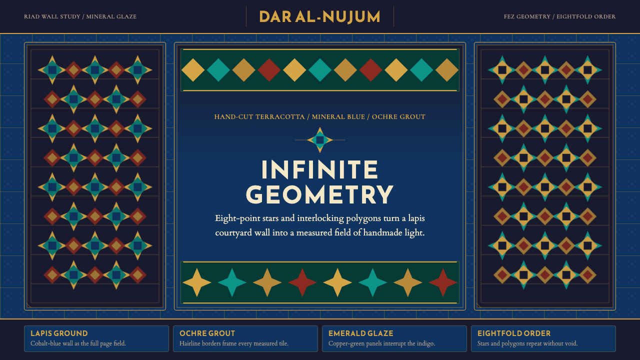 Moroccan Zellige TileLuxurious geometry without void. Lapis ground, ochre borders, and eight-point…华贵几何填满视野:青金石蓝底、赭金边框与八角星密铺。
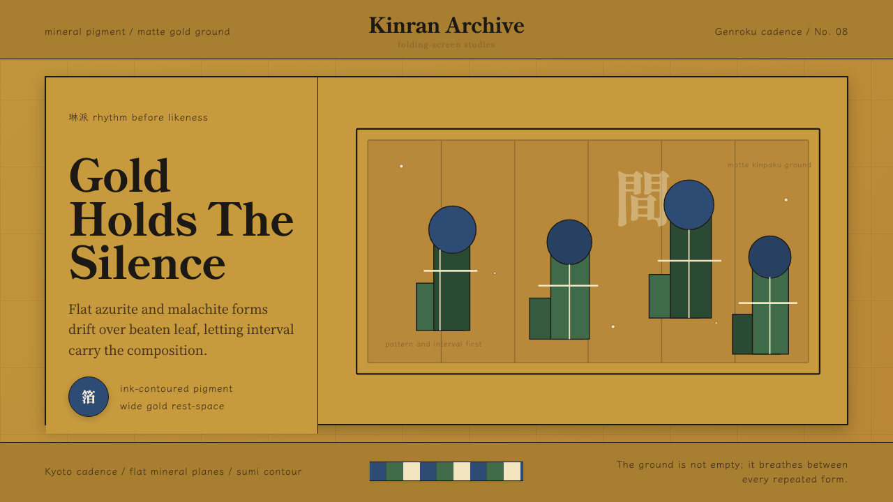 Edo Rinpa (Kōrin)Matte gold breathes. Azurite and malachite repeats float across inked screen…哑金会呼吸:群青与绿青反复漂浮在墨线屏风折面上。
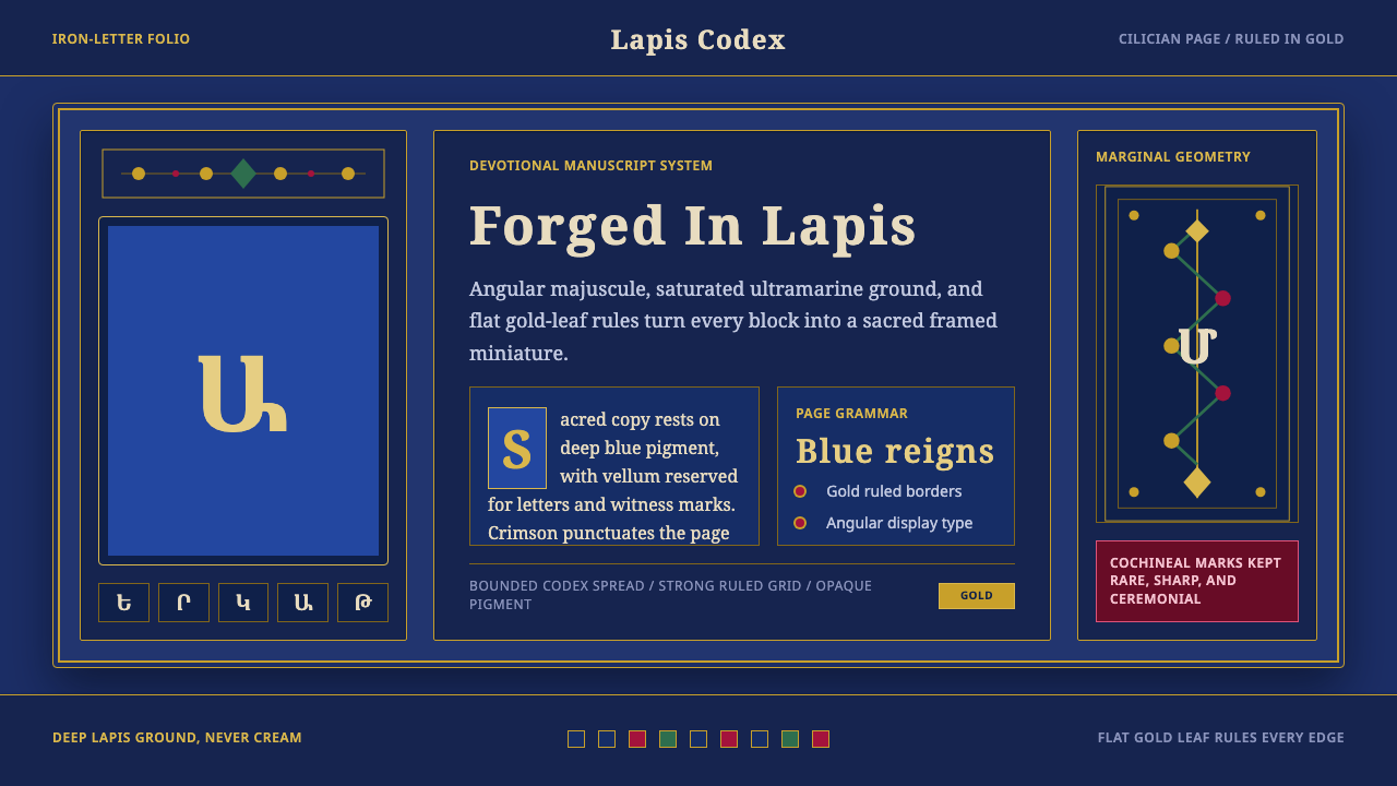 Armenian ErkatʿagirDevotional lapis reigns. Gold rules and angular serif glyphs frame a sacred g…虔敬青金石主宰:金色线框与棱角字形围合神圣网格。
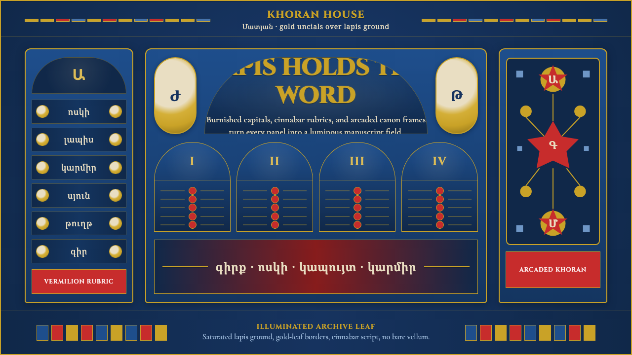 Armenian Manuscript FolkloreJewel-dense devotion. Lapis ground, gold uncials, and vermilion arcades fill…宝石般虔敬。青金石底、金色大写与朱砂拱廊填满画面。
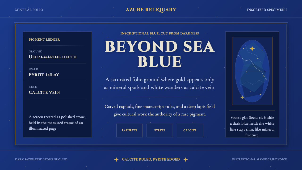 Badakhshan Lapis LazuliStone as manuscript. Ultramarine field, pyrite flecks, calcite veins, carved…以石为页:群青底、黄铁矿金点、方解石纹、铭文大写。
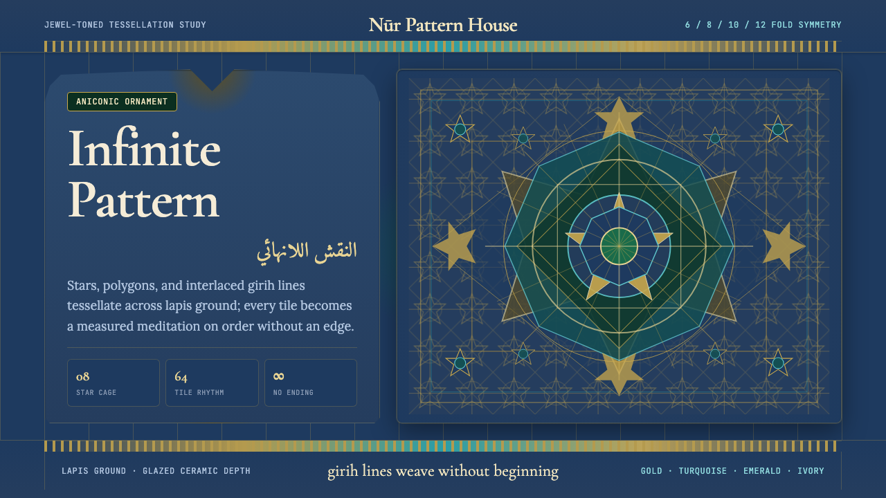 Islamic Geometric ArtInfinite order, fully tiled. Lapis ground with gold girih lines and turquoise…无限秩序,满幅铺陈。青金石底、金色girih线与绿松石星格。