What is Chipperfield Museum Gray?
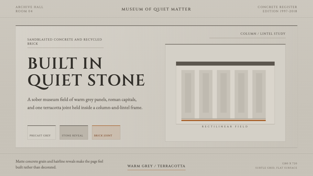
Chipperfield Museum Gray turns restrained museum architecture into a design system — sandblasted stone-gray concrete, roman-capital gravity, and one terracotta accent used with total discipline.
Chipperfield Museum Gray in brief
Chipperfield Museum Gray is drawn from the built work of British architect David Chipperfield, specifically two Berlin museum projects — the Neues Museum and the James-Simon-Galerie — that share a defining quality: architecture so restrained it disappears in service of what it houses. Rather than announcing itself, the design language recedes, letting material, proportion, and light carry the entire expressive weight.
The ground of the system is a pale, sober, warm stone-gray drawn from hand-sandblasted precast concrete mixed with white marble aggregate — a color deliberately positioned between cream and white rather than settling into either, so it reads as quarried stone rather than manufactured material. Against this quiet field, a single terracotta accent, sourced from recycled brick used in the Neues Museum's own reconstruction, supplies the system's only concession to warmth or contrast.
Typographically and structurally, the language uses classical roman capitals to fit the museum register, alongside rectilinear, column-and-lintel composition that echoes the physical logic of load-bearing stone architecture. The overall effect is calm, material, and slow to read — a system built for institutions that want gravity rather than spectacle.
Where does Chipperfield Museum Gray come from?
David Chipperfield is a British architect whose practice, founded in London in 1985, became known internationally for a restrained, material-driven approach often described as contextual minimalism — buildings that respond carefully to their historic surroundings rather than asserting a contrasting, attention-seeking form. His work sits within a broader late-modernist lineage that values proportion, material honesty, and quiet dialogue with context over expressive or sculptural gestures.
The Neues Museum in Berlin, part of the city's Museum Island complex, had stood as a bombed-out ruin since the Second World War, its ornate nineteenth-century interiors largely destroyed. Chipperfield's reconstruction, carried out between 1997 and 2009 in collaboration with heritage architect Julian Harrap, took a deliberately unusual position for a restoration project: rather than either fully rebuilding the lost ornament or leaving the ruin untouched, the design repaired the structure using new materials that are honestly legible as new, while preserving visible scars, bullet damage, and missing sections as part of the building's history. This approach — sometimes called critical reconstruction — is central to the design system's respect for both material honesty and historical layering.
The recycled-brick terracotta accent in this system traces directly to that reconstruction: brick reclaimed from the ruined building was reused in new construction wherever possible, giving the Neues Museum project a literal, physical continuity between old and new fabric. The precast concrete elsewhere in the building was mixed specifically with aggregate sourced to visually harmonize with the museum's original Saxon sandstone and limestone, which is the direct origin of this system's warm stone-gray ground.
The James-Simon-Galerie, completed in 2018 after a decade-plus of planning, serves as the new entrance building for the entire Museum Island complex. Its design extends the same restrained material language — pale concrete, colonnade-and-lintel framing evoking classical museum architecture without literally copying it — into an entirely new structure, demonstrating that the system's principles were not unique to a restoration project but form a coherent, repeatable architectural vocabulary. Together, the two buildings span more than two decades of Chipperfield's practice and represent one of the most widely studied examples of contemporary museum architecture in Europe.
What defines the Chipperfield Museum Gray look?
Color
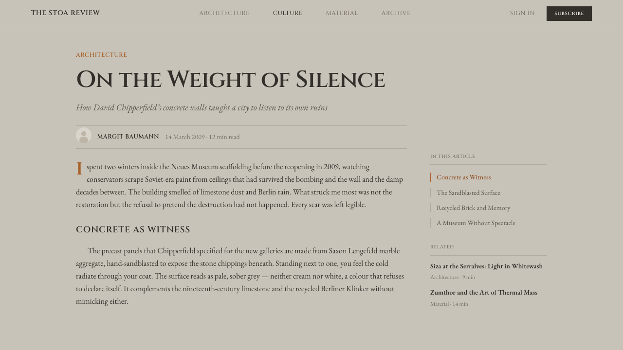
The ground color is a pale, warm stone-gray — deliberately positioned between cream and white so it reads as quarried mineral rather than a manufactured neutral. This gray carries a slight warmth rather than the cool blue-gray of industrial concrete, echoing the tone of natural sandstone and limestone. The single accent, a muted recycled-brick terracotta, appears sparingly and always against the gray ground, never paired with any second accent color.
Material
Hand-sandblasted precast concrete is the defining material, its surface deliberately textured rather than smooth-poured or polished — a finish that reads as worked by hand even though it is a manufactured building element. This sits in contrast to raw brutalist concrete, which typically retains visible formwork marks and a rawer, more industrial surface; this system's concrete is treated to feel closer to dressed stone.
Typography
Classical roman capital letterforms carry the museum register — the same broad structural tradition used on carved inscriptions and institutional signage for centuries, chosen for its gravity and legibility rather than any contemporary trend. Labels and headings favor generous spacing between letters over tight, condensed setting, reinforcing a sense of unhurried, engraved permanence rather than dense information delivery.
Composition
Layout follows a rectilinear, column-and-lintel logic — vertical structural elements supporting horizontal spans, echoing the physical grammar of load-bearing stone architecture rather than the more fluid or asymmetric compositions found in other design languages. Sections are organized as distinct framed bays rather than a continuous scroll, giving the layout a sense of walking through discrete rooms.
Restraint
Every decision in this system is governed by a single question: does this serve what the architecture houses, or does it call attention to itself? Ornament, gradient, and decorative flourish are absent by principle, not by budget constraint. The restraint should read as confident and considered rather than austere or unfinished — a quality achieved through careful proportion rather than mere absence of detail.
Light
Light in the source architecture is treated as a material in its own right — daylight admitted through carefully proportioned openings to model the sandblasted concrete's texture and reveal subtle variation across the gray surface, rather than flooding spaces evenly. This system favors a similar approach to light: soft, directional emphasis that reveals surface texture rather than flat, uniform illumination.
Historical Layering
Where the Neues Museum reconstruction is visible, old and new fabric are left honestly distinguishable rather than blended into a seamless whole — visible seams between historic stone and new concrete are treated as content, not flaws to be hidden. Applied to design work, this suggests a system comfortable showing structure and process rather than concealing every seam behind a uniformly polished surface.
Who shaped Chipperfield Museum Gray?
Chipperfield founded his London practice in 1985 and became internationally recognized for a restrained, contextual approach to architecture, particularly through his Berlin museum work. His method of 'critical reconstruction' at the Neues Museum — repairing rather than replicating, and leaving damage visible as history — established a widely referenced model for how contemporary architecture can intervene in a historic structure without erasing its past.
Harrap, a heritage architect specializing in the conservation of historic buildings, collaborated with Chipperfield on the Neues Museum reconstruction, bringing the technical and philosophical expertise needed to navigate the ethics of repairing a war-damaged, historically significant structure. His involvement grounded the project's approach to material honesty in established conservation practice rather than purely aesthetic judgment.
Museum Island is the UNESCO World Heritage complex of museum buildings in central Berlin that both the Neues Museum and the James-Simon-Galerie belong to. The institutional context of this complex — a cluster of nineteenth- and twentieth-century museum buildings rebuilding themselves after wartime destruction — shaped the restrained, historically respectful register this design system draws from.
How do you use Chipperfield Museum Gray today?
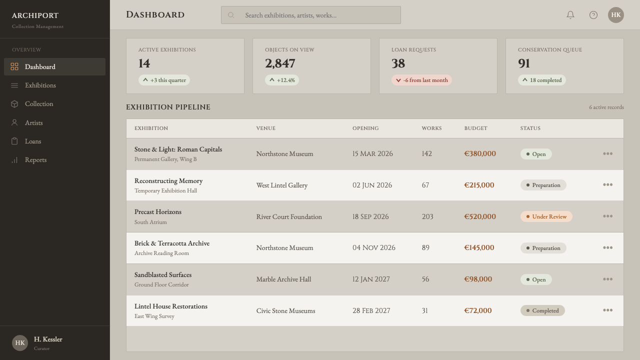
Chipperfield Museum Gray is best suited to work that wants to project institutional gravity, credibility, and restraint — cultural and heritage brands, museums and galleries, academic and archival platforms, and any product positioning itself as serious, considered, and built to last rather than trendy or disposable.
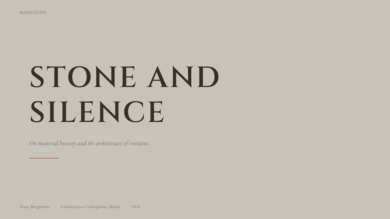
For presentation slides, the style works exceptionally well for cover and section-divider pages: a broad, textured stone-gray field with a title set in wide-spaced roman capitals communicates seriousness without needing imagery. Content slides should favor a strict column-and-lintel grid — clear vertical divisions echoing structural bays — with body text kept plain and unadorned, and the terracotta accent reserved for a single structural marker per slide, such as a rule line or a section number, never spread across multiple elements. Data slides benefit from being framed like an inscribed plaque rather than a conventional chart-heavy dashboard — numerals set large and quiet against the stone-gray ground, with the terracotta used only to flag the single most important figure.
For web interfaces, this system suits institutional and cultural-sector dashboards, donor or membership portals, and pricing pages for premium, trust-driven products where calm authority matters more than energetic conversion tactics. It is a poor fit for fast-moving consumer apps, playful products, or contexts that need to feel urgent or exciting — the restrained gray-on-gray register actively resists urgency, and forcing bright interactive color into it undermines the system's coherence.
For editorial and marketing work, the style excels at long-form cultural journalism, institutional annual reports, and heritage or archival storytelling, where the roman-capital typography and rectilinear composition lend even ordinary content an air of permanence. Marketing pages should let the stone-gray field dominate large areas and use the terracotta accent only as a rare, deliberate punctuation mark — a section divider, a single highlighted word — never as a broad background color.
A common mistake is treating this as simply 'gray minimalism' and losing the material warmth that distinguishes it from cold, industrial concrete styling. Authentic application keeps the gray warm rather than blue-toned, uses the terracotta with real discipline rather than as a generic accent color splashed across multiple elements, and preserves generous, unhurried spacing rather than compressing content to fit more onto a page — cramped spacing undermines the sense of considered permanence the style depends on.
Chipperfield Museum Gray — FAQ
Is this style the same as brutalism?
No, though they share a material — concrete. Brutalism typically embraces raw, rough concrete with visible formwork marks as an assertive, muscular statement, often paired with bold, monumental massing. Chipperfield Museum Gray uses concrete in a refined, hand-finished way specifically to recede and support what it surrounds, paired with classical proportion rather than brutalism's more aggressive geometric weight. The shared material produces very different emotional registers.
Why is the terracotta accent used so sparingly instead of as a broader secondary color?
Because in the source architecture, the terracotta brick appears only where reclaimed material was structurally reused — it is a trace of history, not a decorative choice, and it never dominates a facade. Using it sparingly in the design system preserves that same sense of a single, meaningful mark against a much larger quiet field; spreading it broadly would turn a historically grounded detail into generic color decoration and undercut the system's discipline.
Can this style work with photography and imagery, or is it text-only?
It works well with photography as long as the imagery itself is calm and considered — architectural or object photography with soft, directional light and minimal color saturation sits naturally within the system, echoing how light is handled in the source buildings. Bright, high-saturation, or heavily stylized photography will clash with the restrained palette and should be avoided or desaturated to match.
Is 'critical reconstruction' a specific technical term, and does the design system need to reference it literally?
It is a recognized term in architectural preservation discourse describing the approach Chipperfield used at the Neues Museum — repairing rather than replicating lost ornament, and leaving damage visible as historical evidence. Design work drawing on this system does not need to reference the term explicitly; what matters is absorbing its underlying discipline — material honesty, comfort with visible seams between old and new, restraint over ornament — into visual choices rather than citing the architectural theory itself.
How does this system differ from generic 'Scandinavian minimalism' styling?
Scandinavian minimalism typically leans toward lighter, cooler neutrals, natural wood tones, and a domestic, comfortable warmth. Chipperfield Museum Gray is institutional rather than domestic in character — its warmth comes specifically from stone and concrete rather than wood, its proportions echo monumental architecture rather than furniture-scale design, and its typography leans classical and inscriptional rather than the clean geometric sans typical of Scandinavian branding. The two can look superficially similar in their restraint, but the material and historical references are distinct.
Related design styles
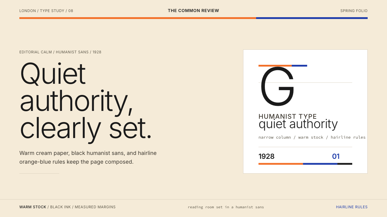 Gill Sans (BBC, 1928)Quiet authority, clearly set. Warm cream, black humanist sans, and hairline o…
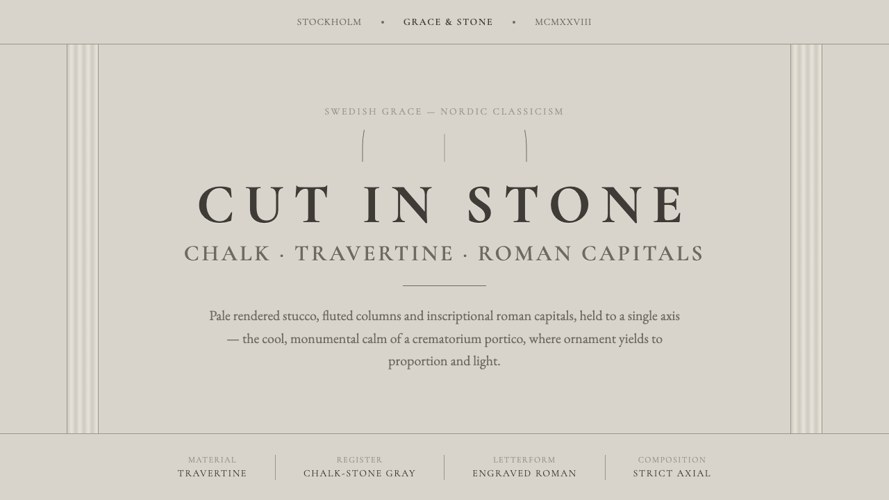 Nordic Classicism AsplundStone, not cream. Engraved Trajan capitals on cool chalk stucco, fluted colum…
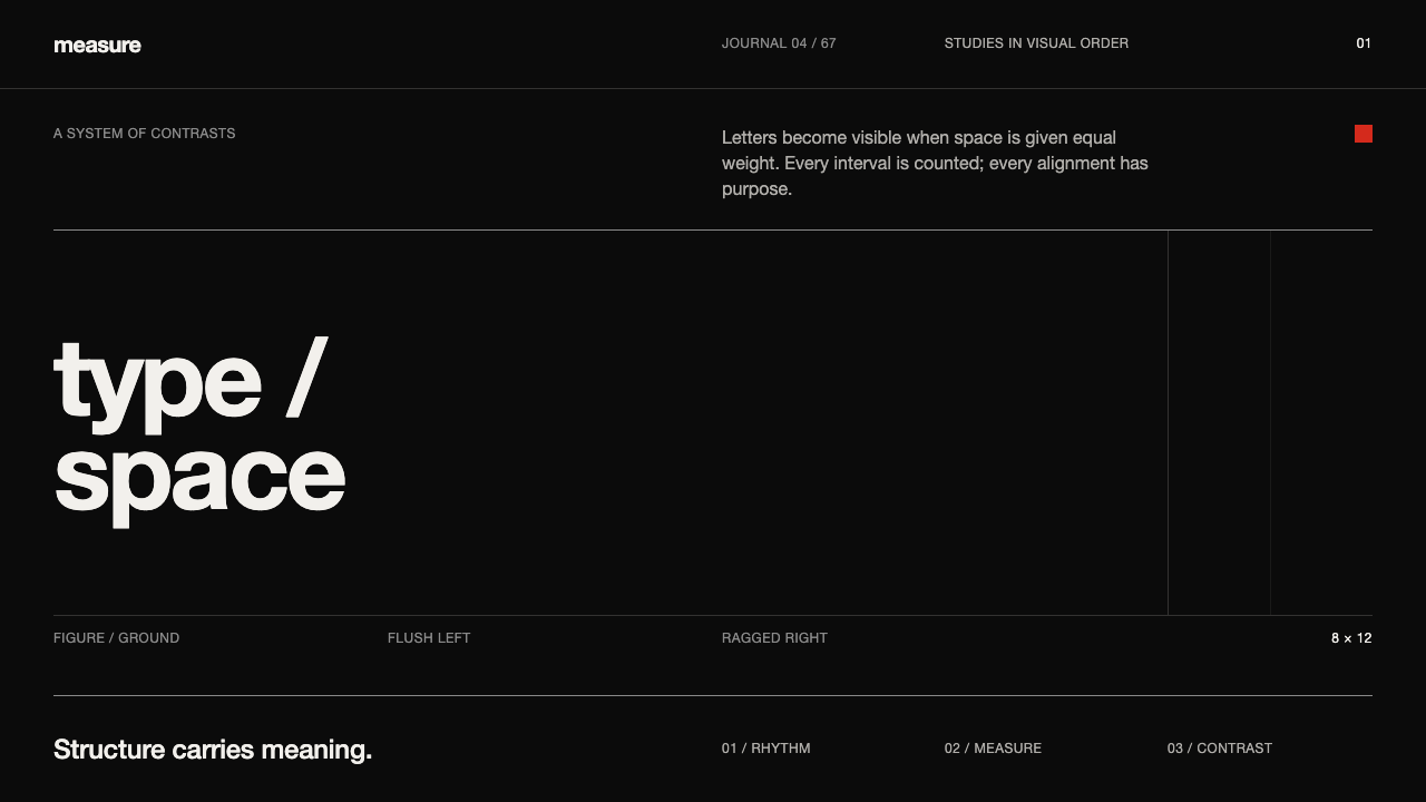 Emil Ruder TypografieDiscipline makes type visible. Near-white grotesque and measured space cut th…
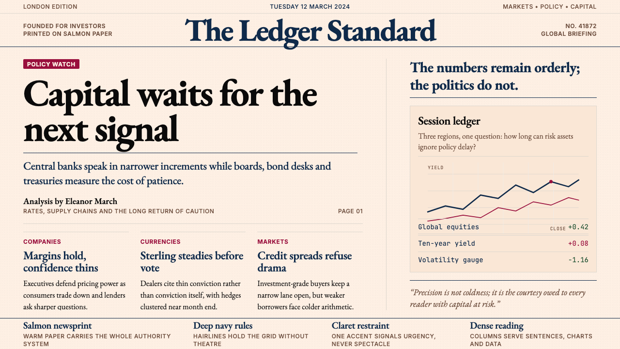 Financial Times (Pink Paper)Authority on salmon paper. Deep navy rules and claret accents discipline dens…
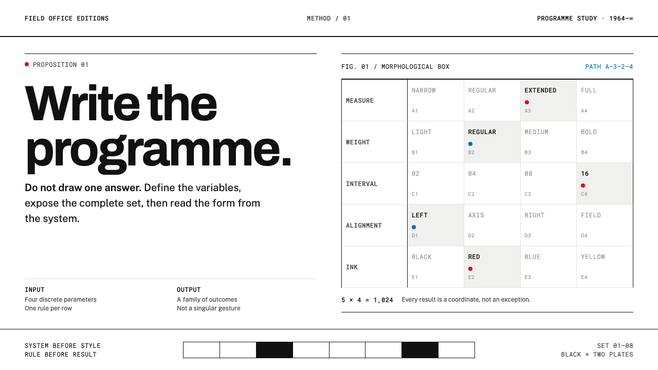 Karl Gerstner ProgrammesDesign becomes a programme. Black hairlines and a strict matrix turn paramete…
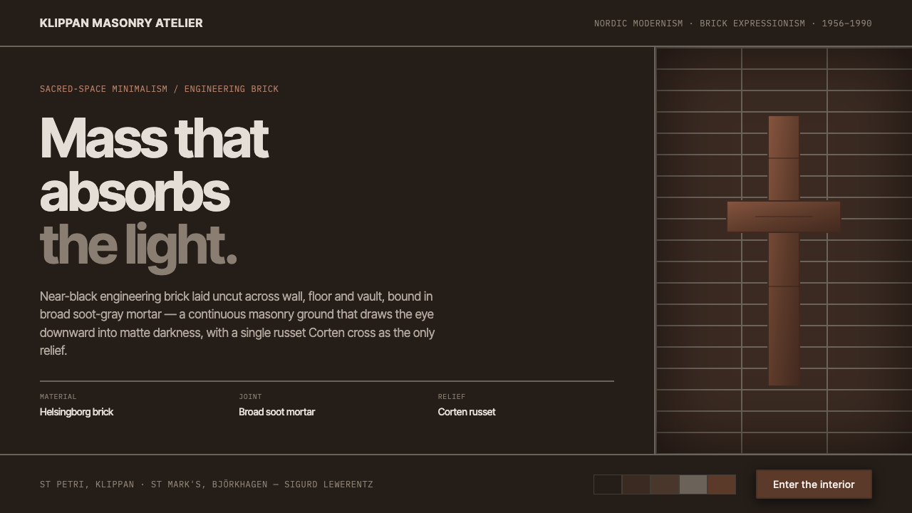 Lewerentz Dark BrickMass that absorbs light. Near-black engineering brick, broad soot mortar, one…