What is Nordic Classicism (Asplund)?
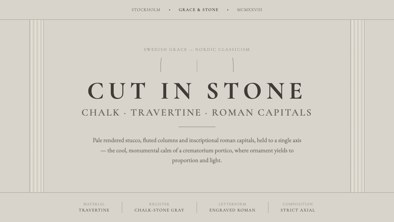
Nordic Classicism holds architecture at its quietest point: cool chalk stucco, stone-cut letters, fluted columns, and an axis calm enough to feel ceremonial.
Nordic Classicism (Asplund) in brief
Nordic Classicism is the architectural language associated with Sweden and Stockholm from the early twentieth century through the middle of the century, with Swedish Grace reaching its high point between 1915 and 1930. In its Asplund-inflected form, it translates classical order into a notably restrained northern register: pale rendered stucco, yellow travertine cladding, fluted columns, classical geometry, and engraved Roman capitals. The result is recognizably monumental without becoming theatrical.
The style is often described through Swedish Grace, but grace here does not mean softness, luxury, or decorative abundance. It means proportion held under control. The architecture relies on an ordered façade, a measured portico, a limited material vocabulary, and a deliberate relationship between solid wall, opening, column, and inscription. Its calm comes from subtraction and alignment rather than from emptiness alone.
Its visual temperature matters. Nordic Classicism is stone, chalk, lime, and matte plaster rather than warm cream. The intended mood is closer to the portico of the Woodland Crematorium than to the orange-rendered exception of the Stockholm Public Library. Cool pale surfaces allow columns, shadows, carved lettering, and axial composition to read with unusual clarity, giving even a modest arrangement a quiet civic gravity.
Where does Nordic Classicism (Asplund) come from?
The movement belongs to Sweden, with Stockholm as its central setting, and spans the period identified as 1900–1950. Its most concentrated expression is Swedish Grace, whose high point ran from 1915 to 1930. Rather than abandoning classicism, Nordic Classicism narrows it: the classical vocabulary remains visible, but it is stripped of excess and made compatible with pale plaster, stone cladding, and a northern sense of reserve.
Erik Gunnar Asplund is the figure through whom the supplied description most directly distills the style. His version of the language makes classical architecture feel less like a display of inherited authority and more like a carefully composed environment. The portico, the rendered wall, the column, and the inscription each retain distinct presence; together they produce a calm that is formal without being pompous.
The source places Sigurd Lewerentz and Ivar Tengbom alongside Asplund as key figures, and identifies Nordic Classicism, Swedish Grace, and Stripped Classicism as its related movements. Those terms clarify the style's position. It is Nordic in atmosphere, classical in its geometry and axial discipline, graceful in its restraint, and stripped in the sense that ornament is held back so material, proportion, and lettering can carry the expression.
What defines the Nordic Classicism (Asplund) look?
Cool Chalk and Stone
The dominant register is pale, cool, and mineral. Rendered stucco reads as chalk or lime rather than as a warm domestic surface, while yellow travertine provides a denser counterpoint. Matte finishes are essential because they keep attention on mass, edge, and proportion. The palette should feel weathered, architectural, and quietly durable, never sugary or sunlit.
Axial Calm
Strict axial symmetry organizes the composition. A central approach, aligned opening, portico, or inscription gives the viewer a clear place from which to read the work. This is not symmetry used as ornament; it is symmetry as a stabilizing structure. The effect is slow, composed, and ceremonial, allowing the architecture to feel settled before any detail is noticed.
Restrained Classical Geometry
Classical geometry is present in the discipline of the whole rather than in a crowded accumulation of motifs. Planes, openings, columns, and voids are given legible roles and held in measured relation. The composition should look inevitable, as though each part has been reduced to the amount required for balance. Decorative surplus weakens the style because it interrupts that sense of necessity.
Fluted Columns and Portico
Fluted columns bring a measured vertical rhythm to the pale field, while the portico concentrates the building's public address at its threshold. Neither element needs excessive elaboration. Their power lies in repetition, spacing, and silhouette: column against wall, shadow within flute, roof line held above an ordered entry. They make arrival feel deliberate and dignified.
Inscriptional Roman Capitals
Lettering should feel engraved rather than printed. Roman capitals carry the clarity and permanence of an inscription, making names, titles, and short statements part of the architecture rather than an added graphic layer. The best treatment is sparse, evenly placed, and materially convincing. It speaks with authority through restraint, not through loud scale or ornamented letterforms.
Matte Monumentality
Nordic Classicism creates monumentality without polished spectacle. Matte plaster and stone absorb visual noise, allowing light and shadow to articulate form softly but clearly. The atmosphere is quiet rather than dramatic, dignified rather than luxurious. This restraint is what keeps the style humane: a building can feel civic and enduring without becoming intimidating.
Who shaped Nordic Classicism (Asplund)?
Asplund is the central figure in this account of Nordic Classicism. The source describes the style as Swedish Grace distilled through him, and uses the Woodland Crematorium portico as the clearest measure of its cool chalk-and-stone register. His importance here is not excess of signature detail, but the ability to make restraint, classical geometry, and quiet monumentality read as one coherent language.
Lewerentz is identified as one of the movement's key figures. His inclusion places Nordic Classicism beyond a single-author style and within a broader Swedish architectural field. In a Curio application, his name is a reminder that the style should be understood as a shared vocabulary of disciplined classicism, not as a decorative imitation of one façade or one building.
Tengbom is likewise named as a key figure in the movement. Together with Asplund and Lewerentz, he anchors the style in the Swedish context from which Swedish Grace emerged. The useful lesson is collective rather than biographical: Nordic Classicism gains force from a consistent civic register of material restraint, ordered geometry, and inscriptional presence.
How do you use Nordic Classicism (Asplund) today?
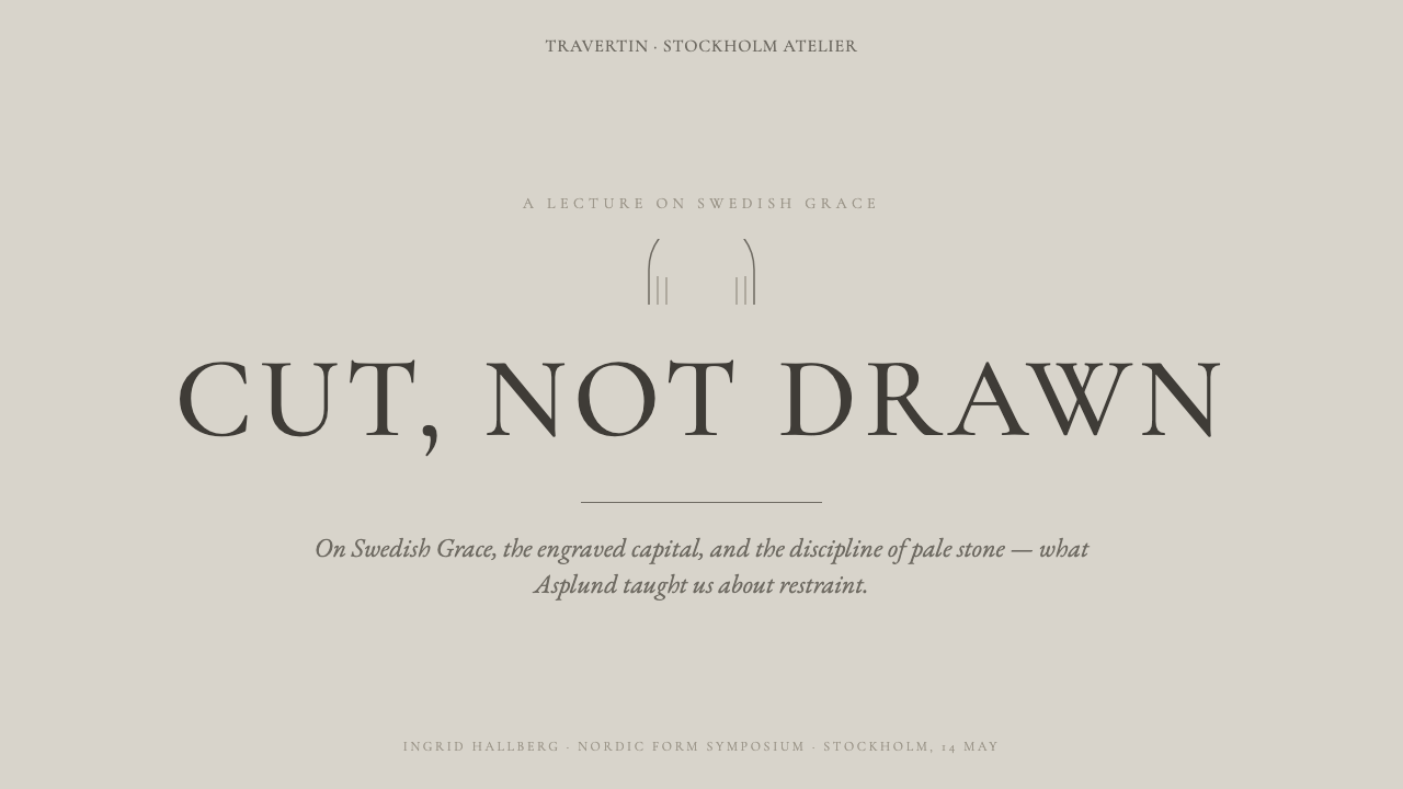
For presentation covers, use a pale chalk or stone-like ground and build the composition around a central axis or a measured portico-like frame. An engraved Roman-capital title can sit with generous surrounding quiet, while one fluted vertical motif or travertine-toned plane supplies material character. Content slides should remain ordered and spare: align headings, body copy, captions, and dividers to a shared axis rather than treating every section as an independent card. Data slides work best when charts are simplified into calm architectural diagrams, with restrained contrast and labels that feel inscribed rather than promotional.
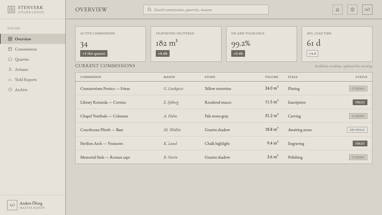
For web interfaces, Nordic Classicism fits dashboards, institutional portals, cultural archives, and pricing pages that need authority without visual aggression. Establish a clear central alignment and use pale matte surfaces as the principal field. Panels should feel like stone or plaster planes, not floating glass objects; navigation should read as architectural signage; Roman-serif display text is most effective for page titles, landmarks, and short declarations, while dense functional information remains sober and highly legible.
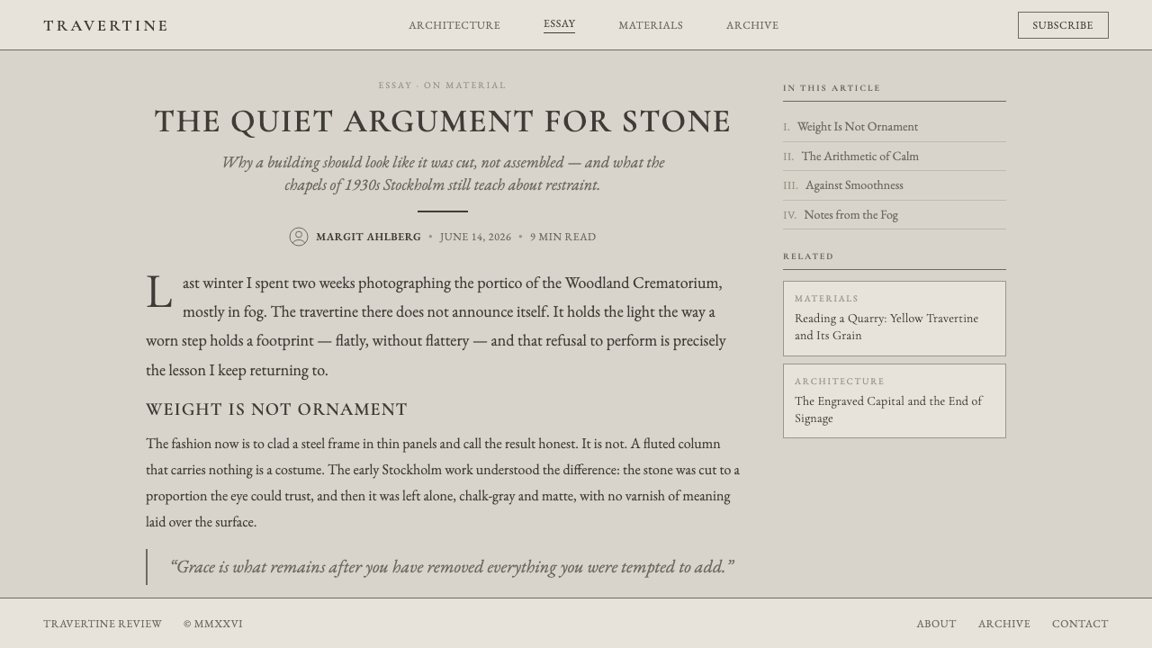
For editorial and marketing work, the style supports subjects that benefit from trust, permanence, heritage, and thoughtful pace. An article can use a broad pale margin, a centered or axially aligned title block, restrained rules, and occasional inscription-like pull quotes. A marketing page can stage a product or institution through sequential architectural moments: threshold, central statement, material detail, and quiet call to action. The visual language should make the audience slow down rather than demand constant attention.
The common mistake is confusing Nordic Classicism with generic beige luxury or with ornate neoclassicism. Warm cream, glossy metallic effects, crowded mouldings, decorative wreaths, and theatrical contrast all move the result away from its source. Another mistake is borrowing columns and Roman capitals without the axial discipline that gives them meaning. If the surfaces are not cool and matte, the geometry not calm, and the lettering not integrated as an inscription, the result becomes costume rather than Nordic Classicism.
Nordic Classicism (Asplund) — FAQ
Is Nordic Classicism the same as Swedish Grace?
They overlap closely but are not identical labels. Nordic Classicism names the broader movement and regional architectural language; Swedish Grace identifies its particularly refined Swedish high point between 1915 and 1930. In this source, Asplund's work distills Swedish Grace into a concise visual system of cool stucco, restrained classical geometry, fluted columns, and inscriptional capitals.
Why is the palette described as cool rather than creamy?
Because the reference is pale rendered stucco, chalk, lime, stone, and yellow travertine. The source explicitly distinguishes the Woodland Crematorium portico from the orange-render exception of the Stockholm Public Library. Cool pale material makes the axial order and engraved lettering more legible; warm cream shifts the atmosphere toward domestic softness and away from the style's quiet monumentality.
Can the style work for a contemporary digital product?
Yes, when the product needs ordered hierarchy, institutional trust, or a cultural sense of permanence. Translate the architecture into interface behavior: use alignment as the main organizing force, preserve generous quiet around important statements, keep surfaces matte in feeling, and make display typography feel inscriptional. It is less suitable when the product depends on playful abundance, rapid visual novelty, or overtly warm emotional expression.
What most often makes an application feel inauthentic?
Usually it is the loss of restraint. A project may borrow pale walls, columns, or Roman capitals, then undermine them with glossy surfaces, decorative accumulation, warm luxury cues, or scattered alignment. Nordic Classicism depends on the whole composition agreeing with itself: cool material character, axial calm, limited detail, and lettering integrated into the architectural order. Any one motif alone is insufficient.
Related design styles
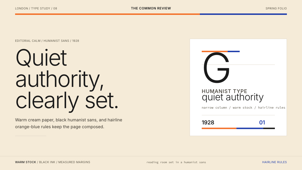 Gill Sans (BBC, 1928)Quiet authority, clearly set. Warm cream, black humanist sans, and hairline o…
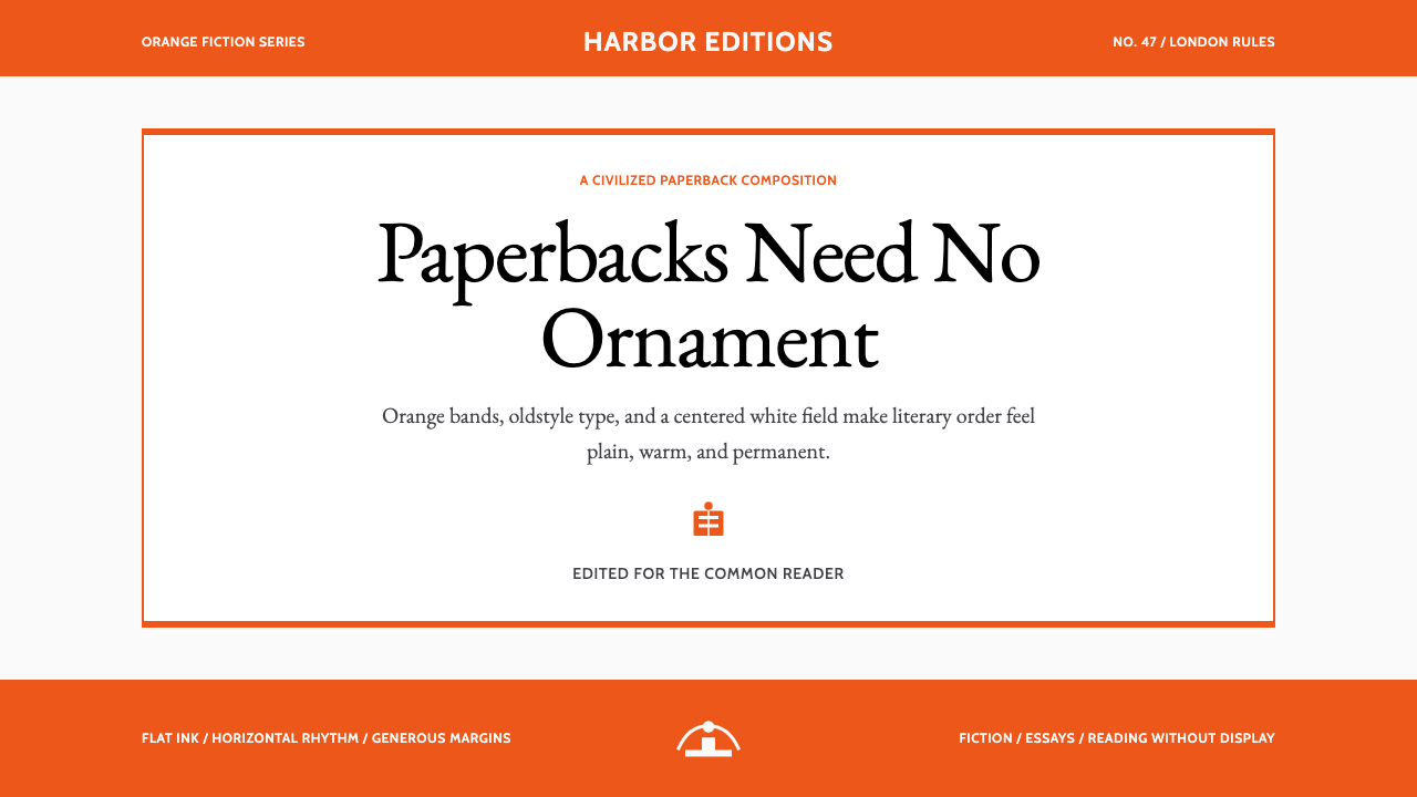 Penguin Classics OrangePaperback authority. Orange tri-bands, serif title panel, and flat ink enforc…
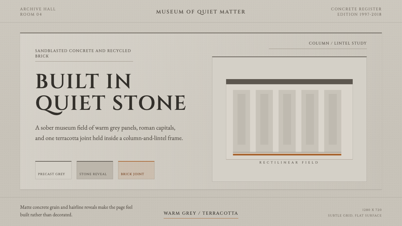 Chipperfield Museum GrayMuseum gravity, rendered quietly. Warm concrete grey, roman capitals, one ter…
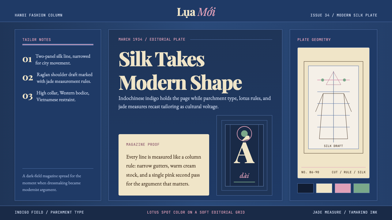 Vietnamese Áo Dài 1934 (Cát Tường)Indigo editorial poise. Parchment serif columns and lotus-pink rules frame th…
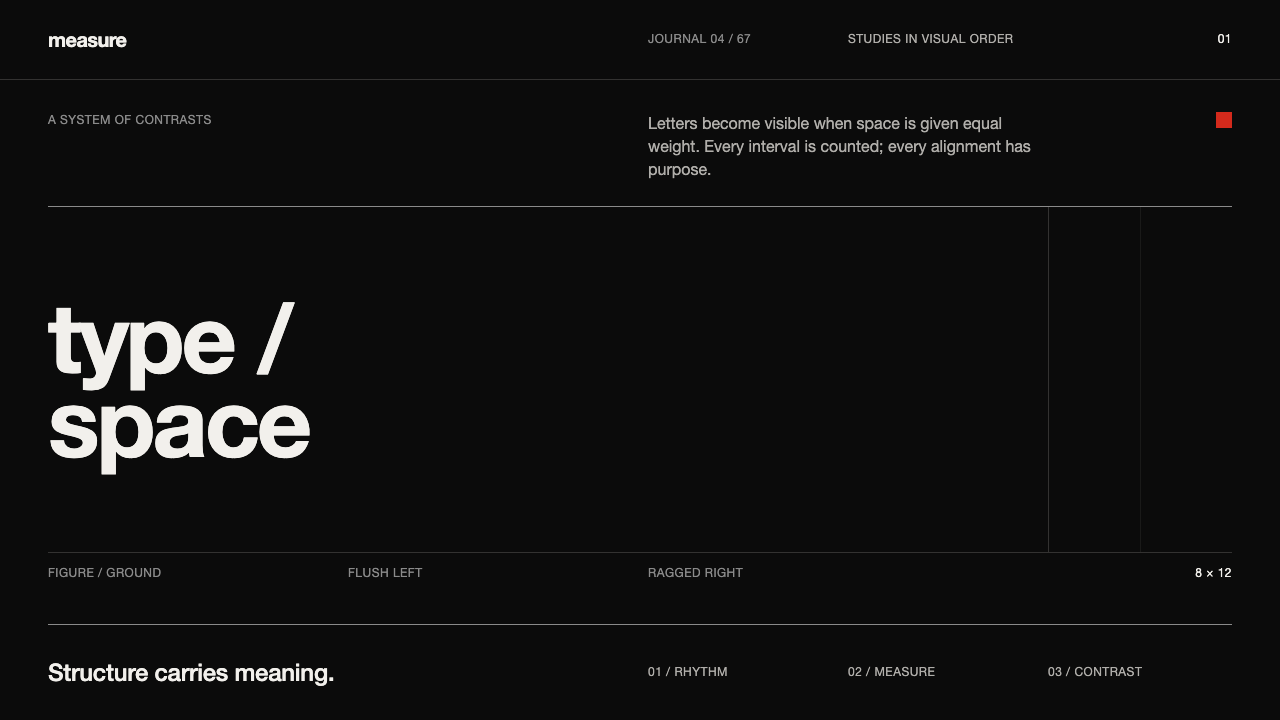 Emil Ruder TypografieDiscipline makes type visible. Near-white grotesque and measured space cut th…
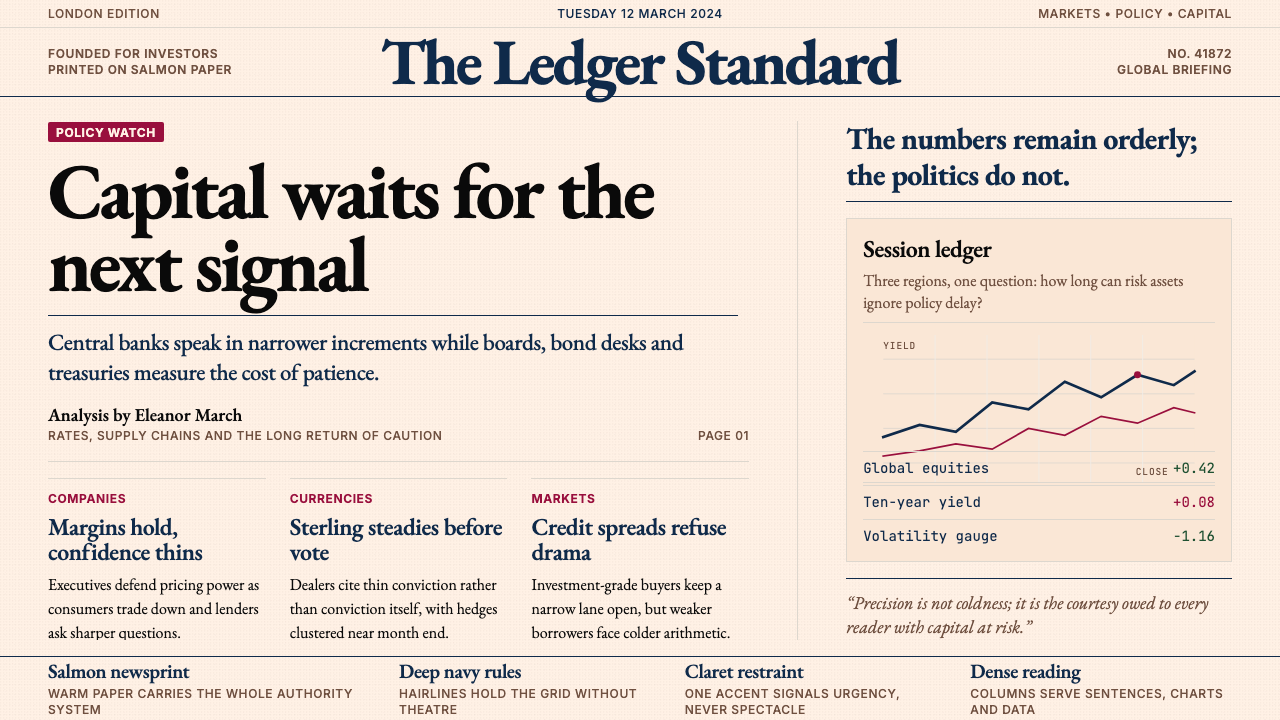 Financial Times (Pink Paper)Authority on salmon paper. Deep navy rules and claret accents discipline dens…