What is Kaunas Interwar Modernism?
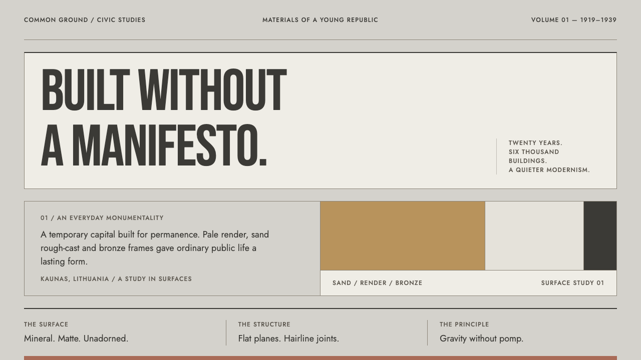
Kaunas modernism is Baltic restraint in mineral form: pale rendered walls, warm sand, hairline joints and capital letters cut like facade lettering.
Kaunas Interwar Modernism in brief
Kaunas Interwar Modernism is a design language taken from the surface of a city. Between 1919 and 1939 Kaunas served as the temporary capital of Lithuania, a role it never expected to hold, and in those twenty years it filled with banks, post offices and apartment blocks designed in the modernist idiom. The buildings share cubic volumes, flat planes and a distinctive material palette: pale artificial-stone render, warm sand rough-cast, pink granite plinths and dark bronze frames.
The character of that architecture is gravity without pomp. It is modernism without the manifesto. Where the Bauhaus announced itself with slogans and primary colours, the builders of Kaunas spoke more quietly, in a Baltic register of restraint: composed, civic and a little reserved. The buildings do not shout their novelty. They stand in the street, mineral and matte, and let proportion do the persuading.
The design system takes that surface literally. The page is a flat rendered plane in a pale stone grey. The main colour is the warm sand of a post-office wall. Cards behave like stone slabs set into that wall, separated by a hairline joint rather than lifted by shadow. Headings are condensed capitals, cut like lettering on a facade, and the whole layout is held to a grid as strict as the band of windows running across a street elevation.

Where does Kaunas Interwar Modernism come from?
Kaunas became Lithuania's temporary capital in 1919 and kept the role until 1939. That is the twenty-year window in which this architecture appeared. The city built like a capital it never expected to be, hurriedly but seriously, and the library's reference material counts roughly six thousand modernist buildings from the period. The scale is the surprising part: this is not a handful of landmarks but the fabric of an entire city.
The builders were largely architects who had studied abroad and came home to a state that needed banks, post offices and homes all at once. They worked fast, and their training shows in a shared repertoire: cubic massing, plain surfaces, restrained ornament and an eye for how one material can carry a whole facade. The library groups the influences under three labels: interwar Lithuanian modernism, Art Deco civic architecture and functionalism. They are overlapping currents that the city absorbed without choosing between them.
The materials explain the look. Pale artificial-stone render gives walls that are flat, even and faintly grainy. Warm sand rough-cast brings a sunlit, slightly coarse colour. Pink granite grounds the base of a building as a plinth, and dark bronze outlines windows and doors. Each material is used in its natural role, and ornament stays restrained, so what you notice is the surface itself: how it takes light, how it is jointed, how the lettering is cut into it.
In 2023 the interwar architecture of Kaunas was inscribed by UNESCO, giving international recognition to a city whose twenty years as a capital might otherwise have been remembered as an interlude. The Curio style does not treat that recognition as an excuse for nostalgia. It reads the buildings as a working vocabulary of render, sand, stone, bronze, condensed capitals and hairline joints, and that vocabulary translates well to screens because it was already a system of flat planes and strict grids.
What defines the Kaunas Interwar Modernism look?
Rendered ground
The page is a pale stone-grey plane, matte and even, like artificial-stone render on a street wall. It is neither white nor fully neutral: a slight warmth and a fine grain keep it mineral. Large areas of the layout should feel like walls, flat and unpolished, with no sheen to catch the eye.
Warm sand primary
The main colour is the warm sand of rough-cast on a post-office wall, a sunlit, slightly coarse yellow-brown. It is used for large planes, key blocks and primary actions, never as a bright accent. Because it comes from a material rather than from a pigment, it should feel baked into the layout, not painted on top of it.
Hairline joints, not shadows
Cards read as stone slabs set into a wall and are separated by a fine joint line, not lifted by shadow. Elevation is never faked. Where one surface needs to stand apart from another, a thin line or a step in tone does the job, exactly as a mason's joint marks the edge of a panel.
Condensed capitals
Headings are set in tall, narrow capitals, like lettering cut into a facade. They carry the formality of an inscription: upright, evenly spaced, with no flourish. Lowercase body text stays quiet beneath them, so that the heading reads as a sign on the building and the paragraph as the room behind it.
Window-band grid
The grid is held as strictly as a band of windows across a street elevation. Modules repeat, alignments hold from top to bottom, and horizontal rhythm dominates. Nothing floats free of the structure. This discipline is what lets the style feel civic and trustworthy even when its surfaces are plain.
Granite and bronze anchors
Pink granite appears as a plinth, a low band at the base of a layout, a footer or a quiet base for a table. Dark bronze appears in frames and outlines, around inputs, windows and image edges. Both are used in small amounts to ground and frame the sand and render, in the way that stone and metal ground a building's walls.
Matte grain
Nothing glows, nothing reflects. The whole system is matte and slightly grainy, a mineral surface rather than a lit screen. If a detail looks glossy, it does not belong. The finish should feel as if you could run a hand across it and meet a fine, dry texture.

Who shaped Kaunas Interwar Modernism?
Feliksas Vizbaras is listed first among the key architects the library associates with the Kaunas wave. The reference material names him without a biography, so his entry is best read as a marker for the whole generation: architects schooled abroad who came home to build the civic fabric of a temporary capital at speed. For a designer, his name is a useful doorway into the banks and post offices that shaped the style's institutional voice.
Vytautas Landsbergis-Žemkalnis is another architect the library names for the period. Read next to the library's movement notes on functionalism and Art Deco civic architecture, his name points to the same lesson the whole city teaches: modern form does not require a manifesto. Plain planes, strong horizontals and aligned openings were enough, and that economy is exactly what the design system wants to preserve.
Arnas Funkas is named among the architects associated with interwar Kaunas. Treat his name as a doorway into the material side of the movement, the render, rough-cast, granite and bronze that give the style its palette. When you choose tones for a Kaunas layout you are effectively choosing materials, and studying how these buildings are surfaced is the fastest way to calibrate those choices.
Mykolas Songaila completes the library's list of four architects for the period. Together the four names point to something bigger than any one career: a city that filled with roughly six thousand modernist buildings in twenty years and, in 2023, saw that heritage inscribed by UNESCO. His entry is a reminder that this style belongs to a collective achievement, and that the right register for it is civic, not personal.
How do you use Kaunas Interwar Modernism today?
On slides, Kaunas modernism makes covers that feel institutional in the best sense. Set the title in condensed capitals on a warm sand block over a stone-grey ground, add a single hairline rule beneath it, and let the slide breathe. Content slides work as wall elevations: modules aligned to a visible grid, each separated by thin joint lines. For data, use flat, unshadowed charts with bars in sand or bronze on a rendered ground, and label them in the same condensed capitals so that a chart reads like an inscription.
On the web, the style suits banks, public services, civic platforms, legal and financial products, and any interface that needs to feel steady and trustworthy. Cards and panels sit flush, divided by thin lines rather than shadows. Navigation can use condensed capitals as quiet signage. Pricing pages are a natural fit: tiers read as equal panels in a wall, with the recommended one picked out by a sand fill rather than a glow. Keep states plain, with a darker joint line or a bronze frame for focus.
For editorial and marketing work, the style is good at conveying architecture, urbanism, heritage, design history, banking and anything that wants to say 'solid and quietly modern'. Use generous margins, large condensed headings and photography that shows facades, stone and lettering. Campaign pages can borrow the repeated window band as a recurring structural rhythm. The tone is composed rather than loud; a Kaunas layout persuades by looking inevitable.
Because the style comes from a specific city and period, it works best when that origin is honoured. If a project is about architecture, Lithuania or the Baltic region, name Kaunas and the interwar years. For projects that borrow the vocabulary alone, the structural ideas of flat planes, joints instead of shadows and one strict grid transfer cleanly, and no pretence of local authority is needed.
The most common mistake is to treat the sand as a warm brand colour and apply it everywhere, as if the style were simply 'beige and capitals'. Sand is a material, and it belongs on large planes where it can read as rough-cast, not on every button. The second mistake is to add soft drop shadows, glows or glossy highlights to the cards, which destroys the stone logic at once. The third is to loosen the grid. This system lives on strict alignment, and the moment elements drift out of their window band, it stops looking like Kaunas and starts looking like a generic neutral theme.

Kaunas Interwar Modernism — FAQ
Why was Kaunas a capital between 1919 and 1939?
The library's reference describes Kaunas as the temporary capital of Lithuania for twenty years between the wars, a role the city did not expect to hold. That unplanned status is what drove the building boom: banks, post offices and apartment blocks were erected quickly by architects who had trained abroad. The style borrows the seriousness of that civic moment, not its politics.
How is Kaunas modernism different from the Bauhaus?
Both use plain planes and reject surface decoration, but the tone differs. The Bauhaus announced itself through manifestos, primary colours and graphic confrontation. Kaunas modernism is modernism without the manifesto: quieter, more mineral, more civic, and defined by materials such as render, sand rough-cast, granite and bronze. In design terms that means a muted, matte palette and hairline joints instead of bold colour blocks.
Why does the style use hairlines instead of shadows?
Because the reference is a wall. On a rendered facade, panels and stone slabs are separated by joints, not by cast shadows. Hairline joints keep the layout flat and mineral, make edges precise, and avoid the sense of floating that shadows create. They also reproduce well in print and on screens of any quality.
What does UNESCO recognition have to do with the style?
The interwar architecture of Kaunas was inscribed by UNESCO in 2023. That recognition confirms the architecture as a coherent body of work, roughly six thousand buildings, rather than a scattering of landmarks. For the design system it is context, not content: it reinforces the idea that the vocabulary of render, sand, stone and bronze is a considered system worth translating into layouts.
Which kinds of product suit this style best?
It suits products that need to feel steady, public and trustworthy: banking, public services, legal and civic tools, architecture and design publications, and heritage brands. It is less natural for entertainment or playful consumer products, where its restraint can read as stern. A warm sand primary and gentle proportions soften it enough for most professional contexts.
Related design styles
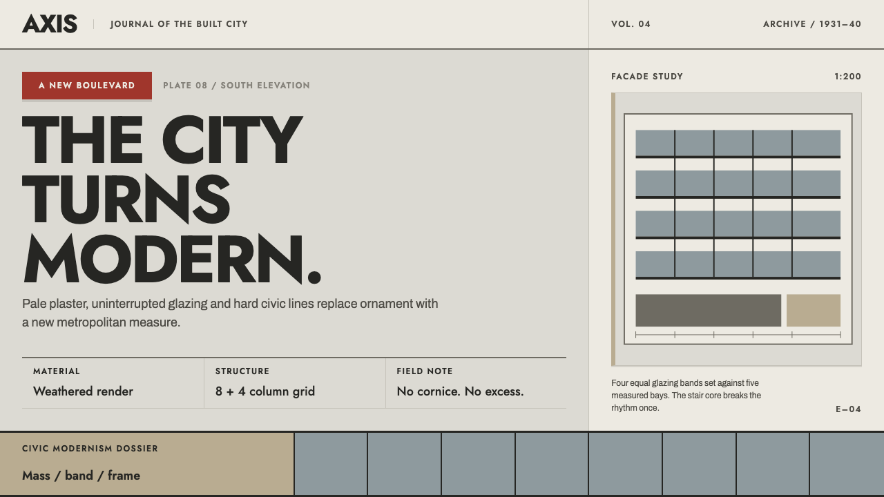 Bucharest Interwar ModernismModernism gathers civic weight. Sooted plaster, strict glazing bands and one…
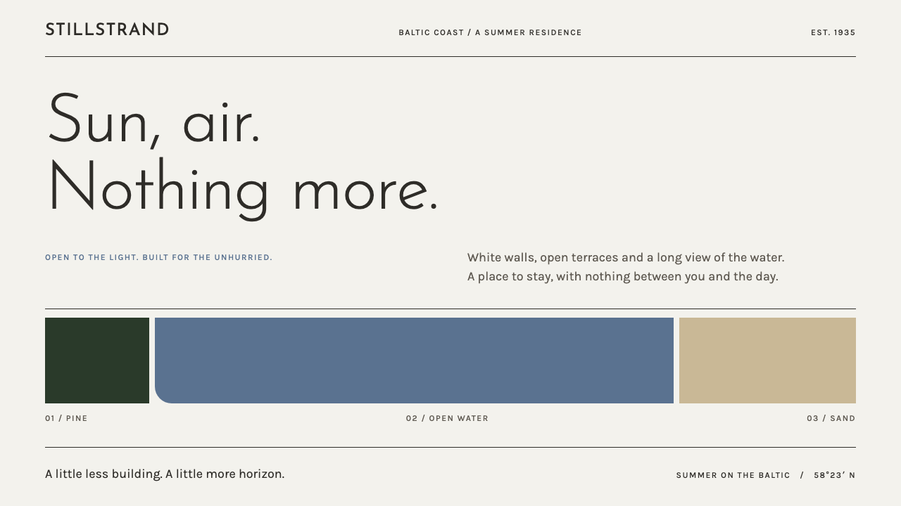 Pärnu Resort FunctionalismNothing ornamental. Light geometric type and Baltic-blue bands stretch across…
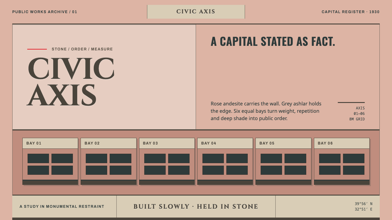 Ankara Republican ArchitectureAuthority moves slowly. Rose andesite, grey ashlar and six equal bays enforce…
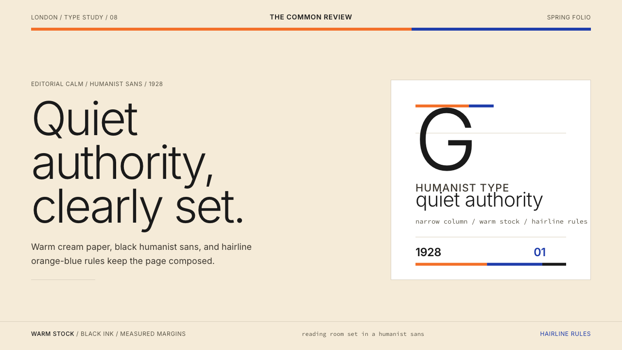 Gill Sans (BBC, 1928)Quiet authority, clearly set. Warm cream, black humanist sans, and hairline o…
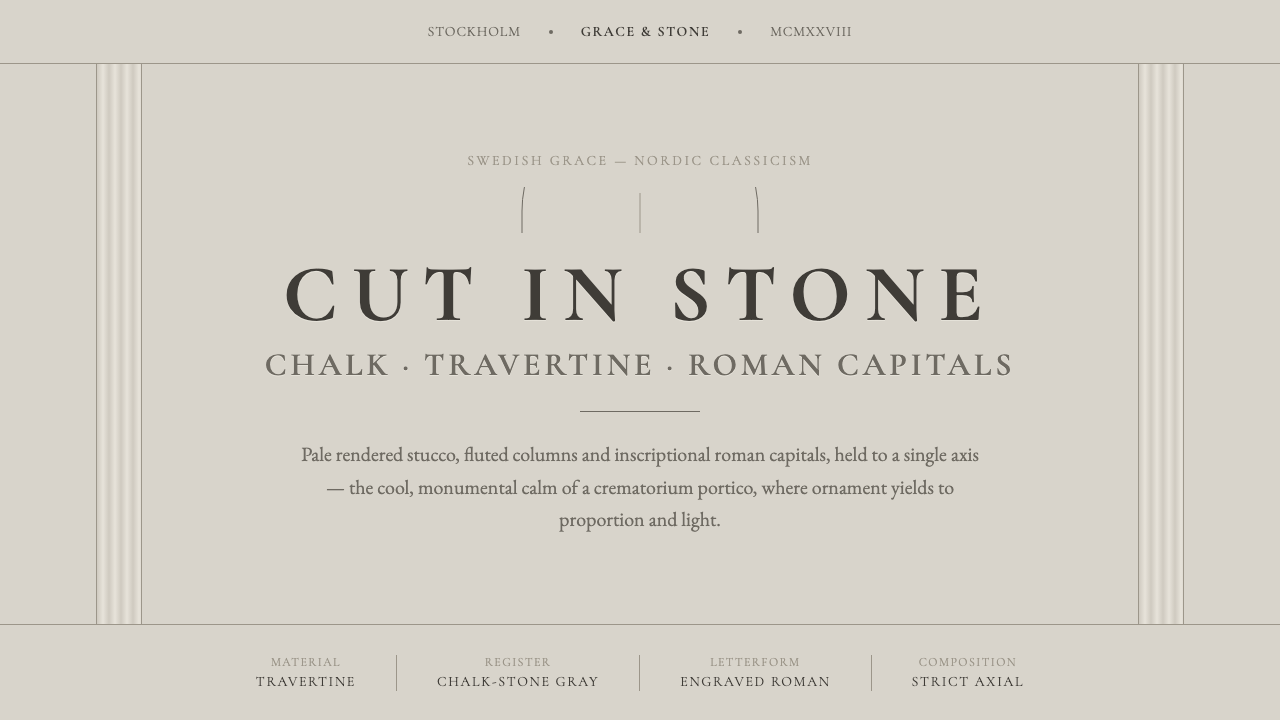 Nordic Classicism AsplundStone, not cream. Engraved Trajan capitals on cool chalk stucco, fluted colum…
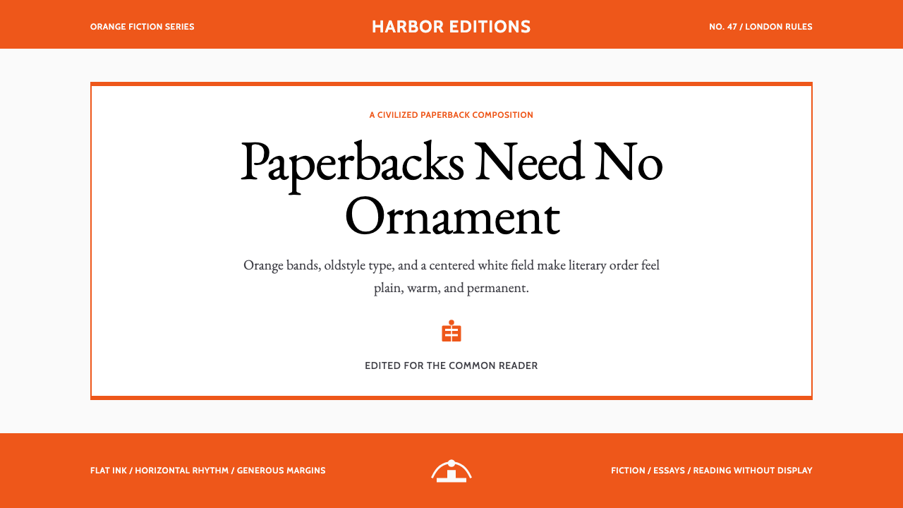 Penguin Classics OrangePaperback authority. Orange tri-bands, serif title panel, and flat ink enforc…