What is Pärnu Resort Functionalism?
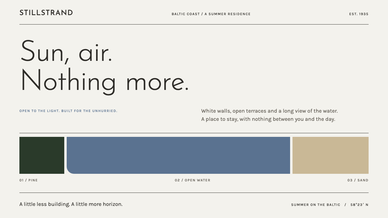
Pärnu's white resort buildings of the 1930s looked like ships beached in the sand, and this style keeps their discipline: sun, air, one horizontal line and nothing ornamental.
Pärnu Resort Functionalism in brief
Pärnu Resort Functionalism is a design style drawn from the white modernist buildings that Olev Siinmaa, the city architect of Pärnu, put up on Estonia's cure-town beachfront in the 1930s. Its visual language is white render, bands of Baltic blue, light geometric lettering and wide, low layouts held together by thin metal-like rules. It belongs to Estonian functionalism, part of the wider Nordic modernism of the interwar years, and to a particular genre within it: the resort building made for sun, sea air and treatment.
The buildings were described as ships beached in the sand, and the image is a useful one. Railed balconies, a single curved corner, ribbon glazing and the occasional round window give a white mass its vocabulary, and nothing on the facade is decoration. The design system carries over three working ideas: large fields of untouched white doing the job that ornament does elsewhere; a strong horizontal that organises the page; and a small number of precise details, a thin line or one rounded corner, that play the part of railing and porthole.
The style is light in every sense. Type is thin and geometric, bands of colour are broad and flat, and the overall effect is one of openness and fresh air. It is a style for interfaces that need to feel calm, clear and clean without reaching for the heavier gestures of severe modernism.

Where does Pärnu Resort Functionalism come from?
The setting is Pärnu, a seaside town in Estonia on the Gulf of Riga, and the period is 1927 to 1939. In the record the era peaks with the Rannahotell, the beach hotel of 1937. Pärnu was Estonia's cure town, a place people came to for sea air, sun and mud treatment, and the buildings of its beach quarter were made to serve that purpose: places to bathe, rest, take treatment and walk.
The architect at the centre of the story is Olev Siinmaa, who as city architect of Pärnu rebuilt the beachfront in white render during the 1930s. His work in the record includes the Rannahotell, the beach salon, the mud baths and his own villa. Taken together they form a seaside quarter in a single language. That coherence is rare. It comes from one office shaping a whole district across a decade, not from one landmark standing alone among unrelated neighbours.
The language itself came from the international functionalism of the time, with its belief that form should follow use, and from the Nordic version of modernism, which tied the new architecture to light, air and health. A resort was an ideal programme for such ideas. People went there to be outdoors, to be in the sun and to be looked after, so a building that opened itself to light and air was not only a stylistic choice but an argument about what the building was for. In Pärnu the argument was staged between two natural backdrops: the dark wall of pine forest behind the buildings and the grey-gold sand in front.
Anton Soans is the second name the record lists beside Siinmaa, and the movements it names, Estonian functionalism, Nordic modernism and interwar resort architecture, place the work in a wider setting. The period closes in 1939, as the war arrives. What survives from it, in buildings and in photographs, is a clear picture of how a small country on the Baltic chose to present itself in the 1930s: modern, clean, healthy and unornamented. The design system keeps that picture and turns its discipline into rules for layout.
What defines the Pärnu Resort Functionalism look?
White render ground
The ground is a large field of untouched white, like a wall of smooth render. It carries no texture, no pattern and no photographic fill. Emptiness is treated as a material, and the area left blank does the work that ornament would do elsewhere. Layouts that crowd the white with boxes and fills lose the sense of sun and air on which the style depends.
Baltic-blue bands
Colour arrives as broad, flat bands of Baltic blue stretched across the white, the way a painted stripe or a strip of sea runs along a building. A band can serve as a header, a section divider or a footer, and it is always flat, with no gradient and no shadow. Blue is the single chromatic voice, and everything else is white, thin dark type or neutral.
Wide, low layouts
The dominant gesture is the horizontal. Sections are wide and shallow, content runs in long strips, and the eye is drawn left to right along the line of a facade rather than up a tall stack. Tall, narrow columns and cramped vertical lists work against the style, which wants to feel horizontal, low and open to the horizon.
Light geometric lettering
Type is thin and geometric, built from circles and straight strokes, with open counters and generous spacing. It reads as signage on a white wall. Weight is kept light throughout, and hierarchy comes from size and position rather than from bold faces, so a headline looks like a sign on a facade, not a shout.
Thin metal rules
Division is done with fine, even lines, like the railing along a balcony. A rule separates a header from a body, underlines a table row or edges a panel. Because the lines are thin and uniform they never add visual weight, and they let the white do the real work of separation. Heavy borders and boxed cards defeat the purpose.
A single curve
Almost everything is straight, so the occasional curve is an event: one rounded corner, one circular window-like element, a single arc. On the buildings it is the curved corner and the round porthole. In a layout, one such gesture per composition is enough, and more of them turn a disciplined page into a soft, bubbly one.
Space instead of ornament
The governing rule is the one the buildings obeyed: nothing is decoration. Every line, band and block is there because it organises or informs, and the vocabulary is limited to sun, air and a horizontal line. Where another style would add a flourish, this one adds more empty white, and the result is a calm that feels earned rather than merely minimal.

Who shaped Pärnu Resort Functionalism?
Olev Siinmaa was the city architect of Pärnu and the central figure of the style. In the 1930s he rebuilt the town's beachfront in white render, and the record lists the Rannahotell of 1937, the beach salon, the mud baths and his own villa among his work. What distinguishes him is the consistency of the result: a whole seaside quarter that reads as a single design, which is exactly the quality the design system tries to reproduce across a set of pages.
Anton Soans is listed beside Siinmaa as a key figure of the same moment in Pärnu. The record does not spell out the details of his individual commissions, and readers who want them are best sent to the architectural histories of the town. What his name confirms is that the resort was shaped by more than one hand: a generation of Estonian architects working in the same direction in the same years.
The Rannahotell of 1937 is the high point of the period in the record. It belongs to the group of buildings described as ships beached in the sand, with railed balconies, a curved corner, ribbon glazing and the occasional round window, and it is the best single reference for the style's vocabulary. A designer who studies photographs of it will learn most of the system's rules without reading a word of the specification.
How do you use Pärnu Resort Functionalism today?
Pärnu Resort Functionalism suits work that needs to feel calm, clear and clean: hospitality, spas and wellness, travel, architecture and urban-planning content, public institutions and any product that wants an air of openness and health. Its horizontal bias makes it well suited to wide screens and landscape formats. It is a poor fit for loud, playful or highly energetic brands, where a style built on restraint will feel withholding.
In presentation slides, the landscape format is the style's natural home. A cover can be a white field with a single wide band of Baltic blue across the lower third and a short title in thin geometric type. Content slides work as wide, shallow panels separated by a thin rule, with one idea per panel. Data slides prefer horizontal bar charts and thin lines in a single blue, and a panoramic strip of photograph can stand in for the ribbon glazing of the facade.
On the web, think of booking and reservation sites, hotel and spa pages, travel guides, wellness apps and calm dashboards. Build navigation as a thin horizontal strip, give each section a full-width panel, and use one band of blue as the single colour moment. Photographs of sea, sand and pine fit naturally as panoramic strips. A circular element, such as an avatar or a play button, can borrow the idea of the round window, provided it is the only curve in sight.
For editorial and marketing work, the style supports architecture monographs, travel features, annual reports of public bodies and exhibition catalogues. Use generous margins, thin rules between sections, captions in light type and long horizontal image strips. A clean white page with a single blue band can carry a surprising amount of authority, in the same way the white facades did against the dark pines.
The most common mistake is to add ornament: gradients, drop shadows, textured backgrounds or decorative icons. Each one contradicts the claim that nothing on the building is decoration. Close behind are heavy bold type, a second or third accent colour, and nautical clichés such as anchors, ropes and stripes, which mistake the ship metaphor for a theme instead of a principle. Overusing the curve is a further error, since a single rounded corner is a gesture and ten of them are a texture.

Pärnu Resort Functionalism — FAQ
What is Estonian functionalism?
It is the local branch of the modernist movement that held form should follow use, flourishing in Estonia between the wars. In a resort town like Pärnu it produced white-rendered buildings with railed balconies, curved corners and ribbon windows, built for sun, air and treatment. The record places it within wider Nordic modernism, and in this design system it becomes a set of rules about white space, horizontals and restraint.
Is this just Bauhaus or the International Style under another name?
They are relatives, not twins. All share a belief in function, plain surfaces and the rejection of ornament. But this style is tied to a specific place and purpose: a Baltic resort, the sea and the pine forest, sun and air. It is lighter and calmer than Bauhaus's primary-colour confrontation, with one cool blue where Bauhaus would use three saturated primaries.
Why white and not a more neutral grey or cream?
Because the white is the render of the buildings, and the buildings are white so that they read against the dark pines and the grey-gold sand. White carries the idea of sun and cleanliness that the resort stood for, and it makes the blue band and the thin type legible by contrast. Moving to cream or grey would warm or cool the page and change its meaning.
What role does the blue play?
Baltic blue is the single chromatic voice. It arrives as flat bands that behave like a painted stripe on a facade or a strip of sea on the horizon, and it marks headers, dividers and key moments. Because there is only one colour, it carries emphasis without needing a legend, and the rest of the page can stay quiet, white and thin.
Can the style be adapted to a dark mode?
It is built on bright white, and the dark pine in the story is a backdrop, not the ground of the buildings. A night version is possible only by rethinking the roles of white and blue, and it will feel like a different style. For most uses, keeping the white ground and providing a separate dark theme from another system produces better results than inverting this one.
Related design styles
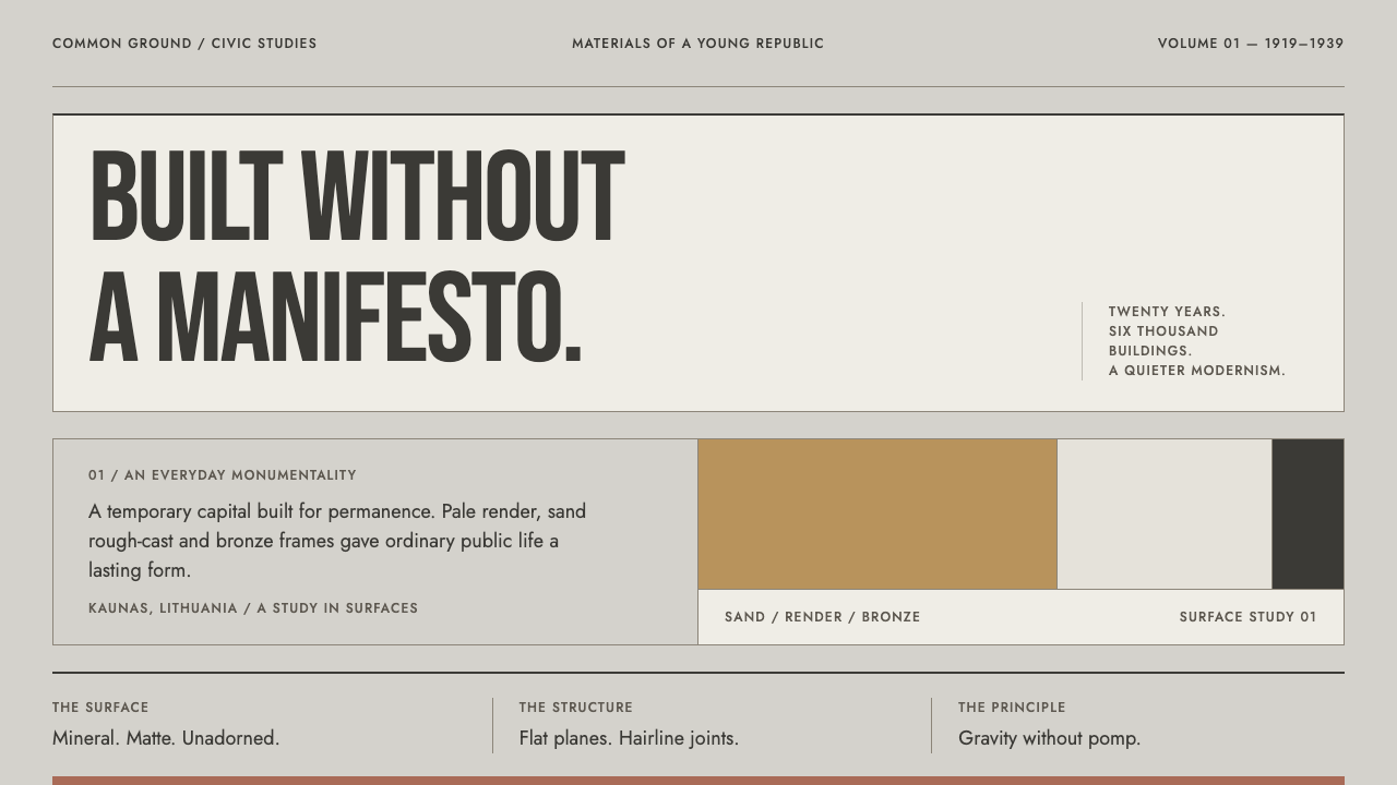 Kaunas Interwar ModernismGravity without pomp. Condensed caps, sand planes and hairline joints make mo…
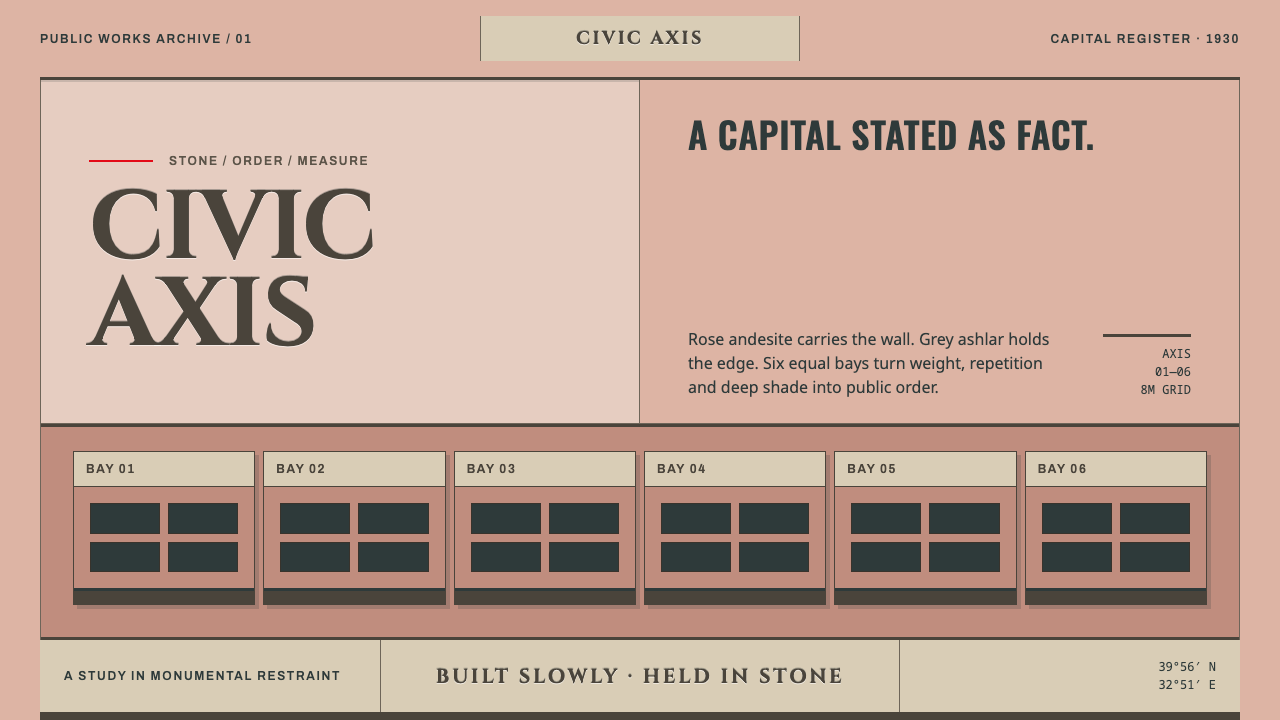 Ankara Republican ArchitectureAuthority moves slowly. Rose andesite, grey ashlar and six equal bays enforce…
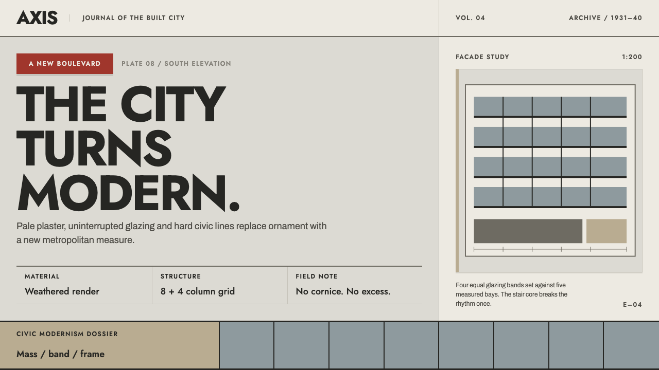 Bucharest Interwar ModernismModernism gathers civic weight. Sooted plaster, strict glazing bands and one…
 Gill Sans (BBC, 1928)Quiet authority, clearly set. Warm cream, black humanist sans, and hairline o…
 Nordic Classicism AsplundStone, not cream. Engraved Trajan capitals on cool chalk stucco, fluted colum…
 Penguin Classics OrangePaperback authority. Orange tri-bands, serif title panel, and flat ink enforc…