What is Ankara Republican Architecture?
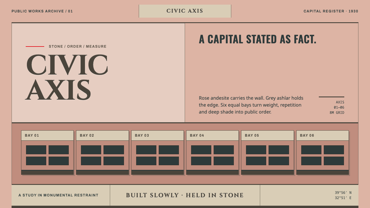
Ankara Republican Architecture is state power in dusty rose stone: grey ashlar bases, equal bays, letters cut into the wall, and one long axis that makes everything move slowly.
Ankara Republican Architecture in brief
Ankara Republican Architecture is a light, stone-toned system modelled on the government buildings of Turkey's new capital, built roughly between 1927 and 1940. Its walls are the colour of local andesite, a dusty pink that shifts toward lilac and rose. Its plinths, porticoes and dressings are grey ashlar. Its lettering is cut in Roman capitals, and its structure is a strict row of equal bays organised along one long axis.
The system's temperament is summed up in the source by a single quality: slow. Authority here does not shout and does not charm. It is symmetrical, heavy and blunt, with no domes and no flourishes, only the joints between stones, the deep shadow of a portico and letters chiselled into a wall. Everything is built to be approached along a line, on foot, with time to take it in.
For a designer, this makes it one of the most distinctive light-mode systems in the library. Where most light interfaces default to white and a bright accent, this one defaults to a warm stone pink with a grey base beneath it, and it trusts repetition, proportion and weight to do the work that colour and decoration do elsewhere. It is not a friendly style, and it is not meant to be. It is a composed and confident one.
Where does Ankara Republican Architecture come from?
Ankara became the capital of the new Turkish Republic in 1923, and its ministries quarter was drawn as a capital before it was a city. The source material describes a plan first and buildings second: the German planner Hermann Jansen set the layout, and the Austrian architect Clemens Holzmeister then filled it with the Ministry of National Defence, the General Staff Building, the Court of Cassation, the Central Bank, Ziraat Bank and the Grand National Assembly. The district known as Bakanlıklar, the Ministries Quarter, runs along the axis of Atatürk Boulevard, and the source dates its core to roughly 1927 to 1940.
The buildings are faced in local andesite, a volcanic stone quarried around Ankara. Because the stone is not a single colour, the walls run through lilac, pink and dusty rose, so that the whole district reads as a layer of old rose dust. Grey ashlar, squared and finely dressed stone, is kept for the plinths, the porticoes and the dressings around openings, where it carries load and holds the composition down. Roman-cut capital letters are chiselled into the walls, square piers stand in strict bays, and one long axis runs toward the Güven Monument. The result keeps its register blunt, symmetric and deliberately slow.
The source places the style between two currents: the First National Architecture Movement, which had looked for a national manner in Seljuk and Ottoman precedent, and stripped modernism, which pared that vocabulary down to mass, proportion and plain surface. Its third label, Republican state architecture, names the purpose. These were buildings for a young state that wanted to look permanent, and they were designed by foreign architects, many from German-speaking countries, working alongside local ones. The source names Holzmeister and Jansen first, then Anton Hanak, Ernst Egli and Bruno Taut among its key figures.
What survives as a design vocabulary is an unflattering state aesthetic. It does not smile at the visitor. It offers symmetry, weight and slowness: no domes, no ornament, only the joints of stone, the depth of a portico and words cut into the wall. A system built on these things is useful for the same reason the originals were. It tells the viewer that what they are looking at is serious, stable and meant to last.
What defines the Ankara Republican Architecture look?
Rose-andesite walls
The main field is a dusty stone pink that drifts between lilac, pink and rose, because that is how local andesite varies from block to block. It must read as mineral and aged, a powdered and slightly grey rose, never as sugary pastel. A faint tonal variation across large areas is welcome, since it recalls the unevenness of real stone, but there is no gradient and no glow.
Grey ashlar base
Grey stone carries the base of the composition. Plinths, porticoes, door surrounds and frames are cool grey, heavier in value than the rose walls above them. This produces a bottom-weighted structure that feels load-bearing: footers, nav bars and entrance elements sit on grey, while rose fills the field. The grey also provides the contrast needed for edges and text.
Six equal bays
A facade is divided into equal bays by square piers, and the blurb for this system counts six. Repetition replaces variety: each bay is the same width, the same height and the same depth of shadow. In layout terms, this becomes a strict modular grid of equal columns where content aligns to the bay edges and no element is allowed to be a favourite.
Roman-cut inscriptions
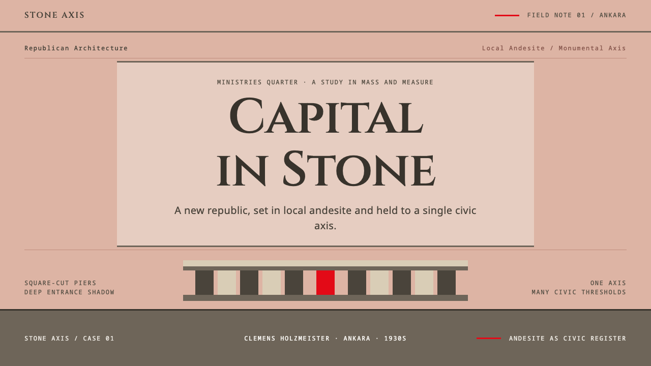
Lettering is in capitals of Roman proportion, as if chiselled into the wall: even, serious, generously spaced and set in large, quiet blocks. Titles and key words appear this way and are often centred on the axis. The lettering behaves like architecture, with the same weight as the wall, and is never ornamented, italicised or set in a playful voice.
One long axis
The quarter is organised along a single long axis ending at the Güven Monument, and everything in the system obeys an equivalent line. Pages are symmetrical about a central spine, headings are centred, and the eye is led from the entrance to the focal point in a straight path. Off-axis moves are rare, and when they occur they are deliberate and balanced by a counterpart.
Deep portico shadow
Depth comes from recess, not from lighting effects. A portico or an opening is shown as a darker, cooler plane set back from the wall, and shadows are solid, short and directional. There is no soft ambient blur. Cards and panels look like openings cut into a thick wall rather than layers floating above it, which supports the sense of mass.
Deliberate slowness
Pace is part of the style. Layouts are generous, with long rhythmic intervals, large margins and a refusal to crowd. Motion, if any, is measured and linear rather than springy: elements arrive and settle, they do not bounce. The overall impression is of a room in which nobody is in a hurry, and where the building decides the tempo.
Who shaped Ankara Republican Architecture?
Holzmeister is the Austrian architect who filled the Ankara plan with its principal state buildings: the Ministry of National Defence, the General Staff Building, the Court of Cassation, the Central Bank, Ziraat Bank and the Grand National Assembly. His name stands for the whole register of this system, which is monumental, stone-faced and calm.
Jansen is the German planner who set the plan for the quarter. The source's point is that Ankara's ministries district was drawn as a capital before it was a city, and Jansen's layout is what created the long axis and the strict ordering of parts that the design system turns into its grid.
Hanak was an Austrian sculptor, and he is associated with the Güven Monument, the focal point at the end of the district's long axis. His role is a reminder that this architecture was not only about walls and bays, but also about a monument that gives the axis its destination and its sense of meaning.
Egli is an architect named among the key figures of the early Republic's building programme in Ankara. He belongs to the group of foreign architects who worked there in the 1930s, and stands for the plain, sober, institutional side of the style rather than its most monumental one.
Taut was a German architect who worked in Turkey in the later 1930s. His presence in the list shows the modernist side of the story: the move from national ornament toward plain surface and proportion that the source calls stripped modernism, and which is the reason the style carries no flourishes.
How do you use Ankara Republican Architecture today?
Ankara Republican Architecture suits subjects that need to feel serious, stable and institutional without turning cold. Its key decision is the axis: decide where the central line of every page runs, then build equal bays on either side. The more disciplined the repetition, the stronger the effect, so this is a system that rewards restraint and punishes improvisation.
For presentation slides, a cover can be a rose-stone field with a grey base band along the bottom, a centred title in capitals set like an inscription, and nothing else. Content slides work on a six-column bay grid, with agendas, comparisons and roadmaps laid out as equal piers. Data slides suit equal-width bars that read like columns in an elevation, with labels in stone-cut capitals and values below. Avoid decorative icons; the grid itself is the decoration.
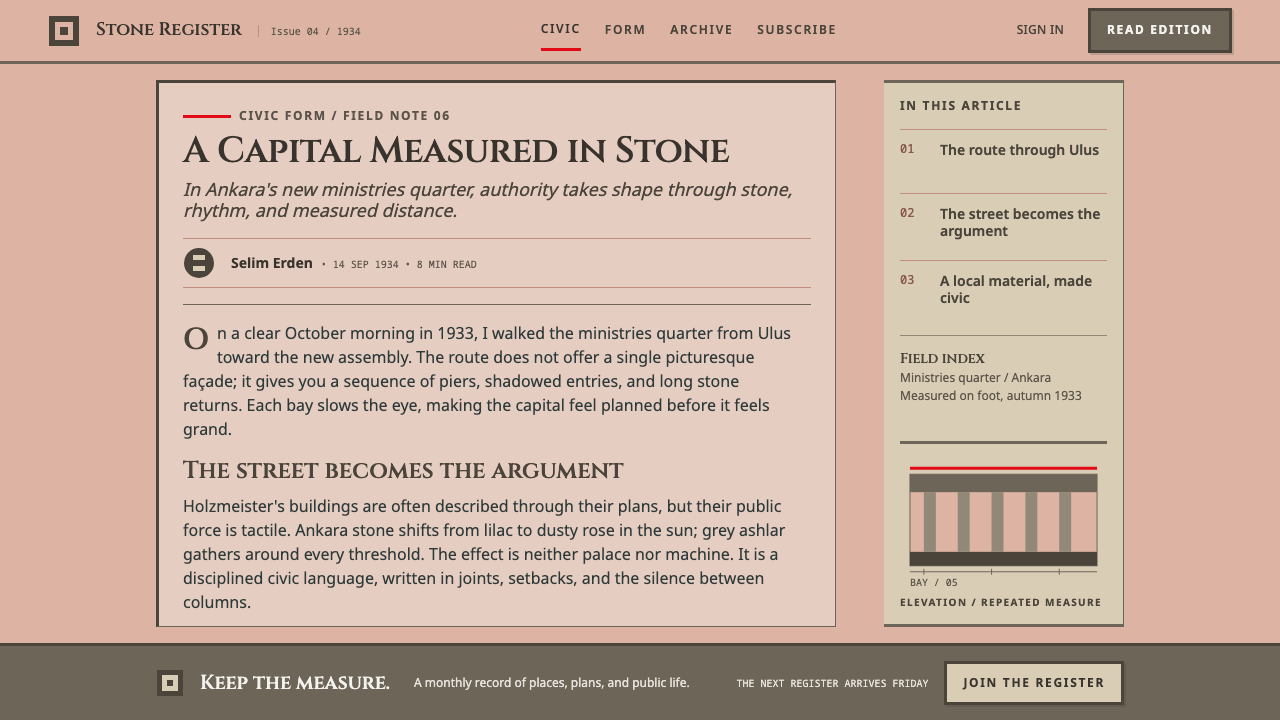
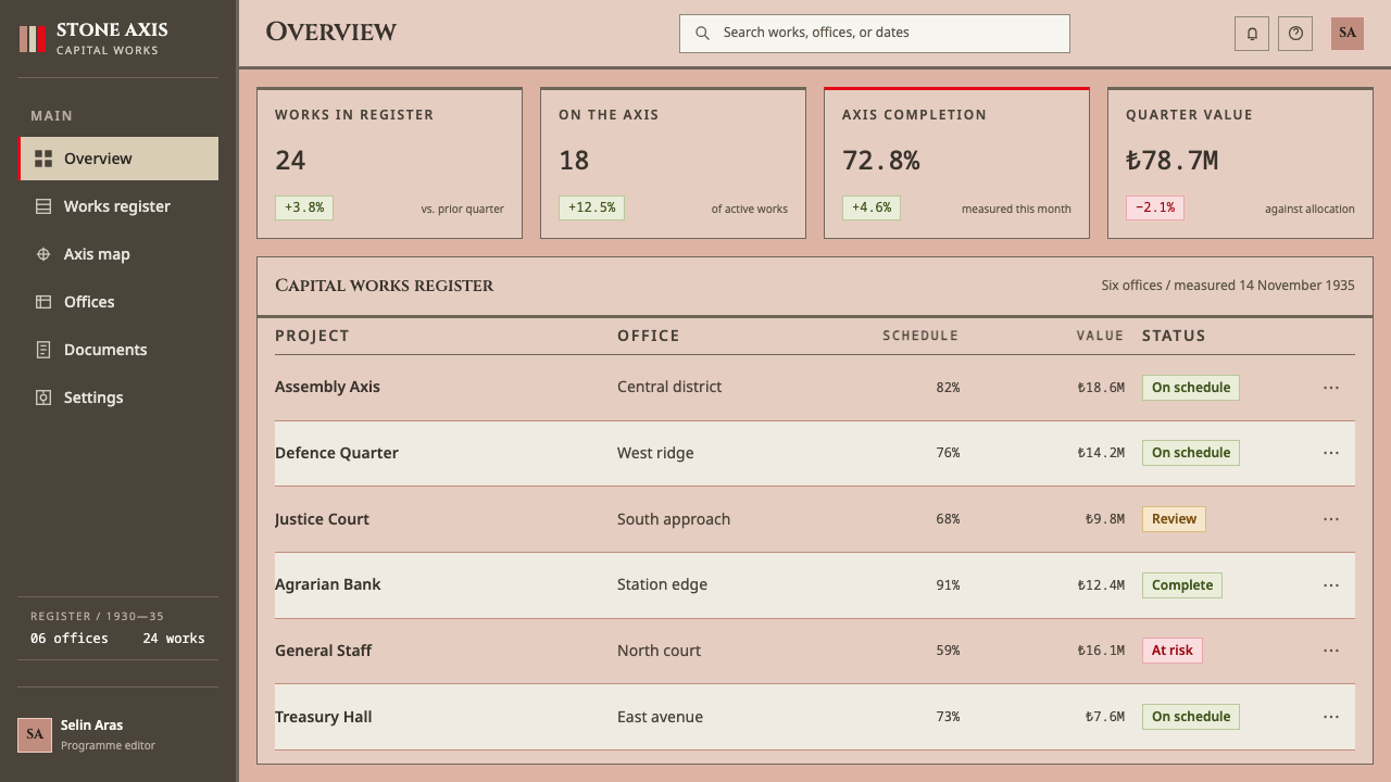
For web interfaces, the style fits government and civic services, legal and financial products, institutions, archives and any dashboard that wants to feel authoritative. Navigation sits on a grey base band, cards are recessed panels with solid short shadows, and tables use equal columns. Pricing pages work well as a row of equal bays with one centred, because the symmetry makes every plan feel official. Keep corners square and avoid rounded pills; a slightly heavy button with a square outline suits the register.
For editorial and marketing work, the system suits annual reports, white papers, policy documents, institutional campaigns and exhibition materials about architecture and the early twentieth century. Headlines are set like inscriptions, body text sits in a narrow central column, and section breaks are marked by a change from rose to grey instead of an ornament. When it is used for something other than an institution, it brings gravity, so reserve it for the occasions that want gravity.
The most common mistake is letting the rose drift into sweet pastel pink, which turns a stern stone into a confectionery colour. The stone must stay dusty and slightly grey. Other frequent errors include breaking the symmetry for a trendy layout, adding rounded corners and ornaments, softening shadows into blur, and speeding up the animation. The system is meant to feel slow, heavy and exact, so any move toward lightness weakens it.
Ankara Republican Architecture — FAQ
What is the Ankara ministries quarter?
It is the government district of Ankara, known as Bakanlıklar, laid out along the axis of Atatürk Boulevard in roughly 1927 to 1940. Hermann Jansen set its plan and Clemens Holzmeister designed many of its main buildings, including the Ministry of National Defence, the General Staff Building, the Court of Cassation, the Central Bank, Ziraat Bank and the Grand National Assembly.
Why is the palette rose and grey?
Because the buildings are faced in local andesite, whose colour runs through lilac, pink and dusty rose, while grey ashlar is used for plinths, porticoes and dressings. The system carries that relationship directly: rose for the field, grey for the base and the frames. The rose should read as aged mineral, not as a candy pastel.
How does this differ from other monumental state architecture?
It belongs to the broader family of stripped, monumental state architecture of the period, with its symmetry, heavy bases and lack of ornament. What sets it apart is the local stone and its colour, the Roman-cut inscriptions, and the plan built around one long axis. The source places it between the First National Architecture Movement and stripped modernism.
How do I use the bays in a layout?
Treat the bays as a strict grid of equal columns with square, solid divisions. Align content to the bay edges, keep widths identical, and avoid giving one bay extra emphasis unless it sits on the central axis. Repetition is the point. If the content needs hierarchy, create it with scale and the grey base band, not with uneven columns.
When should I not use this style?
Avoid it for products that need to feel playful, intimate or fast: children's apps, lifestyle brands, casual social tools and anything built on lightness or surprise. Its register is formal and unsmiling by design. It also needs careful handling when the subject is political or national, since it carries the connotations of state authority.
Related design styles
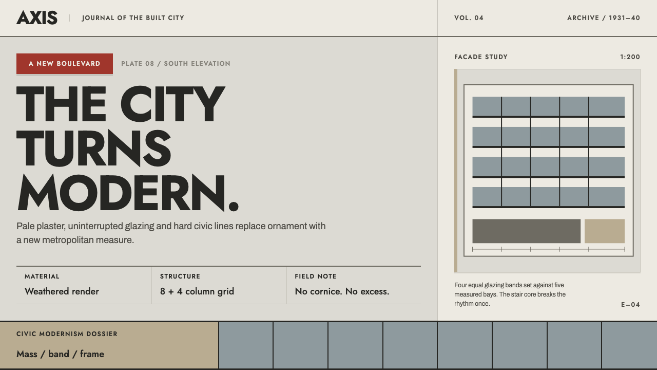 Bucharest Interwar ModernismModernism gathers civic weight. Sooted plaster, strict glazing bands and one…
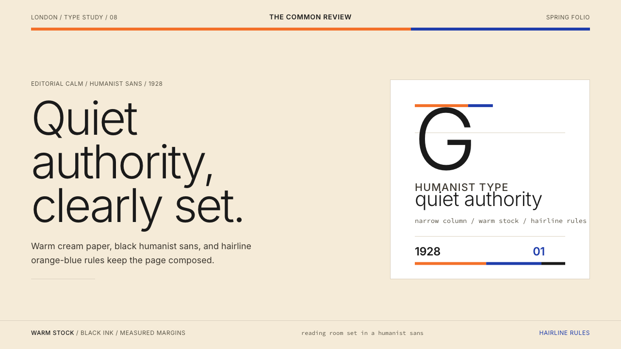 Gill Sans (BBC, 1928)Quiet authority, clearly set. Warm cream, black humanist sans, and hairline o…
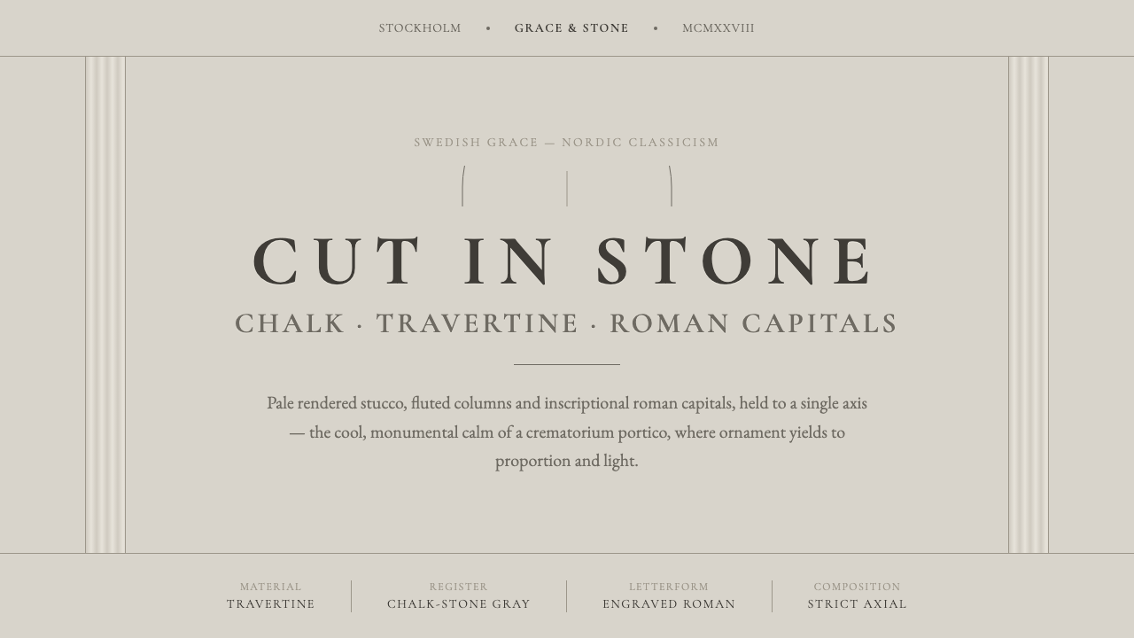 Nordic Classicism AsplundStone, not cream. Engraved Trajan capitals on cool chalk stucco, fluted colum…
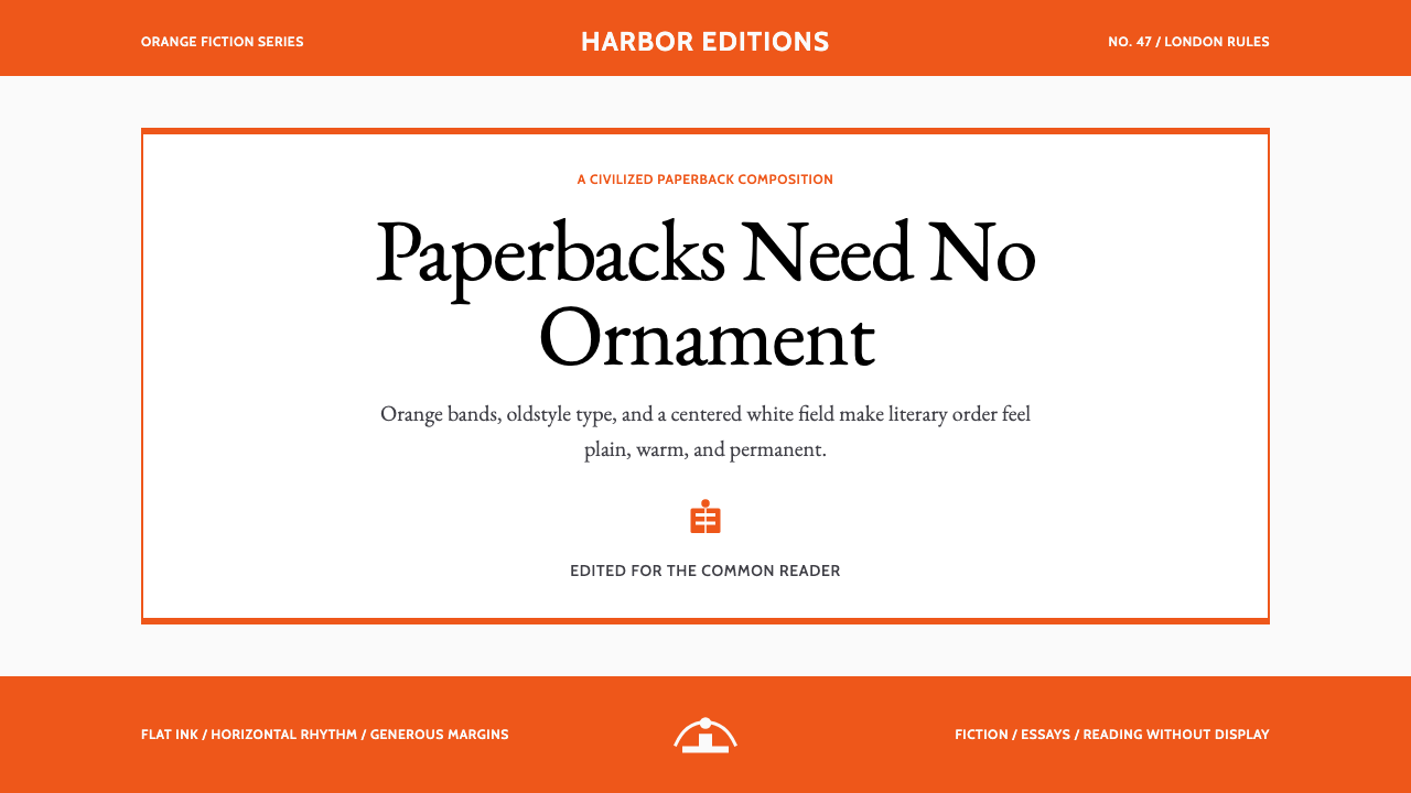 Penguin Classics OrangePaperback authority. Orange tri-bands, serif title panel, and flat ink enforc…
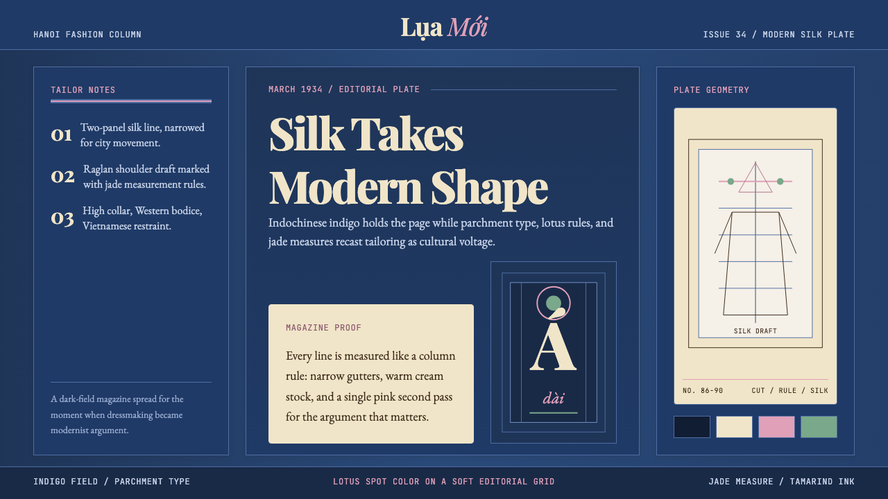 Vietnamese Áo Dài 1934 (Cát Tường)Indigo editorial poise. Parchment serif columns and lotus-pink rules frame th…
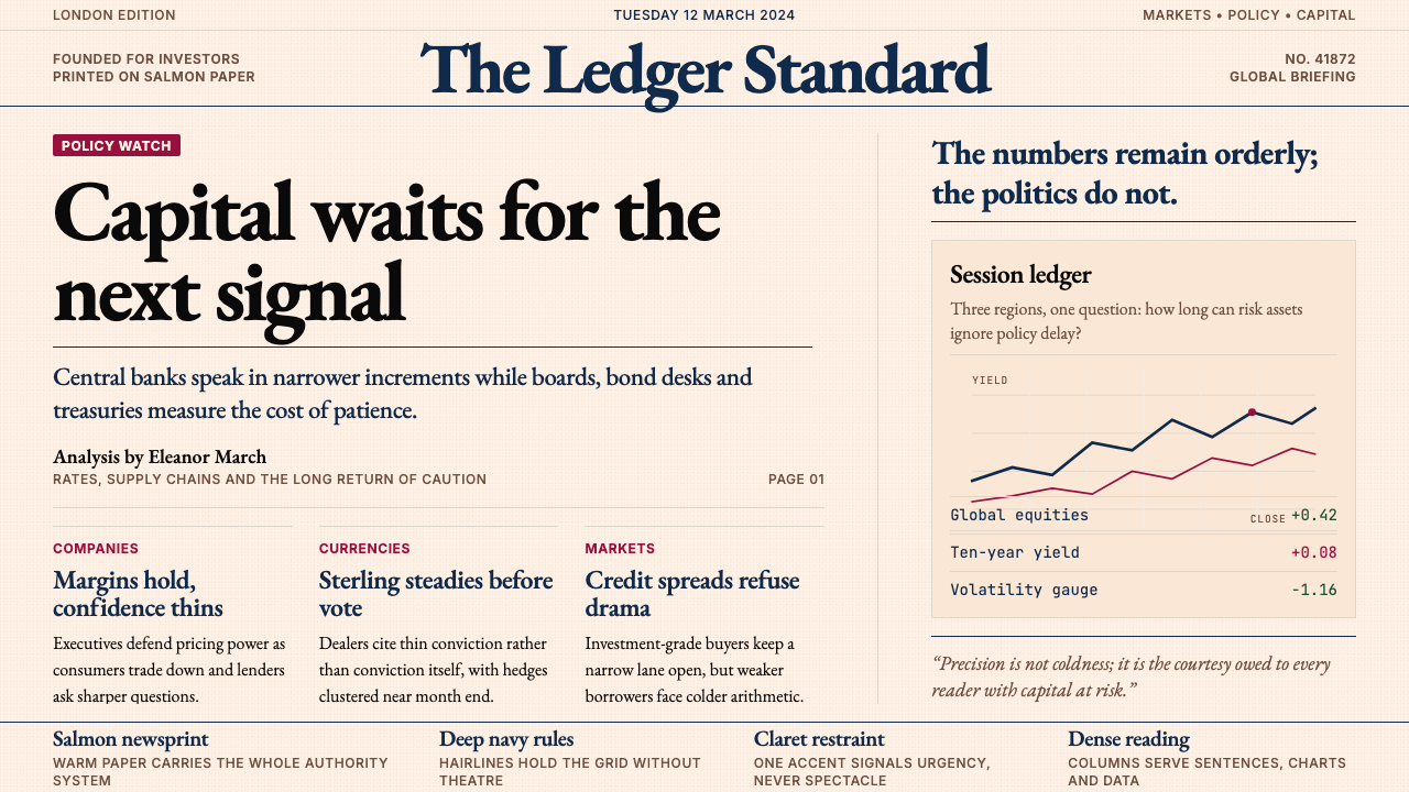 Financial Times (Pink Paper)Authority on salmon paper. Deep navy rules and claret accents discipline dens…