What is Bucharest Interwar Modernism?
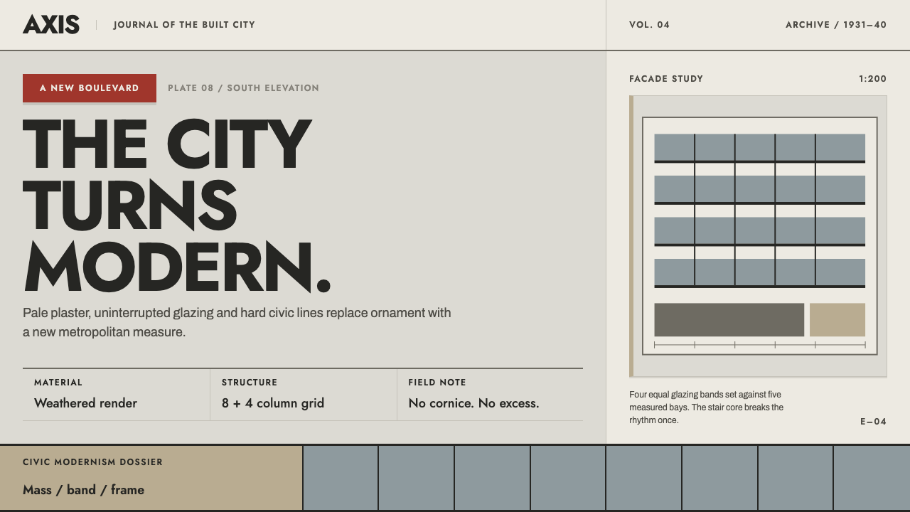
Bucharest's interwar modernism is what a city looks like when it trades ornament for glazing bands — pale plaster weathered to soot grey, hard shadows, and one red marquee kept for the label that matters.
Bucharest Interwar Modernism in brief
Bucharest Interwar Modernism is the architectural language of Romania's capital in the years around 1929 to 1940, when a generation of local architects stopped dressing the city as a Little Paris and began building a pale, horizontal, almost unornamented one. Its calling cards are a massed plaster volume, long continuous bands of glazing, a roofline with no cornice, and the quiet absence of any applied pattern. In the terms of the sources behind this design system, it sits where three movements overlap: Romanian interwar modernism, the International Style, and the last phase of Art Deco.
What makes the style useful as a design system is that it is read in its present condition rather than as an architect's rendering. The buildings were meant to be white. Nearly a century of city soot has taken that white down to a weathered mid-grey, and where the plaster has gone, the older ochre render shows through. The system works in exactly that register: matte colour fields, hard architectural shadow, strict horizontals, and a single red band held back for the one label that matters. It is modernism with civic weight, not modernism as a laboratory.
To the eye it is a restrained, heavy-lidded look. Large flat fields of grey and warm neutral sit in horizontal bands. Edges are straight and decisive. Shadows fall as hard shapes rather than soft haze. Typography behaves like lettering on a facade, running with the building instead of decorating it. Colour is nearly absent until the red appears, and because the red appears once, it reads as signage rather than decoration. That discipline is what separates the style from generic grey minimalism: the grey is a material, the horizontals are a structure, and the red is a sign.
Where does Bucharest Interwar Modernism come from?
Between the world wars, Bucharest stopped calling itself Little Paris. The nickname had described a capital that looked west for its ornament — cornices, carved stone, borrowed boulevard grandeur. The interwar generation looked at the same city and imagined something else: a white Balkan metropolis of cubic volumes and flat roofs, built in plaster and glass and proud of what it left off the facade. The shift was less a rejection of Paris than a decision that a modern capital should speak through proportion and light instead of decoration, and that it should do so in its own regional voice.
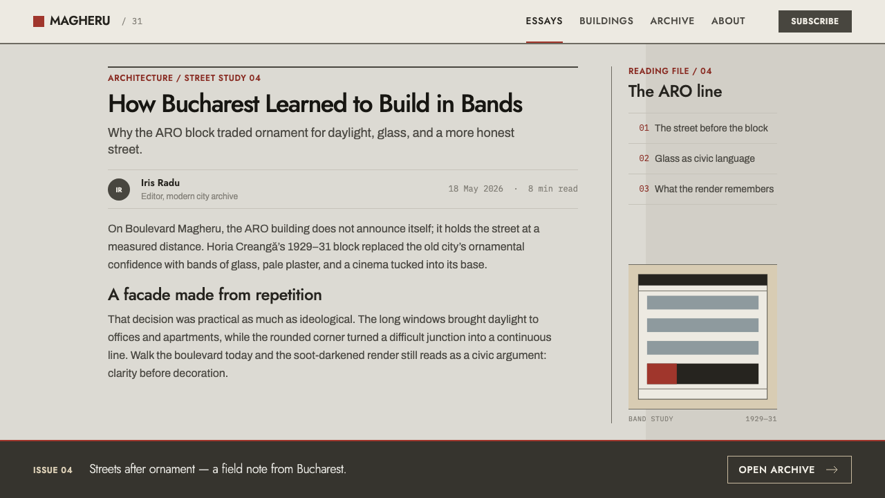
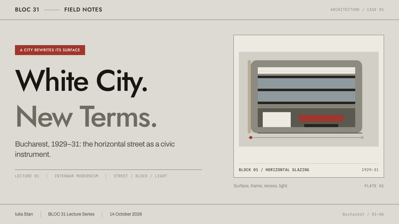
The building that set the terms is Horia Creangă's ARO block, built between 1929 and 1931 on Boulevard Magheru. It is a pale plaster mass with long horizontal glazing bands, no cornice and no ornament, and a cinema cut into its base. Almost everything the later ensemble would repeat is already there: the idea that a tall commercial building can be one calm volume, that windows can be the main compositional device, and that the ground floor can be given to public entertainment instead of a stone portal. The Magheru ensemble, together with the neighbouring Bălcescu boulevard, continued to fill in through 1940 and became the best known face of the style, while the villas of the Dorobanți district carried the same language at domestic scale.
Bucharest's modernists were not a single school. The architects associated with this period include Horia Creangă, Marcel Iancu, Duiliu Marcu and Octav Doicescu, and their influences were mixed. Iancu is the most cosmopolitan of them: he came back from the Dada circle in Zurich and, in the same years that Creangă was raising the ARO block, built white villas. Because the movements involved range from Romanian interwar modernism through the International Style to late Art Deco, the city's modernism carries both rigour and a certain civic swagger — strict horizontals and flat surfaces, but also a sense of occasion in entrances, marquees and street-corner massing.
The last chapter of the story belongs to time rather than to architects. The buildings were conceived in white, but their plaster has stood in the open for close to a century in a smoky city. It has darkened into a weathered mid-grey, and in places the render has failed and revealed the ochre beneath. This design system deliberately takes that aged surface as its ground instead of the original ideal, because the aged surface is what a person actually sees on the boulevard today. The one colour that survives from the street is the red of a cinema marquee, associated here with the Patria cinema, used as a single band for the single label that carries the most weight.
What defines the Bucharest Interwar Modernism look?
Weathered grey fields
The dominant colour is not white but the mid-grey that white plaster becomes after decades of city soot. It is applied as broad matte fields, never glossy, and it gives the whole system its gravity. Lighter and darker steps of the grey separate zones the way a facade separates storeys, so hierarchy comes from tonal steps rather than from accent colour.
Ochre beneath the plaster
Where the plaster has gone, an ochre render shows through. In the system this appears as a warm undertone that keeps the greys from turning clinical — a patch, a margin, a secondary field — and never as a bright accent. It is the colour of damage honestly shown, and it supplies the only warmth the palette allows apart from the red.
Strict horizontals
Layouts are organised as stacked horizontal bands, echoing the long glazing strips of the ARO block. Content runs in continuous rows, dividers are long rules, and sections stretch wide rather than stacking into tall narrow columns. Verticals exist, but they are supporting players, never the dominant gesture on the page.
Hard architectural shadow
Shadows are cast the way sun falls on a plaster facade: hard-edged, offset in a single direction, solid. They define volume and separate planes without any blur. Nothing floats on a soft haze; an element is either on the wall or standing in front of it, and the shadow tells you which.
No cornice, no ornament
Edges are finished plainly. There are no decorative borders, flourishes, bevels or pattern fills. The buildings have no cornice to crown them, and the interface should have no equivalent: a section ends where its content ends. This quiet absence is what lets the single red mark be read at once.
One red marquee band
Red appears once. It is the marquee band, a horizontal stripe carrying the one label that needs to be found first — a primary action, a single status, a title. Because the rest of the palette is neutral, the red lands with the force of signage. Using it twice on the same screen breaks the idea.
Civic weight
Everything is a little heavier and calmer than a typical contemporary interface: generous masses, wide margins, a steady rhythm. The tone is institutional and confident rather than playful, closer to a municipal building or a cinema palace than to a startup landing page. The weight comes from proportion and repetition, not from any decorative device.
Who shaped Bucharest Interwar Modernism?
Creangă designed the ARO block on Boulevard Magheru, built between 1929 and 1931, the building that fixed the vocabulary of the whole ensemble: a pale plaster mass, long horizontal glazing bands, no cornice, no ornament, and a cinema set into the base. It is the single most useful reference for this design system, because nearly every rule the system follows — horizontals, absence of ornament, a public ground floor — can be read straight off that one facade.
Iancu came to architecture by way of the Dada circle in Zurich, and in the same years as the ARO block he was building white villas. His presence is a reminder that the city's modernism was not only an engineering culture; it also drew on an avant-garde sensitivity to surface and proportion. In design terms he stands for the intimate end of the style, the white wall as a quiet field, where Creangă stands for the civic end.
Marcu is one of the four architects the sources tie to this style. No single building is needed to understand what he represents for the system: one of several authors of a shared vocabulary rather than a lone genius. The lesson for a designer is about repetition. The style works because more than one hand applied the same few rules until a boulevard read as one idea.
Doicescu is the fourth name attached to the style, and like Marcu he matters here as a member of a generation rather than through one celebrated facade. His place in the story supports a simple design point: the vocabulary of pale mass, glazing band and bare edge was shared widely enough to be recognised as a city's accent, which is exactly what makes it reusable as a system today.
How do you use Bucharest Interwar Modernism today?
Bucharest Interwar Modernism suits work that wants to feel established, municipal and unhurried. It is a quiet system, so its success depends on three habits: let grey carry the page, let horizontals carry the structure, and spend the red exactly once.
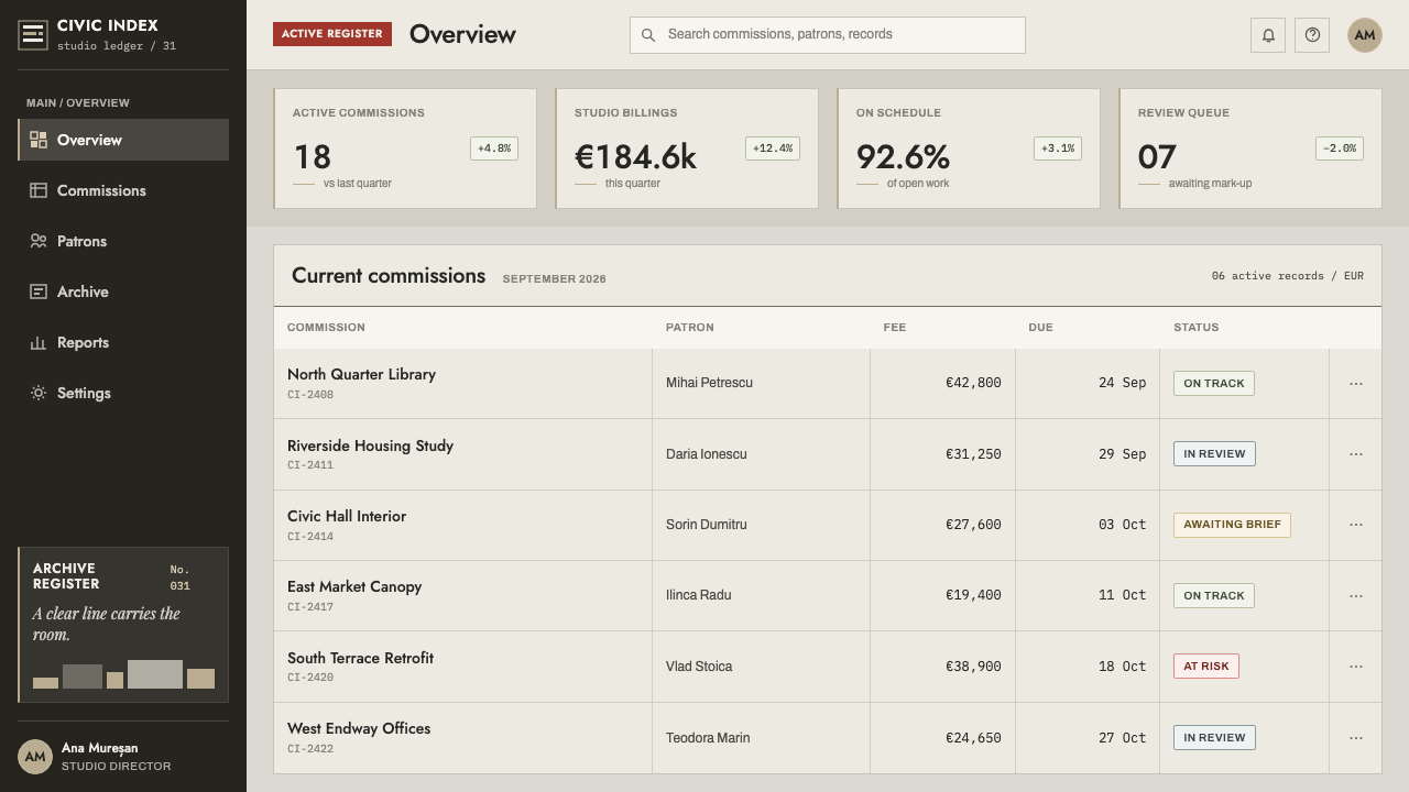
On slides, a cover works best as plain lettering on a broad matte grey field, with a long horizontal band running behind or beneath the title and a hard-edged shadow wherever one block overlaps another. The red marquee band belongs to the title bar or to a single label. Content slides read as stacked rows — a heading band, a body band, a footnote band — rather than a grid of small tiles. Data slides suit horizontal bar charts and timelines, which echo the glazing bands; keep chart colour to tones of grey and ochre, and let the red mark only the one value the audience must not miss.
In web interfaces, dashboards and pricing pages take well to full-width rows with a consistent rhythm. Use matte neutral cards with hard offset shadows instead of soft elevations, plain-text navigation, and no ornamental icons. For pricing, make the tiers equal-weight panels and put the red band on the label of the recommended plan or on the single primary button. Status systems should resist a rainbow: grey for normal, ochre for caution, and red only for the one thing that must be seen first.
Editorial pages are a natural fit: a long measure of calm body text, wide horizontal section dividers, captions set like lettering on a facade. Marketing pages can borrow the architectural scale — wide hero bands, restrained headlines, one marquee-like red strip for an announcement or call to action. Photography of buildings, streets and interiors suits the style; keep images desaturated or within a warm neutral range so the red stays unique.
The most common mistake is to treat the red as a theme colour and scatter it across buttons, links, icons and badges. Once it appears five times the marquee idea is gone and the page collapses into generic grey-and-red UI. The second mistake is to clean the grey up into white, which converts the weathered civic register into ordinary minimalism. The third is adding rounded, glossy or gradient treatments, which belong to a different building altogether.
Bucharest Interwar Modernism — FAQ
Is this the same as Bauhaus or the International Style?
They are relatives, not twins. The International Style is one of the three movements this system draws on, so the pale volumes, glazing bands and bare surfaces will feel familiar. What is distinct here is the local accent: the surface is a weathered mid-grey with ochre showing through rather than a pristine white, the shadows are hard and architectural, and the only colour is a single red marquee band. Bauhaus-style primary colour systems spread colour across the layout; this one holds it back almost entirely.
Why grey instead of white?
Because the buildings are no longer white. They were conceived in pale plaster, but years of city soot have taken them down to a weathered mid-grey, with ochre render exposed where the plaster has failed. The system takes the building as it stands today. Grey also does practical work: it lets the single red band carry meaning, it gives the page weight, and it keeps hierarchy tonal rather than colourful. A white version would be a different, more ordinary style.
Where exactly should the red go?
On the one thing the viewer must find first, and nowhere else. That might be the title bar of a slide, the label of the recommended pricing plan, the single primary button on a page, or the one metric that is out of range on a dashboard. Think of the marquee on a cinema: it announces the building's purpose and nothing more. If you find yourself wanting a second red element, ask whether it is really a second priority, and if so, use tone or weight in grey instead.
Can it work as a dark theme?
This system is built as a light-to-mid register: weathered plaster in daylight, with matte fields and hard shadows that read against it. A literal inversion tends to lose what makes the style distinct, because the ochre undertone and the sooty grey depend on the contrast with a lighter wall. If you need a dark variant, treat the darkest soot tone as the ground, keep the same strict horizontals and hard shadows, and still use the red once. Expect it to feel heavier and more nocturnal than the original.
What kinds of products does it suit, and where does it struggle?
It suits products that want to feel established and orderly: dashboards, reports, civic or institutional services, cultural venues, architecture and property brands, and editorial work about cities. It struggles where warmth, playfulness or sensory richness is the point — children's products, food and lifestyle brands, celebratory campaigns — because its restraint and grey weight can read as austere. It also demands discipline from the team, since the single-red rule only works if every contributor respects it.
Related design styles
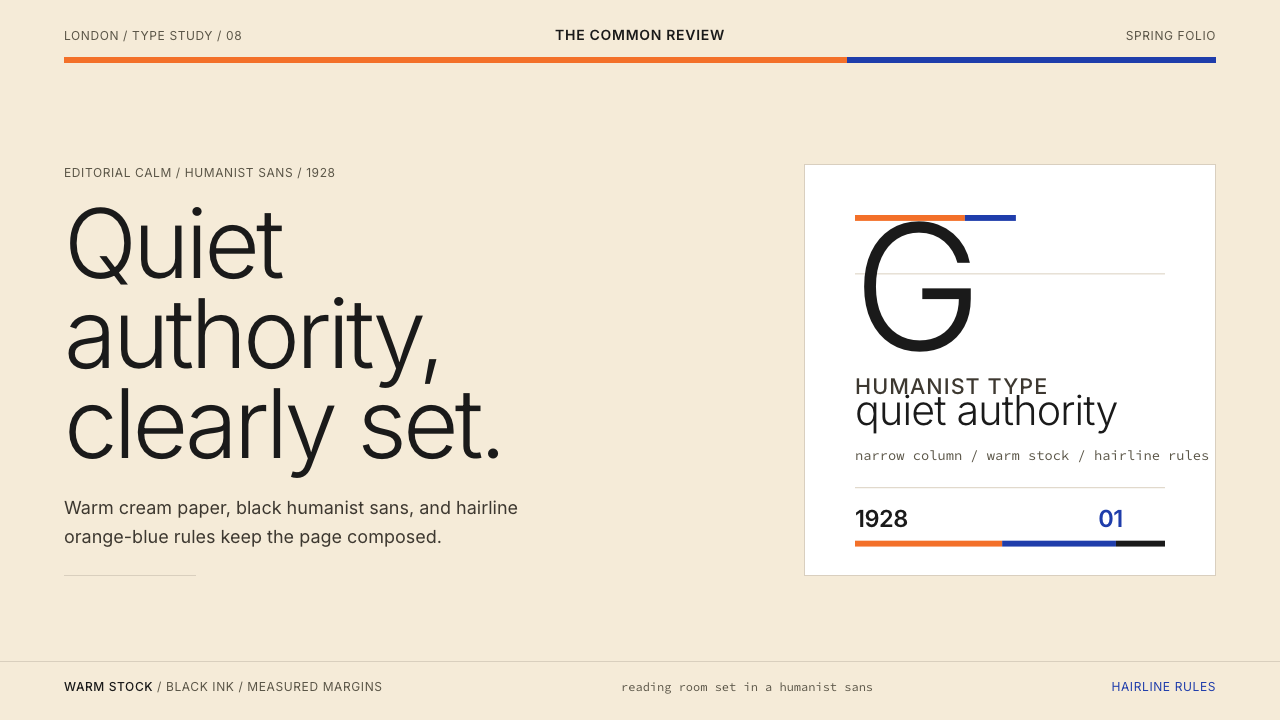 Gill Sans (BBC, 1928)Quiet authority, clearly set. Warm cream, black humanist sans, and hairline o…
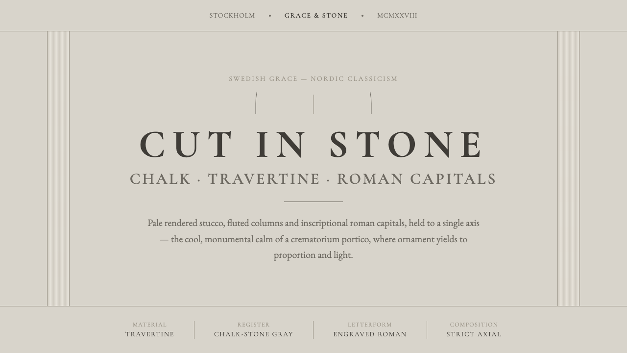 Nordic Classicism AsplundStone, not cream. Engraved Trajan capitals on cool chalk stucco, fluted colum…
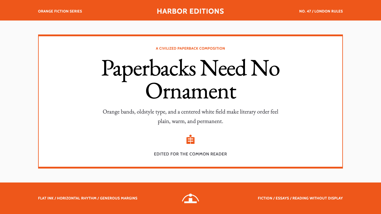 Penguin Classics OrangePaperback authority. Orange tri-bands, serif title panel, and flat ink enforc…
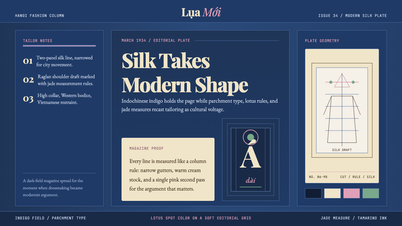 Vietnamese Áo Dài 1934 (Cát Tường)Indigo editorial poise. Parchment serif columns and lotus-pink rules frame th…
 Ankara Republican ArchitectureAuthority moves slowly. Rose andesite, grey ashlar and six equal bays enforce…
 Chipperfield Museum GrayMuseum gravity, rendered quietly. Warm concrete grey, roman capitals, one ter…