What is Heliograph Signalling?
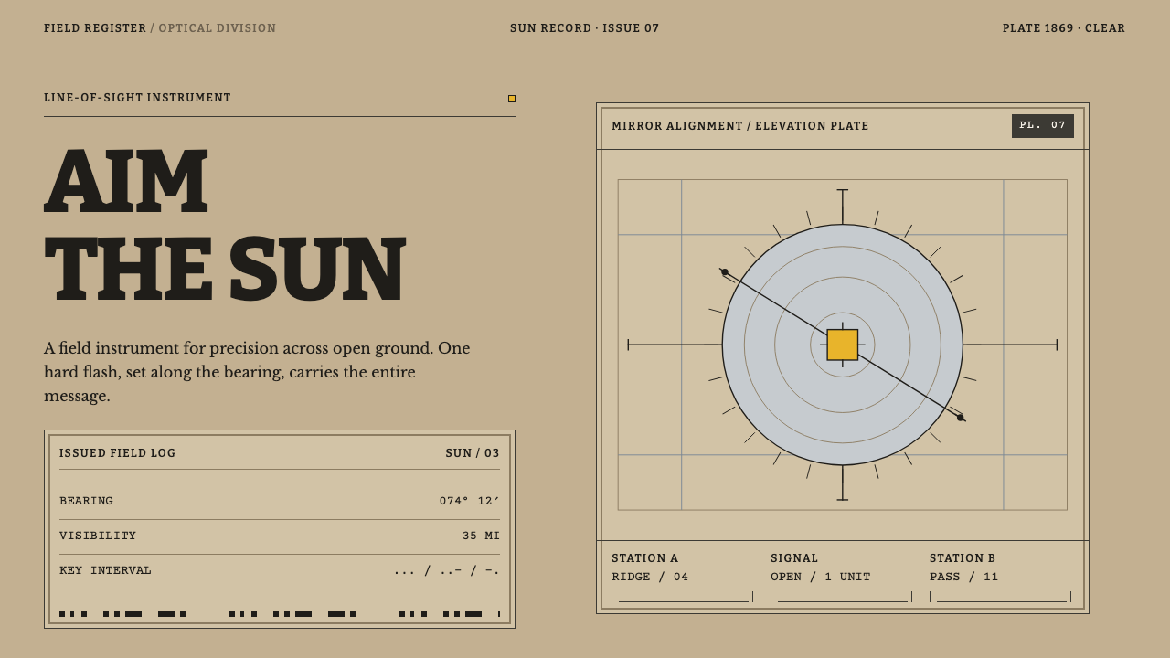
A heliograph is a mirror that talks, and its design language is built the same way — khaki ground, ruled survey lines, heavy slab type, and one hard yellow flash that is either on or off.
Heliograph Signalling in brief
A heliograph is a signalling instrument that sends messages by reflecting sunlight from a mirror. An operator aims the flash at a distant station and breaks the beam with a key, so that short and long flashes spell out Morse code across miles of open country with no wire and no fuel. The Heliograph Signalling design language takes that instrument as its model, and it treats the object, its materials and its manuals as the sources of every visual decision.
The result is a precise, plain and slightly severe style. The ground is khaki, a dusty field colour. The only strong accent is a single yellow, standing for the flash itself. Lines are straight and taut, tables are ruled, and headings use thick slab-serif letters of the kind found in field manuals and printed survey plates. The layouts are those of a signal handbook: horizontal and vertical structure, sight lines with marked ends, and spacing that follows the rhythm of dots and dashes.
Its central idea is in the blurb, aimed precision and not atmosphere. A flash of sunlight carries a message only if it is pointed correctly. A beam that is slightly off arrives as nothing at all. This system therefore avoids glow, haze, soft transitions and mood. Meaning is conveyed by alignment, by clear on-off states, and by structures a reader can follow with a finger. It is a design language for people who need to understand quickly, not feel something.

Where does Heliograph Signalling come from?
The first heliograph was built in 1869 by Henry Christopher Mance while on survey duty at Karachi, in what was then British India. The work was part of the wider effort to map the subcontinent, associated with the Great Trigonometrical Survey, in which stations across long distances had to be linked precisely and quickly. A flashing mirror was a natural answer for surveyors who needed to communicate over hills and plains. The context is useful for design: the instrument came out of measurement, and so its language is one of lines, angles and aim.
Mance's instrument was compact. It had a five-inch silvered glass mirror with an unsilvered spot at the centre that lets the operator sight the distant station, U-shaped arms carrying a tangent screw and an elevation screw for fine adjustment, a shutter key to interrupt the beam, a leather case and a wooden tripod. The whole kit weighed about seven pounds. It was issued equipment, not a gadget with brass gears and ornament. Every part exists to hold a mirror steady, to aim it and to switch the flash, and the design language inherits that function-first discipline.
The silvered mirror itself depended on a nineteenth-century advance in chemistry, associated with Justus von Liebig, whose work on silvering glass made reflective mirrors practical. Once the mirror existed, the military value of the idea was obvious. The Government of India adopted the heliograph in 1875, and it remained in service into the early twentieth century. Its natural territory was the North-West Frontier: dry country of long sight lines and difficult passes, where a runner or a telegraph line was slow or impossible, and where a field station could talk to another across a valley using only the sun.
Three traditions meet in the style. Victorian military signalling supplied the manuals, the drill and the habit of codifying every step. The Great Trigonometrical Survey supplied the plates, the tables and the idea that knowledge is a network of sighted lines. Optical telegraphy, the broad family of systems that send messages as patterns of visible signals rather than through wires, supplied the logic of on-off states and coded rhythm. These origins belong to an imperial administration, and the frontier regions were scenes of conflict; using the look responsibly means treating it as an instrument and a document style, not as a romantic backdrop.
What defines the Heliograph Signalling look?
Khaki Ground
The base colour is khaki, a dusty, greyish tan. The word comes from a language of the subcontinent in which it means dust or earth, and it fits because the uniform and the hillside were the same dust. The ground is therefore a field colour, quiet and unglamorous, and the page reads like paper that has been out in the sun.
One Hard Yellow
There is a single accent, a hard yellow, which stands for the reflected flash. It is either on or off, with no transitional gradient between. Because it is the only saturated colour, it works like a signal: whatever is yellow is the thing being sent. This is why the system should never have a second competing accent.
Straight Taut Rules
Lines are straight because a beam of light is. The beam widens by only about fifty feet for every mile it travels, so it goes where it is aimed or it goes nowhere. Borders, dividers and table lines are therefore plain, ruled and rectilinear, with no curves, swashes or rounded corners. Straightness here is a statement about accuracy.
Thick Slab-Serif Type
Headings and key labels are set in heavy slab-serif letters, sturdy and unfussy, the sort of lettering that survives rough printing and field conditions. Body text is plain and compact. The type should feel like a manual, with clear levels from title to note and nothing decorative. Weight is used to tell the reader where to look first.
Survey-Plate Tables
Information is laid out as in a survey plate or an issue list: ruled tables, numbered rows, small captions and a legend. Components are named as plainly as the parts of the kit itself, with each part listed and labelled. The effect is the look of a document that expects to be checked line by line.
Sight Lines with End Ticks
The characteristic graphic is a straight line between two stations, marked at each end with a small tick or cap. It stands for aim: a connection that exists because two points have been lined up. In an interface it suits connectors, timelines and relationship diagrams, where the endpoints matter as much as the line between them.
Morse Rhythm
Spacing is organised like Morse code: short marks, long marks and measured gaps. Rows of short and long bars can act as dividers or loading indicators, and intervals between blocks follow a consistent ratio. The rhythm gives the page a pulse without any animation, since the repeated pattern reads as a message even when it says nothing.

Who shaped Heliograph Signalling?
Mance built the first heliograph in 1869 while on survey duty at Karachi. His design combined a silvered mirror with an unsilvered sighting spot, a mounting with tangent and elevation screws, a shutter key, a case and a tripod, all in a kit of about seven pounds. His achievement was to turn a flashing mirror into a repeatable, issued instrument, which is why the design language prizes reproducibility, labelled parts and plain function.
Liebig was a German chemist whose work on silvering glass made practical mirrors possible, and mirrors are the heart of a heliograph. He is not a signaller or a surveyor, which is the point of including him: the instrument rests on a chain of advances, from chemistry to optics to field kit. In design terms, he stands for the idea that a clean, reflective surface is an engineered achievement, and not an accident.
The Great Trigonometrical Survey was the long-running effort to map the Indian subcontinent through chains of precisely measured sight lines, and it is the setting in which the first heliograph was built, on survey duty at Karachi. It is included as an institution rather than a person because its habits shaped the look: ruled plates, tables of readings, numbered stations and the conviction that knowledge is a network of lines that must be aimed correctly.
How do you use Heliograph Signalling today?
Heliograph Signalling is a style for clarity under conditions where the reader has little time and no patience for decoration. Its rules are strict, and applying it well means respecting them: one accent colour, straight lines, heavy type, ruled tables. The reward is a look that feels trustworthy and procedural, like a document you could follow in the field.
For presentation slides, a cover can be a khaki field with a heavy slab-serif title, a thin ruled border and a single yellow mark, perhaps a short bar or a small square, standing for the flash. Content slides work as ruled tables and numbered lists, with a caption row and a legend. Data slides suit this style especially well when the chart is built from straight lines and tick marks, with the yellow reserved for the one value or trend the audience must notice.
For web interfaces, the style suits documentation, reference sites, status and logistics tools, field-service applications, mapping and survey products, and any interface where users follow procedures. Use khaki as the page ground, dark ink for text and rules, and yellow only for the active state, the current step or a critical alert. Make tables and form layouts ruled and compact, use end-tick connectors in flow diagrams, and let hover states change to yellow with no glow or transition.
For editorial and marketing work, the style gives history, engineering, outdoor and technology stories a sober, documentary voice. Articles can use heavy headings, numbered figures and ruled sidebars, with a yellow rule or marker as the single decorative gesture. Product pages for precise equipment, tools and instruments can adopt the plate-and-legend layout, listing parts and specifications openly. Real photography of instruments, paper and maps supports the look better than stylised illustration.
The most common mistake is to read the theme as steampunk and add brass gears, lens flares or glowing sun rays. The original kit was plain, issued equipment, and the style depends on that plainness. A second mistake is to introduce more than one accent colour, which destroys the on-or-off logic of the flash. A third is to soften corners and shadows, which contradicts the straight-line principle. Finally, avoid using the look as a casual military costume; treat it as a document style with serious origins.

Heliograph Signalling — FAQ
What is a heliograph and how does it work?
A heliograph is a signalling device that reflects sunlight from a mirror toward a distant receiving station. The operator aims the flash using a sighting spot at the centre of the mirror, then uses a shutter key to interrupt the beam in short and long flashes that spell out Morse code. The first was built by Henry Christopher Mance in 1869, and the Government of India adopted the instrument in 1875.
Why does the style use only one accent colour?
Because the yellow stands for the flash, and a flash is either on or off. A second competing accent would blur that logic, so the colour is reserved for the single thing being signalled: the active step, the key value, the critical alert. The restraint makes the one yellow element unmistakable, which is exactly what a signal is for.
Why is the ground colour khaki?
The word khaki comes from a language of the subcontinent in which it means dust or earth, and the colour matched both the uniform and the hillside. In the design language it works as a practical neutral: a warm grey-tan that makes dark ink and a hard yellow stand out, and gives the page the look of field paper rather than a clean white screen.
Does the design need to use Morse code literally?
No. Morse is a rhythm, not a requirement. The style borrows the idea of short marks, long marks and measured gaps as a spacing logic, for dividers, indicators and the timing of layout. Spelling words in dots and dashes can work as a small decorative detail, but it is the rhythm and the consistent ratios that make the page feel like a signal manual.
Is the style suitable for dark mode or for friendly consumer products?
It is a light-ground system, and the khaki field with dark ink is central to its character. A dark variant is possible, but the yellow flash would then dominate and lose its quiet precision. It is also a poor fit for products that want warmth, play or softness. Its strengths are procedure, documentation, instruments and reference material, where a plain, exact voice is a benefit.
Related design styles
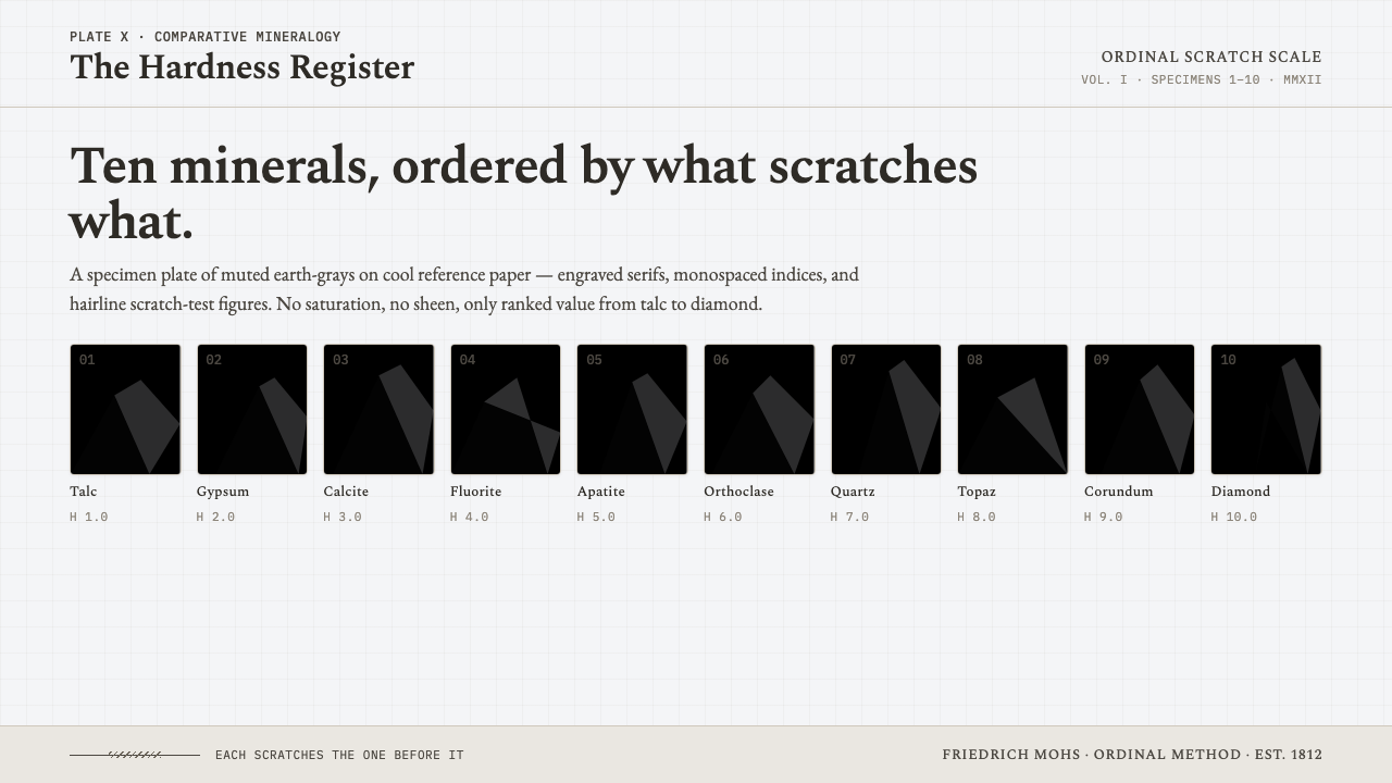 Mohs Hardness ScaleRanked by what scratches what. Ten mineral-gray chips on cool chart-white, en…
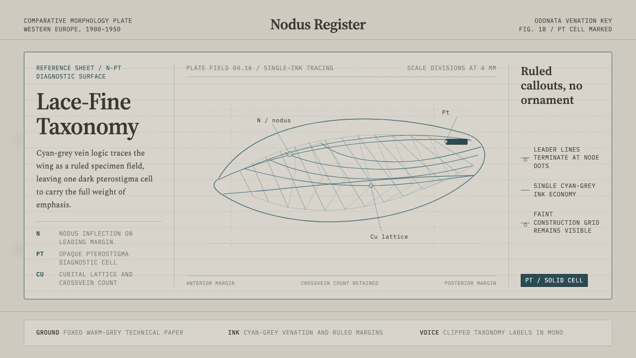 Dragonfly Wing VenationPrecision, nearly weightless. Cyan-grey veins rule a foxed paper taxonomy pla…
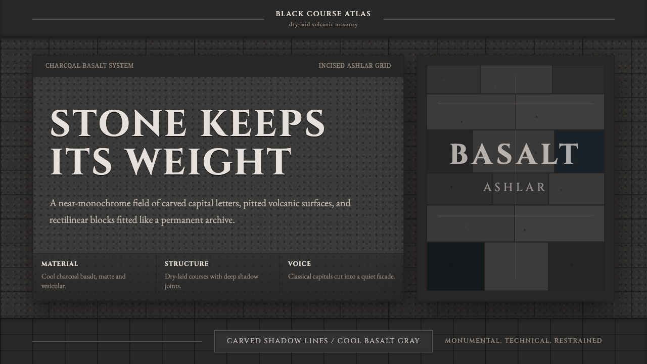 Hauran Basalt StoneMonolith refuses shine. Charcoal Cinzel capitals lock into dry-laid basalt gr…
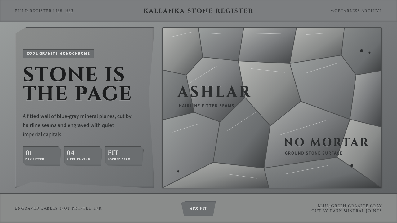 Inca Ashlar StoneworkStone becomes the page. Granite-gray planes lock into hairline ashlar seams.
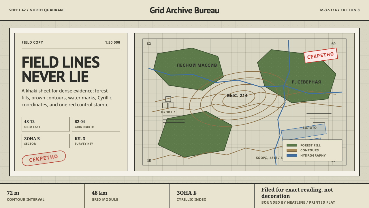 Soviet Classified MapAustere field intelligence. Khaki grid, forest green fills, brown contours, r…
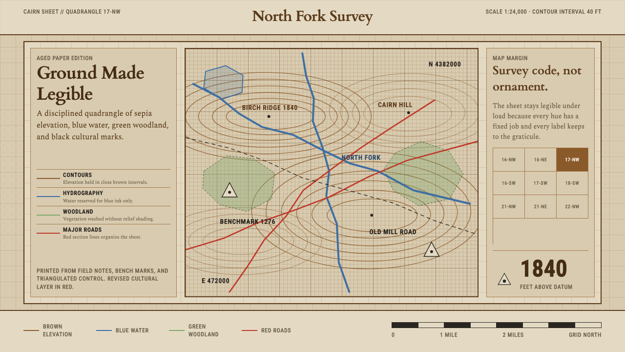 Topographic Survey MapMeasurement becomes beauty. Sepia contours and blue hydrography sit on aged m…